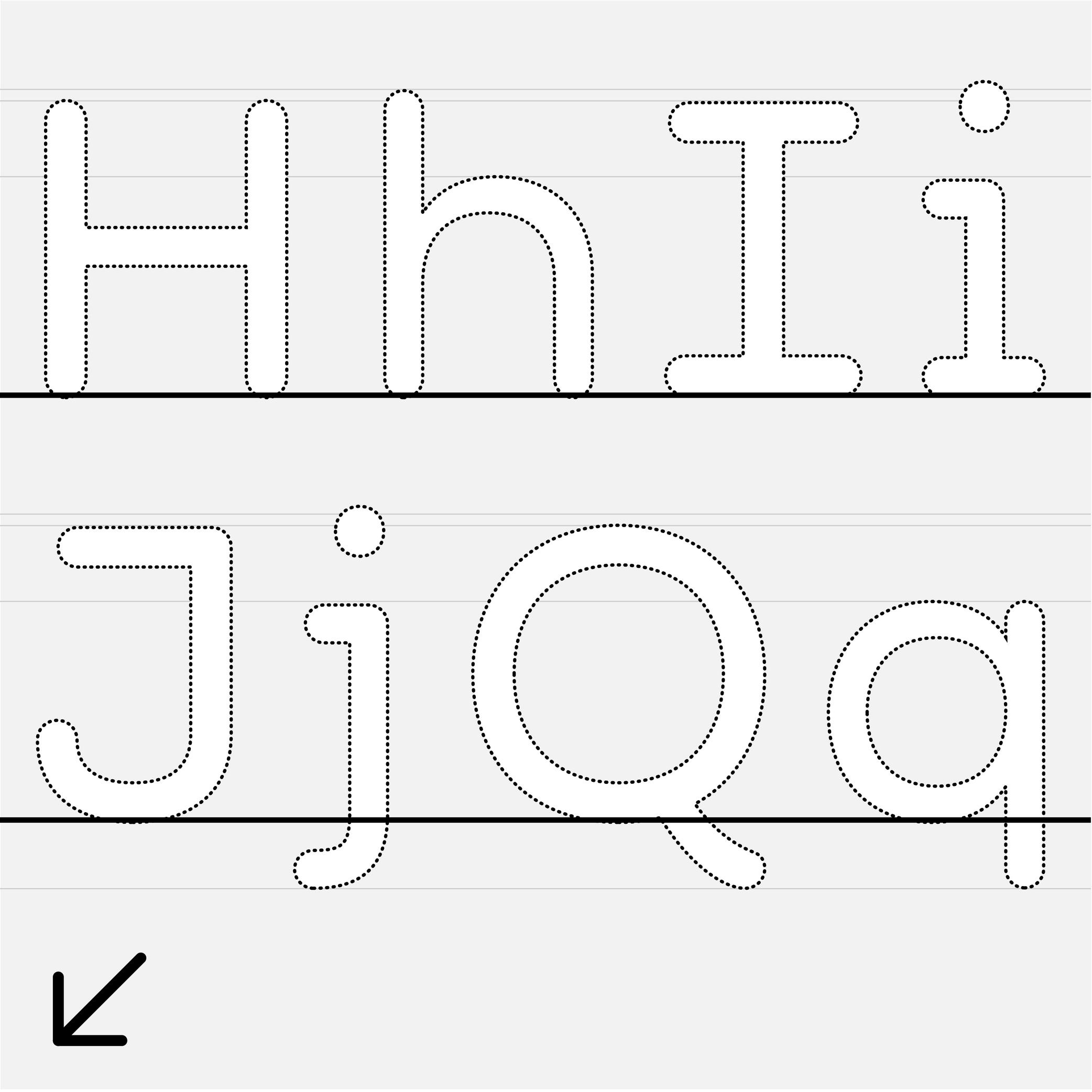
Alphabet
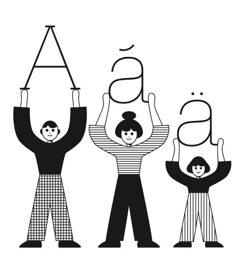
Illustration: James Graham .
(Read More)An alphabet is a type of writing system that uses a set of letters to represent a language visually. Each letter represents a different sound, and when combined together following a certain order specific to each language, they form syllables, words, and sentences.
Across the world and throughout history, many languages have used alphabetical systems (Greek, Arabic, Hebrew, etc.). As of today, the Latin script is being used for the largest number of languages, with many different sets of alphabets, varying in number of letters depending on the needs of the language (i.e., both English and Spanish use the Latin script, but they have different alphabets).
Alternate (Glyph)
 (Read More)
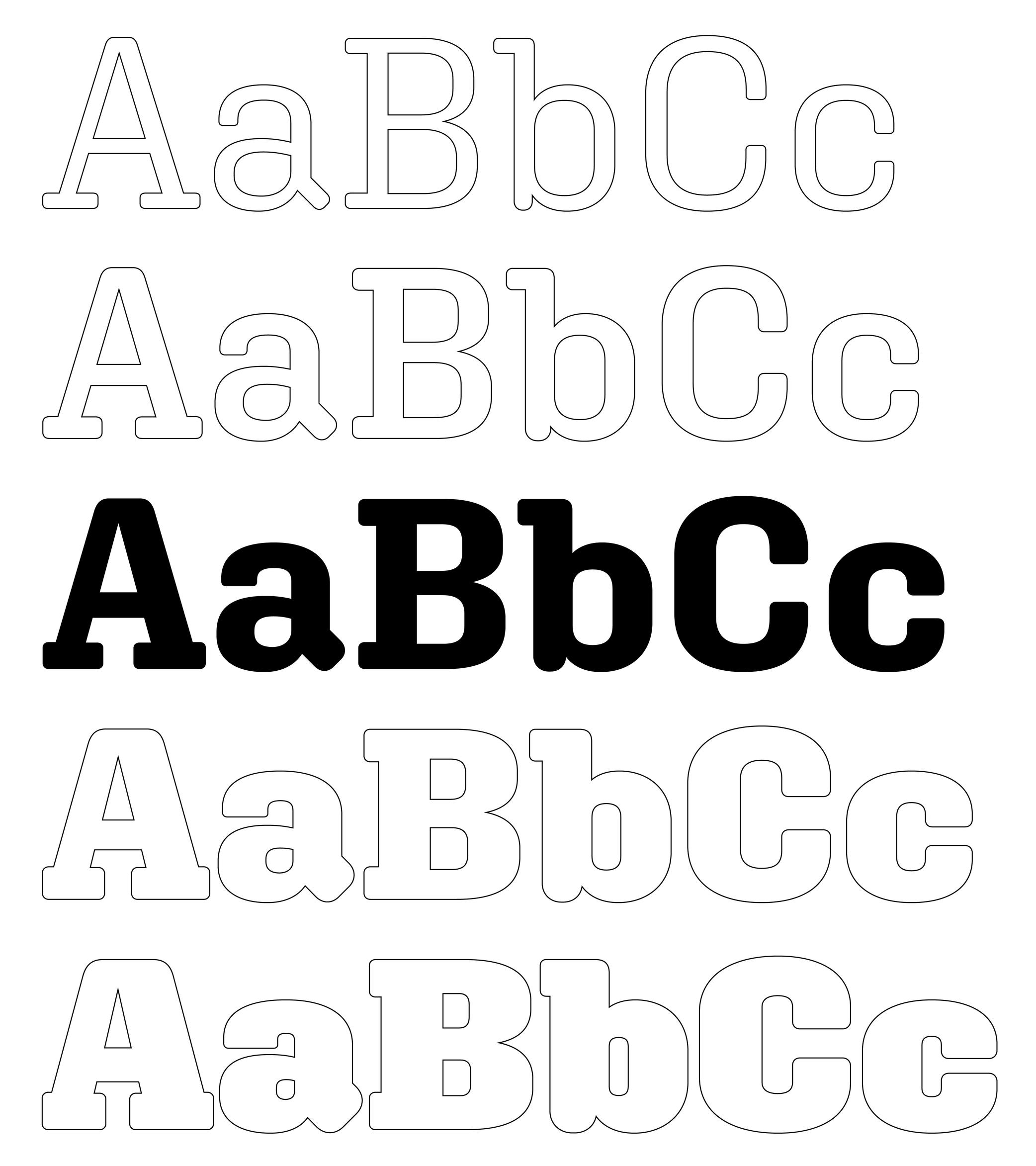
An alternate is a variant shape of a character, which has to be considered as a glyph of its own.
Alternate glyphs are created for various reasons:
• contextual: such as case-sensitive punctuations, where punctuation symbols can be aligned in a nicer way with capital letters when set within them, or tabular figures if they are used in numeric tables;
• positional: in Arabic or other scripts that have connected characters, a character may need to have different shapes depending on its position in a word (initial, medial, final, isolated);
• stylistic: such as single-story or double-story letters a or g. These alternates can also reflect a specific aesthetic choice (e.g., with or without swashes).
• localization: some languages using a same script as others require a different form of the same character as localized preference variant.In digital fonts, these variants are accessed through OpenType features. Each one is tagged with a specific code (added as an extension to a glyph’s name) that enables a software to apply them whenever needed. Some most used ones being listed below:
• calt : contextual alternates
• case : case-sensitive forms
• ss01, ss02, etc. : stylistic sets
• locl : localized forms
• onum : oldstyle figures
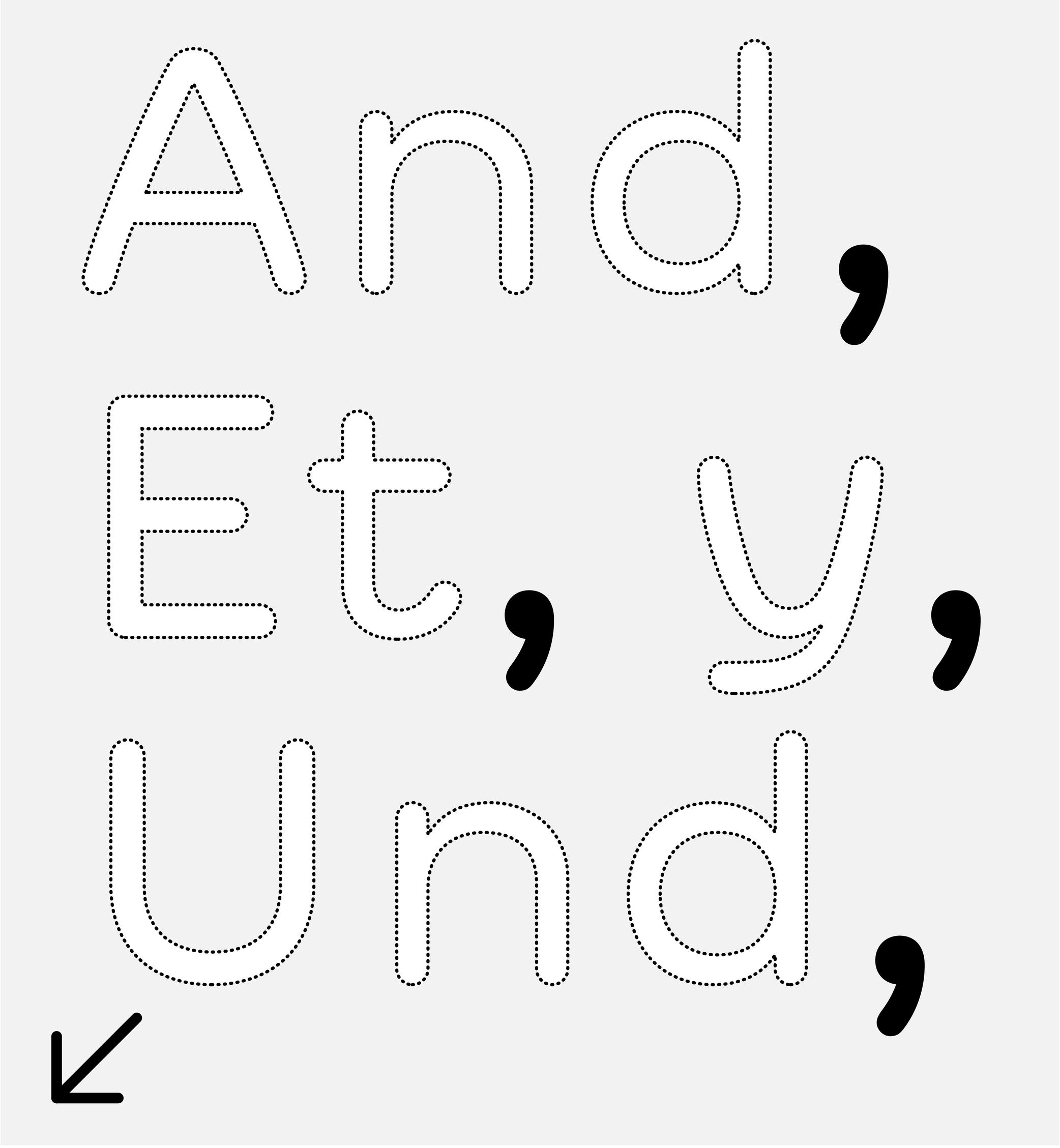
• tnum : tabular figuresAmpersand
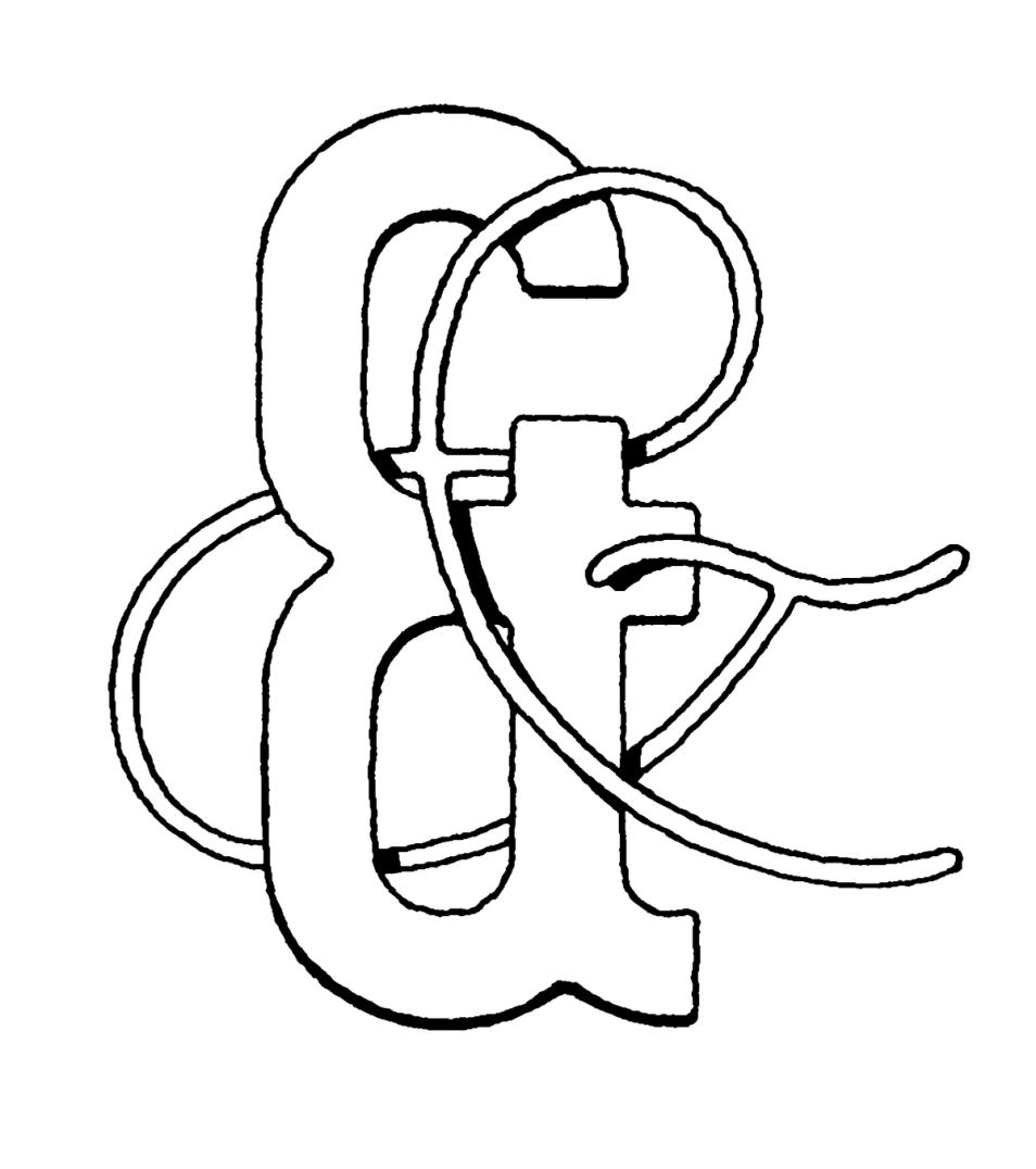
Illustration: Tezzo Suzuki .
(Read More)FUNCTION
The ampersand (&) is a character used in titles, company, or brand names with combined words to replace “and.”
HISTORY
During the Middle Ages in Europe, books were mainly produced to distribute religious texts. For that reason, most texts were written in Latin, even after Gutenberg’s invention of metal-type printing in 1450. The letters e and t (for et meaning “and” in Latin) were used so often that punch-cutters combined the letters to create a single character et, first as a ligature and later as a character on its own.
DESIGN
The ampersand has many design possibilities. The & as we know today is only one out of many designs that have been created, experimented, and used since the introduction of the combination of the letters e and t of metal-type printing. Its top is often aligned with the uppercase and/or figures to give it enough space to be legible.
TYPOGRAPHIC RULES
The ampersand is mostly used as a decorative addition in titles or brands to represent the word “and” (or equivalent in other languages). It is better to use the word “and” in body-size texts.
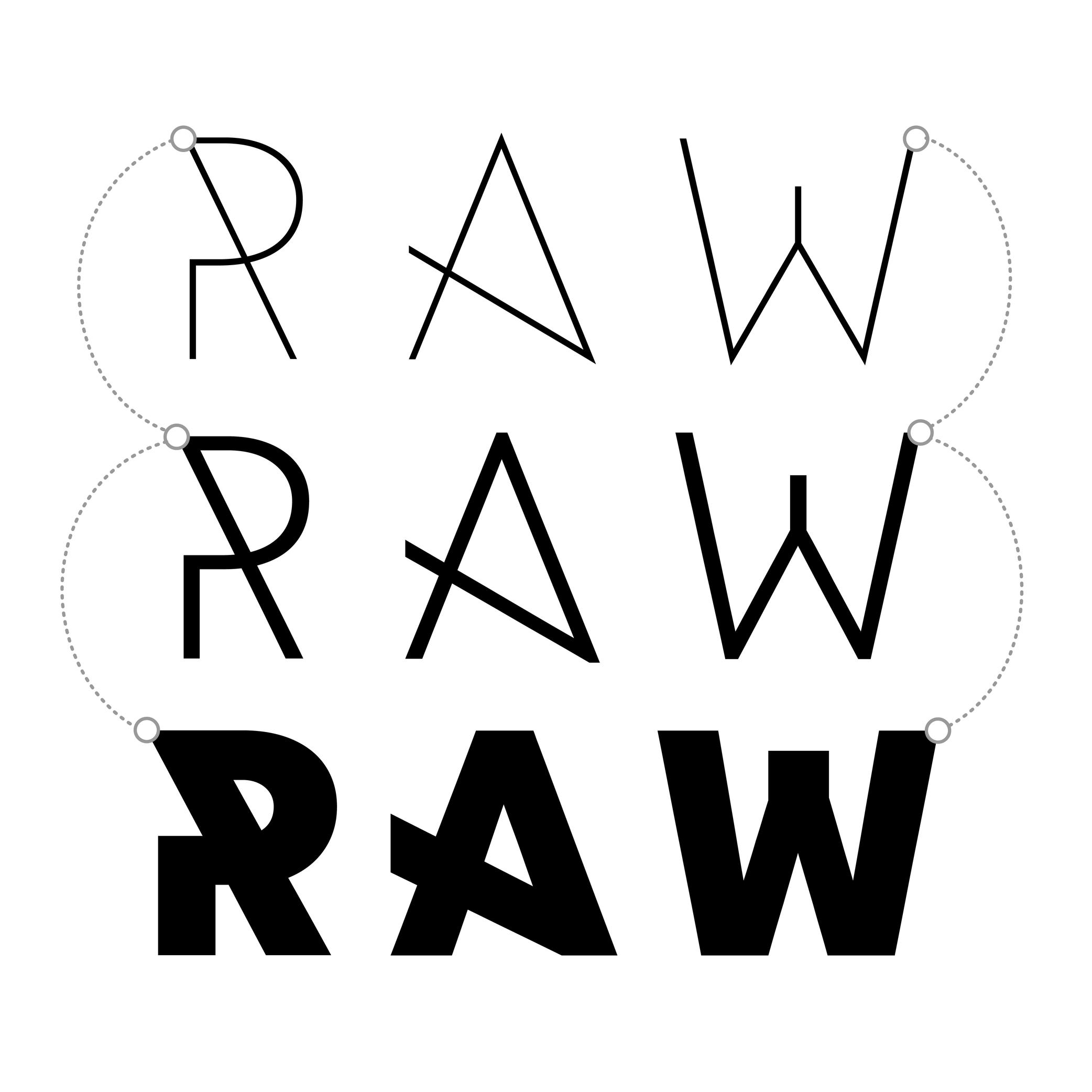
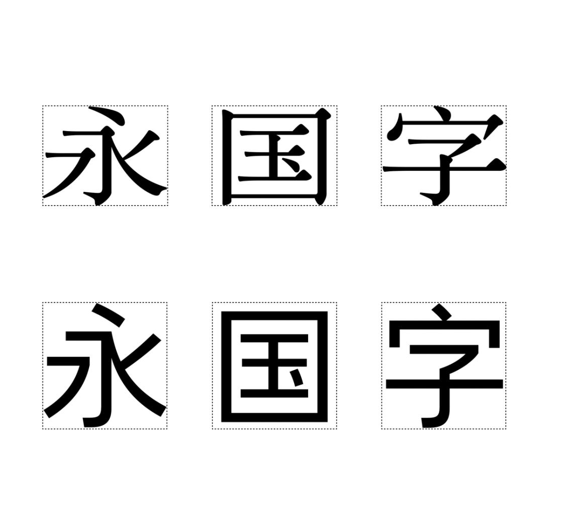
Anatomy
Illustration: Le Champ Fleury, Geoffroy Tory, 1529. Source: Bibliothèque nationale de France .
(Read More)To name and describe parts of letters and other characters, many terms are borrowed from architecture (e.g., arch of an n) or from human and animal anatomy (e.g. leg of an R), which is why we speak of “type design anatomy.”
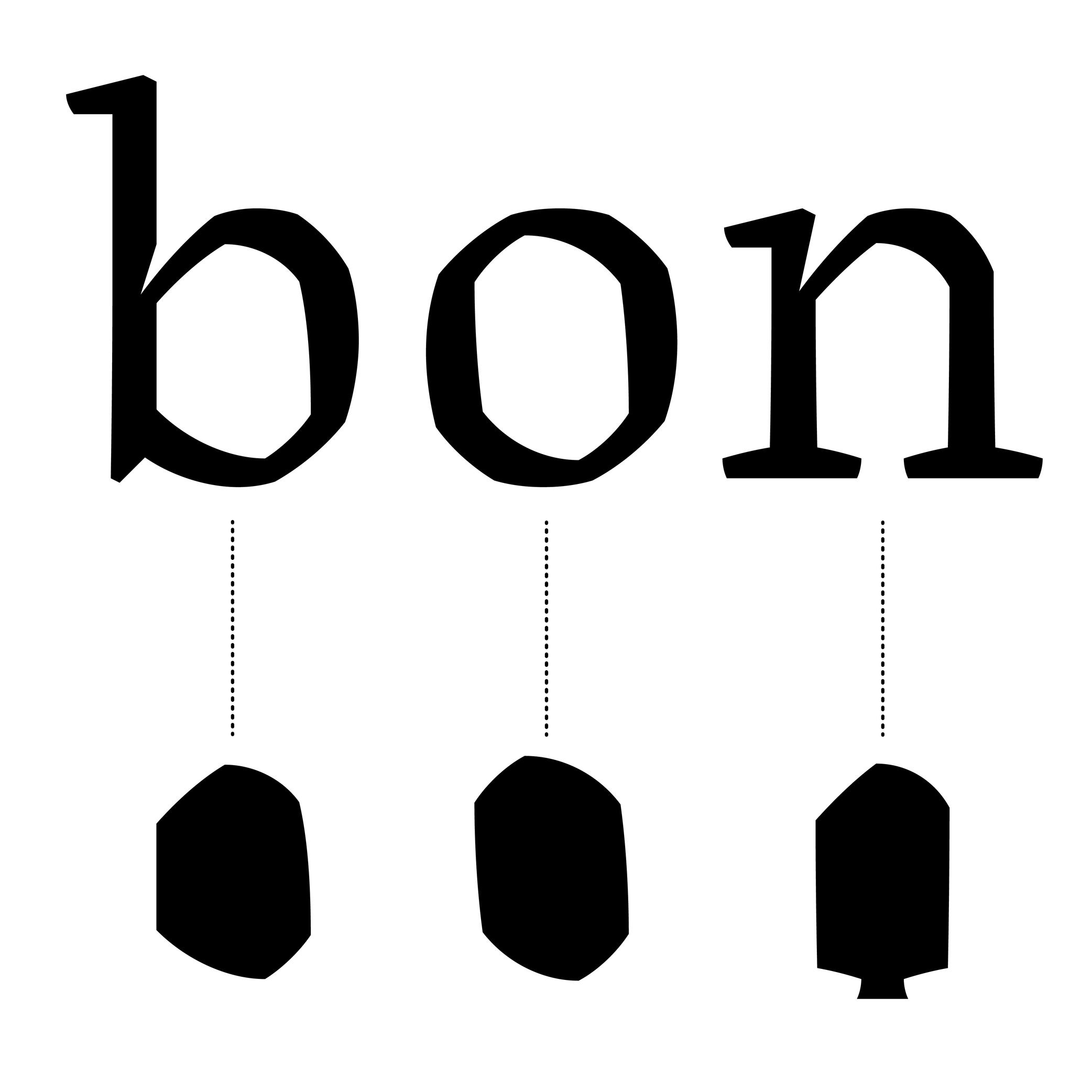
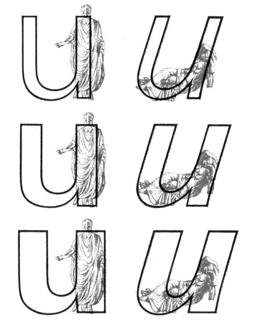
Anchor
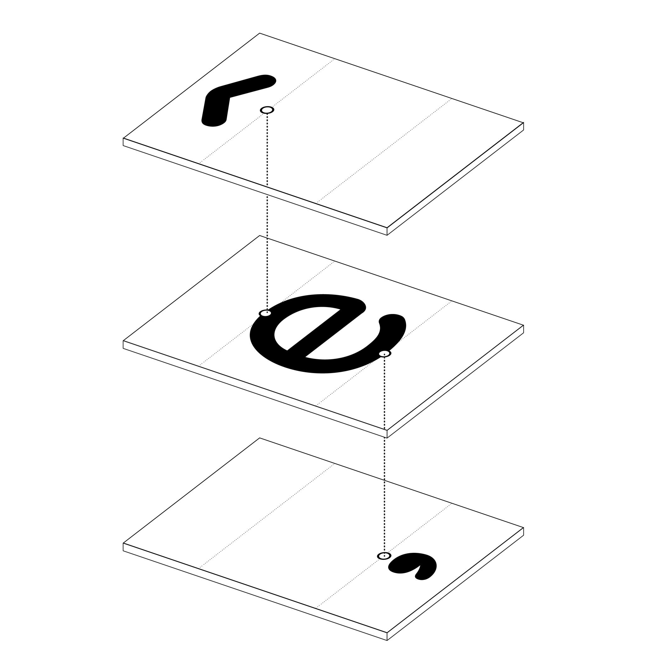
Illustration: Words of Type.
(Read More)In many languages and scripts, some glyphs are a combination of others, such as accented letters: é is the pairing of e with the diacritic “acute” on top.
When designing fonts, instead of copy-pasting the contours of both e and the acute accent into é, the designer adds an anchor on the top of e and below the acute accent, where both should be connected or anchored to each other. Thus, both elements are “called” to form the character é, which becomes its components.
Angle
Sponsored by TypeMates . Typefaces in use: Edie & Eddie Modern , designed by Lisa Fischbach, 2022.
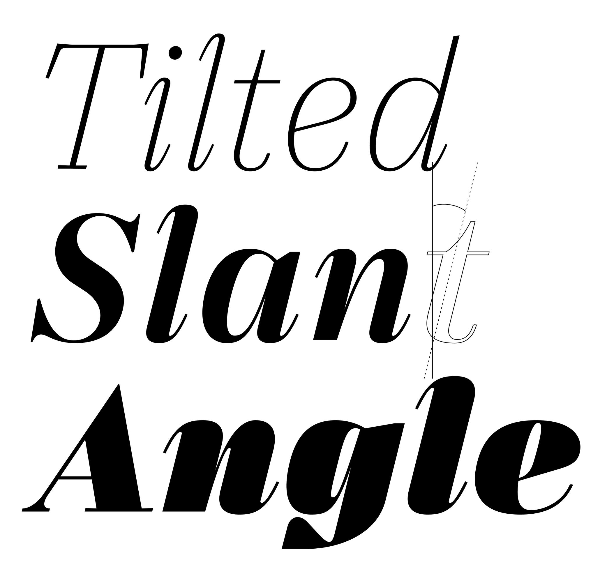
(Read More)Also called slant.
The angle is what we can observe on italic-style letterforms. We say the vertical stems are stretched and leaning to the right at a certain angle.
In the same typeface family, the degree of the italic angle may vary from one weight to another, different sizes of use (display to caption styles), different scripts, or even from one glyph to another in the same style to optically improve the typeface’s balance.
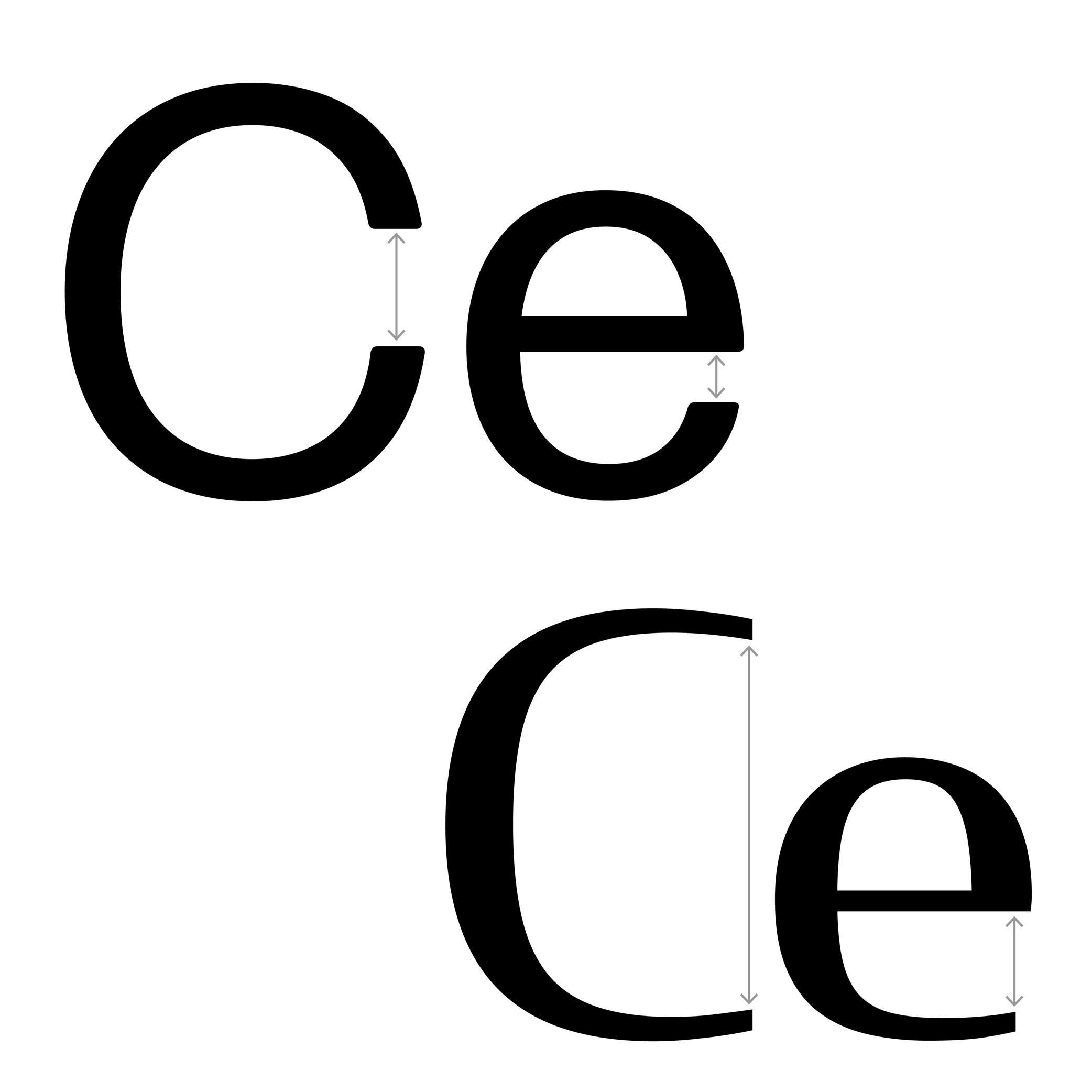
Aperture
Sponsored by DJR . Typefaces in use: (top) Forma DJR , (bottom) Condor , designed by David Jonathan Ross, 2017.
(Read More)The aperture is the frontier between the counter and the surrounding white space of opened letters (such as a, e or c).
Contemporary typefaces that are meant for long text reading are often designed with a wider aperture (sometimes even without a terminal at the top of a and c) as solutions to increase their legibility at smaller size.
Apex
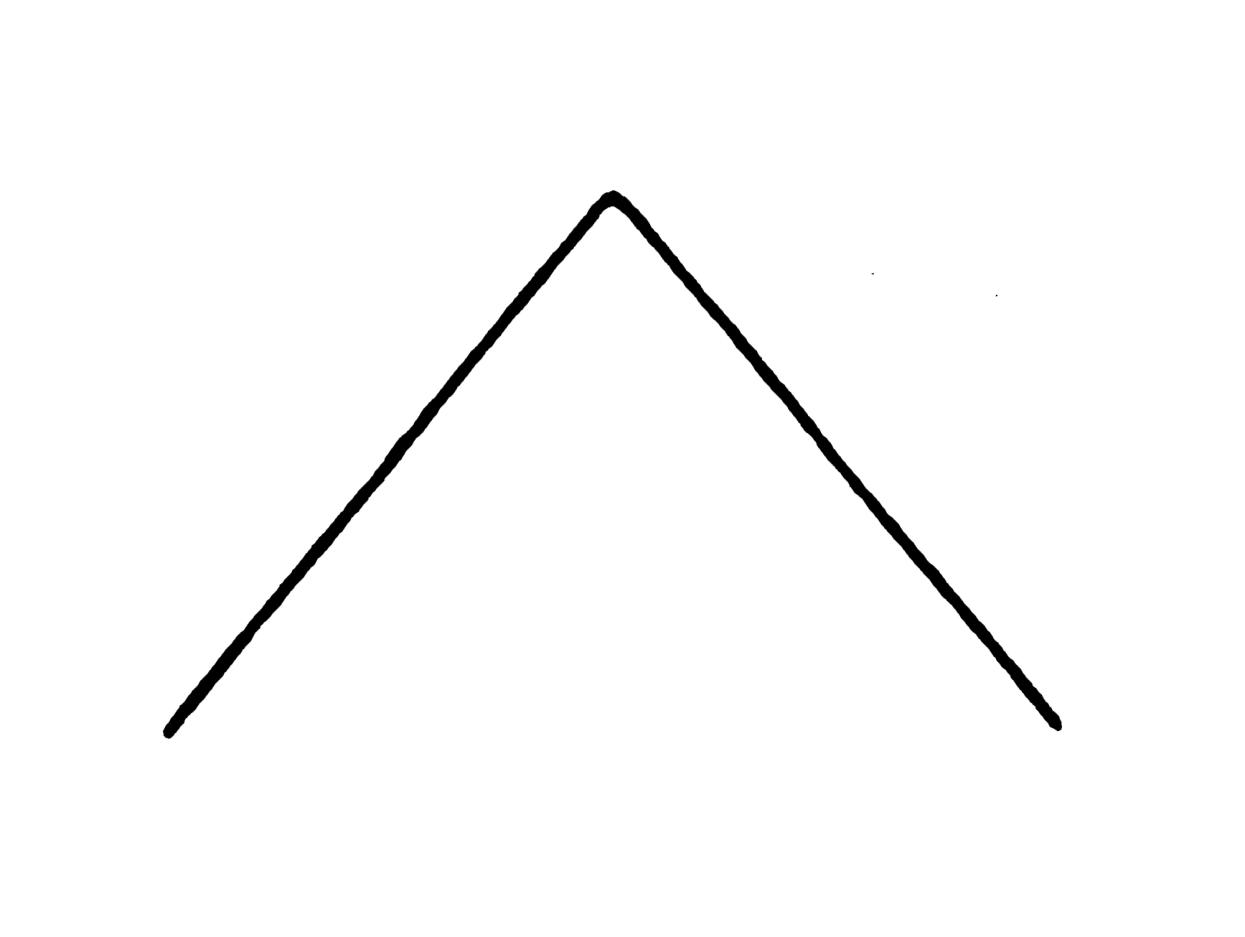
Illustration: Tezzo Suzuki .
(Read More)The apex is the point on the top of a letter where two stems meet, such as the top of the letter A or the middle of w.
We also find the term “vertex,” referring to the top of A as well, but also to other pointed parts such as the base of V or the intersection of K when/if its diagonals don’t meet the vertical stem.
Apostrophe
Sponsored by DJR . Typeface in use: Roslindale , designed by David Jonathan Ross, 2017.
(Read More)FUNCTION
The apostrophe (or “single quote” for English speakers) is a very common punctuation mark in languages using the Latin alphabet. It has different functions from one language to another. In English, for example, it is used as a possession (“part of a letter” to “a letter’s part”) or an elision marker (“it is” to “it’s”).
HISTORY
A symbol looking like an apostrophe dates back to the 16th century in France when the engraver Geoffroy Tory (1480–1533) introduced this sign to replace a letter or a short word.
With the invention of typewriters, other look-alike glyphs (single quote, prime, acute accent, etc.) were assembled into the same key with the apostrophe to save as many keys as possible for the limited space of the keyboard. But this led to confusion that is still observed nowadays, with the prime glyph being often used as an apostrophe.DESIGN
Well-designed typefaces either have slanted or curly-shaped apostrophes (related to the comma of the typeface). This shape avoids confusion with the prime.
Arch
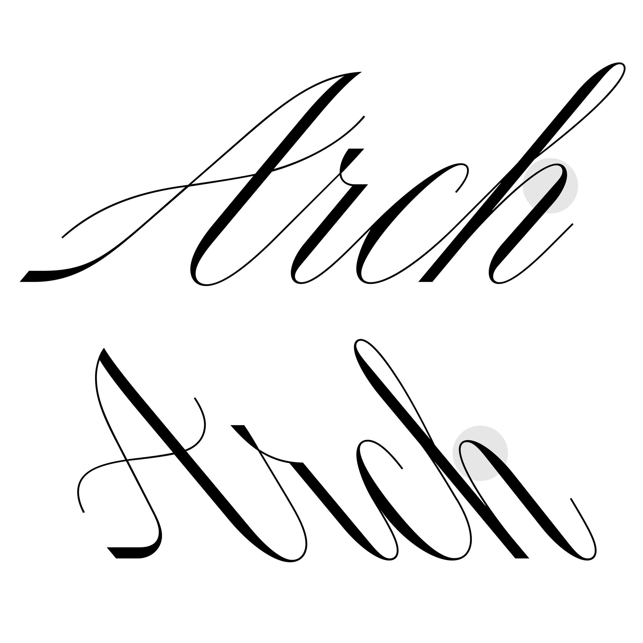
Sponsored by R-Typography . Typeface in use: Canora Frente and Verso , designed by Rui Abreu, 2021.
(Read More)Many terms are borrowed from architecture or human and animal anatomy to designate and describe parts of letters and other characters. We even speak of type design anatomy.
In Latin script, the arch is the top-right part of letters such as n, m, h and a.
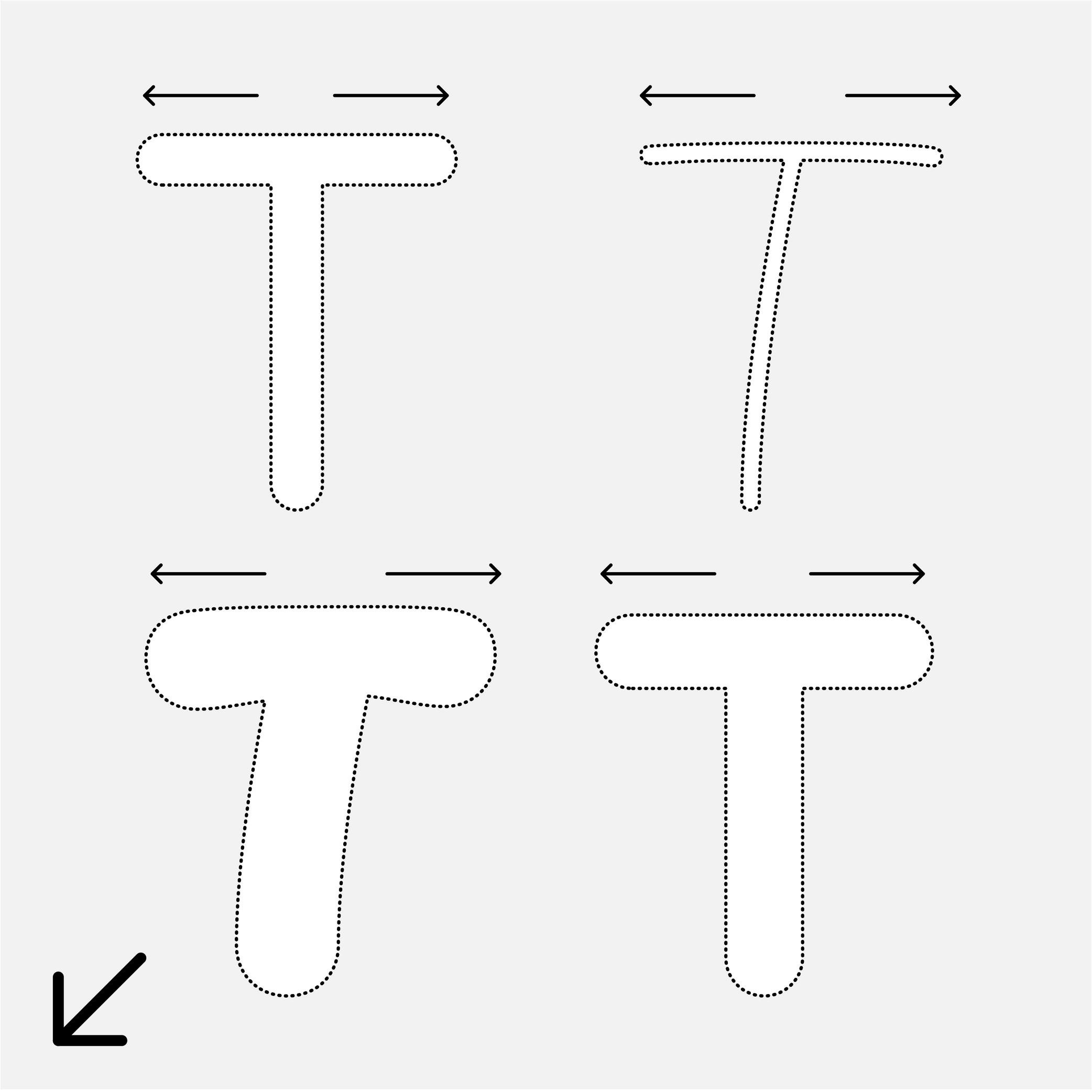
Arm
Sponsor Word of Type and feature your typeface in this card with a linked caption. Contact us for more information.
(Read More)Many terms are borrowed from architecture or human and animal anatomy to designate and describe parts of letters and other characters. We even speak of type design anatomy.
In Latin script, the arm is the horizontal bar at the top of the letter T, as well as the horizontal bars on the E and F.
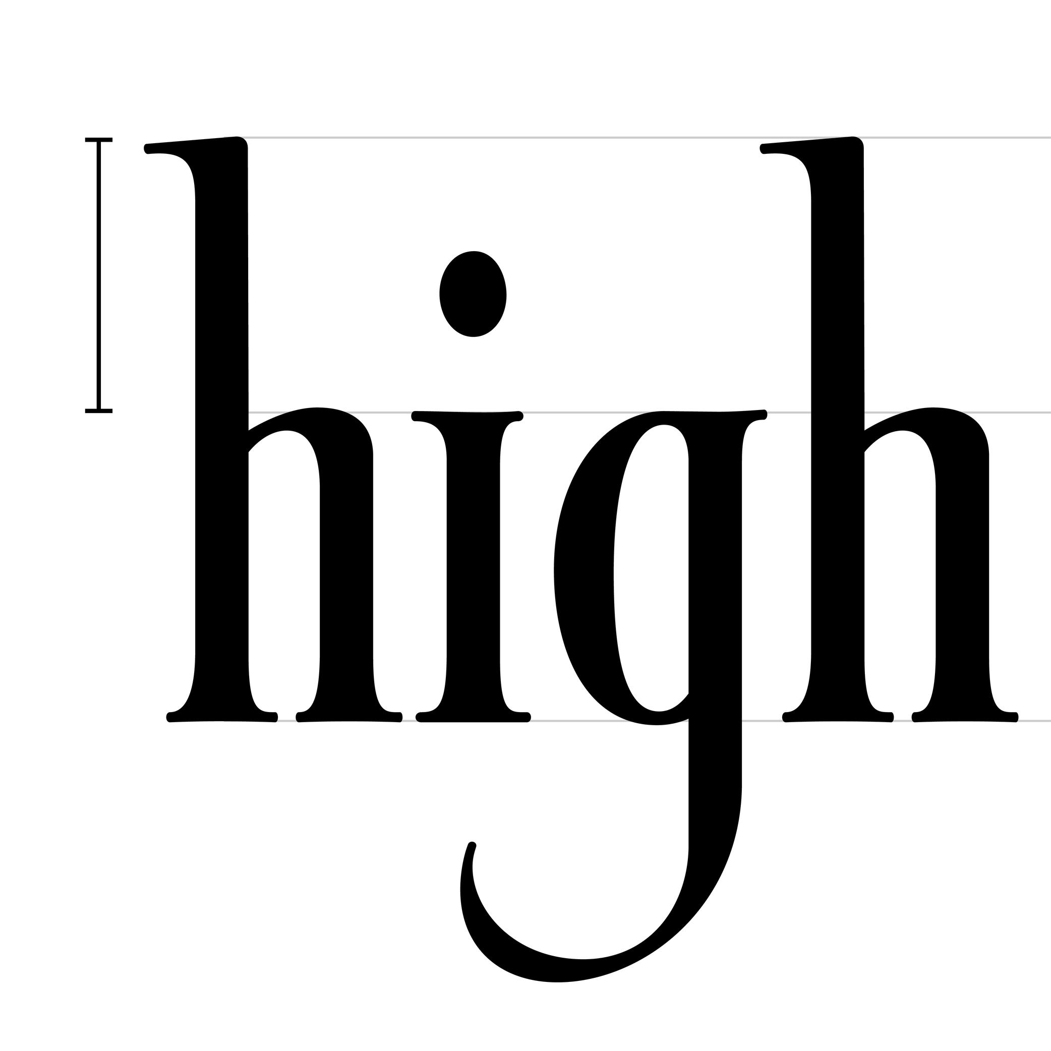
Ascender
 (Read More)
The parts of lowercase letters that go above the x-height level (such as b, d or h) are called “ascenders.”
On the opposite side of the x-height, the parts going below the baseline are descenders.
Both don’t necessarily need to have the same length. In general, descenders are shorter than ascenders.
Attention: do not confuse ascender height with the capital height (or cap height). Ascenders in Latin script are commonly taller than capital letters.
Asterisk
Illustration: Words of Type. Typeface in use: Knowledge Rounded, designed by Lisa Huang, 2024.
(Read More)FUNCTION
The asterisk (*) is commonly used as a punctuation symbol placed after a word to indicate that it refers to a note.
HISTORY
Star-shaped symbols are seen in documents from many regions of the world throughout history. It was only in the Middle Ages in Europe that the asterisk began to be used as a mark to link a part of a text to additional comments added elsewhere.
DESIGN
The asterisk can have many different designs in order to match the style of a typeface, from a very abstract five-branched star to more flourished ones, with more or less contrast between the center and the tips. The asterisk is aligned at the top of the glyphs to be legible in a text.
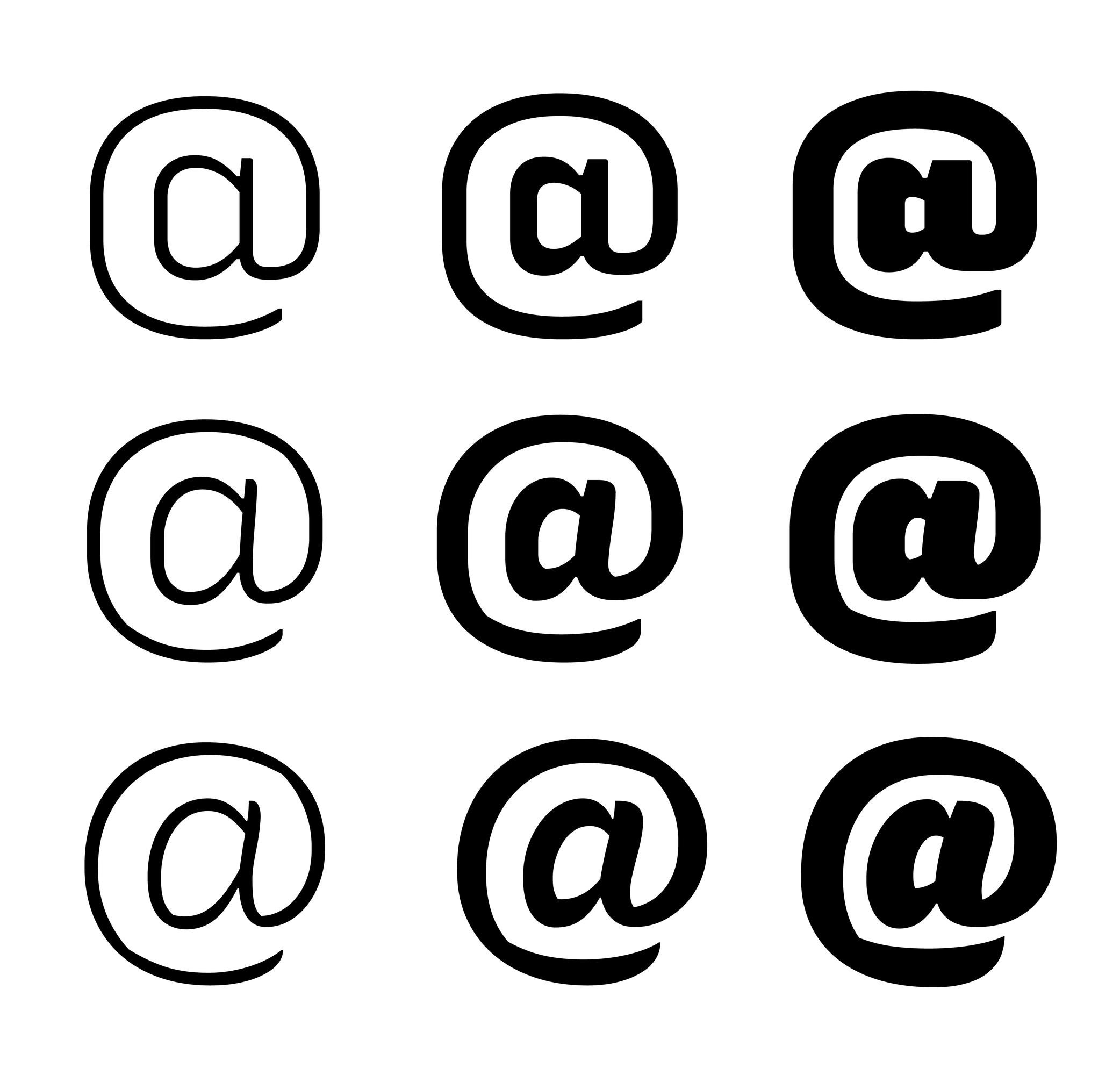
At (sign )
 (Read More)
FUNCTION
The at sign (@) is used in email addresses to indicate a domain name or a social media account tag.
HISTORY
The origins of how and why the at sign was created and why it looks the way it does remain unclear. Allegedly, it has been created as a symbol to measure weight or quantity (to signify “at the rate of”) in some parts of Europe since the 14th century. That symbol looked more or less the same as the modern at sign: with a letter a circled by an elongated tail.
Since the use of email addresses, it is used to indicate at which domain name it is hosted.
DESIGN
The at sign is commonly designed as a lowercase a with a tail surrounding the letter. Due to the sign’s visual complexity, there are many solutions to simplify it by making the tail shorter (not entirely enclosing the a) or by starting the tail directly from the top instead of the bottom of the stem.
Axis (in Type Design)
Sponsored by R-Typography . Typeface in use: Gliko Modern L , designed by Rui Abreu, 2018.
(Read More)In Latin script, we speak of a “diagonal,” “tilted” or “oblique” axis when we refer to the shapes of letters in a typeface that have some contrast.
In calligraphy (when using a broad nib pen), the axis of the stroke is defined by the angle at which the pen is held, from which a contrast between thin and thick parts is formed. The axis should be kept the same (or very similar) for a consistent construction on all glyphs.
Balance
Illustration: Catherine Potvin .
(Read More)The concept of balance is fundamental in typeface design. With many different shapes (letters, figures, symbols, etc.) that have to be combined to create a more complex group (words, sentences), a certain level of training and expertise is required to achieve a harmonious balance of the whole set.
A good balance allows a comfortable reading experience.
Baseline
Sponsor Word of Type and feature your typeface in this card with a linked caption. Contact us for more information.
(Read More)The baseline is where the bottom extremity of letters such as n and H are positioned, and it is used as a reference guide for the entire character set. We also say that letters are “sitting” on the baseline.
The baseline—with other guidelines like x-height, ascender, descender and capital height—helps to control the position of all letters and glyphs.
Bézier Curve
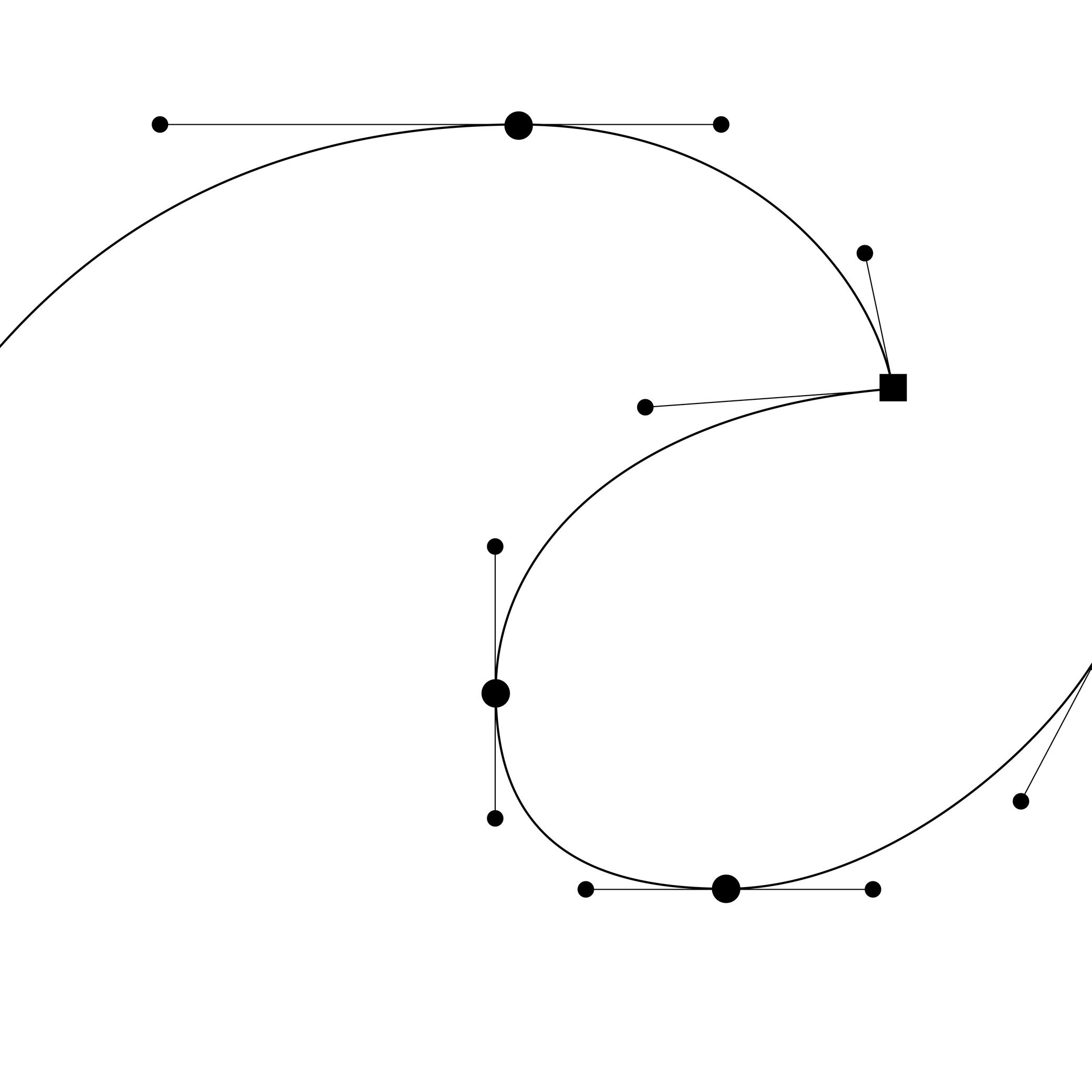
Illustration: Words of Type.
(Read More)In digital type design, Bézier curves are used to draw contours on applications with vectors drawn by placing points and handles. This technology allows the users to rasterize digital shapes while keeping their quality.
The most common font file format—OpenType—allows the use of two types of Bézier curves: cubic and quadratic.
Bilingual
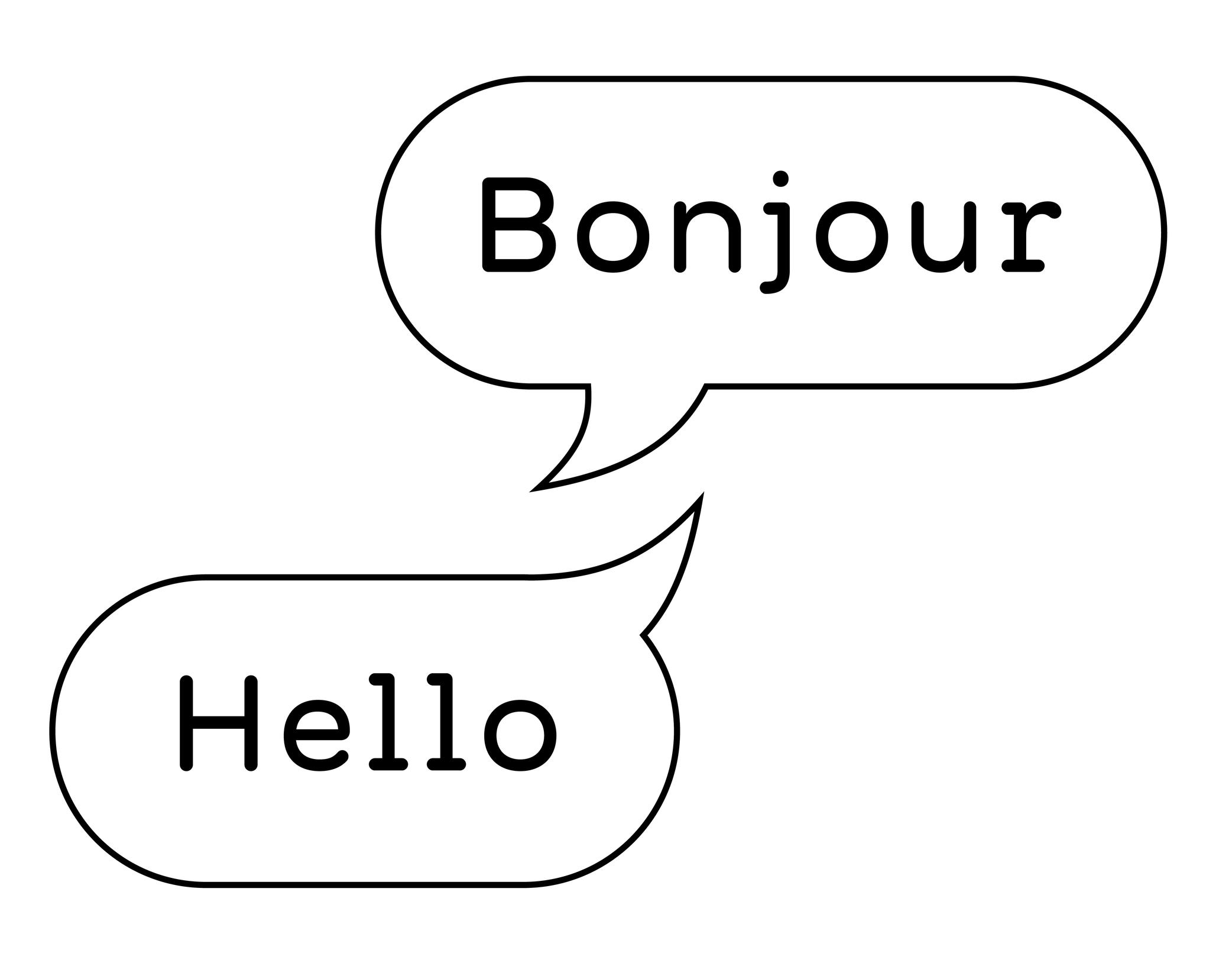
Illustration: Words of Type. Typeface in use: Knowledge Rounded, designed by Lisa Huang, 2024.
(Read More)A bilingual text is written in two languages (e.g., English and French).
Be careful to not mix up “bilingual” with “bi-scriptual.” The latter means “two scripts,” or “two writing systems.” For example, English and Chinese are two different languages, but they also use different scripts.
Binding
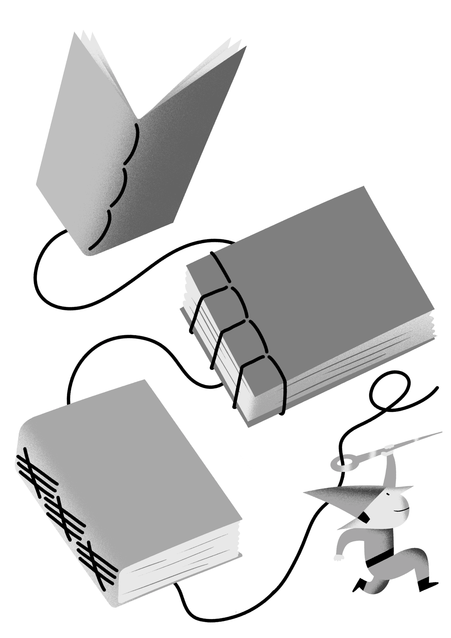
Illustration: Yann Bastard .
(Read More)Books are bound using a variety of binding techniques, from traditional to modern ones, and from various corners of the world: Japanese or Chinese bindings, Otabind, Smyth sewing, perfect binding, and others.
Body Text
Sponsored by TypeTogether . Typeface in use: Aneto , lead designers: Veronika Burian, José Scaglione, 2022.
(Read More)Also called body copy or running text, body text is usually the main written part of a document. Titles, subtitles, captions and others should be visually different from the body text so each type of information is clearly distinct and recognizable.
It is advised to set the body text at a size that is most comfortable for long reading: from 9 to 12 points for printed media and 16 to 18 points for digital screens.
Bold (weight)
 (Read More)
While Regular is the most common weight for body text, Bold is a style often chosen to highlight a word or a sentence with a stronger emphasis than Italic.
Bounding Box
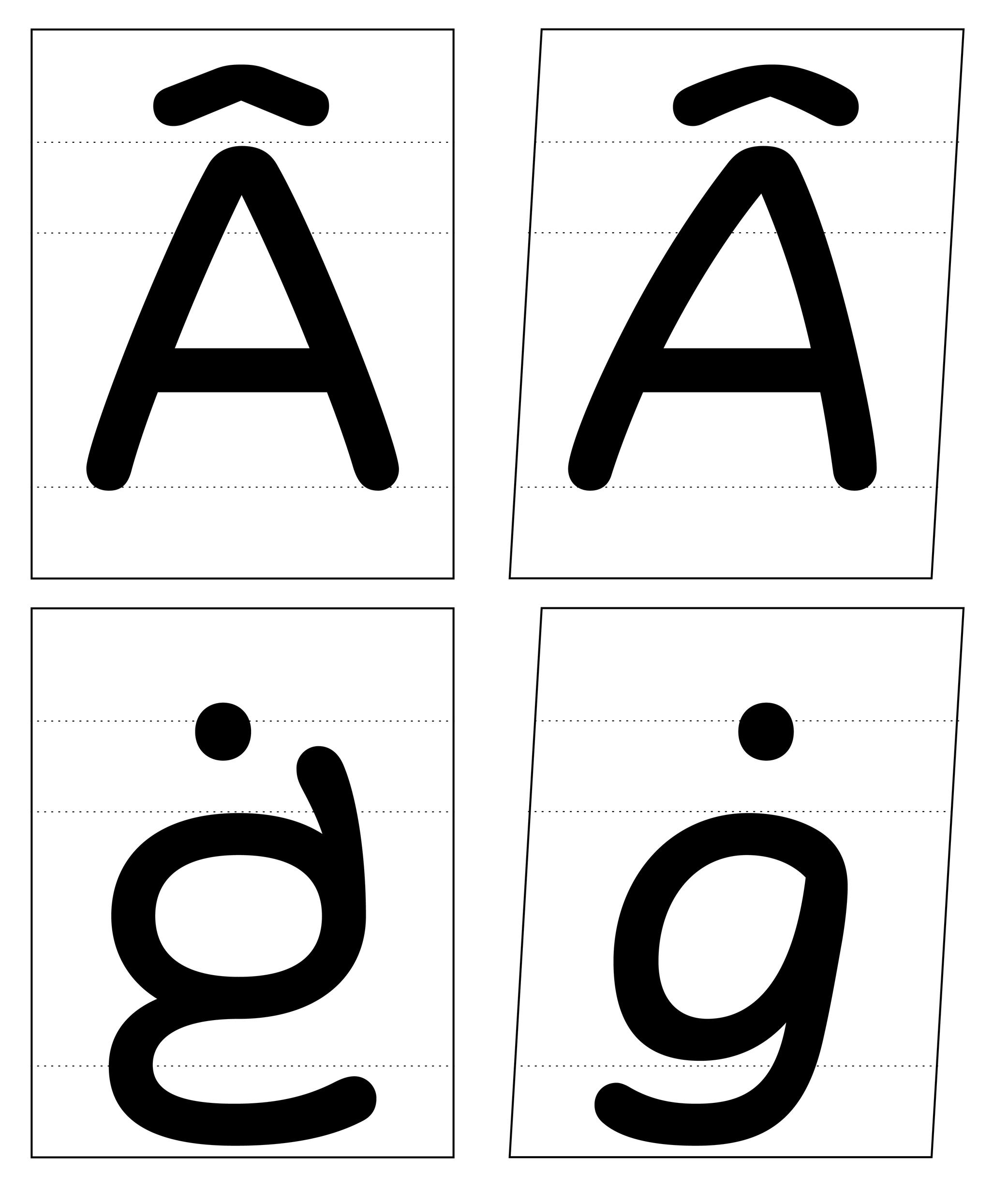
Illustration: Words of Type. Typeface in use: Knowledge Rounded, designed by Lisa Huang for Words of Type, 2024.
(Read More)The bounding box is a virtual rectangle enclosing a selected (vector) shape—such as a segment, an outline, or an entire glyph.
The font bounding box defines the outermost limits of a typeface, marked by the four extreme coordinates along the X and Y axes: highest (Y-max), lowest (Y-min), leftmost (X-min), and rightmost (X-max).
FONT ENGINEERING ADVICE
The font bounding box is stored in the head table.
Bowl
Sponsor Word of Type and feature your typeface in this card with a linked caption. Contact us for more information.
(Read More)Many terms are borrowed from architecture or human and animal anatomy to designate and describe parts of letters and other characters. We even speak of type design anatomy.
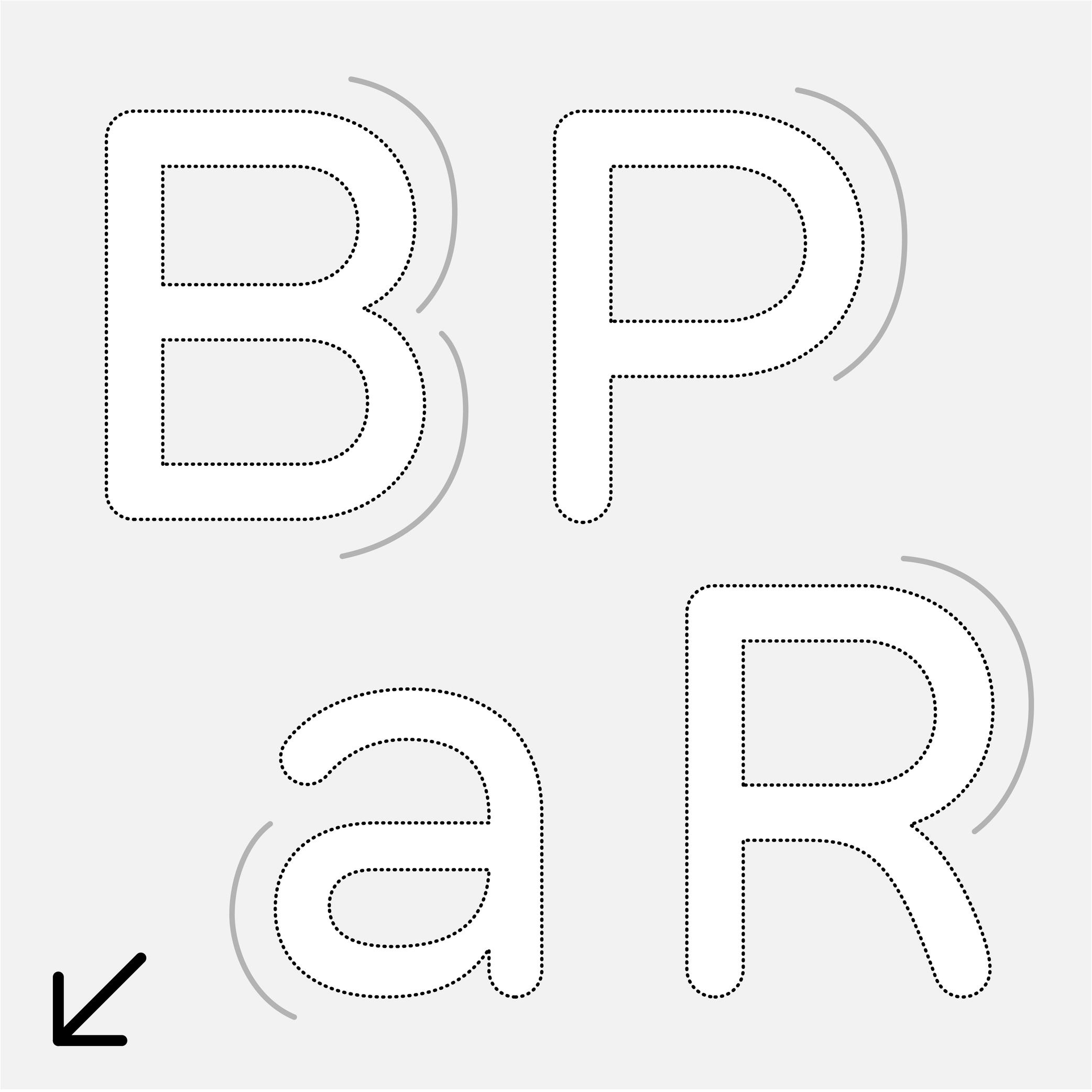
In the Latin script, the bowl refers to the rounded parts of a letter, like those in a, B, P, R, etc.
Calligraphy
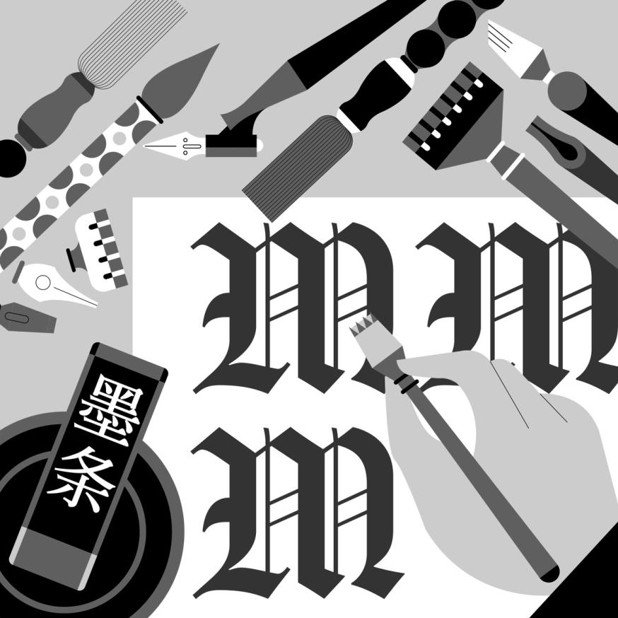
Illustration: Jonny Wan .
(Read More)The word calligraphy comes from the Greek kalos, meaning “beautiful,” and graphein, meaning “to write.” Together, it means “to write beautifully.”
Many civilizations around the world have practiced calligraphy (and continue to do so today) using a variety of tools: brush, pen, quill, broad nib pen or brush, etc. Most even consider it to be an art form.
Today, we describe typefaces whose letters and characters are inspired by those written with a calligraphy tool and following certain calligraphy styles as calligraphic. However, this is slightly different from “script” or “handwritten” styles, as those refer to handwritten shapes free from any particular calligraphic style.
Cap Height
Sponsor Word of Type and feature your typeface in this card with a linked caption. Contact us for more information.
(Read More)The cap height (short for “capital height”) is at the top level of square capital letters, such as H.
The cap height is one of the main guidelines for Latin-script typefaces. It is usually lower than the ascender height in typefaces meant to be used at small size. This is also the case for sans serif styles to show a difference between l (lowercase L) and I (uppercase i). In many display styles, the ascenders are the same as the cap height to save some vertical space.
Capitalize
Sponsored by Type Together . Typeface in use: Rezak , designed by Anya Danilova, 2022.
(Read More)Also called to set in All-Caps.
In applications and tools that can process texts, to capitalize is to transform every selected lowercase letter into its capital variant.
FONT ENGINEERING ADVICE
The capitalization button in text editors usually calls several OpenType features: the case sensitive (.case), the capital spacing (.cpsp) and the proportional numbers features (.pnum).
Caption
 (Read More)
To inform a reader that a passage of text is a caption, it is usually placed near the image it is linked to, but it is usually also set in a smaller size and/or in a different style.
Some typefaces contain a specific caption style in the family with optimized details for specific use in small sizes, such as lower contrast and higher x-height.
Case Sensitive
Sponsor Word of Type and feature your typeface in this card with a linked caption. Contact us for more information.
(Read More)By default, most punctuation signs and some characters are designed to be combined with lowercase letters because this is the most frequent situation.
When combined with capital letters, some of them need to be adjusted to be optically aligned with the capitals. These variants are required in a good typeface so the user can access enough tools for quality micro-typography. They are called case-sensitive alternates, usually attached with the extension “.case” and accessible or activated on applications supporting OpenType features.
Center Space
Sponsored by Mallikātype . Typeface in use: Nan Sans, designed by Tianmeng Xue. Coming soon.
(Read More)In the Chinese Hanzi script, the center space (or optical core, 中宫 in Chinese) corresponds to the central area of a character, similar in Latin to the area between the x-height and the baseline. This area can differ from style to style, but it has to be visually constant for all characters in a typeface.
A text typeface with a bigger center space has its legibility improved for small sizes.
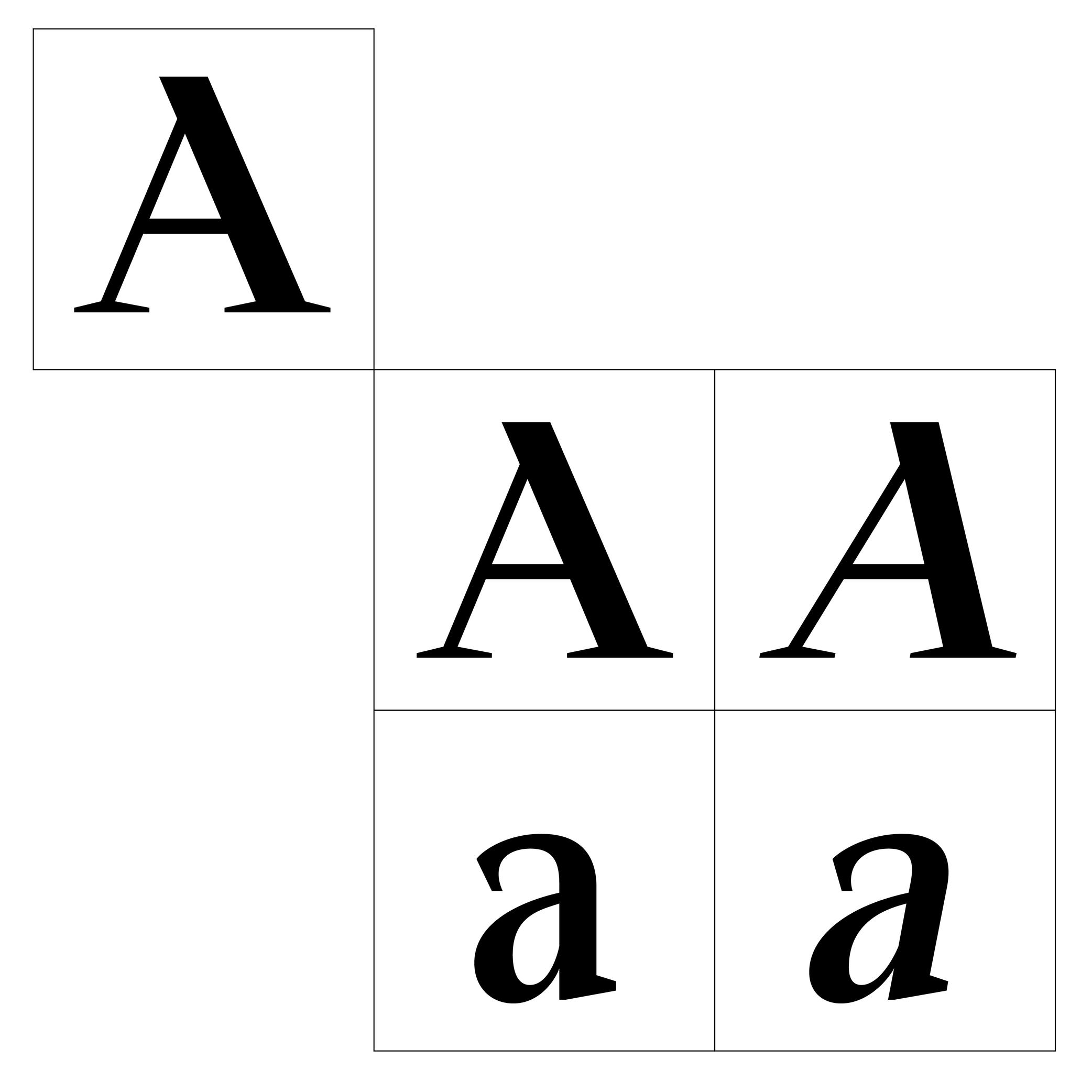
Character
Illustration: Tezzo Suzuki .
(Read More)A character is an abstract symbol that represents a unit of a language in its written form. It is a broad term that covers letters, figures, punctuation, symbols, and more.
Not to confuse with a glyph, which is a visual representation of a character.
To be more precise:
• one character can be represented by multiple glyphs (such as alternates glyphs of the same character a: single story and double story a);
• one glyph can contain multiple characters (such as ligature fl containing two characters).In computing, characters are encoded in character encoding standards like Unicode or ASCII. These standards map a character to a numerical value (also called a “code point”) that can be processed by a computer. The character is what the user types, and the glyph is what is displayed in return.
NOTE
The distinction between uppercase and lowercase doesn’t affect the linguistic value of a character. A and a are therefore considered case variants of the same character in linguistic and phonological terms. In computing and digital typography, however, A and a are assigned different Unicode code points (A = U+0041 and a =U+0061), making them distinct encoded characters in that context.
FONT ENGINEERING ADVICE
In a font file, the cmap table (character to glyph index mapping) links character’s code points to the font’s glyphs.
Character Set
Illustration: Words of Type. Typeface in use: Knowledge Rounded, designed by Lisa Huang, 2024.
(Read More)A character set is a list of glyphs (letters, figures, symbols, ligatures, punctuations, etc.).
In digital fonts, character sets (also called “encoding lists”) contain the glyphs of a font with their individual names and Unicode references.
There are multiple character sets specific to various scripts or languages, as each contains the needed glyphs used by its respective language. Separated character sets per script or language allow a smaller and optimized file size.In the context of a type design, a character-set is a group of encoded glyphs, while a glyph-set encompasses all the glyphs of a typeface—whether encoded or not.
Classification
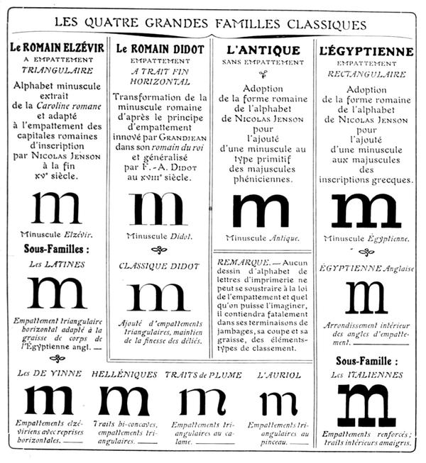
Francis Thibaudeau’s typographic classification, from Manuel français de typographie moderne, Francis Thibaudeau, 1924. Collection of Bibliothèque nationale de France (French National Library).
(Read More)With the many styles and designs of typefaces that exist, it can be difficult to describe, sort, or even find them in a catalog that isn’t familiar to the user.
Each writing system has its own typeface classification categories that best suit its nature and history. As aesthetic values differ from one culture to another, the same (or similar) style may not convey the same impression across different scripts, and one category considered a convention for one script is not always relevant to others.
For example, Latin typefaces have been sorted into multiple classification systems since the beginning of metal typesetting. Here are some of them:
• Thibaudeau, by French typographer Francis Thibaudeau in 1921, with four categories: Elzévirs, Didots, Égyptiennes and Antiques;
• Vox (or Vox-Thibaudeau), by French historian Maximilien Vox in 1954, who started with the Thibaudeau classification as a basis and added more categories to include the additional typeface styles in the Deberny & Peignot type foundry’s library;
• Vox-ATypI, with additional categories and subcategories from the ATypI (Association Typographique Internationale), added between 1962 and 2021.Today, classification systems vary from one type foundry to another, using more or less “standardized” terms better suited to their own catalog or the scripts covered. These boxes also help users find what they are looking for in a wide variety of choices. They are not rules to be followed to the letter. Imagination and creativity shouldn’t be confined!
Coherence
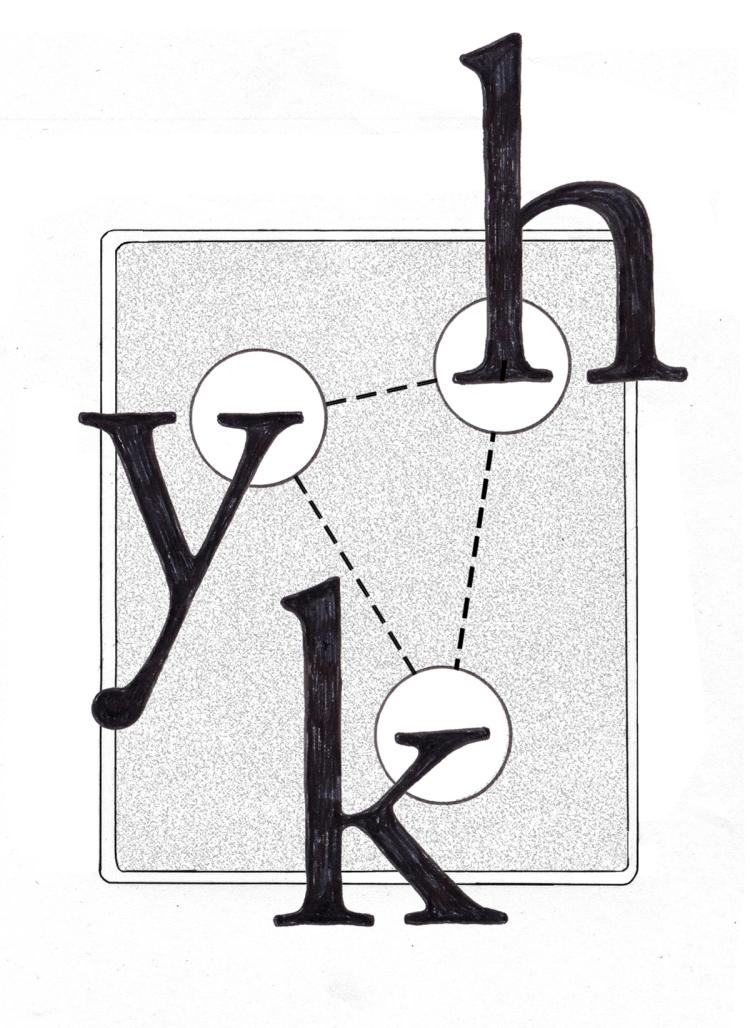
Illustration: Chloe Kendall .
(Read More)It is important to manage the coherence (or consistency) of the shapes of all glyphs in a typeface to create a unified set. This includes the shape of the serifs, thickness of the strokes, proportions with one another, spacing, etc.
Colon
Sponsor Word of Type and feature your typeface in this card with a linked caption. Contact us for more information.
(Read More)FUNCTION
A colon indicates the beginning of a quote, a list, a ratio within numbers, or it can be used to indicate time in between two numbers.
HISTORY
The colon has been used in various languages for various types of uses. Scribes during Europe’s Middle Ages began using it as we do nowadays.
DESIGN
The colon is built with two periods on top of each other. The top one is placed just below the x-height and the bottom one sits on the baseline.
TYPOGRAPHIC RULES
There is no space before the colon in a sentence, and is followed by a space (U+00A0). But this rule doesn’t apply to every Latin language!
Colophon
Illustration: Words of Type. Typeface in use: Archipel, designed by Lisa Huang, 2024.
(Read More)Also called imprint.
A colophon is a suggestive list of information about the production of a work or project. It can range from names and roles of people involved, typefaces or brand and kind of paper used, manufacturer and location of production, to hosting domain for websites, and more.
Color
Illustration: Words of Type.
(Read More)The color of a text is the quality of its visual texture given by the design of the typeface in use.
Different settings such as spacing, leading, frequency of some letters or diacritics can also influence the typographic color.
Comma
Sponsor Word of Type and feature your typeface in this card with a linked caption. Contact us for more information.
(Read More)FUNCTION
A comma separates parts of a sentence to mark a short pause or following ideas. If not overused, it helps improve the reading experience. It is also used in numbers to visually separate figures of larger categories. In the United States and most other English-speaking countries, in numerals of one thousand or more, a comma is used in between groups of three digits counting from the right (where a period is used for the same purpose in other European languages).
HISTORY
In Europe, the origins of many punctuation symbols, including the comma, come from the inventions of Greek scholar Aristophanes of Byzantium (3rd century BC) who created a set of symbols to help with the reading of texts aloud.
DESIGN
The comma is basically a period with a tail. It has to be designed with enough differences to the period so that both can’t be confused with one another, even in smaller text sizes.
TYPOGRAPHIC RULES
A comma has no space before and is always followed by a space (U+0020) when used in a sentence. In numbers with decimals, it is used as such:
(European languages) 15.000,05
(English) 15,000.05
Compatibility
Sponsored by NM type . Typeface in use: Movement Direct , designed by Noel Pretorius & María Ramos, 2019.
(Read More)Variable fonts technology allows users to navigate between two or more specific styles (called “masters” or “sources”) with high precision and much smaller font file sizes than several static fonts.
Outline compatibility allows the interpolation of vector shapes, enabling the generation of intermediate instances between two source files. This is essential for variable fonts, but even in static font design, maintaining compatibility is beneficial: it spares the designer from manually draw in-between weights or styles as separate masters, when they can be automatically created during the export.
For each glyph, compatibility means:
• same number of points, in the same order;
• same number of contours, in the same order and direction;
• same number of components, in the same order.Component
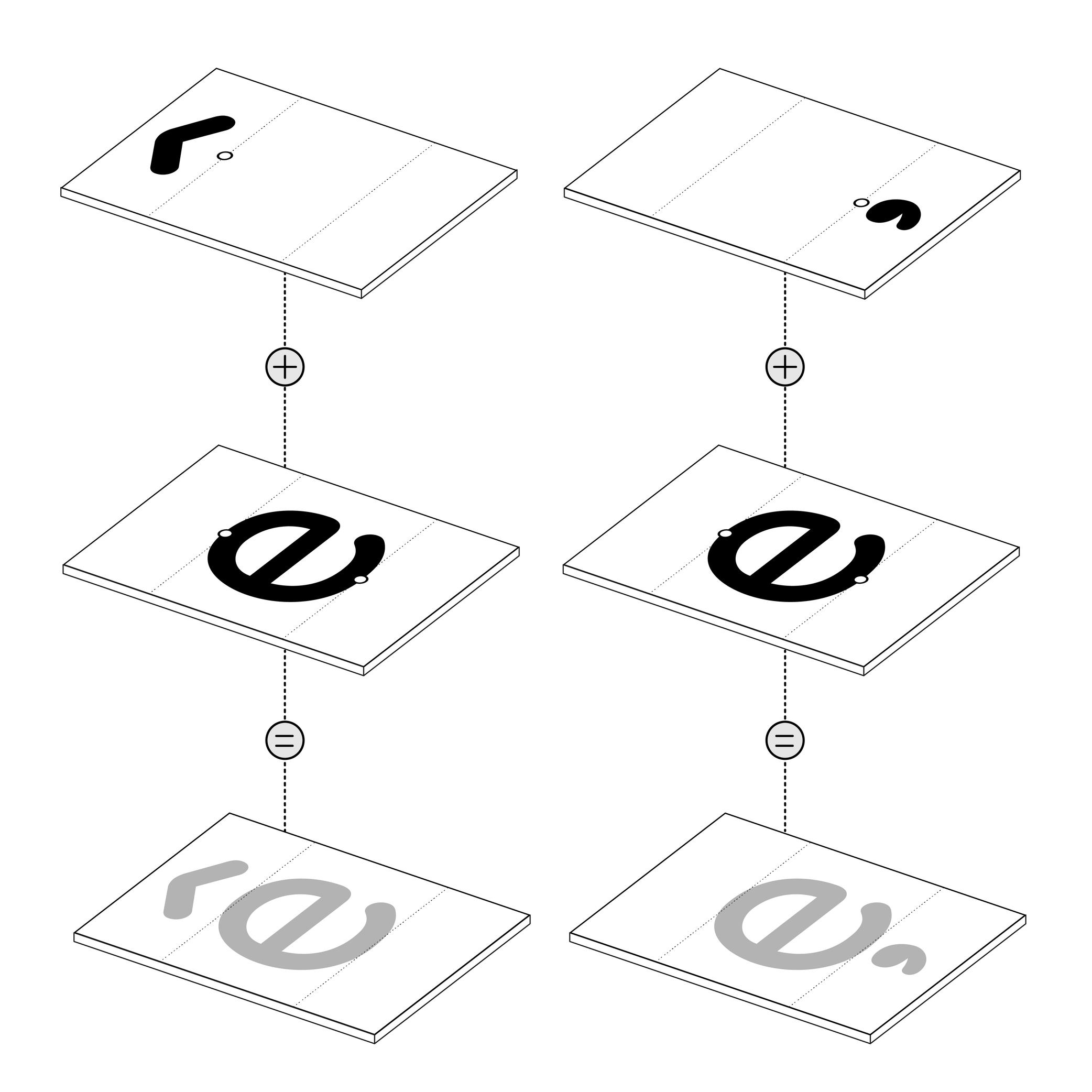
Illustration: Words of Type. Typeface in use: Knowledge Rounded, designed by Lisa Huang for Words of Type, 2024.
(Read More)Many shapes in a digital font are repeated identically across glyphs. These repeated elements can be turned into components. Components are reusable parts stored as separate glyphs which can be borrowed to form another glyph. For example, the letter é is made of the combination of two components; the base letter e and the acute accent.
Using components instead of copying contours keeps shapes consistent and helps reduce the font file size.
• A glyph made only of components is called a “composite.”
• A glyph that combines both contours and components is called a “mixed composite.” Mixed composites are not permitted in the final binary font (exported font) files. As a result, they are usually decomposed during export.
• When a component references another component, it is said to be “nested.”
• A component is considered as aligned when it is reused in a glyph without transformation.For design purposes, components can be transformed — shifted (translated), scaled, rotated, skewed, flipped, or mirrored. Transformed components may need to be decomposed, especially if the transformation alters the contour direction (such as mirroring), which can affect its appearance on the pixel grid.
FONT ENGINEERING ADVICE
The component system is a compression strategy used in TrueType fonts to reduce file size by referencing repeated shapes across glyphs. In contrast, PostScript-based fonts (OpenType-CFF flavor, with the .otf extension) use a different space-saving method called subroutines—small sections of path instructions that can be reused. Because subroutines operate at the path level rather than referencing entire glyphs, components are typically decomposed during export so their outlines can be stored and reused within these subroutines.
Construction
Illustration: Yann Bastard .
(Read More)Letters, characters and other glyphs of every script are written with a specific number of strokes of a particular shape. This is the glyph construction.
This construction went through multiple evolutions over time and at different pace for each script, being influenced by various circumstances (tools in use, style preferences, needs, etc.).
Contour
Illustration: Words of Type. Typeface in use: Knowledge Rounded, designed by Lisa Huang, 2024.
(Read More)Also called Outline.
The shape of a glyph is defined by one or more contours. In digital typeface design, the contour is what the designer draws. What the user sees on screen or in print is the filled shape in between these contours.
Contours and outlines are related but not exactly the same. An outline is the full outer shape of a glyph: it defines what the glyph looks like overall. While a contour is one continuous closed path within that outline. For example, the outline of the letter O typically has two contours; one for the outer circle and one for the inner counter (the transparent “hole”).
Contrast
Illustration: Erik van Blokland .
(Read More)The contrast is the relationship between a glyph’s thick and thin parts.
The thickness variation in a stroke comes originally from handwriting, as a result of the tool’s reaction to the medium in combination with how it is held and the writer’s movements.
Nowadays, in type design for the Latin script, we speak of a vertical contrast when the vertical parts are thicker than the horizontal ones; this is its “natural” contrast. The opposite is known as a reversed or inverted contrast.But these concepts only apply to scripts that evolved using tools and a medium that creates such contrast “naturally”, which is not universal for all. For example, the Hebrew script’s contrast would naturally be distributed the other way around.
Counter
Sponsored by NM type . Typeface in use: Sastre, designed by María Ramos, 2024.
(Read More)Also called counterform.
A counter is the negative shape inside a glyph with an enclosed form, either entirely closed (such as b) or partially open (such as n).
This term comes from the “counterpunch.” Punchcutters used counterpunches to depress the white spaces inside letterforms while making the master punches for metal-type sorts.
Concretely, they would strike the counterpunch into a larger steel punch. Afterward, the punchcutter filed down the outside of the punch, creating the letterform’s exterior contour.
Punchcutters could reuse a counterpunch on any related letterforms in the typeface, keeping a consistent look throughout an entire font.TYPE DESIGN
In digital type design for Latin scripts, it is important to keep this consistency as well, with various techniques, such as putting the component of a reference letter in the background or copy-pasting the contours of the counter, or making sure that they visually look consistent by placing them next to each other while designing the shapes.
Crossbar
Sponsor Word of Type and feature your typeface in this card with a linked caption. Contact us for more information.
(Read More)Many terms are borrowed from architecture or human and animal anatomy to designate and describe parts of letters and other characters. We are even speaking of type design anatomy.
For Latin script, the crossbar is the horizontal bar on letters like A or H.
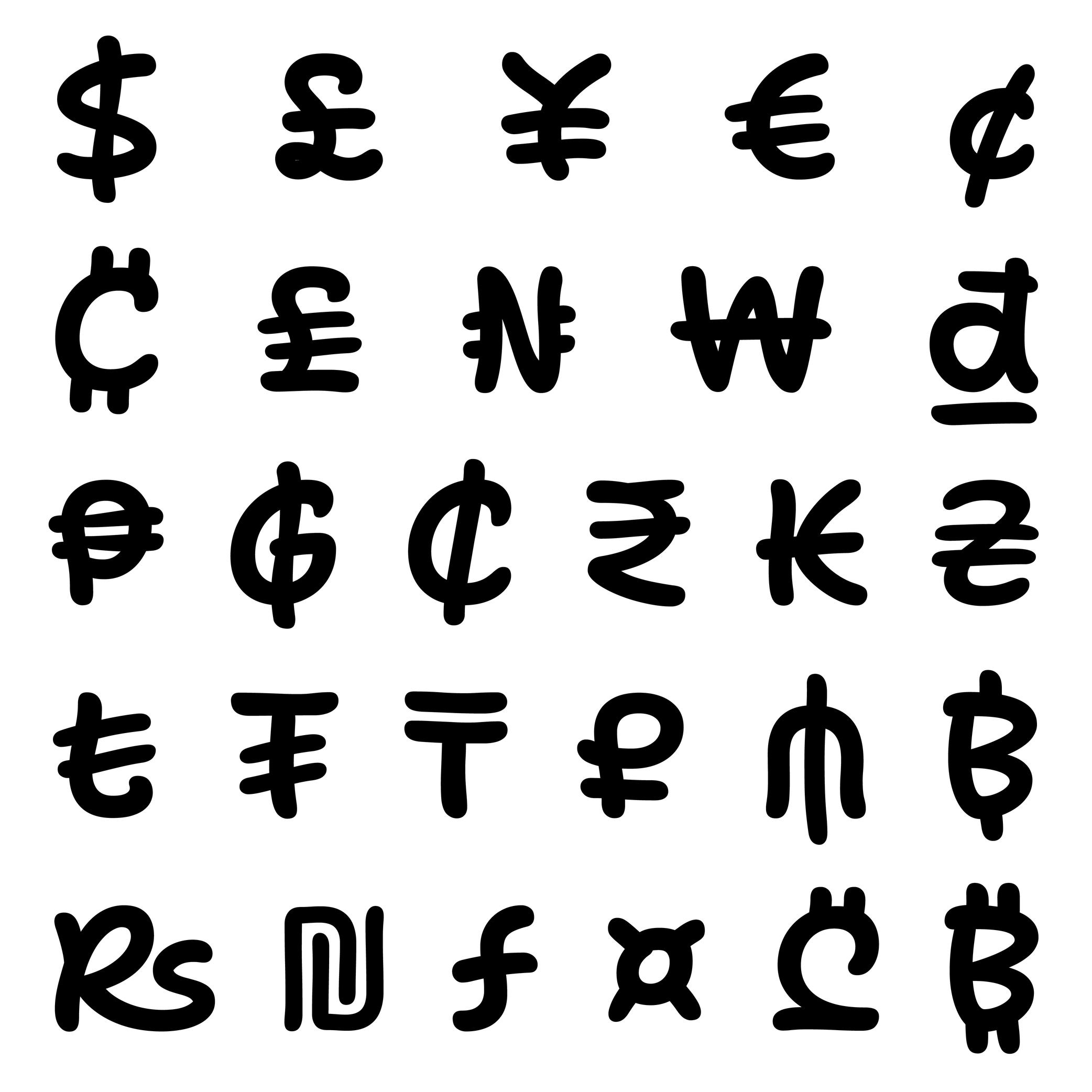
Currency
Sponsored by ArrowType . Typeface in use: Shantell Sans , designed by Shantell Martin and Stephen Nixon, available at Google Fonts, 2023.
(Read More)Every currency symbol carries one function: to give a financial value to numbers. Each of them evolved through time. Some of them disappeared or have been modified to follow the needs of various civilisations.
For most of them, currency symbols are made of Latin letters with various levels of modifications (US dollar $, Euro €, Vietnamese dong ₫). Some of them can simply” be letters (Swiss CHF) or a character on their own (Chinese Yuan 元).
DESIGN
Currency symbols need to be designed in a good balance with figures, as they are combined with them.
In a typeface family with a wide range of weights, currency symbols of the lightest styles can easily carry every stroke and conventional details. But as the style gets bolder, these can be tricky to keep, especially when too many details darken the symbol to a point where it is hardly recognizable. The most common solution is to simplify the symbol by removing some “less” important parts while keeping the symbol’s legibility.
Custom
Illustration: James Graham .
(Read More)Companies, brands, institutions and so on can find great benefits in using and/or owning a custom-made typeface with a design that fits their voice. Unlike retail typefaces, they can be used as an important and exclusive element of the visual identity and be fully suited to their needs.
A custom typeface costs more at first than a license of an existing retail one (the client can have a design for their exclusive use instead of a retail design that may be used by many others). Still, it can be financially and strategically more interesting, and profitable than licensing retail typefaces in the long run. The pros and cons between these choices are worth the effort of comparison and evaluation.
Dash
Sponsor Word of Type and feature your typeface in this card with a linked caption. Contact us for more information.
(Read More)USAGE
Among the multiple types of dashes (yes, there are many!), the most common ones are:
1. en dash, used for:
• to indicate a list;
• indicate a closed range (as a substitute of words “to” or “between”);
• (less common) to hide letters in a word;
• connecting words in compounds (in some languages)2. em dash, used for:
• indicate lines in a dialogue;
• (less common) to hide entire words or part of one.Both en and em dashes are also used to enclose a section of a sentence, just like a pair of parentheses, or to indicate a separation within a sentence like a colon or semicolon.
HISTORY
Before the adoption of any punctuation standard, markers of various forms were used by scribes to indicate pauses. Dashes of various lengths have been used for many kinds of roles through the centuries, and across countries. But for dash-like symbols, these evolutions left us with the en dash and em dash as principal successors.
DESIGN
Their length has been standardized during the metal type printing era (in Europe and North America), using the size of the font as a reference for their measurement as such:
• 1 em = the font size;
• length of em dash = 1 em (or sometimes the width of letter m of the font);
• length of en dash = 1/2 of 1 em (or sometimes the width of letter n of the font).
Both are placed at the optical middle height between the baseline and ascenders. In a typeface style with contrast, the thickness of the dashes has to be visually consistent with that of the thin parts.TYPOGRAPHIC RULES
Generally, in American English, it is preferred to use the en and em dash without any spaces before and after them; whereas in British English, it is often preferred to use a space before and after an en dash, and em dashes are rarely used.
NOT TO BE CONFUSED
The en dash is particularly often confused with the shorter character hyphen (U+2010), the mathematical sign minus − (U+2212), or the hyphen-minus - (U+002D).
In digital fonts, each of these glyphs has its own Unicode. They are designed and can be accessed individually. But on modern keyboards—inherited from typewriter keyboards which had to make compromises on the number of glyphs due to the limited space available—we are still often typing (mistakenly and without always knowing) the hyphen-minus instead of the hyphen or the en dash. Thankfully, most intelligent text processing apps automatically replace these with the correct glyph depending on the context.
Descender
Sponsored by Frere-Jones Type . Typefaces in use: Empirica , designed by Tobias Frere-Jones, Nina Stössinger, 2018.
(Read More)The parts of lowercase letters (such as p, q or y), old style figures or some punctuation symbols going below the baseline are called descenders.
In the same typeface, all descenders need to have the same height for overall consistency.
On the opposite side, parts going above the x-height are ascenders, like in letters b, d or f.
Both ascenders and descenders don’t necessarily need to have the same length. In general, descenders are shorter than ascenders.
Diacritic
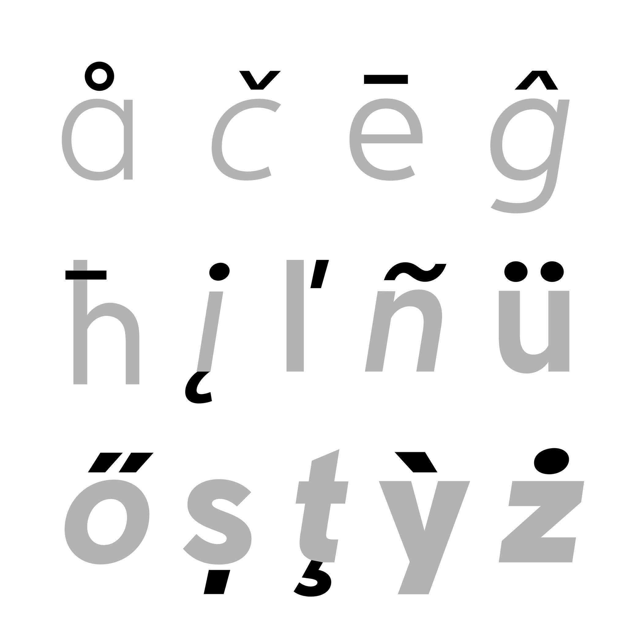
Sponsored by Nymark Type . Typeface in use: Tranemo , designed by Andreas Nymark, 2021.
(Read More)Diacritics are marks added to letters. They can be above, below, or attached to a letter. In most languages and scripts using diacritics, these bring to the letter a different sound than that of the letter by itself.
LATIN SCRIPT
The Latin script is used in a large number of languages. Most of them use diacritics to bring (sometimes very subtle) variations of sound to letters. The quality of the sound of a diacritic can be different from one language to another. An example with the cedilla ç, used in French, Portuguese, and Turkish. Other languages even use multiple diacritics combined together within the same letter (like in Vietnamese with ở).
ARABIC SCRIPT
In the Arabic script, letters have different pronunciations depending on which diacritic is attached to them (or not there), and the language in use.
CHINESE PINYIN
In Mainland China during the 1950s, a new phonetic transcription system was created to make Chinese learning easier: Pinyin, which borrows Latin alphabet letters combined with diacritics as tone markers.
DESIGN
When creating a typeface, diacritics are designed as individual glyphs and are then combined with letters as components in type design applications. They need to be:
- visually aligned to the same height with one another (for those placed in the same area);
- have consistent weight and color;
- placed in a position with the letter that feels “natural” for each language.
Display
 (Read More)
Display (or Titling) typefaces are designed and used at large sizes to catch the reader’s attention (in posters, billboards, newspaper or magazine titles, covers, etc.).
In order to do so, they have more elaborate designs and/or exaggerated details than typefaces for running text.
Drop
Sponsor Word of Type and feature your typeface in this card with a linked caption. Contact us for more information.
(Read More)Many terms are borrowed from architecture or human and animal anatomy to designate and describe parts of letters and other characters. We even speak of type design anatomy.
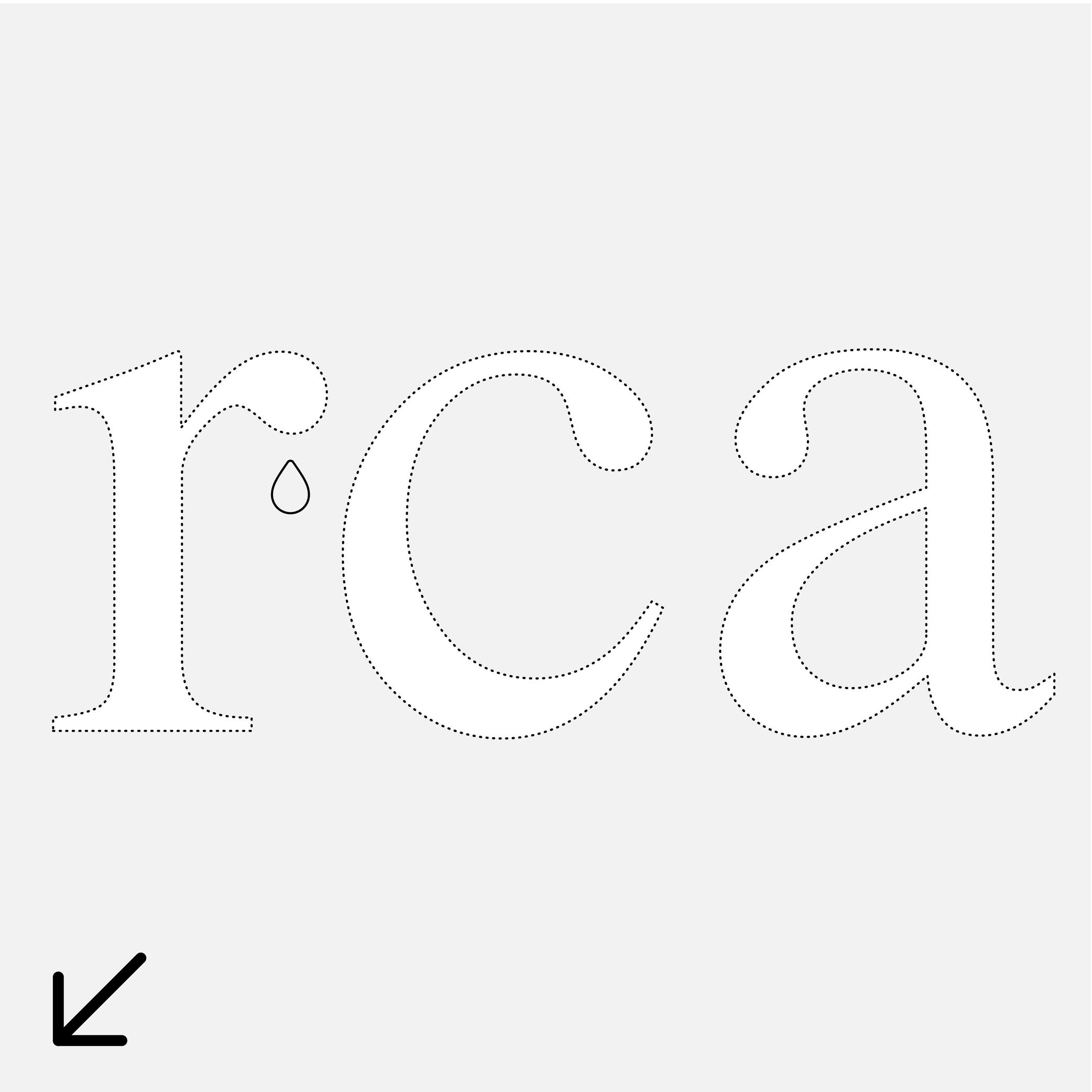
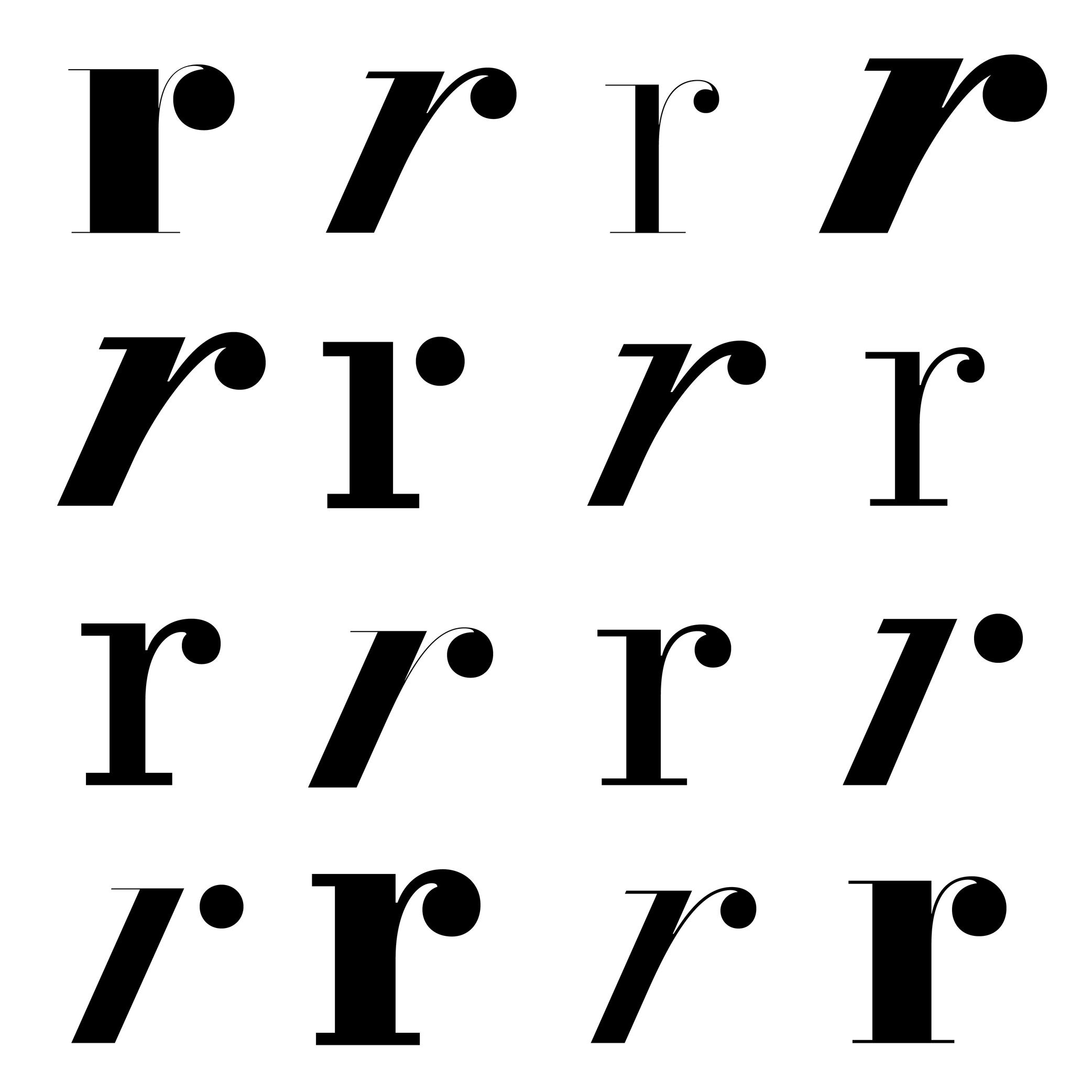
For Latin script, the drop refers to the top hanging part of r or a that looks like a drop falling downward, generally present in serif style fonts.
Ductus
Illustration: Tezzo Suzuki .
(Read More)Glyphs from every script are written with a specific stroke order and drawn in a specific direction. This is called the ductus (from Latin ducere, meaning “to lead,” “to pull”). It took multiple evolution phases for characters to look as they do today. Most ductus changes were for characters to be written more easily (and/or faster) with the tools used.
Ear
Sponsored by Commercial Type . Typeface in use: Le Jeune , designed by Paul Barnes, Christian Schwarz, Greg Gazdowicz, 2016.
(Read More)Many terms are borrowed from architecture or human and animal anatomy to designate and describe parts of letters and other characters. We even speak of type design anatomy.
In the Latin script, the ear refers to the top-right hanging part of letters like the r, f or the double-storey g.
Ellipsis
Sponsor Word of Type and feature your typeface in this card with a linked caption. Contact us for more information.
(Read More)FUNCTION
The ellipsis (or dot dot dot) is a punctuation symbol used to indicate a missing part of a text (incomplete or untold) or a rhetorical pause…
DESIGN
An ellipsis is composed of three periods aligned next to each other. It is advised to place the periods closer together than three actual periods to avoid an exaggerated gap in texts. In Chinese, the ellipsis has six dots instead of three and is traditionally center-aligned.
TYPOGRAPHIC RULES
In most languages, when an ellipsis indicates a string of missing text, it is surrounded by parentheses (…).
If it’s placed at the end of a sentence, the ellipsis is followed by a space after the period to introduce the next sentence.
Emphasis
Illustration: Malota .
(Read More)In typography, we speak of “emphasis” when a section of a text needs to be visually brought forward or separated from the rest while keeping the paragraph’s setting, such as for a work’s title, comments, or a quote.
The most common way to create an emphasis in Latin based languages is to set the text in italic. Other scripts such as Chinese Hanzi and Japanese don’t have italics, and use different ways to emphasize text: bolder weight, underline, or dots.
EULA
Illustration: James Graham .
(Read More)Digital typefaces are products distributed and sold like software: it is not the design itself that is sold, but a copy (a font) attached with an agreement to use it: its license.
When purchasing a license, a specific EULA (End User License Agreement) is attached, containing all the terms and conditions of use granted by the distributor, foundry or designer for each font.
Different EULAs and licensing terms can exist according to the politics and principles of each entity. It is always advised to contact the foundry or the distributor if there is any doubt or question related to the terms in the EULA, to be sure that the license and EULA are valid for the intended use.Exclamation Mark
Sponsored by Kerns & Cairns . Typeface in use: Apotek , designed by Dyana Weissman, 2020.
(Read More)FUNCTION
The exclamation mark is placed at the end of a sentence to indicate an exclamation (obviously!).
HISTORY
There is a theory that early exclamation marks were used by early manuscript copyists in Europe, who wrote the Latin word ‘io’ (sort of ‘hurray’), which evolved into a vertical stroke (formerly i) on top of a dot (formerly o). Other languages use different marks for the same purpose (as in Armenian or Burmese).
DESIGN
The top of the exclamation mark is optically aligned to the cap height, with a period at its base. The shape of the vertical stem can be designed to match the typeface (contrast, rounded tip, etc.).
TYPOGRAPHIC RULES
In English and in many other languages, there is no space before the exclamation mark. But in French, there is a non-breaking space. And in Spanish, a reversed exclamation mark is placed at the beginning of the sentence, with the upright one at the end, with no space.
Expansion
(Read More)Expansion is one of the multiple contrast types in Latin-script type design (along with translation and rotation).
The specificities of the expansion contrast come from the pressure applied while writing a stroke with a fountain pen or quill (the two flexible tips split with added pressure) while keeping the pen tip at a vertical axis.
Bodoni and Didone (or Didot) styles are typical examples of expansion contrast typefaces.
Export
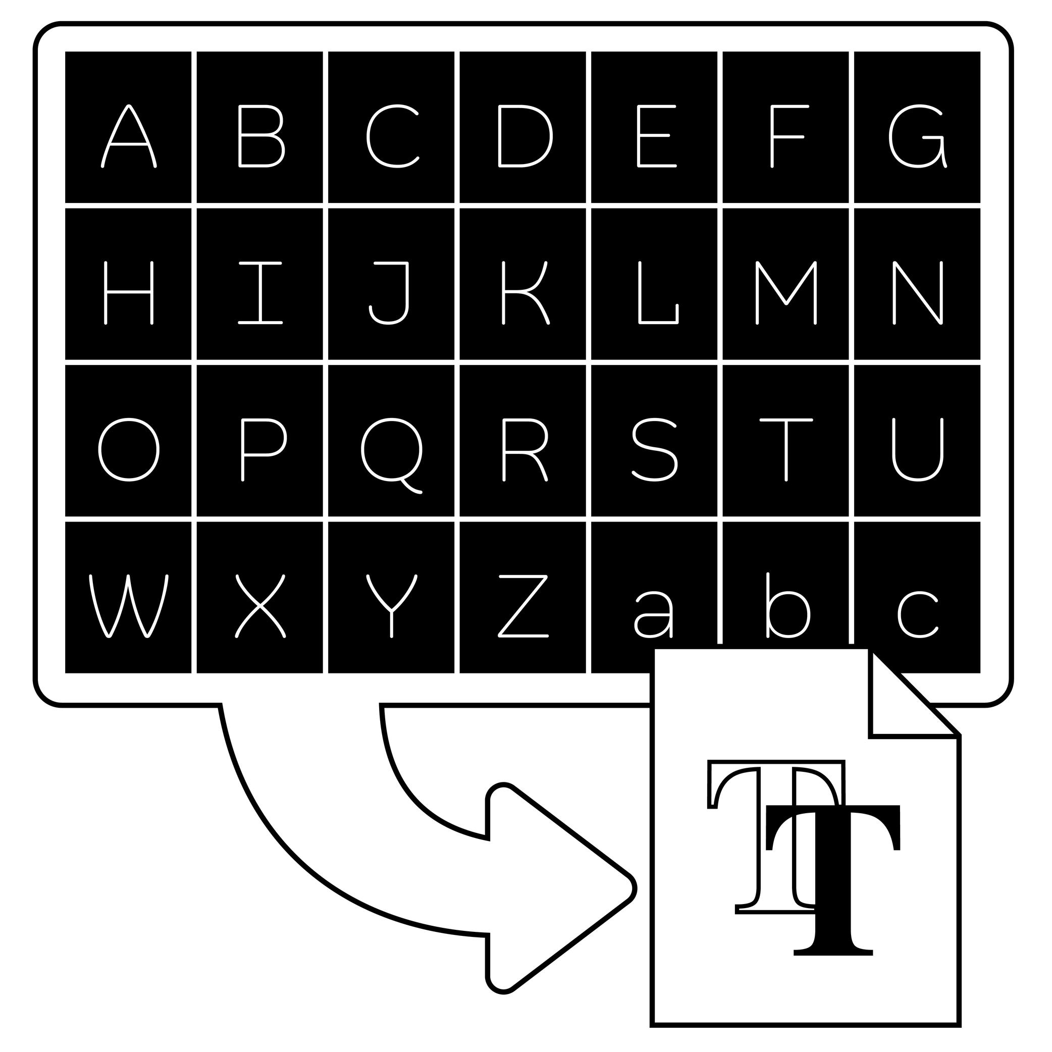
Illustration: Words of Type. Typeface in use: Knowledge Rounded, designed by Lisa Huang, 2024.
(Read More)In type design applications (or font editing software applications), exporting is the process of transforming a working editable file (called “source file”) into one or more font files that can be installed and used.
The most common exported format is “OpenType,” which comes in several flavors depending on usage:
• .otf for PostScript outlines, commonly used in Adobe apps and professional printing workflows;
• .ttf for TrueType outlines, widely supported on Windows and Android systems;
• .woff and .woff2 which are compressed formats designed specifically for use on the web.FONT ENGINEERING ADVICE
Exported font files are binary. This means all the font data—such as glyph outlines, kerning pairs, hinting instructions, and more—is stored as sequences of bits (0s and 1s) that the operating system can interpret directly, without relying on a third-party tool. By contrast, source files like .glyphs (Glyphs), .vfb (FontLab), or .ufo (an open format compatible with many editors, mainly used in Robofont) are not binary. They require a specific software to be read and edited..
Extension
(Read More)A typeface is usually distributed with a given glyphset or character set.
If some characters for a specific use are missing, such as those needed for additional language support, they can be designed and added to the initial list. We speak then of creating a glyph “extension.”
Extrapolation
(Read More)Variable fonts technology allows users to navigate between two or more specific styles (called “masters” or “sources”) with high precision and much smaller font file sizes than several static fonts.
When we navigate between masters—in the design space—we are looking at “interpolations,” and “extrapolations” go in the opposite directions.
For example, if we design a Regular and a Bold weight, a Medium can be interpolated between them. Using the same data, it could also be possible to extrapolate a Light weight, extending beyond the original scope of that weight axis.
It is not commonly used but some type design applications (or plug-ins) can generate previews of extrapolated instances.
GOING FURTHER
In a font editor software, extrapolation can be used to create new masters, helping extend the boundaries of the existing design space.
In a variable font, extrapolation can theoretically be used to preview areas of the design space (usually called “corners”) that haven't been defined by masters. Traditionally, you need at least 4 masters to define a design space of 2 axes. For example, a Regular and Bold on the weight axis, and a Condensed and Condensed Bold on the width axis. Mathematically, it should be possible to omit the Condensed Bold corner in the source, and still be able to generate a full functional VF out of the 3 other masters—Condensed Bold being extrapolated and not defined as a master. This makes it possible to manage complex design spaces while keeping the font file size reasonable.
Extrapolated results can be unreliable and visually disappointing, so they should be used with caution.
FONT ENGINEERING ADVICE
Functional variable font extrapolations as described above were not really possible until the addition of the avar2 font table in 2024 in the OpenType Specifications. The table is still not widely supported yet and thus still at the experimental stage (as of the current version of Words of Type).
Extrema Point
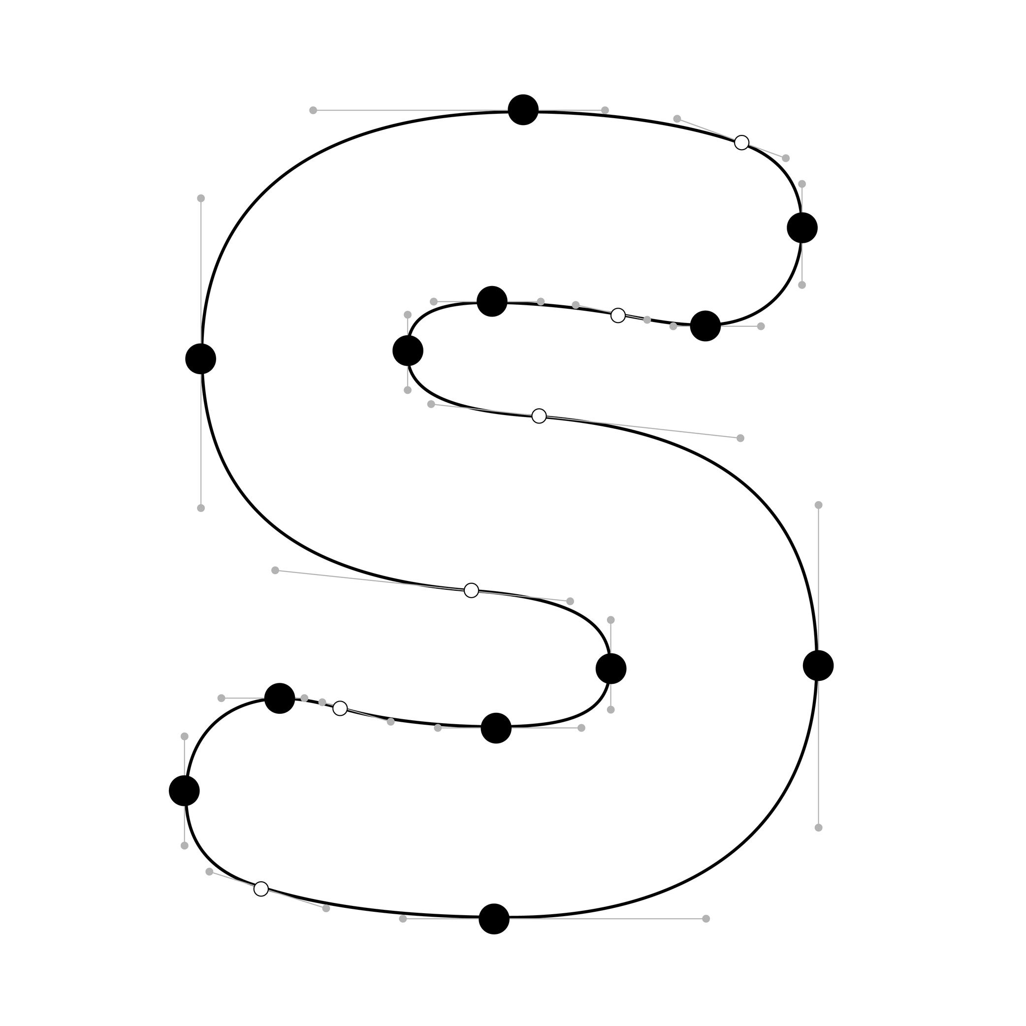
Illustration: Words of Type. Typeface in use: Knowledge Rounded, designed by Lisa Huang, 2024.
(Read More)In digital fonts, curves are defined by at least two end points (also called “on-curve points” or “nodes”) and one or more “off-curve points” (also called “handles”), which control the shape and tension of the curve.
Extrema points are the highest, lowest, leftmost, or rightmost points on a curve. These can be recognised by their associated handles, which align strictly horizontally or vertically.
FONT ENGINEERING HINT
Hints can only attach to extrema points. For proper rasterization (conversion of vector shapes into pixels), it is therefore essential to ensure these points are present and correctly placed.
NOTE
Since PostScript hinting doesn’t apply to diagonal stems, it is debated whether vertical extrema are necessary in italic shapes.
Eye
Sponsored by Commercial Type . Typeface in use: Portrait , designed by Berton Hasebe, 2013.
(Read More)Many terms are borrowed from architecture or human and animal anatomy to designate and describe parts of letters and other characters. We even speak of type design anatomy.
In Latin type design, the eye refers to the ratio between the x-height and the other guidelines (ascenders and descenders).
A typeface is suited for text usage if it has a ratio slightly bigger between its eye to its ascenders and descenders, as this enhances the legibility of the letters.
Family
Illustration: Jay Cover .
(Read More)While a typeface refers to its design concept, a typeface (or font) family is the collection of styles derived from that design.
Each style has their own specificities (weight, width, contrast, slope, etc.), while retaining common characteristics—making them part of the same family.
A family usually contains a limited number of styles along the weight axis, including their matching italics.
When it spans a wide range of styles, across multiple axes, it is often referred to as a “superfamily.” These large families are often grouped into subfamilies to organize styles more clearly in the font menus of text editor softwares.Figure
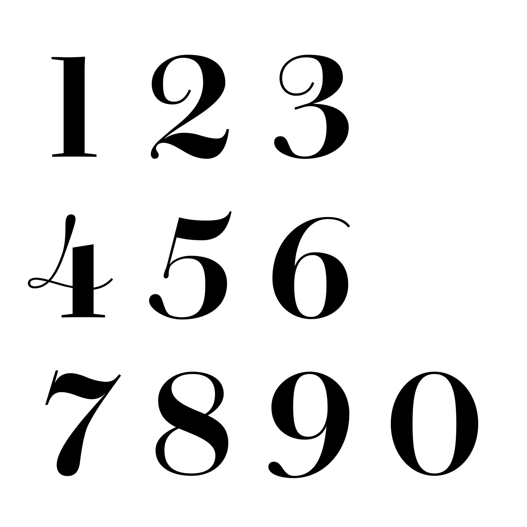
Sponsored by Commercial Type . Typeface in use: Chiswick, designed by Paul Barnes, 2017.
(Read More)The words ‘figure’ and ‘number’ are often confused. But, linguistically speaking, they are to be distinguished from one another: a figure (or numeral) is the graphic representation of a number, which is a mathematical concept. Several figures can be combined to form a number. For example, the number ‘22’ is represented by two figures ‘2’.
There are multiple styles of figures (oldstyle, proportional, lining, tabular, etc.) that suit specific situations.
HISTORY
In Europe, figures and numbers used to be represented by Roman capital letters (X, V, I, D, C, etc.). With the rise of trade with Arab countries around the 15th century, the Arabic figures (themselves influenced by Indian figures) were adopted and replaced the Roman capitals. These distinct origins explain the difference between the structure and stroke shapes of modern figures compared to Latin letters.
Font
Illustration: Raven Mo .
(Read More)Since the era of metal type printing, a font referred to a set of lead pieces for a specific typeface, in a particular style and size. For example, Times New Roman 10 pts, Times New Roman Bold 16 pts, and Times New Roman Bold Italic 16 pts were three distinct fonts of the Times New Roman typeface.
The word “font” comes from the French fondre, meaning “to melt,” as characters were cast by pouring molten lead into moulds called matrices.
In the digital era, a font is an independent file containing a typeface in one or more style. In static fonts, one file corresponds to one style. In variable fonts, a single file can include multiple styles through interpolation.
For example:
• Helvetica Neue Light (HelveticaNeue-Light.otf) and Helvetica Neue Light Italic (HelveticaNeue-LightItalic.otf) are two separate static fonts.
• Helvetica VAR HelveticaVAR.ttf and Helvetica VAR Italic HelveticaVAR-Italic.ttf are variable fonts, each containing a range of styles (Light, Regular, Bold, etc.).Format
Illustration: Words of Type.
(Read More)There are multiple file formats for digital fonts. Each one is specifically designed for optimal use at different times and situations.
HISTORY
The history of digital fonts includes several major formats. The most notable ones are:
• PostScript Type 1, developed by Adobe in 1984;
• TrueType, developed by Apple in 1991;
• Multiple Master Type 1, Adobe, 1992;
• TrueType GX, Apple, 1994;
• OpenType, co-developed by Microsoft and Adobe in 1996.GOING FURTHER
Today, OpenType is the dominant format in use (extension name as .otf). It supports both PostScript and TrueType outline technologies, which now exist as two “flavors” or “outlining models” within the OpenType container.
WOFF and WOFF2 are additional web-optimized containers that compress and package OpenType/TrueType fonts for efficient delivery over the internet. The term “format” tends to be used instead of flavor but, technically, PostScript and TrueType are no longer standalone formats; instead, they are integrated into the broader and more versatile OpenType ecosystem.
Geometric
 (Read More)
A typeface with a geometric style has shapes designed in a way that follows the logic of geometry (straight, round, square, etc.).
But our human eyes are organic (as opposed to artificial), we need to use optical tweaks and adjustments in addition to the shapes drawn out of geometric tools to make the letterforms look geometric.Glyph
Sponsored by Blaze Type . Typeface in use: Apoc , designed by Matthieu Salvaggio with Tomorrow Type, 2018.
(Read More)The terms “glyph” and “character” are often mixed up, but there is a linguistic difference between them: a glyph is a specific representation of a character. For example, the character A can be represented by either glyphs A and a.
In digital typography, a glyph may be encoded or not. If it represents a distinct character, it will be assigned a Unicode code point. If it is a localized, positional or stylistic variant, it won’t have its own code point and is instead accessed via OpenType feature substitutions.
FONT ENGINEERING ADVICE
In a font file, the cmap table maps characters (code points) to glyph indices. The GSUB table defines all available glyph substitutions, enabling access to stylistic alternates, ligatures, and localized forms.
Glyph Surface
Sponsored by Mallikātype . Typefaces in use: (top) Jinhua Serif , 2023, and (bottom) Nan Sans, coming soon. Designed by Xue Tianmeng, Li Jian, and Kazuhiro Yamada.
(Read More)In East Asian typeface design (Chinese, Japanese, and Korean), characters (commonly called Hanzi) are settled in a squared frame, the same for all characters of one typeface.
The glyph surface (字面 in Chinese, literally ‘face of the character’) is the area occupied by the character in its square.
Gravity Center
Sponsored by Mallikātype . Typeface in use: Beiwei Longmen, coming soon. Designed by Tianmeng Xue.
(Read More)In Chinese Hanzi script, the gravity center (also barycenter, 重心 in Chinese, literally ‘focus’) can be perceived as the optical center of a glyph, similar to the horizontal bar of the capital letter H.
It has to be visually aligned for all characters—especially for text typefaces—to allow a fluid and continuous reading.
Grid
Illustration: Words of Type.
(Read More)In typography (or typesetting), a structure—called a grid—is designed on a page to place the elements, helping with the content’s organization and legibility.
Guillemet
Sponsored by Formagari . Typeface in use: Modale Antique , designed by Emmanuel Besse, 2024.
(Read More)FUNCTION
Guillemets (or chevron quotes) are quotation marks used in multiple European languages, such as French, Portuguese and Italian.
HISTORY
It is difficult to track down the origins of guillemets, but one of the earliest books using those dates back from 1527 by Dutch/Belgian printer Josse Badius, in which quotes were introduced. They may have been invented by French printer and punchcutter Guillaume Le Bé (1525–1598), after whom they were named: ‘guillemet’ as short for ‘Guillaume.’
DESIGN
Guillemets are shaped like small arrowheads vertically centred with the characters. In the Latin script, guillemets are placed in between the baseline and x-height by default. They can be centered between the baseline and capital height as case sensitive alternates to be better aligned with capital letters.
TYPOGRAPHIC RULES
Depending on the language, they are either pointing inward or outward of a quote, double or single (single guillemets are used as secondary quotes), followed by a space or without. Some examples here:
- « French » or ‹ French ›
- «Italian»
- »Danish«
Note: comma-shaped quotation marks “like these” are standardized in English.
Handle
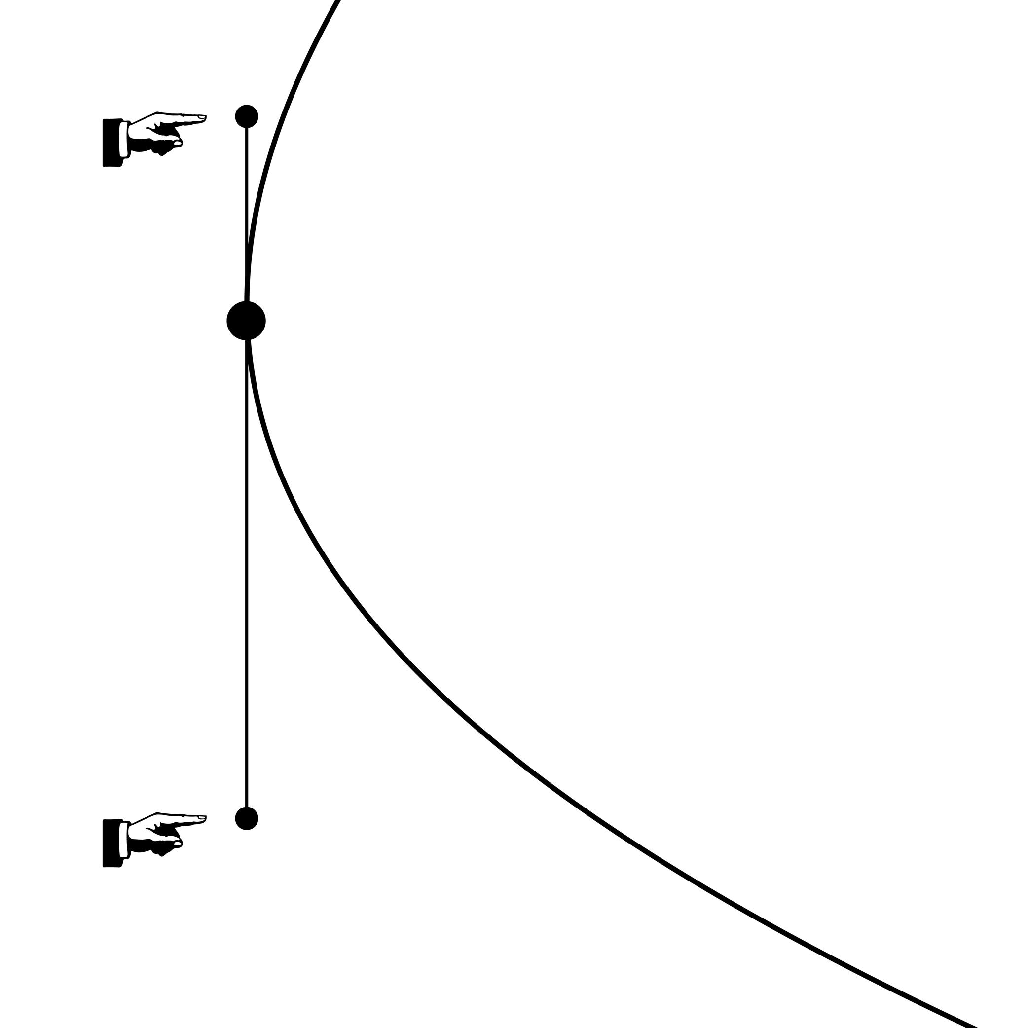
Illustration: Words of Type.
(Read More)Also called Bézier Control Point (BCP) or off-curve point.
Handles are control toggles placed by the designer to define the curvature of a segment. Their length and relative position must follow certain rules to ensure the contour remains functional and compatible, especially when exported to formats like TrueType that use quadratic curves.
GOING FURTHER
Cubic and quadratic Bézier curves differ in structure: cubic curves allow more control with fewer points, while quadratic curves often require additional points to approximate the same shape. During export to TrueType, extra points may be added to preserve the original curvature from a PostScript-based source.
When working with cubic curves in an editable source file, keep in mind:
• both handles should stay on the same side of the curve to maintain a strictly concave or convex shape. If the curvature direction changes, converting to quadratic may lead to poor approximations or unnecessary extra points;
• handles should be balanced (roughly equal in length) to avoid irregularities and bumpy curves;
• avoid intersecting handles on the same segment, as this can also cause distorsions.Handwriting
Illustration: Yann Bastard .
(Read More)The word ‘handwriting’ refers to texts written by hand.
Handwritten forms of any languages, combined together as handwritings, are considered to be one of the most important technologies ever invented, as it separated communications from live speech, made knowledge preservable, and began the development of numerous devices used for writing and materials to write on.
In many cultures, handwriting is so tightly related to the person writing a text that many consider someone’s handwriting style to reflect either the personality of the writer or his/her emotions at the moment of writing (and also his/her age).
Hanzi
Illustration: Tezzo Suzuki .
(Read More)Hanzi is the pinyin phonetic transcription of 汉字, literally meaning ‘character of the Han people’.
Hanzi characters are used in the Chinese language and they combine logograms and ideograms.
Note: Chinese is the language and Hanzi is the writing system (or script).
Today, there are two variations of Hanzi in the Chinese language: Traditional and Simplified Hanzi. Mainland China adopted Simplified Chinese Hanzi to increase literacy by making Hanzi simpler, while territories like Hong Kong and Taiwan kept the Traditional forms as a way to keep their cultural identity.
Multiple neighboring countries that have a strong historical connection with China also use Hanzi, or did so before adopting a different script:
- Japanese: Hanzi (Kanji in Japanese) used in combination with Hiragana and Katakana;
- Korean: now using Hangeul script, but some Hanzi (Hanja in Korean) are still used in specific situations;
- and Vietnamese: now using the Latin alphabet.
Each language and territory uses specific variations of the same Hanzi. However, since each has evolved independently, they developed more or less subtle differences from those of the Chinese.
Height
Illustration: Jonny Wan .
(Read More)In type design, height refers to vertical measurements used as guidelines for different categories of glyphs (such as uppercases, lowercases, small caps, etc.). These are measured from the baseline and help ensure visual consistency across the typeface.
LCG (LATIN, CYRILLIC, GREEK)
LCG scripts typically use the following height guidelines for their lowercases, uppercases, and small caps:
• x-height: height of short lowercases;
• ascender height: height of the extension of lowercase letters that rise above the x-height;
• descender height: height of the extension of lowercase letters that fall below the baseline;
• cap height: height of uppercase letters;
• small case height: heigh of the small cases;
• sometimes also specific figure heights too (for old style or proportional figures, and more).CJK (CHINESE, JAPANESE, KOREAN)
Characters of CJK scripts are commonly designed to fit within a common em-square (same width and/or height) for all characters within the same typeface. Designers often define:
• ideographic em height: total vertical space for a character;
• baseline offset: vertical alignment for mixed-script texts.ARABIC SCRIPTS
Arabic scripts have various types of heights measurements depending on the style involved, including some that don’t follow the same rule as Latin script, where the “horizontal” baseline may not be exactly the same word to word when the letters are typed into texts. But in general, we can list down the following:
• baseline: anchors the “horizontal” alignment;
• median line: main body height;
• ascender and descender lines: based on the tallest and lowest glyph strokes;
• mark height: guides the placement of diacritics.INDIC SCRIPTS
The following are the most common height measurements for Indic scripts (which encompasses a large number of different scripts!):
• shirorekha (headline): the horizontal bar on top of many letters;
• base height: where the main glyph body sits;
• matra height: position for vowel signs and marks above or below the base glyph.Note: These design heights relate to glyphs’ outlines, and are not to be confused with vertical metrics, which define the overall line spacing in a font.
FONT ENGINEERING ADVICE
The x-height and the cap-height are important values that can be found in the OS/2 table of the font file.
Hinting
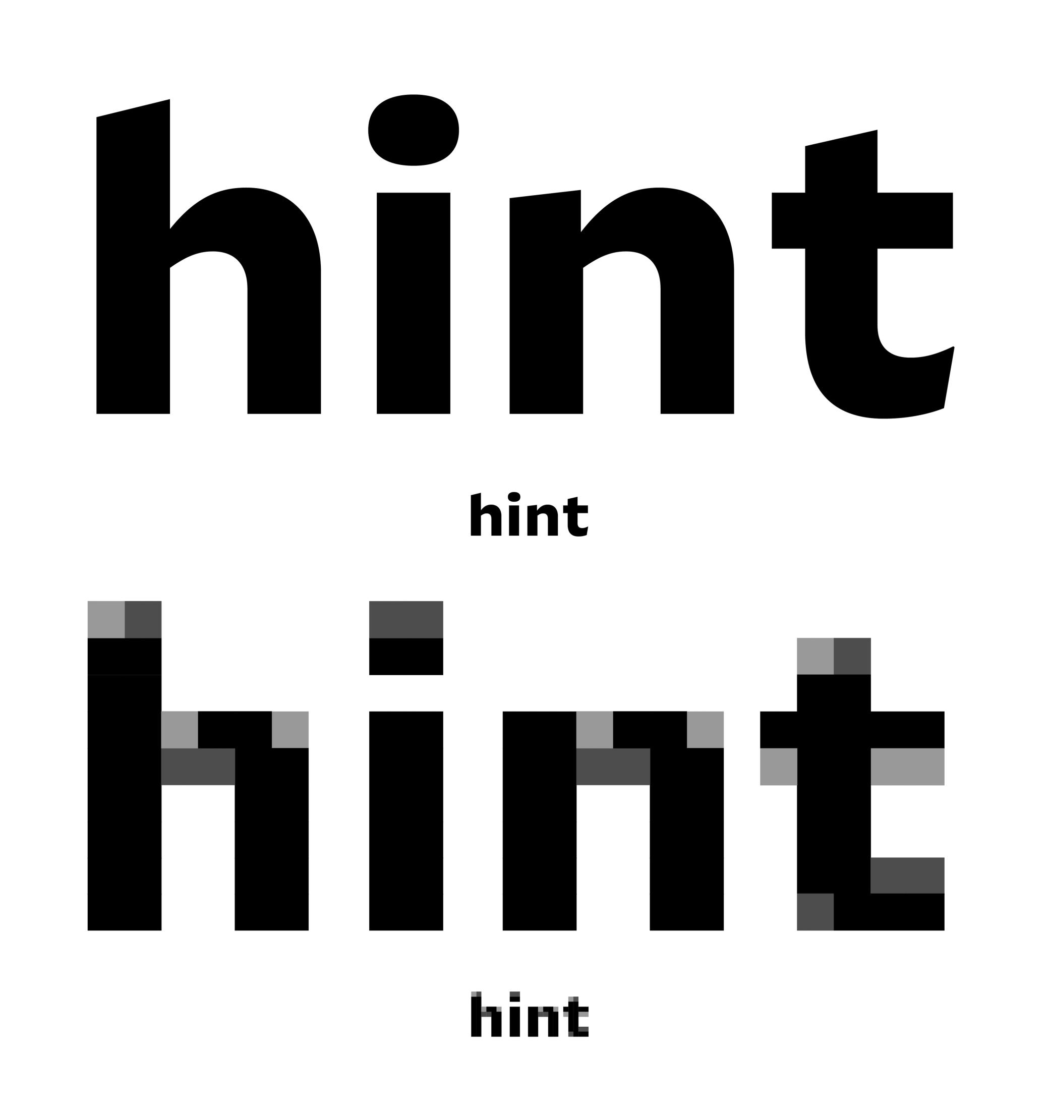
Sponsored by Frere-Jones Type . Typeface in use: Mallory MicroPlus , designed by Tobias Frere-Jones.
(Read More)Hinting is the process of embedding instructions into a font file to optimize how it renders at small sizes or lower screen resolutions. These instructions help maintain legibility by aligning key parts of glyphs—such as strokes and spacing—to the pixel grid.
GOING FURTHER
A large part of hinting involves key font data like alignment zones, overshoot values (also known as blue zones), and stem thickness.
There are two methods of hinting:
• auto-hinting, which uses algorithms to generate these instructions automatically;
• manual hinting, which gives a more precise control over how each glyph aligns, but is time-consuming.Hinting also differs according to the type of outline:
• Truetype hinting (used in .ttf files), which is point-based. It adjusts individual points to align with the pixel grid;
• Postcript hinting (used in .otf files), which is stem-based. It aligns vertical and horizontal strokes to the pixel grid.SUPPORT
Rendering support also varies:
• Windows and Android interpret TrueType hinting;
• Adobe apps interpret PostScript hinting;
• macOS and iOS native apps ignore hinting altogether.
Therefore, .ttf fonts are generally better for the web and office environments, while .otf fonts are preferred in professional publishing and design workflows using Adobe tools or PostScript printers.FONT ENGINEERING ADVICE
TrueType hinting instructions are stored in dedicated tables such as glyf, fpgm, prep, cvt , and gasp. While all PS hinting instruction are stored in the CFF table.
Hook
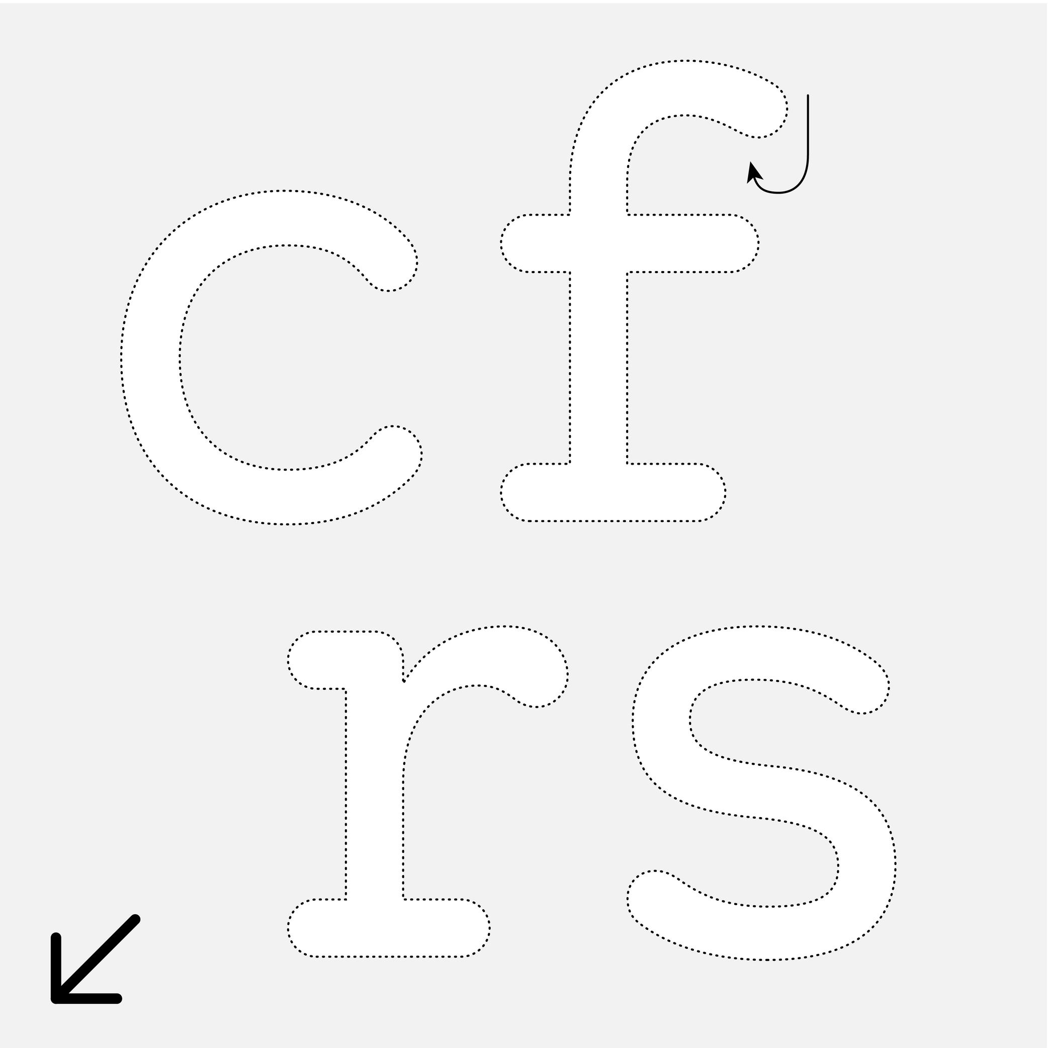
Sponsor Word of Type and feature your typeface in this card with a linked caption. Contact us for more information.
(Read More)Many terms are borrowed from architecture or human and animal anatomy to designate and describe parts of letters and other characters. We even speak of type design anatomy.
In the Latin script, the hook refers to the part curling downward in letters such as c, f, r, s, etc.
Depending on the style or the shape of this part, it can also be called an ear, an arch or a (upper) terminal.
Hypertext
(Read More)A hypertext link is a part of digital text linked to another page or website.
It is often displayed underlined or highlighted in a different color or style.
Hyphen
Sponsor Word of Type and feature your typeface in this card with a linked caption. Contact us for more information.
(Read More)FUNCTION
Hyphens are short dash-like glyphs used as word connectors in names or compound words, or to mark a word break (hyphenation in justified or unjustified texts), like in this word card’s illustration.
HISTORY
Before printing presses appeared, scribes used various markings in addition to the letters or characters as signs of punctuation. For the same function, they were often different from one country to the next, and could even be different from one scribe to another. In Ancient Greek manuscripts—when spaces were not used to separate words yet—there was a symbol in the shape of a curved underline used to connect two letters of a word. The name of the hyphen even comes from Ancient Greek: hypó hén, meaning “under one.” Since placing characters under letters with Johannes Gutenberg’s printing press was complicated, the hyphen moved upward to the middle height.
Later, with the limited space on typewriter keyboards, engineers had to make a compromise and put every similar glyph together under one key. This was the case for the en dash, hyphen, and minus signs (the latter two even became a hybrid hyphen-minus).
DESIGN
The hyphen is the shortest dash , and is placed at the same height as its siblings at middle height of letters.
In a typeface style with contrast, the hyphen’s thickness must be visually consistent with that of the thin parts.
TYPOGRAPHIC RULES
The hyphen has no spaces before or after it. See Hyphenation for information on how to use hyphens in a justified text.
NOT TO BE CONFUSED
It is often confused with the mathematical sign minus − (U+2212), which is usually longer than the hyphen, the hyphen-minus - (U+002D), or even with the en dash – (U+2013).
In digital fonts, each of those glyphs have their own Unicode. They are designed and can be accessed individually. But even on our modern keyboards, typewriter keyboards left us the hyphen-minus that we often use mistakenly, instead of the hyphen or the en dash. Thankfully, most intelligent text-processing apps automatically replace the hyphen-minus with the correct glyph depending on the context.
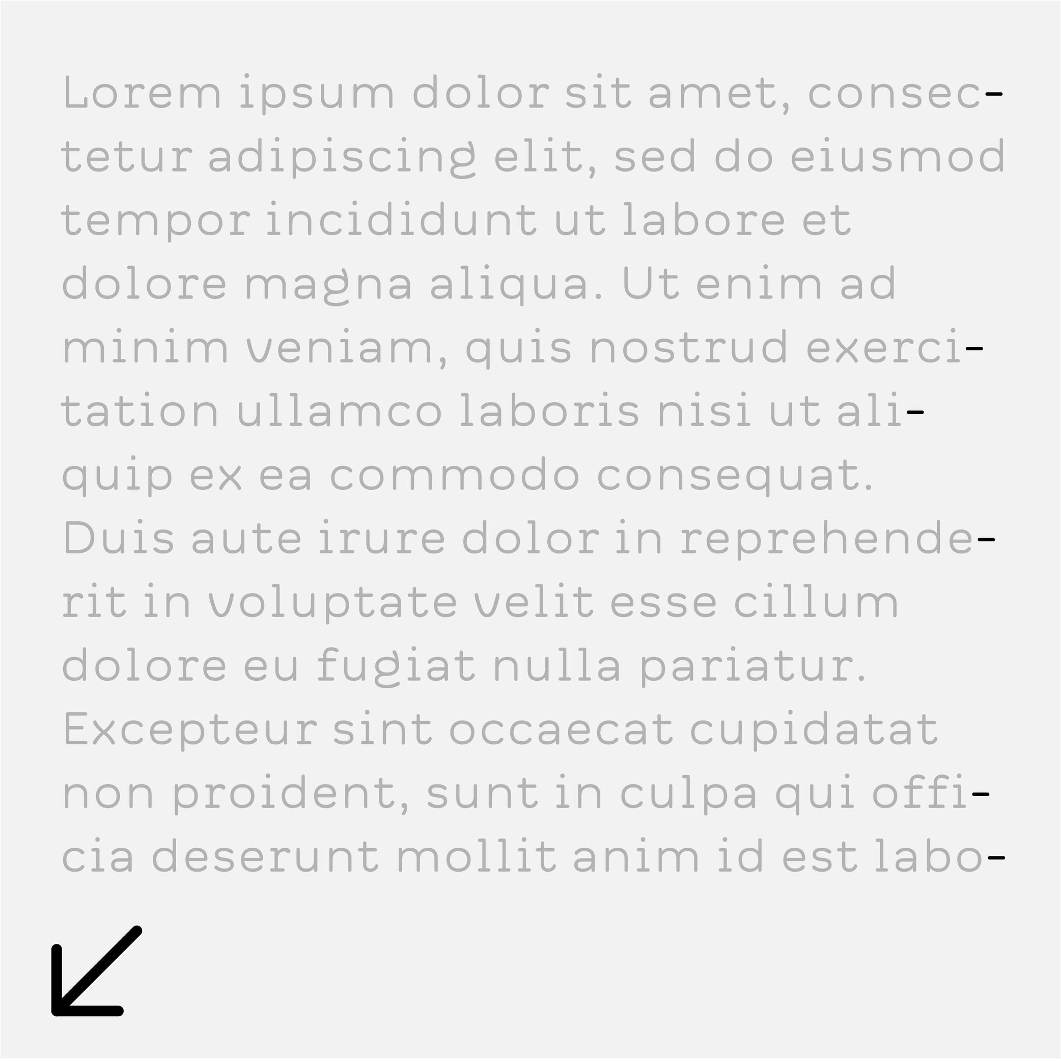
Hyphenation
(Read More)Hyphenation is the management of word breaks (with a hyphen) wherever a word at the end of a line doesn’t fit. The position of a word-break within a word depends on the language and the script.
There are some options about the usage of hyphenation, such as:
• whether or not to avoid it in capitalized words;
• whether or not to avoid it in the last word of a paragraph or a column;
• generally to avoid having more than three hyphenated lines of text in a row.Icon
Illustration: Jonny Wan .
(Read More)In typography and type design, an icon can be a pictogram (a stylized drawing of an object) or an ideogram (a drawing with a meaning).
Ideogram
(Read More)An ideogram is a drawing or symbol representing a specific meaning or a concept. It isn’t necessarily visually related to what it refers to, like pictograms or logograms.
Some scripts, such as Chinese Hanzi or Egyptian Hieroglyphs, use ideograms as part of their system.
Indent
(Read More)When typesetting a text, an indent indicates a new paragraph with a new line. It doesn’t have a “visible” sign so to speak, but it is equally considered a punctuation symbol.
In most word-processing applications, the indent symbol can be seen while selecting some text or activating the display of hidden characters.
Ink Trap
Sponsored by Blaze Type . Typeface in use: Area Normal Inktrap , designed by Matthieu Salvaggio, 2021.
(Read More)When printing technology was primarily based on printing inked metal types on paper, ink could easily spread into the small corners of the characters. In printing, this effect is called a “bleed.” Especially at small sizes, too much ink spread can weaken legibility.
One of the best examples of a typeface solving the ink-spread problem is Bell Centennial, designed by Matthew Carter in 1975 for the US telephone company AT&T. It needed a typeface for its phone books, which would be printed on thin and porous paper. The resulting typeface featured inner corners that dug into the letterforms’ usual contours. Those are called ink traps.
In digital typeface design, designers still use ink traps, especially for typefaces intended for small sizes (on printed and/or digital media), but also as design features (which can be pretty wild!).
Instance
Sponsored by Blaze Type . Typeface in use: Mega , designed by Matthieu Salvaggio and Malo Haffreingue, 2023.
(Read More)Variable fonts technology allows users to navigate within or use multiple variations between two or more specific styles (called “masters”) with high precision and much smaller font files. When we navigate between masters, we are looking at interpolations, which can be exported and used as individual font styles, called “instances.”
GOING FURTHER
Whether a font is variable or not, the concept of a design space can help makers and users visualize how the styles within a typeface family relate to one another. An instance is a style positioned at a defined location in this space. In addition to having a name (like “Regular,” “Bold,” or “Condensed Bold”), an instance also has coordinate values along one or more design axes (such as weight or width). That becomes especially important in the context of variable fonts, where styles are not static but generated through interpolation within the design space.
The names and values associated with common axes such as weight, width, italic, and slant are standardized and documented in the OpenType Specification .
FONT ENGINEERING ADVICE
There is a distinction between the design space (defined by the outlines and master values) and the user space (what applications read and expose to the user). OpenType specifications document the user space.
Although it is possible to assign any coordinate values to masters and instances for design purposes, these must be mapped to standardized user space values when it come to the common axes mentioned above.
For example, a Regular style must always map to 400 on the weight axis, and a Bold to 700. Some apps only read these values to display an instance, the are therefore necessary for a proper user experience.Interpolation
Sponsored by Commercial Type . Typeface in use: Ionic Modern , designed by Paul Barnes with Greg Gazdowicz, 2024.
(Read More)Variable fonts technology allows users to navigate between two or more specific styles (called “masters” or ”sources”) with high precision and much smaller font file sizes than several static fonts.
An interpolation is the transformation of vector outlines from one master to another along one or more design axes. For example, the interpolation between a Regular and Bold style allows the generation of a Medium style (thus generating an “instance”) as well as any other intermediate state.
This process relies on the compatibility of the outlines across masters, meaning they must share the same structure and number of points to interpolate correctly.
Interpolation allows variable fonts to have a reduced file size because they store only two masters (or more) and variations data of every intermediates, rather than separate outlines for multiple styles there may be in between.
FONT ENGINEERING ADVICE
A variable font technically contains only one full master: the origin. This is the default style shown when variable font technology is not supported.
The other masters are stored as delta data—mathematical differences from the origin—used to interpolate and generate other instances dynamically. This delta data is stored in the gvar table.Italic
Univers, extract from Manuel Typographique, by Fournier le Jeune, 1766, as displayed in De Plomb, d’Encre et de Lumière, Essai sur la typographie & la communication écrite, C. Peignot and G. Bonnin, French National Printing Office (Imprimerie Nationale), 1982
(Read More)DESCRIPTION
Two construction styles are possible for the same weight in a Latin script typeface: Roman (or upright) and Italic. Italics usually have slanted letterforms, with more or less obvious influence from handwritten letter structure (connected letters) and shapes (softer starts and endings). In general, italic letters also have a slightly narrower width than their upright companion.
For italic styles to be visually linked to an upright version, they have to be related to each other (similar weight, height, etc.). However, they also need to be different enough so that the reader can easily differentiate one from the other. Managing a good balance between differentiation and similarity is part of the typeface designer’s expertise to design a “nice couple.”
HISTORY
During the Renaissance in Europe, when the Humanist movement emerged, they developed a new style of handwriting that combined the old Carolingian Minuscule (all lowercase letters) with forms inspired by Ancient Roman inscriptional lettering (Capitalis Monumentalis). Both have a close relationship to the ‘natural’ movements of the human hand.
While Humanistic handwriting could use either roman (upright, interrupted) or italic (slanted, connected) letterforms, each direction would eventually become an independent style used for different purposes, as is familiar today. The names we use now also come from that era, with ’roman’ referring to the alphabet of the Ancient Romans and ‘Italic’ being a moniker English writers used to refer to the style of connected letters that had originated more recently in Italy.
In typography, the first italic typefaces used date to around 1500. However, it was not until the mid-16th century that French printers began using roman and italic styles as we do today. They employed both styles in various applications to convey different impressions (emphasis, comments, etc.).
USE IN TYPOGRAPHY TODAY
In text, Italic styles are mainly used as a functional companion for a typeface family’s roman styles.
They are used when a part of a sentence or word needs to be emphasized, or differentiated from the rest. Italics are often used to emphasize titles of various works (albums, books, films, magazines, newspapers, etc.), words in a different language, or words that need to be highlighted.NOTE
Not every writing system uses or even has Italic styles like in the Latin script. Instead, other scripts use different ways to achieve the same purpose of emphasis (i.e., by using a different weight or specific kind of punctuation).
Junction
 (Read More)
Many terms are borrowed from architecture or human and animal anatomy to designate and describe parts of letters and other characters. We even speak of type design anatomy.
The junction is the meeting point of two strokes.
Justification
Illustration: Words of Type.
(Read More)Justification refers to text blocks where all lines are the same length, except, perhaps, for the last lines of individual paragraphs.
HISTORY
In the Middle Ages, many scribes would try to keep the appearance of their manuscripts as neat as possible. Guidelines for the left and the right margins, as well as the spaces between columns, would be scored onto the pages before they began to write lines of text. However, it was virtually impossible to keep the lengths of all lines of handwritten text equal, even with hyphenation (splitting a word across two lines).
When he pioneered Western printing technology, Johannes Gutenberg solved that problem through three methods:
• first, like scribes before him, he would hyphenate words that did not fit entirely on the end of a line.
• second, he manipulated the space between words so that some lines had narrower word spaces and others wider ones.
• finally, his compositors had narrower versions of some letterforms to fit more words onto one line (if and whenever that was possible).USE IN TYPOGRAPHY TODAY
In digital typesetting, algorithms for hyphenation and justification still split words across two lines and employ flexible word-space widths. However, Gutenberg’s use of multiple widths for individual letters did not catch on.
Inexperienced typographers occasionally use software features that can make some or all characters on a line artificially narrower or employ negative tracking between all characters on a line. These possibilities are both typographic abominations that should never be used.
Instead, users should adjust the hyphenation and justification options in their page-layout software to achieve a better result and add soft hyphens and/or soft line breaks to improve the appearance of their justified texts.Some other typesetting options (common for scripts written horizontally and from left to right) are centered, flush left/ragged right, and flush right/ragged left.
Kerning
Sponsored by Kerns & Cairns . Typeface in use: Glissade , designed by Dyana Weissman, coming soon.
(Read More)Each glyph of a typeface has a specific spacing value on each sides, which can be positive, negative, or zero. Setting these values for characters in a font globally is called setting its “spacing.”
And “kerning” is the positioning adjustment applied to specific pairs of glyphs to refine their spacing where the global values alone give a result that is too loose, too tight, or it parts of the glyphs overlap with one another. A good kerning (combined with a good spacing) on a font ensures a smoother texture of the text.
Once a kerning value is set for one pair, it can often be applied to other pairs with similar shapes (e.g., V + A, W + A) using kerning groups.
Some DTP (Desktop Publishing) applications offer kerning adjustment algorithms that can override the font’s built-in kerning. This is useful when working with non-professional fonts.
FONT ENGINEERING HINT
• In older fonts, the kern table contains pairwise adjustments.
• In modern OpenType fonts, kerning is stored in the gpos (Glyph Positioning) table, which supports pair-based, class-based, and contextual adjustments for greater efficiency and flexibility.Language
Illustration: Catherine Potvin .
(Read More)As opposed to the word script, a language is a means of communication and expression that does not necessarily rely on spoken words (e.g., sign language).
Latin Script
(Read More)Historians and linguists consider that the origins of the Latin script date back to the Phoenician civilization around the 13th century BC in Greece and the Mediterranean Sea. They created a consonantal alphabet called abjad, which was borrowed by other languages in the region for the innovative nature of its phonetic system, and due to the large influence of the Phoenician people as principal traders and navigators. This alphabet later led to multiple derivatives, including Greek and Latin alphabets.
The Latin script evolved from the Greek, with a Proto-Latin appearing around the 2nd century BC. It started by taking some of the Greek letters and modifying them, adding or removing others to fit better with the Latin language, spoken by Roman civilization (which is why it is also called the Roman alphabet).
The modern Latin script contains 26 distinct letters from its most basic set, with uppercase and lowercase forms for each. Many languages using the Latin alphabet have additional letters, ligatures or digraphs (e.g., æ, œ) to better adapt to the sounds of each.
With Eurocentrism ideology (main focus on European culture), the type design industry has also been largely focused on scripts used by the Western world: Latin in particular, with hundreds of years of practice, experience, theories, teaching and conventions, exhibitions and festivals mainly about this script. But, thanks to the increasing international exchanges and efforts to create a perspective beyond those boundaries, the type design industry is currently evolving into a much richer and diverse typographic culture.
Layout
Illustration: Yann Bastard .
(Read More)Layout can either be a noun or a verb. It refers to both the activity of arranging graphic elements on a surface (page, screen, wall, space, etc.) and the result of that arrangement. The different graphic elements within a layout might include blocks of text, titles, pagination, images, etc. The white space between and around elements is just as important as the elements themselves.
Ideally, a layout has a clear and consistent aesthetic, and that aesthetic is appropriate to the desired function of the layout’s contents.
Leading
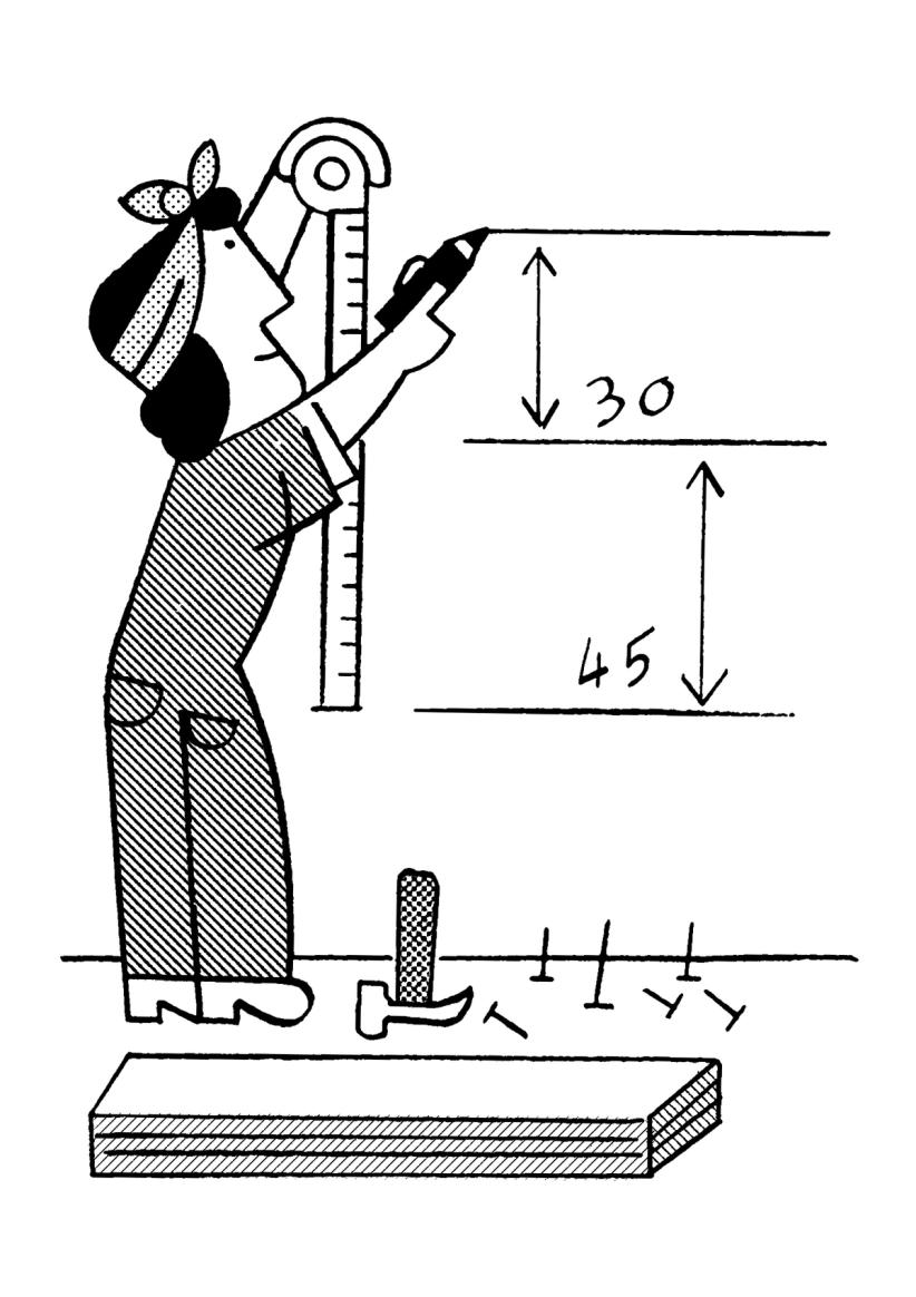
Illustration: Jay Cover .
(Read More)The leading is the amount of space added to increase line spacing (the height of the space between two baselines).
HISTORY
The word refers to the strips of lead used to separate lines of type with in the era of metal-type printing. The line spacing between two lines of 12 pt text set solid was exactly 12 pt. When 2 pt piece of lead was added between those lines, the line spacing value was increased to 14 pt. But the leading value was not 14 pt, instead it was 2 pt.
TODAY
Increasing line-spacing values in InDesign or in CSS isn’t per se leading, it is a line-spacing increase. Although, it is quite common to say “increase the leading” while you are technically increasing the line spacing.
FONT ENGINEERING HINT
The default leading can be controlled through the font’s vertical metrics:
• in the OS/2 table (used primarily by Windows): sTypoAscender, sTypoDescender, sTypoLineGap;
• in the hhea table (used primarily by macOS): Ascender, Descender, LineGap.These values don’t need to match with the alignment zones (horizontal guidelines for the outlines). There are different strategies for setting them up, but for cross-platform consistency, it’s essential to keep the OS/2 and hhea values aligned.
Leg
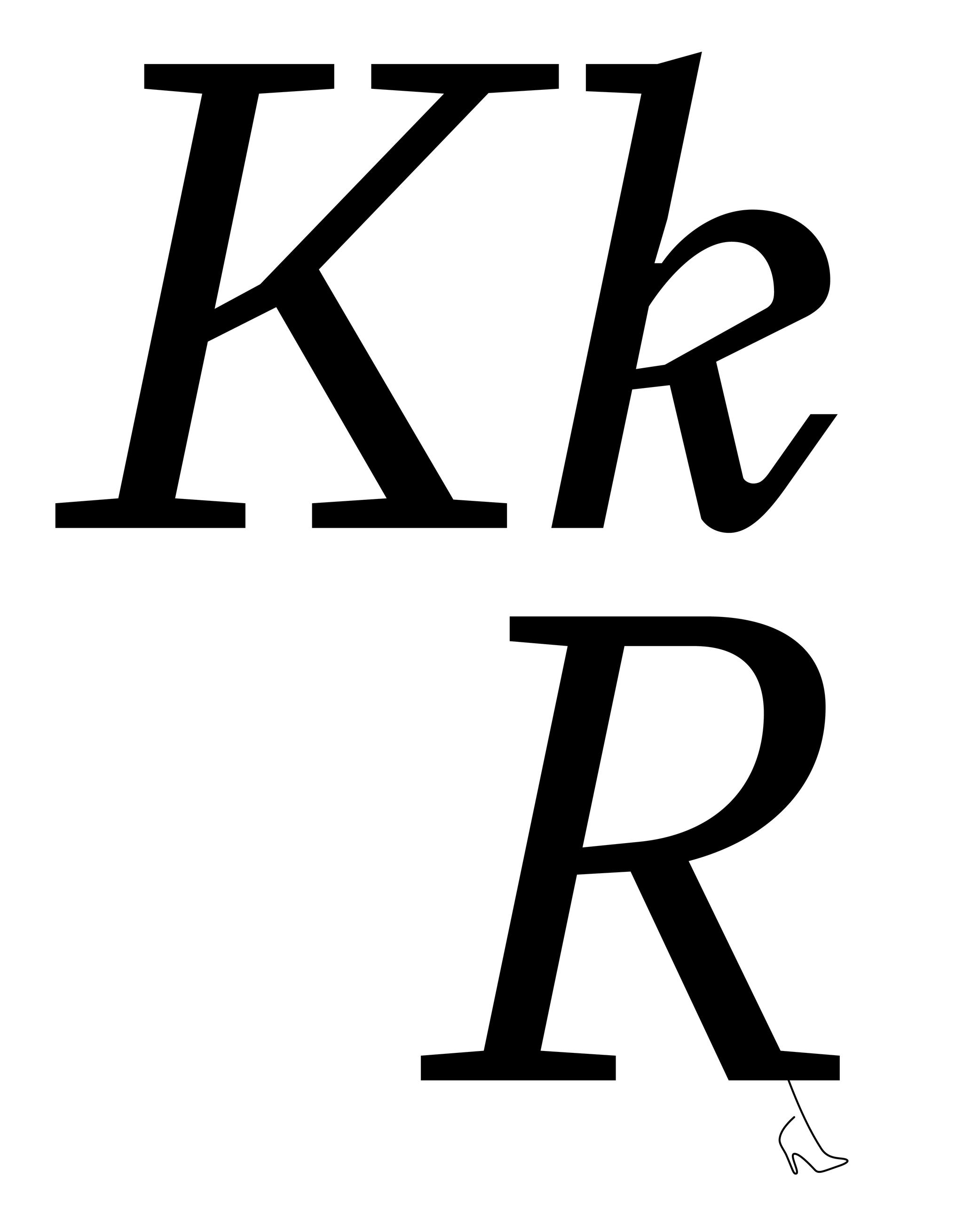
Sponsored by Type Together . Typeface in use: Aeroplan , designed by Nina Faulhaber, 2023.
(Read More)Many terms are borrowed from architecture or human and animal anatomy to designate and describe parts of letters and other characters. We even speak of type design anatomy.
In Latin script, the leg is the lower diagonal stroke of letters like R, k or K.
Legibility
Illustration: Catherine Potvin .
(Read More)Legibility is about how easily a text can be read thanks to the identification of each character.
In typeface design, some shapes allow a glyph to be recognized more easily than others, generally due to the readers’ familiarity.
It is a subjective concept that can vary with context, culture and history. The meaning of legibility and readability is often mixed up.Letter
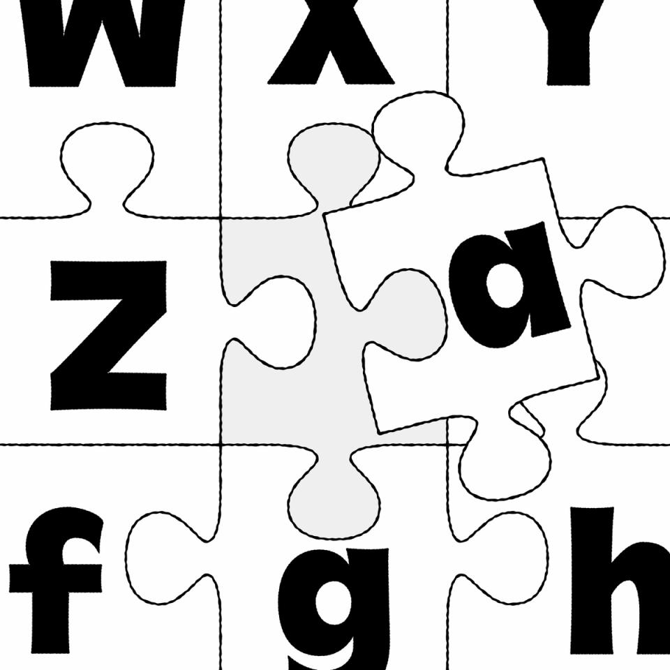
Illustration: Raven Mo .
(Read More)Letters are a type of characters used in an alphabet to represent the sounds of a spoken language.
The same letter can have multiple sounds due to different pronunciation in different languages, and one sound can be transcribed with various letters or characters. Some letters can also bear diacritics to have more or less subtle variations of pronunciation in some languages.
Linguistically, a letter is an abstract symbol, but it can appear in different glyph forms, such as cases (uppercase or lowercase), stylistic variants, or contextual forms.
FONT ENGINEERING HINT
In a font file, a letter is encoded as a character (with a unique Unicode code point) but it may correspond to multiple glyphs. For example, an a can have a single or double storey form.
Some letters can also be combined into a single glyph to form a ligature (such as fi or æ).These substitutions are handled in the gsub (Glyph Substitution) table, while the character-to-glyph mapping is defined in the cmap (Character To Glyph Index Mapping) table.
Lettering
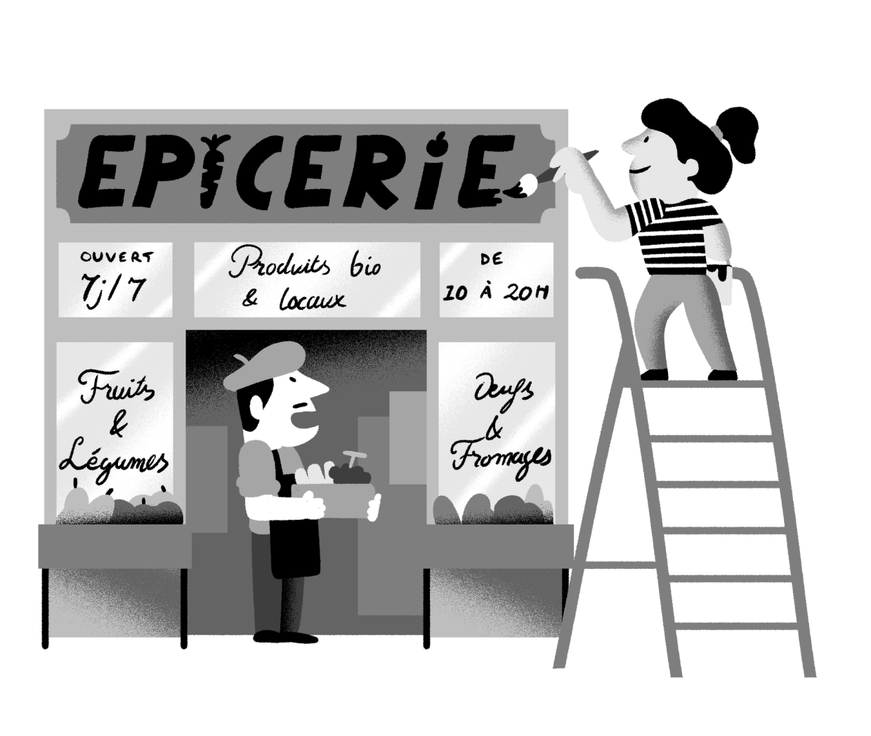
Illustration: Yann Bastard .
(Read More)A lettering is a drawing of a group of characters made for a specific situation (such as on a shop sign) or for a piece of work (a brand’s logo, a title for a magazine insert, etc.), unlike a typeface where each and every glyph is individually designed in a way to work in all kinds of combinations.
License

Illustration: Catherine Potvin .
(Read More)Typefaces in their digital form are products distributed and sold like software: it is not the design itself that is sold, but a copy (a font) attached with an agreement to use it: its license.
A license contains terms and conditions granted by the designer and/or the publisher to use the font. There are multiple types of licenses adjusted to the intended use of the potential client. There can be different licenses, with a pricing system specific to particular distributors, according to their marketing philosophy.
Ligature
Sponsored by LO-OL . Typeface in use: Kronik Antik Display, designed by Loris Olivier, 2023.
(Read More)In the era of metal-type printing, some character combinations in specific languages were used so often that they were combined to save time while composing texts. Punchcutters would ensure that one sort from the font would depict both letterforms together. We call these individual sorts with more than one letterform a “ligature.”
Other ligatures weren’t made because of the need to save time but because a series of letterforms would otherwise appear in a non-aesthetic manner on the page. One example of this is the f and i. Without a ligature, the white space between those two letters would be bigger than between other lowercase letters. Plus, the upper terminal of the f would be too close to the dot of the i.
The same principle has been kept in digital typefaces and ligatures exist as independent glyphs. OpenType features allow us to switch from two separated glyphs to their ligature variant thanks to the ligature alternate features (if they exist in the selected typeface).
Light (weight)
Sponsored by R-Typography . Typeface in use: Rizoma , designed by Rui Abreu, 2018.
(Read More)A typeface style with a lighter (thinner) weight than the Regular can be called “Light.”
It is one of the most common weights in Latin typefaces (along with Regular and Bold). However, many other terms exist for weight styles on the Design Space spectrum, such as Thin, Book, ExtraLight or Hairline.
Line Length
Sponsor Word of Type and feature your typeface in this card with a linked caption. Contact us for more information.
(Read More)A line of text that is too long or too short affects its readability.
Depending on the script and/or the document, there is an average number of words or characters for a comfortable reading.In English, a “good” line length average is between 10 to 15 words.
Lithography
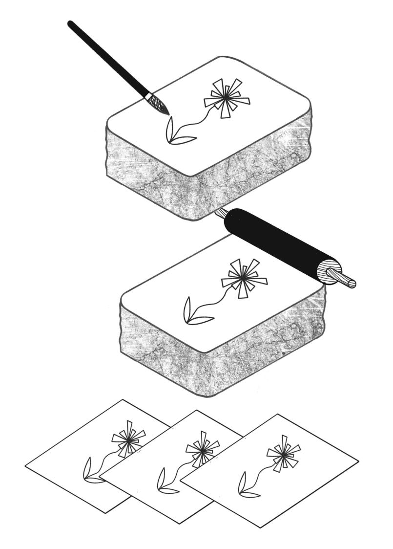
Illustration: Chloe Kendall .
(Read More)Lithography is a printing technique that enables the rapid production of elaborate prints using stone plates (lithos means ‘stone’ in Greek).
HISTORY
Lithography was invented in 1796 by Alois Senefelder (1771–1834), an actor in Bavaria. He developed lithography as a method of reproducing sheets of music.
After lithography proved successful at this, ever more complex and elaborate images were printed lithographically. Since lithography reproduced images drawn directly onto the stone, it allowed for closer results to original drawings than other techniques of that time. Lithography allowed for multiple layers and colors and was often used for advertising posters, sheet music covers, etc. Before offset lithography became the predominant printing method during the second half of the twentieth century, some books combined multiple techniques (lithography and/or engravings for images, letterpress printing for texts).
TECHNIQUE
The process of lithography printing uses the hydrophobic/hydrophilic chemical reaction between water and oil. Combined with the effect of acid or corrosive products, which creates an area for water to go in, the more greasy ink can be kept on the surface and transferred to the paper to be printed.
TODAY
Nowadays, traditional lithography is mostly used to print artistic works and other specific prints, as the process is much more costly than modern techniques, even if it renders a high-quality result. On the other hand, offset lithography is still the standard method by which most items are printed today.
Loop
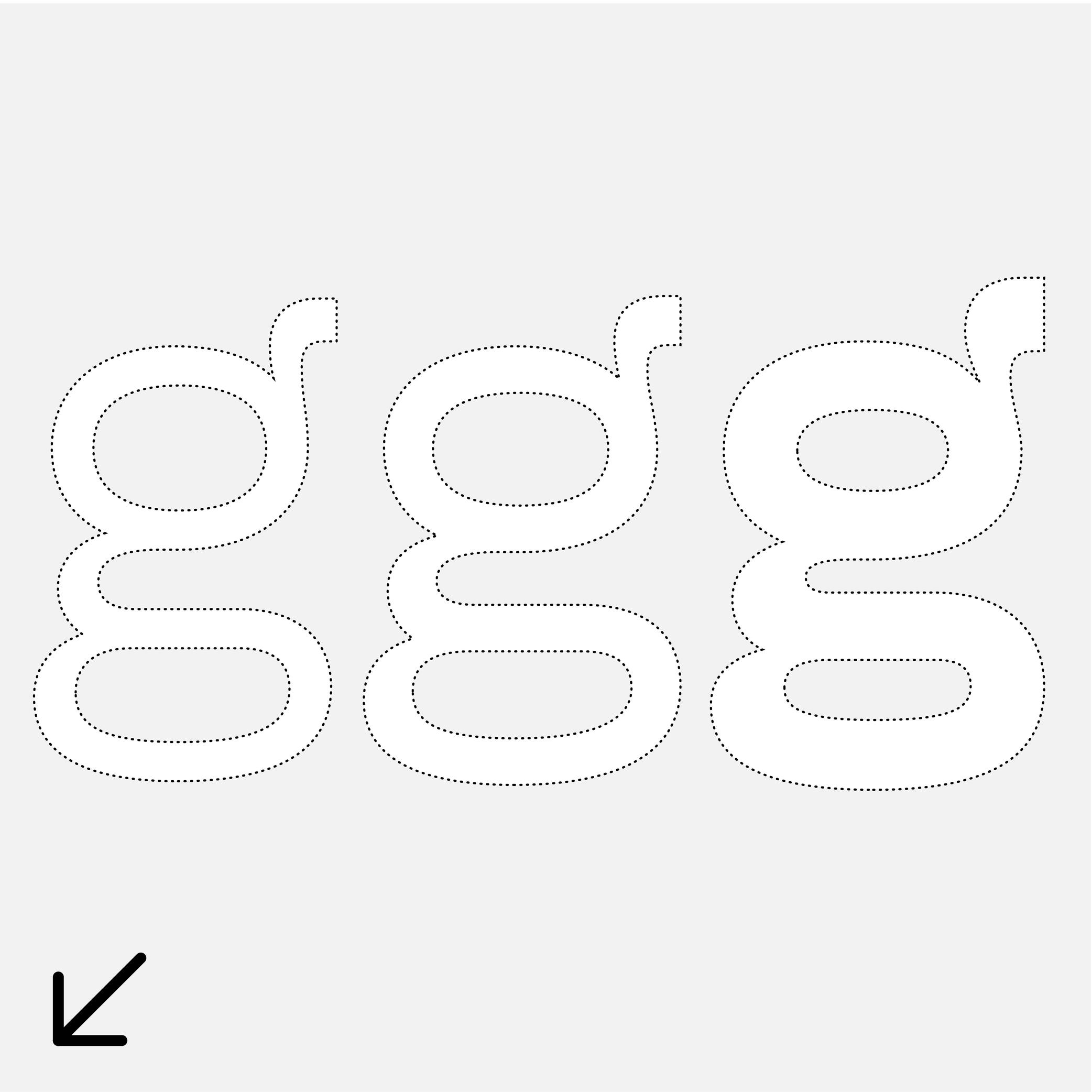
Sponsor Word of Type and feature your typeface in this card with a linked caption. Contact us for more information.
(Read More)Many terms are borrowed from architecture or human and animal anatomy to designate and describe parts of letters and other characters. We even speak of type design anatomy.
In the Latin script, a loop is the lower part of a double-story g, looking like a loop, open or closed.
Lowercase
Sponsored by Formagari . Typeface in use: Cedrat, designed by Emmanuel Besse, 2024.
(Read More)Also called minuscule.
Lowercase letters are the smaller forms of alphabetic letters, at least in scripts like Latin that have two cases. Lowercase letters are the opposite of uppercase letters (or majuscules/capitals).
HISTORY
The words ending with -case are a legacy from the era of printing with movable metal type. For the English-language, letters (metal pieces of type) from one font size were traditionally sorted into two wooden drawers or cases, one for each kind of characters. Capitals were in the kept in the upper case, and lowercase letters were on the bottom one. Later, single drawers would be used for an entire font. There, capitals were kept the upper section of the drawer, above the lowercase.
Even though they appeared later than their uppercase “parents,” lowercase letters went through many more iterations. Some of these evolutions were influenced by history (invention of new tools), cultures (preference for certain styles) and geography (influence of nearby cultures).
Majuscule
(Read More)A majuscule is a capital letter placed at the beginning of a sentence or the first letter of a name.
Note that all capital letters are not necessarily majuscules, such as CAPITALIZED words, which are made of capital letters.
Manuscript
Illustration: Malota .
(Read More)A manuscript is a hand-written document.
Margins
Illustration: Words of Type.
(Read More)Margins are the spaces around a composition block (left, right, top and bottom margins).
Master
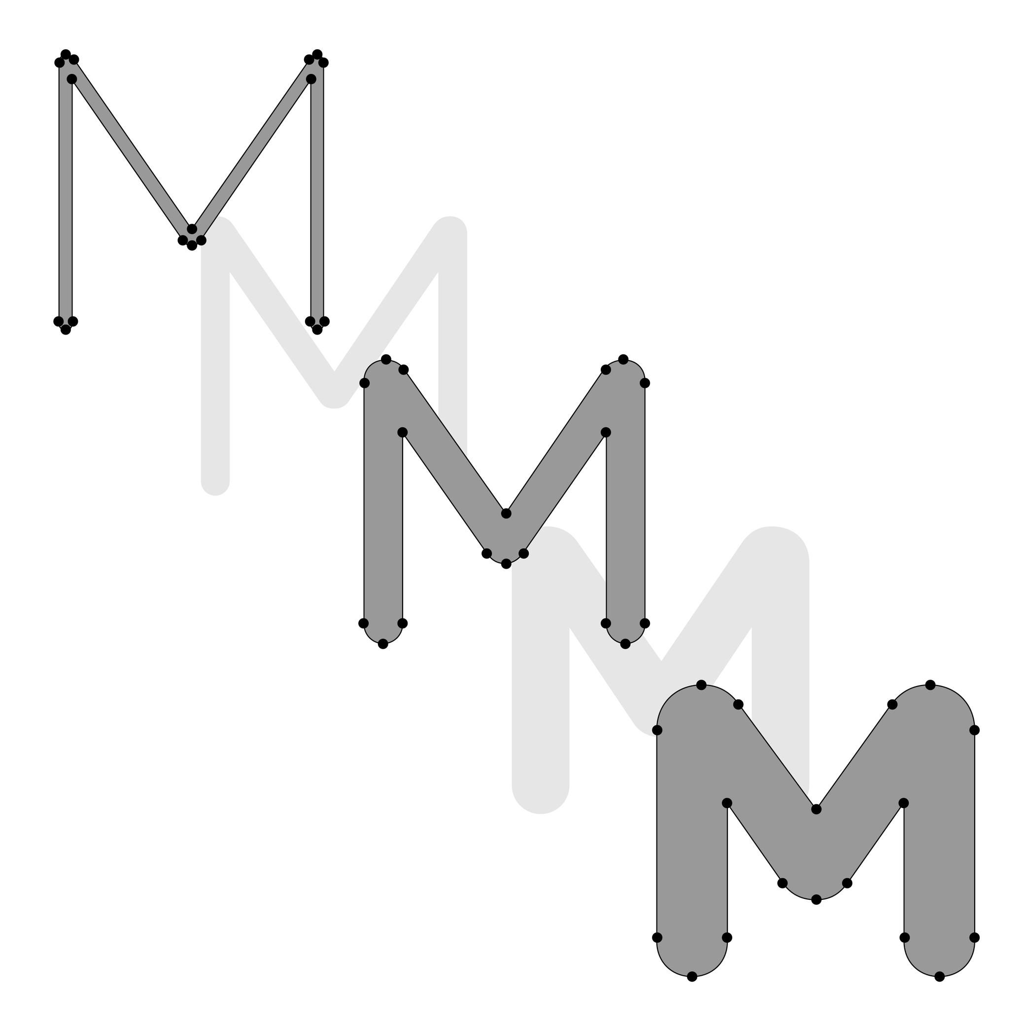
Illustration: Lisa Huang. Typeface in use: Knowledge Rounded, designed by Lisa Huang, 2024.
(Read More)In digital type design, a master is a fully drawn style of a typeface (e.g., Regular, Bold, Regular Condensed) that defines a reference point in its design space (the area in which a typeface can change in terms of weight, width, and so on, such as going from Regular to Bold).
Masters are used to generate intermediate instances through interpolations. For an interpolation to work, masters must be compatible with each other (same contour structure, point order, components, etc.).
In general, a master means it is a style—in or of a typeface—with editable outlines in a typeface file, as opposed to interpolated instances which are generated intermediaries, and therefore are not directly editable.
NOTE
The terms “source” and “master” are terms that are often mixed up.
A source file (with.glyphs, .ufo, .vfj format extensions) is a working file containing editable outlines and can contain one or more masters. It usually requires a font editor app to be opened and modified (e.g., GlyphsApp, Robofont, Fontlab).
The font format .ufo (for Unified Font Object) is compatible with most font editors. In that format, one master corresponds to one source.
FONT ENGINEERING HINT
In Variable Fonts, only one full master (the origin) is stored explicitly. Additional masters are stored as variation instructions data in the gvar (Glyph Variation) table. Intermediate masters (not the extremes of an axis) can also be defined, and generated. Intermediates are needed when simple linear interpolations between two extremes would result in undesired designs at some point. They add extra data to describe corrections along the axis, ensuring smoother or more controlled transitions. While they don’t store full outlines, including them still increases file size.
Metadata
(Read More)Digital fonts are files containing various categories of information for it to be fully functional, correctly installed and used on devices, called metadata.
There are information such as names of the designer(s), publisher or distributor, version number or export, its release date, copyright information, etc.
Metric System
Illustration: Words of Type. Typeface in use: Knowledge Rounded, designed by Lisa Huang, 2024.
(Read More)The metric system is a measuring system used nowadays in most countries around the world, where the units are the meter, gram, Celsius degree, etc.
The United States of America and countries that were part of the British Empire use the imperial system with feet, pounds and Fahrenheit degrees.
Multilingual
Sponsored by Typotheque . Typeface in use: Lava , designed by Peter Biľak, 2013.
(Read More)Multilingual means that a text makes use of multiple languages. The term should not be confused with “multiscript.”
For example, a book published in English and French languages is multilingual but uses the same script: the Latin script.
Multiple Masters
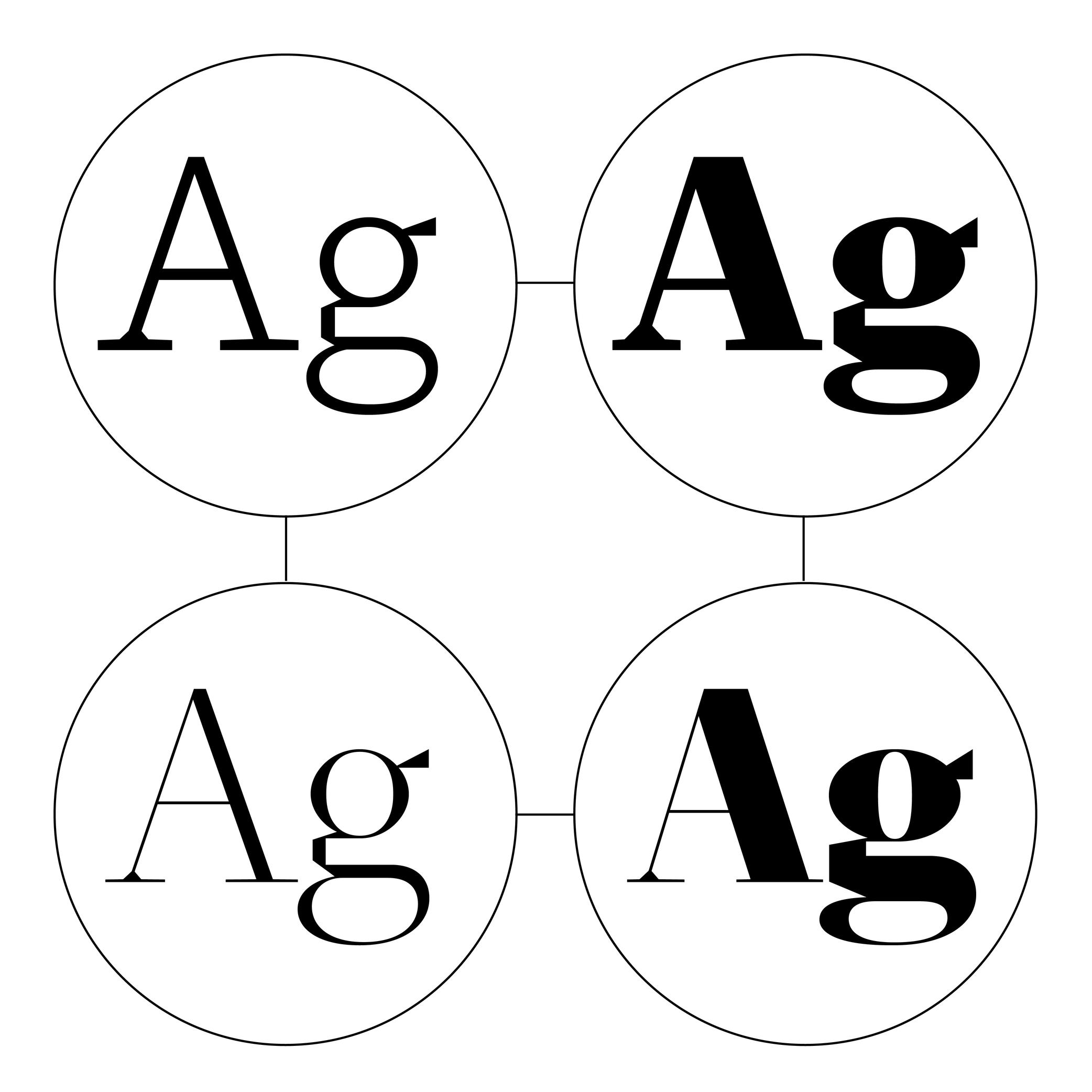
Sponsored by R-Typography . Typeface in use: Montris , designed by Rui Abreu, 2024.
(Read More)Variable Fonts technology allows users to navigate within or use multiple variations between two or more specific styles (called masters) with high precision and much smaller font files.
Whenever more than two masters are used—giving a more complex Variable Font file—it is considered as a Multiple Master font (or MM for short).
Multiscript
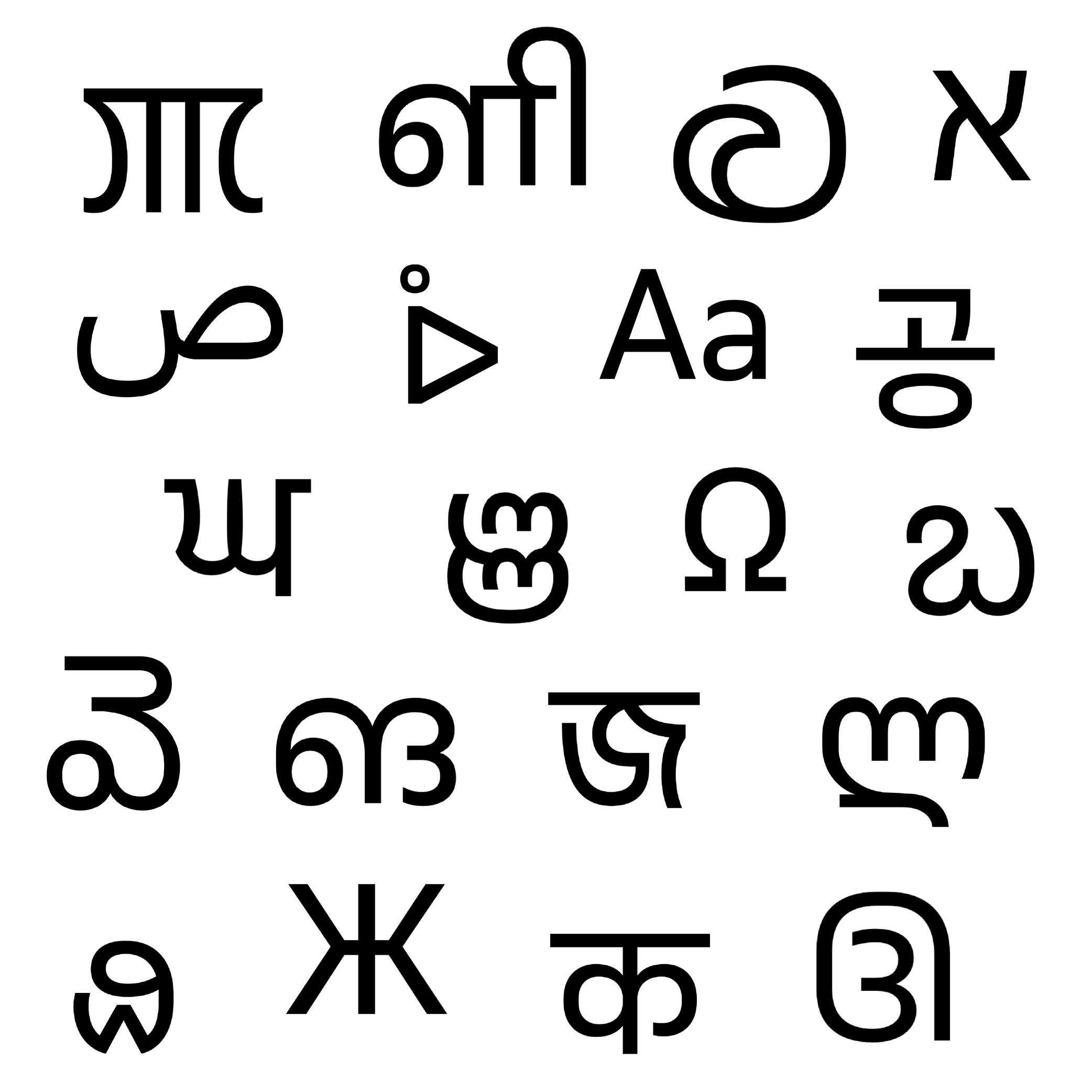
Sponsored by Typotheque . Typeface in use: November , multiple designers, 2016.
(Read More)Multiscript texts are written in multiple scripts or writing systems. For example, a book published in English and Arabic languages is multiscript because it uses two different scripts. But one in English and French is then multilingual: the same script for two languages.
Node
Illustration: Words of Type. Typeface in use: Knowledge Rounded, designed by Lisa Huang, 2024.
(Read More)A vector is a segment-line defined by two nodes (points or on-curve points).
That vector can be a straight line if it is without handles (or off-curve points), or curved if it is with handles.In digital type design, glyph outlines are composed of closed paths (also called contours), where each point connects two segments—as if they were “tying” the vectors together. Because of this connective role, points are commonly referred to as nodes.
There are two main kinds of points:
• nodes (on-curve points): points that sit directly on the contour and define the actual path of the outline;
• handles (off-curve points): points that control the curvature of the segment without being part of the contour itself. They are also called Bézier control-points (BCP for short).Together, nodes and handles determine the final shape of the glyph.
Number
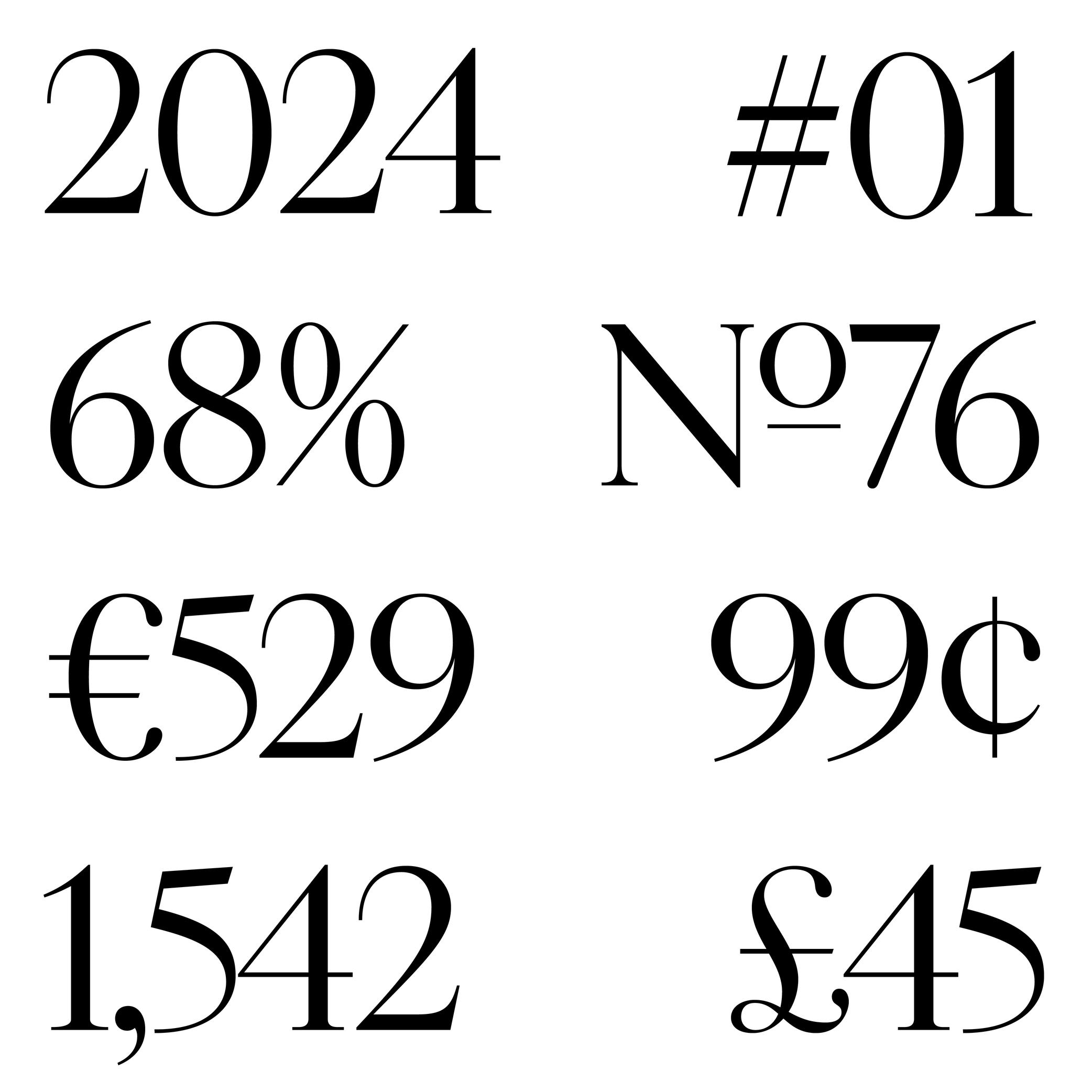
Sponsored by Production Type . Typeface in use: Cardinal Photo , designed by Jean-Baptiste Levée, 2020.
(Read More)The confusion between the words “figure” and “number” is seen very often. But, linguistically speaking, they are to be distinguished from one another: a figure (or numeral) is the graphic representation of a number, which is a mathematical concept. Several figures can be combined to form a number. For example, the number 22 is represented by using the figures 2 twice.
Oldstyle Figures
Sponsored by Dinamo . Typeface in use: Daily Scotch , designed by Fabian Harb and Michelangelo Nigra, 2024.
(Read More)DESCRIPTION
Oldstyle figures are designed to fit with the design of lowercase characters. They are more often used in texts as they visually blend in better than the other figure variants.
HISTORY
The proportions of oldstyle figures are closely related to how they were written in calligraphy using similar strokes and movements as those of the (lowercase) letters.
“Oldstyle” used to have a typographic meaning of its own. It was a 19th century/early 20th century term for revivals of Renaissance serif faces after British printers got bored of Bodoni/Didot/Scotch/etc., and particularly referred to revivals of types those from Venice, Paris, and Caslon’s much later roman. Some typefaces had “Old Style” in their name to signify this.
EVOLUTION
Oldstyle figures are also called “traditional” figures in some languages, as more modern styles came later on (hence the name identification) as better adapted forms to specific situations: tabular, lining or proportional figures. In digital typefaces, several style sets of figures are available and can be accessed via the alternate sets.
OpenType Features
Sponsored by Typotheque . Typeface in use: Irma Display Black , designed by Peter Biľak, 2009-2011.
(Read More)OpenType features are additional typographic options included in fonts using OpenType format.
For a single character, a font can contain multiple glyph variants (or alternates) alongside its default form. These can serve stylistic purposes (e.g., swashes, stylistic sets) or functional improvements (e.g., fractions, localized forms, contextual alternates).
Features can be activated in software that supports them (like design or word-processing apps) or through CSS on websites. Some common OpenType features include:
• Case-sensitive forms (case);
• Localized forms (locl);
• Small capitals or small caps (smcp);
• Tabular, proportional or oldstyle figures (tnum, pnum, onum);
• Stylistic sets (ss01-ss20);
• Superiors, inferiors (sups, sinf);
• Nominator, denominator, fractions (numr, dnum, frac).You can find the full list of OpenType features here .
FONT ENGINEERING HINT
OpenType features are implemented in the font’s layout tables:
• GSUB (Glyph Substitution): replaces one glyph with another (e.g., default a with a swash variant).
• GPOS (Glyph Positioning): adjusts spacing and positioning between glyphs (e.g., kerning, mark placement).OpenType Format
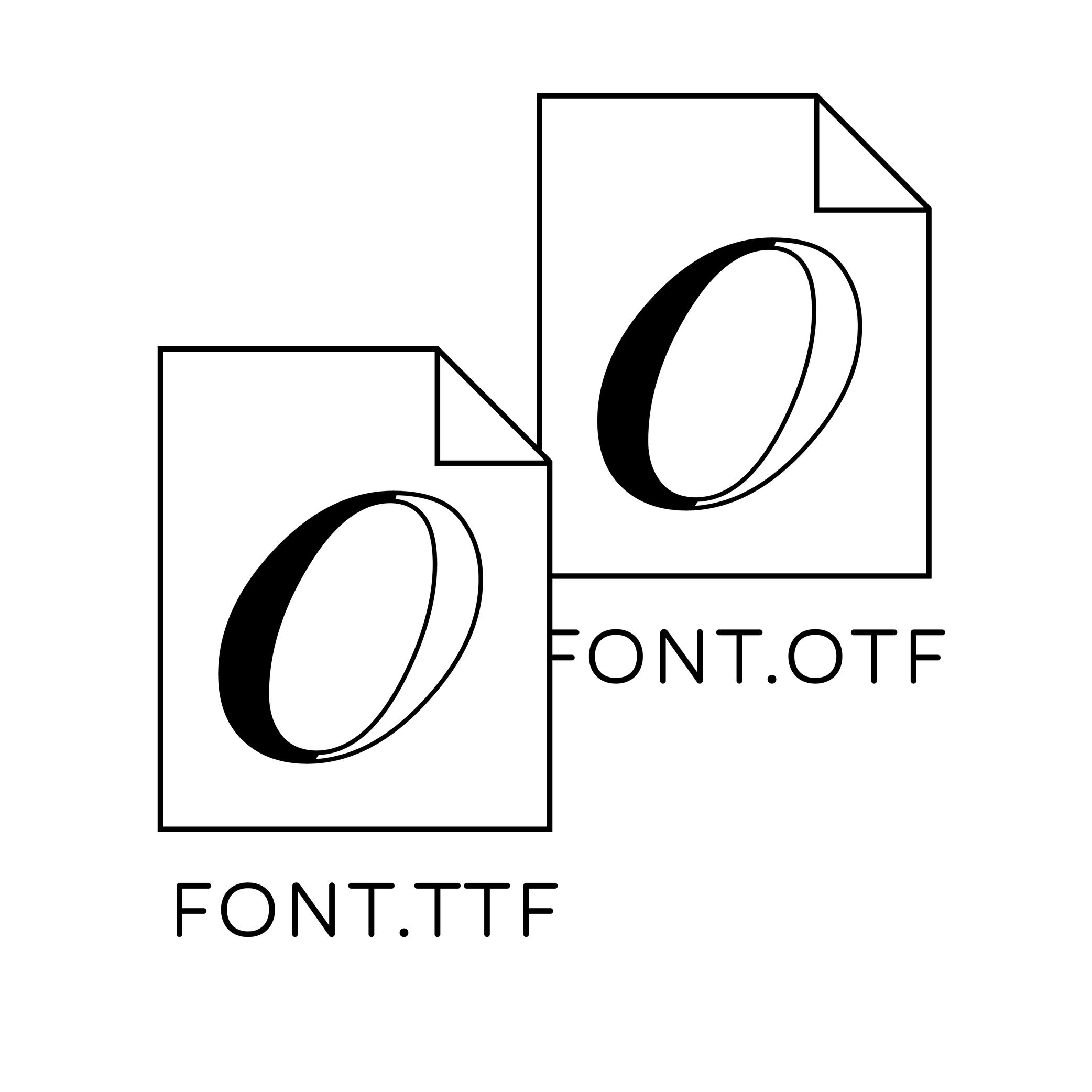
Illustration: Words of Type.
(Read More)OpenType is a digital font file format created by Adobe and Microsoft in 1996. It was mainly developed for fonts to be on printed media and is still in constant evolution.
OpenType font files contain all the data of a typeface style in one single file, from the glyphs’ shapes and metrics, to additional stylistic sets known as OpenType features. It has also a higher glyph capacity than others font formats (up to 65,000 and more!).Optical Corrections
Illustration: Erik van Blokland .
(Read More)The shapes used to form the words and texts we read are seen by our eyes. And our eyes and brain are organs that don’t rely on geometry, rulers, and compasses to “read” the world.
Even if they are geometrically aligned, some shapes may appear uneven and require optical adjustments to appear consistent. In type design, we talk about optical corrections.
Optical Size
Sponsored by Blaze Type . Typeface in use: Joly , designed by Léon Hugues, 2021.
(Read More)When a typeface is intended to be used at some specific sizes only (large on billboards or small in printed books), some details can be optimized for each situation, resulting in optical size styles such as Text, Caption, Titling, or Display.
For text styles, aspects such as lower contrast and simpler details have been proven more efficient for reading small texts (especially if they are printed on rough surfaces), while display styles can carry elaborate details as they are seen in larger sizes.
Orphan
Illustration: Words of Type. Typeface in use: Knowledge, designed by Lisa Huang, 2024.
(Read More)Odd situations can happen when typesetting a text making its overall appearance look sloppy.
When the first line of a paragraph appears alone at the end of a column or a page, it is called an orphan.
Overlap
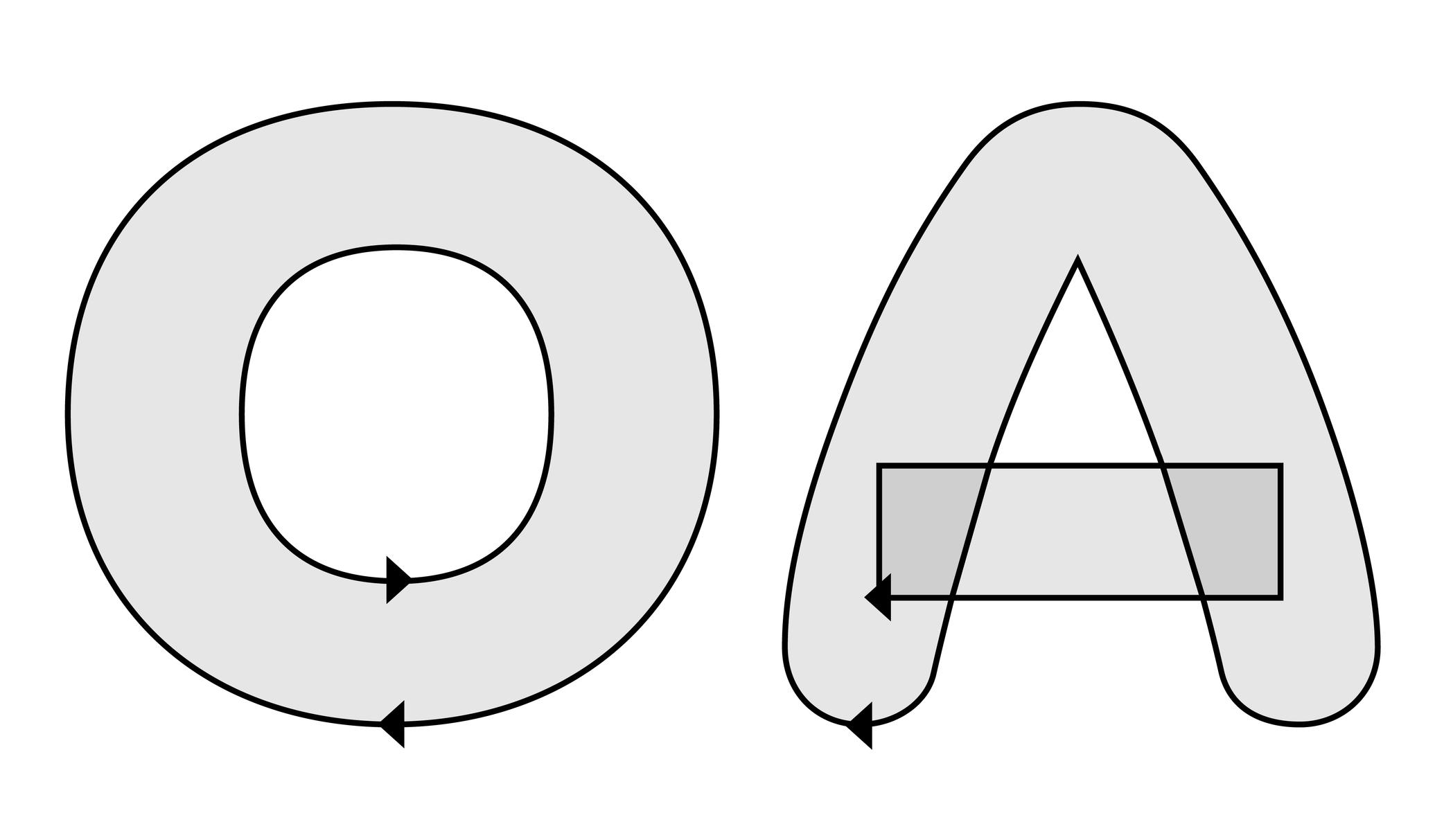
Illustration: Words of Type. Typeface in use: Knowledge Rounded, designed by Lisa Huang, 2024.
(Read More)In type design (digital or analog), an overlap refers to the situation where two or more contours of a glyph intersect or sit on top of each other.
For example:
• a complex shape like the letter E can be drawn as several overlapping contours;
• a counter form like in the letter O, which requires two contours: a larger outer contour (filled) and a smaller inner contour (the hole).When drawing a glyph in a digital file, the direction of each contour determines whether it is filled or cut out: the counter forms are drawn in the opposite direction than the larger contour.
Have you ever noticed a weird blank area in a letter out there? Well, that is the result of overlaps mistakenly drawn or managed at the export!
FONT ENGINEERING HINT
In an exported font file, managing overlaps depends on the outline technology:
• with PostScript outlines (.otf), contours are usually merged during export to avoid unwanted results. The rasterizer applies the “non-zero winding rule,” so overlaps are interpreted as counters regardless of their direction. Still, maintaining consistent contours directions is important, as it ensures that the export algorithms will merge contours correctly and their conversion to TrueType works properly.
• with TrueType outlines (.ttf), the “fill rule” depends on contour direction: clockwise paths are filled, counter-clockwise paths are cut out. Overlaps can remain unmerged as long as directions are consistent. Font editors usually provide a “Remove Overlap” option when generating fonts. This is often recommended for static TrueType fonts because some rendering environments and PostScript printers may still misinterpret overlapping paths.Overshoot
Illustration: Words of Type.
(Read More)Overshoot refers to the slight extension of curved or pointed glyph parts beyond a given height or alignment guideline (such as the baseline, x-height, or cap height).
For example:
• the round part of O often extends slightly above the cap height and below the baseline.
• the pointed part of A might go a tiny bit above the cap height.This is done optically, so that curves and points can appear visually aligned with the flat shapes (such as H or E) even if—mathematically speaking—they go beyond past the guidelines. Without overshoot, rounded or pointed shapes would appear smaller or misaligned to the eye.
FONT ENGINEERING HINT
Overshoot values are used in hinting and can also be reflected in font metrics (such as vertical alignment zones) to ensure consistent rendering across sizes and platforms. On a small pixel grid, overshoot can make curved and flat segments appear uneven. Hinting instructs rasterizers up to which size the overshoot should be suppressed, so curves and flat parts appear visually even at any sizes, and allows it to be restored at larger sizes where the difference is no longer visually noticeable.
In the .otf font format files, the overshoots are stored as BlueValues and OtherBlues in the CFF (Compact Font Format) table. This is because these guidelines are often represented as areas colored in blue in font editors. In .ttf files, the overshoots values are stored in the cvt (Control Value Table) table.
Padding
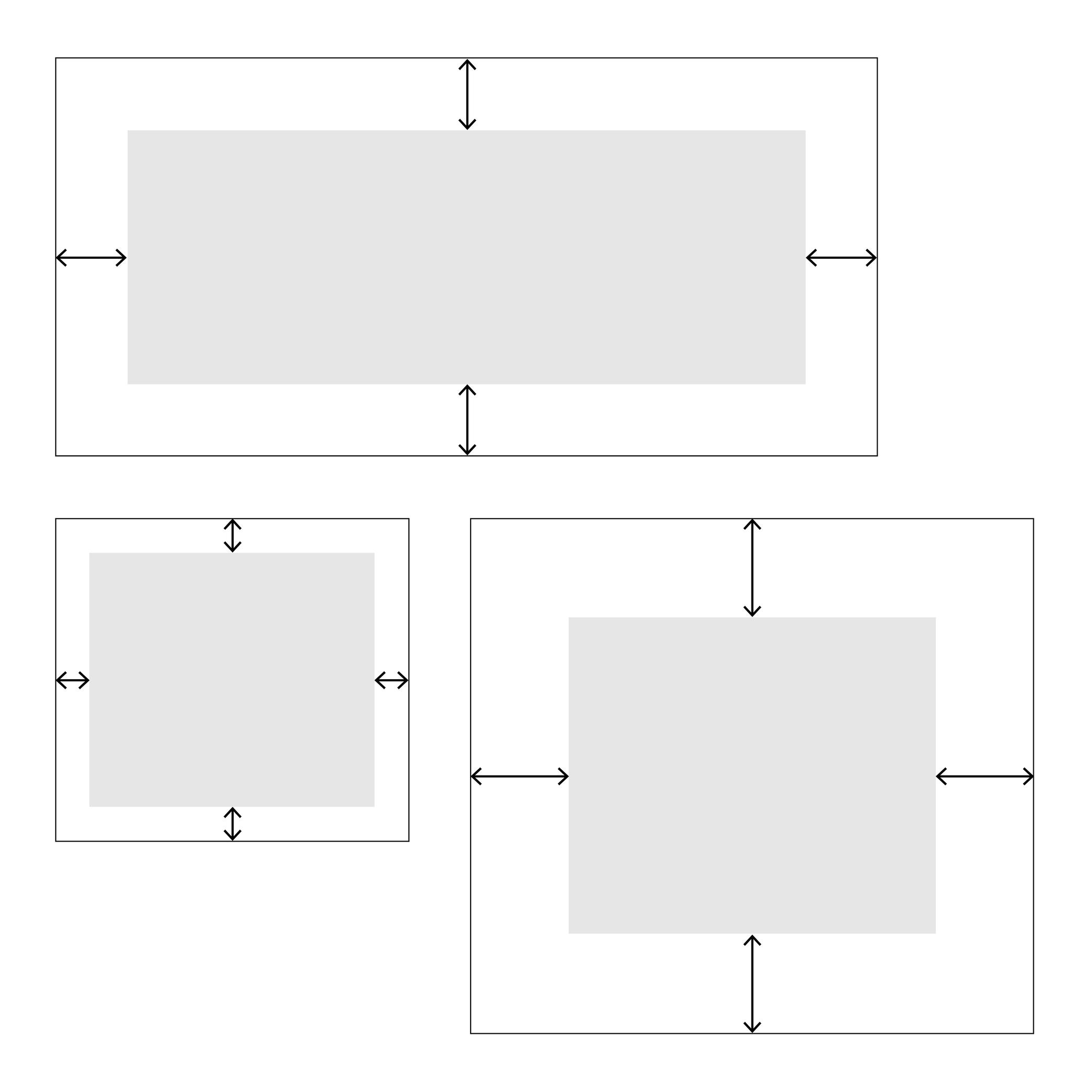
Illustration: Words of Type.
(Read More)In web typography, padding is about setting a specific distance between the sides of an element and its borders, like margins inside it.
Pagination
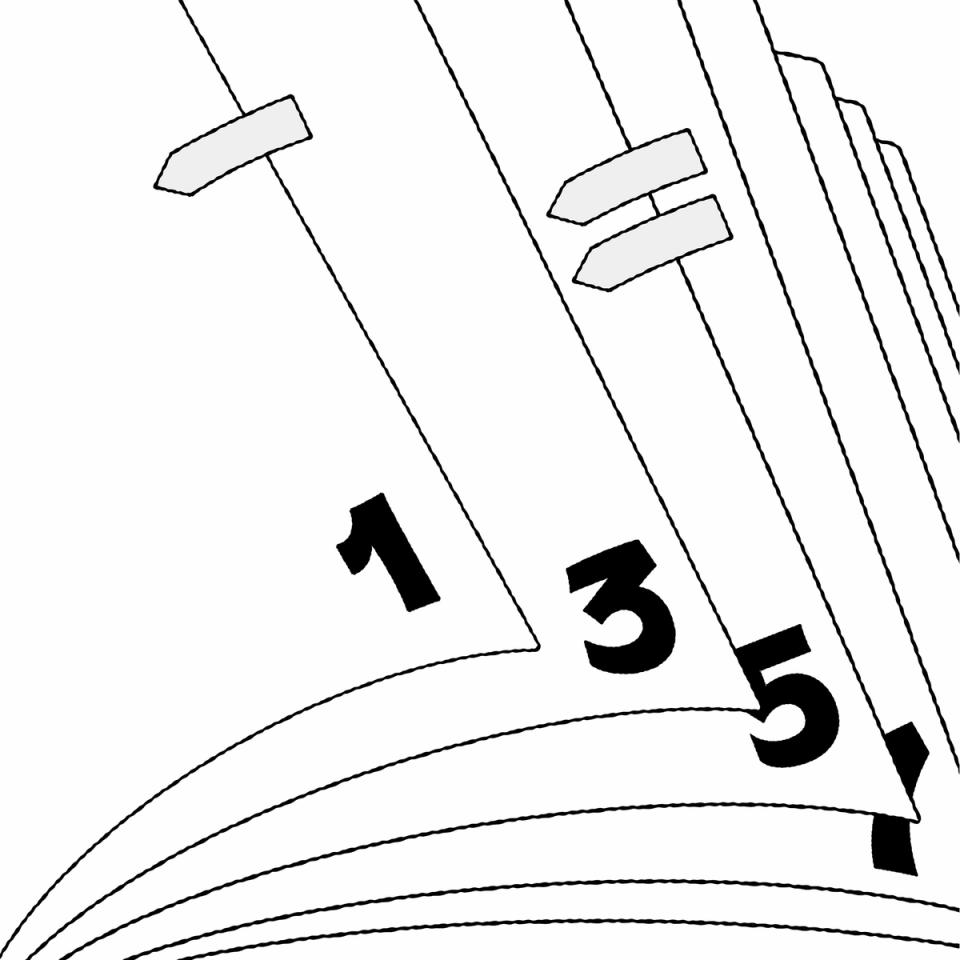
Illustration: Raven Mo .
(Read More)Pagination refers to the page numbering system of a printed document.
Parentheses
Sponsor Word of Type and feature your typeface in this card with a linked caption. Contact us for more information.
(Read More)FUNCTION
Parentheses indicate additional information in a sentence.
HISTORY
Early forms of parentheses added in text for the same purpose were shaped like chevron quotes (or guillemets). They later on evolved into the curved ones we know today.
These were introduced by French printer Nicholas Jenson in Venice, Italy, around the late 15th century.DESIGN
They have the same height as braces and brackets (or curly brackets and squared brackets).
For typefaces with contrast, parentheses have matching contrast (thick middle part, thin tips) and terminal tips (slanted, vertical or horizontal). S
everal parentheses alternates are necessary in a typeface to better fit with capitalized text, text set in titlecase and lowercase, and text set in small caps (when they exist in a typeface).The most common parentheses are curved (like these ones), but different shapes are used in other scripts.
TYPOGRAPHIC RULES
Parentheses are placed around a section of a sentence, with no space between them and the enclosed text.
Note:
one parenthesis
two parenthesesPath
(Read More)“Path” is a general term in digital vector design. It is a continuous trajectory defined by lines and/or curves, which can be open or closed. A segment (straight or curved) is a portion of a path, defined by two nodes (or points). In digital type design, a closed path is called a contour, and the sum of all the contours of a glyph is its outline.
FONT ENGINEERING HINT
In a font file, outline are stored differently according to their type:
• TrueType fonts (.ttf) store contours as quadratic Bézier paths in the glyf (Glyph Data) table.
• PostScript fonts (.otf) store contours as cubic Bézier paths in the CFF (Compact Font Format) table.Period
Sponsor Word of Type and feature your typeface in this card with a linked caption. Contact us for more information.
(Read More)Also called full stop.
FUNCTION
The period is a punctuation symbol that marks the end of a sentence.
It is also used to replace sections of letters in abbreviations and, in numbers, to indicate either thousands or the decimal.
In European languages, the period is used to separate thousands while a comma separates decimals. In English, the period is used the other way around:
(European languages) 15.000,05
(English) 15,000.25In the digital world, the period is often used to separate information from individual categories (domain-name.com).
HISTORY
In Ancient Rome, the period (which looked like a dot placed at the middle height) was used to separate words. Scribes in medieval Europe started using it to separate sentences instead (words were being separated by a space). They also shifted it down to the baseline, which has been kept ever since.
DESIGN
In most scripts, the period is a dot placed on the baseline. In the Latin script, it is about the same size as the dot on the letter i. In many other languages and scripts, sentences end with different symbols. For example, in Chinese and Japanese, the period is a hollow circle, placed at the base or centered in relation to the characters.
TYPOGRAPHIC RULES
When used to end a sentence, it has no space before it, and it is followed by a space between it and the eventual next sentence. It has no space before the next letter in an abbreviation. In American English, when used in a quote, it is preferred to place the quotes after the period. While in British English the period goes after the quotes.
Pictogram
(Read More)The word pictogram comes from the Latin pictum (‘painted’) and Greek gramma (‘character’).
It is an abstract drawing with a shape that relates to what it is referring to, unlike ideograms.Placeholder Text
Sponsor Word of Type and feature your typeface in this card with a linked caption. Contact us for more information.
(Read More)Placeholder text (or Lorem Ipsum) is a fake text used to test the aspect of a typeface or a typographic composition.
Point
(Read More)In typography, points are measurement units to describe the size of a typeface (for printed or digital media).
Several point-based series of typographic measurements have been created and used over the centuries and across the globe. In France and Germany, 12 Didot points make one Cicéro, while in Britain and the US, it was a Pica that would be divided into 12 slightly smaller points.
Today, the international typographic unit in software applications is the (DTP) point, which is exactly 1/72 parts of an inch—a cleaner standard than the Pica point previously used in the United States. Digital font sizes are referred to in point sizes and indicated as pts.
Postscript Format
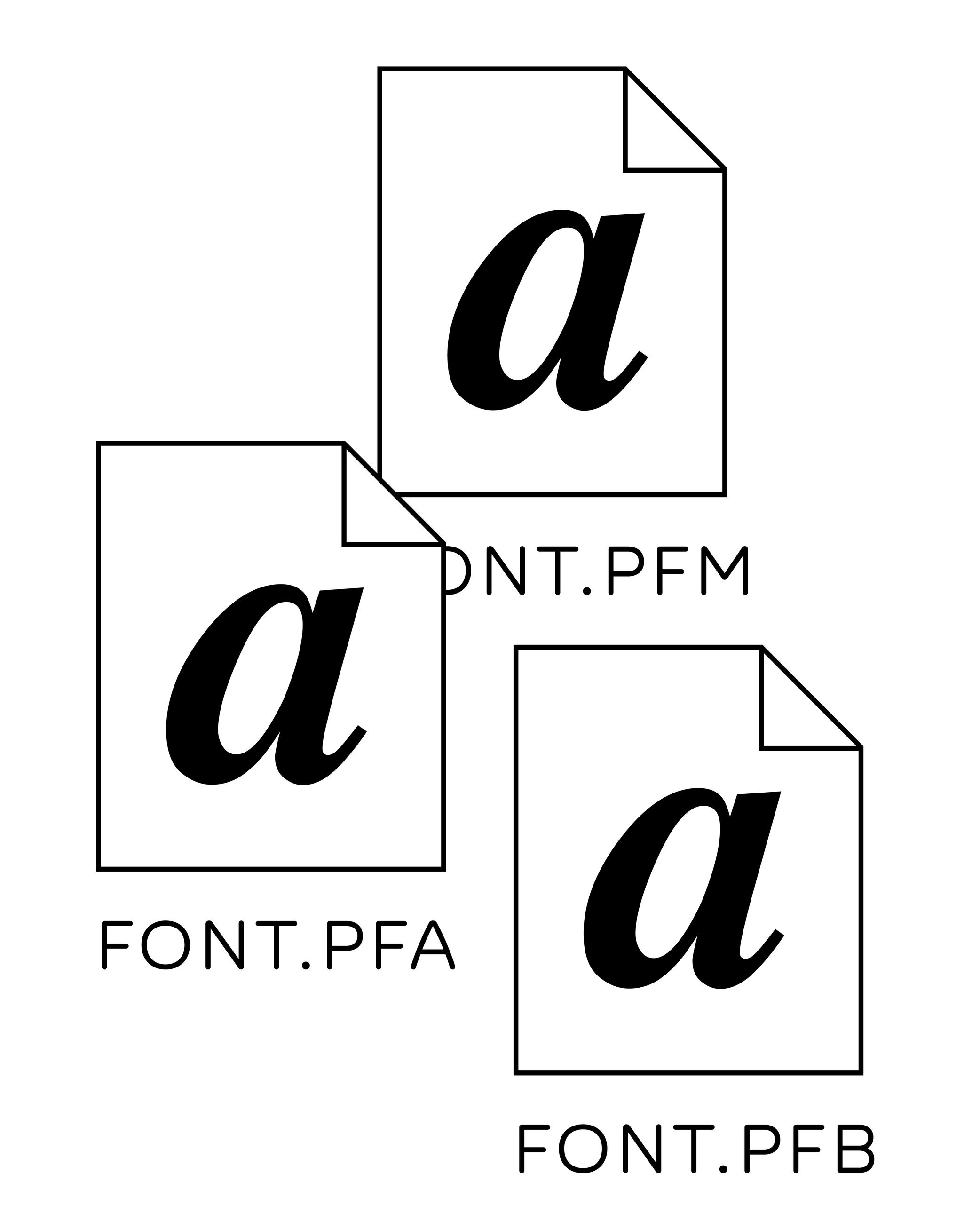
Illustration: Words of Type.
(Read More)PostScript is a page description language (PDL) created by Adobe in 1982. It was specifically designed to describe the layout of a printed page: where text and images go, how fonts and graphics should be rendered, etc.
It enabled the rise of digital publishing (DTP, or Desktop Publishing) by allowing images and text to be printed by high-resolution laser printers.Before PostScript, fonts were bitmap-based (made of pixels), and their quality varied depending on the size they are used at and the resolution of the printers. PostScript fonts introduced scalable outlines defined with cubic Bézier curves (digital vectors), which made it possible to render texts at any size with shapes that are faithful to the original design.
When Adobe released the PostScript Type 1 format, fonts required multiple files:
• one containing glyphs outlines and metrics;
• one for screen displays;
• and one for printers use.
All of these had to be installed together for the font to work.CAUTION
Adobe officially ended support in their products for PostScript Type 1 fonts since 2023. They are also no longer supported by many modern operating systems, so transitioning to OpenType (.otf or .ttf) is essential for compatibility.
FONT ENGINEERING HINT
Modern OpenType fonts with PostScript outlines (.otf) no longer rely on multiple files. Instead, they store cubic Bézier outlines inside the CFF (Compact Font Format) table.
Proof
Illustration: Pauline Fourest (Spaghetype ).
(Read More)To test the quality of a typeface, designers use proofs. They are documents that use the typeface’s font files in various situations, such as different sizes, with numerous glyph combinations, in multiple languages, and varied paragraph lengths, among other things. Specimen documents often resemble those from the printing industry. Type designers use them to check out how their fonts are progressing and/or to help make more targeted corrections.
Proportional Figures

Sponsored by Dinamo . Typeface in use: Daily Scotch , designed by Fabian Harb and Michelangelo Nigra, 2024.
(Read More)Proportional figures in a typeface are designed with different widths, same for oldstyle figures, each one adapted to the forms of the figure in order to have balanced proportions.
For example, 1 would have a narrower width than 3.
Punctuation
Sponsor Word of Type and feature your typeface in this card with a linked caption. Contact us for more information.
(Read More)Often forgotten when we think about the elements of a writing system, punctuation is just as important as letters, characters and figures. Punctuation symbols play a very important role in text.
When use correctly, punctuation marks a text’s rhythm and transmits the author’s desired voice. When well-designed in a typeface, punctuation helps with readability and facilitates typesetting and typography.
During the evolution of each writing system across the globe, multiple scripts developed different punctuation shapes for the same or similar purpose. Not every script or language uses the same shapes found in the Latin script.
Question Mark
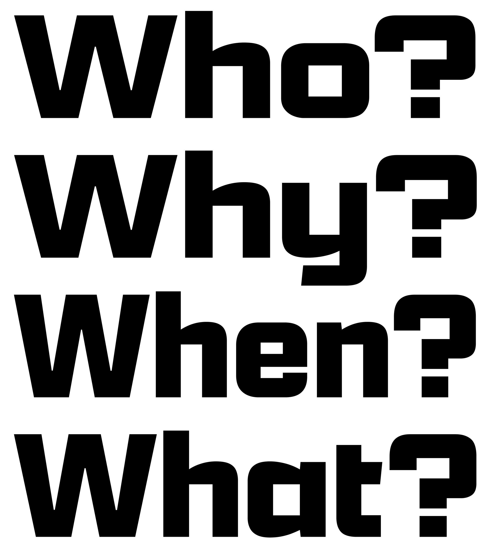
Sponsored by Kerns & Cairns . Typeface in use: Apotek , designed by Dyana Weissman, 2020.
(Read More)FUNCTION
The question mark is placed at the end of a question.
HISTORY
In Latin texts dating back to the 16th century, questions were marked with a letter Q above an o (as an abbreviation of quaestio, ‘question’ in Latin). It has evolved over the centuries into the simplified form that we know today.
DESIGN
The question mark has to have enough presence in a text to be visible fairly quickly. In the Latin script, it has about the same height and width as a capital letter. Its design has to be related with other glyphs of the typeface, where the top terminal relates to the terminal of other glyphs in the typeface (such as 2, f or C) and the dot below is identical to the period.
TYPOGRAPHIC RULES
In English and all other languages based in the Latin script, there is no space before the question mark, French is the only exception where there is a thin non-breaking space before it.
In Spanish, a reversed question mark is placed at the beginning of the question and the upright one at the end, with no spaces in between the characters and the words.Quotation Mark
Sponsor Word of Type and feature your typeface in this card with a linked caption. Contact us for more information.
(Read More)FUNCTION
Quotation marks shaped like commas (or called “66” and “99” quotes), double or single, are used in most (but not all) languages to introduce a quote.
HISTORY
When texts were only written by hand, even if there were no standard marks used across Europe to indicate quotes, some slanted and double dashes were used for a similar purpose. During the printing press era, typographers used shifted upwards and/or rotated commas to work as quotation marks, and typewriters adopted the same forms.
DESIGN
Although quotation marks were historically identical to commas, in some typeface styles a slightly shorter and narrower form to create a better text color is more suitable. In sans serif typefaces, quotation marks have an even simpler shape to match with the overall style.
TYPOGRAPHIC RULES
The “66” quote is placed at the beginning of a quote, closed with the “99”, without any space between the quotes and the quoted text.
Some languages use these quotes differently, such as in „German“ or „Polish”, or use quotes of different shapes such as the guillemets in «French», or「Traditional Chinese」.
Single quotes are used as secondary quotes, if they are within double quotes. A common mistake is to use prime and double prime for quotes instead of symbols in mathematics (distance, time, etc.).Readability
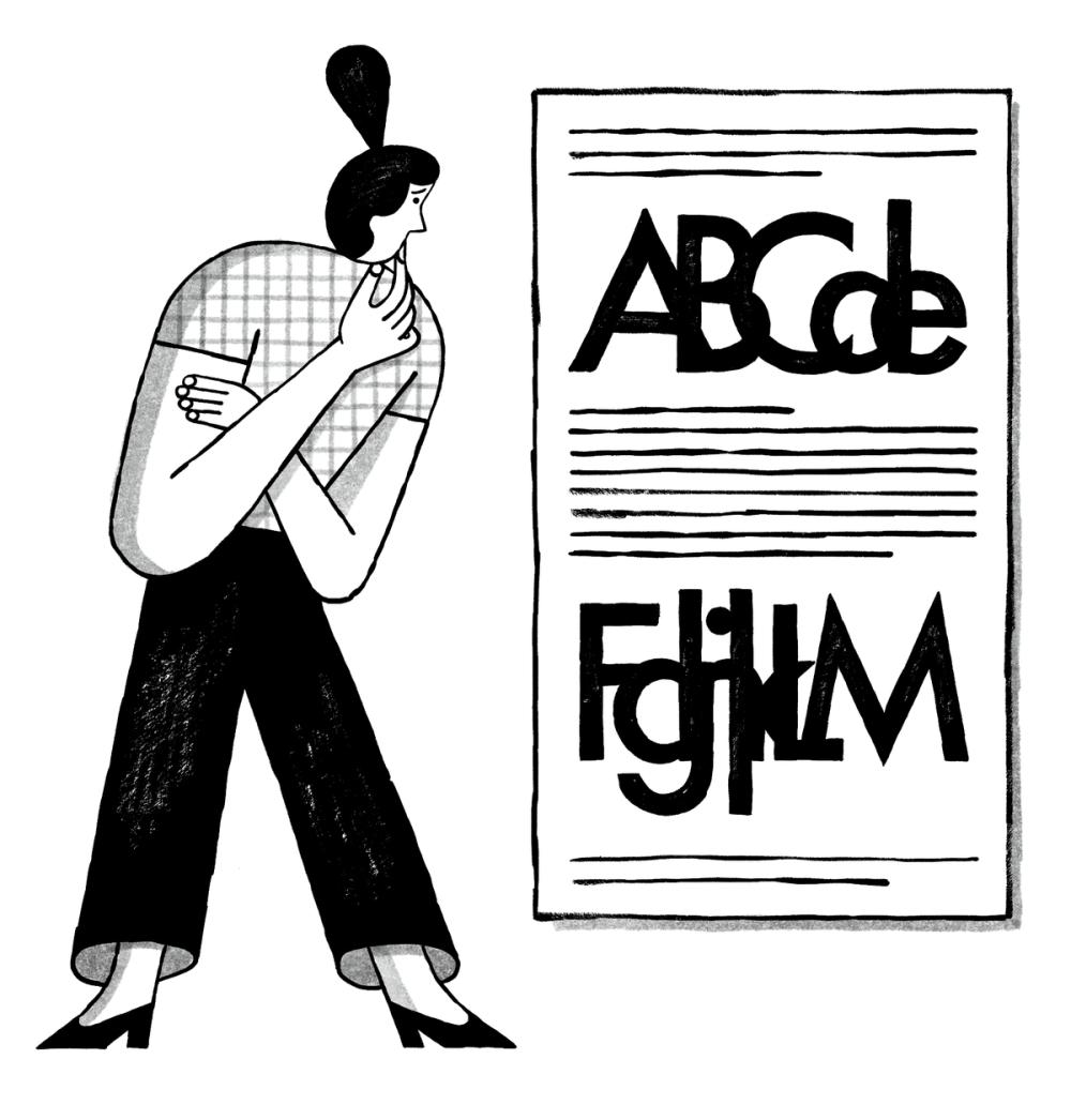
Illustration: Malota .
(Read More)In typography, readability refers to the ease with which a text may be read. The readability of a text is influenced by many aspects (listed in the quote below) other than the text itself. Readability is a concept often confused with legibility.
QUOTE
“The readability of a text is influenced not only by the choice of typeface, type size, correct or incorrect letter and wordspacing, and the length of line, but also by the linespacing or interlinear space, often termed ‘leading’.”
Jost Hochuli (translated by Charles Whitehouse) in Detail in typography.
Regular (weight)
Sponsor Word of Type and feature your typeface in this card with a linked caption. Contact us for more information.
(Read More)Regular weight is the most frequently used style in a typeface family.
With its proportions and features designed to be easily read, it is the best style to be used in running texts.Reversed Contrast
 (Read More)
The contrast is the relationship between a glyph’s thick and thin parts.
The variation in a stroke’s thickness comes originally from handwriting and results from the writing tool’s reaction to the medium, in combination with how the toll is held and the movements the writer makes. Nowadays, in type design for the Latin script, we refer to a vertical contrast when the vertical parts are thicker than the horizontal ones, which is its “natural” contrast. And the opposite is known as a reversed or inverted contrast.
But these concepts only apply to scripts that evolved using tools and a medium that creates such contrast “naturally,” which is not universal for all. For example, the Hebrew script’s contrast would naturally be distributed the other way around.
Revival
(Read More)A revival refers to a new typeface whose letterforms are based on historic models. Today, when we speak of revivals, we usually refer to digital typefaces that take their designs from existing ones. Most often, they base their forms on exisiting typefaces cast in metal, engraved into word, or produced for photo-composition.
The oldest revivals were made by 19th century type foundries when they adapted early 18th century typefaces for industrial printing conditions. In the 20th century, more revivals from mechanical and photo-typesetting device manufacturers followed.Inevitably, the design of a revival contains unique details of the designer, from interpretations of the initial design while analyzing printed results on paper to those on screen at various resolutions. Today, we can see multiple typefaces designed as revivals from one and the same typeface, but each have (sometimes very subtle) differences. For example, we can think of the many versions of the Garamond.
A revival from a running text typeface is considered as a good assignment for students starting to learn typeface design, as this allows to get more familiar with styles considered as “conventional” before experimenting further with more creativity.
Royalties
Illustration: Catherine Potvin .
(Read More)Typefaces are designs sold as fonts (copies of the original design) under their corresponding licenses. When such licenses are distributed and managed by an intermediary (publisher, distributor, or type foundry), a percentage of the sales goes to the designer. That part is the royalties, similar to what is applied in other artistic industries (music, illustration, etc.).
Sans Serif
Illustration: Pauline Fourest (Spaghetype ).
(Read More)DESCRIPTION
Sans serif, or Sans (literally meaning without in French), describes a typeface style without serifs.
HISTORY
As far as we know, the first published sans serif typeface, Two-Lines English Egyptian by William Caslon IV, was published in 1816 in London, England.
Many terms have been used to speak of a sans style as we understand it today, with multiple categories names in different typographic classification systems of Europe: ‘grotesque’ (France and United Kingdom), ‘Grotesk’ (Germany), ‘gothic’ (USA), ‘linéale’, ‘bâton’ or ‘antique’ (France).EVOLUTION
In Europe and North America, Sans-serif styles became popular in the early 20th century as part of a modern trend. Typeface designers experimented a lot around the this style, with some becoming references, and later style sub-categories of Sans-serif: humanistic sans, geometric sans, grotesque or gothic, etc.
But these don’t apply to other scripts that evolved on an independent path from the ‘Latin’ world. Chinese Hanzi have a category of style similar to Sans, called Heiti (or Hei), that doesn’t have as many sub-categories.
Script
(Read More)A script, or writing system, is the visual system (letters, characters, symbols, etc.) used to transcribe one or several languages. Some scripts are used by multiple languages (e.g., the Roman alphabet for many Western European languages).
Script (style)
(Read More)DESCRIPTION
Script is a category of typefaces that imitates handwritten forms.
HISTORY
Various categories of typeface styles started to be identified from the various metal typefaces being produced for movable type printing. Metal type technology worked so that each piece of metal representing one character could be assembled and reassembled in every possible combination, meaning that each character was designed as a disconnected form.
As new typeface designs kept being produced (mainly in Europe), more flourished styles for more diverse choices started to appear, especially during the early 20th century. Not only did they give more possibilities for typesetters (for advertisements or novelty), but new typefaces were also a way for type foundries to display their capabilities in technical and design innovation. Beyond italic styles, typefaces that could imitate handwritten forms (with connected and/or irregular forms) were one of the most challenging styles at that time, technologically speaking. As one (early but not the earliest) example of such a challenge, we have the typeface Mistral, designed by French typeface and advertiser designer Roger Excoffon in 1953 for Fonderie Olive.
EVOLUTION
Thanks to the possibilities offered by digital fonts, which have far fewer physical constraints than metal types, the same glyph can have multiple variations and replace one glyph to a more fitting one (see Opentype features or Alternates), to create the impression of handwritten words. Today, there is a wide choice of Script style typefaces, with a high variety of styles (and qualities).
IMPRESSION
Script typefaces are mainly used as display styles, in titles, short texts, or even in brand logos.
They can convey all kinds of impressions from the many possibilities of ‘sub-styles’. Note: script typefaces are not to be confused with lettering!Semicolon
Sponsor Word of Type and feature your typeface in this card with a linked caption. Contact us for more information.
(Read More)FUNCTION
The semicolon is used as a separation symbol in a sentence between two independent sections. It is also used at the end of different points of a list, ended by a period.
DESIGN
The semicolon has a period at the top (aligned below the x-height) and a comma on the bottom (like the comma), the two elements are vertically aligned.
TYPOGRAPHY RULES
There is no space before the semicolon, except in French, where there is a non-breaking thin space.
Serif
Illustration: Raven Mo .
(Read More)DESCRIPTION
Serifs are elements at the tips of strokes in serif style typefaces.
HISTORY
The origin and evolution of serifs differ in different scripts and don’t even exist in others.
For the Latin script, serifs come from the combination of the movements of the brush when writing Roman capital letters (the origins of the Latin alphabet) and stone carving techniques.EVOLUTION
Calligraphy, metal and wood type printing, photo composition, typewriters, digital typefaces, all of these tools and techniques contributed various shapes and presence (or absence) or serifs among the various typeface styles that we see today.
The positioning of serifs in each letter has been defined by the writing ductus combined with the tools use. For example, the general rule is that serifs should be on both sides at the top and bottom of vertical stems for upright letters, and none on the bottom of italic stems.
There are multiple possibilities for the shapes of serifs: thin, thick, long, short, wedged, squared, triangular, etc. Many typeface styles have a particular serif shape as part of their characteristics.
IMPRESSION
In Latin script, different impressions and feelings are associated with specific typeface styles (traditional, luxurious, casual, elegant, etc.), which are mainly due to the circumstances of their creation, usage preferences, and habits.
For example, humanist or transitional serifs are the go-to styles for long reading uses.DESIGN
For styles where serifs are on both sides of the stems, some asymmetrical letters (such as f, r, F or P) have a large opened counter on one side. To compensate for the imbalance created by the “empty space”, the designer can adjust the serif on that side by making it longer.
Side Bearings
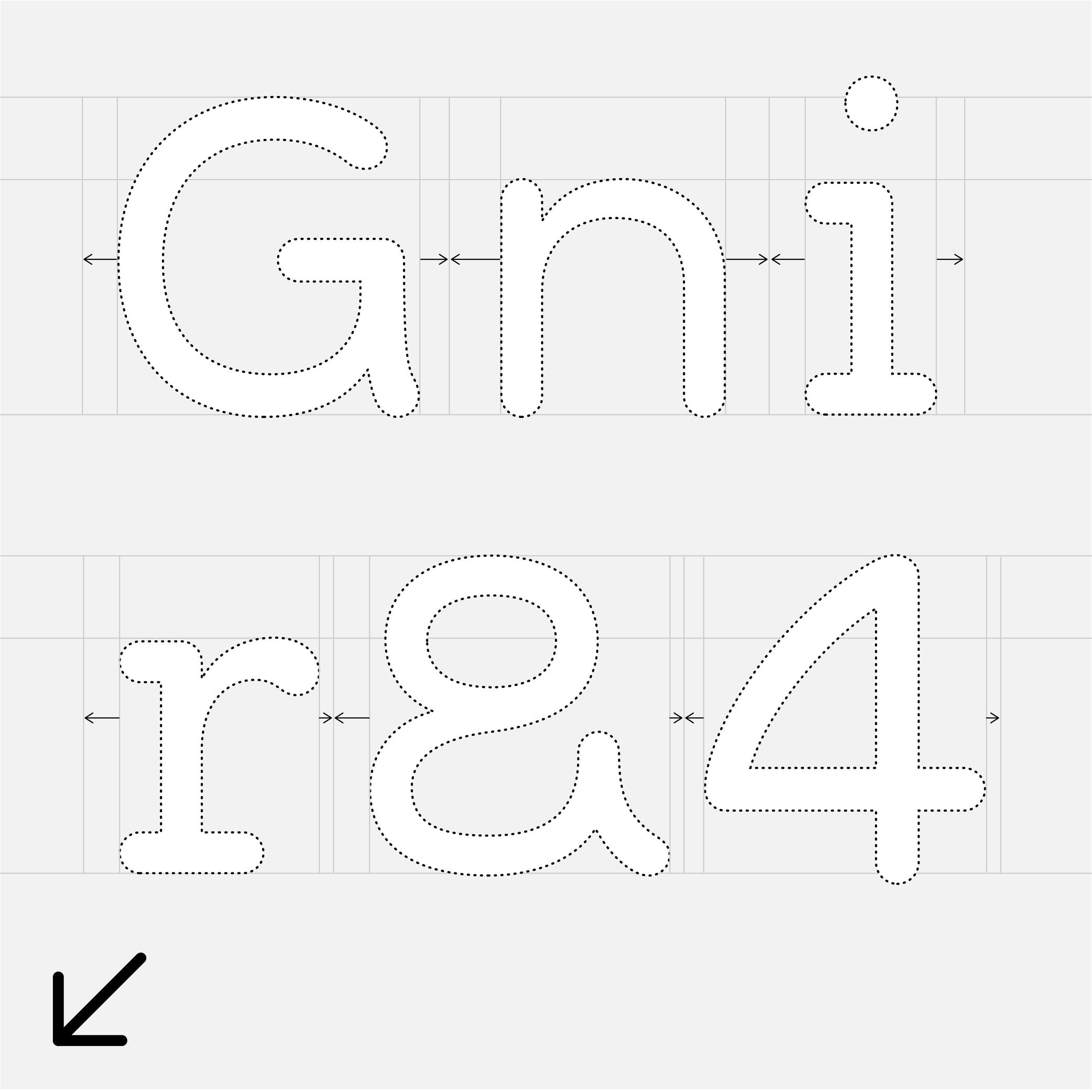
Sponsor Word of Type and feature your typeface in this card with a linked caption. Contact us for more information.
(Read More)A side bearing is the space outside a glyph’s outline, measured from the outline’s extreme points to the side of its body frame, and it controls the spacing to adjacent glyphs. In horizontally written scripts, each glyph has a left side bearing (LSB) and a right side bearing (RSB). Adjusting side bearings is essential for managing the overall rhythm and spacing of a typeface.
FONT ENGINEERING HINT
• Side bearing values are stored in the hmtx table for horizontal metrics.
• The advance width of a glyph is calculated as the sum of its glyph bounding box width, plus its left and right side bearings.Single or Double Storey
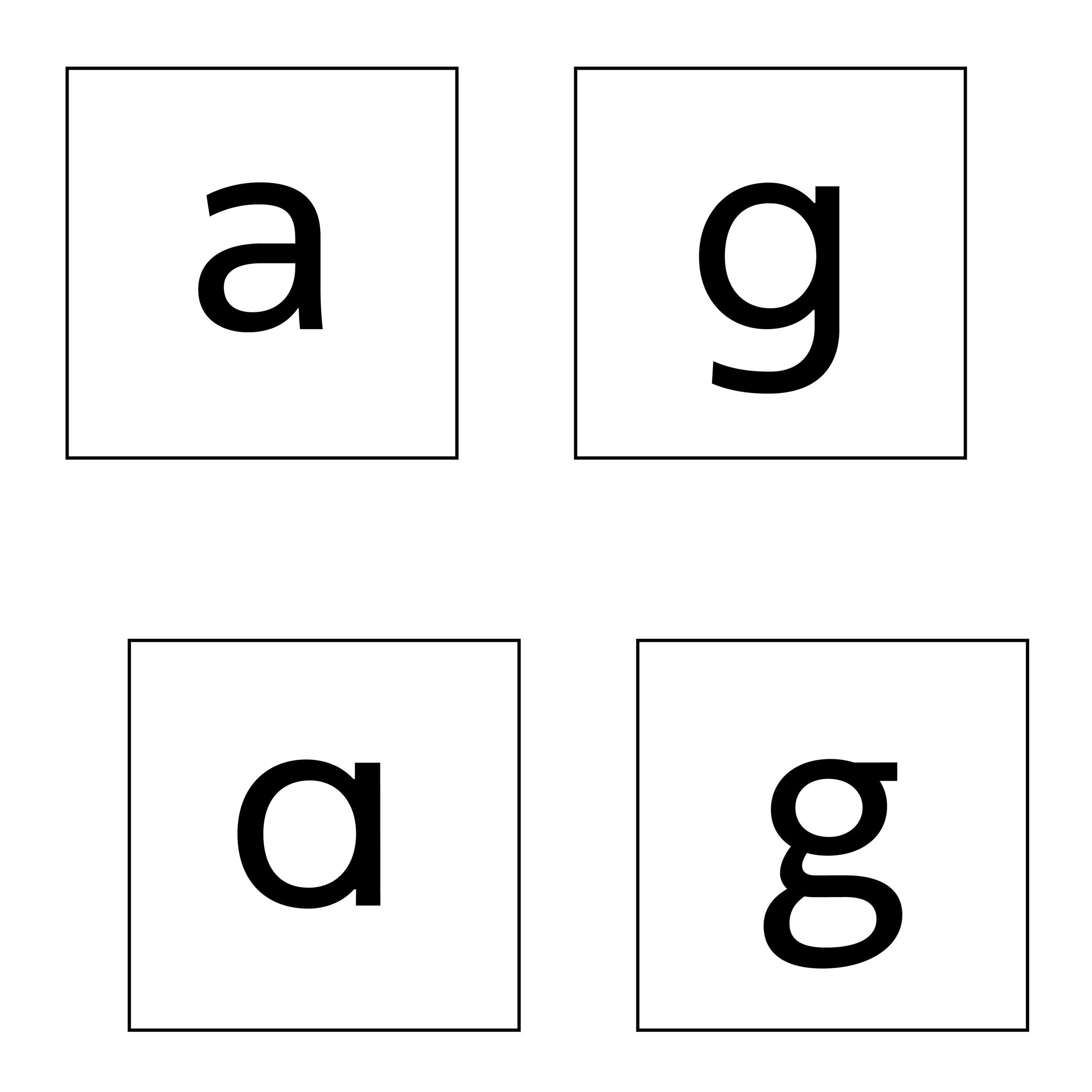
Sponsored by Typotheque . Typeface in use: Zed Text , designed by Peter Biľak, 2024.
(Read More)Latin letters a and g can be represented with two different constructions:
- single storey, for modern and/or geometric styles;
- double storey, for traditional and/or classical styles.
In some typefaces, both constructions are available, as designers feel that some users prefer one over the other.
The letter g can also be designed with a half storey construction, often seen in Scandinavian designs as a legacy from Danish street signs.
Skeleton
Illustration: Pauline Fourest (Spaghetype ).
(Read More)Many terms are borrowed from architecture or human and animal anatomy to designate and describe parts of letters and other characters. We even speak of type design anatomy.
The skeleton is the center line around which every part of a glyph is built (weight, contrast, curvature, terminals, etc.). Keeping the skeleton the same across multiple styles of one typeface family is, by definition, keeping the same structure, which is one of the principal ways to maintain design consistency.
Slash
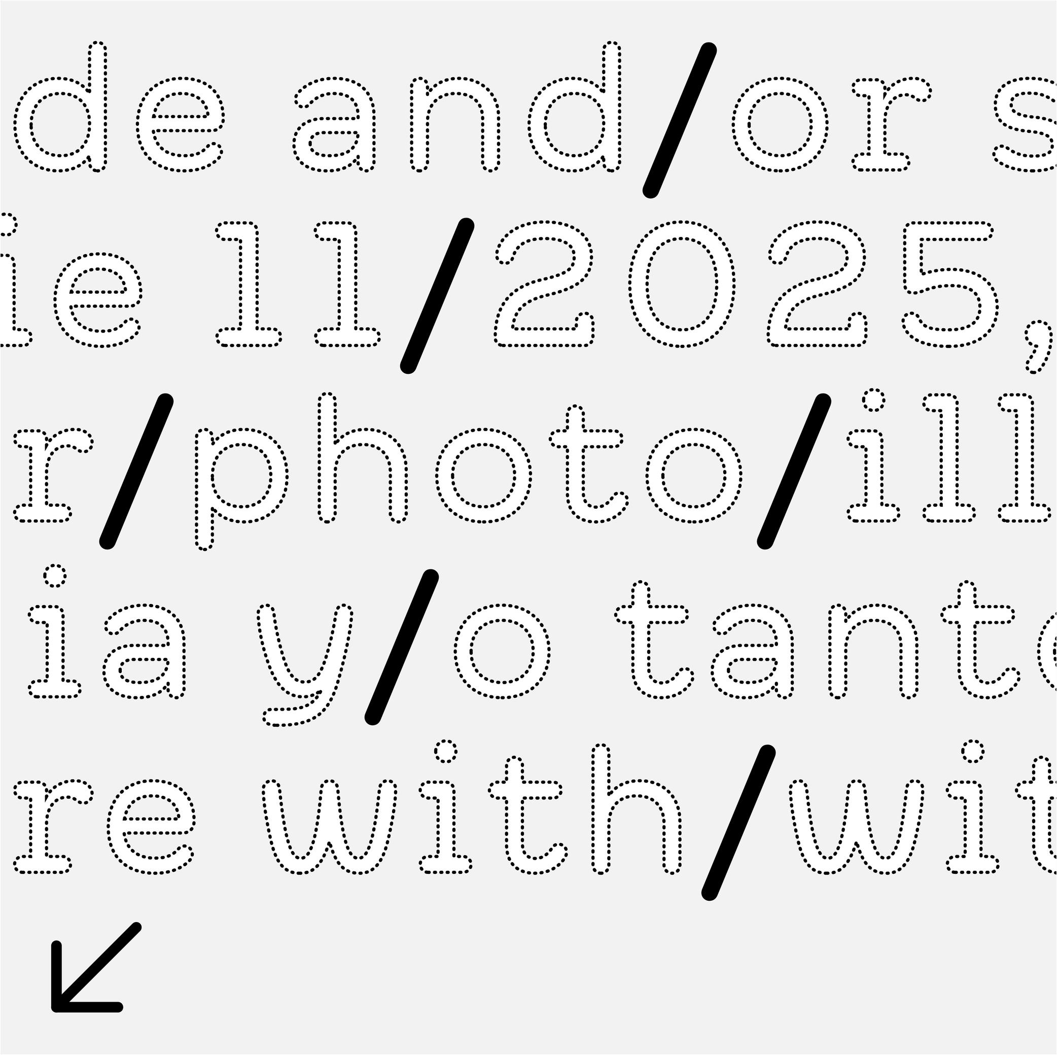
Sponsor Word of Type and feature your typeface in this card with a linked caption. Contact us for more information.
(Read More)FUNCTION
The slash (also called solidus) is used between two alternatives (in/or), as a date separator (2023/24) or, as a more recent use, to list someone’s job titles (designer/photographer/writer/…), generally in short or informative texts. In longer texts, it is better to avoid using a slash and write a complete sentence instead.
DESIGN
The slash is a line with a forward-leaning slope that goes from the capital height (in the Latin script) all the way to the baseline (or below for better visualization).
TYPOGRAPHY RULES
Most languages don’t usually use a space before or after the slash.
Small Caps
 (Read More)
FUNCTION
Small Capitals, or commonly just Small Caps, are letters with a capital letter structure but smaller in size (hence the name).
USAGE
They are used in texts when there are many capital letters together (initials, abbreviations, acronyms, Roman figures or all caps words in texts). In traditional typesetting where a new chapter starts with an initial or drop cap, the other letters of the first word or the entire first line can also be set in small caps to ease out the change towards the following text in lowercase.
HISTORY
The use of small caps started to be popular during metal type printing, as they added an additional option to the typographic palette, while keeping the same typeface.
Today, small caps are not present in every digital Latin typeface (they have their own Unicode values and are not in every Latin character set), as using small caps was more common in the ‘Latin’ world and used in traditional typography.
Some text processing or design applications can automatically generate small caps by scaling down capitals letters (just like they can do the same for italic or bold styles), but this is not advised for high quality typography, as the weight relation is much lighter.
DESIGN
Small caps have no precise height proportions compared to the capitals or lowercase, but a good ratio sits between these two heights.
Their weight and contrast should match those of the lowercase, and their height/width proportions are usually slightly wider than simply scaled-down capitals.
Space
Illustration: Jonny Wan .
(Read More)FUNCTION
For many writing systems (but not all), spaces separate words. Like punctuation symbols, they bring rhythm and clarity to a text and help with the reading experience. In the Latin script, several spaces with different widths are used for various situations (see Typographic Rules below).
HISTORY
In Ancient Latin, Roman capitals had no spaces between words. In some monuments, dots could be placed at middle height to help identify the words. In Europe, with the adoption of the Latin script, they started to appear in calligraphed manuscripts to help the readers identify the different words.
During the metal type printing era, blank pieces of lead were used as spaces between words. There were multiple widths for word spaces to help arrange text lines with precise length (em space, thin space, etc.). They lead to various rules in various languages and typographic traditions.
Nowadays, texts in the digital realm still make use of a variety of spaces for different situations in different languages, and also to offer different typographic options.
DESIGN
Spaces shouldn’t be too wide or too narrow. In Latin script based languages, a common convention is to set the width of the generic space glyph (U+0020) similar to that of the letter I or i.
TYPOGRAPHIC RULES
Many languages—including those commonly using the Latin script—have specific typographic rules.
One example: in French, before a question mark, exclamation mark, semi-colon or colon, there is a non-breaking space, whereas there isn’t any in English or other languages.
In digital typesetting, there are variable word spaces, breaking and non-breaking spaces, which give the text processing application the information on whether the width of the space can be adjusted or if the text line can or can not be broken at a specific place.
Spacing
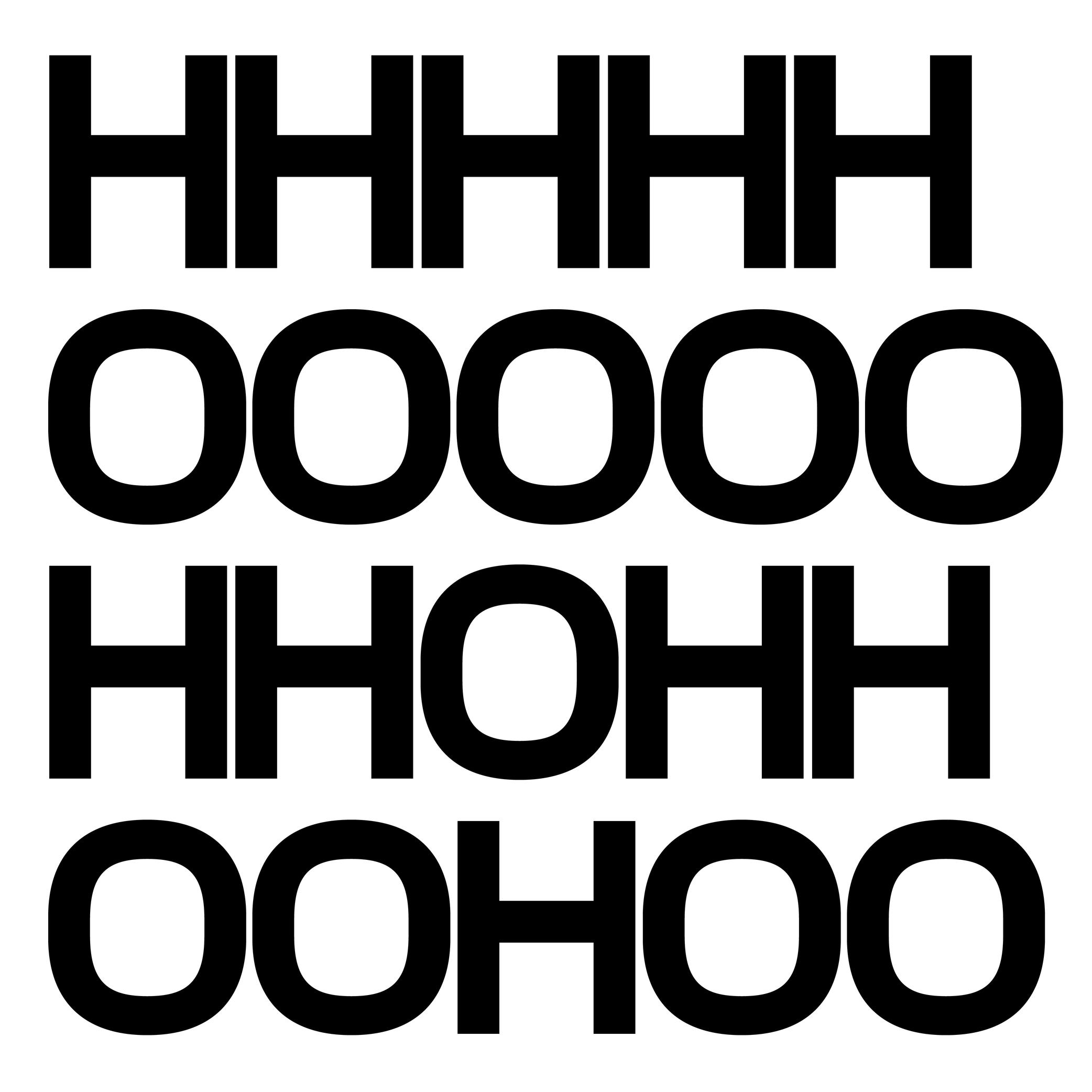
Sponsored by Production Type . Typeface in use: Media Sans , designed by Jean-Baptiste Levée, 2018.
(Read More)Spacing is the space around a glyph, defined by its side bearings (on the left and right side for a script written horizontally). Managing side bearings values is also referred as “managing the spacing.”
It controls the distance between glyphs and helps yo maintain a consistent rhythm and legibility once set in texts, making it an important aspect of a typeface’s quality.Spacing can be adjusted manually, or with the help of coding scripts. Glyphs with similar shapes are often grouped into groups so their side bearings can be adjusted collectively: for example, o, d, c, e, q can often share the same left side bearing group. This ensures consistency and speeds up the spacing process across a typeface.
FONT ENGINEERING HINT
Side bearing values are stored in the hmtx (Horizontal Metrics) table for scripts written horizontally, and in vmtx (Vertical Metrics) for scripts written vertically.
Specimen
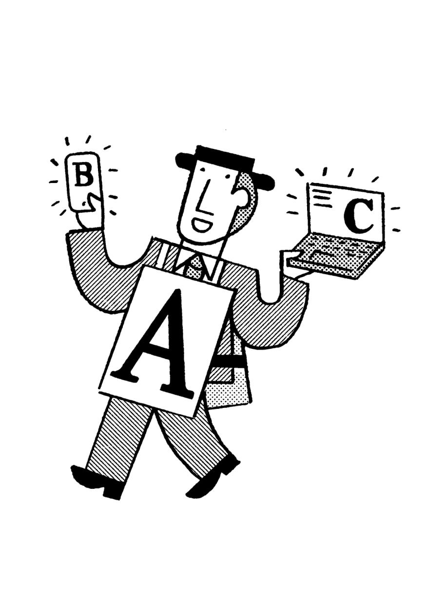
Illustration: Jay Cover .
(Read More)A specimen is a visual sample document published by type foundries that showcases a typeface, its glyph set, text settings in different sizes, Opentype features, etc.
A collection of specimens of different typefaces bound together is called a typeface catalog.Spine (in editorial design)
(Read More)The spine is the side of a printed object (book, brochure, etc.) which is bound.
Spine (in type design)
Sponsor Word of Type and feature your typeface in this card with a linked caption. Contact us for more information.
(Read More)Many terms are borrowed from architecture or human and animal anatomy to designate and describe parts of letters and other characters. We even speak of type design anatomy.
In the Latin script, the spine is the middle curve segment of characters like s or S.
Static Font
Illustration: Words of Type. Typeface in use: Knowledge Round, designed by Lisa Huang, 2024.
(Read More)A static font is an independent font file containing a typeface in a single, predefined style (e.g., Regular, Bold, Italic).
In contrast, a variable font contains data to display and generate an infinite amount of styles.
Stem
Sponsored by Blaze Type . Typeface in use: Rules , designed by Matthieu Salvaggio, Léon Hugues, Tim Vanhille, and Guido Ferreyra, 2024.
(Read More)Many terms are borrowed from architecture or human and animal anatomy to designate and describe parts of letters and other characters. We even speak of type design anatomy.
In many writing systems, a glyph’s stem refers to its vertical bar(s) or stroke(s).
Stroke
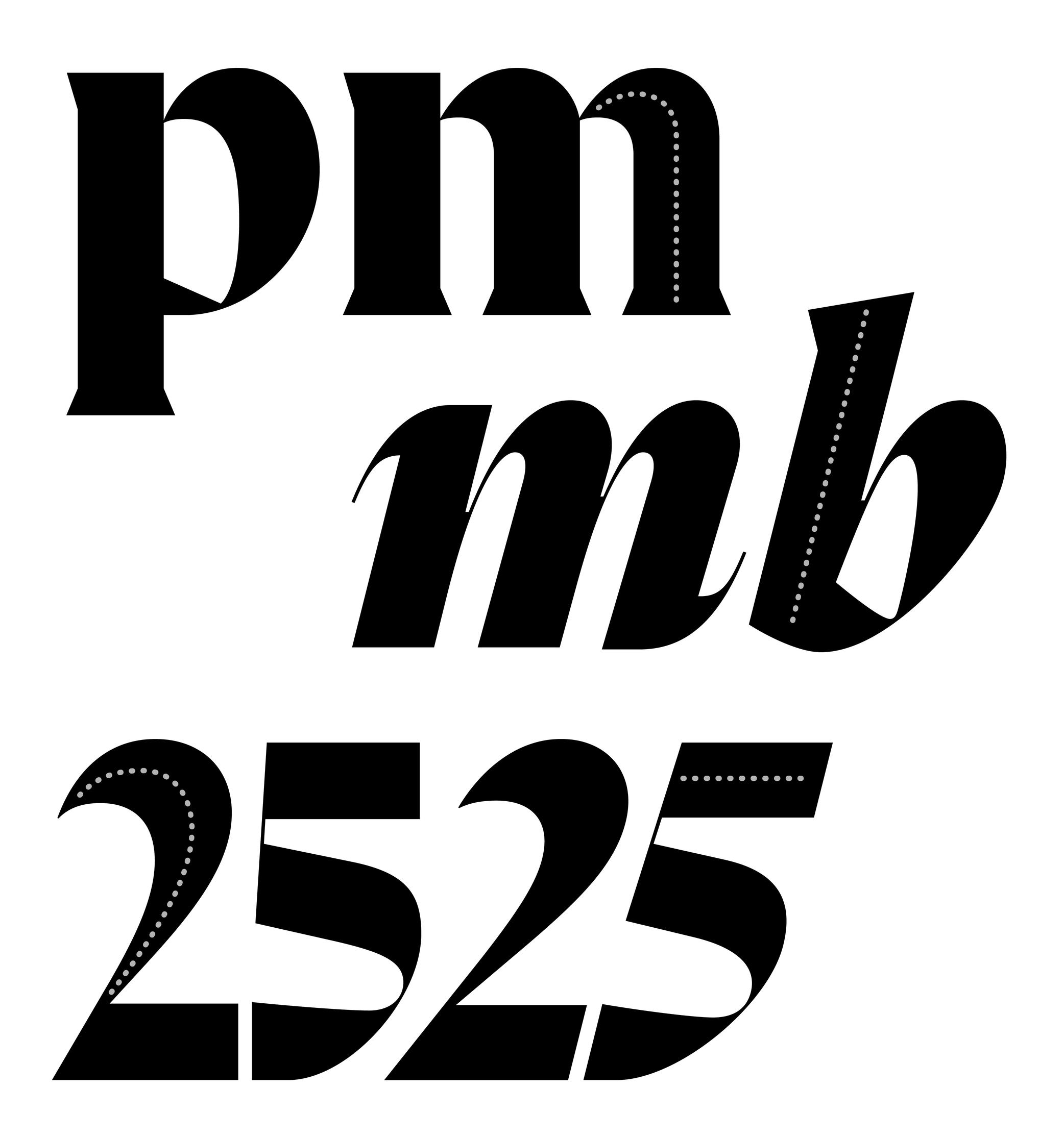
Sponsored by R-Typography . Typeface in use: Flecha , designed by Rui Abreu, 2019.
(Read More)Letters, characters, and other glyphs are written with strokes. Their shapes and writing direction come from how they were traced by hand with the many tools humanity used for writing.
Structure
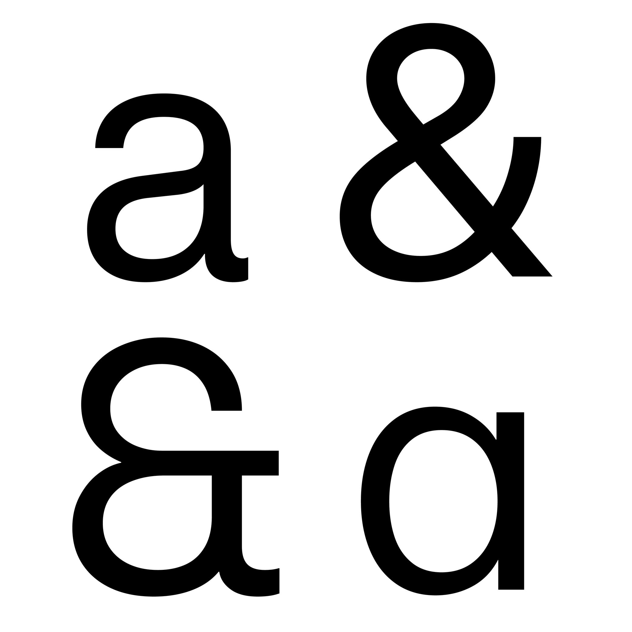
Sponsored by Blaze Type . Typeface in use: Fusion Neue , designed by Matthieu Salvaggio, Tim Vanhille, and Ferdinan Del Fabro, 2024.
(Read More)Every glyph of every writing system follows a specific structure for its parts (positioning of the strokes in relation to each other). People reading words and texts in a given script would recognize the glyphs (letters, characters, symbols, etc.) if their structure follows a convention that is familiar to all of users.
Due to the evolution of each script, the structure can change over time (e.g., Fraktur styles), or have multiple variants (e.g., single and double storey a).
Style
Illustration: Pauline Fourest (Spaghetype ).
(Read More)In any writing system, typefaces exist in an infinite number and variety of styles. They are influenced by many factors, such as technology, tools, necessity, and trends. But some of them are (or can be) grouped into categories for their similarities, into classification systems (sans serif, serif, humanist or geometric, etc.).
In the Latin script, we also identify Roman (or upright) and Italic as two ‘companion’ styles of the same typeface style.
Substitution
(Read More)Glyph substitution is the process that automatically replaces one glyph with another based on specific rules or features existing in the font. It enables advanced typographic behavior within the font, such as contextual, stylistic, or language-specific variations (e.g. small caps, ligatures, alternate forms).
This mechanism is a cornerstone of the OpenType format, as it allows a single font file to contain multiple visual variations and apply them automatically depending on the context, language, or user’s choice. Without it, a font file would function more like with earlier formats: just a container for static outlines.
FONT ENGINEERING HINT
In OpenType fonts, glyph substitution is handled by the GSUB (Glyph Substitution) table. It defines which glyphs can replace others under specific conditions. Substitutions can be triggered automatically by an application, or manually if a user activates its OpenType features.
Swash
Sponsored by Blaze Type . Typeface in use: Sigurd , designed by Matthieu Salvaggio and Léon Hugues, 2021.
(Read More)Swashes are the elongated extensions of letters, designed with longer strokes than their “usual” construction, most generally as a decorative feature and/or in display style typefaces.
HISTORY
They appeared during the metal type era in the Latin world, when swashed letters served as decorative features to the text. They were also a way to showcase the punch-cutters’ skills, sometimes with incredibly long and elaborate swashes.
Swashes still have the same purpose today in digital typefaces, where “normal” letters are the default ones and swashes can be activated as alternates from the typefaces’ features (if available).Synthetic Font
(Read More)A synthetic font refers to a style generated by a text processing software when the requested style isn’t available in the installed font (e.g., a fake bold, italic, or small caps).
For example: if a document or a web page requests Arial Italic but only Arial Regular is installed, the system might slant the Regular font to create its synthetic Italic.
System Font
(Read More)Digital devices need to always have fonts installed in its system, called system fonts, to be able to display textual information on its screen.
Every device manufacturer and/or seller has its own library of system fonts, which support (in the best situations) every script that is eventually used.
Tabular Figures
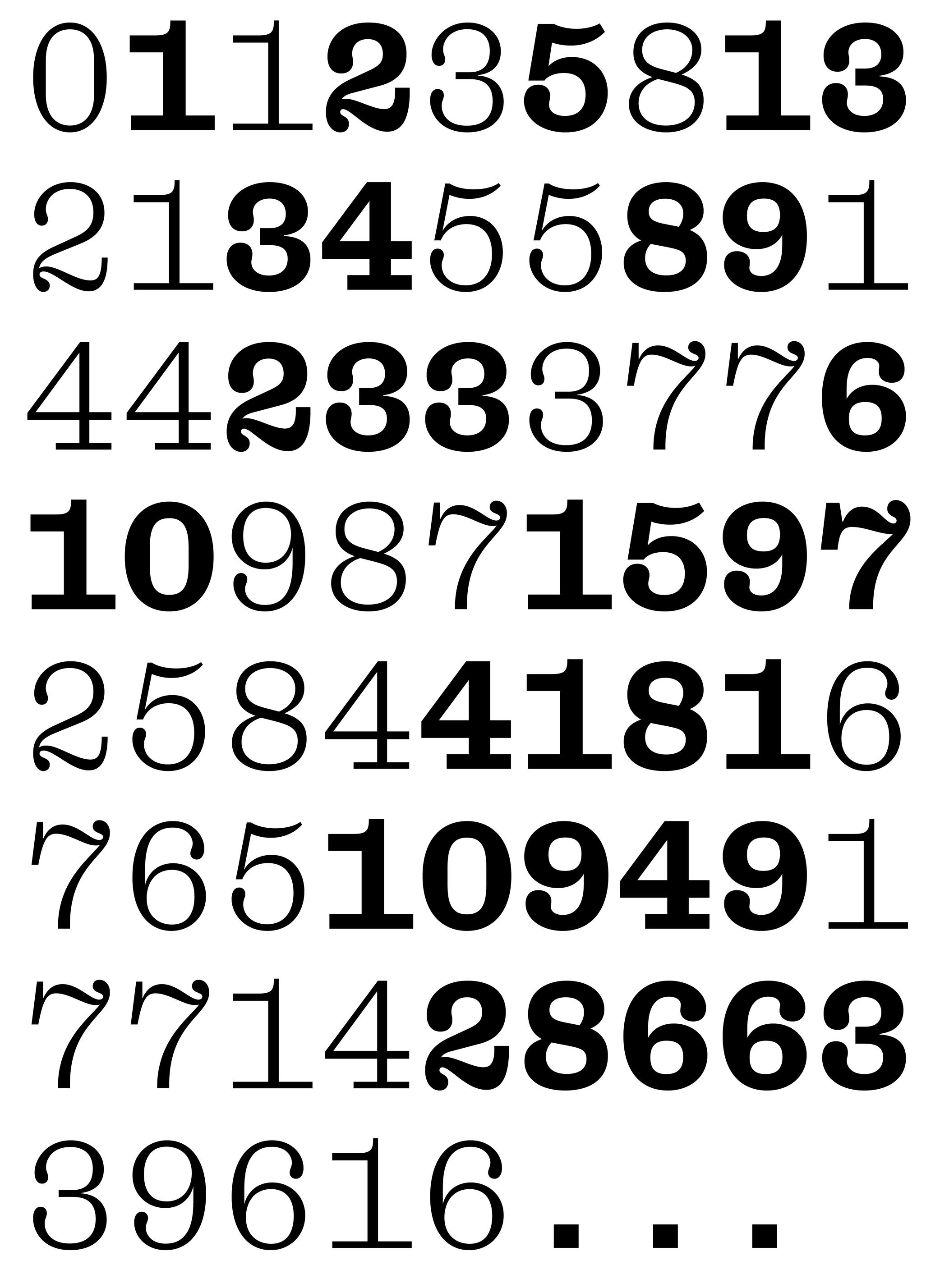
Sponsored by Dinamo . Typeface in use: Daily Slab , designed by Fabian Harb and Michelangelo Nigra, 2024.
(Read More)Tabular figures are designed to fit in the same uniform width frame, making them suitable to be used in tables, and this helps identify the numbers more easily and clearly.
Tail
Sponsor Word of Type and feature your typeface in this card with a linked caption. Contact us for more information.
(Read More)Many terms are borrowed from architecture or human and animal anatomy to designate and describe parts of letters and other characters. We even speak of type design anatomy.
In the Latin script, the tail is a terminal part at the bottom of letters like t, y or Q.
Template
Illustration: Raven Mo .
(Read More)A template serves as a model for typography and typesetting. Like a reference guideline, it helps with the composition of the elements in a page (images, texts, spaces, grids, etc.), printed or on screen, to create a coherent and consistent document with specific design characteristics.
Terminal
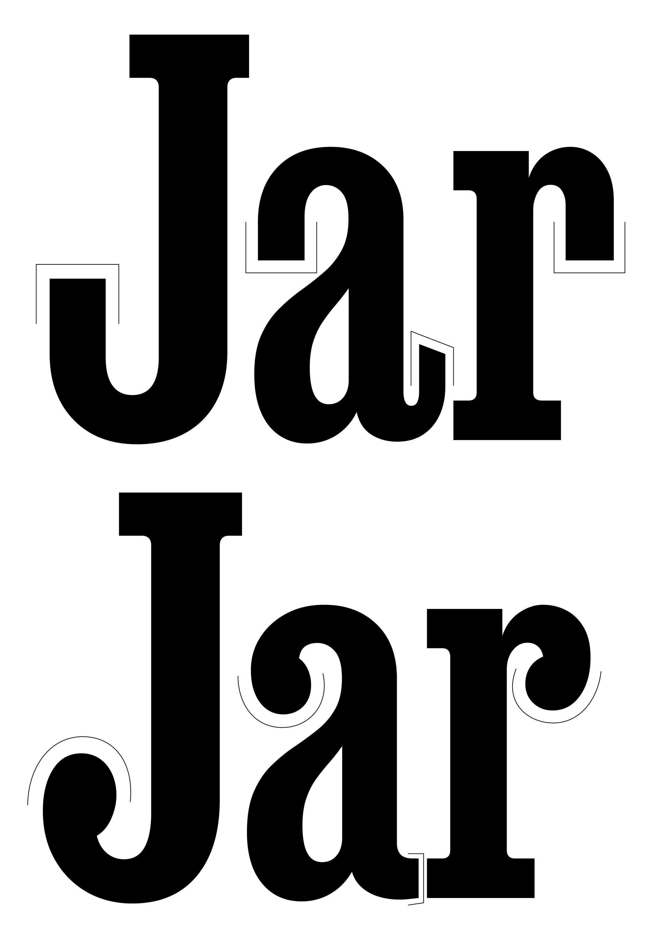
Sponsored by DJR . Typeface in use: Job Clarendon , designed by David Jonathan Ross, 2023.
(Read More)Many terms are borrowed from architecture or human and animal anatomy to designate and describe parts of letters and other characters. We even speak of type design anatomy.
The terminal of a character is its very last part, according to its ductus. The shape of the terminal can vary depending on the style of the typeface, with names that ‘feel’ most suited to its shape (drop, ear, serif, etc.).
Thick
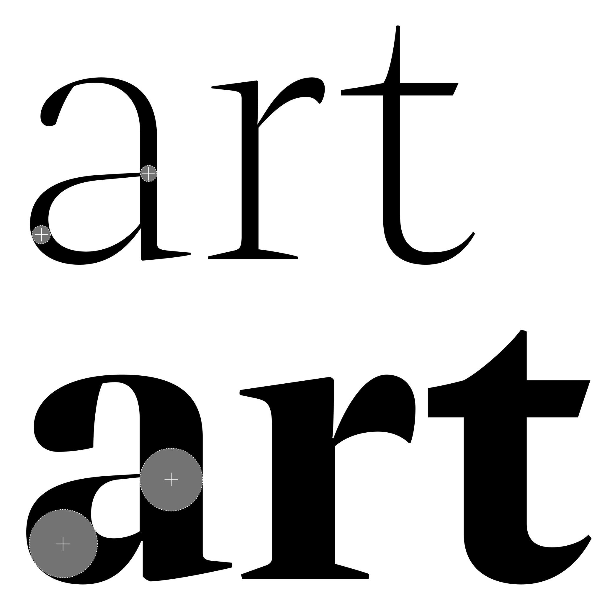 (Read More)
The thickest part(s) of a glyph is called the thick. The opposite is the thin, and the relation between thick and thin is called the contrast.
Thin
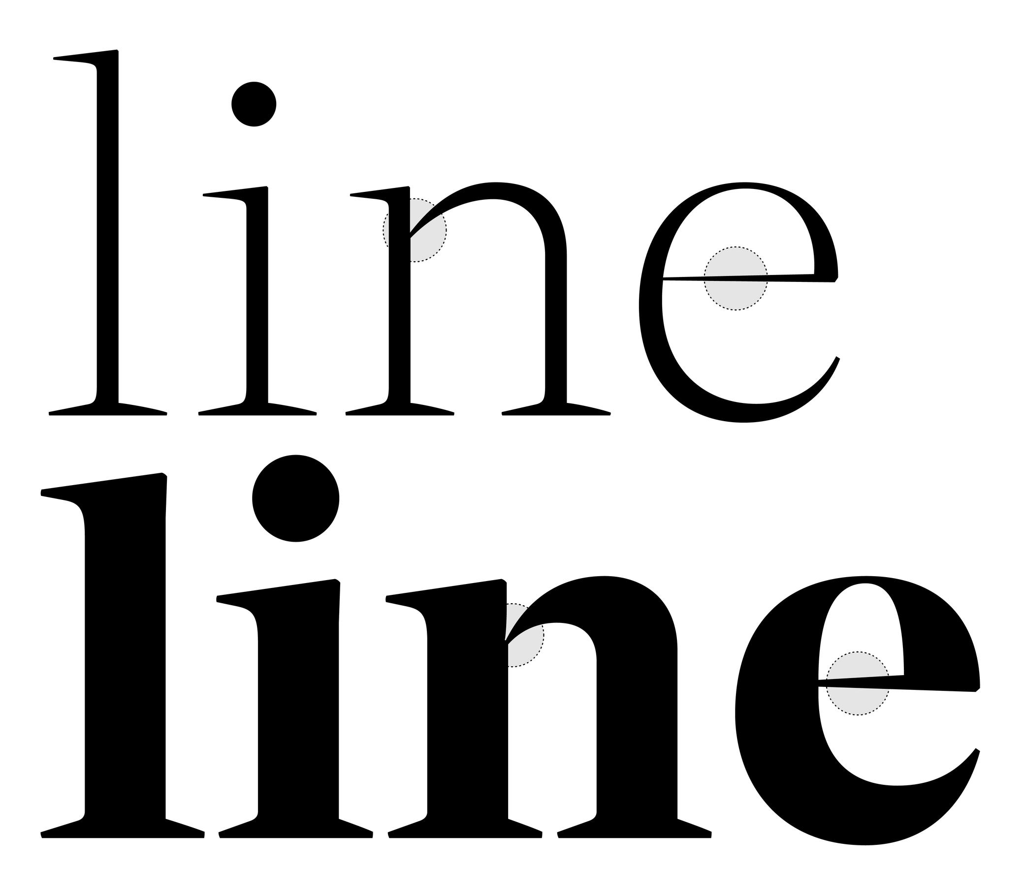 (Read More)
The thinnest part(s) of a glyph is called the thin. The opposite is the thick, and the relation between thick and thin is called the contrast.
Tofu
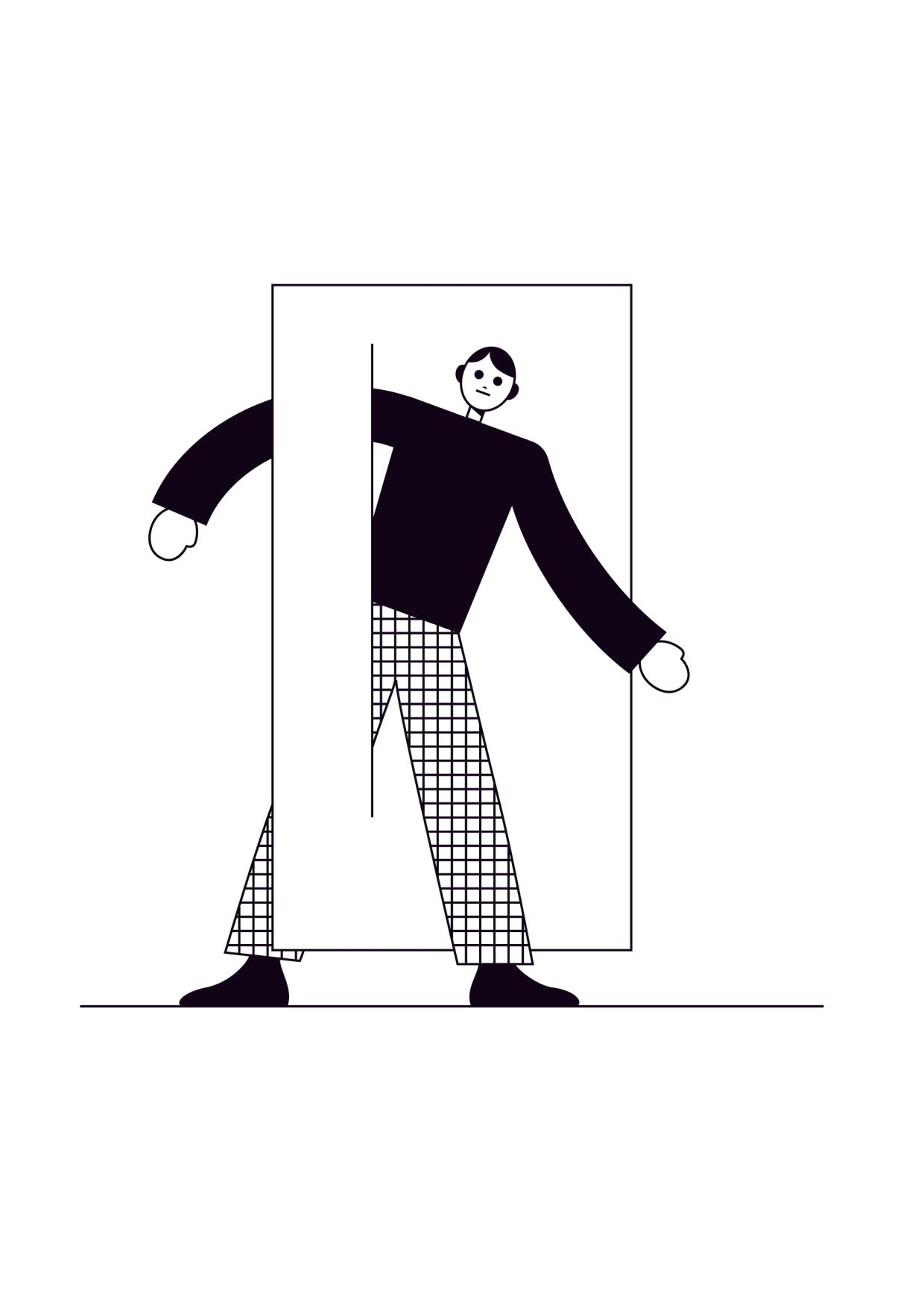
Illustration: James Graham .
(Read More)Tofu is the placeholder symbol that appears when a character cannot be displayed because the font in use doesn’t support it (not existing in the font). Instead of the intended glyph, the reader sees a small rectangle—often empty or filled with a cross, question mark, or other marker.
THE NAME
The word tofu comes from the visual resemblance of the small blank rectangles to blocks of tofu.
AVOIDING TOFUS
To avoid showing a tofu, operating systems implement font fallback mechanisms to replace the missing glyph. If no suitable glyph is found in any available font, then the tofu placeholder is displayed. Sometimes, an entire script can be missing, resulting in a display of long lines of tofus.
Several initiatives exist to reduce the display of tofus. Apple developed the Last Resort font (first available in Mac OS 8.5 in 1998), which displays symbols representing the script and Unicode blocks of missing characters. This helps users to identify which character are missing. Adobe and Google created the Noto (named from “no tofu” expression, first published in 2013) typeface family to provide a coverage for all existing Unicode characters.
FONT ENGINEERING HINT
This fallback system is layered and can sometimes be confusing:
• tofu is what the users see; .notdef is the name of the glyph in fonts. As per the OpenType specifications, every font must contain a .notdef glyph as the first glyph (index 0). Since this glyph isn’t a character, it is not assigned a Unicode code point and therefore doesn’t appear in the cmap (Character-to-Glyph Mapping) table. If a shaping or rendering engine can’t find a glyph for a requested code point in the cmap, it falls back to glyph index 0.
• some environments always substitute the .notdef glyph from the selected font. Others instead use a system-supplied .notdef from a dedicated fallback font (like the Last Resort font), so the tofu can always appear with a consistent design in that environment.
• certain applications (like Adobe InDesign) bypass system font fallback entirely and always display the .notdef glyph from the active font when a glyph is missing.Tracking
Sponsored by Commercial Type . Typeface in use: Control , designed by Christian Schwartz and Miguel Reyes, with contributions by Hrvoje Živčić, after Walter Käch and Jan Van Dijk, 2024.
(Read More)Fonts have spacing values for all glyphs that are defined by its designer.
If glyphs are too loose or too close to the needs (or taste) of the user, the spacing can be modified in most application tools for texts. It is called “to adjust the tracking.”Trial
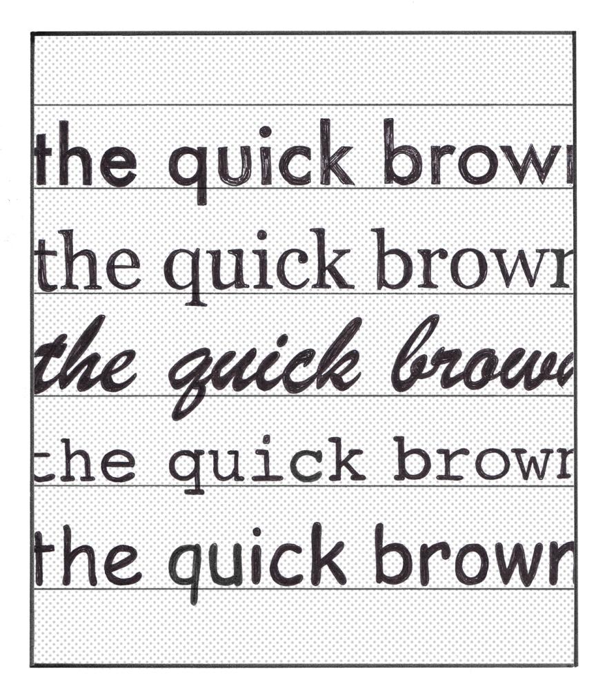
Illustration: Chloe Kendall .
(Read More)Most type foundries and other font distributors offer today the possibility to get a trial of a typeface, which allows the user to try it for free before deciding to buy its license or not. Their conditions of usage are limited to trying the typeface only, listed in a specific trial EULA. In general, foundries share their trials with a limited amount of glyphs and/or features, enough to give an idea of how the typeface looks in a given situation.
TrueType (format)
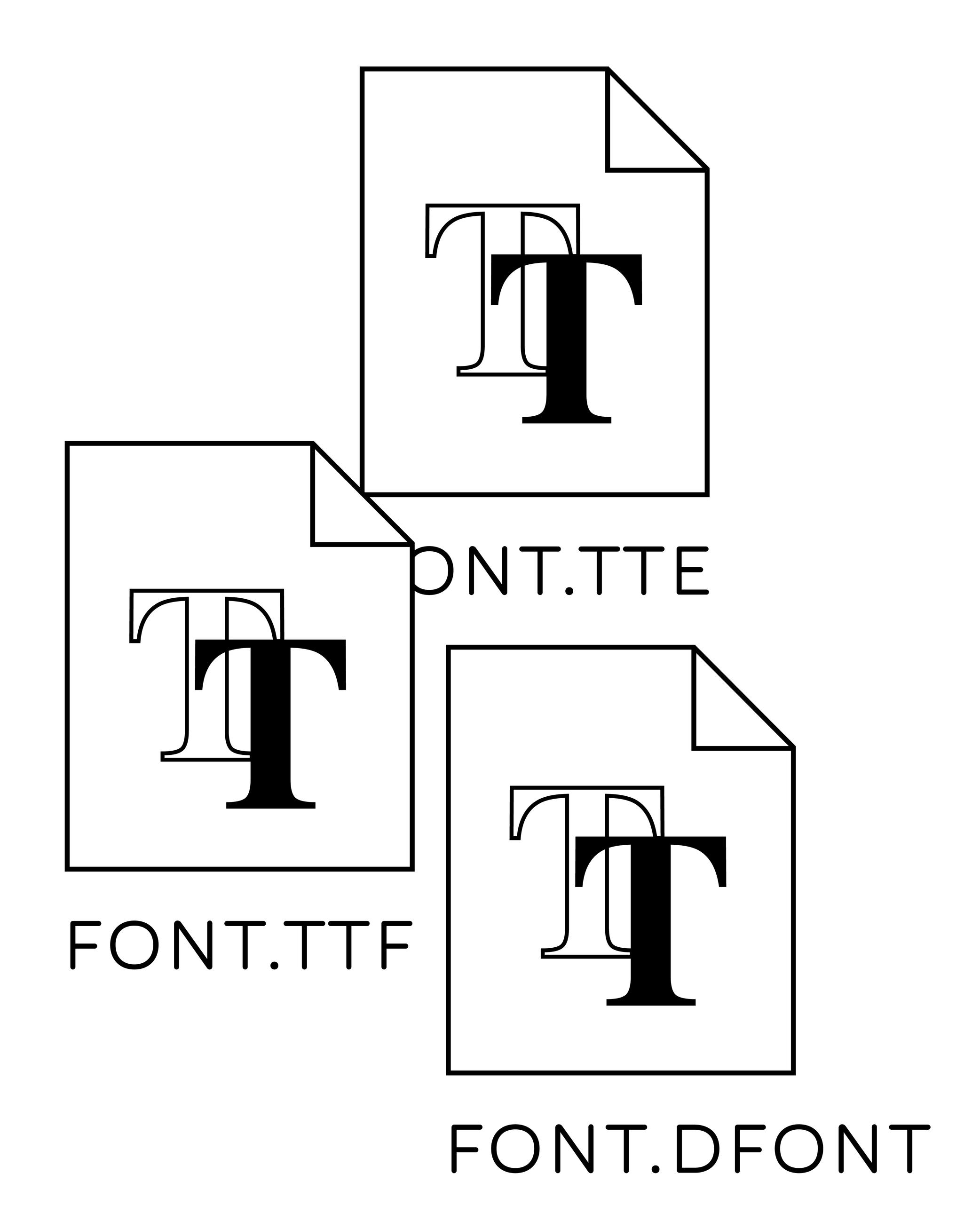
Illustration: Words of Type.
(Read More)TrueType is one of the formats for font files, alongside PostScript and OpenType formats.
HISTORY
TrueType format has been originally created by Apple in the early 1990s for Mac OS and Windows. It was developed after Adobe’s PostScript fonts.
TrueType uses quadratic Bézier curves, which were historically faster to calculate and render than PostScript’s cubic curves. Unlike PostScript fonts—which often required multiple files—installing a single TrueType font is enough to use it.Opentype-TrueType (OTF-TTF) TrueType outlines can also be packaged inside an OpenType container, allowing them to use OpenType features while retaining quadratic outlines. Files using this container still use the “.ttf” extension. PostScript outlines in OpenType containers use “.otf.”
Type Foundry
Illustration: Pauline Fourest (Spaghetype ).
(Read More)A type foundry is a design studio that produces and/or publishes retail typefaces, designs custom typefaces or does various activities related to type design (logotype designs, consultancy, etc.).
We inherited the term “foundry” from companies that produced fonts of metal type for printers. Back then, a font was a set of movable metal pieces of type in one size. Those metal pieces (one per glyph) were produced by melting an alloy of lead and other metals, which would be poured into a mold to produce multiple copies of one letterform or other character. Fondre is the French verb for “to melt.”
Typeface
Illustration: Erik van Blokland .
(Read More)A typeface is a set of glyphs designed with a particular intention (and/or style).
A typeface family can gather multiple styles with their individual particularity (weight, width, contrast, etc.) but keep common traits specific to the same group.
Not to confuse with font or typography.
Typeface Design
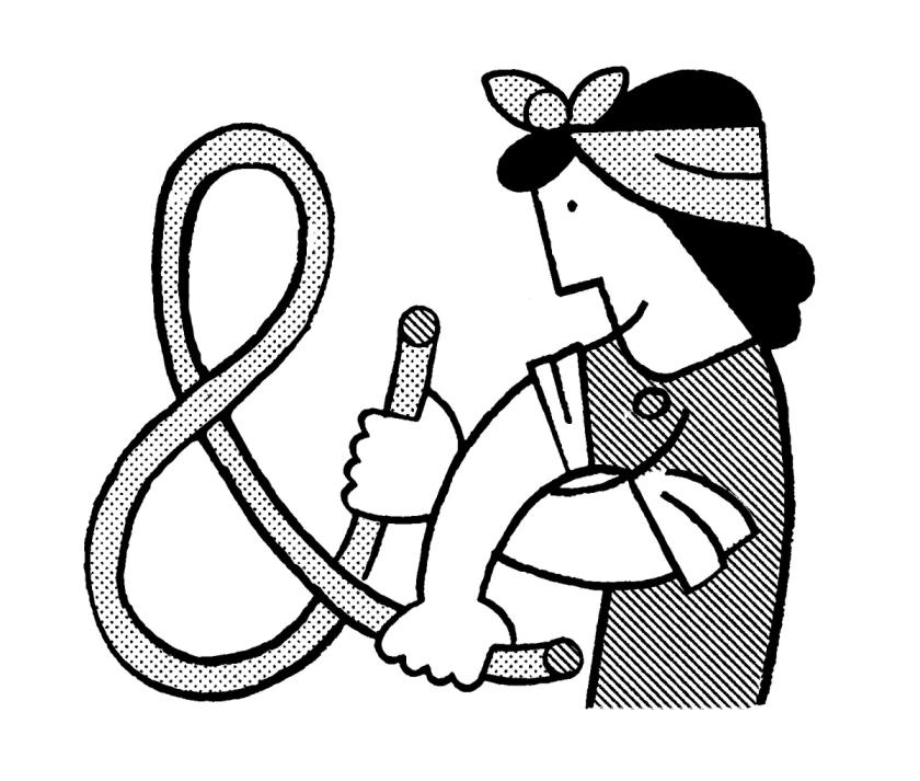
Illustration: Jay Cover .
(Read More)Typeface Design (or type design for short) is the practice of designing typefaces.
It is about designing every part and aspect of a typeface, from drawing the shapes of the glyphs (letters, characters, figures, symbols, and so on) to setting the specifications such as spacing, kerning, and hinting. The person doing type design is called a type designer.
Not to be confused with typography.
Typography
Illustration: Jay Cover .
(Read More)Typography (or typesetting) is the practice of assembling text elements in a design composition by defining multiple aspects such as the ratio between text columns and white spaces, choosing and using typefaces, setting their styles and sizes for all categories of texts, leading, justification style, and hyphenation, etc.
The person practicing typography is called a typographer.
Not to be confused with Typeface Design.
Underscore
Sponsor Word of Type and feature your typeface in this card with a linked caption. Contact us for more information.
(Read More)FUNCTION
The underscore is essentially used today as a marker to separate words whenever spaces are not valid (URLs or email addresses, file names, etc.).
HISTORY
In European book publishing conventions, to underscore a word or sentence in a manuscript was meant to inform the typographer and/or printer to set it in italic (or in roman) style.
The symbol has been kept on typewriters and our contemporary keyboards for various uses in different languages, as an individual sign instead of being a mark combined with other glyphs.
DESIGN
The underscore is a dash-like glyph placed below the baseline and has (usually) the length of the en dash.
TYPOGRAPHIC RULES
There is no space on both sides of the underscore.
NOT TO BE CONFUSED
Commonly, we call this glyph the underscore. But, its ‘proper’ name should be the low line (as it is called in the Unicode naming with its correct code), because the underscore (U+0332) is a combining diacritic symbol used in multiple African and Native American languages.
Unicode
Illustration: Words of Type. Typeface in use: Knowledge Round, designed by Lisa Huang, 2024.
(Read More)Unicode is an international standard for encoding characters, signs, and symbols used in digital devices worldwide.
Developed by the Unicode Consortium—a non-profit organisation with international members—Unicode assigns a unique code (or code point) to each character of as many written languages as possible. More characters and/or more scripts are added almost every year, presented to the organisation members, who research and discuss thoroughly about the relevance of adding them to the Unicode standard. These codes are used by digital systems to ensure consistent and stable exchange of texts across platforms and devices.
FONT ENGINEERING HINT
In font files, Unicode code points are mapped to glyphs through the cmap table (Character to Glyph Mapping). This allows software to know which glyph to display for a given character code. Not all glyphs in a font must be assigned with a Unicode code point; some may exist only for stylistic or contextual substitution purposes.
Unit
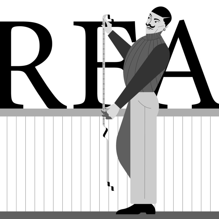
Illustration: Jonny Wan .
(Read More)Font sizes are measured using a specific type of unit called points (pt).
Over the years and across regions, various units have been used (mainly for the Latin script), such as Didot, Cicéro, Pica, or even inches.
HISTORY
The term “em” originally comes from metal type: it was the width of the point-size square of a given type. The em square contains the body of the glyph (from the bottom of the descender to the top of the ascender) plus the space around it.
DIGITAL TYPE DESIGN
In digital type design, fonts are drawn in an imaginary box with a grid, called the em square. It defines the space in which all glyphs of a typeface are designed.
This square is subdivided into abstract units (literally called “units”). These units are scalable, so their actual size in pixels or points depends on the resolution of the screen and the chosen font size.
The height of the square is defined by UPM (Units per Em). For example, if UPM = 1000, the em square is 1000 units high. Outlines, spacing, and metrics are all defined relative to this square. For example, in a 1000-unit em square, the ascender height might be 700 units.WEB DESIGN
The em also became a unit for digital layout. In web design, 1 em equals the font size of the active element. If the font size is 16 px, then 1 em = 16 px. A child element with font-size: 2em would render at 32 px.
PRINT
In traditional print typography, the em square is converted into the chosen point size, linking the abstract design units to physical measurements.
FONT ENGINEERING HINT
The em square is the internal coordinate system used by font files. When a font is rendered, the rasterizer scales the em square to the requested font size, converting the abstract units into pixels. For example, if the em square is 1000 UPM and the font is displayed at 16 px, each unit corresponds to 0.016 px. This makes hinting important, as it ensures shapes remain legible once mapped to the pixel grid.
Uniwidth
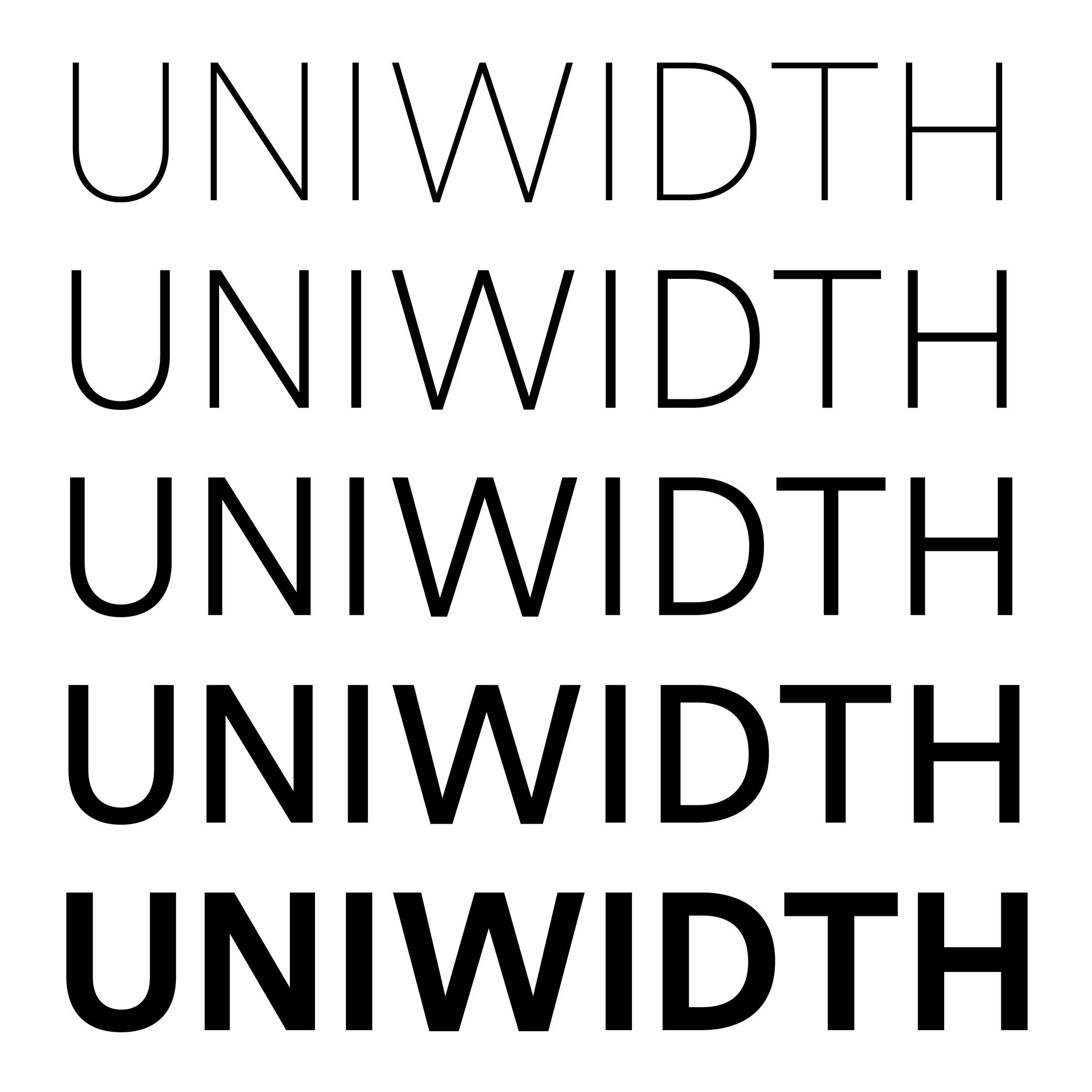
Sponsored by Frere-Jones Type . Typefaces in use: Retina , designed by Tobias Frere-Jones, 2016.
(Read More)ALSO CALLED
Multiplexed or Duplexed.
The term (in English) was brought up by Armenian and American type designer and teacher Hrant Papazian. Many people are still debating about which naming to choose...
In type design, the width and/or spacing of a glyph often changes depending on the weight or style to maintain visual balance. Uniwidth typefaces, however, keep the same horizontal metrics across all weights and styles of a family. It is not the same as monospace fonts, for which all glyphs share the same width—duplexed typefaces are still proportional.
This consistency facilitates digital typesetting, particularly when text changes in style dynamically (e.g., on hover or in interactive interfaces) without altering the layout.
Uppercase
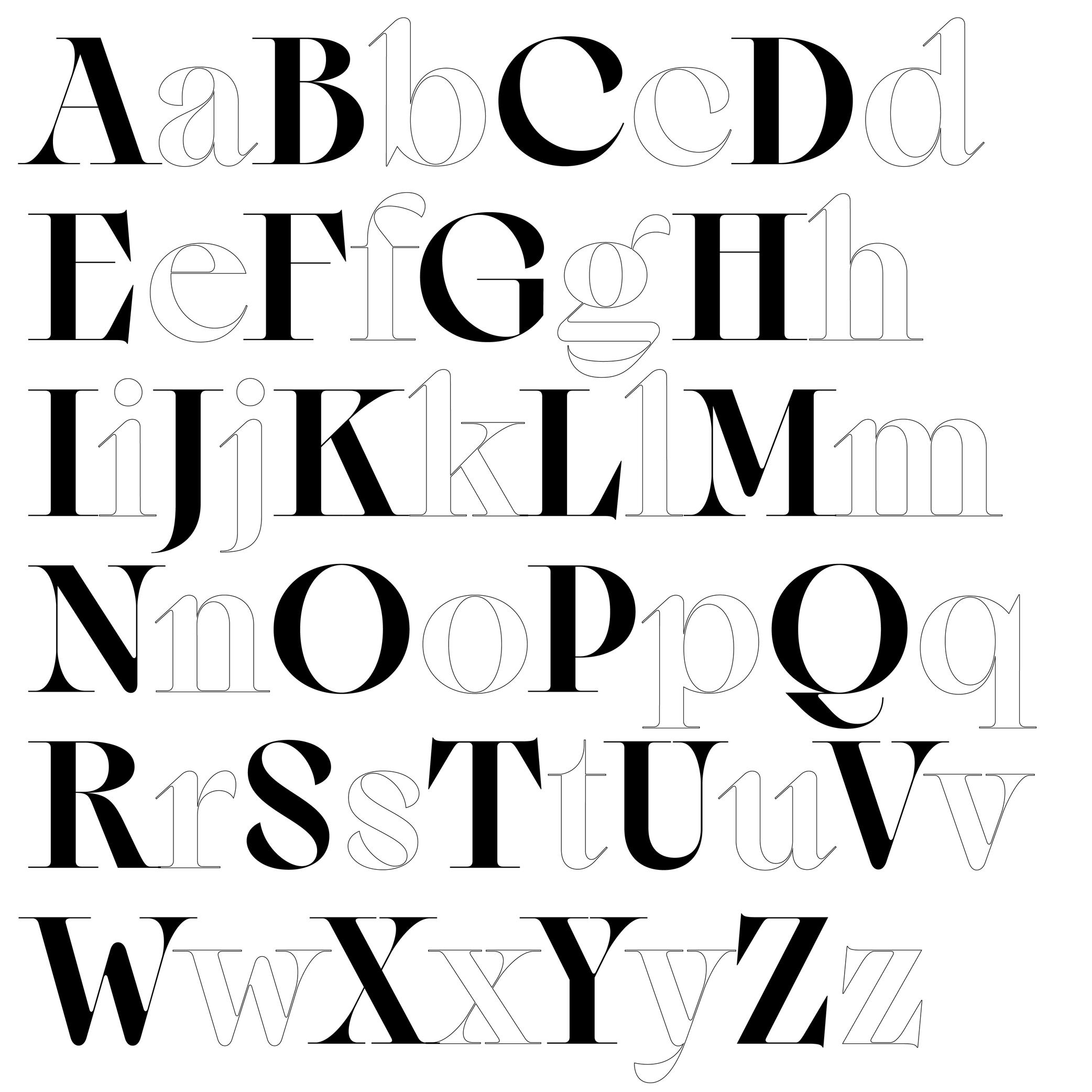
Sponsored by Blaze Type . Typeface in use: Sagittaire , designed by Valerio Monopoli, 2023.
(Read More)Uppercase (or capital letters) are the taller and larger variants of alphabetical letters, as opposed to lowercase letters (or minuscule).
Linguistically speaking, a capital is not to be confused with a majuscule, which is a capital letter with the specific function of being used at the beginning of a sentence or a word.
HISTORY
Capital letterforms derive from Phoenician and Greek alphabets when the Roman Empire started its influence over Europe around the 1st century.
During the Roman Empire, they were painted and/or carved in stone at large sizes for inscriptions on monuments, buildings, and tombstones (called Capitalis Monumentalis).
Through time, with the need to write faster, some shapes evolved, resulting in minuscule (lowercase) letters. But that didn’t make capital letters disappear. On the contrary, they kept coexisting with minuscules. Each has its own specific functions and looks very different, so using both allows a more comfortable reading experience.
The word ending with -case is a legacy from metal type printing when letters (or types) were sorted by categories into cases (one per glyph), themselves into drawers (one per font). Capitals were placed in the cases of the upper section of the drawers, minuscules were on the lower part.
Not to be confused with a majuscule letter.
Variable Font

Sponsored by Letterror . Typeface in use: (“Style”) Very Bauble , (“Weight”) Limited Grotesque , (“Width”) Principia . Designed by Erik van Blokland.
(Read More)A variable font file contains data for an entire typeface family and allows an unlimited number of style variations along one or more design axes.
It uses interpolation, so designers only need to draw key masters to automatically visualize and/or generate intermediate instances.
HISTORY
The concept began with Apple’s TrueType GX technology for QuickDraw GX. Adobe, Google, and Microsoft later developed it into the OpenType Variable Font format, officially announced in 2016. Today, variable fonts are widely used in digital media, especially for responsive and animated text.
BENEFITS
Unlike static fonts, where each file contains a single style, a variable font can generate any style between its masters using interpolation. This reduces the number of separate files needed, decreases overall file size, and allows precise control over weight, width, slant, or other axes. Users can install one variable font file and dynamically adjust styles in applications or responsive environments without switching files.
FONT ENGINEERING HINT
Variable fonts store one full master (the origin) and delta data describing other masters. The gvar (Glyph Variation) table is the heart of outline interpolation. Tables like cvar, MVAR, HVAR, and VVAR handle metrics, spacing, and alignment changes across the axes. FVAR, AVAR, and STAT define, normalize, and provide human-readable names for the variation axes and their instances.
Variation Axis
 (Read More)
A variation axis allows a continuous interpolation of outlines between at least two compatible sources (also called masters).
It is a trajectory between different states of a given shape. For example, the weight axis would shift points to adjust the stem thickness, allowing a transition from Thin to Bold styles.FONT ENGINEERING HINT
The OpenType Specification defines 5 standard axes: weight, width, optical size, italic, and slant.
Note that italic acts as a stylistic link between two styles rather than a true interpolation axis.
These guidelines serve as a reference for how axes should be implemented into a font.Variation axes are stored and referenced across several font tables:
• avar (Axis Variations): normalizes axis coordinates
• fvar (Font Variations): provides location coordinates for the instances
• STAT (Style Attributes): provides human-readable names for axes and their defined instancesVector
(Read More)A vector is a directional line defined by two points.
In digital graphics, vectors represent shapes mathematically rather than as pixels, making them fully scalable.
In digital type design, glyph outlines are built from vectors using Bézier curve technology. Each contour of a glyph is composed of connected vectors, allowing precise, editable, and scalable shapes. Type design applications rely on this vector-based system to create and manipulate glyphs.
Waist
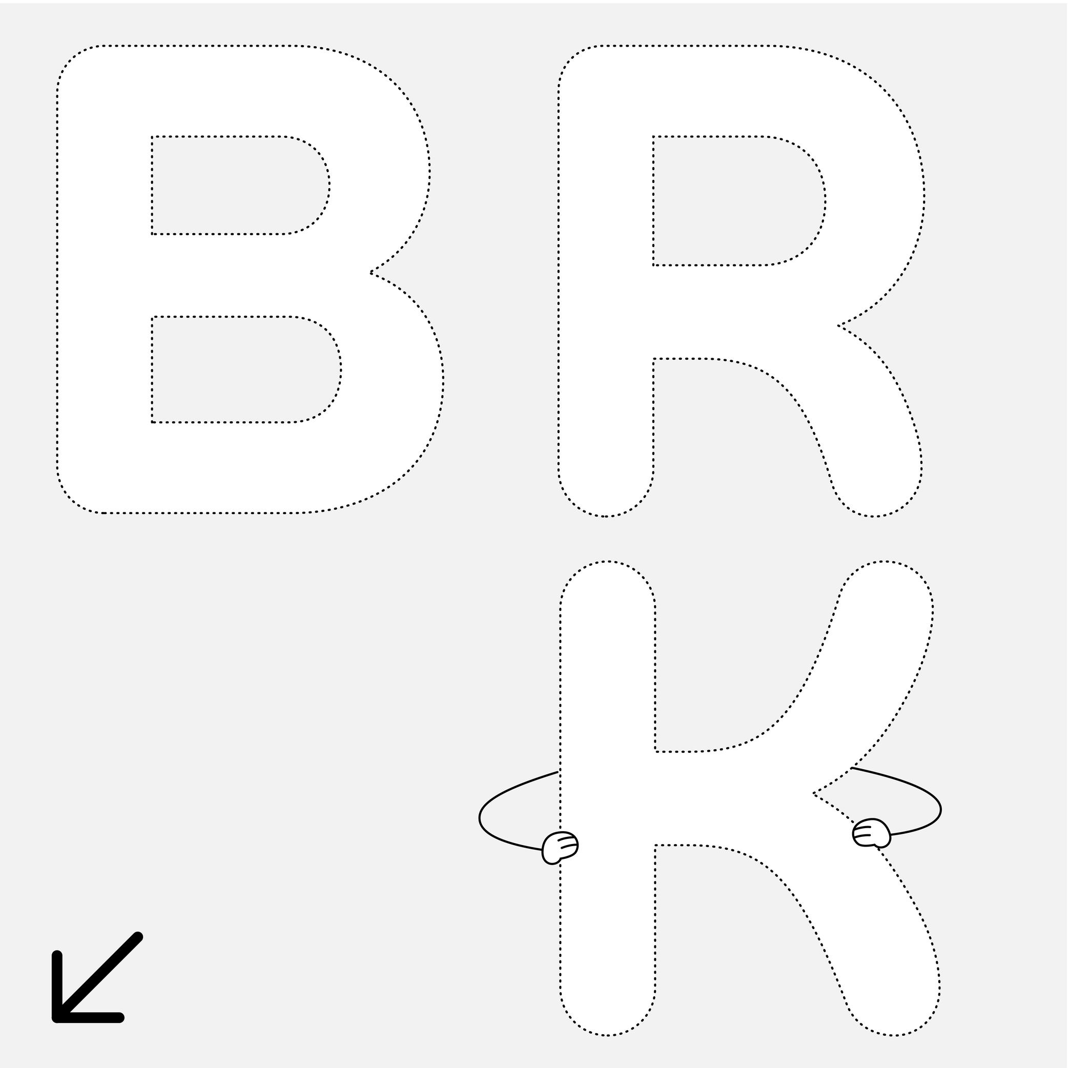
Sponsor Word of Type and feature your typeface in this card with a linked caption. Contact us for more information.
(Read More)Many terms are borrowed from architecture or human and animal anatomy to designate and describe parts of letters and other characters. We even speak of type design anatomy.
In the Latin script, the waist is the middle part of letters like B or R, where the stroke’s connection shapes a narrower part.
Web Font
Illustration: Words of Type. Typeface in use: Knowledge Round, designed by Lisa Huang, 2024.
(Read More)A webfont is a digital font specifically packaged and licensed to be used on websites.
They are distributed in lightweight and compressed formats optimized for the web, such as WOFF (Web Open Font Format).
Webfonts can be:
• hosted by third-party providers (e.g., Google Fonts, Adobe Fonts): which serve the font files from their own servers.
• self-hosted: where the font files are stored on the website’s own server and delivered directly to visitors’ browsers.FONT ENGINEERING HINT
WOFF and WOFF2 are containers that can hold either TrueType or PostScript outlines, but most webfonts are distributed with TrueType outlines since Windows rendering depends on TrueType hinting.
Weight
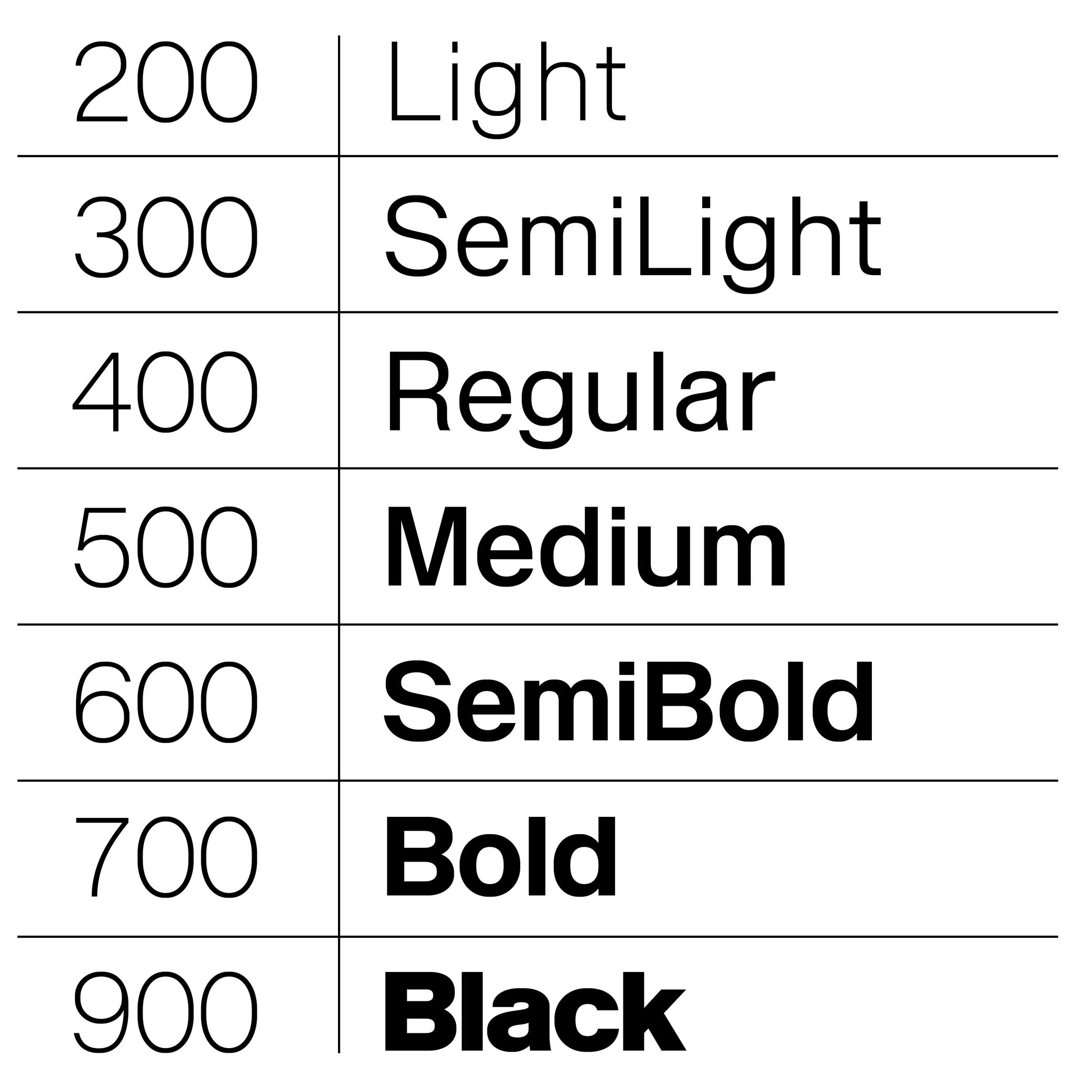
Sponsored by Production Type . Typeface in use: Enduro , designed by Emmanuel Besse, 2020.
(Read More)The weight of a typeface refers to the thickness of its strokes.
Within a typeface family, different weights are designed to be visually consistent across all glyphs of a given style.
NAMING CONVENTIONS
While much of the historical naming conventions (e.g., Light, Bold, Black) originate from the Latin typographic tradition, the concept of weight applies to all writing systems that use stroke thickness variations. These labels are not universal standards as style description conventions differs from a culture to another.
WEIGHT NAMES & CSS VALUES
In digital typography, weights are also expressed numerically, using the “font-weight attribute”:
• Thin: 100
• ExtraLight: 200
• Light: 300
• Regular: 400
• Medium: 500
• SemiBold: 600
• Bold: 700
• ExtraBold: 800
• Black: 900FONT ENGINEERING HINT
In OpenType font formats, weight is stored in the OS/2 table under the “usWeightClass” field, which maps to CSS “font-weight” values (ranging from 100 to 900):
• while CSS defines nine steps, “usWeightClass” allows values from 1 to 1000, giving finer granularity for internal font definitions;
• CSS weight values are expected to correspond to the font’s weight class. Following this standard is important because many environments rely on these mappings for text rendering and style linking. If, for example, Regular = 350, browsers or apps may mislabel it or fail to recognize it as Regular, causing user confusion or incorrect transformation to Bold.For variable fonts, the weight axis is defined by the registered axis tag “wght.” Unlike static fonts, it supports continuous interpolation between a minimum and maximum, allowing CSS “font-weight” to take any integer (e.g., 347) within the supported range for smoother transitions and precise control.
Localized weight names (e.g., ‘Gras’ for Bold in French, ‘Fett’ in German) are often generated from the OS’s internal dictionaries. This ensures style names appear in the user’s language even if the font lacks explicit translations. If the default naming does not strictly follow OpenType Specifications, localized names may not be translated correctly.
White Space
Sponsor Word of Type and feature your typeface in this card with a linked caption. Contact us for more information.
(Read More)A white space is any part of a glyph that is not of the glyph itself. They can be counters (inside), spaces, or negative space (outside).
Widow
Illustration: Words of Type. Typeface in use: Knowledge Round, designed by Lisa Huang, 2024.
(Read More)Odd situations can happen when typesetting a text, making its overall appearance look sloppy.
When the last word or the last line of a paragraph appears alone at the beginning of a column or a page, it is called a widow.
Width
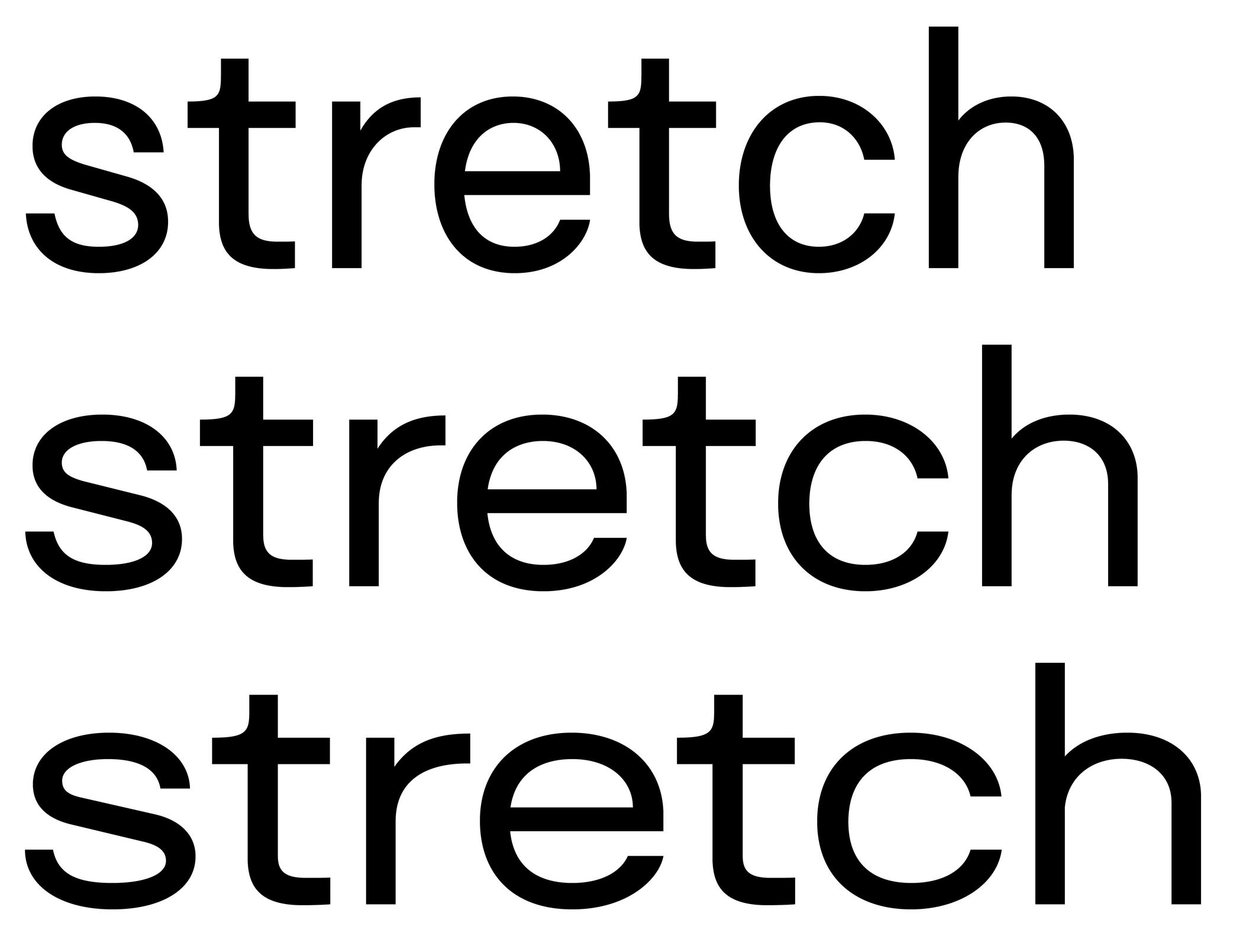
Sponsored by Blaze Type . Typeface in use: Surt , designed by Matthieu Salvaggio, 2020.
(Read More)Other than the width of individual glyphs and characters (the letter M is usually wider than I), there are also various widths for typeface styles that participate in its personality or help make a content set in a specific width to fit specific conditions.
Some common width styles are: Narrow, Condensed, Regular, Extended and Wide. They serve more as a way to identify each style within a typeface family, rather than standards to follow for all scripts, as they can be different from one script to another.
WOFF and WOFF2
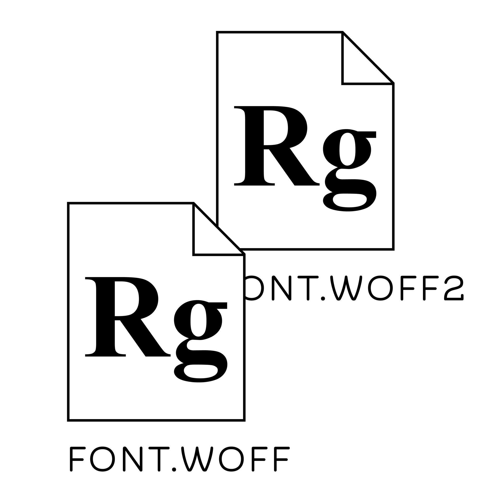
Illustration: Words of Type. Typeface in use: Knowledge Round, designed by Lisa Huang, 2024.
(Read More)WOFF (Web Open Font Format) and WOFF2 are compressed font formats designed specifically for usage on the web.
Compared to raw “.ttf” or “.otf” files, WOFF and WOFF2 are significantly smaller in size, which allows for much faster loading speeds and better performance on websites.
DIFFERENCES BETWEEN WOFF & WOFF2
• WOFF was introduced in 2009 and quickly became the standard for webfont delivery. It is supported by all major browsers, starting with Firefox, which was one of the first to implement it.
• WOFF2, introduced in 2012, provides even better compression and is now supported by all modern browsers, including Chrome, Firefox, Safari, and Edge.Because of their balance between performance, licensing metadata, and broad compatibility, WOFF and especially WOFF2 are the primary formats used for webfonts today.
x-Height
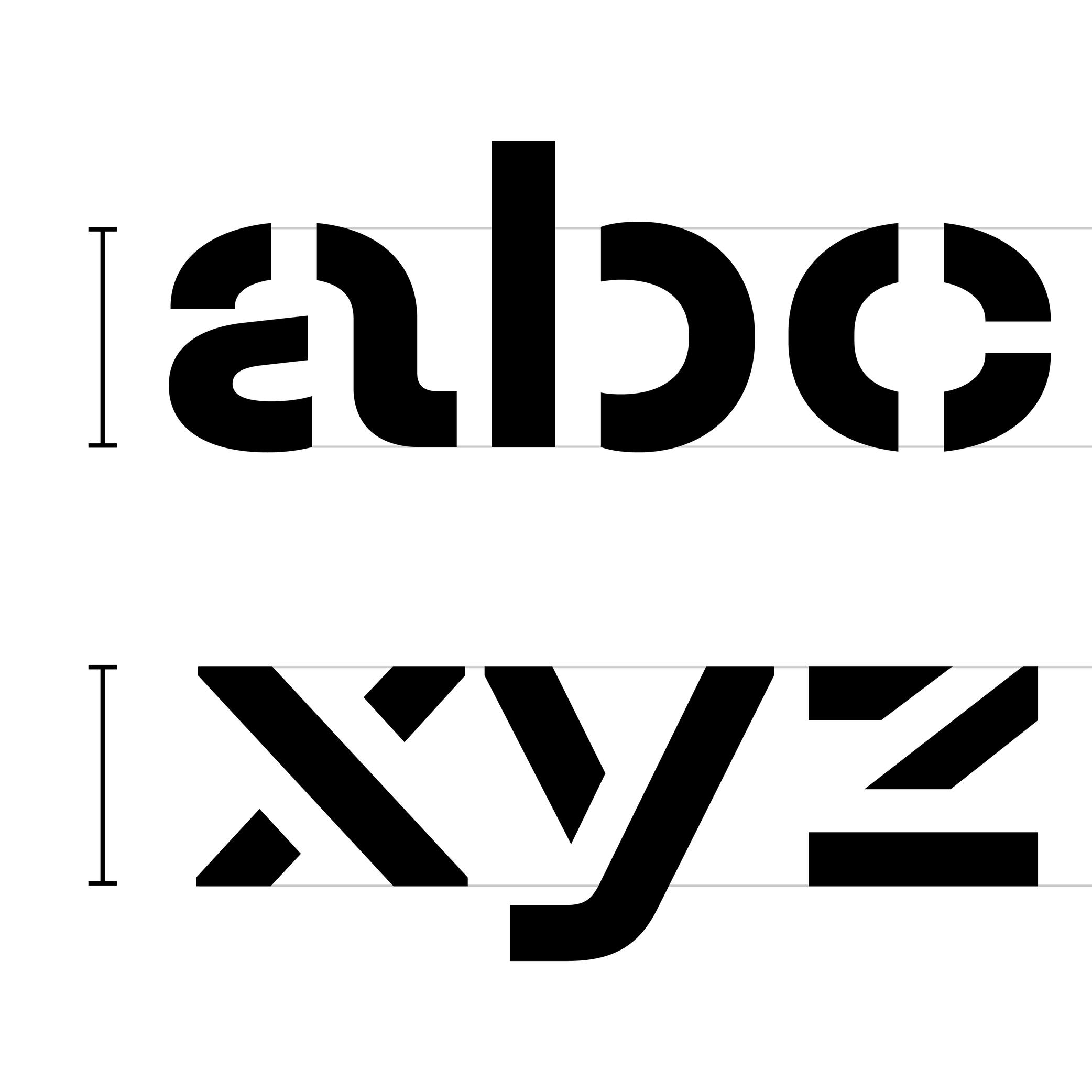
Sponsored by TypeMates . Typeface in use: Halvar Stencil Breitschrift , designed by Paul Eslage, Jakob Runge, Lisa Fischbach and Nils Thomsen-Haberman, 2019.
(Read More)The x-height is the guideline placed at the top of the Latin letter x.
It helps to align the other lowercase letters and to set the proportions with uppercase letters and the ascenders.
Because the letter x is the only lowercase letter without ascenders and horizontal tips at its top and bottom (it has no overshoots), it is the reference letter for lowercase height.