Ink Trap

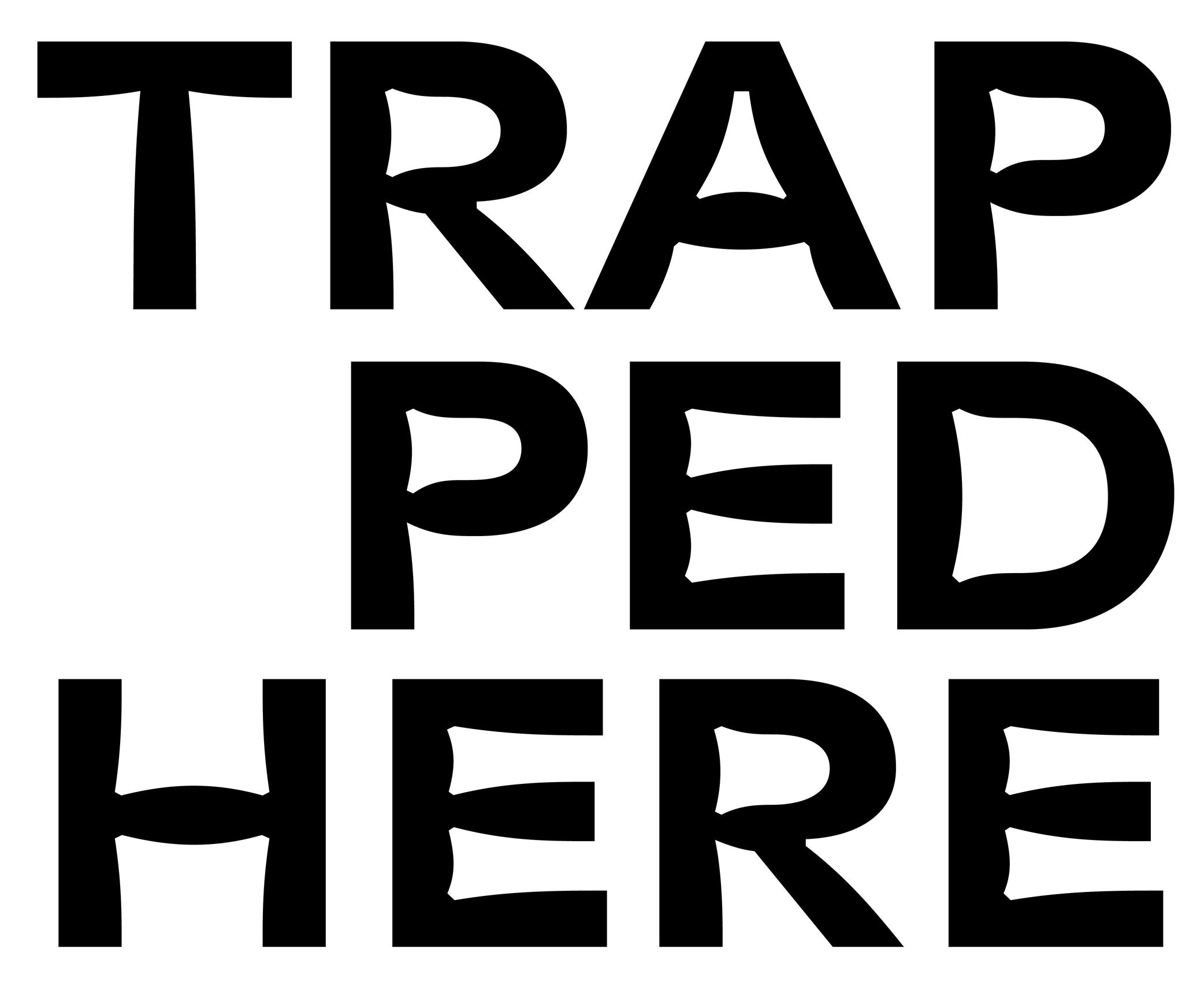
Sponsored by Blaze Type . Typeface in use: Area Normal Inktrap , designed by Matthieu Salvaggio, 2021.
When printing technology was primarily based on printing inked metal types on paper, ink could easily spread into the small corners of the characters. In printing, this effect is called a “bleed.” Especially at small sizes, too much ink spread can weaken legibility.
One of the best examples of a typeface solving the ink-spread problem is Bell Centennial, designed by Matthew Carter in 1975 for the US telephone company AT&T. It needed a typeface for its phone books, which would be printed on thin and porous paper. The resulting typeface featured inner corners that dug into the letterforms’ usual contours. Those are called ink traps.
In digital typeface design, designers still use ink traps, especially for typefaces intended for small sizes (on printed and/or digital media), but also as design features (which can be pretty wild!).
Notes
TYPEFACES
Area Normal Inktrap, Matthieu Salvaggio, 2021.
Bell Centennial, Matthew Carter, 1975.
Whyte, Fabian Harb & Johannes Breyer, with Erkin Karamemet & Fabiola Mejía, Dinamo, 2019.
Waldeck, Benoît Bodhuin, BB Bureau, 2020.