Quotation Mark

Sponsor Word of Type and feature your typeface in this card with a linked caption. Contact us for more information.
FUNCTION
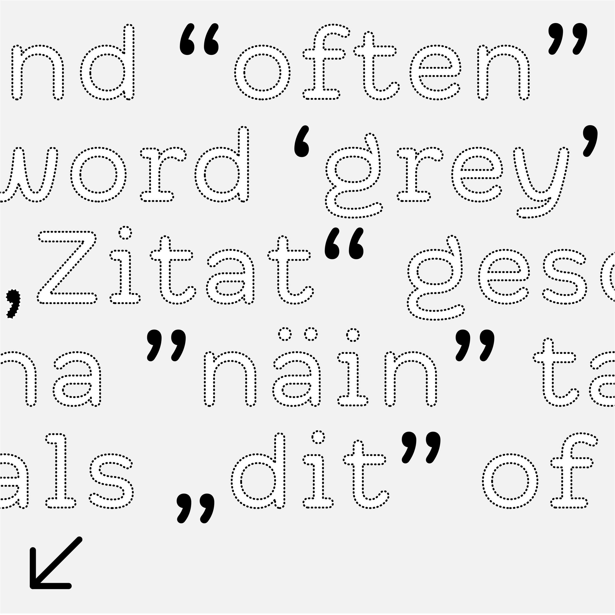
Quotation marks shaped like commas (or called “66” and “99” quotes), double or single, are used in most (but not all) languages to introduce a quote.
HISTORY
When texts were only written by hand, even if there were no standard marks used across Europe to indicate quotes, some slanted and double dashes were used for a similar purpose. During the printing press era, typographers used shifted upwards and/or rotated commas to work as quotation marks, and typewriters adopted the same forms.
DESIGN
Although quotation marks were historically identical to commas, in some typeface styles a slightly shorter and narrower form to create a better text color is more suitable. In sans serif typefaces, quotation marks have an even simpler shape to match with the overall style.
TYPOGRAPHIC RULES
The “66” quote is placed at the beginning of a quote, closed with the “99”, without any space between the quotes and the quoted text.
Some languages use these quotes differently, such as in „German“ or „Polish”, or use quotes of different shapes such as the guillemets in «French», or「Traditional Chinese」.
Single quotes are used as secondary quotes, if they are within double quotes. A common mistake is to use prime and double prime for quotes instead of symbols in mathematics (distance, time, etc.).
Notes
UNICODE
QUOTATION MARK: U+0022
RIGHT DOUBLE QUOTATION MARK: U+201D
LEFT SINGLE QUOTATION MARK: U+2018
RIGHT SINGLE QUOTATION MARK: U+2019
LEFT DOUBLE QUOTATION MARK: U+201C
DOUBLE LOW QUOTATION MARK: U+201E