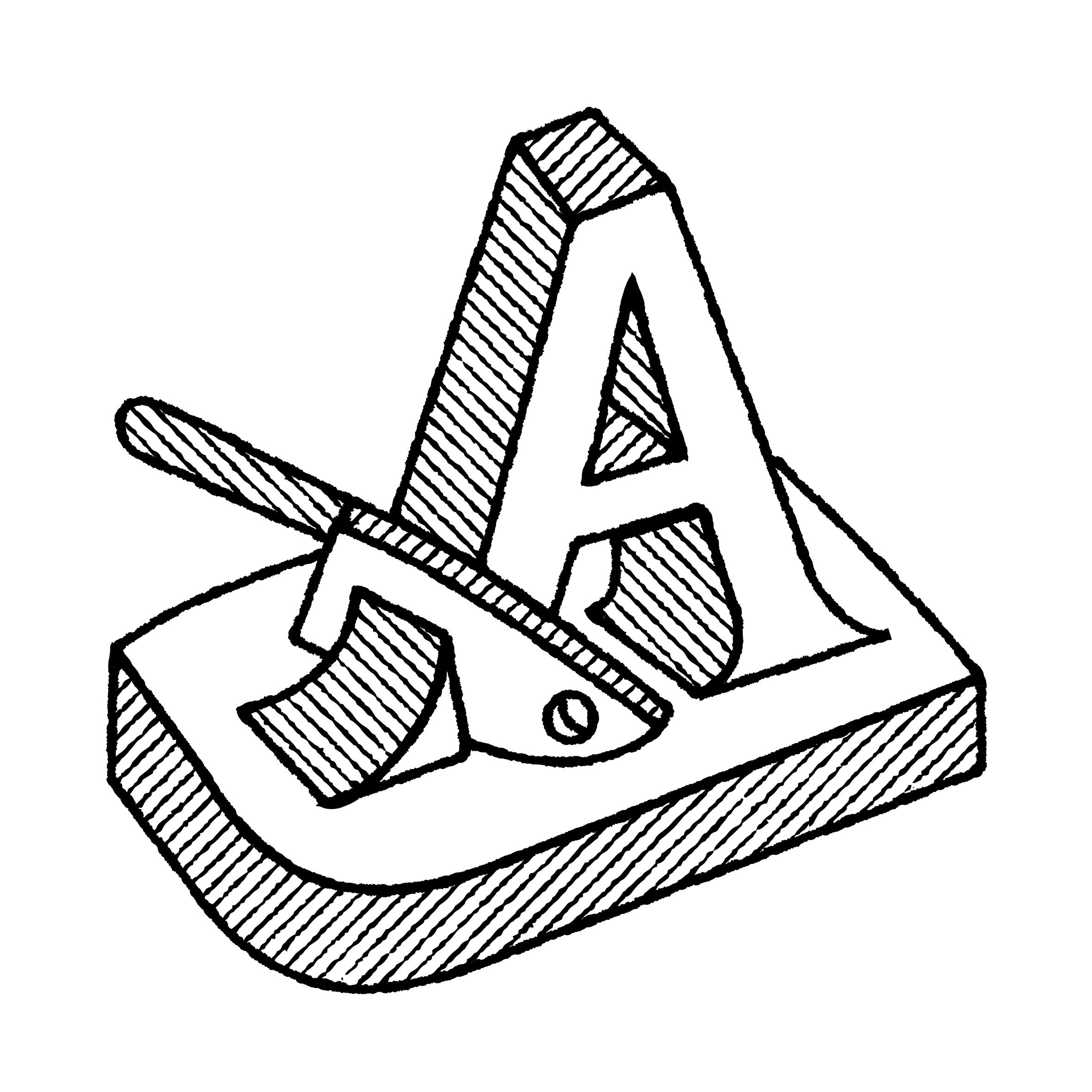
Sans Serif

Illustration: Pauline Fourest (Spaghetype ).
DESCRIPTION
Sans serif, or Sans (literally meaning without in French), describes a typeface style without serifs.
HISTORY
As far as we know, the first published sans serif typeface, Two-Lines English Egyptian by William Caslon IV, was published in 1816 in London, England.
Many terms have been used to speak of a sans style as we understand it today, with multiple categories names in different typographic classification systems of Europe: ‘grotesque’ (France and United Kingdom), ‘Grotesk’ (Germany), ‘gothic’ (USA), ‘linéale’, ‘bâton’ or ‘antique’ (France).
EVOLUTION
In Europe and North America, Sans-serif styles became popular in the early 20th century as part of a modern trend. Typeface designers experimented a lot around the this style, with some becoming references, and later style sub-categories of Sans-serif: humanistic sans, geometric sans, grotesque or gothic, etc.
But these don’t apply to other scripts that evolved on an independent path from the ‘Latin’ world. Chinese Hanzi have a category of style similar to Sans, called Heiti (or Hei), that doesn’t have as many sub-categories.
Notes
SELECTION OF TYPEFACES
Futura (1927), Paul Renner
Helvetica (1967), Max Miedinger and Eduard Hoffmann
Frutiger (1976), Adrian Frutiger
FF Balance (1993), Evert Bloemsma
Faune (2018), Alice Savoie