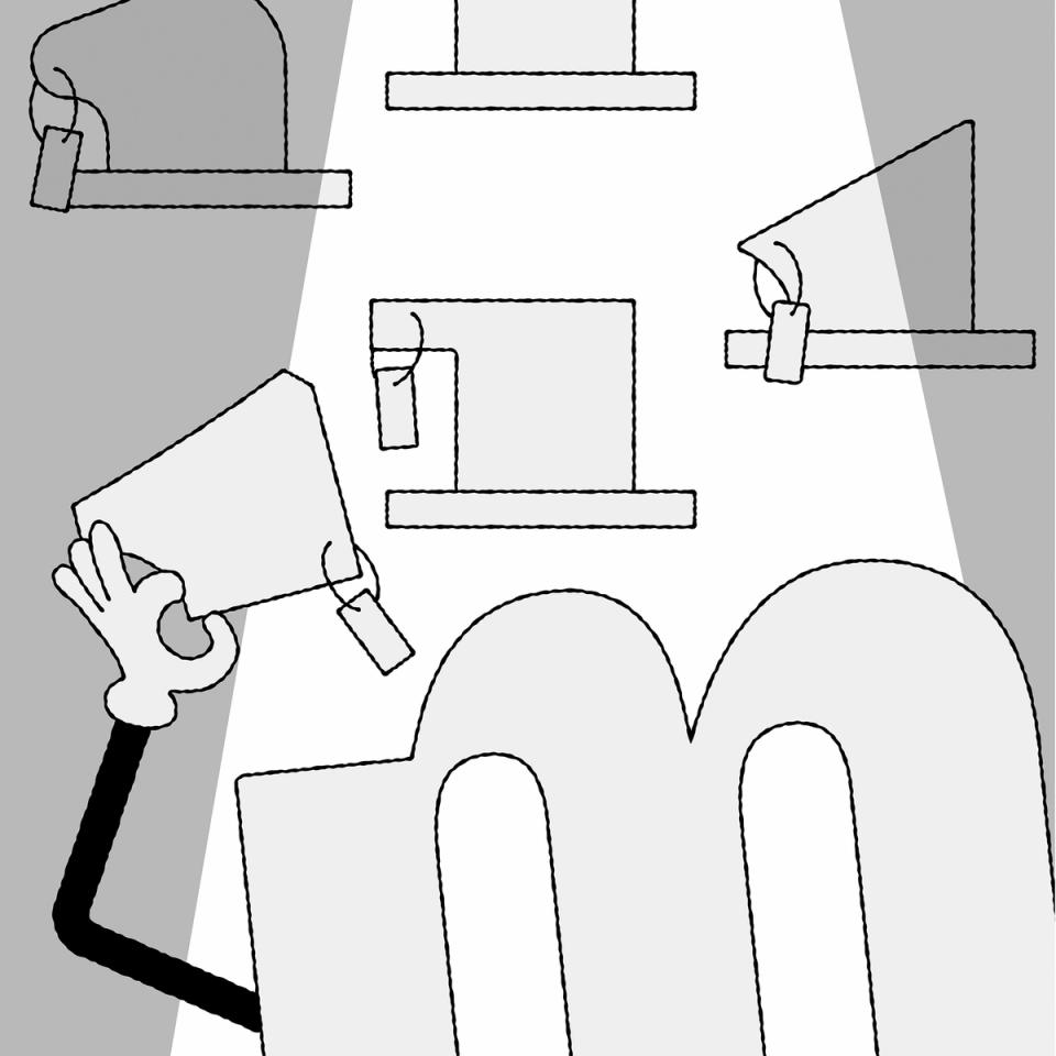
Serif

Illustration: Raven Mo .
DESCRIPTION
Serifs are elements at the tips of strokes in serif style typefaces.
HISTORY
The origin and evolution of serifs differ in different scripts and don’t even exist in others.
For the Latin script, serifs come from the combination of the movements of the brush when writing Roman capital letters (the origins of the Latin alphabet) and stone carving techniques.
EVOLUTION
Calligraphy, metal and wood type printing, photo composition, typewriters, digital typefaces, all of these tools and techniques contributed various shapes and presence (or absence) or serifs among the various typeface styles that we see today.
The positioning of serifs in each letter has been defined by the writing ductus combined with the tools use. For example, the general rule is that serifs should be on both sides at the top and bottom of vertical stems for upright letters, and none on the bottom of italic stems.
There are multiple possibilities for the shapes of serifs: thin, thick, long, short, wedged, squared, triangular, etc. Many typeface styles have a particular serif shape as part of their characteristics.
IMPRESSION
In Latin script, different impressions and feelings are associated with specific typeface styles (traditional, luxurious, casual, elegant, etc.), which are mainly due to the circumstances of their creation, usage preferences, and habits.
For example, humanist or transitional serifs are the go-to styles for long reading uses.
DESIGN
For styles where serifs are on both sides of the stems, some asymmetrical letters (such as f, r, F or P) have a large opened counter on one side. To compensate for the imbalance created by the “empty space”, the designer can adjust the serif on that side by making it longer.