Ligature
Sponsored by LO-OL . Typeface in use: Kronik Antik Display, designed by Loris Olivier, 2023.
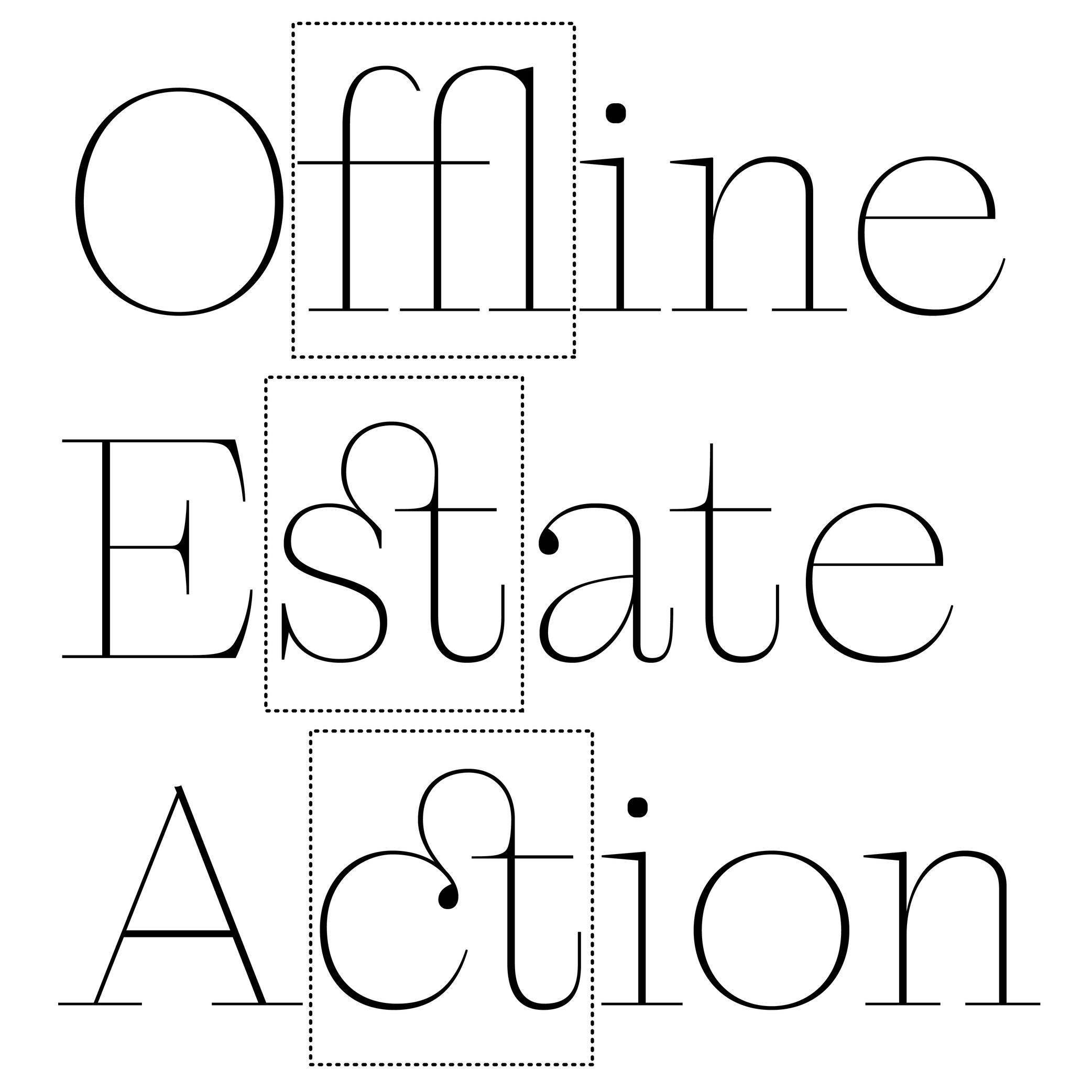
In the era of metal-type printing, some character combinations in specific languages were used so often that they were combined to save time while composing texts. Punchcutters would ensure that one sort from the font would depict both letterforms together. We call these individual sorts with more than one letterform a “ligature.”
Other ligatures weren’t made because of the need to save time but because a series of letterforms would otherwise appear in a non-aesthetic manner on the page. One example of this is the f and i. Without a ligature, the white space between those two letters would be bigger than between other lowercase letters. Plus, the upper terminal of the f would be too close to the dot of the i.
The same principle has been kept in digital typefaces and ligatures exist as independent glyphs. OpenType features allow us to switch from two separated glyphs to their ligature variant thanks to the ligature alternate features (if they exist in the selected typeface).
Notes
SELECTED OPENTYPE FEATURES NAME
STANDARD LIGATURES: .liga
CONTEXTUAL LIGATURES: .clig