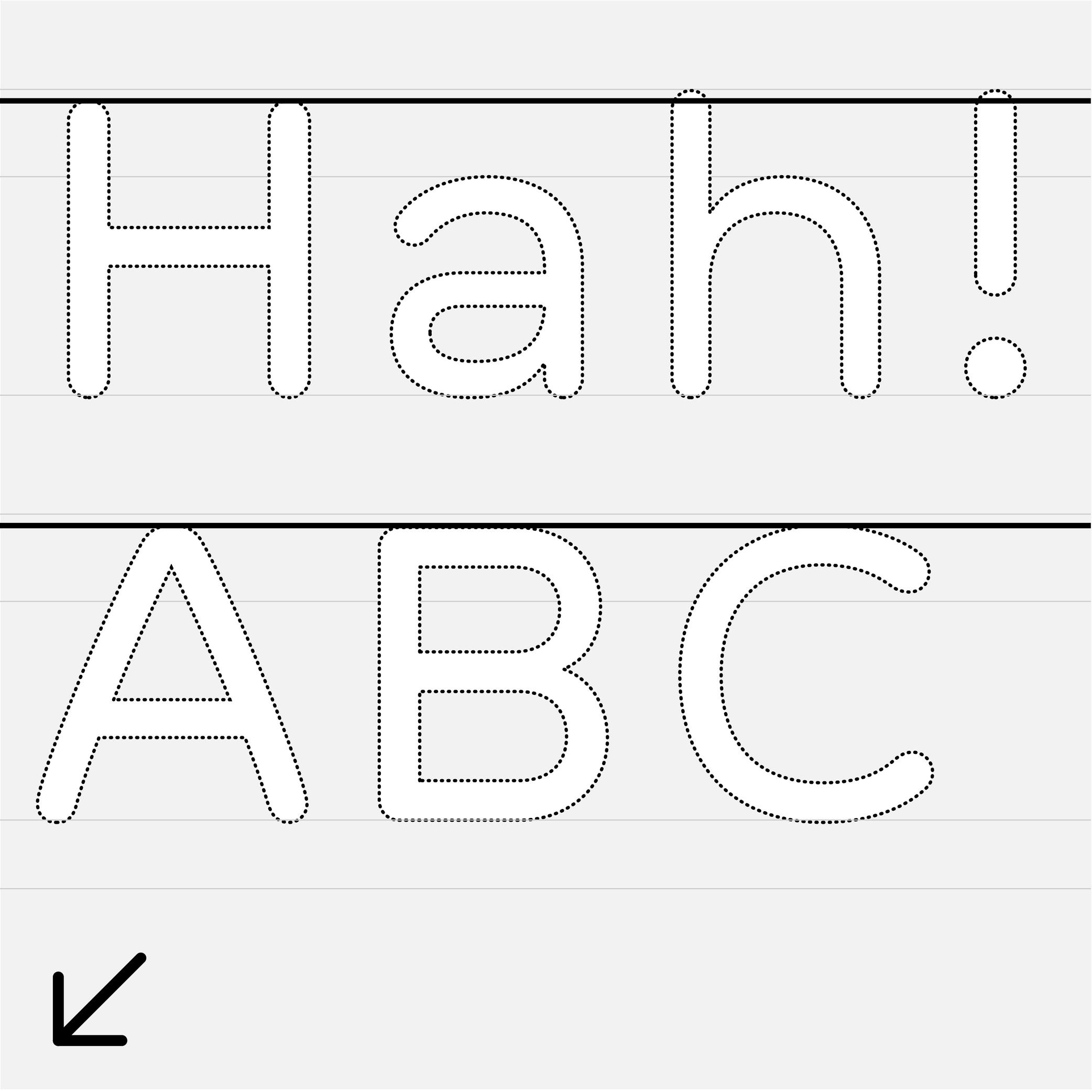
Cap Height
Sponsor Word of Type and feature your typeface in this card with a linked caption. Contact us for more information.
The cap height (short for “capital height”) is at the top level of square capital letters, such as H.
The cap height is one of the main guidelines for Latin-script typefaces. It is usually lower than the ascender height in typefaces meant to be used at small size. This is also the case for sans serif styles to show a difference between l (lowercase L) and I (uppercase i). In many display styles, the ascenders are the same as the cap height to save some vertical space.