Italic

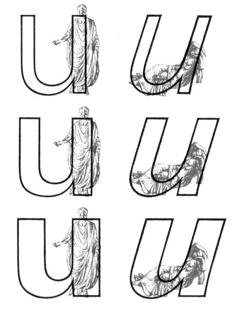
Univers, extract from Manuel Typographique, by Fournier le Jeune, 1766, as displayed in De Plomb, d’Encre et de Lumière, Essai sur la typographie & la communication écrite, C. Peignot and G. Bonnin, French National Printing Office (Imprimerie Nationale), 1982
DESCRIPTION
Two construction styles are possible for the same weight in a Latin script typeface: Roman (or upright) and Italic. Italics usually have slanted letterforms, with more or less obvious influence from handwritten letter structure (connected letters) and shapes (softer starts and endings). In general, italic letters also have a slightly narrower width than their upright companion.
For italic styles to be visually linked to an upright version, they have to be related to each other (similar weight, height, etc.). However, they also need to be different enough so that the reader can easily differentiate one from the other. Managing a good balance between differentiation and similarity is part of the typeface designer’s expertise to design a “nice couple.”
HISTORY
During the Renaissance in Europe, when the Humanist movement emerged, they developed a new style of handwriting that combined the old Carolingian Minuscule (all lowercase letters) with forms inspired by Ancient Roman inscriptional lettering (Capitalis Monumentalis). Both have a close relationship to the ‘natural’ movements of the human hand.
While Humanistic handwriting could use either roman (upright, interrupted) or italic (slanted, connected) letterforms, each direction would eventually become an independent style used for different purposes, as is familiar today. The names we use now also come from that era, with ’roman’ referring to the alphabet of the Ancient Romans and ‘Italic’ being a moniker English writers used to refer to the style of connected letters that had originated more recently in Italy.
In typography, the first italic typefaces used date to around 1500. However, it was not until the mid-16th century that French printers began using roman and italic styles as we do today. They employed both styles in various applications to convey different impressions (emphasis, comments, etc.).
USE IN TYPOGRAPHY TODAY
In text, Italic styles are mainly used as a functional companion for a typeface family’s roman styles.
They are used when a part of a sentence or word needs to be emphasized, or differentiated from the rest. Italics are often used to emphasize titles of various works (albums, books, films, magazines, newspapers, etc.), words in a different language, or words that need to be highlighted.
NOTE
Not every writing system uses or even has Italic styles like in the Latin script. Instead, other scripts use different ways to achieve the same purpose of emphasis (i.e., by using a different weight or specific kind of punctuation).
Notes
BOOK REFERENCE
Italic, What gives Typography its emphasis, Hendrik Weber, niggli Verlag, 2021.