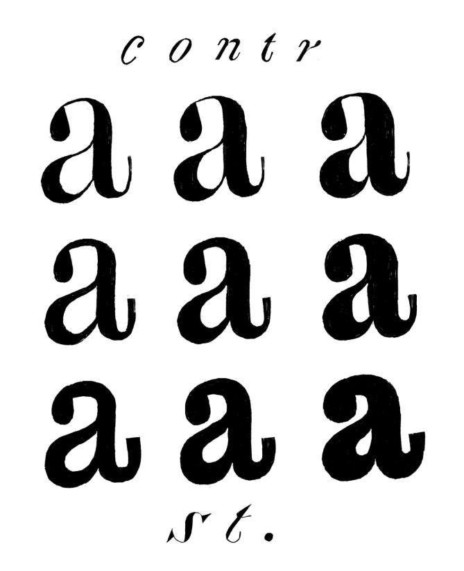
Contrast

Illustration: Erik van Blokland .
The contrast is the relationship between a glyph’s thick and thin parts.
The thickness variation in a stroke comes originally from handwriting, as a result of the tool’s reaction to the medium in combination with how it is held and the writer’s movements.
Nowadays, in type design for the Latin script, we speak of a vertical contrast when the vertical parts are thicker than the horizontal ones; this is its “natural” contrast. The opposite is known as a reversed or inverted contrast.
But these concepts only apply to scripts that evolved using tools and a medium that creates such contrast “naturally”, which is not universal for all. For example, the Hebrew script’s contrast would naturally be distributed the other way around.