Overlap
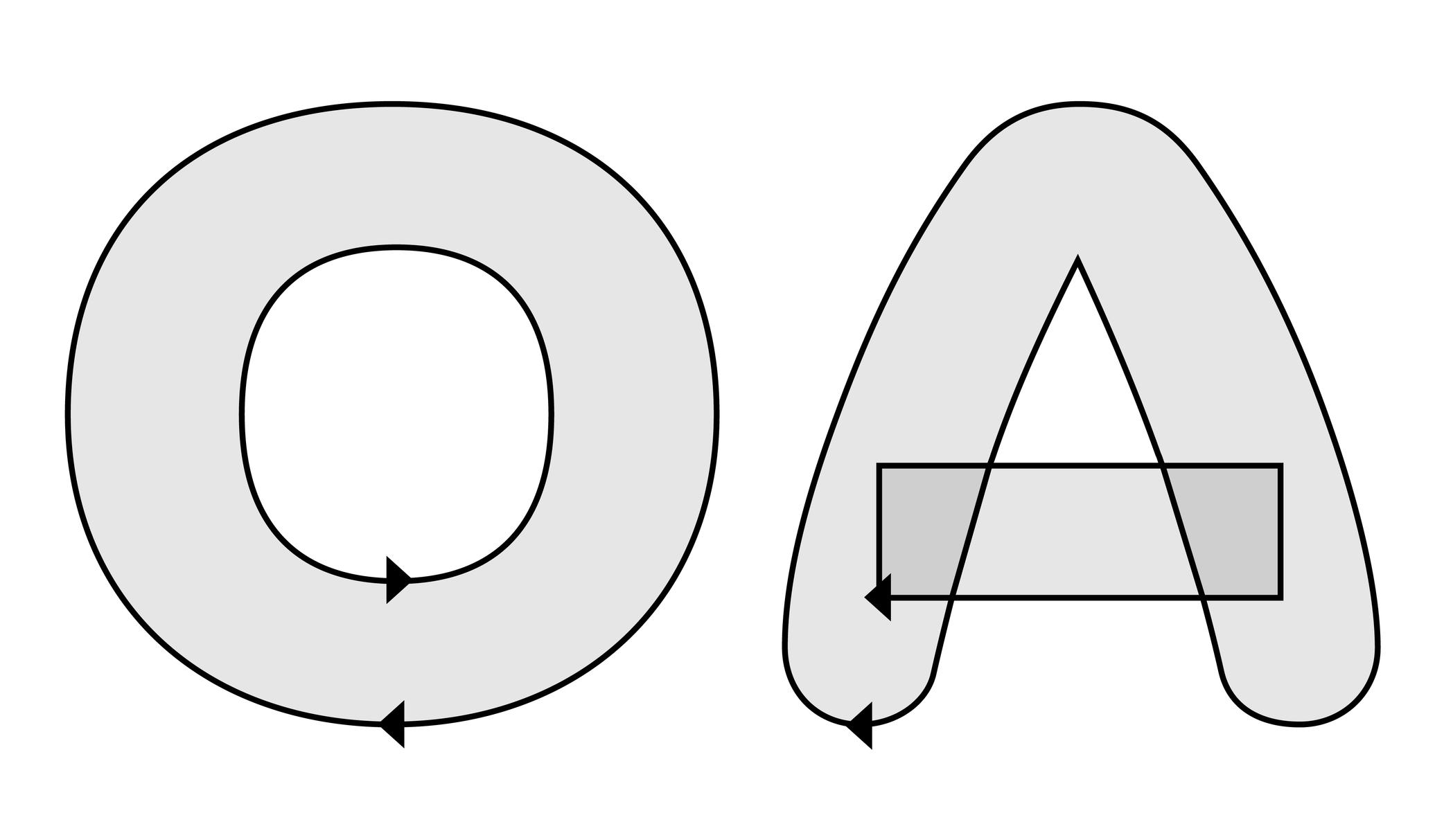
Illustration: Words of Type. Typeface in use: Knowledge Rounded, designed by Lisa Huang, 2024.
In type design (digital or analog), an overlap refers to the situation where two or more contours of a glyph intersect or sit on top of each other.
For example:
• a complex shape like the letter E can be drawn as several overlapping contours;
• a counter form like in the letter O, which requires two contours: a larger outer contour (filled) and a smaller inner contour (the hole).
When drawing a glyph in a digital file, the direction of each contour determines whether it is filled or cut out: the counter forms are drawn in the opposite direction than the larger contour.
Have you ever noticed a weird blank area in a letter out there? Well, that is the result of overlaps mistakenly drawn or managed at the export!
FONT ENGINEERING HINT
In an exported font file, managing overlaps depends on the outline technology:
• with PostScript outlines (.otf), contours are usually merged during export to avoid unwanted results. The rasterizer applies the “non-zero winding rule,” so overlaps are interpreted as counters regardless of their direction. Still, maintaining consistent contours directions is important, as it ensures that the export algorithms will merge contours correctly and their conversion to TrueType works properly.
• with TrueType outlines (.ttf), the “fill rule” depends on contour direction: clockwise paths are filled, counter-clockwise paths are cut out. Overlaps can remain unmerged as long as directions are consistent. Font editors usually provide a “Remove Overlap” option when generating fonts. This is often recommended for static TrueType fonts because some rendering environments and PostScript printers may still misinterpret overlapping paths.