Kerning
Sponsored by Kerns & Cairns . Typeface in use: Glissade , designed by Dyana Weissman, coming soon.
Each glyph of a typeface has a specific spacing value on each sides, which can be positive, negative, or zero. Setting these values for characters in a font globally is called setting its “spacing.”
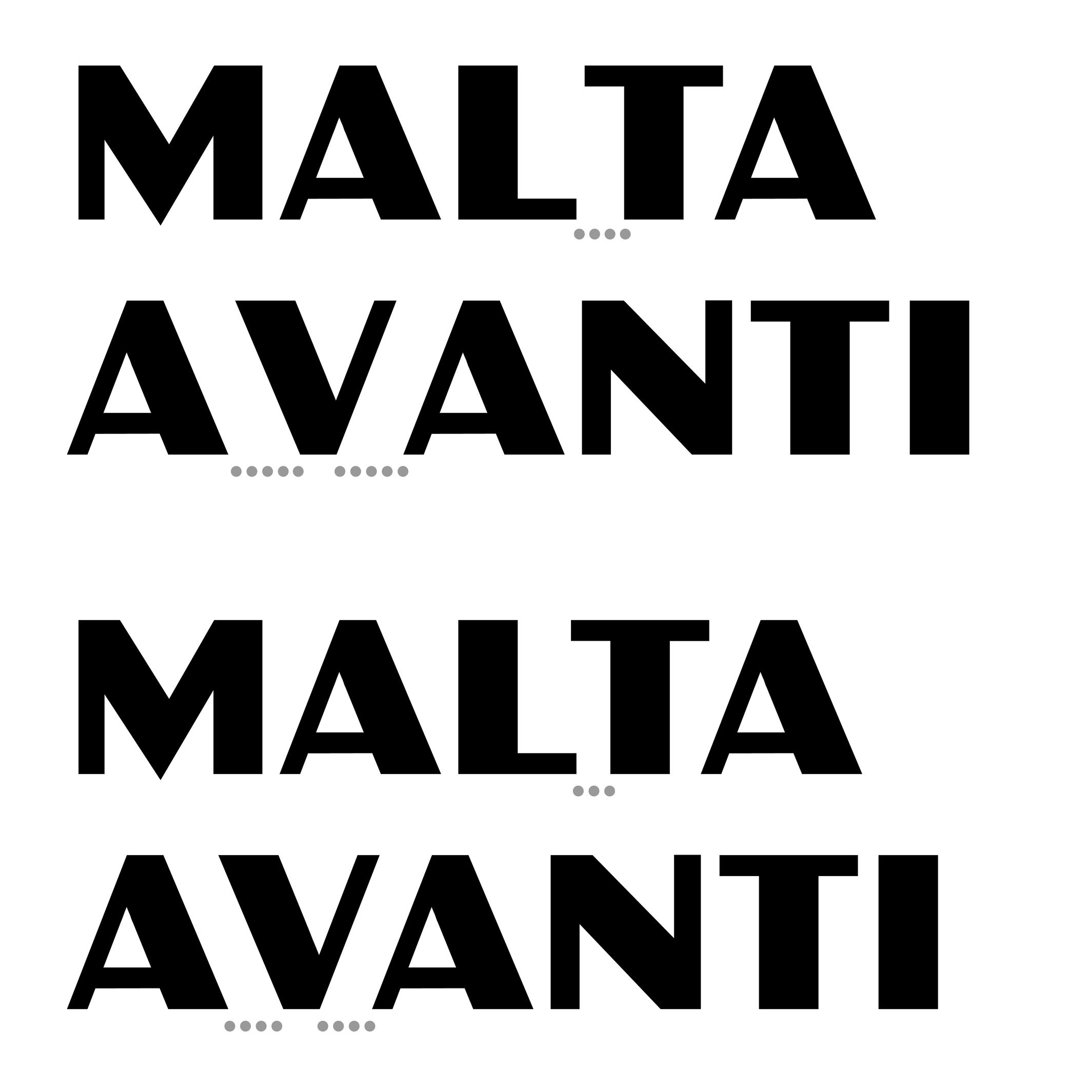
And “kerning” is the positioning adjustment applied to specific pairs of glyphs to refine their spacing where the global values alone give a result that is too loose, too tight, or it parts of the glyphs overlap with one another. A good kerning (combined with a good spacing) on a font ensures a smoother texture of the text.
Once a kerning value is set for one pair, it can often be applied to other pairs with similar shapes (e.g., V + A, W + A) using kerning groups.
Some DTP (Desktop Publishing) applications offer kerning adjustment algorithms that can override the font’s built-in kerning. This is useful when working with non-professional fonts.
FONT ENGINEERING HINT
• In older fonts, the kern table contains pairwise adjustments.
• In modern OpenType fonts, kerning is stored in the gpos (Glyph Positioning) table, which supports pair-based, class-based, and contextual adjustments for greater efficiency and flexibility.