Dash

Sponsor Word of Type and feature your typeface in this card with a linked caption. Contact us for more information.
USAGE
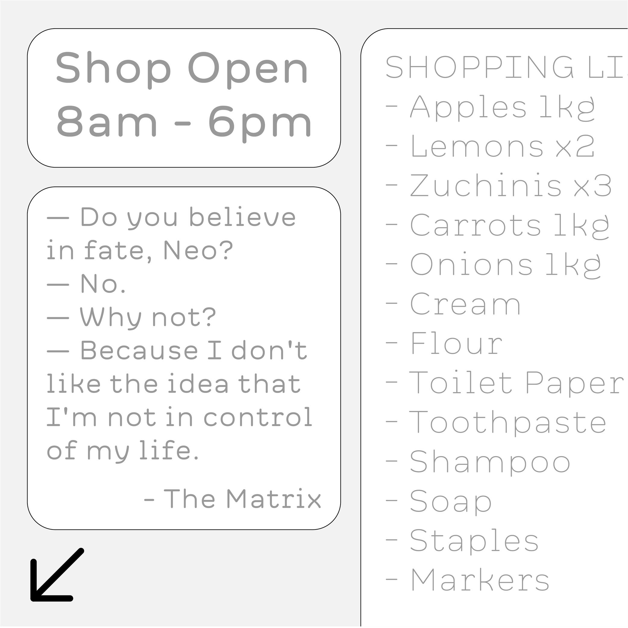
Among the multiple types of dashes (yes, there are many!), the most common ones are:
1. en dash, used for:
• to indicate a list;
• indicate a closed range (as a substitute of words “to” or “between”);
• (less common) to hide letters in a word;
• connecting words in compounds (in some languages)
2. em dash, used for:
• indicate lines in a dialogue;
• (less common) to hide entire words or part of one.
Both en and em dashes are also used to enclose a section of a sentence, just like a pair of parentheses, or to indicate a separation within a sentence like a colon or semicolon.
HISTORY
Before the adoption of any punctuation standard, markers of various forms were used by scribes to indicate pauses. Dashes of various lengths have been used for many kinds of roles through the centuries, and across countries. But for dash-like symbols, these evolutions left us with the en dash and em dash as principal successors.
DESIGN
Their length has been standardized during the metal type printing era (in Europe and North America), using the size of the font as a reference for their measurement as such:
• 1 em = the font size;
• length of em dash = 1 em (or sometimes the width of letter m of the font);
• length of en dash = 1/2 of 1 em (or sometimes the width of letter n of the font).
Both are placed at the optical middle height between the baseline and ascenders. In a typeface style with contrast, the thickness of the dashes has to be visually consistent with that of the thin parts.
TYPOGRAPHIC RULES
Generally, in American English, it is preferred to use the en and em dash without any spaces before and after them; whereas in British English, it is often preferred to use a space before and after an en dash, and em dashes are rarely used.
NOT TO BE CONFUSED
The en dash is particularly often confused with the shorter character hyphen (U+2010), the mathematical sign minus − (U+2212), or the hyphen-minus - (U+002D).
In digital fonts, each of these glyphs has its own Unicode. They are designed and can be accessed individually. But on modern keyboards—inherited from typewriter keyboards which had to make compromises on the number of glyphs due to the limited space available—we are still often typing (mistakenly and without always knowing) the hyphen-minus instead of the hyphen or the en dash. Thankfully, most intelligent text processing apps automatically replace these with the correct glyph depending on the context.
Notes
UNICODE
EN DASH: U+2013
EM DASH: U+2014
HYPHEN: U+2010
MINUS SIGN: U+2212
BOOK REFERENCE
Shady characters , by Keith Houston, 2013.