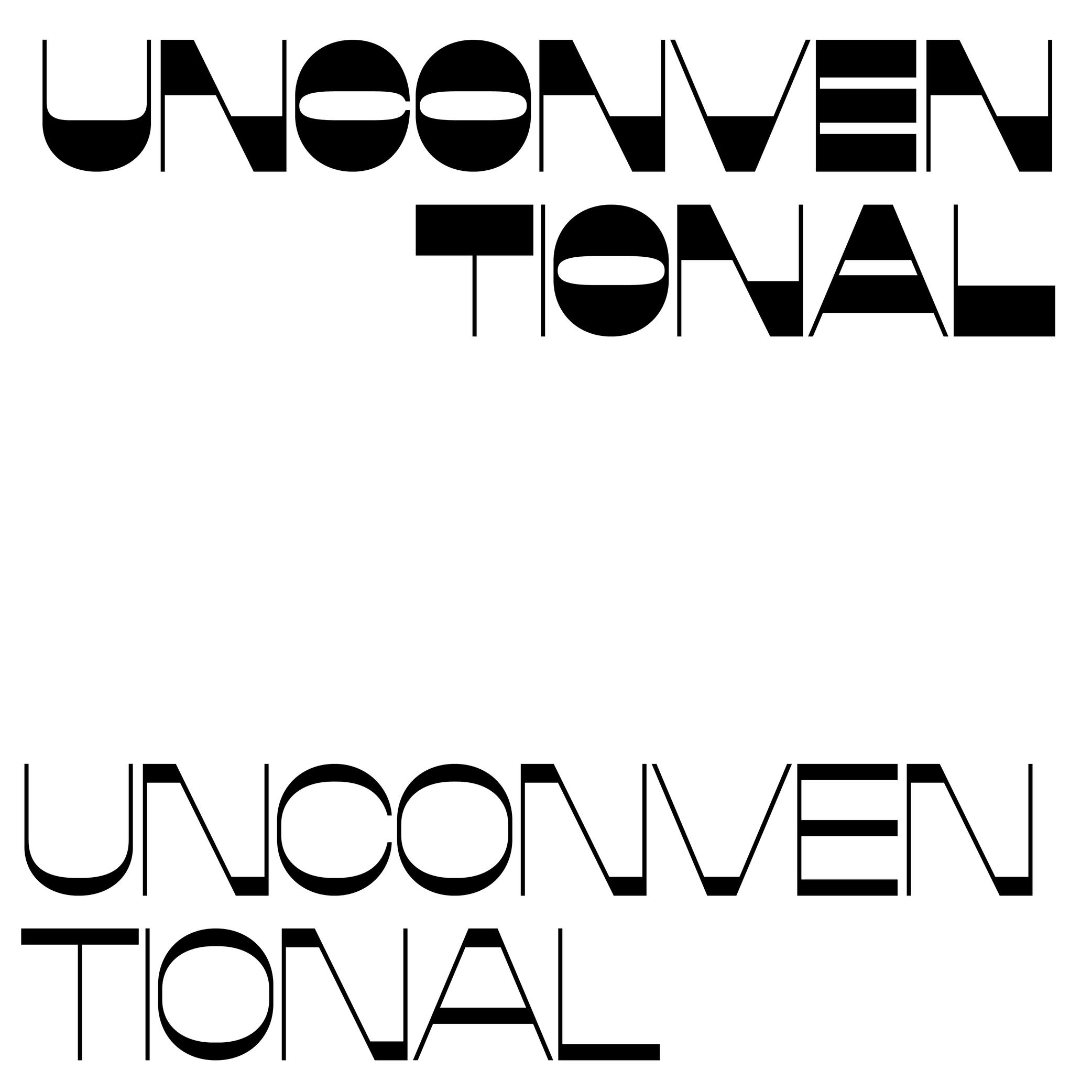
Reversed Contrast

The contrast is the relationship between a glyph’s thick and thin parts.
The variation in a stroke’s thickness comes originally from handwriting and results from the writing tool’s reaction to the medium, in combination with how the toll is held and the movements the writer makes. Nowadays, in type design for the Latin script, we refer to a vertical contrast when the vertical parts are thicker than the horizontal ones, which is its “natural” contrast. And the opposite is known as a reversed or inverted contrast.
But these concepts only apply to scripts that evolved using tools and a medium that creates such contrast “naturally,” which is not universal for all. For example, the Hebrew script’s contrast would naturally be distributed the other way around.