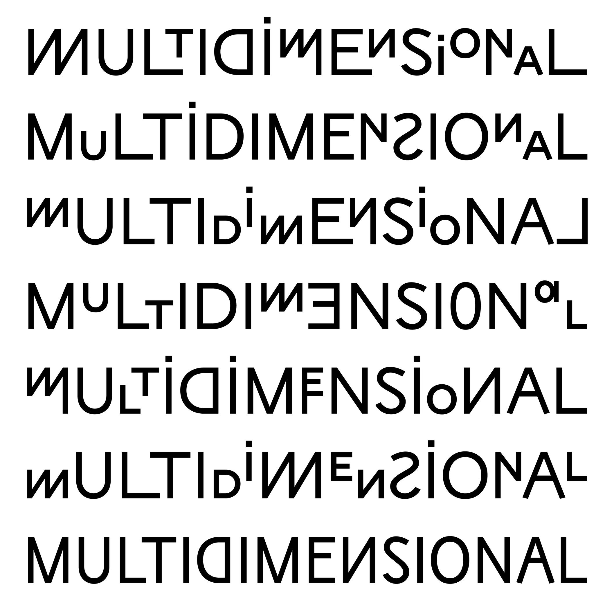
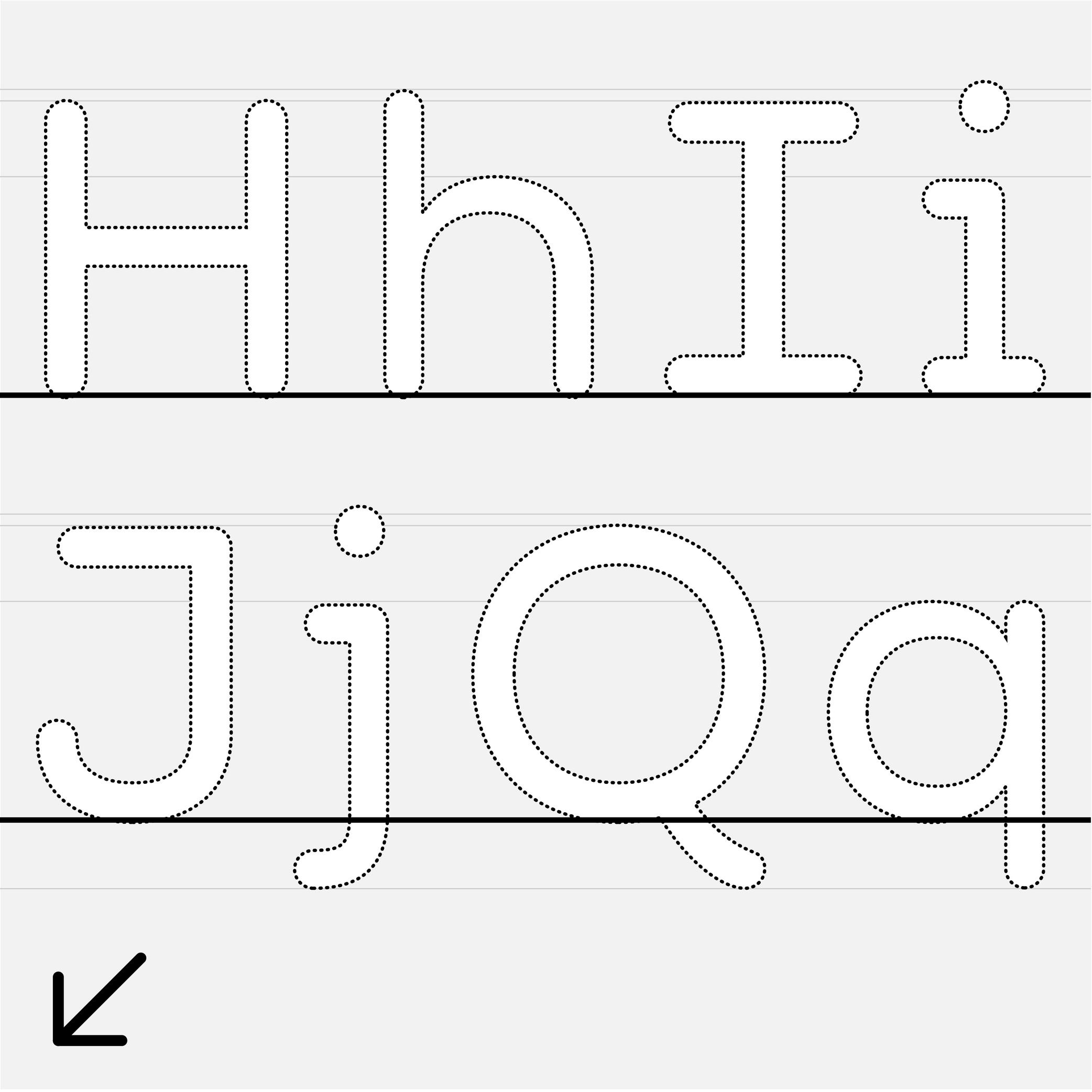
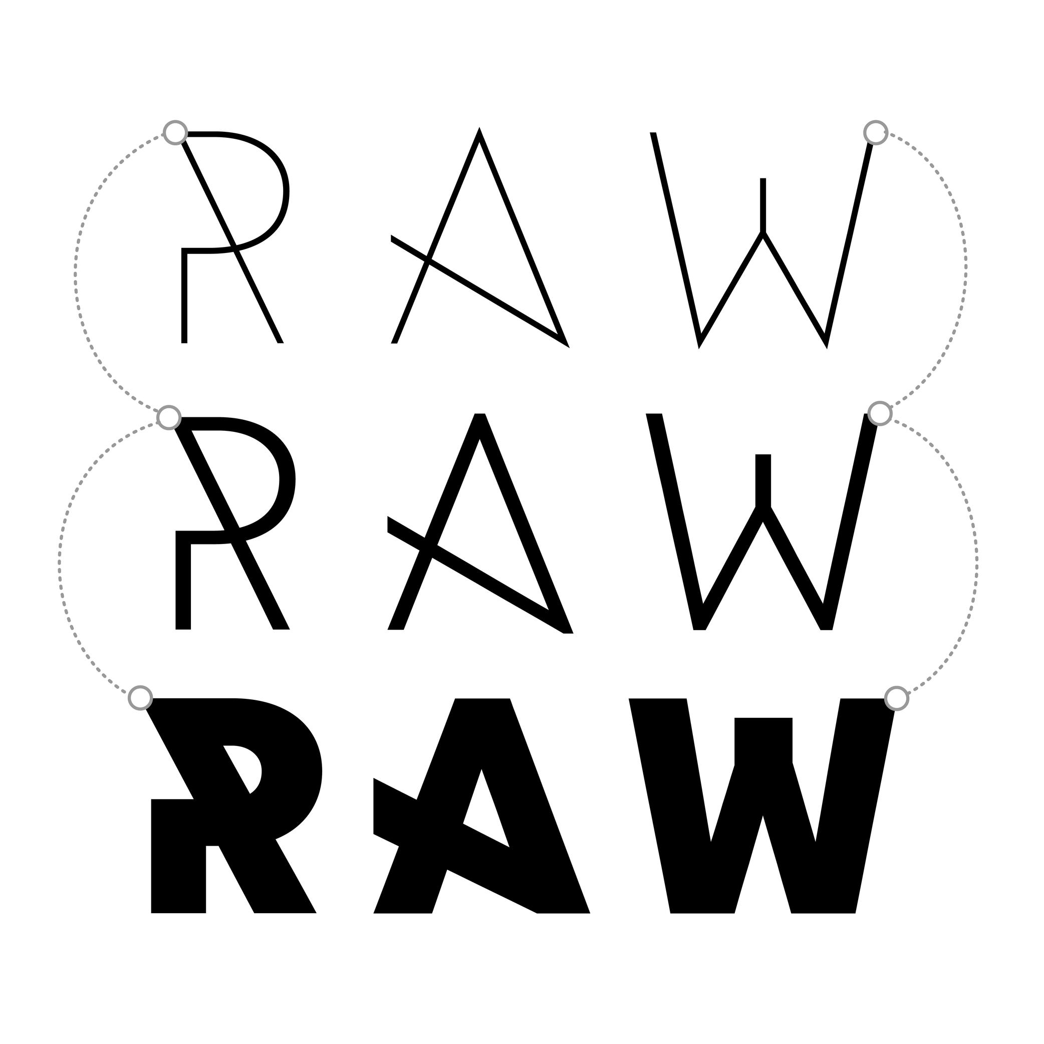
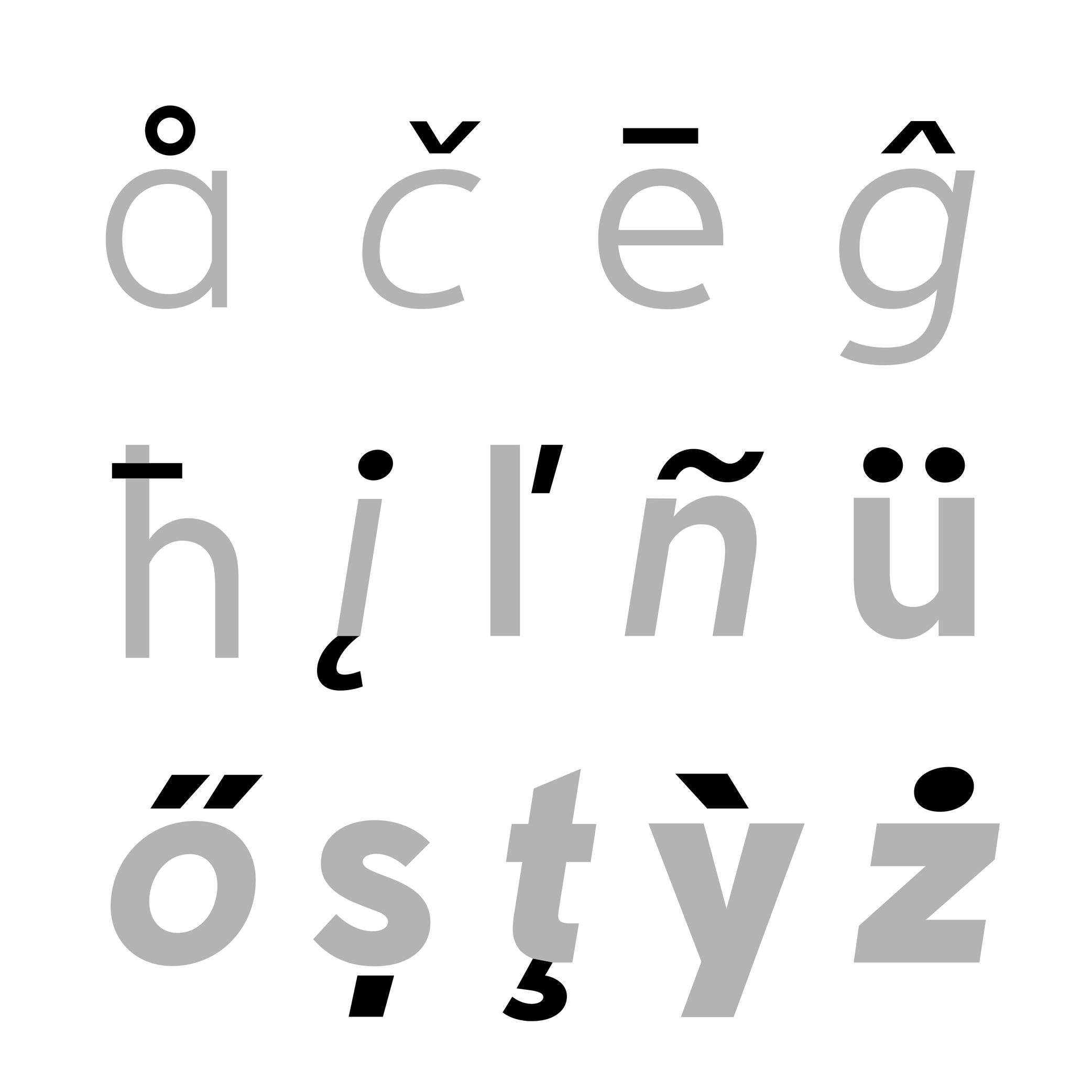
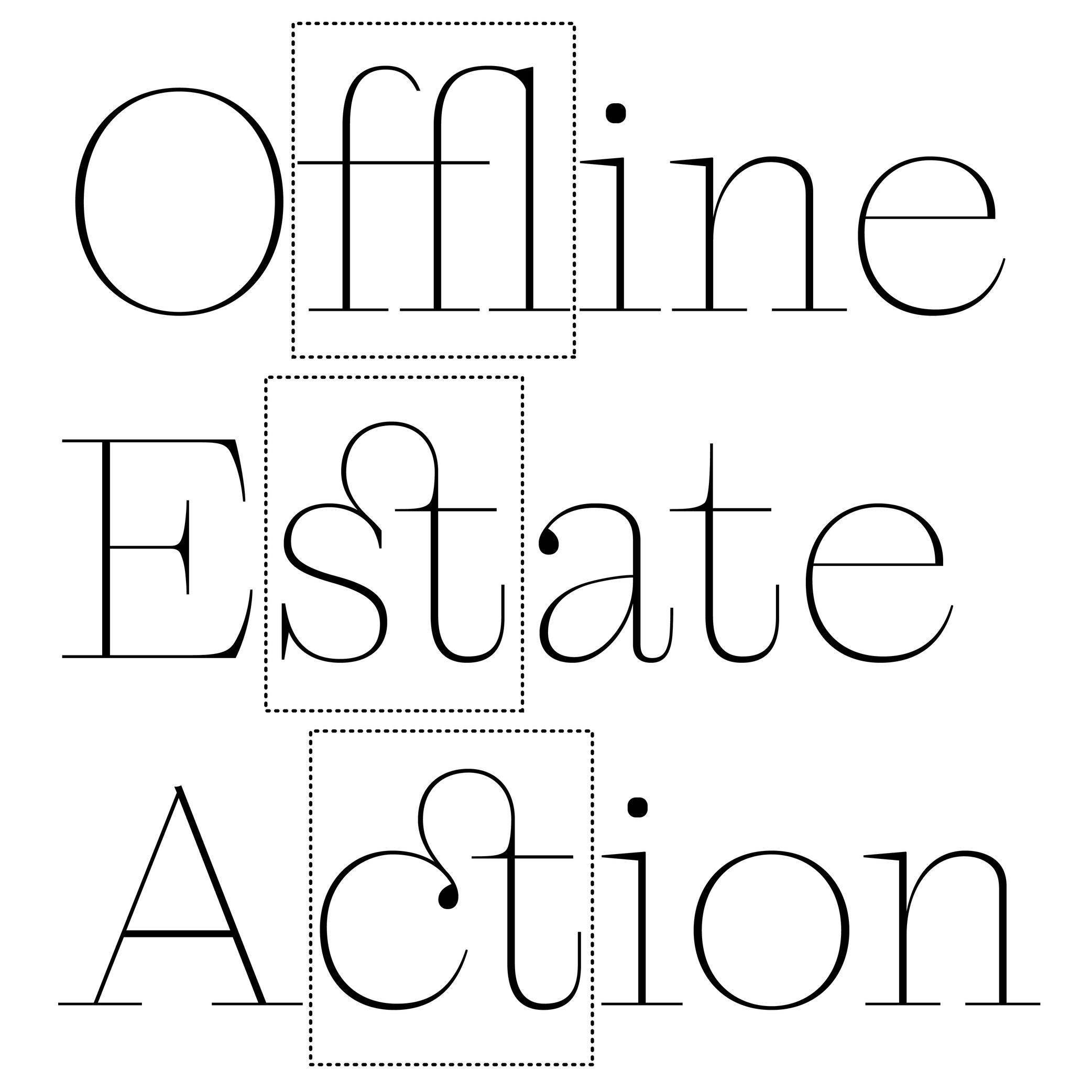
Alternate
 (Read More)
An alternate is a variant shape of a character, which has to be considered as a glyph of its own.
Alternate glyphs are created for various reasons:
• contextual: such as case-sensitive punctuations, where punctuation symbols can be aligned in a nicer way with capital letters when set within them, or tabular figures if they are used in numeric tables;
• positional: in Arabic or other scripts that have connected characters, a character may need to have different shapes depending on its position in a word (initial, medial, final, isolated);
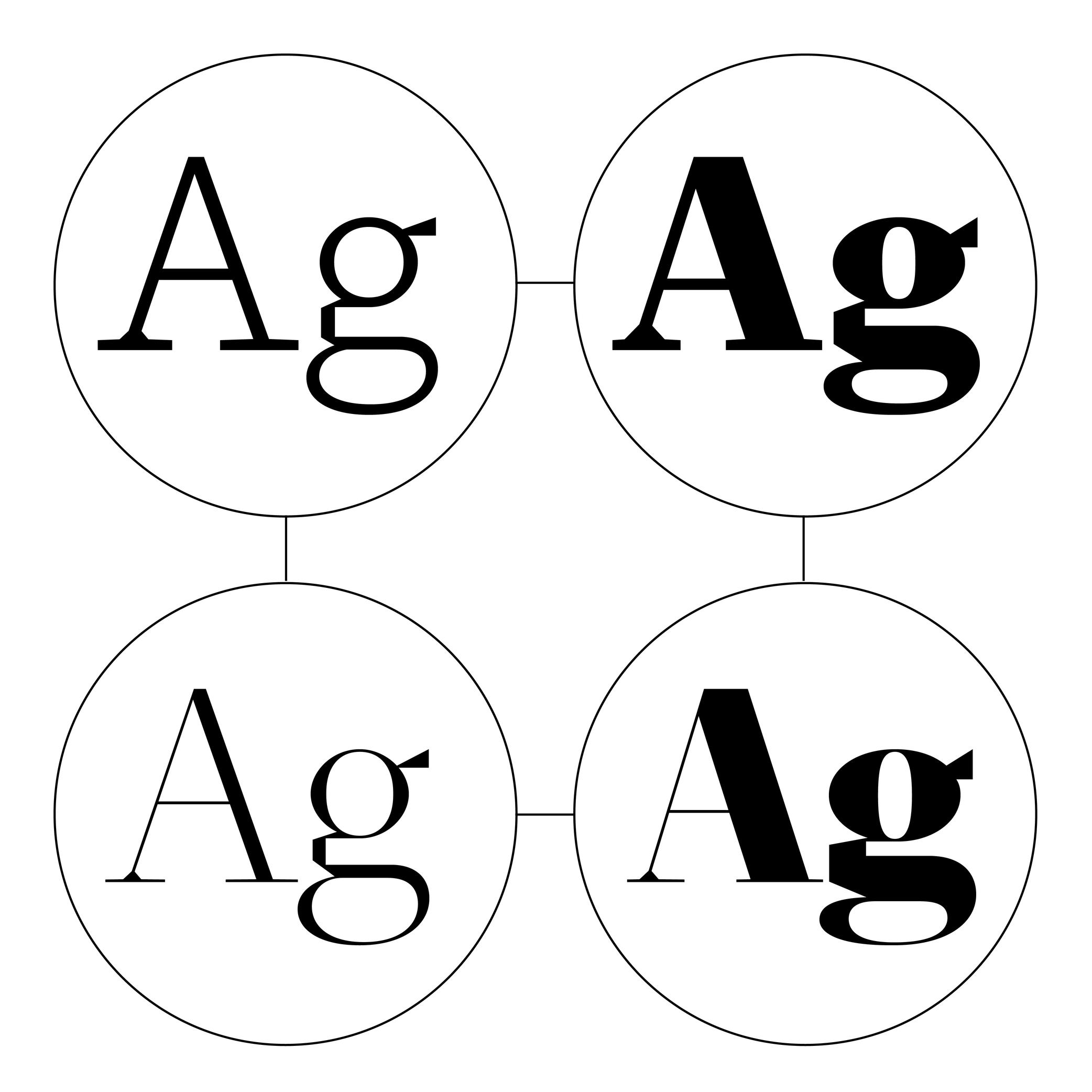
• stylistic: such as single-story or double-story letters a or g. These alternates can also reflect a specific aesthetic choice (e.g., with or without swashes).
• localization: some languages using a same script as others require a different form of the same character as localized preference variant.In digital fonts, these variants are accessed through OpenType features. Each one is tagged with a specific code (added as an extension to a glyph’s name) that enables a software to apply them whenever needed. Some most used ones being listed below:
• .calt: contextual alternates;
• .case: case-sensitive forms
• .ss01, .ss02, etc.: stylistic sets;
• .locl: localized forms;
• .onum: oldstyle figures;
• .tnum: tabular figuresAnchor
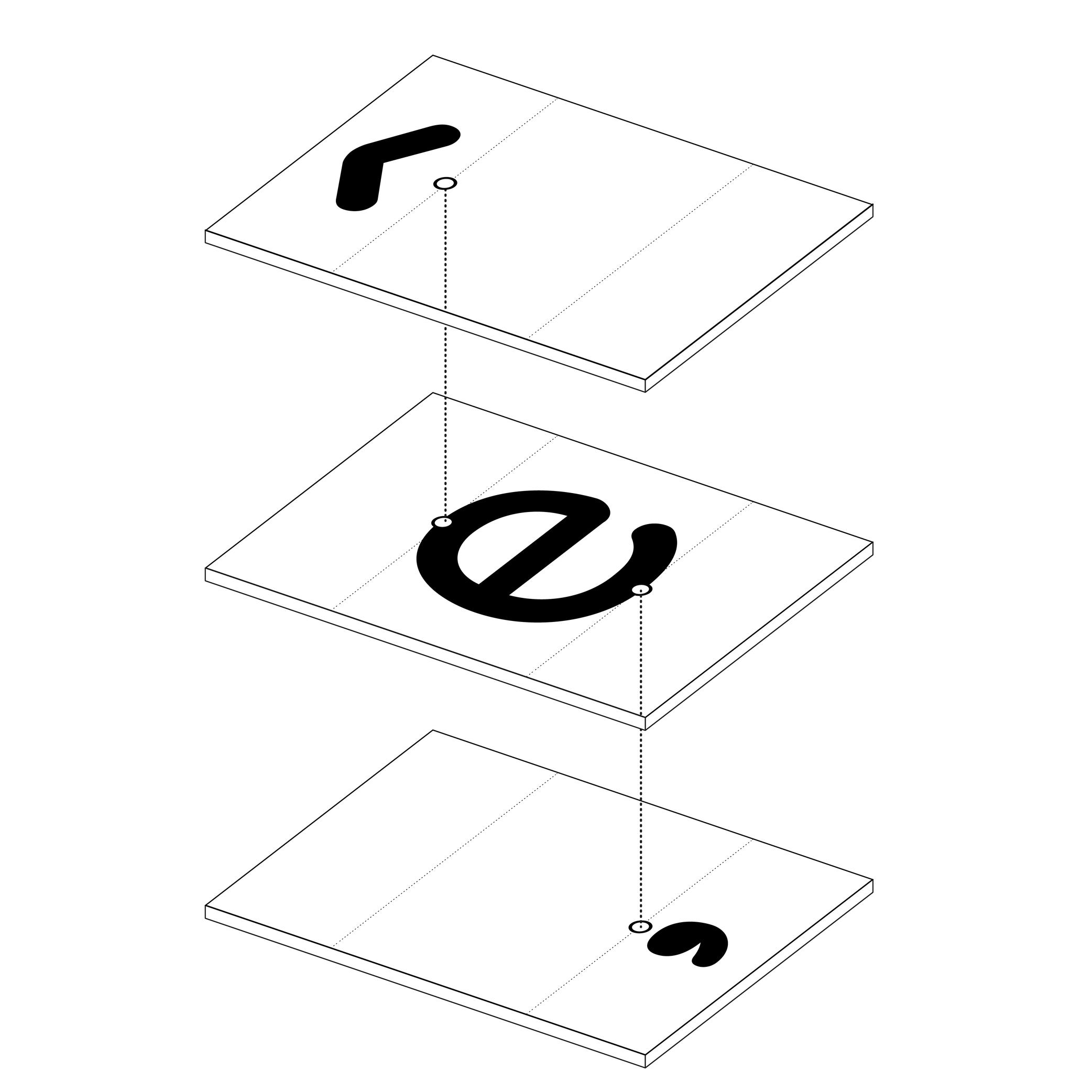
Illustration: Words of Type.
(Read More)In many languages and scripts, some glyphs are a combination of others, such as accented letters: é is the pairing of e with the diacritic “acute” on top.
When designing fonts, instead of copy-pasting the contours of both e and the acute accent into é, the designer adds an anchor on the top of e and below the acute accent, where both should be connected or anchored to each other. Thus, both elements are “called” to form the character é, which becomes its components.
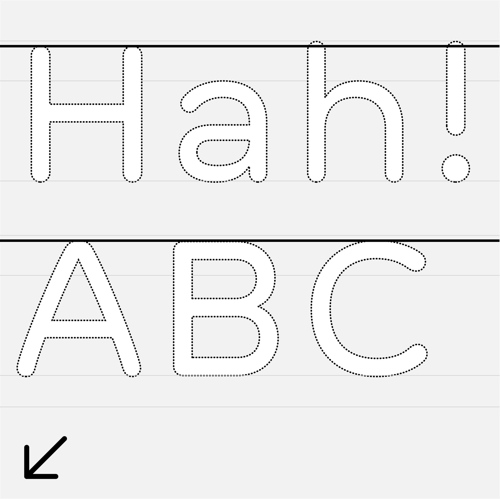
Ascender
 (Read More)
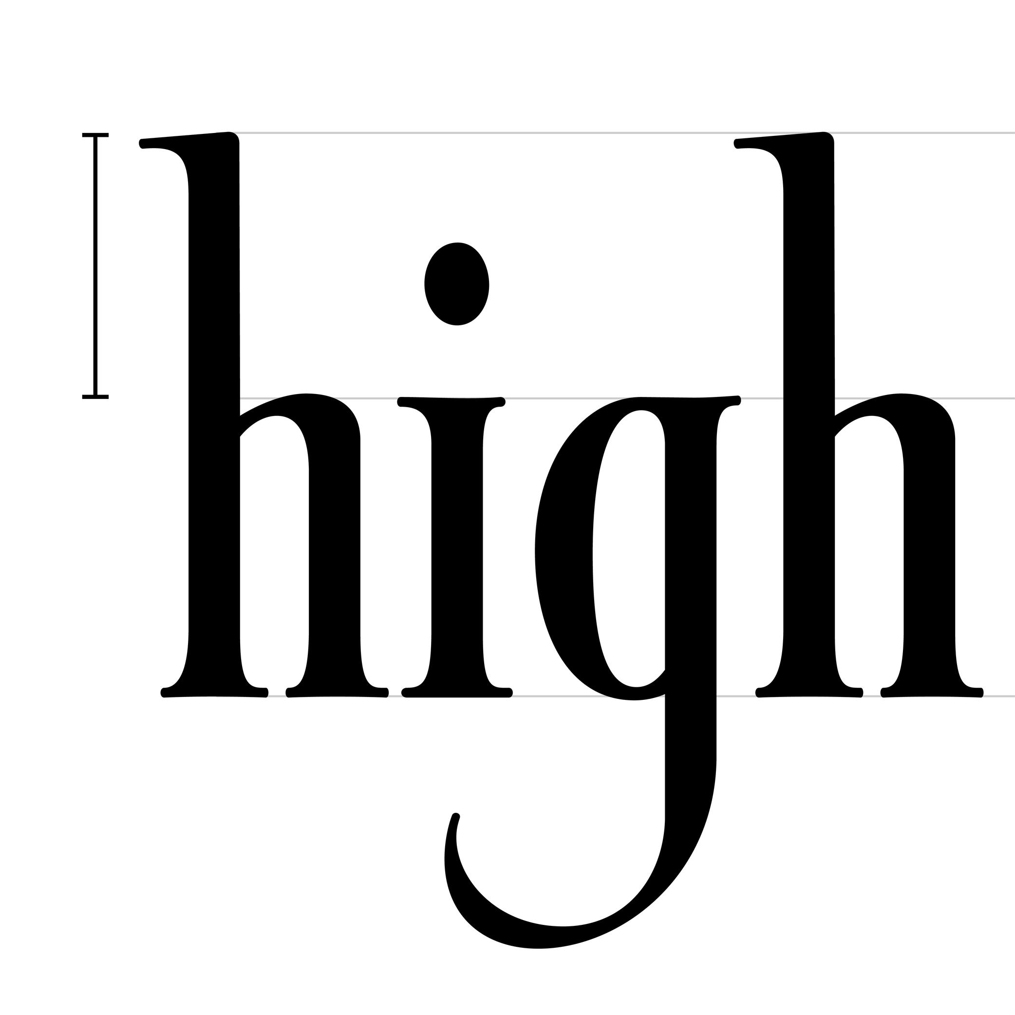
The parts of lowercase letters that go above the x-height level (such as b, d or h) are called ascenders.
On the opposite side of the x-height, the parts going below the baseline are descenders.
Both don’t necessarily need to have the same length. In general, descenders are shorter than ascenders.
Attention: do not confuse ascender height with the capital height (or cap height). Ascenders in Latin script are commonly taller than capital letters.
Axis (in Type Design)
Sponsored by R-Typography . Typeface in use: Gliko Modern L , designed by Rui Abreu, 2018.
(Read More)In Latin script, we speak of a “diagonal,” “tilted” or “oblique” axis when we refer to the shapes of letters in a typeface that have some contrast.
In calligraphy (when using a broad nib pen), the axis of the stroke is defined by the angle at which the pen is held, from which a contrast between thin and thick parts is formed. The axis should be kept the same (or very similar) for a consistent construction on all glyphs.
Baseline
Sponsor Word of Type and feature your typeface in this card with a linked caption. Contact us for more information.
(Read More)The baseline is where the bottom extremity of letters such as n and H are positioned, and it is used as a reference guide for the entire character set. We also say that letters are “sitting” on the baseline.
The baseline—with other guidelines like x-height, ascender, descender and capital height—helps to control the position of all letters and glyphs.
Bézier Curve
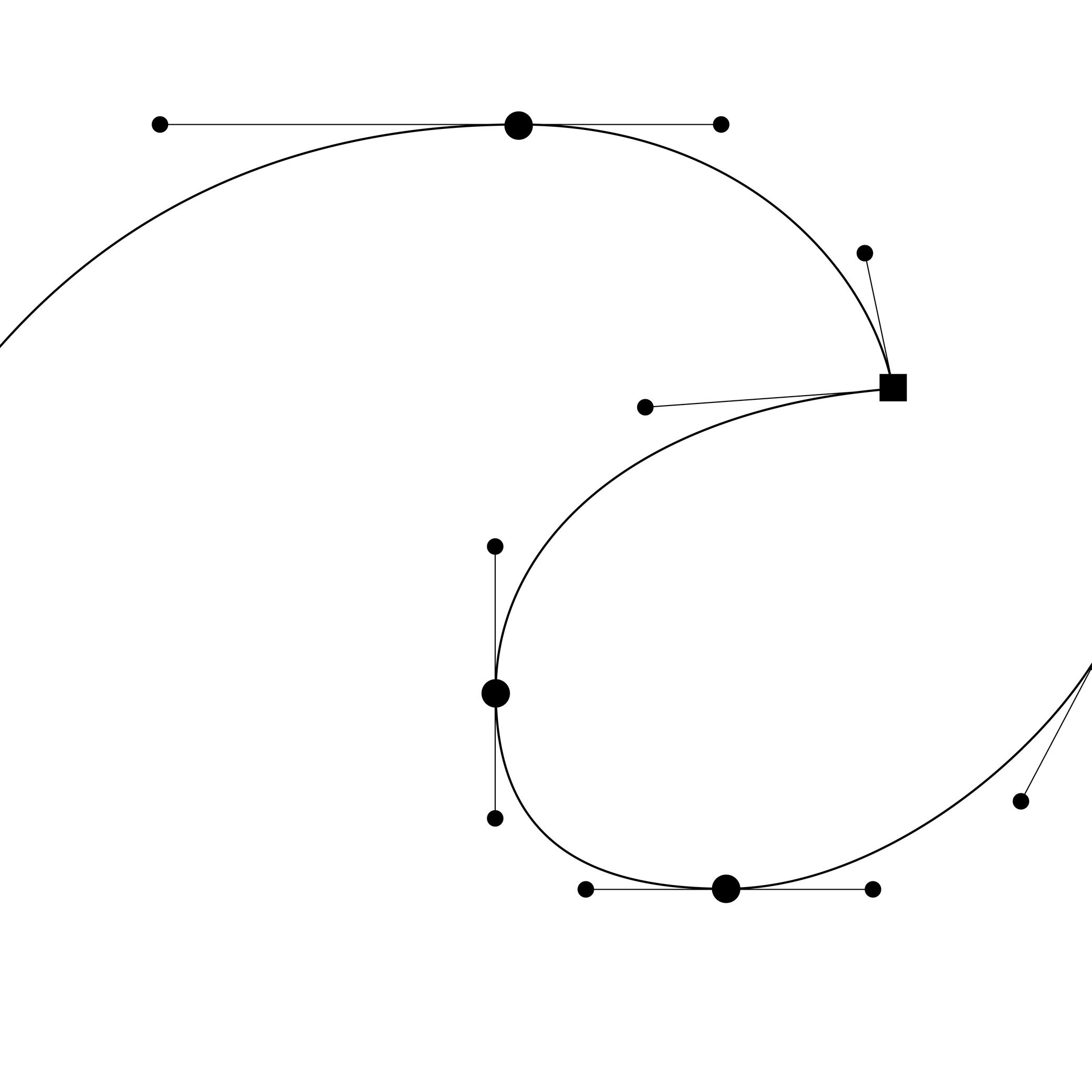
Illustration: Words of Type.
(Read More)In type design, Bézier curves are used to draw contours on digital applications with vectors drawn by placing points and handles. This technology allows us to rasterize digital shapes and keep their quality.
HISTORY
Bézier curve technology was developed by French mathematician and physicist Paul de Casteljau in 1959. Working at that time for the automobile brand Citroën, de Casteljau developed a mathematical formula to improve the design process of car bodies. French engineer Pierre Bézier used the same technology in 1962 for Renault (another automobile brand) to create shapes using digital tools. It wasn’t until 1985, when Citroën lifted its industrial secrecy clause, that de Casteljau could speak about his work and Pierre Bézier was able to publicly mention the origins of his own.
In 1982, Bézier curves were used by the American computer scientist John Warnock to develop a technology for describing and positioning digital shapes and contours for the company that he co-founded with Charles Geschke: Adobe Systems.
MORE
There are two types of Bézier curves: cubic and quadratic.
A cubic Bézier curve section requires the positioning of four points (two points and two handles), creating three sections between each point. The overall shape resembles a cubic shape, hence the name. Postscript font formats use cubic curves.
Quadratic curves are formed by three points (two points and one control point) to create a curve, with two sections cut halfway through to determine where the curve turns to the other point. TrueType font formats use quadratic curves.
Bounding Box
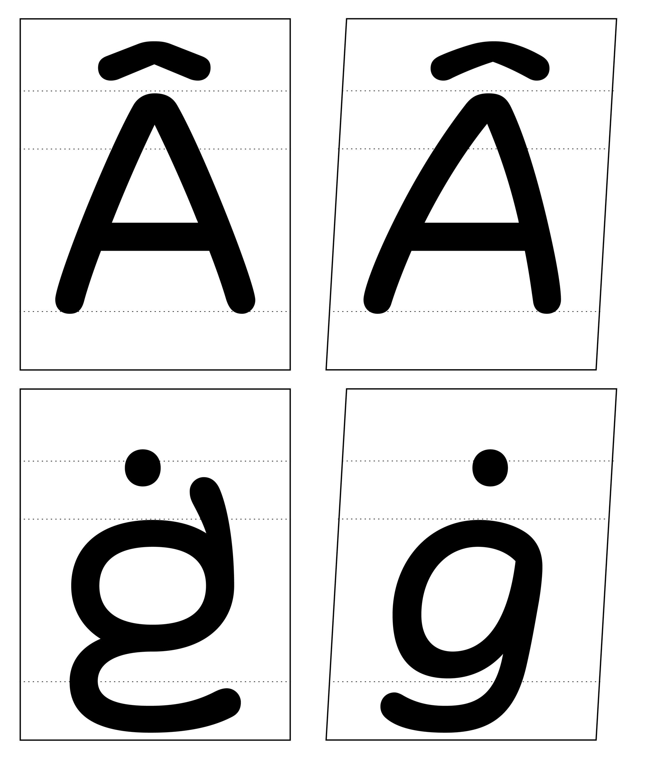
Illustration: Words of Type. Typeface in use: Knowledge Rounded, designed by Lisa Huang for Words of Type, 2024.
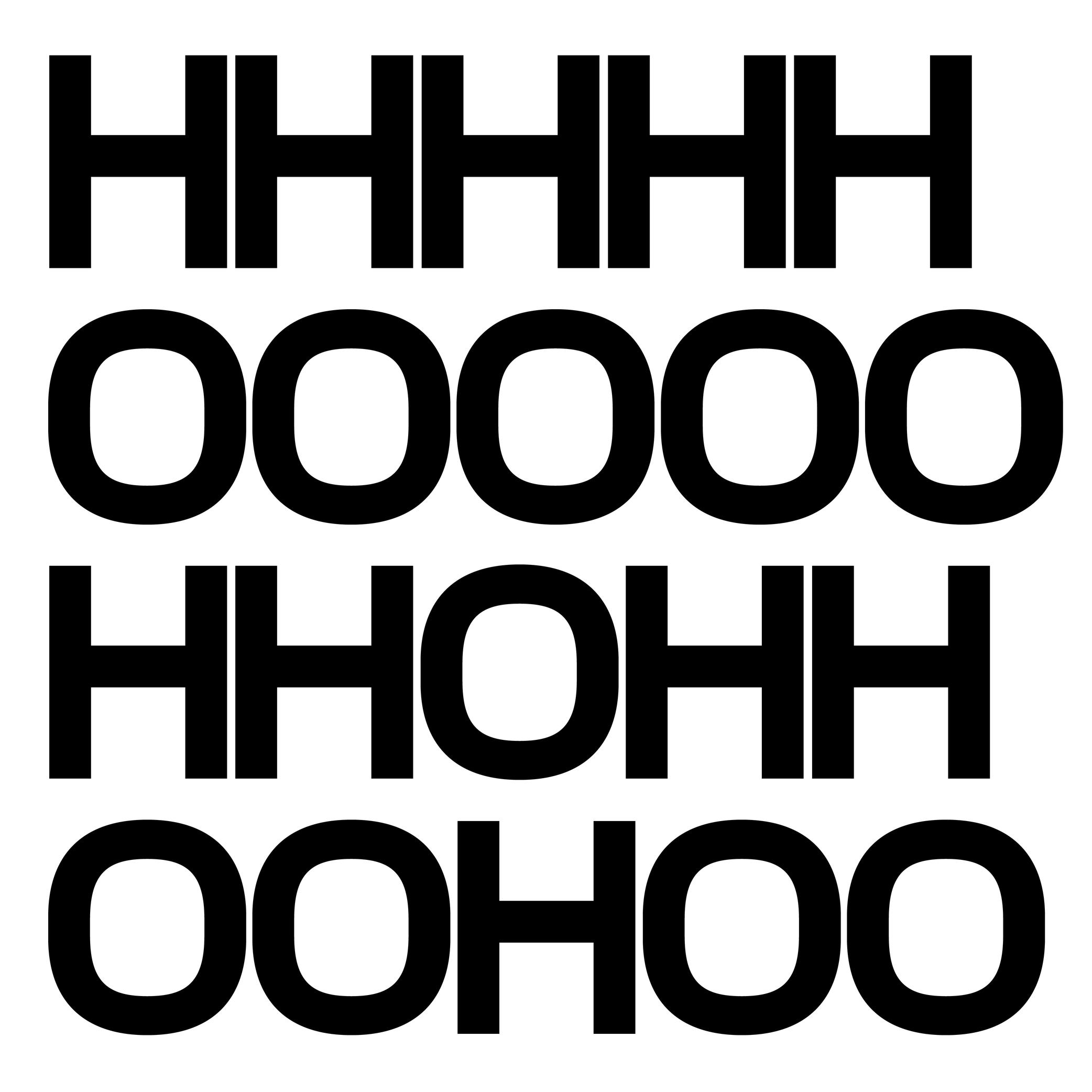
(Read More)The bounding box is a virtual rectangle enclosing a selected (vector) shape—such as a segment, an outline, or an entire glyph.
The font bounding box defines the outermost limits of a typeface, marked by the four extreme coordinates along the X and Y axes: highest (Y-max), lowest (Y-min), leftmost (X-min), and rightmost (X-max).
FONT ENGINEERING ADVICE
The font bounding box is stored in the head table.
Cap Height
Sponsor Word of Type and feature your typeface in this card with a linked caption. Contact us for more information.
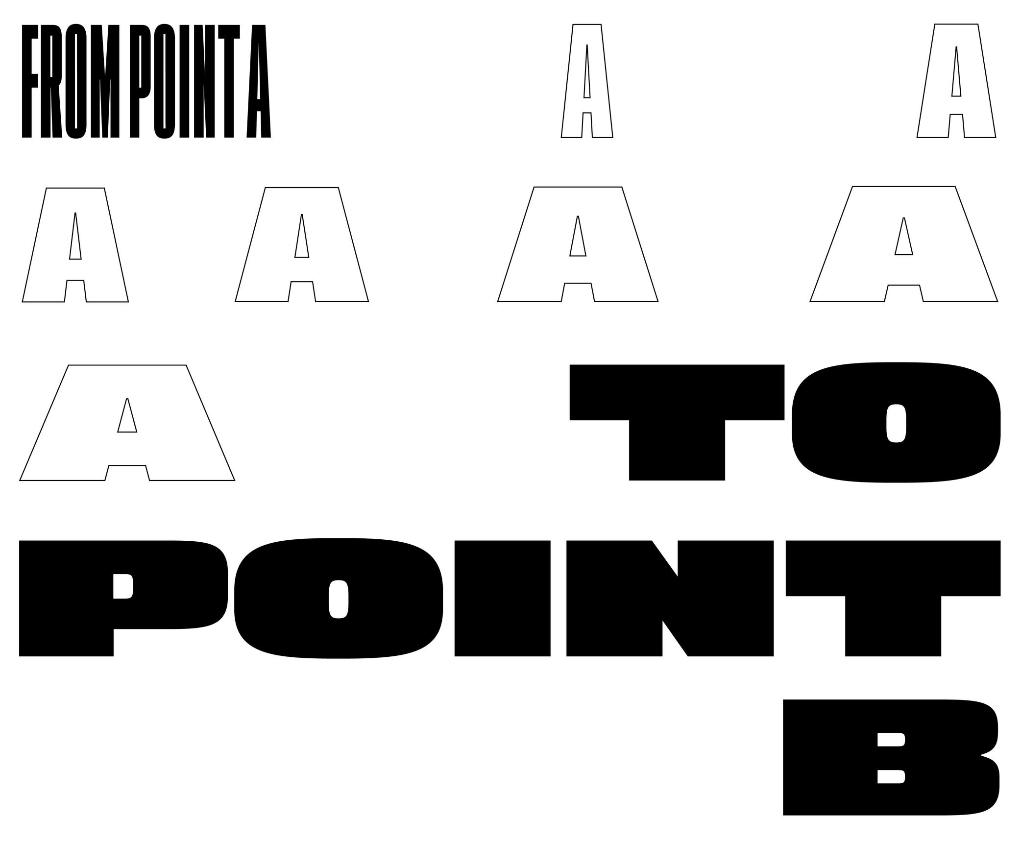
(Read More)The cap height (short for capital height) is at the top level of square capital letters, such as H.
The cap height is one of the main guidelines for Latin-script typefaces. It is usually lower than the ascender height in typefaces meant to be used at small size. This is also the case for sans serif styles to show a difference between l (lowercase L) and I (uppercase i). In many display styles, the ascenders are the same as the cap height to save some vertical space.
Capitalize
Sponsored by Type Together . Typeface in use: Rezak , designed by Anya Danilova, 2022.
(Read More)Also called to set in All-Caps.
In applications and tools that can process texts, to capitalize is to transform every selected lowercase letter into its capital variant.
FONT ENGINEERING ADVICE
The capitalization button in text editors usually calls several OpenType features: the case sensitive (.case), the capital spacing (.cpsp) and the proportional numbers features (.pnum).
Case Sensitive
Sponsor Word of Type and feature your typeface in this card with a linked caption. Contact us for more information.
(Read More)By default, most punctuation signs and some characters are designed to be combined with lowercase letters because this is the most frequent situation.
When combined with capital letters, some of them need to be adjusted to be optically aligned with the capitals. These variants are required in a good typeface so the user can access enough tools for quality micro-typography. They are called case-sensitive alternates, usually attached with the extension “.case” and accessible or activated on applications supporting OpenType features.
Character Set
Illustration: Words of Type. Typeface in use: Knowledge Rounded, designed by Lisa Huang, 2024.
(Read More)A character set is a list of glyphs (letters, figures, symbols, ligatures, punctuations, etc.).
In digital fonts, character sets (also called encoding lists) contain the glyphs of a font with their individual names and Unicode references.
There are multiple character sets specific to various scripts or languages, as each contains the needed glyphs used by its respective language. Separated character sets per script or language allow a smaller and optimized file size.In the context of a type design, a character-set is a group of encoded glyphs, while a glyph-set encompasses all the glyphs of a typeface—whether encoded or not.
Colophon
Illustration: Words of Type. Typeface in use: Archipel, designed by Lisa Huang, 2024.
(Read More)Also called imprint.
A colophon is a suggestive list of information about the production of a work or project. It can range from names and roles of people involved, typefaces or brand and kind of paper used, manufacturer and location of production, to hosting domain for websites, and more.
Compatibility
Sponsored by NM type . Typeface in use: Movement Direct , designed by Noel Pretorius & María Ramos, 2019.
(Read More)Variable Fonts technology allows users to navigate between two or more specific styles (called masters or sources) with high precision and much smaller font file sizes than several static fonts.
Outline compatibility allows the interpolation of vector shapes, enabling the generation of intermediate instances between two source files. This is essential for Variable Fonts, but even in static font design, maintaining compatibility is beneficial: it spares the designer from manually draw in-between weights or styles as separate masters, when they can be automatically created during the export.
For each glyph, compatibility means:
• same number of points, in the same order;
• same number of contours, in the same order and direction;
• same number of components, in the same order.Component
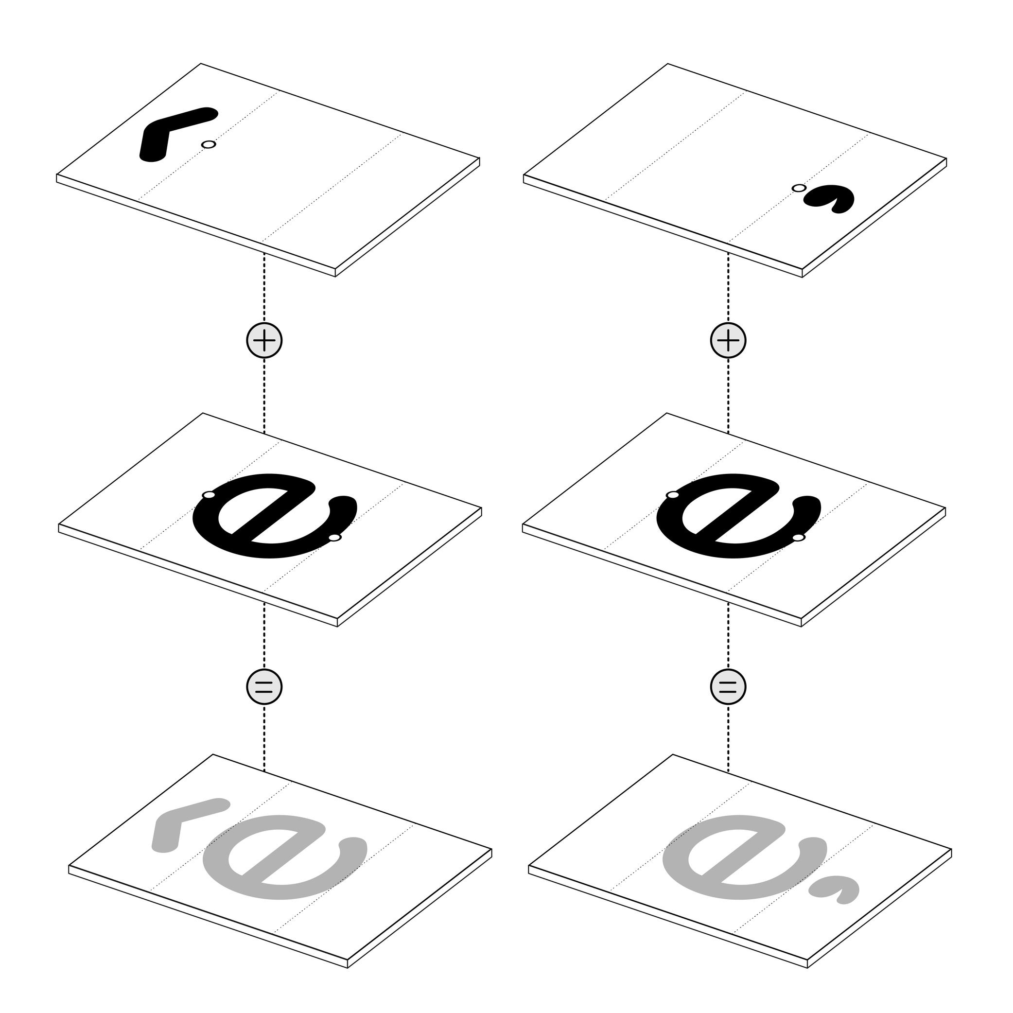
Illustration: Words of Type. Typeface in use: Knowledge Rounded, designed by Lisa Huang for Words of Type, 2024.
(Read More)Many shapes in a digital font are repeated identically across glyphs. These repeated elements can be turned into components. Components are reusable parts stored as separate glyphs which can be borrowed to form another glyph. For example, the letter é is made of the combination of two components; the base letter e and the acute accent.
Using components instead of copying contours keeps shapes consistent and helps reduce the font file size.
• A glyph made only of components is called a composite.
• A glyph that combines both contours and components is called a mixed composite. Mixed composites are not permitted in the final binary font (exported font) files. As a result, they are usually decomposed during export.
• When a component references another component, it is said to be nested.
• A component is considered as aligned when it is reused in a glyph without transformation.For design purposes, components can be transformed — shifted (translated), scaled, rotated, skewed, flipped, or mirrored. Transformed components may need to be decomposed, especially if the transformation alters the contour direction (such as mirroring), which can affect its appearance on the pixel grid.
FONT ENGINEERING ADVICE
The component system is a compression strategy used in TrueType fonts to reduce file size by referencing repeated shapes across glyphs. In contrast, PostScript-based fonts (OpenType-CFF flavor, with the .otf extension) use a different space-saving method called subroutines—small sections of path instructions that can be reused. Because subroutines operate at the path level rather than referencing entire glyphs, components are typically decomposed during export so their outlines can be stored and reused within these subroutines.
Contour
Illustration: Words of Type. Typeface in use: Knowledge Rounded, designed by Lisa Huang, 2024.
(Read More)Also called Outline.
The shape of a glyph is defined by one or more contours. In digital typeface design, the contour is what the designer draws. What the user sees on screen or in print is the filled shape in between these contours.
Contours and outlines are related but not exactly the same. An outline is the full outer shape of a glyph: it defines what the glyph looks like overall. While a contour is one continuous closed path within that outline. For example, the outline of the letter O typically has two contours; one for the outer circle and one for the inner counter (the transparent “hole”).
Descender
Sponsored by Frere-Jones Type . Typefaces in use: Empirica , designed by Tobias Frere-Jones, Nina Stössinger, 2018.
(Read More)The parts of lowercase letters (such as p, q or y), old style figures or some punctuation symbols going below the baseline are called descenders.
In the same typeface, all descenders need to have the same height for overall consistency.
On the opposite side, parts going above the x-height are ascenders, like in letters b, d or f.
Both ascenders and descenders don’t necessarily need to have the same length. In general, descenders are shorter than ascender
Diacritic
Sponsored by Nymark Type . Typeface in use: Tranemo , designed by Andreas Nymark, 2021.
(Read More)Diacritics are marks added to letters. They can be above, below, or attached to a letter. In most languages and scripts using diacritics, these bring to the letter a different sound than that of the letter by itself.
LATIN SCRIPT
The Latin script is used in a large number of languages. Most of them use diacritics to bring (sometimes very subtle) variations of sound to letters. The quality of the sound of a diacritic can be different from one language to another. An example with the cedilla ç, used in French, Portuguese, and Turkish. Other languages even use multiple diacritics combined together within the same letter (like in Vietnamese with ở).
ARABIC SCRIPT
In the Arabic script, letters have different pronunciations depending on which diacritic is attached to them (or not there), and the language in use.
CHINESE PINYIN
In Mainland China during the 1950s, a new phonetic transcription system was created to make Chinese learning easier: Pinyin, which borrows Latin alphabet letters combined with diacritics as tone markers.
DESIGN
When creating a typeface, diacritics are designed as individual glyphs and are then combined with letters as components in type design applications. They need to be:
- visually aligned to the same height with one another (for those placed in the same area);
- have consistent weight and color;
- placed in a position with the letter that feels “natural” for each language.
EULA
Illustration: James Graham .
(Read More)Digital typefaces are products distributed and sold like software: it is not the design itself that is sold, but a copy (a font) attached with an agreement to use it: its license.
When purchasing a license, a specific EULA (End User License Agreement) is attached, containing all the terms and conditions of use granted by the distributor, foundry or designer for each font.
Different EULAs and licensing terms can exist according to the politics and principles of each entity. It is always advised to contact the foundry or the distributor if there is any doubt or question related to the terms in the EULA, to be sure that the license and EULA are valid for the intended use.Export
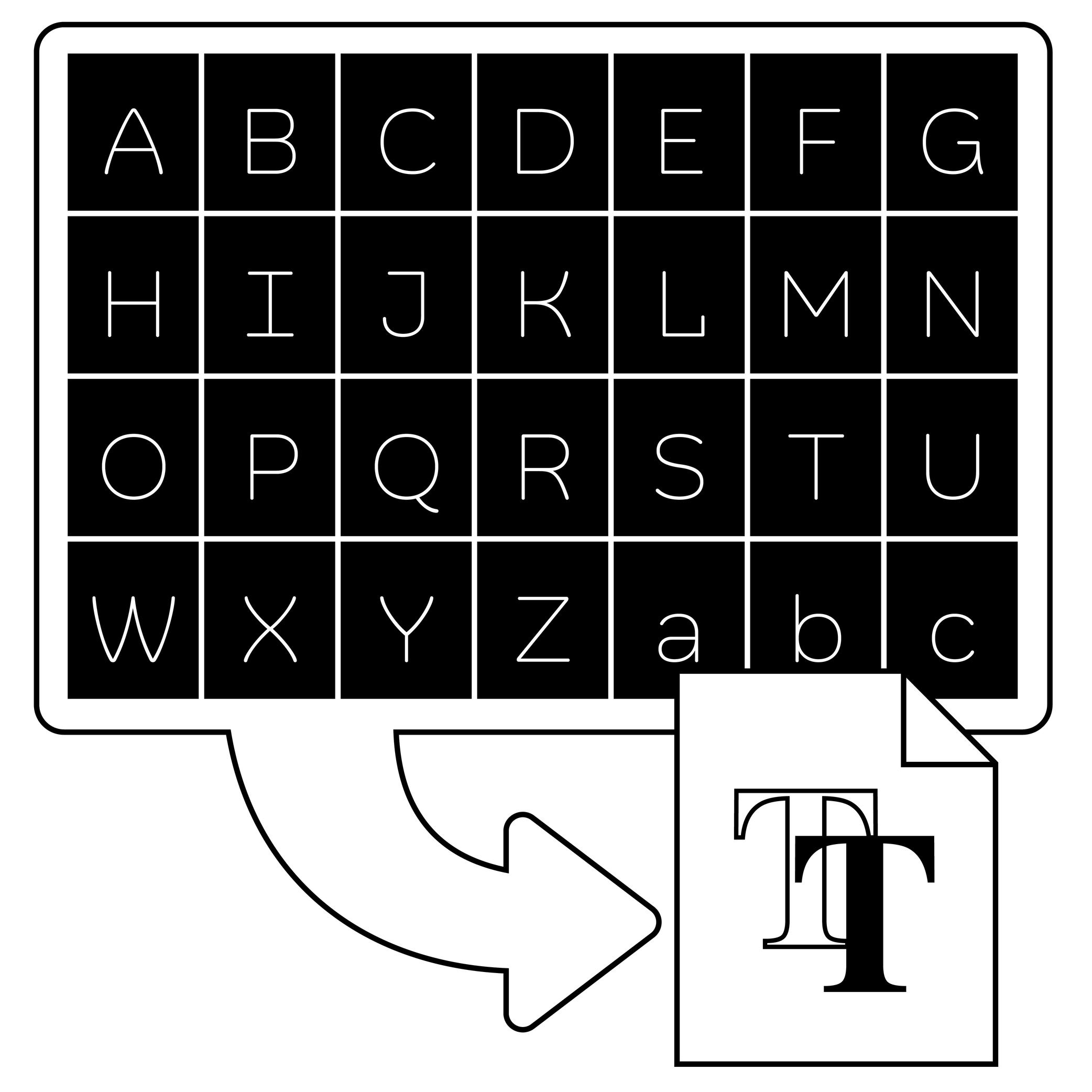
Illustration: Words of Type. Typeface in use: Knowledge Rounded, designed by Lisa Huang, 2024.
(Read More)In type design applications (or font editing software applications), exporting is the process of transforming a working editable file (called source file) into one or more font files that can be installed and used.
The most common exported format is OpenType, which comes in several flavours depending on usage:
• .otf for PostScript outlines, commonly used in Adobe apps and professional printing workflows;
• .ttf for TrueType outlines, widely supported on Windows and Android systems;
• .woff and .woff2 which are compressed formats designed specifically for use on the web.FONT ENGINEERING ADVICE
Exported font files are binary. This means all the font data—such as glyph outlines, kerning pairs, hinting instructions, and more—is stored as sequences of bits (0s and 1s) that the operating system can interpret directly, without relying on a third-party tool. By contrast, source files like .glyphs (Glyphs ), .vfb (FontLab ), or .ufo (an open format compatible with many editors, mainly used in Robofont ) are not binary. They require a specific software to be read and edited.
Extrapolation
(Read More)Variable Fonts technology allows users to navigate between two or more specific styles (called masters or sources) with high precision and much smaller font file sizes than several static fonts.
When we navigate between masters—in the design space—we are looking at interpolations, and extrapolations go in the opposite directions.
For example, if we design a Regular and a Bold weight, a Medium can be interpolated between them. Using the same data, it could also be possible to extrapolate a Light weight, extending beyond the original scope of that weight axis.
It is not commonly used but some type design applications (or plug-ins) can generate previews of extrapolated instances.
GOING FURTHER
In a font editor software, extrapolation can be used to create new masters, helping extend the boundaries of the existing design space.
In a Variable Font, extrapolation can theoretically be used to preview areas of the design space (usually called corners) that haven't been defined by masters. Traditionally, you need at least 4 masters to define a design space of 2 axes. For example, a Regular and Bold on the weight axis, and a Condensed and Condensed Bold on the width axis. Mathematically, it should be possible to omit the Condensed Bold corner in the source, and still be able to generate a full functional VF out of the 3 other masters—Condensed Bold being extrapolated and not defined as a master. This makes it possible to manage complex design spaces while keeping the font file size reasonable.
Extrapolated results can be unreliable and visually disappointing, so they should be used with caution.
FONT ENGINEERING ADVICE
Functional Variable font extrapolations as described above were not really possible until the addition of the avar2 font table in 2024 in the OpenType Specifications. The table is still not widely supported yet and thus still at the experimental stage (as of the current version of Words of Type).
Extrema Point
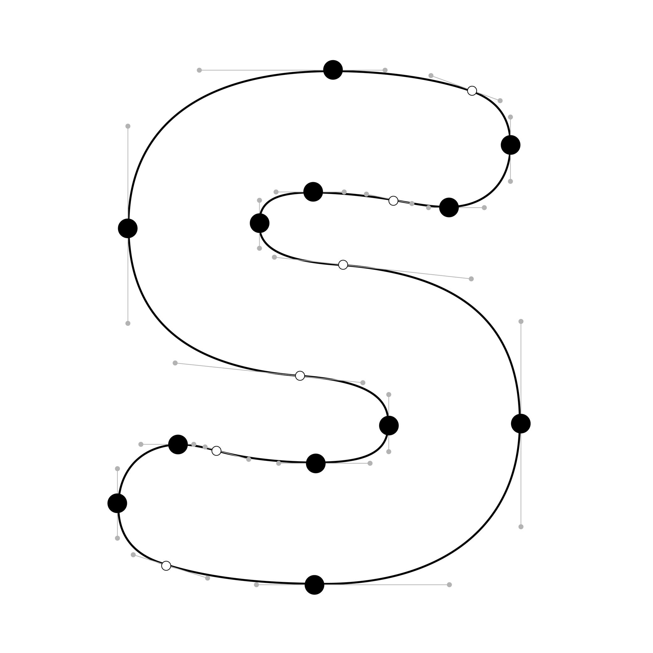
Illustration: Words of Type. Typeface in use: Knowledge Rounded, designed by Lisa Huang, 2024.
(Read More)In digital fonts, curves are defined by at least two end points (also called on-curve points or nodes) and one or more off-curve points (also called handles), which control the shape and tension of the curve.
Extrema points are the highest, lowest, leftmost, or rightmost points on a curve. These can be recognised by their associated handles, which align strictly horizontally or vertically.
Hints can only attach to extrema points. For proper rasterization (conversion of vector shapes into pixels), it is therefore essential to ensure these points are present and correctly placed.
NOTE
Since PostScript hinting doesn’t apply to diagonal stems, it is debated whether vertical extrema are necessary in italic shapes.
Font
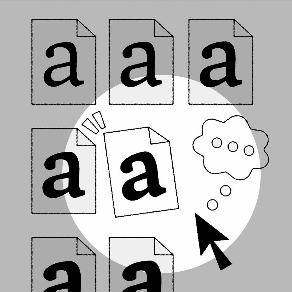
Illustration: Raven Mo .
(Read More)Since the era of metal type printing, a font referred to a set of lead pieces for a specific typeface, in a particular style and size. For example, Times New Roman 10 pts, Times New Roman Bold 16 pts, and Times New Roman Bold Italic 16 pts were three distinct fonts of the Times New Roman typeface.
The word font comes from the French fondre, meaning to melt, as characters were cast by pouring molten lead into moulds called matrices.
In the digital era, a font is an independent file containing a typeface in one or more style. In static fonts, one file corresponds to one style. In variable fonts, a single file can include multiple styles through interpolation.
For example:
• Helvetica Neue Light (HelveticaNeue-Light.otf) and Helvetica Neue Light Italic (HelveticaNeue-LightItalic.otf) are two separate static fonts;
• Helvetica VAR (HelveticaVAR.ttf) and Helvetica VAR Italic (HelveticaVAR-Italic.ttf) are variable fonts, each containing a range of styles (Light, Regular, Bold, etc.).Format
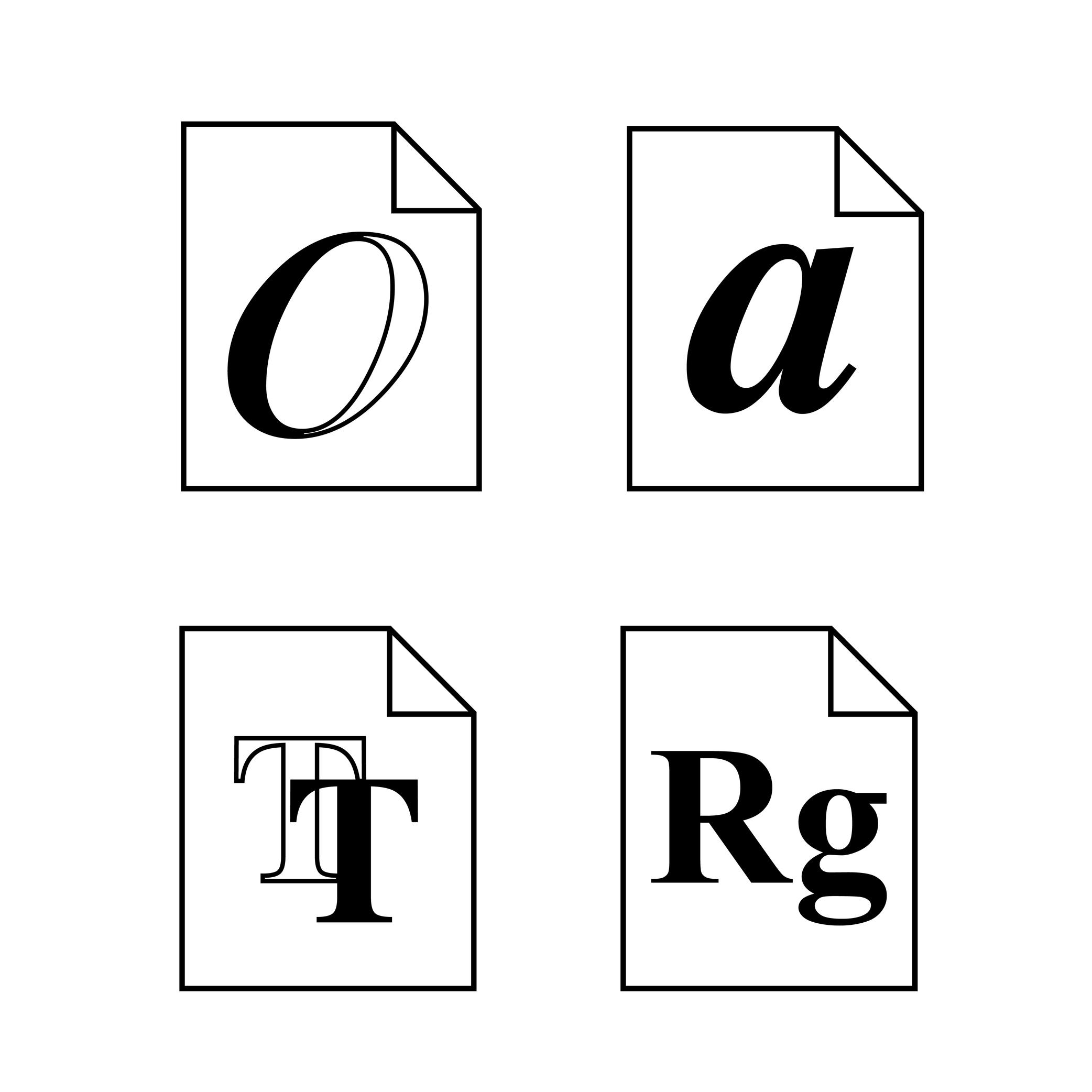
Illustration: Words of Type.
(Read More)There are multiple file formats for digital fonts. Each one is specifically designed for optimal use at different times and situations.
HISTORY
The history of digital fonts includes several major formats. The most notable ones are:
• PostScript Type 1, developed by Adobe in 1984;
• TrueType, developed by Apple in 1991;
• Multiple Master Type 1, Adobe, 1992;
• TrueType GX, Apple, 1994;
• OpenType, co-developed by Microsoft and Adobe in 1996.GOING FURTHER
Today, OpenType is the dominant format in use (extension name as .otf). It supports both PostScript and TrueType outline technologies, which now exist as two flavors or outlining models within the OpenType container.
WOFF and WOFF2 are additional web-optimized containers that compress and package OpenType/TrueType fonts for efficient delivery over the internet. The term format tends to be used instead of flavor but, technically, PostScript and TrueType are no longer standalone formats; instead, they are integrated into the broader and more versatile OpenType ecosystem.Glyph
Sponsored by Blaze Type . Typeface in use: Apoc , designed by Matthieu Salvaggio with Tomorrow Type, 2018.
(Read More)The terms ‘glyph’ and ‘character’ are often mixed up, but there is a linguistic difference between them: a glyph is a specific representation of a character. For example, the character A can be represented by both glyphs A and a.
In digital typography, a glyph may be encoded or not. If it represents a distinct character, it will be assigned a Unicode code point. If it is a localized, positional or stylistic variant, it won’t have its own code point and is instead accessed via OpenType feature substitutions.
FONT ENGINEERING ADVICE
In a font file, the cmap table maps characters (code points) to glyph indices. The GSUB table defines all available glyph substitutions, enabling access to stylistic alternates, ligatures, and localized forms.
Grid
Illustration: Words of Type.
(Read More)In typography (or typesetting), a structure—called a grid—is designed on a page to place the elements, helping with the content’s organization and legibility.
Handle
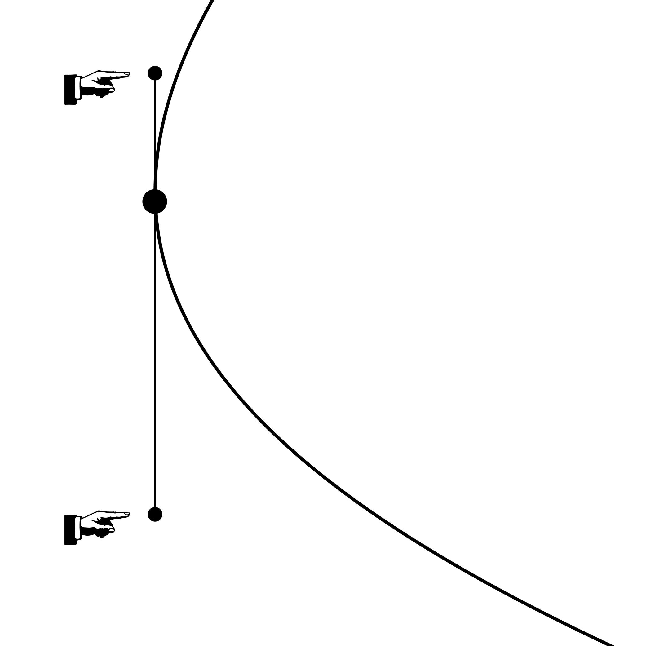
Illustration: Words of Type.
(Read More)Handles—also called Bézier Control Point (BCP for short) or off-curve points—are toggles placed by the designer to determine the curvature of a segment. Their length and relative position have rules to be followed to ensure the quality of a contour in any situation once the file is exported and used:
- both handles on the same side of the curve;
- about 1/3 of the length of the curved segment between the handle and its closest point;
- no intersection of handles of the same segment.
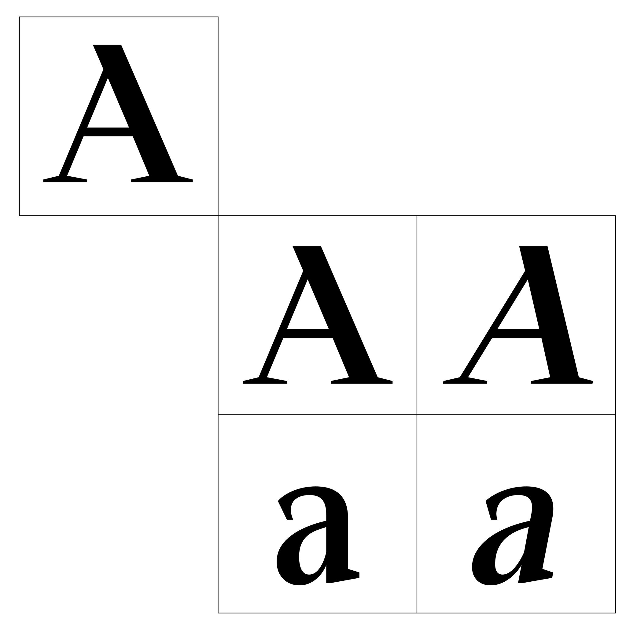
Height
Illustration: Jonny Wan .
(Read More)For each category of glyphs in a character set (caps, lowercase, smallcaps, etc.), the designer uses specific height levels as guidelines. They help maintain the consistency of the shapes and the positioning of the various elements for every glyph throughout the typeface.
Hinting
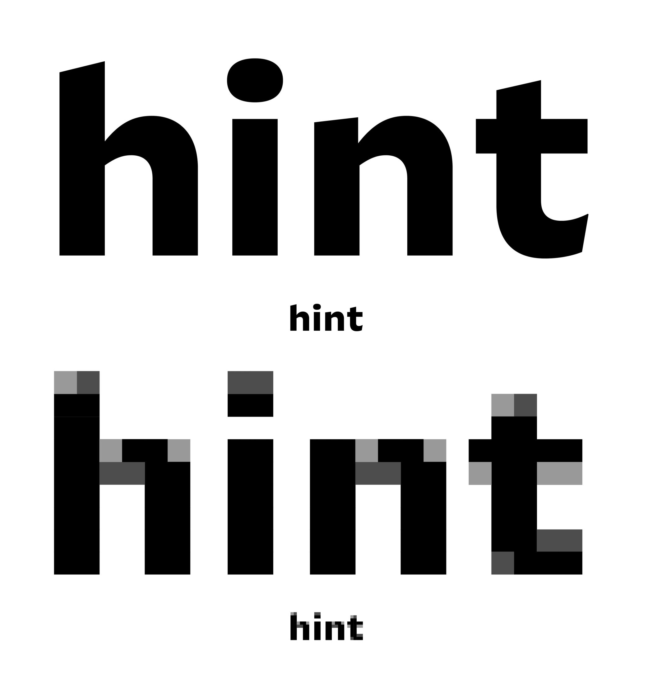
Sponsored by Frere-Jones Type . Typeface in use: Mallory MicroPlus , designed by Tobias Frere-Jones.
(Read More)Before high-resolution screens were available, those with lower resolutions required the use of font files that went through a hinting process.
Digital fonts are files with glyphs as vector contours shaped by the designer on type design applications. On lower-resolution screens, they are rendered by being adapted into bitmap fonts on pixel grids.
Hinting is about giving instructions to each pixel’s position in lower resolution situations, ensuring a rendering that is as close as possible to the original design.Hypertext
(Read More)A hypertext link is a part of digital text linked to another page or website.
It is often displayed underlined or highlighted in a different color or style.
Hyphenation
(Read More)Hyphenation is the management of word breaks (with a hyphen) wherever a word at the end of a line doesn’t fit. The position of a word-break within a word depends on the language and the script.
There are some options about the usage of hyphenation, such as:
• whether or not to avoid it in capitalized words;
• whether or not to avoid it in the last word of a paragraph or a column;
• generally to avoid having more than three hyphenated lines of text in a row.Icon
Illustration: Jonny Wan .
(Read More)In typography and type design, an icon can be a pictogram (a stylized drawing of an object) or an ideogram (a drawing with a meaning).
Instance
Sponsored by Blaze Type . Typeface in use: Mega , designed by Matthieu Salvaggio and Malo Haffreingue, 2023.
(Read More)Variable Font technology allows users to navigate within or use multiple variations between two or more specific styles (called masters) with high precision and much smaller font files. When we navigate between masters, we are looking at interpolations, which can be exported and used as individual font files, called instances.
GOING FURTHER
Whether a font is variable or not, the concept of a design space can help makers and users visualize how the styles within a typeface family relate to one another. An instance is a style positioned at a defined location in this space. In addition to having a name (like Regular, Bold, or Condensed Bold), an instance also has coordinate values along one or more design axes (such as weight or width). That becomes especially important in the context of variable fonts, where styles are not static but generated through interpolation within the design space.
The names and values associated with common axes such as weight, width, italic, and slant are standardised and documented in the OpenType Specifications .
FONT ENGINEERING ADVICE
There is a distinction between the design space (defined by the outlines and master values) and the user space (what applications read and expose to the user). OpenType specifications document the user space.
Although it is possible to assign any coordinate values to masters and instances for design purposes, these must be mapped to standardized user space values when it come to the common axes mentioned above. For instance, a Regular style must always map to 400 on the weight axis, and a Bold to 700. Some apps only read these values to display an instance, the are therefore necessary for a proper user experience.
Interpolation
Sponsored by Commercial Type . Typeface in use: Ionic Modern , designed by Paul Barnes with Greg Gazdowicz, 2024.
(Read More)Variable Fonts technology allows users to navigate between two or more specific styles (called masters or sources) with high precision and much smaller font file sizes than several static fonts.
For example, the interpolation between Regular and Bold allows the generation of a Medium style (also called instance) as well as any other intermediate state.
This process relies on the compatibility of the outlines across masters, meaning they must share the same structure and number of points to interpolate correctly.
Interpolation allows variable fonts to have a reduced file size because they store only two masters (or more) and their variations data, rather than separate outlines for every possible style.
FONT ENGINEERING ADVICE
A variable font technically contains only one full master: the origin. This is the default style shown when variable font technology is not supported.
The other masters are stored as delta data—mathematical differences from the origin—used to interpolate and generate other instances dynamically. This delta data is stored in the gvar table.Kerning
Sponsored by Kerns & Cairns . Typeface in use: Glissade , designed by Dyana Weissman, coming soon.
(Read More)Characters have a specific space on both sides, which can be positive, negative, or zero. Setting these values for characters in a font globally is called setting its spacing. And in some cases, when specific pairs might result with a space that is too loose, too tight, or even with parts colliding, the designer needs to work on their kerning. Kerning is about adjusting the distance between such pairs whenever they are used next to one another and in that specific order, to give a smoother texture of the text.
Once a kerning value has been set for a pair of glyphs, those values can be repeated on every other pair with identical or similar shapes (e.g., V + A, W + A). Kerning can be set even with already published fonts in most applications (useful in justified texts), but great typefaces usually have these already fixed.
Lettering
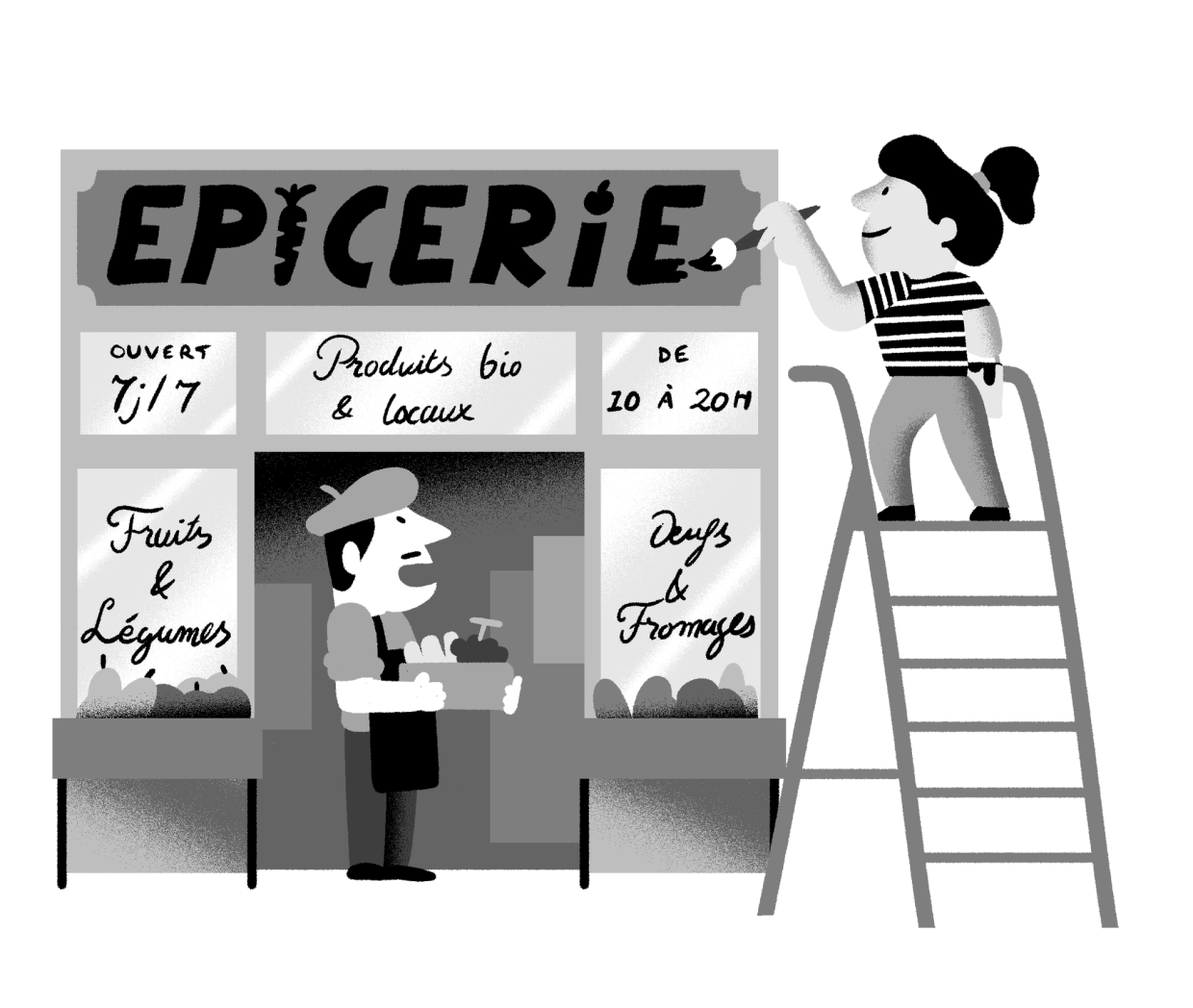
Illustration: Yann Bastard .
(Read More)A lettering is a drawing of a group of characters made for a specific situation (such as on a shop sign) or for a piece of work (a brand’s logo, a title for a magazine insert, etc.), unlike a typeface where each and every glyph is individually designed in a way to work in all kinds of combinations.
Ligature
Sponsored by LO-OL . Typeface in use: Kronik Antik Display, designed by Loris Olivier, 2023.
(Read More)In the era of metal-type printing, some character combinations in specific languages were used so often that they were combined to save time while composing texts. Punchcutters would ensure that one sort from the font would depict both letterforms together. We call these individual sorts with more than one letterform a ligature.
Other ligatures weren’t made because of the need to save time but because a series of letterforms would otherwise appear in a non-aesthetic manner on the page. One example of this is the f and i. Without a ligature, the white space between those two letters would be bigger than between other lowercase letters. Plus, the upper terminal of the f would be too close to the dot of the i.The same principle has been kept in digital typefaces and ligatures exist as independent glyphs. OpenType features allow us to switch from two separated glyphs to their ligature variant thanks to the ligature alternate features (if they exist in the selected typeface).
Margins
Illustration: Words of Type.
(Read More)Margins are the spaces around a composition block (left, right, top and bottom margins).
Master
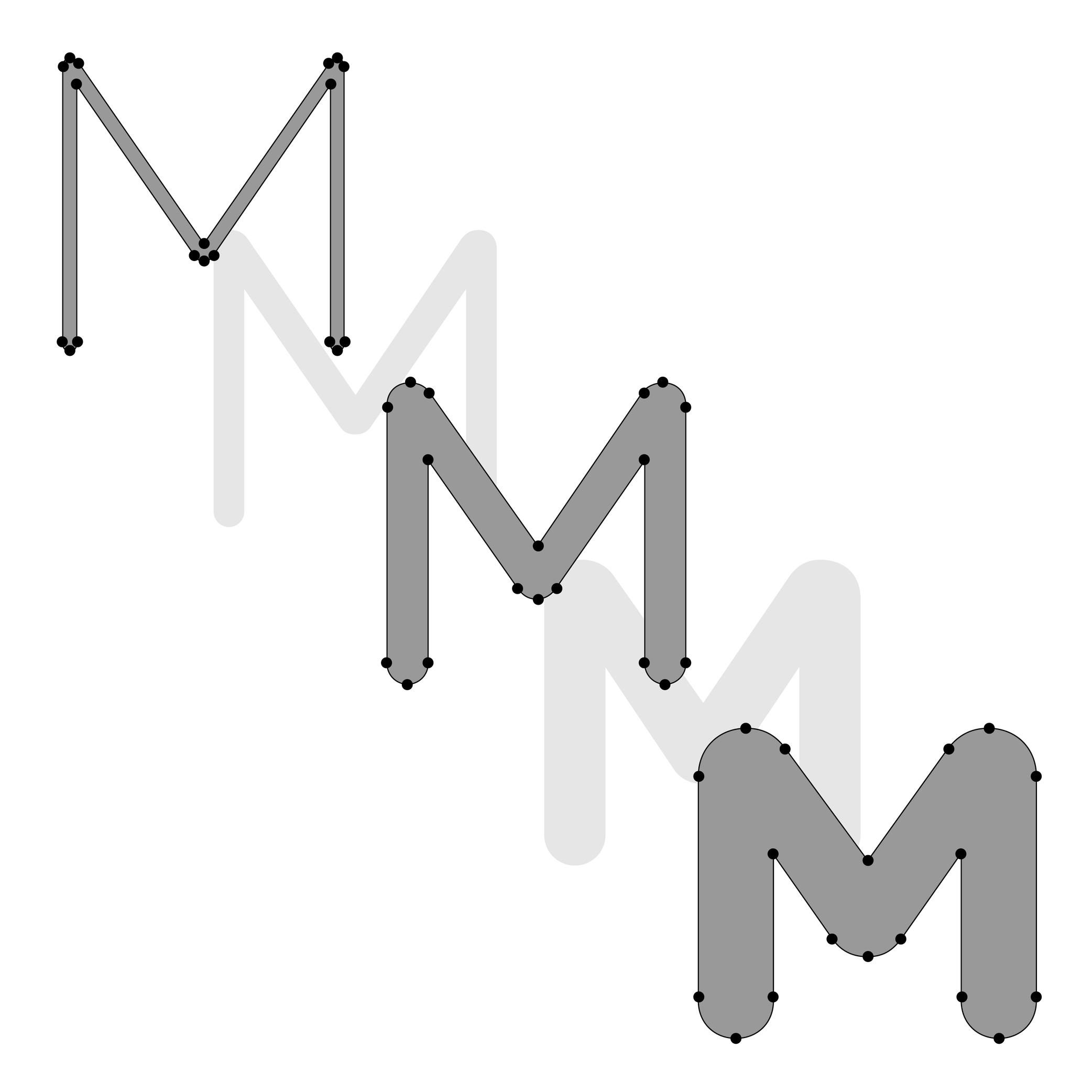
Illustration: Lisa Huang. Typeface in use: Knowledge Rounded, designed by Lisa Huang, 2024.
(Read More)For a Variable Font file to work correctly, it requires a minimum of two font files called masters, in which the glyphs need to be designed with:
- the same number of nodes and anchors;
- the same number of contours;
- in the same order and the same direction; so that interpolations or instances in between the masters can be calculated and displayed properly.
Masters can set up various types of axes (or design ranges) such as weight, optical size, slant angle, etc.
When there are multiple axes in a Variable Font, it is a Multiple Masters font.Metadata
(Read More)Digital fonts are files containing various categories of information for it to be fully functional, correctly installed and used on devices, called metadata.
There are information such as names of the designer(s), publisher or distributor, version number or export, its release date, copyright information, etc.
Multiple Masters
Sponsored by R-Typography . Typeface in use: Montris , designed by Rui Abreu, 2024.
(Read More)Variable Fonts technology allows users to navigate within or use multiple variations between two or more specific styles (called masters) with high precision and much smaller font files.
Whenever more than two masters are used—giving a more complex Variable Font file—it is considered as a Multiple Master font (or MM for short).
Node
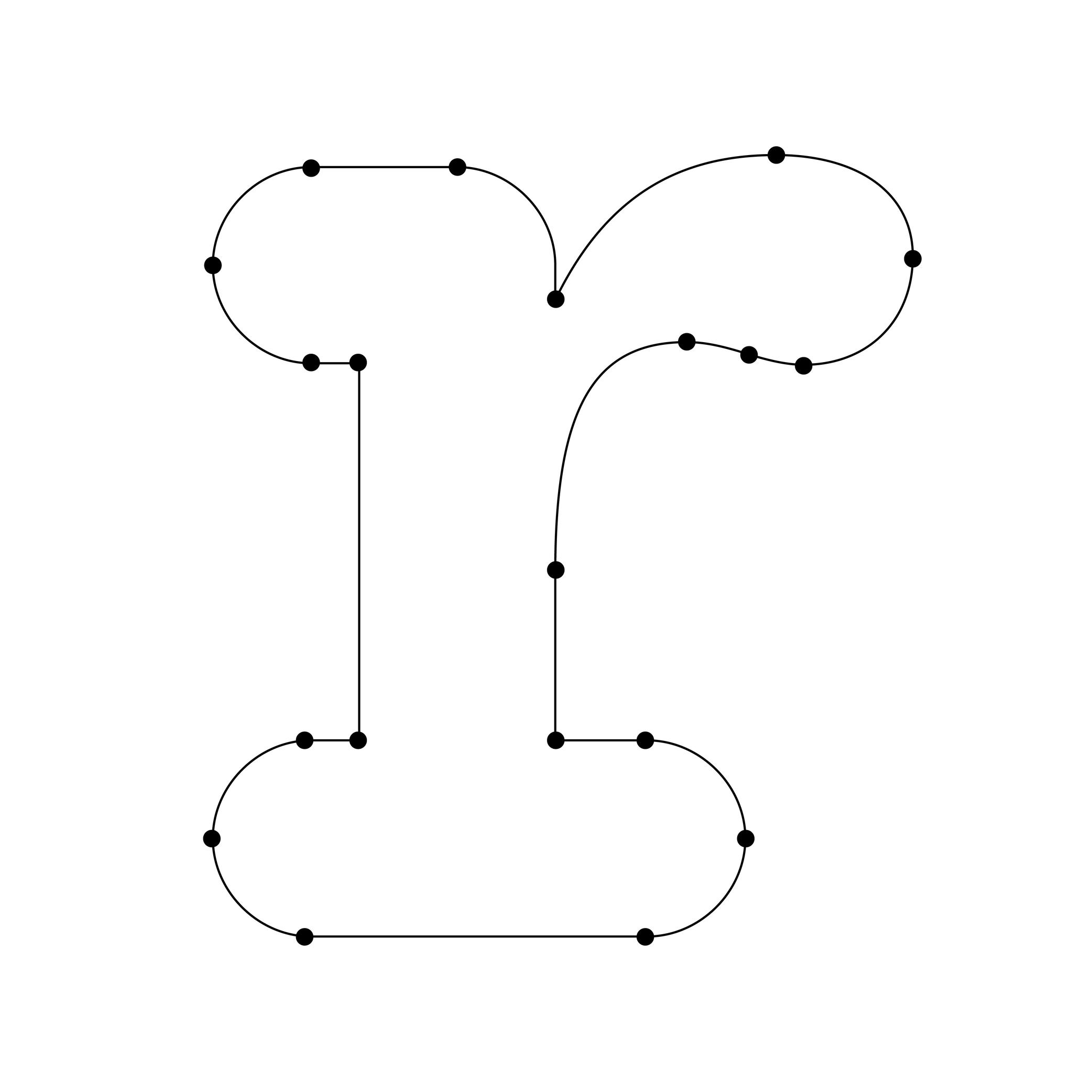
Illustration: Words of Type. Typeface in use: Knowledge Rounded, designed by Lisa Huang, 2024.
(Read More)When drawing characters in type design applications, contours are created by positioning a succession of nodes (or points), just like vector contours in most design applications.
The points of a straight line are nodes. Those on curved segments are on-curve points. Handles with each on-curve point are off-curve points (also control points) to control the curvature of the segment.
OpenType Features
Sponsored by Typotheque . Typeface in use: Irma Display Black , designed by Peter Biľak, 2009-2011.
(Read More)Opentype features are found in digital fonts with an OpenType format.
For the same glyph, there can be multiple variations (or alternates) along with their default form, as options for stylistic alternative or functional improvement. OpenType features can be activated in apps supporting them or with code lines calling them on a website, if they exist in the selected typeface.
Some principal features are: case sensitive, swashes, various figure styles (old style, tabular, proportional, etc.), and small capitals (or Small Caps).
OpenType (format)
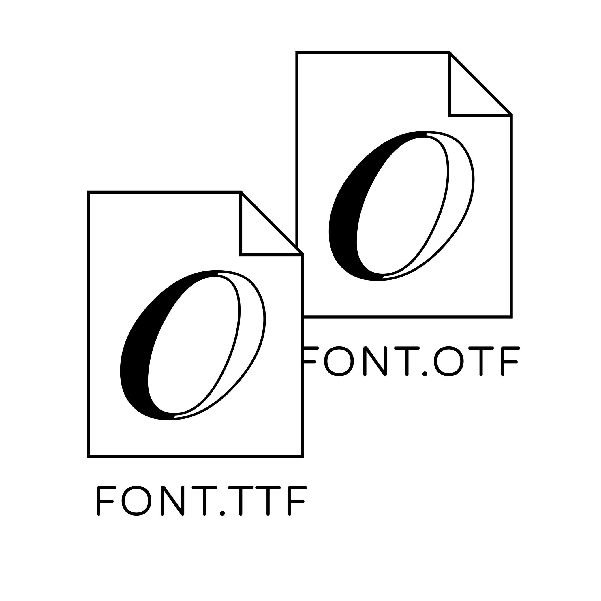
Illustration: Words of Type.
(Read More)OpenType is a digital font file format created by Adobe and Microsoft in 1996. It was mainly developed for fonts to be on printed media and is still in constant evolution.
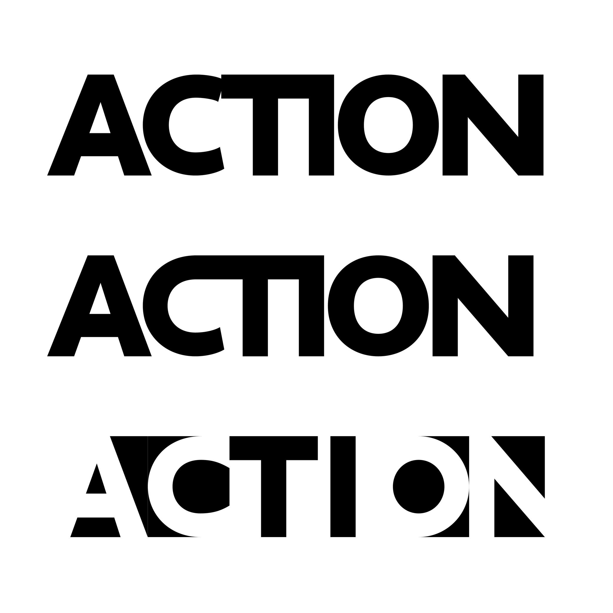
OpenType font files contain all the data of a typeface style in one single file, from the glyphs’ shapes and metrics, to additional stylistic sets known as OpenType features. It has also a higher glyph capacity than others font formats (up to 65,000 and more!).Optical Corrections
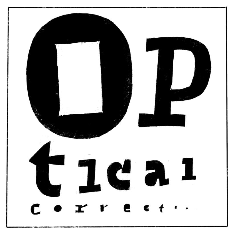
Illustration: Erik van Blokland .
(Read More)The shapes used to form the words and texts we read are seen by our eyes. And our eyes and brain are organs that don’t rely on geometry, rulers, and compasses to “read” the world.
Even if they are geometrically aligned, some shapes may appear uneven and require optical adjustments to appear consistent. In type design, we talk about optical corrections.
Optical Size
Sponsored by Blaze Type . Typeface in use: Joly , designed by Léon Hugues, 2021.
(Read More)When a typeface is intended to be used at some specific sizes only (large on billboards or small in printed books), some details can be optimized for each situation, resulting in optical size styles such as Text, Caption, Titling, or Display.
For text styles, aspects such as lower contrast and simpler details have been proven more efficient for reading small texts (especially if they are printed on rough surfaces), while display styles can carry elaborate details as they are seen in larger sizes.
Overlap
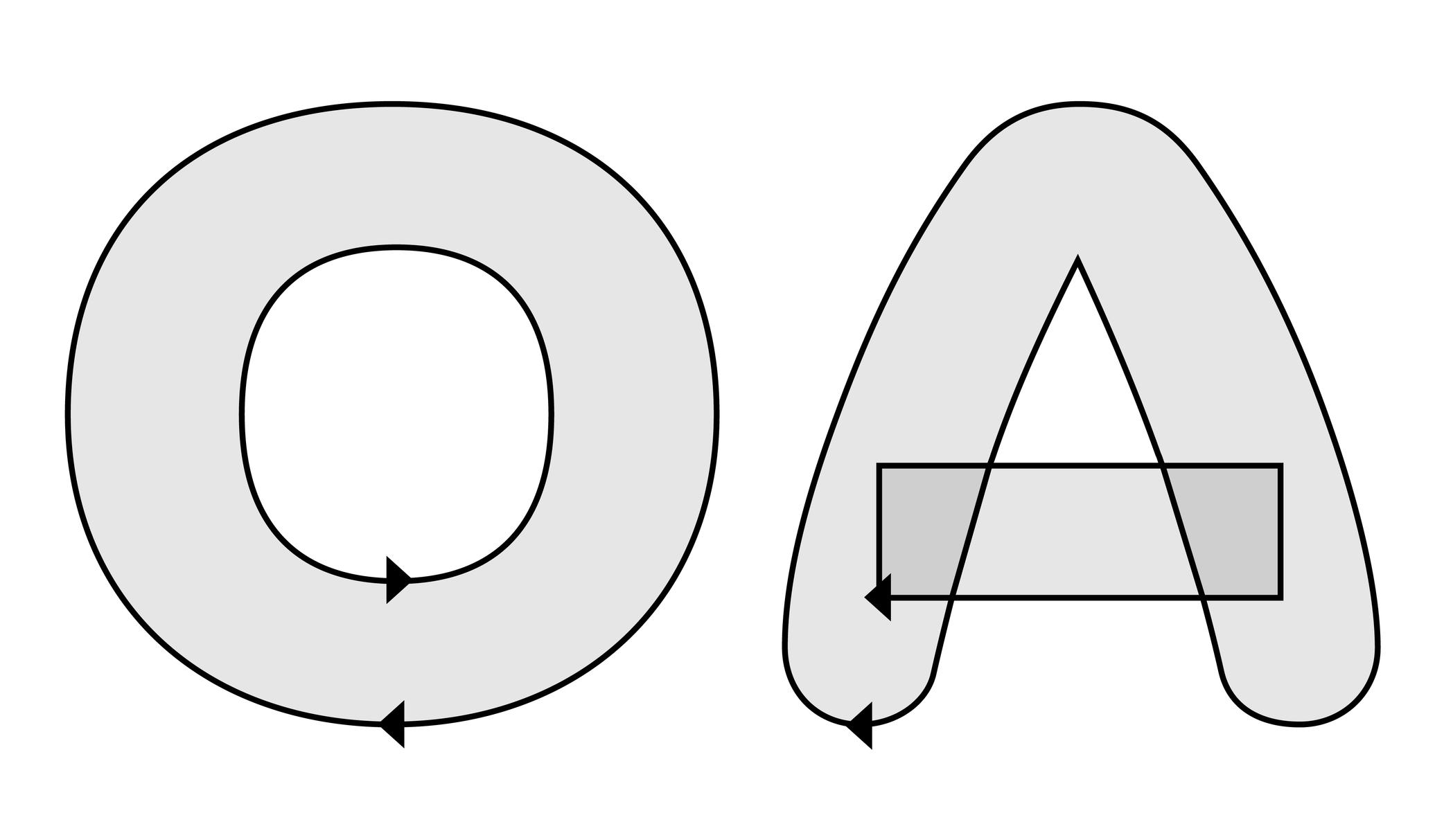
Illustration: Words of Type. Typeface in use: Knowledge Rounded, designed by Lisa Huang, 2024.
(Read More)When designing glyphs in type design applications, the contours of multiple shapes can be overlapped on top of one another to form more complex shapes (the letter E can be split into several segments, for instance) or to create a counter like in letter O, with a larger contour on the outside and a smaller one inside.
These two effects are controlled by changing the contours’ relative direction.
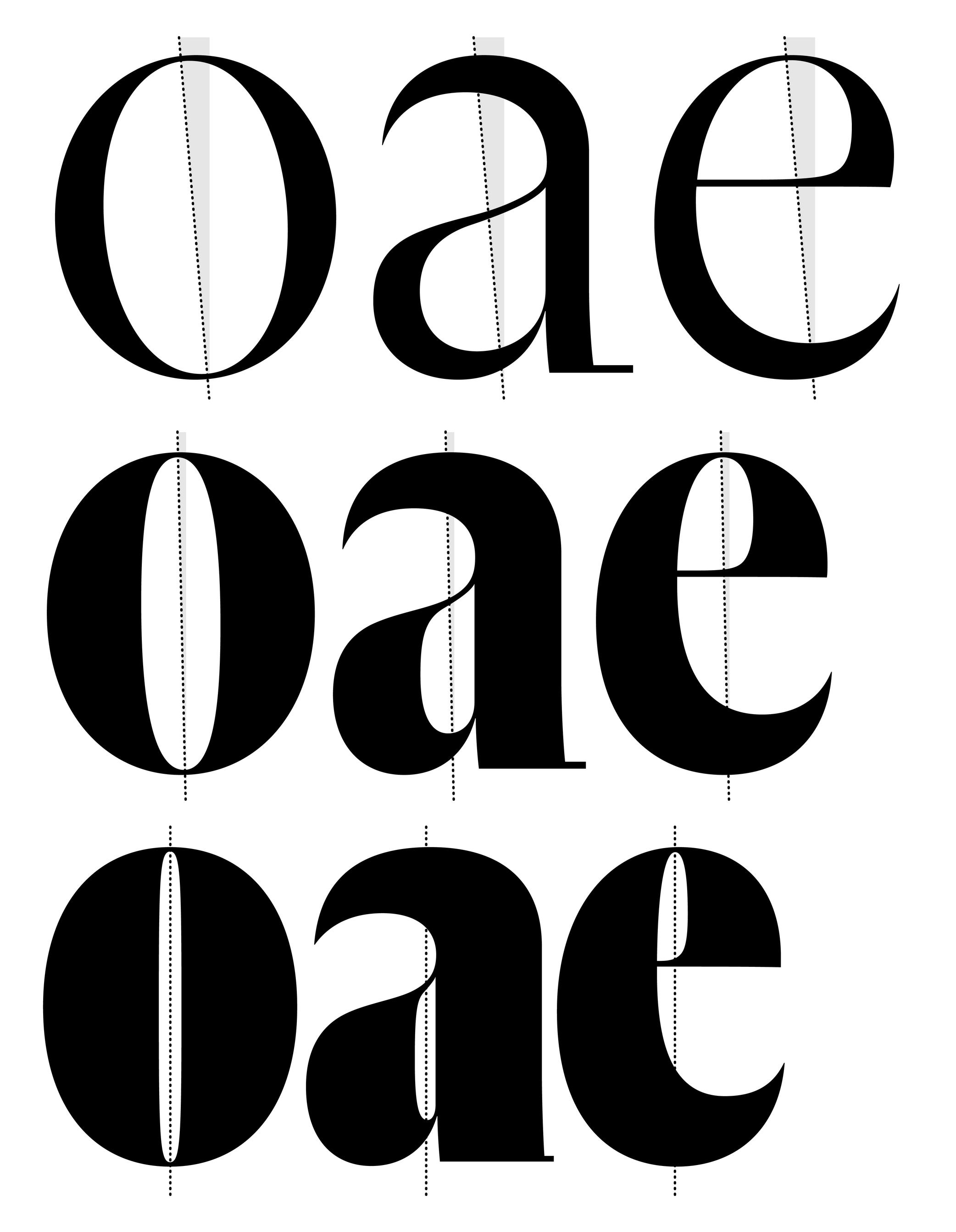
Overshoot
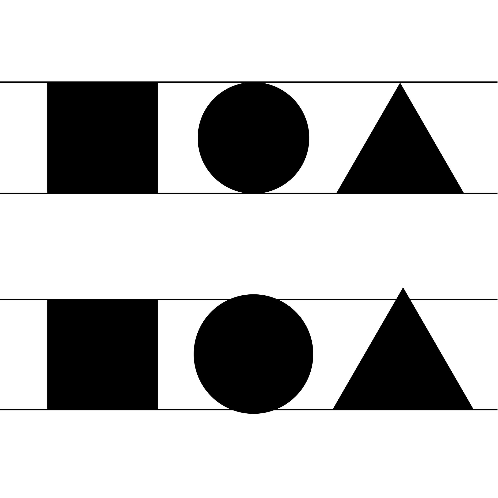
Illustration: Words of Type.
(Read More)The overshoot of a glyph is the part that goes slightly beyond the height of its fellow letters to achieve an optical evenness, such as rounded letters compared to square ones.
See Optical Corrections for more details.
Padding
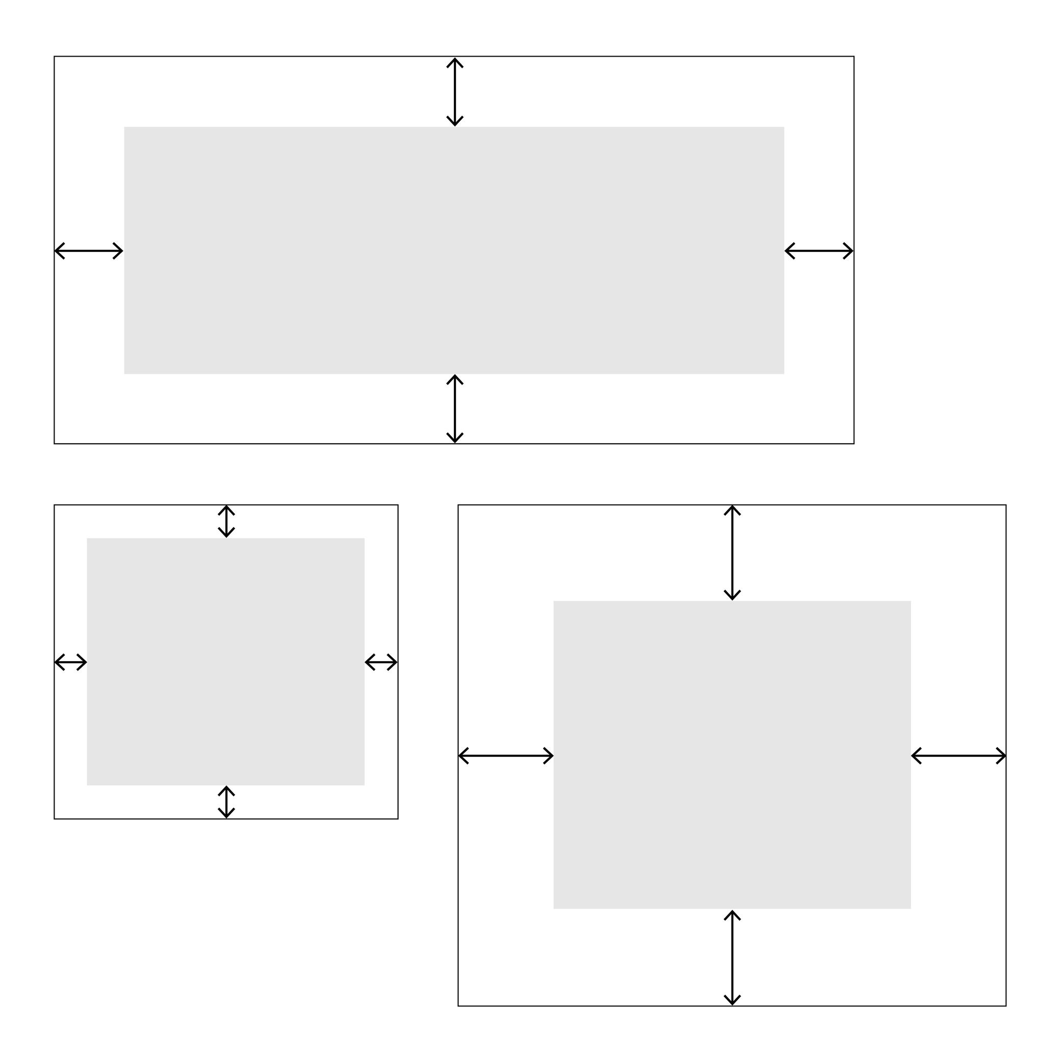
Illustration: Words of Type.
(Read More)In web typography, padding is about setting a specific distance between the sides of an element and its borders, like margins inside it.
Path
(Read More)The digital contours of glyphs in a font are shaped by a succession of points. Together, those form a path of points.
When two contours are overlapped on top of each other, the path direction of the last contour (clockwise or counter-clockwise) in relation to the previous one will determine whether it appears as a counter-form or is “invisible.”
Placeholder Text
Sponsor Word of Type and feature your typeface in this card with a linked caption. Contact us for more information.
(Read More)Placeholder text (or Lorem Ipsum) is a fake text used to test the aspect of a typeface or a typographic composition.
Point
(Read More)In typography, points are measurement units to describe the size of a typeface (for printed or digital media).
Several point-based series of typographic measurements have been created and used over the centuries and across the globe. In France and Germany, 12 Didot points make one Cicéro, while in Britain and the US, it was a Pica that would be divided into 12 slightly smaller points.
Today, the international typographic unit in software applications is the (DTP) point, which is exactly 1/72 parts of an inch—a cleaner standard than the Pica point previously used in the United States. Digital font sizes are referred to in point sizes and indicated as pts.
Postscript (format)
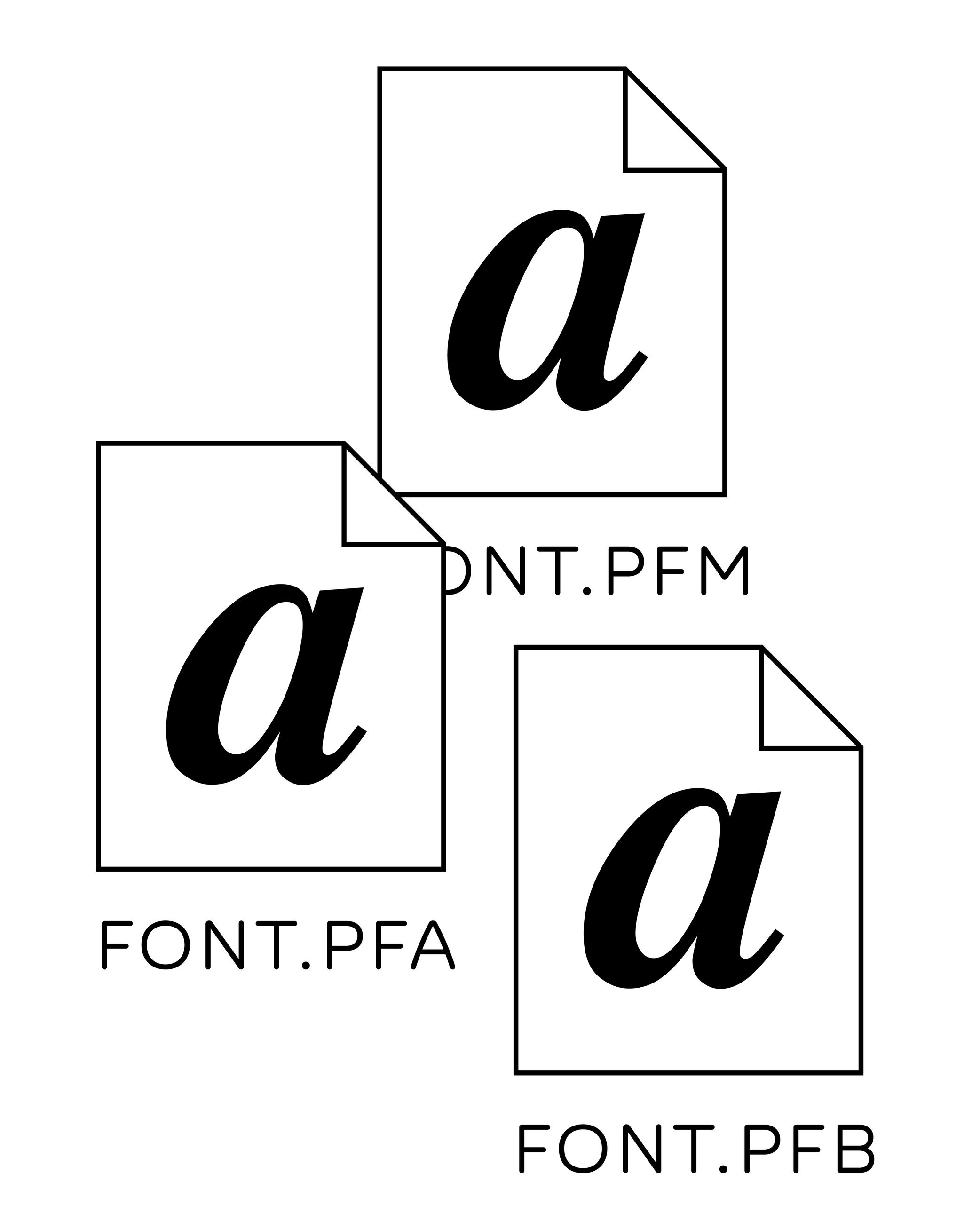
Illustration: Words of Type.
(Read More)Postscript is a computing language created by Adobe in 1982. It allowed the development of digital publishing (or DTP for Desktop Publishing) by printing images and texts on high-resolution laser printers.
Before Postscript fonts were used as Bitmap fonts, made out of pixels, with more or less resemblance to the designs depending on the size of the output (printed, or on high or low-resolution screens). Since Postscripts fonts were introduced (which contained font data as scalable outlines), fonts could be rendered as shapes much closer to the original designs, even at small sizes. Postscript fonts contained several files (glyph shapes and metrics, one to be displayed on screen and one to be read by the printer) for one font, and all needed to be installed to use them.
Revival
(Read More)A revival refers to a new typeface whose letterforms are based on historic models.
Today, when we speak of revivals, we usually refer to digital typefaces that take their designs from existing ones. Most often, they base their forms on exisiting typefaces cast in metal, engraved into word, or produced for photo-composition.
The oldest revivals were made by 19th century type foundries when they adapted early 18th century typefaces for industrial printing conditions. In the 20th century, more revivals from mechanical and photo-typesetting device manufacturers followed.Inevitably, the design of a revival contains unique details of the designer, from interpretations of the initial design while analyzing printed results on paper to those on screen at various resolutions. Today, we can see multiple typefaces designed as revivals from one and the same typeface, but each have (sometimes very subtle) differences. For example, we can think of the many versions of the Garamond.
A revival from a running text typeface is considered as a good assignment for students starting to learn typeface design, as this allows to get more familiar with styles considered as “conventional” before experimenting further with more creativity.
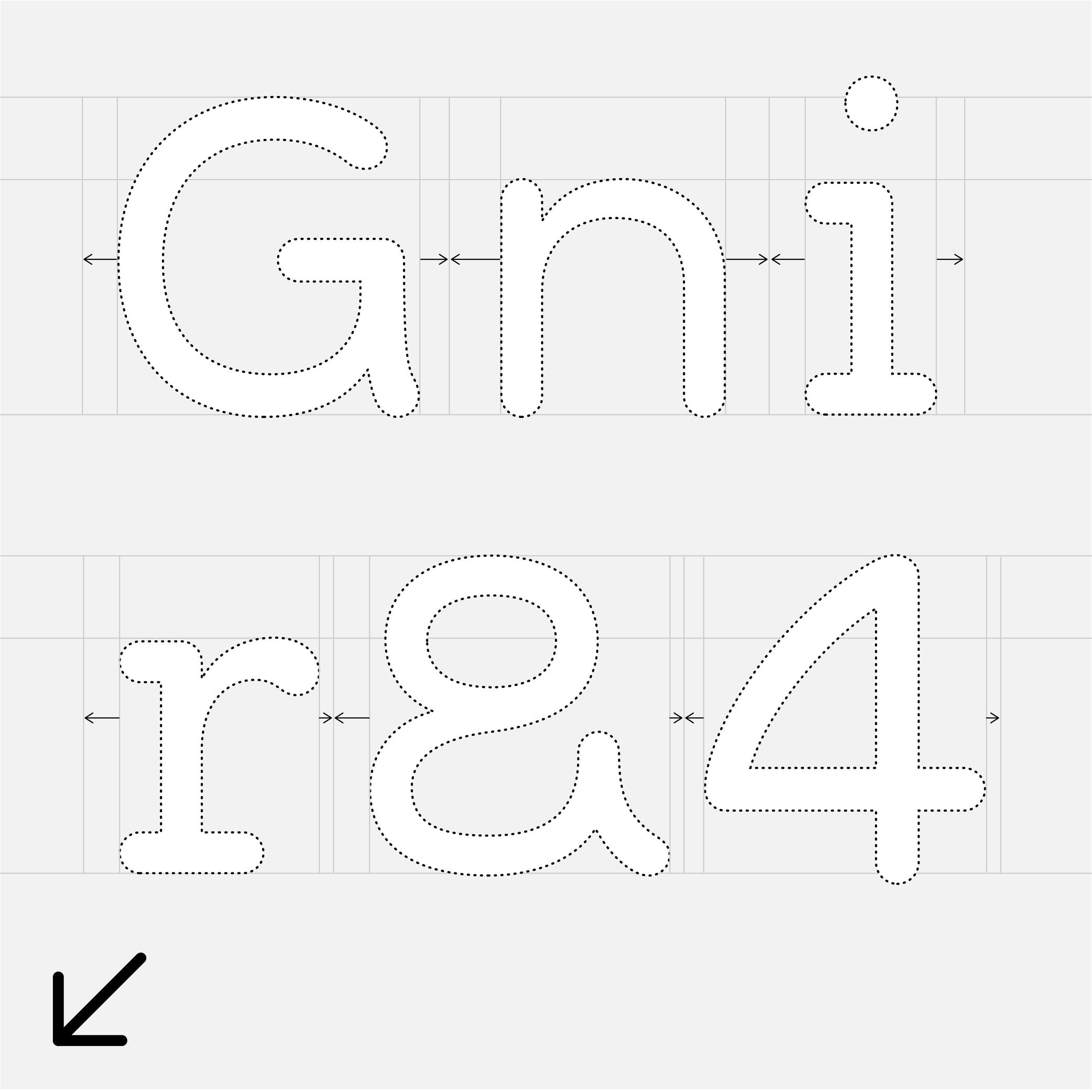
Side Bearings
Sponsor Word of Type and feature your typeface in this card with a linked caption. Contact us for more information.
(Read More)A side bearing is the distance between a glyph’s side and its bounding box. In scripts written horizontally, there is always a left side bearing (LSB) and a right side bearing (RSB). Managing the side bearing values is working on the spacing of the typeface.
Skeleton
Illustration: Pauline Fourest (Spaghetype ).
(Read More)Many terms are borrowed from architecture or human and animal anatomy to designate and describe parts of letters and other characters. We even speak of type design anatomy.
The skeleton is the center line around which every part of a glyph is built (weight, contrast, curvature, terminals, etc.). Keeping the skeleton the same across multiple styles of one typeface family is, by definition, keeping the same structure, which is one of the principal ways to maintain design consistency.
Spacing
Sponsored by Production Type . Typeface in use: Media Sans , designed by Jean-Baptiste Levée, 2018.
(Read More)Spacing is about managing the values of a glyph’s side bearings (or the distance between its most left and right side edge to the side of the bounding box), which influences the distance between each glyph combination.
Good spacing is just as important as the design of glyphs themselves, as the combination of both influences the quality of a typeface.
Specimen
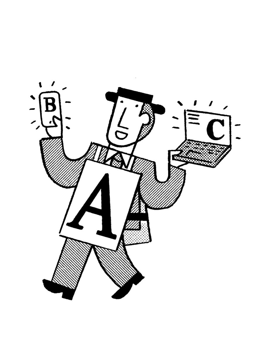
Illustration: Jay Cover .
(Read More)A specimen is a visual sample document published by type foundries that showcases a typeface, its glyph set, text settings in different sizes, Opentype features, etc.
A collection of specimens of different typefaces bound together is called a typeface catalog.Static Font
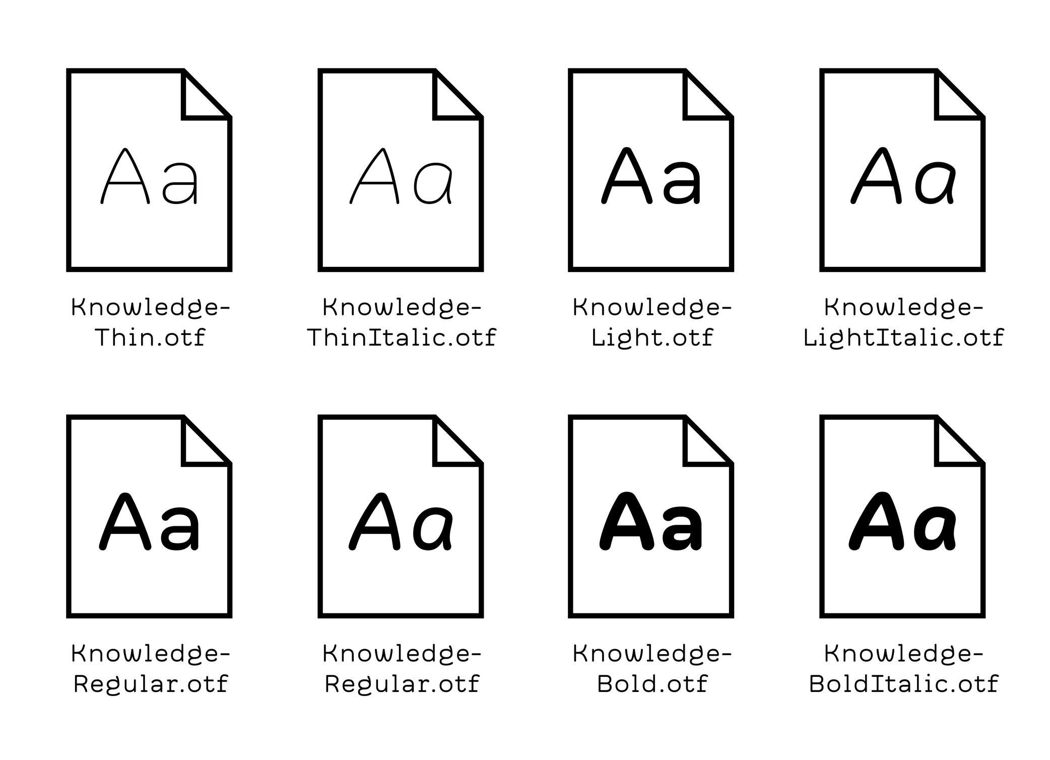
Illustration: Words of Type. Typeface in use: Knowledge Round, designed by Lisa Huang, 2024.
(Read More)Static fonts are independent font files with data of a typeface in a particular and single style, as opposed to Variable Fonts, which contain data of indefinite styles.
Substitution
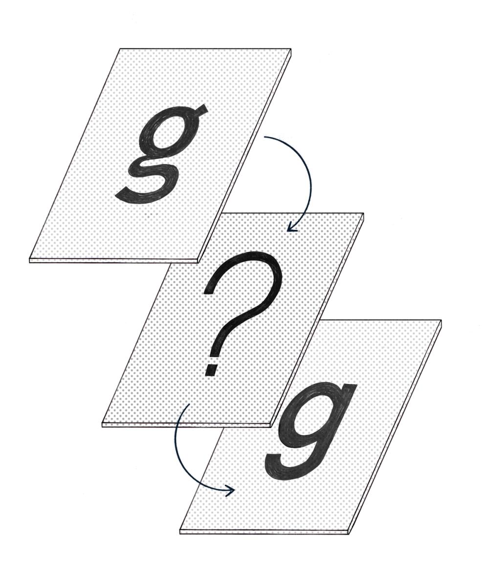
Illustration: Chloe Kendall .
(Read More)Whenever a file contains text using a font that isn’t installed on the user’s device, the system will replace it with another one as a fallback solution. It is a font substitution.
Synthetic Font
(Read More)In most text processing tools, it is possible to apply a different style (Bold, Italic, Underlined, or Strike-through).
When those styles don’t exist already in the selected typeface, the system can “automatically” generate a similar effect even if it hasn’t been designed (this is not recommended, but can be handy if needed).
What is created in such a situation is called a synthetic font.
System Font
(Read More)Digital devices need to always have fonts installed in its system, called system fonts, to be able to display textual information on its screen.
Every device manufacturer and/or seller has its own library of system fonts, which support (in the best situations) every script that is eventually used.
Template
Illustration: Raven Mo .
(Read More)A template serves as a model for typography and typesetting. Like a reference guideline, it helps with the composition of the elements in a page (images, texts, spaces, grids, etc.), printed or on screen, to create a coherent and consistent document with specific design characteristics.
Tofu
Illustration: James Graham .
(Read More)Suppose a text uses a script that is not supported by any font available in a device’s system or contains one or more glyphs that don’t exist in any fonts that are already installed. In that case, the reader will see the “unrecognized” glyph replaced by a tofu.
They are generally displayed as rectangles filled with a cross.Tracking
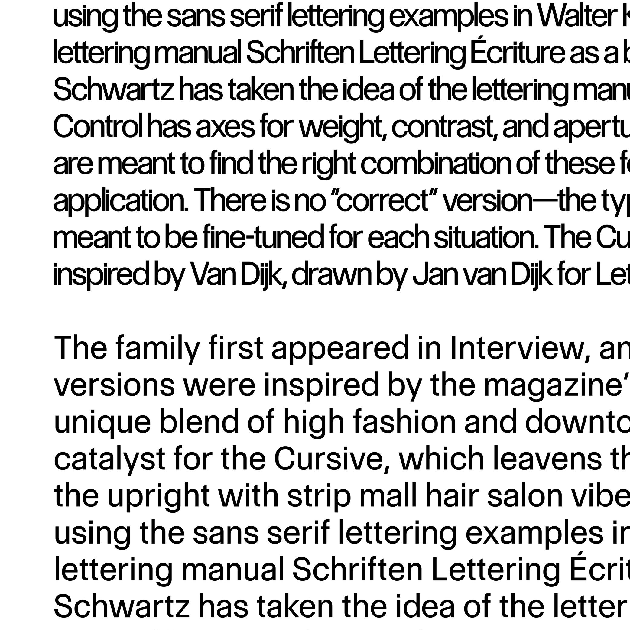
Sponsored by Commercial Type . Typeface in use: Control , designed by Christian Schwartz and Miguel Reyes, with contributions by Hrvoje Živčić, after Walter Käch and Jan Van Dijk, 2024.
(Read More)Fonts have spacing values for all glyphs that are defined by its designer.
If glyphs are too loose or too close to the needs (or taste) of the user, the spacing can be modified in most application tools for texts. It is called “to adjust the tracking.”Trial
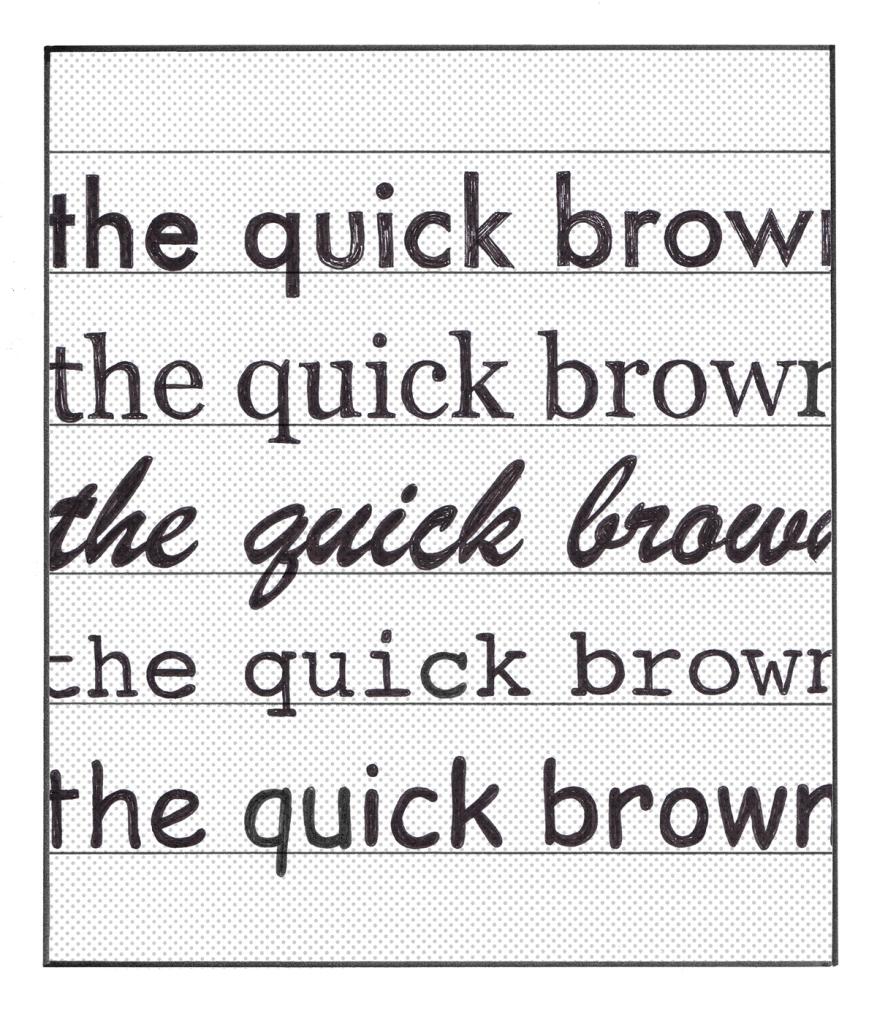
Illustration: Chloe Kendall .
(Read More)Most type foundries and other font distributors offer today the possibility to get a trial of a typeface, which allows the user to try it for free before deciding to buy its license or not. Their conditions of usage are limited to trying the typeface only, listed in a specific trial EULA. In general, foundries share their trials with a limited amount of glyphs and/or features, enough to give an idea of how the typeface looks in a given situation.
TrueType (format)
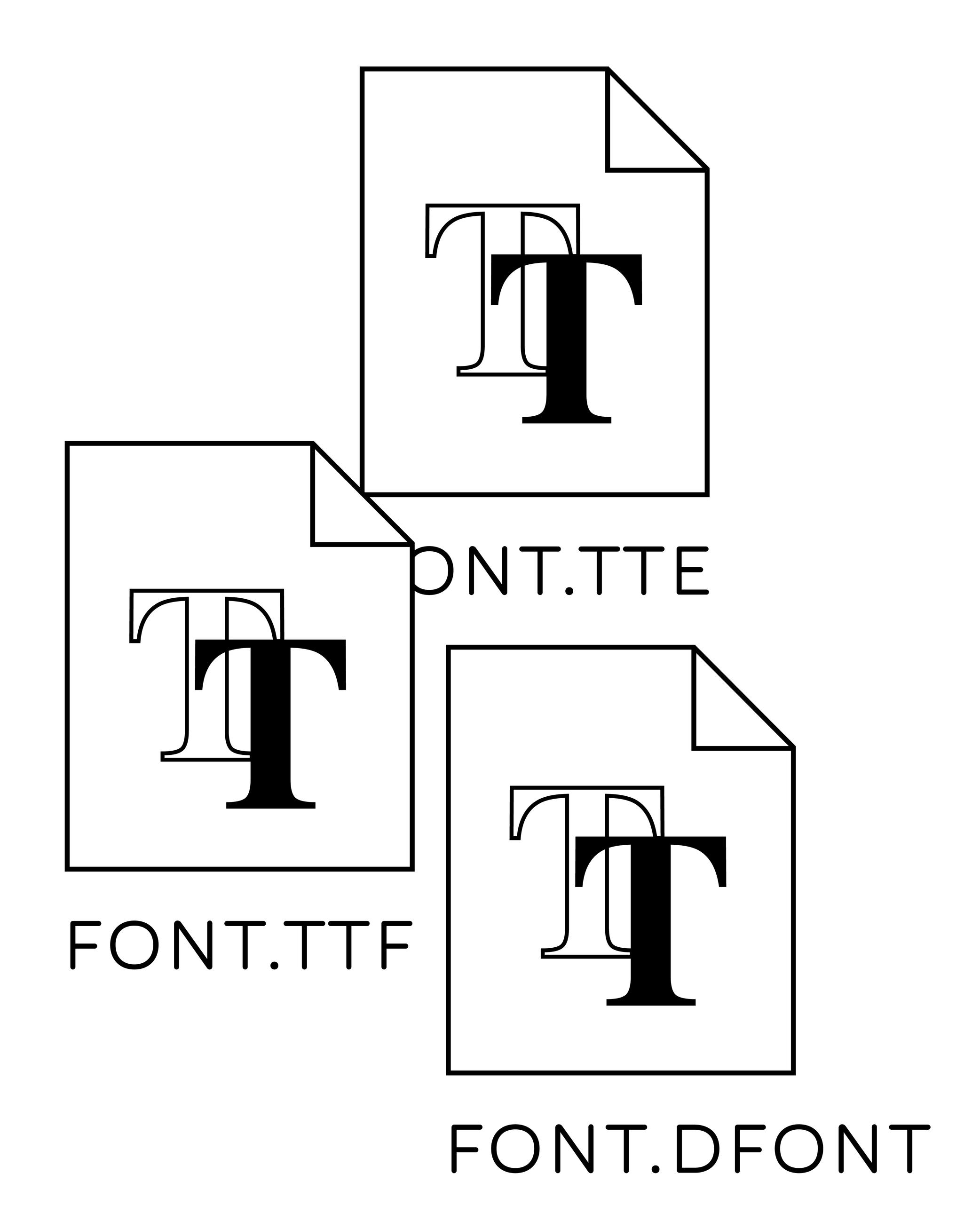
Illustration: Words of Type.
(Read More)TrueType is a digital font file format created by Apple in the 1990s, used for fonts installed on Mac OS and Microsoft Windows systems. It was developed a few years after the Postscript format was introduced by Adobe. TrueType is based on quadratic curves that are processed, calculated and rendered faster than the cubic curves used by Postscript format. Unlike Postscript fonts, which require the installation of every file one font may contain, installing a single TrueType font is enough to be able to use it.
Typography
Illustration: Jay Cover .
(Read More)Typography (or typesetting) is the practice of assembling text elements in a design composition by defining multiple aspects such as the ratio between text columns and white spaces, choosing and using typefaces, setting their styles and sizes for all categories of texts, leading, justification style, and hyphenation, etc.
The person practicing typography is called a typographer.
Not to be confused with Typeface Design.
Unicode
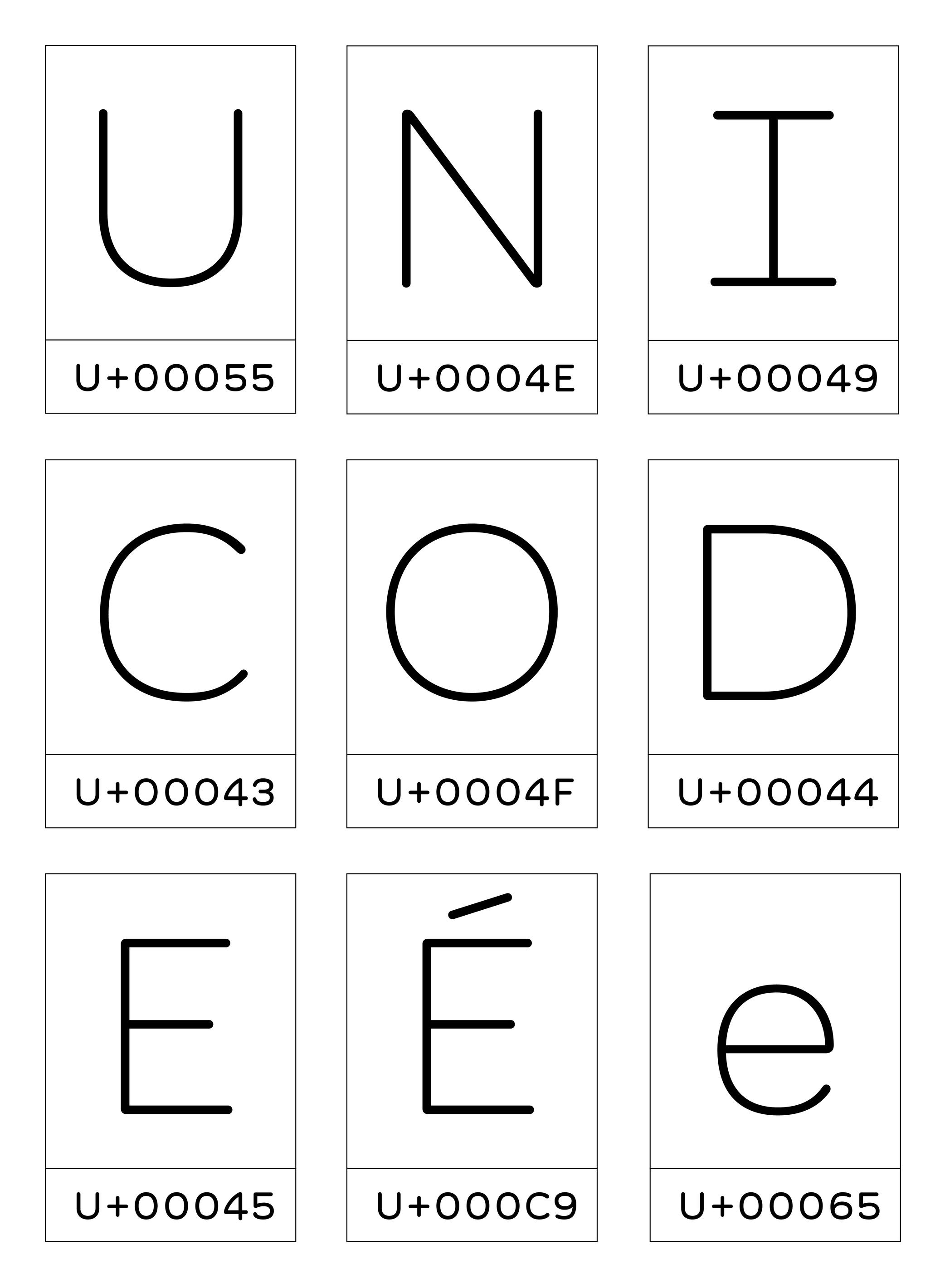
Illustration: Words of Type. Typeface in use: Knowledge Round, designed by Lisa Huang, 2024.
(Read More)Unicode is an international coding norm to identify signs and symbols used in digital devices worldwide.
Created by a non-profit organization called the Unicode Standard Consortium with a team of international members, the Unicode attributes a code to each glyph of any written language. These codes are integrated into the systems of digital devices to ensure a stable information exchange.
Unit
Illustration: Jonny Wan .
(Read More)Measuring the sizes of fonts is made with a specific type of unit called points or pts.
Multiple types of units with various sizes and names have been used over the years and across the globe, from the Didot point to Pica points to inches and DTP points (and these are for Latin script only).
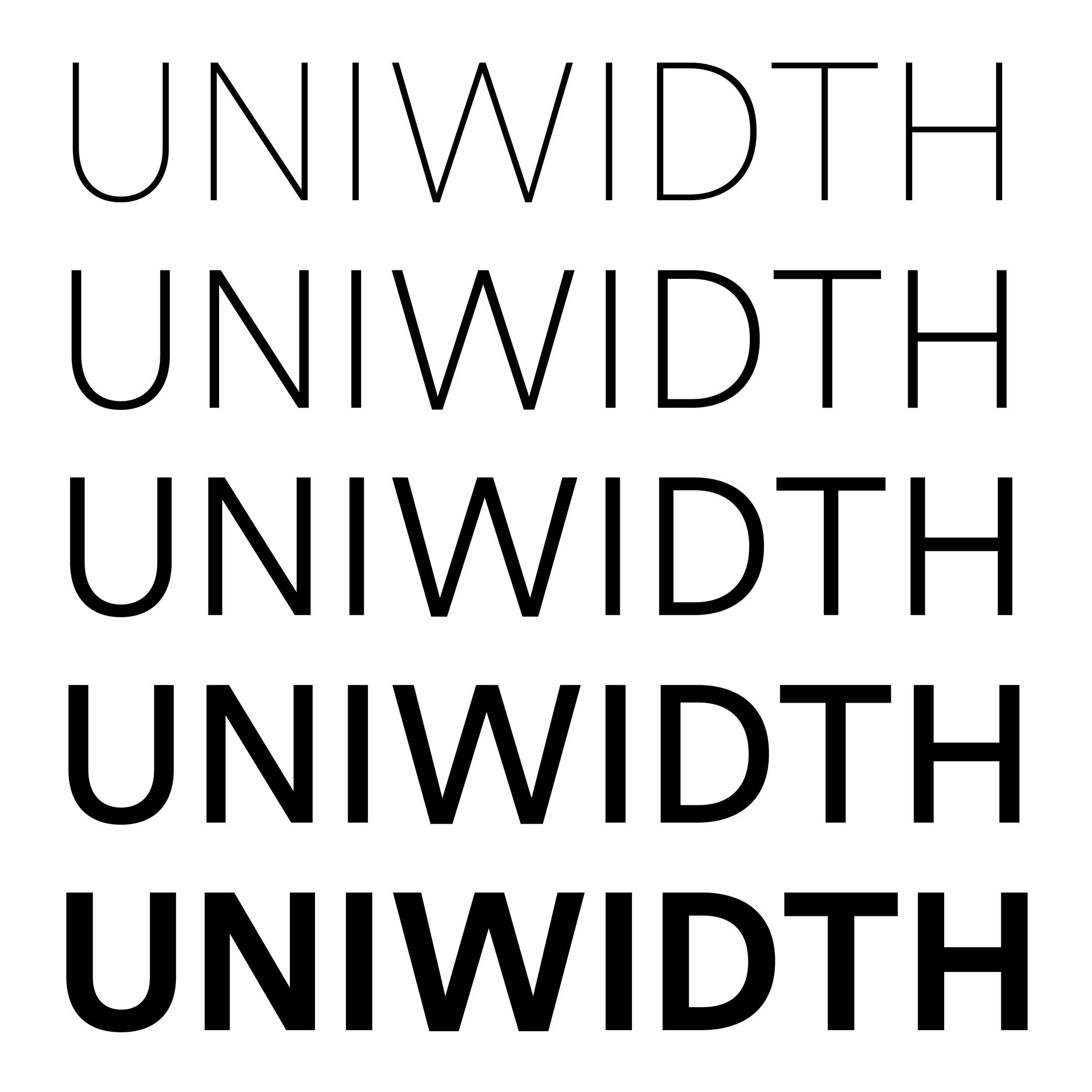
Uniwidth
Sponsored by Frere-Jones Type . Typefaces in use: Retina , designed by Tobias Frere-Jones, 2016.
(Read More)Also called Multiplexed or Duplexed.
The term of Uniwidth has been brought up by Armenian type designer and teacher Hrant Papazian.
In type design, the width and/or spacing values of a glyph change depending on the weight of the style to ensure a visual balance. However, some typefaces are designed as uniwidth, which means that the same glyph keeps the same width across all weights and styles of the family.
This feature facilitates digital typesetting, especially when there is an interaction between the user/viewer and the text on a digital screen. For example, words or parts of text can switch to a different style without modifying the typesetting of the block while hovering or clicking.
Variable Font
Sponsored by Letterror . Typeface in use: (“Style”) Very Bauble , (“Weight”) Limited Grotesque , (“Width”) Principia . Designed by Erik van Blokland.
(Read More)DESCRIPTION
A Variable Font file contains data of an entire typeface family and allows an unlimited amount of style variations defined by the designer.
HISTORY
Variable Fonts started with a technology created by Apple (TrueType GX for QuickDraw GX), from which Adobe, Google, and Microsoft joined in to develop it into OpenType Variable Fonts, announced in 2016. Today, Variable fonts are the go-to font format (for typefaces available in such format) for digital media, especially when there are animated texts.
BENEFITS
Unlike static fonts (in which one font file contains the data of a single style), one Variable Font file contains as many variations as possible between two or more master files of a typeface. Rather than searching for the right file for the right style within a typeface family, the user can install one Variable Font file of a typeface, adjust the style to what is desired and have the design application automatically generate the result or have an optimized variation to the environment whenever it changes (responsive to the screen format).
Variation Axis
 (Read More)
Variable Fonts technology allows users to navigate between two or more specific styles (called masters or sources) with high precision and much smaller font file sizes than several static fonts.
They do so on what is called a variation axis, which allows a continuous interpolation of outlines between compatible sources. It is a trajectory between different states of a given shape.
For example, the weight axis would shift points to adjust the stem thickness, allowing a transition from Thin to Bold.FONT ENGINEERING ADVICE
The OpenType Specification defines 5 standard axes: weight, width, optical size, italic, and slant — italic being a link between two styles rather than an actual variation axis. These guidelines serve as reference for how these axes should be implemented.
The variations axes are defined in several font tables: the avar, the fvar and the STAT tables.
Vector
(Read More)Vectors are digital contours drawn using vector graphics based on Bézier curve technology.
Type design applications rely on the same technology to create the shapes of glyphs.
Web Font
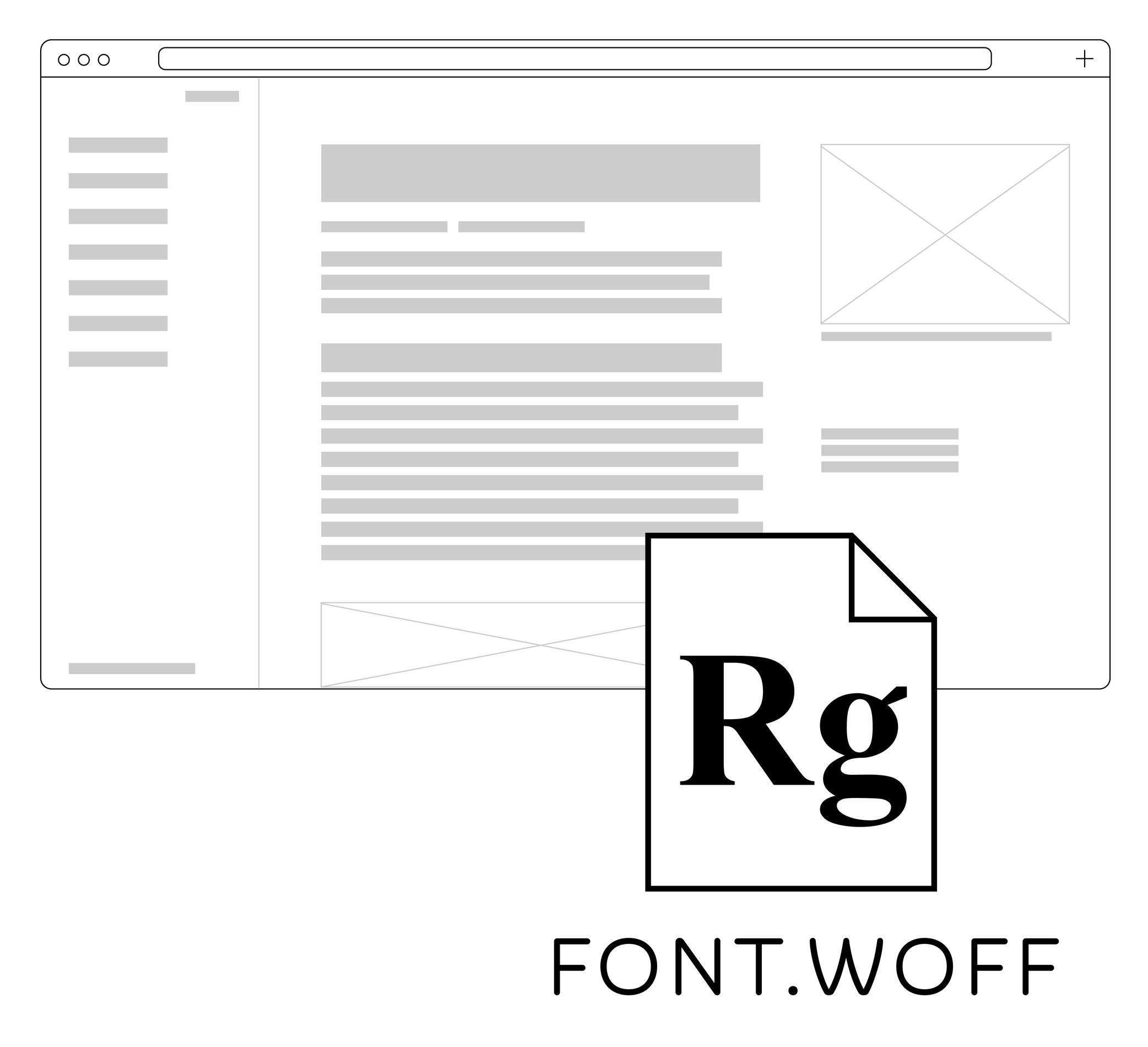
Illustration: Words of Type. Typeface in use: Knowledge Round, designed by Lisa Huang, 2024.
(Read More)Web fonts are font files used in websites. There are specific formats supported by web browsers, in which the web fonts are loaded as part of the website’s content.
Today, the most common web font formats are WOFF (for Web Open Font Format, extension: .woff) and WOFF2 (.woff2).
WOFF and WOFF2
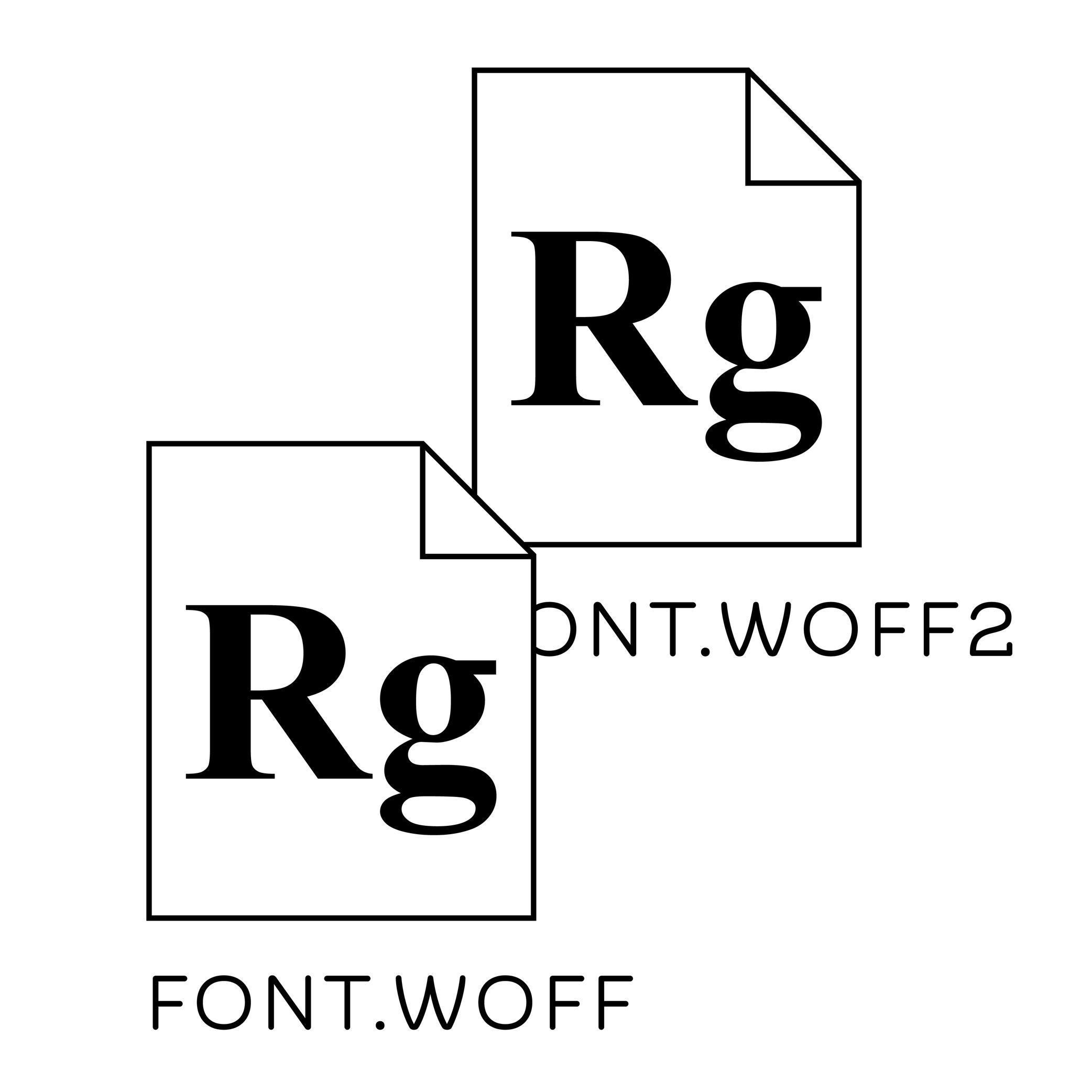
Illustration: Words of Type. Typeface in use: Knowledge Round, designed by Lisa Huang, 2024.
(Read More)WOFF and WOFF2 are two font formats that are compressed and specifically created for the web. In terms of size, they are much smaller than TrueType or OpenType font files, allowing a much faster loading speed. WOFF has been used since 2009, and is supported by most web browsers such as Mozilla’s Firefox.
WOFF2 (or WOFF 2.0) was created in 2022, supported by more browsers like Google’s Chrome.
x-Height
Sponsored by TypeMates . Typeface in use: Halvar Stencil Breitschrift , designed by Paul Eslage, Jakob Runge, Lisa Fischbach and Nils Thomsen-Haberman, 2019.
(Read More)The x-height is the guideline placed at the top of the Latin letter x.
It helps to align the other lowercase letters and to set the proportions with uppercase letters and the ascenders.
Because the letter x is the only lowercase letter without ascenders and horizontal tips at its top and bottom (it has no overshoots), it is the reference letter for lowercase height.