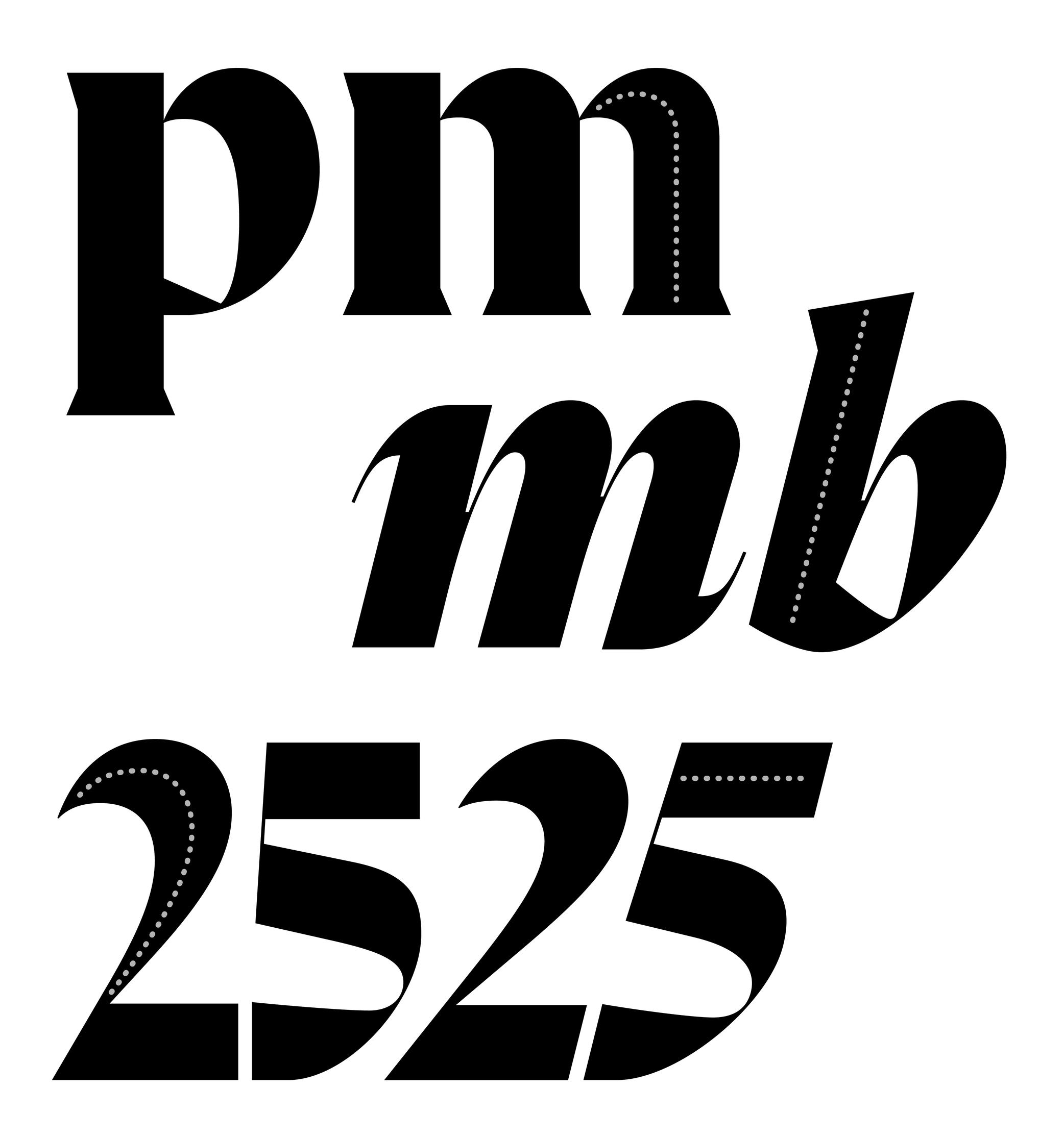
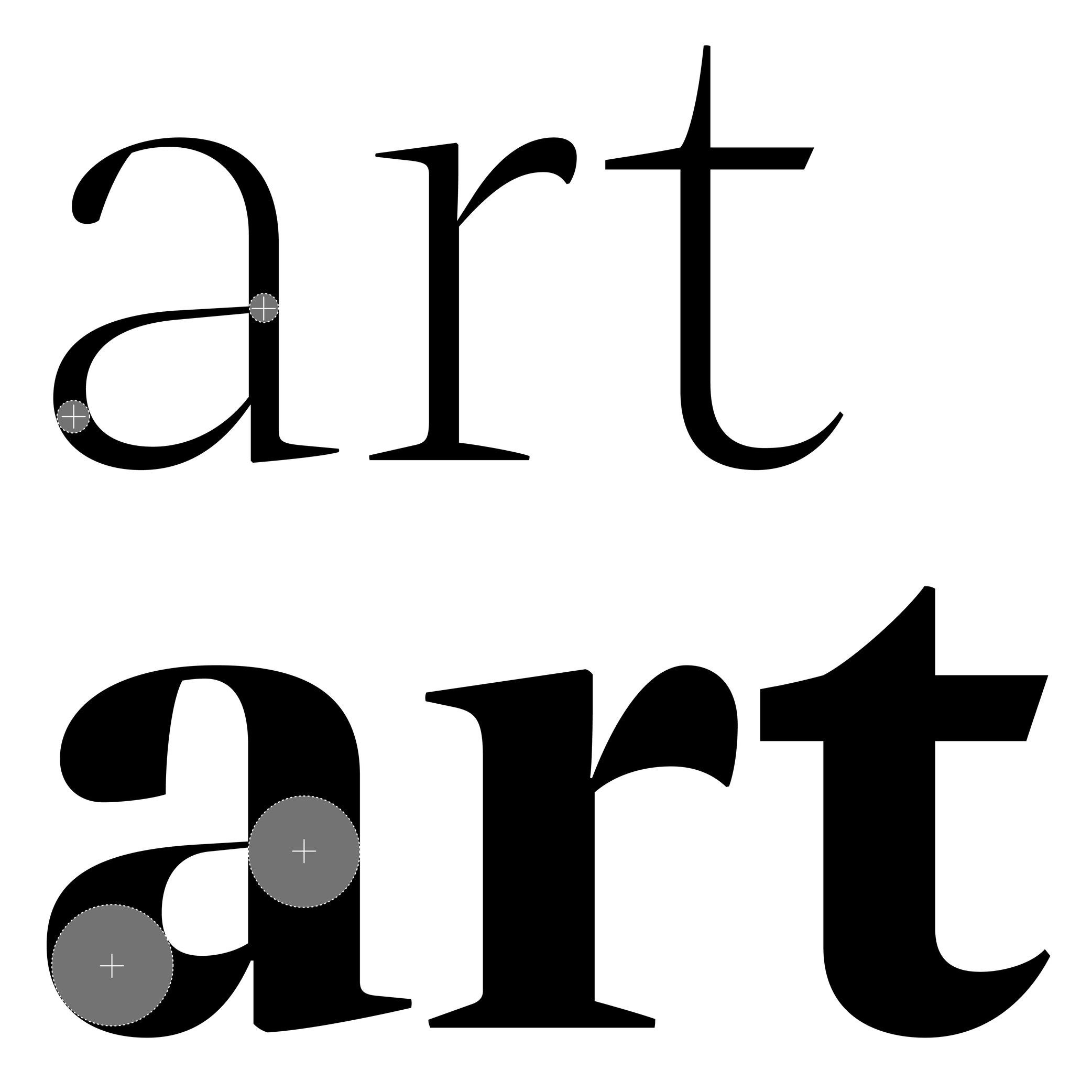
Anatomy
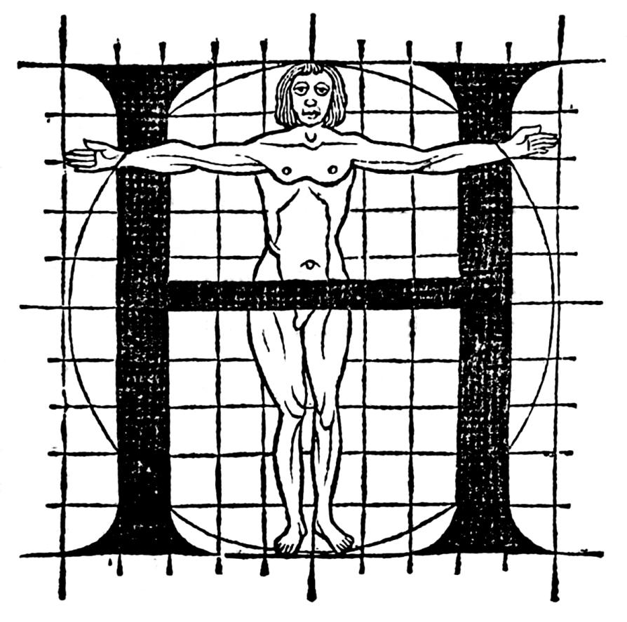
Illustration: Le Champ Fleury, Geoffroy Tory, 1529. Source: Bibliothèque nationale de France .
(Read More)To name and describe parts of letters and other characters, many terms are borrowed from architecture (e.g., arch of an n) or from human and animal anatomy (e.g. leg of an R), which is why we speak of “type design anatomy.”
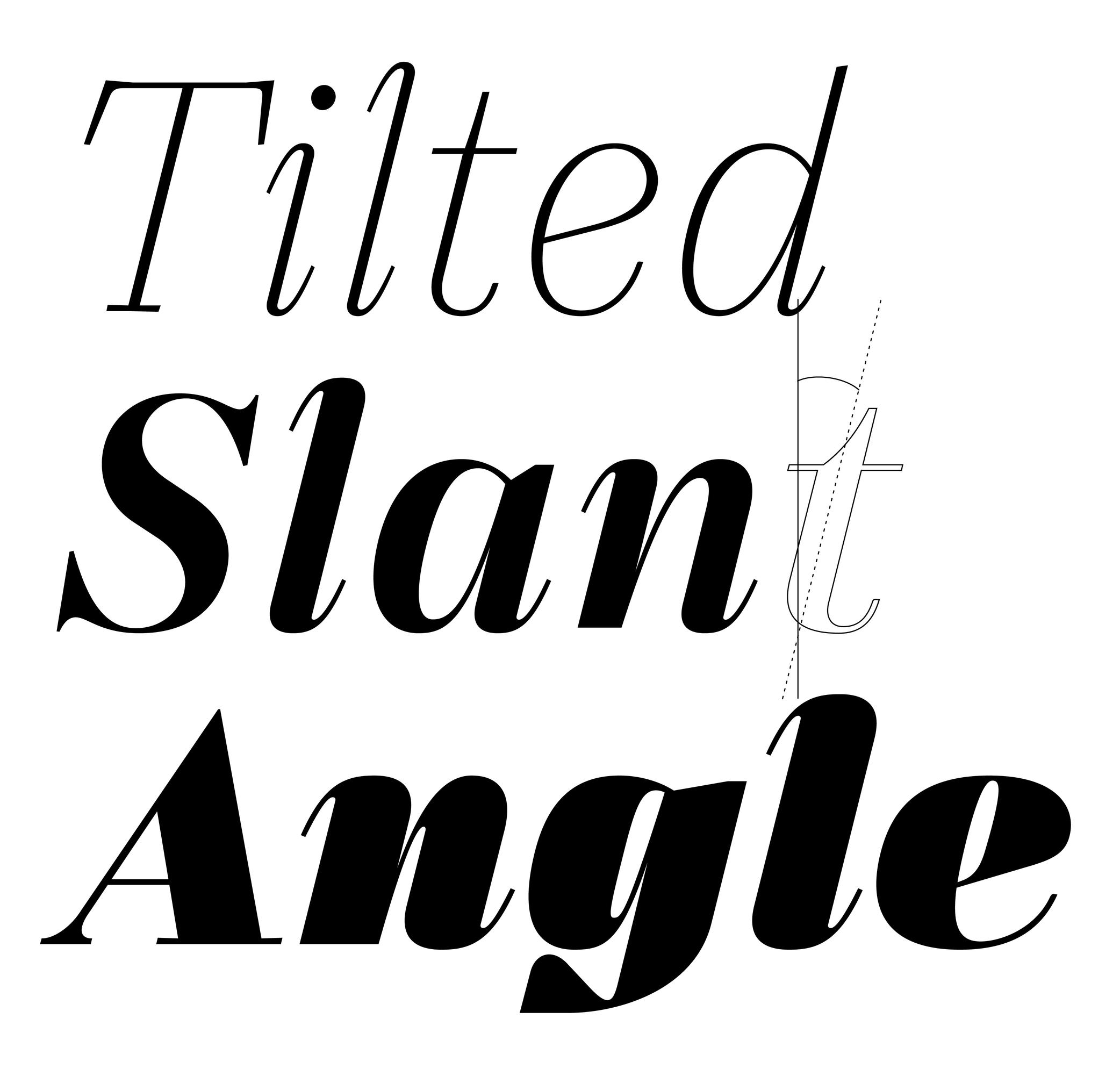
Angle
Sponsored by TypeMates . Typefaces in use: Edie & Eddie Modern , designed by Lisa Fischbach, 2022.
(Read More)Also called slant.
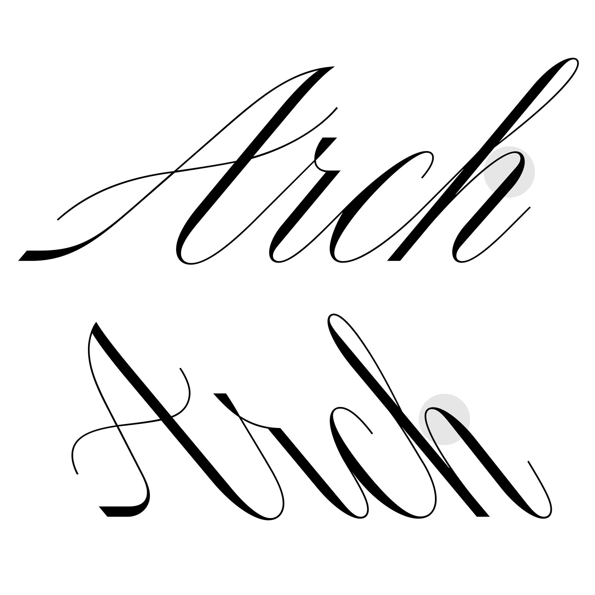
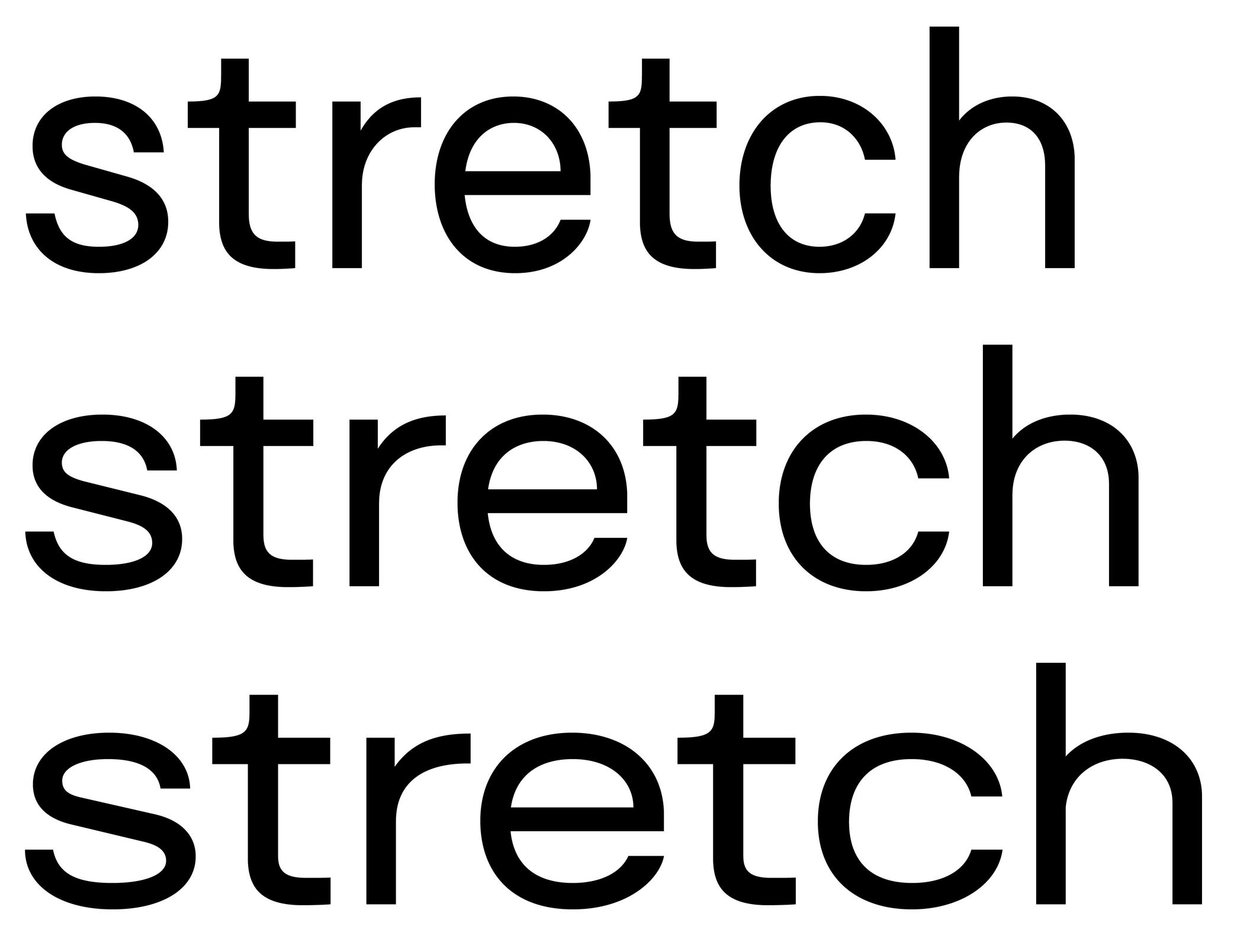
The angle is what we can observe on italic-style letterforms. We say the vertical stems are stretched and leaning to the right at a certain angle.
In the same typeface family, the degree of the italic angle may vary from one weight to another, different sizes of use (display to caption styles), different scripts, or even from one glyph to another in the same style to optically improve the typeface’s balance.
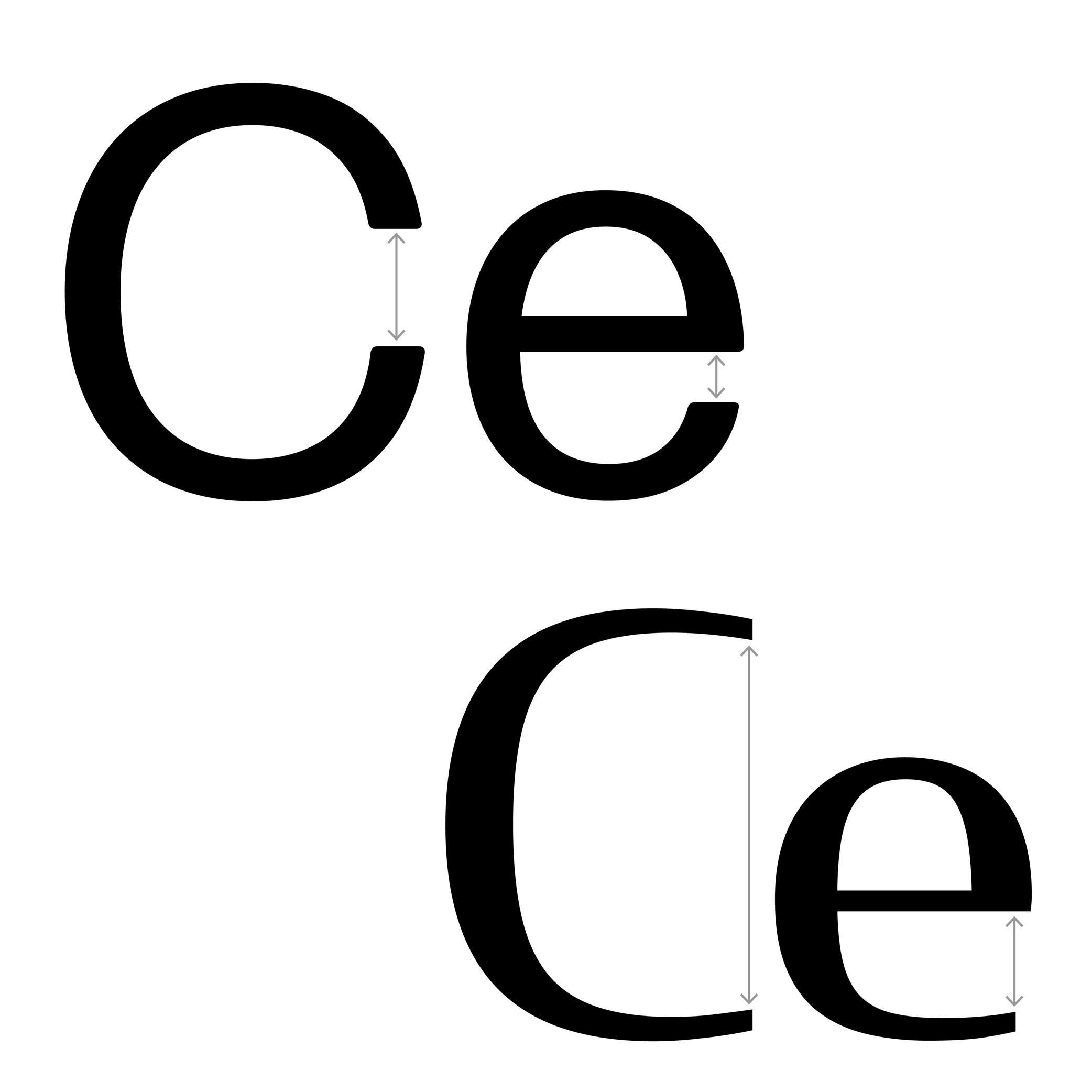
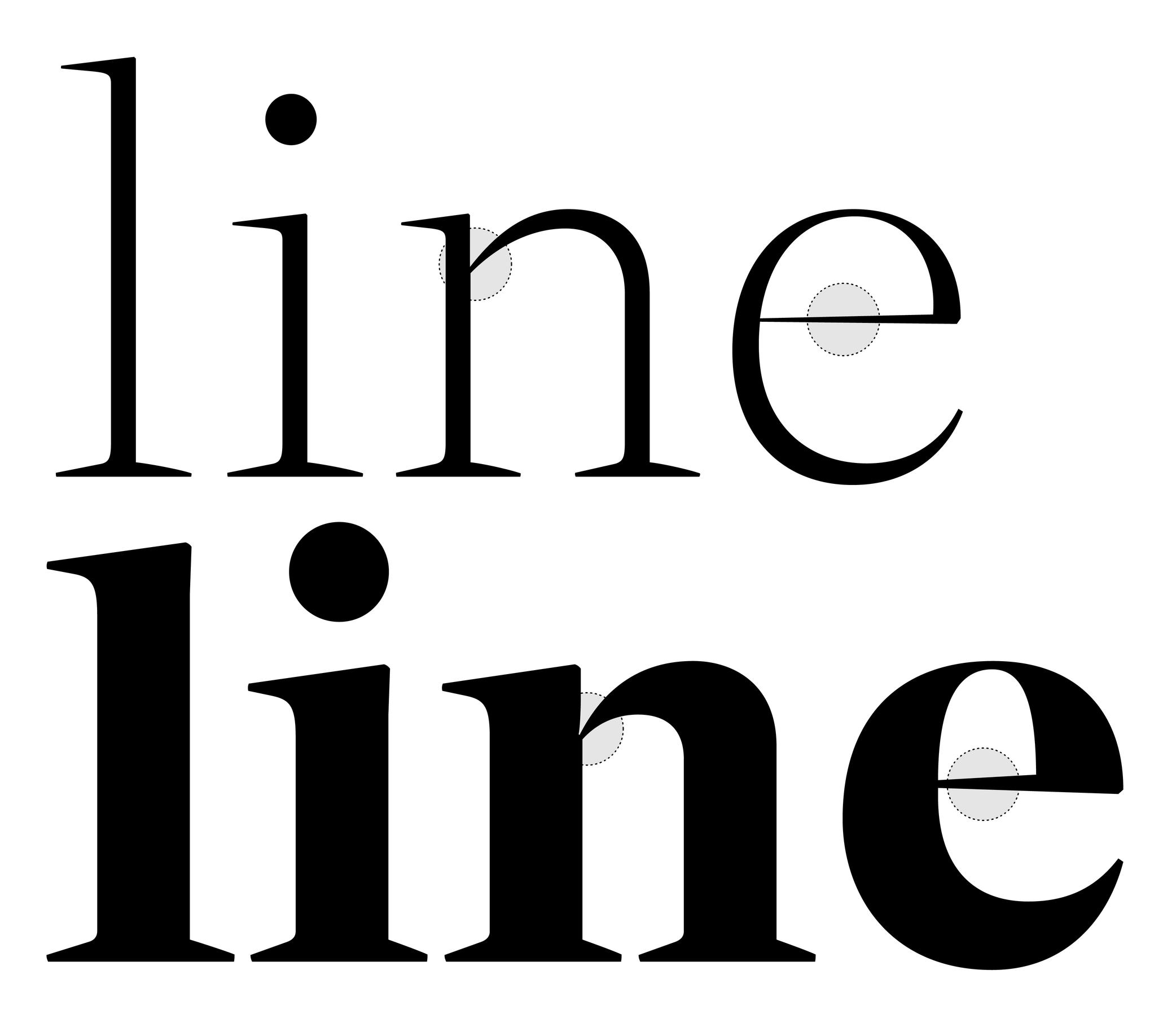
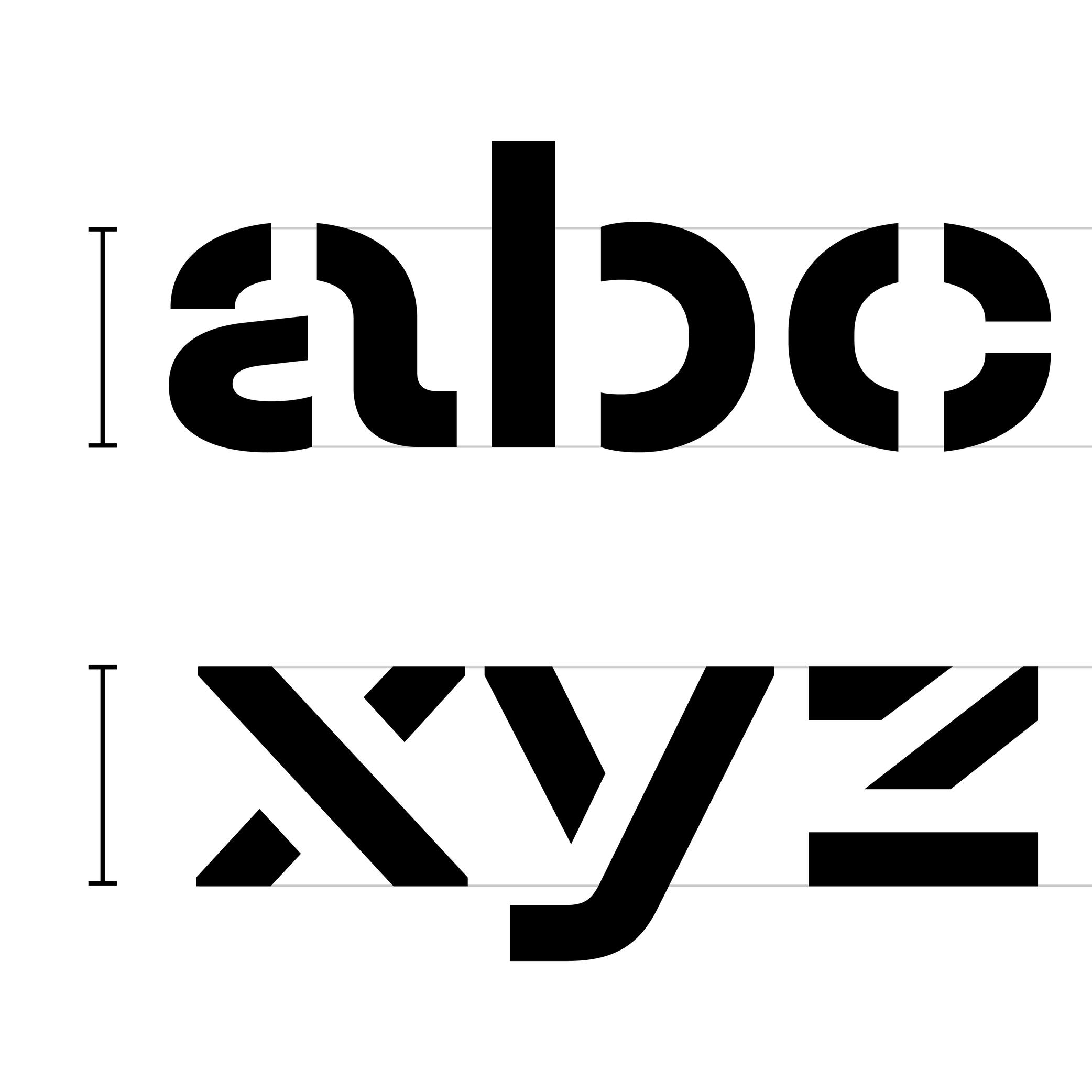
Aperture
Sponsored by DJR . Typefaces in use: (top) Forma DJR , (bottom) Condor , designed by David Jonathan Ross, 2017.
(Read More)The aperture is the frontier between the counter and the surrounding white space of opened letters (such as a, e or c).
Contemporary typefaces that are meant for long text reading are often designed with a wider aperture (sometimes even without a terminal at the top of a and c) as solutions to increase their legibility at smaller size.
Apex
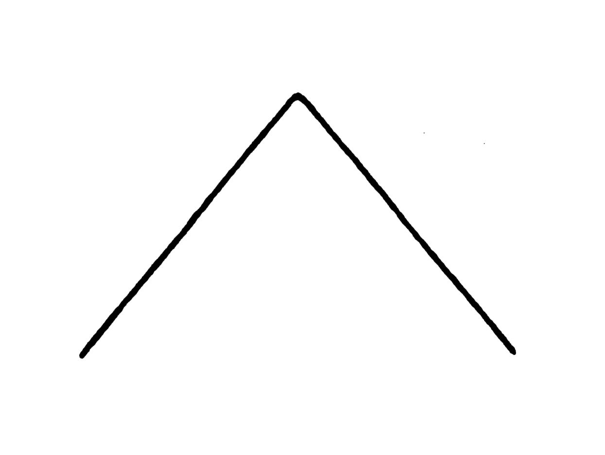
Illustration: Tezzo Suzuki .
(Read More)The apex is the point on the top of a letter where two stems meet, such as the top of the letter A or the middle of w.
We also find the term “vertex,” referring to the top of A as well, but also to other pointed parts such as the base of V or the intersection of K when/if its diagonals don’t meet the vertical stem.
Arch
Sponsored by R-Typography . Typeface in use: Canora Frente and Verso , designed by Rui Abreu, 2021.
(Read More)Many terms are borrowed from architecture or human and animal anatomy to designate and describe parts of letters and other characters. We even speak of type design anatomy.
In Latin script, the arch is the top-right part of letters such as n, m, h and a.
Arm
Sponsor Word of Type and feature your typeface in this card with a linked caption. Contact us for more information.
(Read More)Many terms are borrowed from architecture or human and animal anatomy to designate and describe parts of letters and other characters. We even speak of type design anatomy.
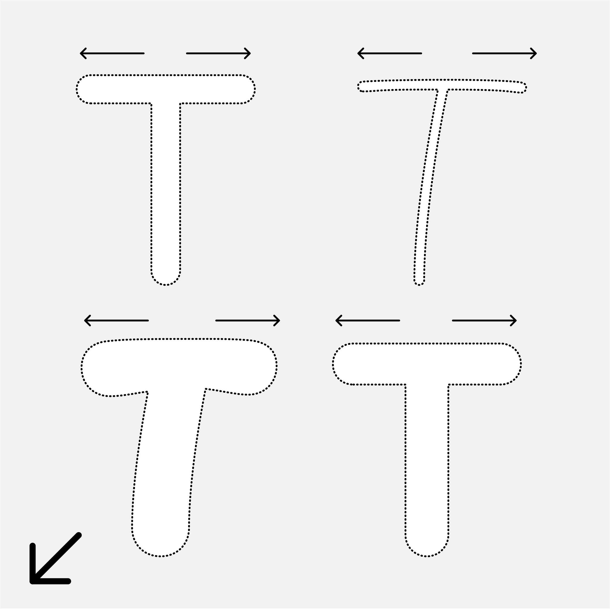
In Latin script, the arm is the horizontal bar at the top of the letter T, as well as the horizontal bars on the E and F.
Ascender
 (Read More)
The parts of lowercase letters that go above the x-height level (such as b, d or h) are called “ascenders.”
On the opposite side of the x-height, the parts going below the baseline are descenders.
Both don’t necessarily need to have the same length. In general, descenders are shorter than ascenders.
Attention: do not confuse ascender height with the capital height (or cap height). Ascenders in Latin script are commonly taller than capital letters.
Axis (in Type Design)
Sponsored by R-Typography . Typeface in use: Gliko Modern L , designed by Rui Abreu, 2018.
(Read More)In Latin script, we speak of a “diagonal,” “tilted” or “oblique” axis when we refer to the shapes of letters in a typeface that have some contrast.
In calligraphy (when using a broad nib pen), the axis of the stroke is defined by the angle at which the pen is held, from which a contrast between thin and thick parts is formed. The axis should be kept the same (or very similar) for a consistent construction on all glyphs.
Balance
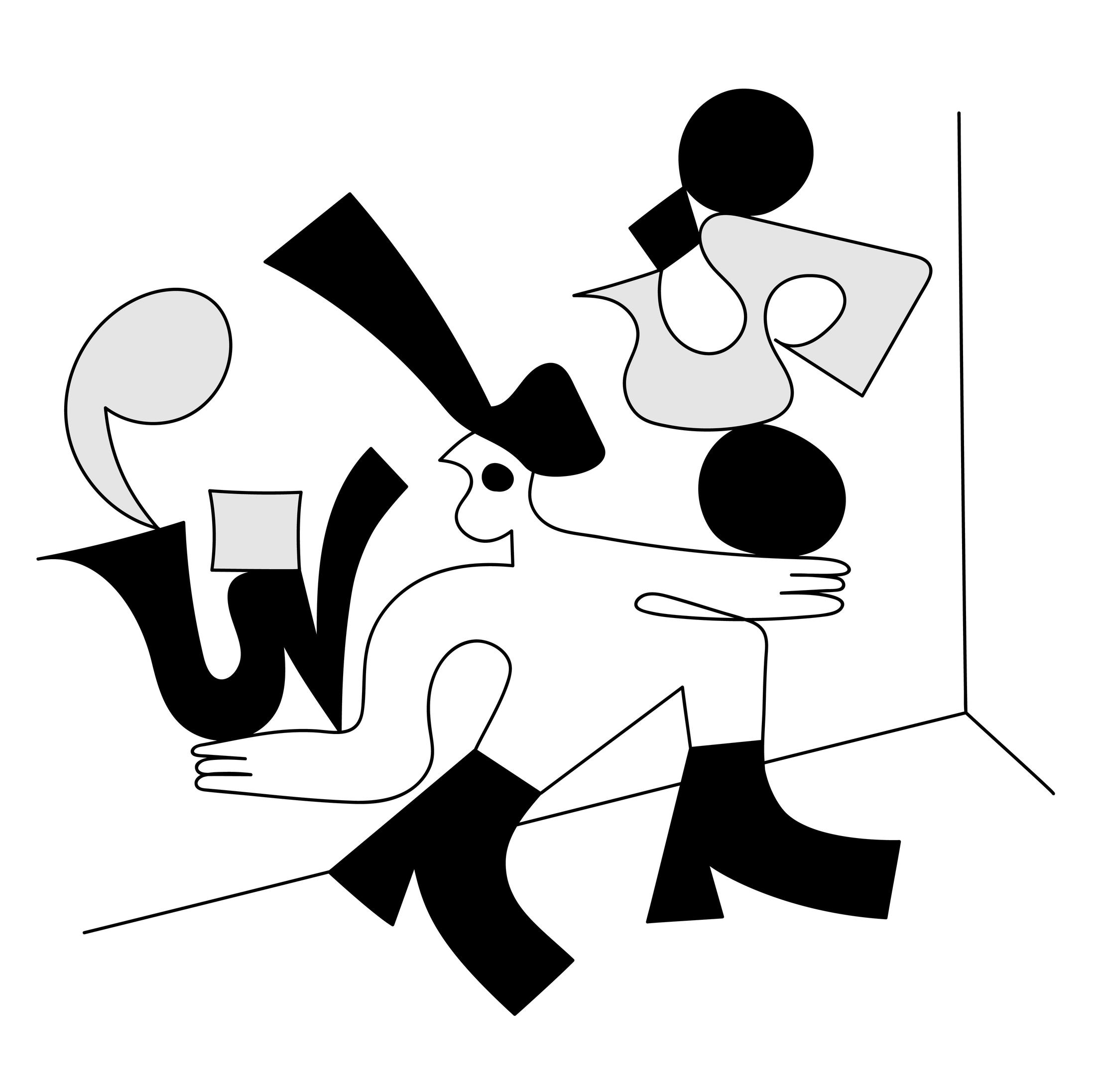
Illustration: Catherine Potvin .
(Read More)The concept of balance is fundamental in typeface design. With many different shapes (letters, figures, symbols, etc.) that have to be combined to create a more complex group (words, sentences), a certain level of training and expertise is required to achieve a harmonious balance of the whole set.
A good balance allows a comfortable reading experience.
Baseline
Sponsor Word of Type and feature your typeface in this card with a linked caption. Contact us for more information.
(Read More)The baseline is where the bottom extremity of letters such as n and H are positioned, and it is used as a reference guide for the entire character set. We also say that letters are “sitting” on the baseline.
The baseline—with other guidelines like x-height, ascender, descender and capital height—helps to control the position of all letters and glyphs.
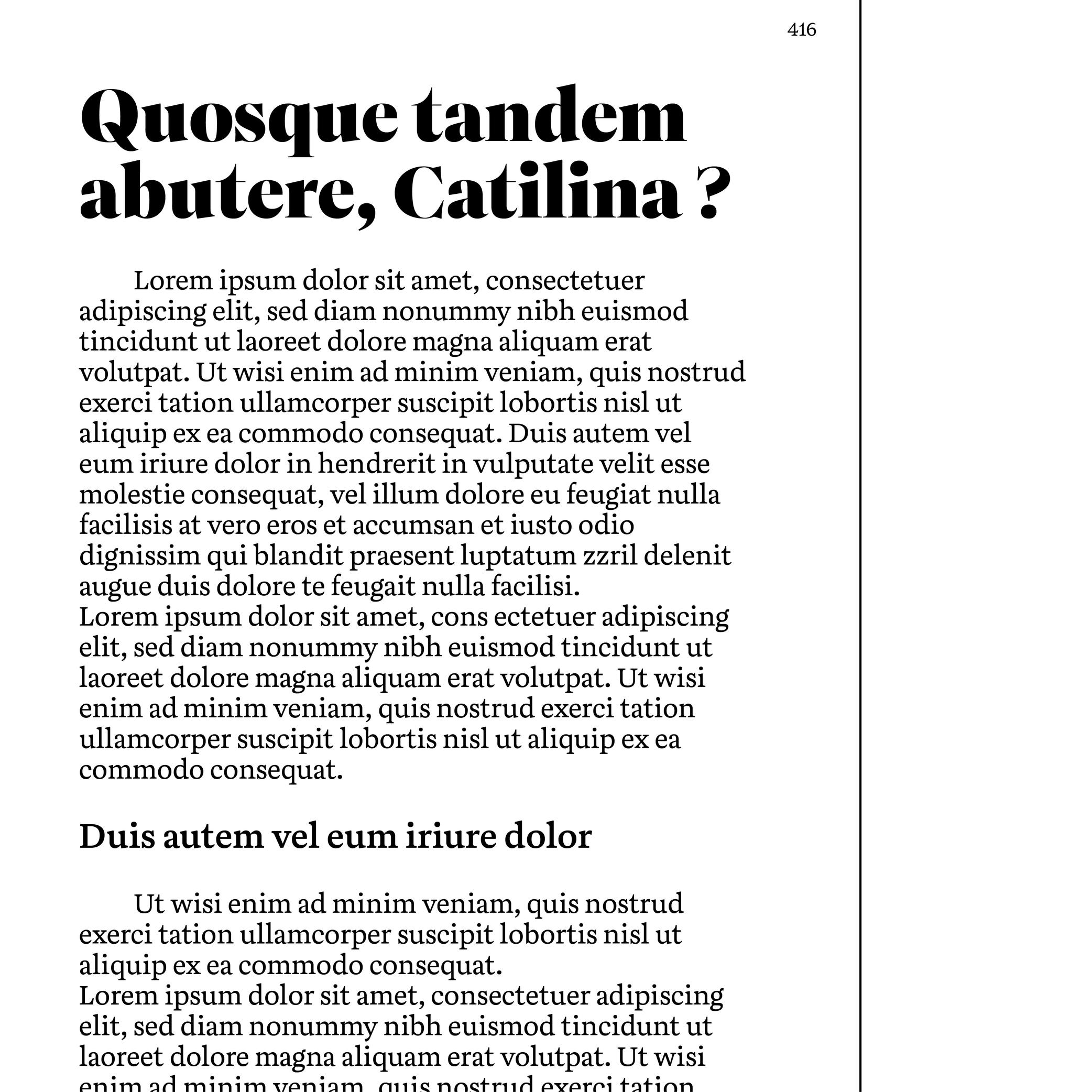
Body Text
Sponsored by TypeTogether . Typeface in use: Aneto , lead designers: Veronika Burian, José Scaglione, 2022.
(Read More)Also called body copy or running text, body text is usually the main written part of a document. Titles, subtitles, captions and others should be visually different from the body text so each type of information is clearly distinct and recognizable.
It is advised to set the body text at a size that is most comfortable for long reading: from 9 to 12 points for printed media and 16 to 18 points for digital screens.
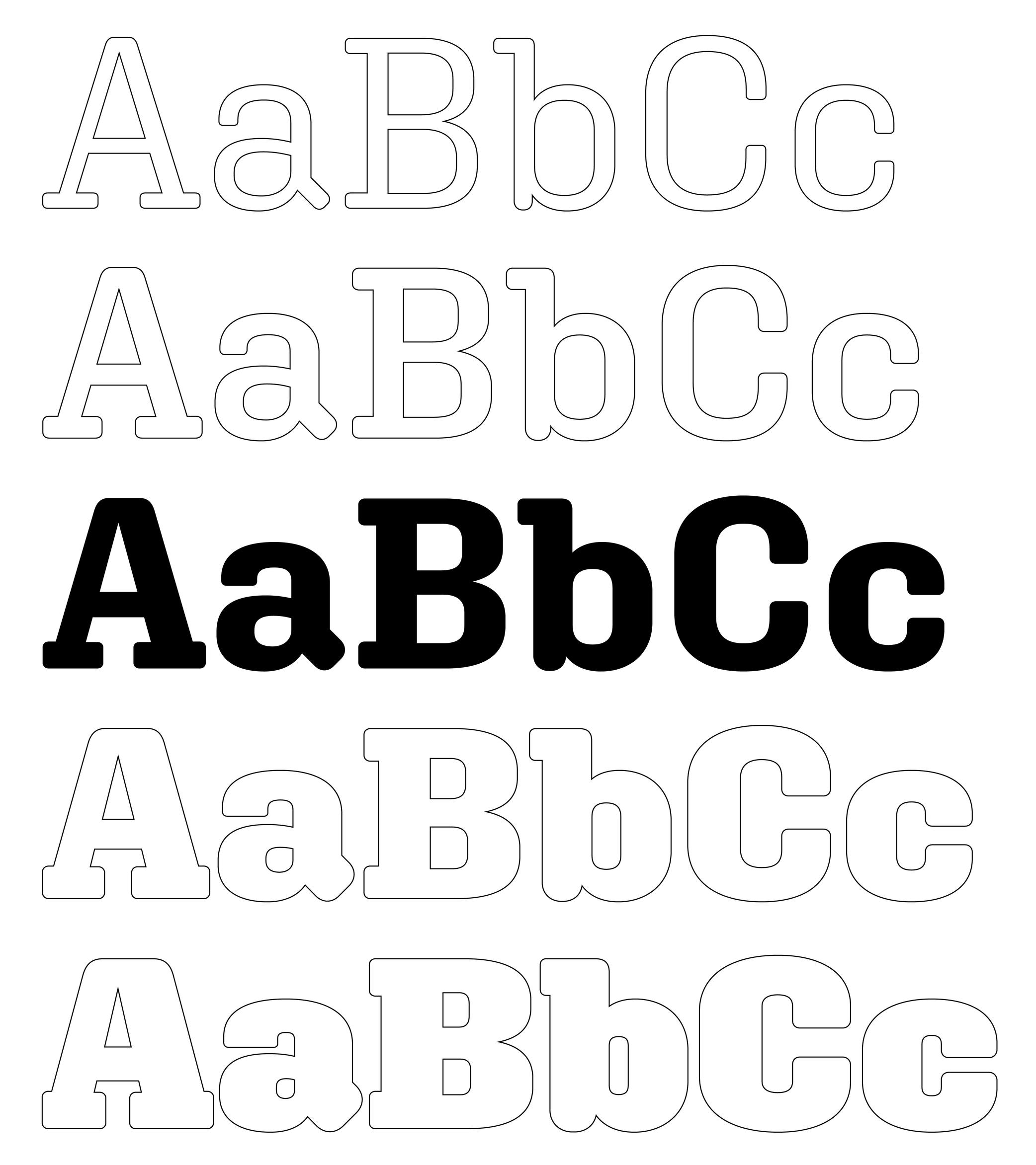
Bold (weight)
 (Read More)
While Regular is the most common weight for body text, Bold is a style often chosen to highlight a word or a sentence with a stronger emphasis than Italic.
Bowl
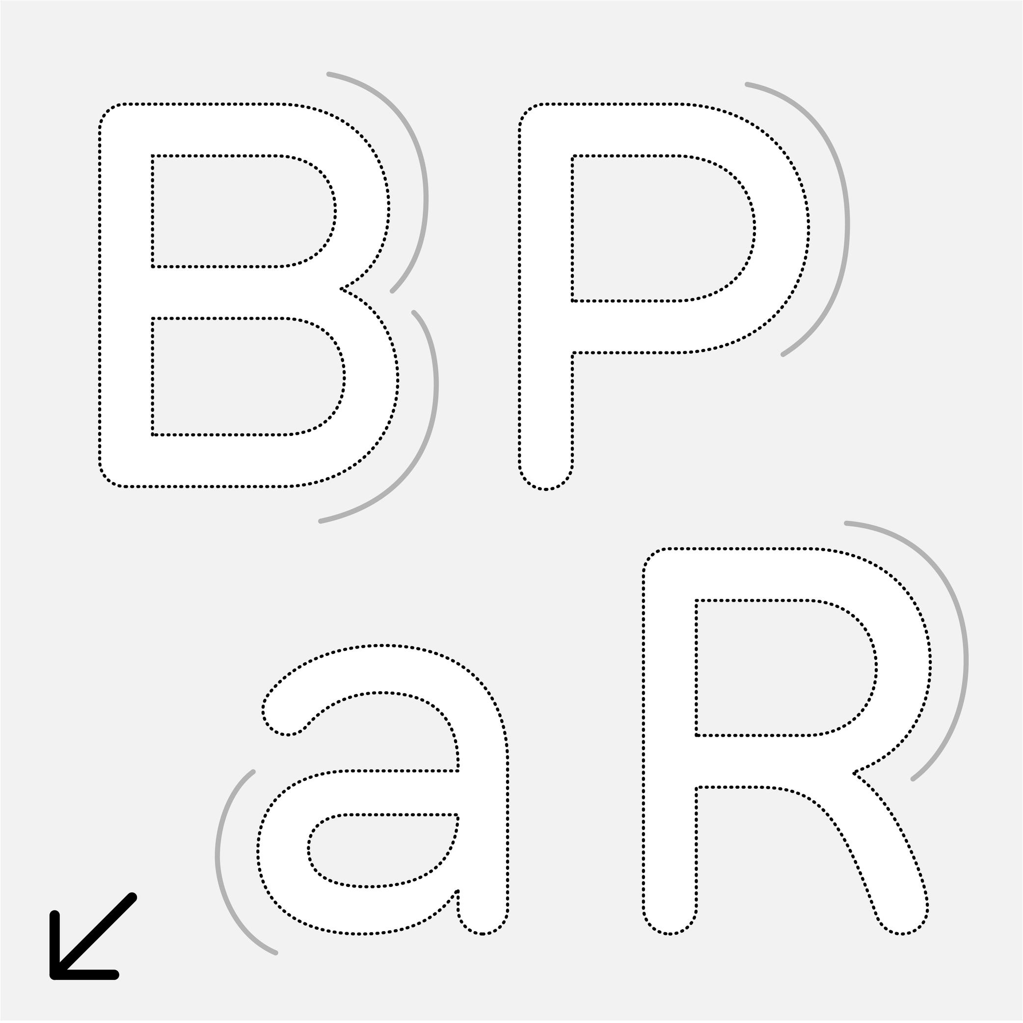
Sponsor Word of Type and feature your typeface in this card with a linked caption. Contact us for more information.
(Read More)Many terms are borrowed from architecture or human and animal anatomy to designate and describe parts of letters and other characters. We even speak of type design anatomy.
In the Latin script, the bowl refers to the rounded parts of a letter, like those in a, B, P, R, etc.
Calligraphy
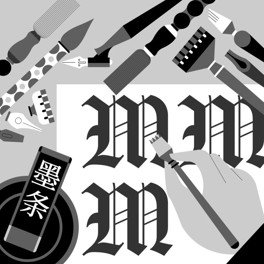
Illustration: Jonny Wan .
(Read More)The word calligraphy comes from the Greek kalos, meaning “beautiful,” and graphein, meaning “to write.” Together, it means “to write beautifully.”
Many civilizations around the world have practiced calligraphy (and continue to do so today) using a variety of tools: brush, pen, quill, broad nib pen or brush, etc. Most even consider it to be an art form.
Today, we describe typefaces whose letters and characters are inspired by those written with a calligraphy tool and following certain calligraphy styles as calligraphic. However, this is slightly different from “script” or “handwritten” styles, as those refer to handwritten shapes free from any particular calligraphic style.
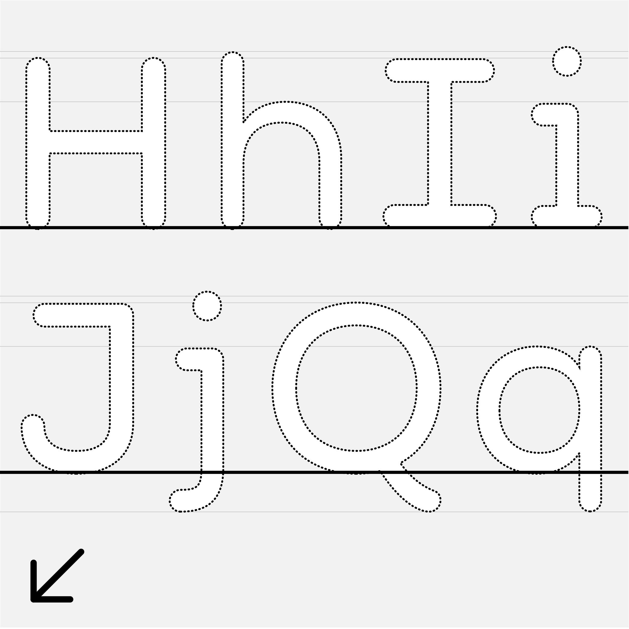
Cap Height
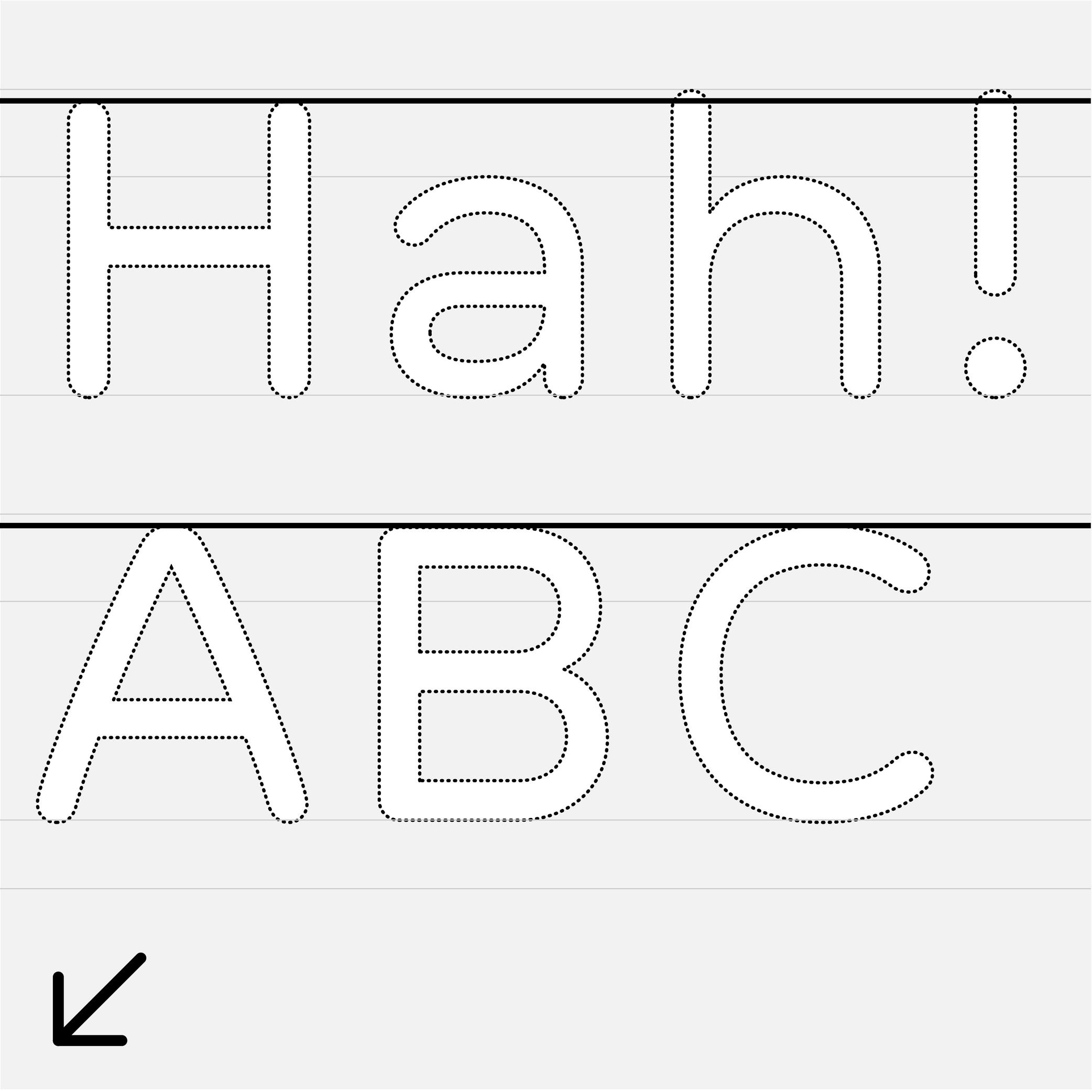
Sponsor Word of Type and feature your typeface in this card with a linked caption. Contact us for more information.
(Read More)The cap height (short for “capital height”) is at the top level of square capital letters, such as H.
The cap height is one of the main guidelines for Latin-script typefaces. It is usually lower than the ascender height in typefaces meant to be used at small size. This is also the case for sans serif styles to show a difference between l (lowercase L) and I (uppercase i). In many display styles, the ascenders are the same as the cap height to save some vertical space.
Caption
 (Read More)
To inform a reader that a passage of text is a caption, it is usually placed near the image it is linked to, but it is usually also set in a smaller size and/or in a different style.
Some typefaces contain a specific caption style in the family with optimized details for specific use in small sizes, such as lower contrast and higher x-height.
Center Space
Sponsored by Mallikātype . Typeface in use: Nan Sans, designed by Tianmeng Xue. Coming soon.
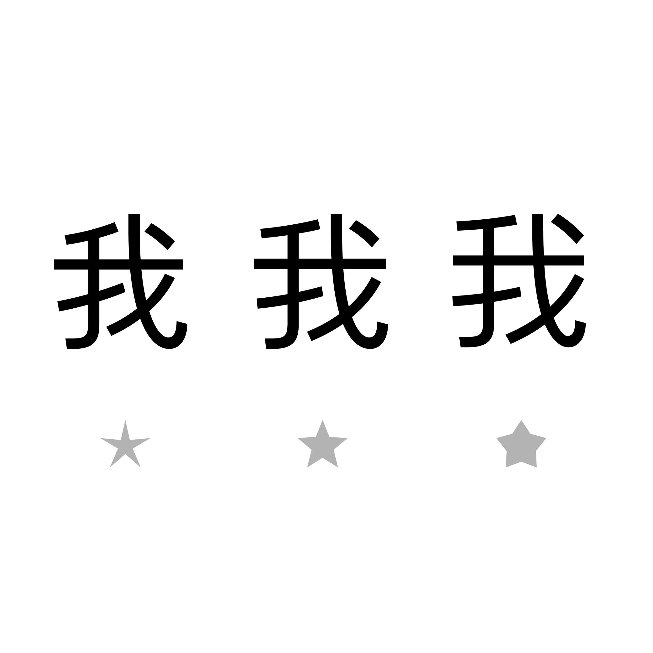
(Read More)In the Chinese Hanzi script, the center space (or optical core, 中宫 in Chinese) corresponds to the central area of a character, similar in Latin to the area between the x-height and the baseline. This area can differ from style to style, but it has to be visually constant for all characters in a typeface.
A text typeface with a bigger center space has its legibility improved for small sizes.
Classification
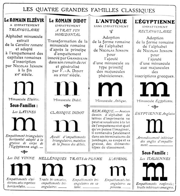
Francis Thibaudeau’s typographic classification, from Manuel français de typographie moderne, Francis Thibaudeau, 1924. Collection of Bibliothèque nationale de France (French National Library).
(Read More)With the many styles and designs of typefaces that exist, it can be difficult to describe, sort, or even find them in a catalog that isn’t familiar to the user.
Each writing system has its own typeface classification categories that best suit its nature and history. As aesthetic values differ from one culture to another, the same (or similar) style may not convey the same impression across different scripts, and one category considered a convention for one script is not always relevant to others.
For example, Latin typefaces have been sorted into multiple classification systems since the beginning of metal typesetting. Here are some of them:
• Thibaudeau, by French typographer Francis Thibaudeau in 1921, with four categories: Elzévirs, Didots, Égyptiennes and Antiques;
• Vox (or Vox-Thibaudeau), by French historian Maximilien Vox in 1954, who started with the Thibaudeau classification as a basis and added more categories to include the additional typeface styles in the Deberny & Peignot type foundry’s library;
• Vox-ATypI, with additional categories and subcategories from the ATypI (Association Typographique Internationale), added between 1962 and 2021.Today, classification systems vary from one type foundry to another, using more or less “standardized” terms better suited to their own catalog or the scripts covered. These boxes also help users find what they are looking for in a wide variety of choices. They are not rules to be followed to the letter. Imagination and creativity shouldn’t be confined!
Color
Illustration: Words of Type.
(Read More)The color of a text is the quality of its visual texture given by the design of the typeface in use.
Different settings such as spacing, leading, frequency of some letters or diacritics can also influence the typographic color.
Construction
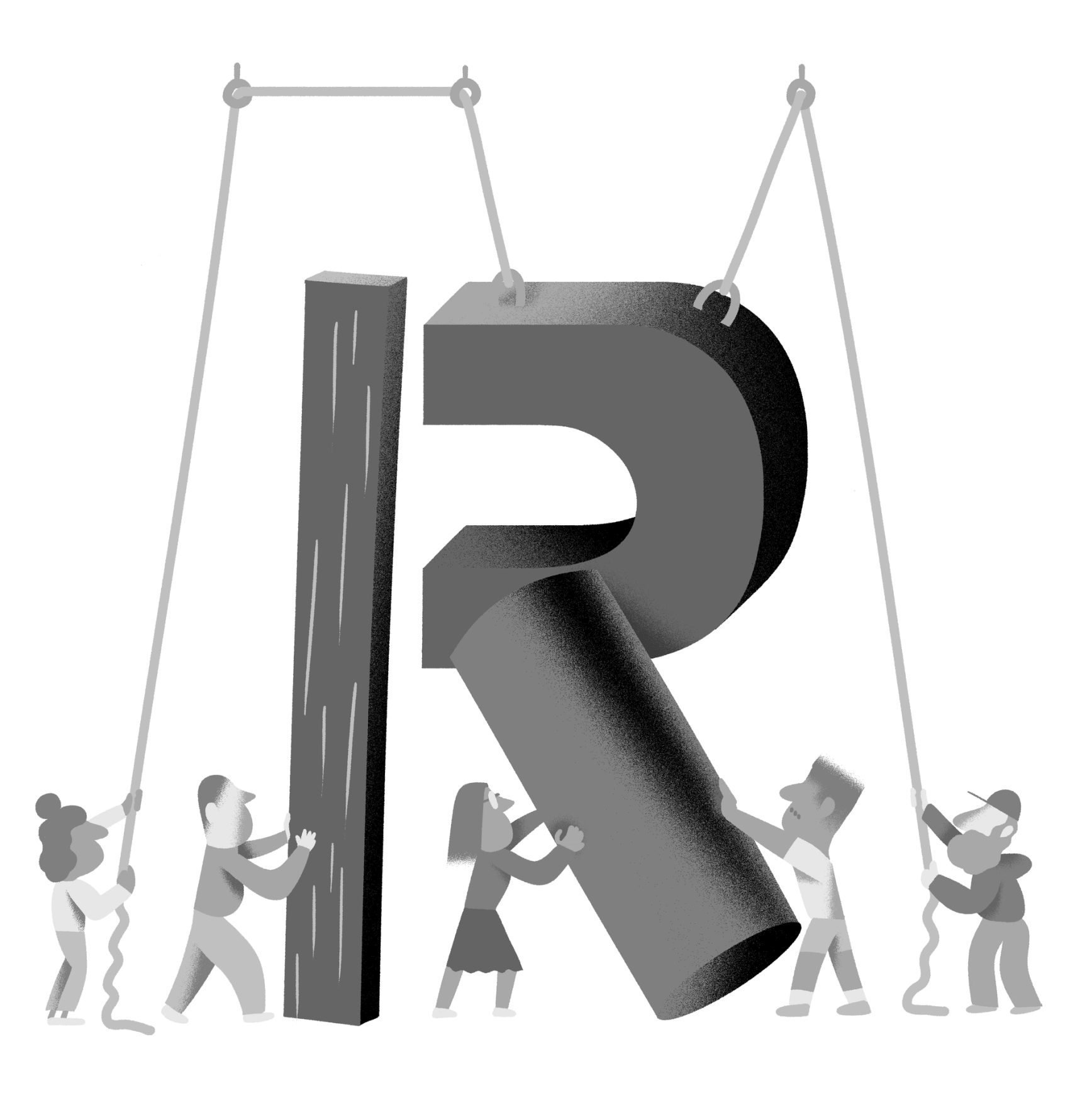
Illustration: Yann Bastard .
(Read More)Letters, characters and other glyphs of every script are written with a specific number of strokes of a particular shape. This is the glyph construction.
This construction went through multiple evolutions over time and at different pace for each script, being influenced by various circumstances (tools in use, style preferences, needs, etc.).
Contrast
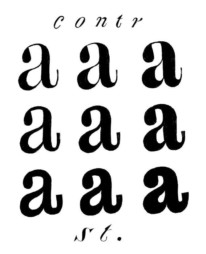
Illustration: Erik van Blokland .
(Read More)The contrast is the relationship between a glyph’s thick and thin parts.
The thickness variation in a stroke comes originally from handwriting, as a result of the tool’s reaction to the medium in combination with how it is held and the writer’s movements.
Nowadays, in type design for the Latin script, we speak of a vertical contrast when the vertical parts are thicker than the horizontal ones; this is its “natural” contrast. The opposite is known as a reversed or inverted contrast.But these concepts only apply to scripts that evolved using tools and a medium that creates such contrast “naturally”, which is not universal for all. For example, the Hebrew script’s contrast would naturally be distributed the other way around.
Counter
Sponsored by NM type . Typeface in use: Sastre, designed by María Ramos, 2024.
(Read More)Also called counterform.
A counter is the negative shape inside a glyph with an enclosed form, either entirely closed (such as b) or partially open (such as n).
This term comes from the “counterpunch.” Punchcutters used counterpunches to depress the white spaces inside letterforms while making the master punches for metal-type sorts.
Concretely, they would strike the counterpunch into a larger steel punch. Afterward, the punchcutter filed down the outside of the punch, creating the letterform’s exterior contour.
Punchcutters could reuse a counterpunch on any related letterforms in the typeface, keeping a consistent look throughout an entire font.TYPE DESIGN
In digital type design for Latin scripts, it is important to keep this consistency as well, with various techniques, such as putting the component of a reference letter in the background or copy-pasting the contours of the counter, or making sure that they visually look consistent by placing them next to each other while designing the shapes.
Descender
Sponsored by Frere-Jones Type . Typefaces in use: Empirica , designed by Tobias Frere-Jones, Nina Stössinger, 2018.
(Read More)The parts of lowercase letters (such as p, q or y), old style figures or some punctuation symbols going below the baseline are called descenders.
In the same typeface, all descenders need to have the same height for overall consistency.
On the opposite side, parts going above the x-height are ascenders, like in letters b, d or f.
Both ascenders and descenders don’t necessarily need to have the same length. In general, descenders are shorter than ascenders.
Display
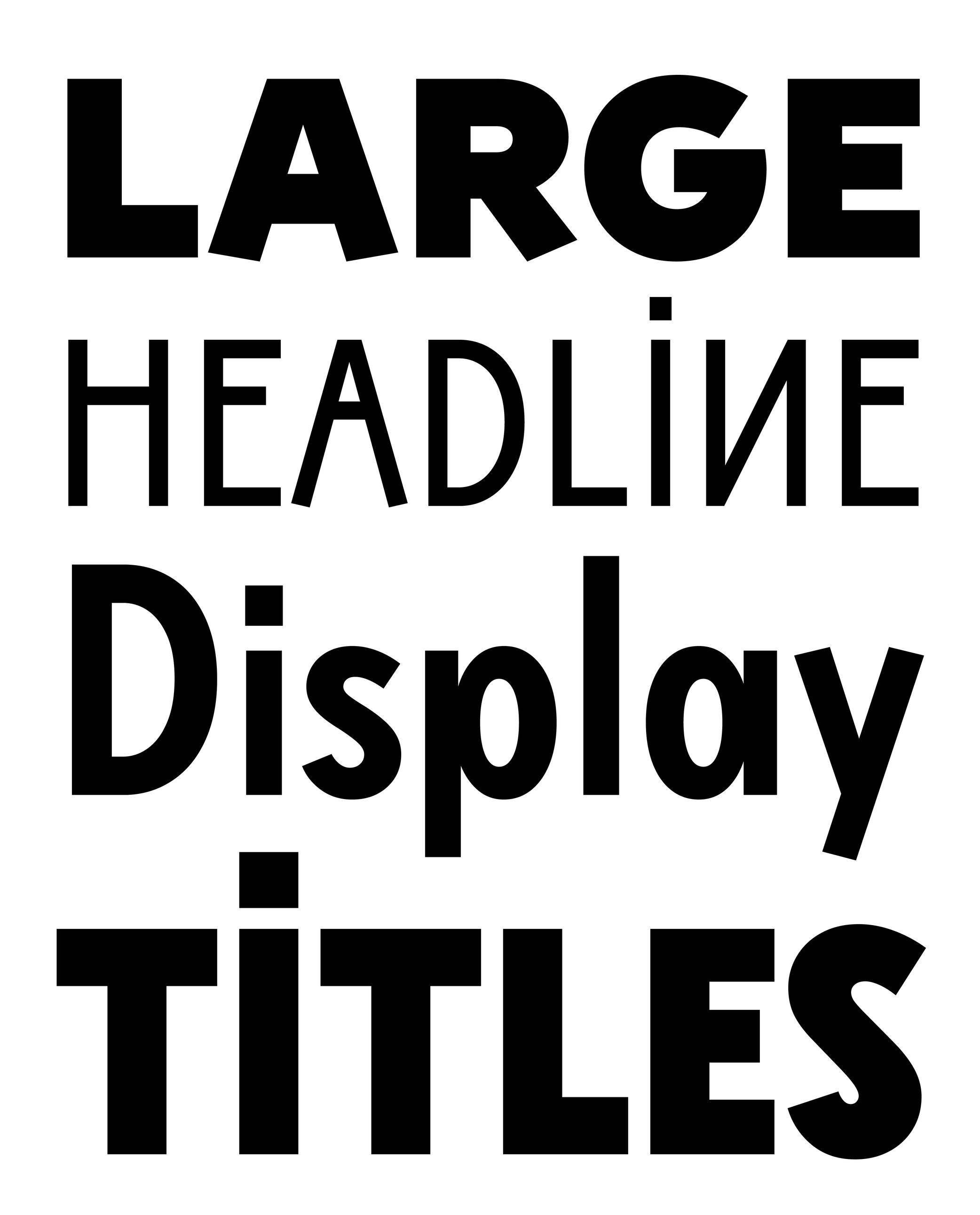 (Read More)
Display (or Titling) typefaces are designed and used at large sizes to catch the reader’s attention (in posters, billboards, newspaper or magazine titles, covers, etc.).
In order to do so, they have more elaborate designs and/or exaggerated details than typefaces for running text.
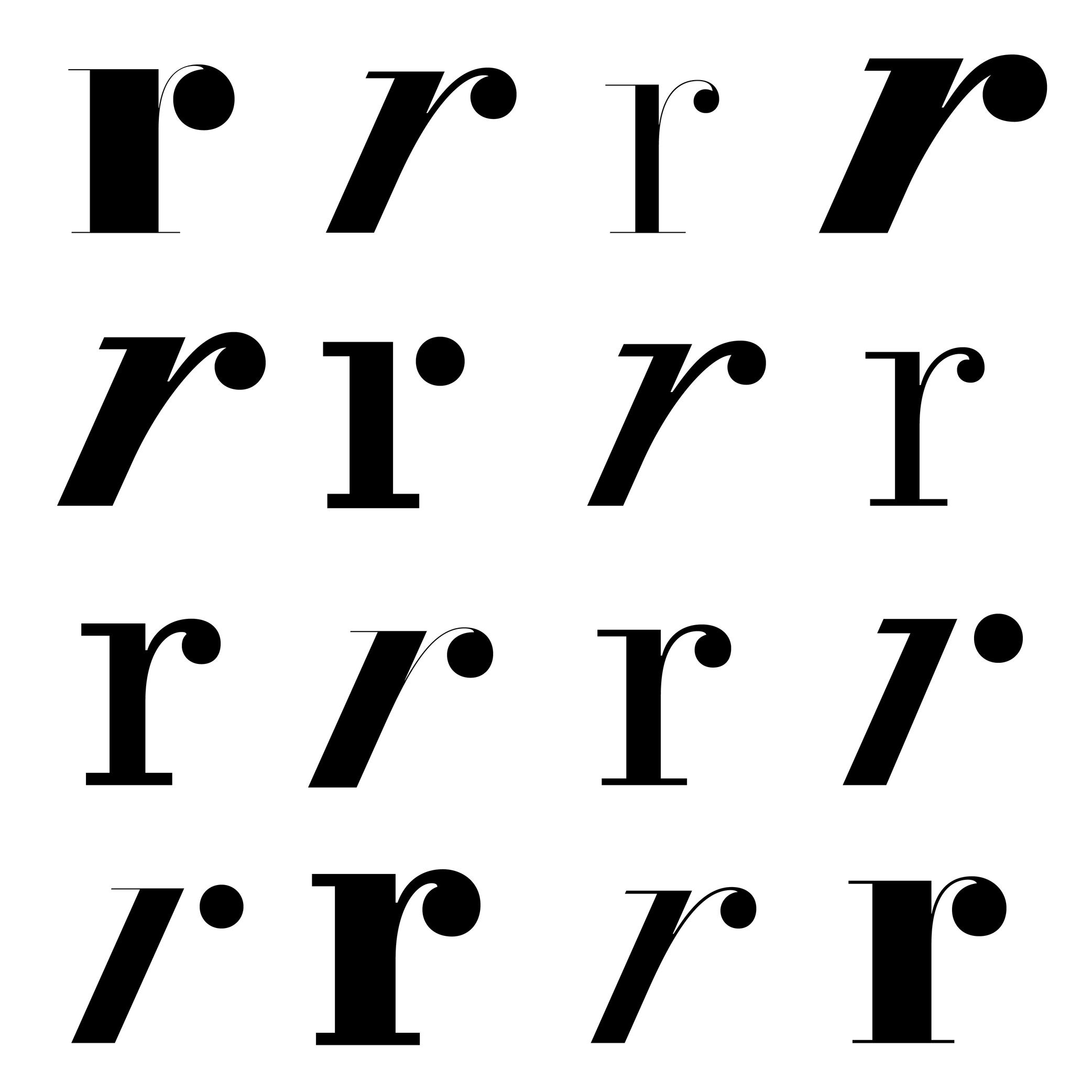
Drop
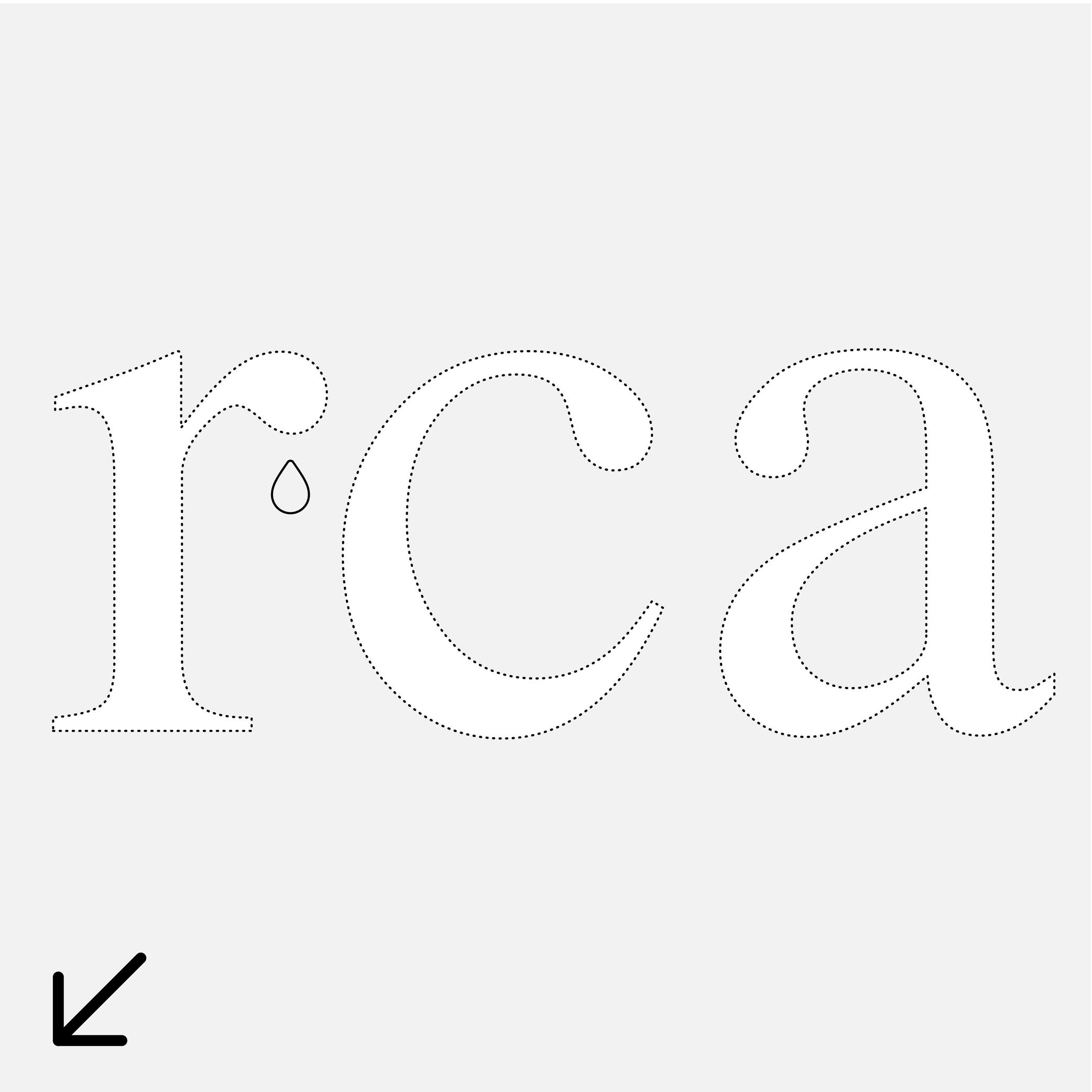
Sponsor Word of Type and feature your typeface in this card with a linked caption. Contact us for more information.
(Read More)Many terms are borrowed from architecture or human and animal anatomy to designate and describe parts of letters and other characters. We even speak of type design anatomy.
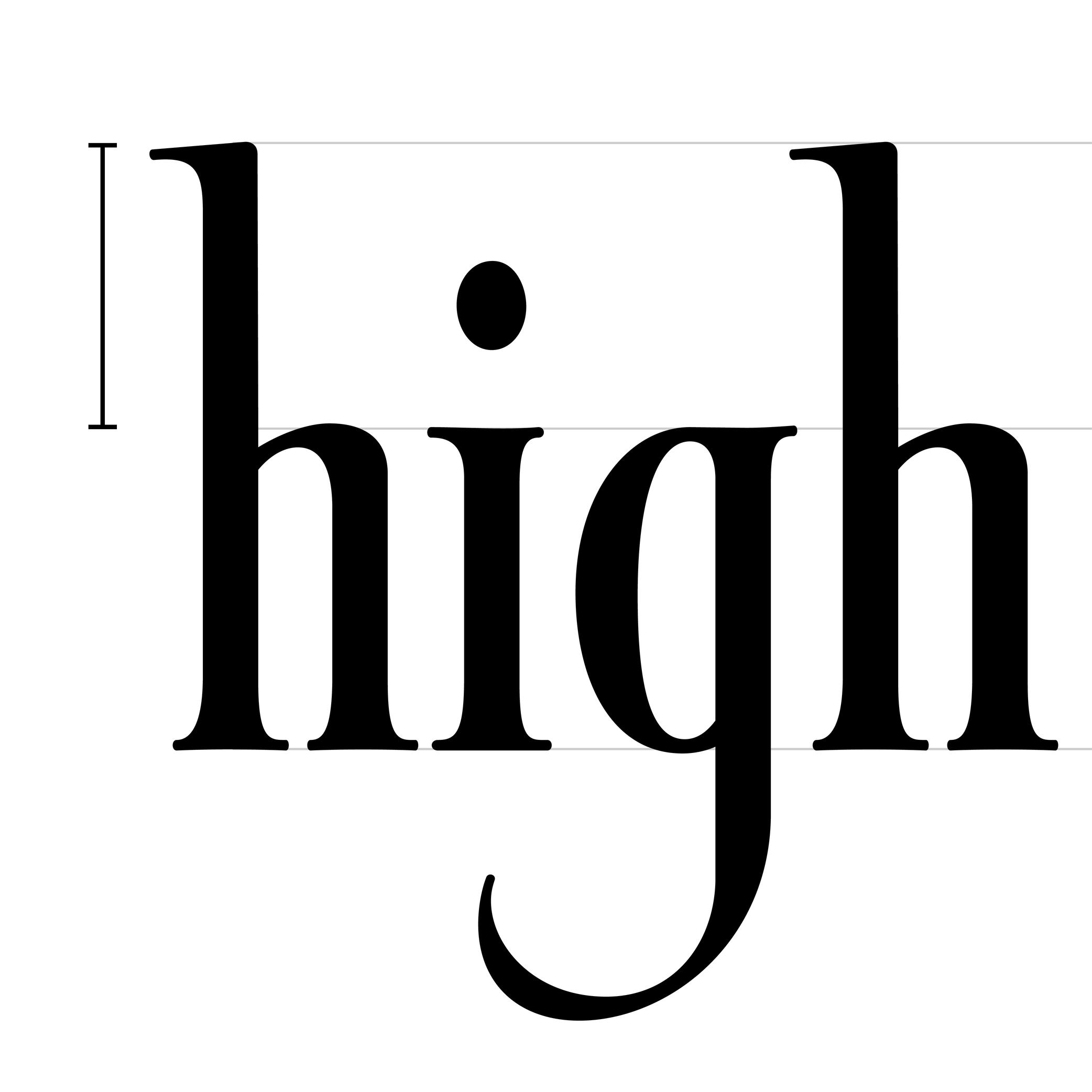
For Latin script, the drop refers to the top hanging part of r or a that looks like a drop falling downward, generally present in serif style fonts.
Ear
Sponsored by Commercial Type . Typeface in use: Le Jeune , designed by Paul Barnes, Christian Schwarz, Greg Gazdowicz, 2016.
(Read More)Many terms are borrowed from architecture or human and animal anatomy to designate and describe parts of letters and other characters. We even speak of type design anatomy.
In the Latin script, the ear refers to the top-right hanging part of letters like the r, f or the double-storey g.
Expansion
(Read More)Expansion is one of the multiple contrast types in Latin-script type design (along with translation and rotation).
The specificities of the expansion contrast come from the pressure applied while writing a stroke with a fountain pen or quill (the two flexible tips split with added pressure) while keeping the pen tip at a vertical axis.
Bodoni and Didone (or Didot) styles are typical examples of expansion contrast typefaces.
Eye
Sponsored by Commercial Type . Typeface in use: Portrait , designed by Berton Hasebe, 2013.
(Read More)Many terms are borrowed from architecture or human and animal anatomy to designate and describe parts of letters and other characters. We even speak of type design anatomy.
In Latin type design, the eye refers to the ratio between the x-height and the other guidelines (ascenders and descenders).
A typeface is suited for text usage if it has a ratio slightly bigger between its eye to its ascenders and descenders, as this enhances the legibility of the letters.
Family
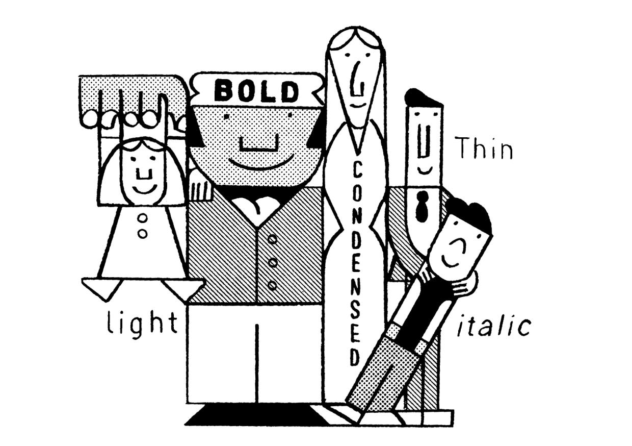
Illustration: Jay Cover .
(Read More)While a typeface refers to its design concept, a typeface (or font) family is the collection of styles derived from that design.
Each style has their own specificities (weight, width, contrast, slope, etc.), while retaining common characteristics—making them part of the same family.
A family usually contains a limited number of styles along the weight axis, including their matching italics.
When it spans a wide range of styles, across multiple axes, it is often referred to as a “superfamily.” These large families are often grouped into subfamilies to organize styles more clearly in the font menus of text editor softwares.Geometric
 (Read More)
A typeface with a geometric style has shapes designed in a way that follows the logic of geometry (straight, round, square, etc.).
But our human eyes are organic (as opposed to artificial), we need to use optical tweaks and adjustments in addition to the shapes drawn out of geometric tools to make the letterforms look geometric.Handwriting
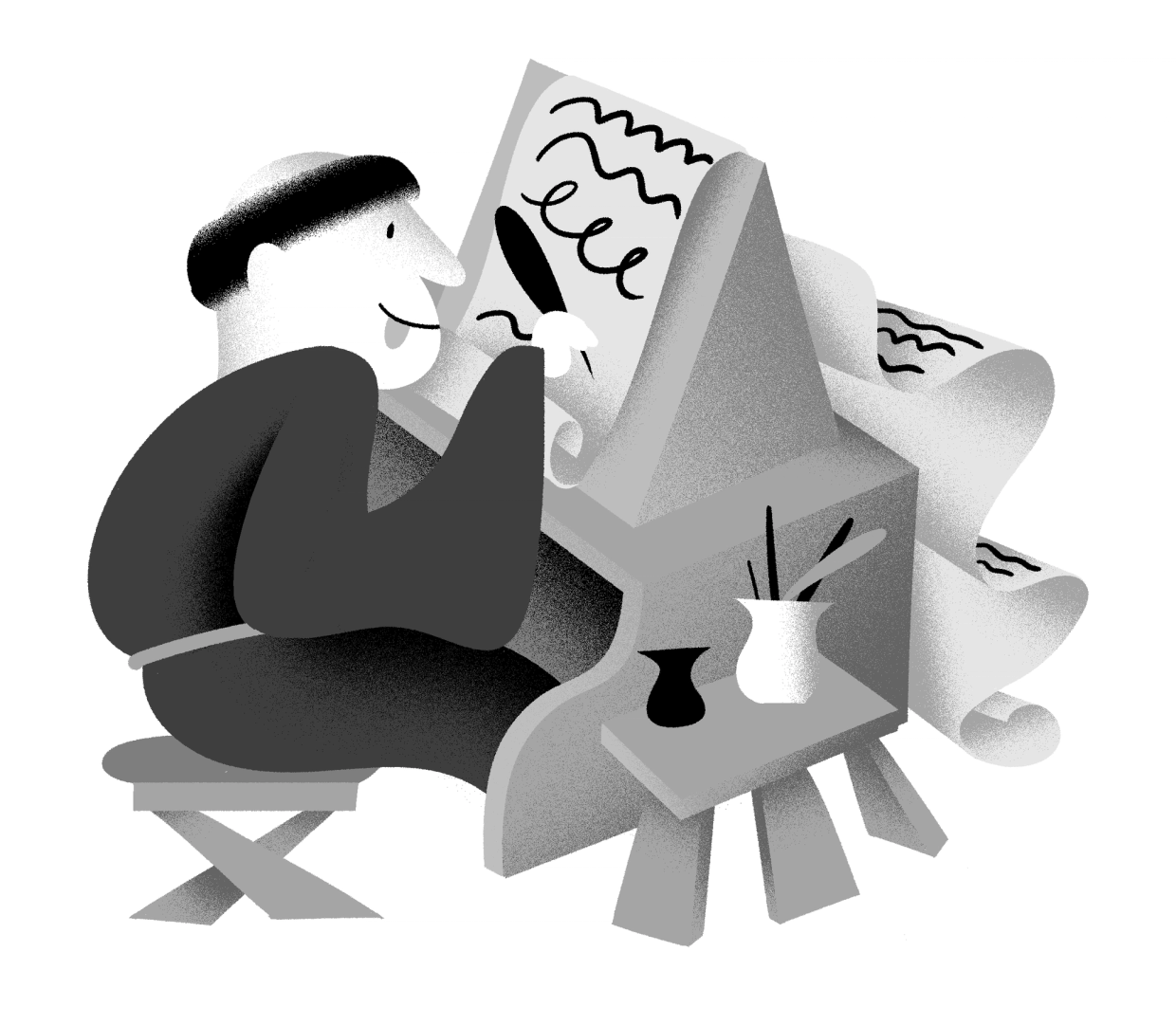
Illustration: Yann Bastard .
(Read More)The word ‘handwriting’ refers to texts written by hand.
Handwritten forms of any languages, combined together as handwritings, are considered to be one of the most important technologies ever invented, as it separated communications from live speech, made knowledge preservable, and began the development of numerous devices used for writing and materials to write on.
In many cultures, handwriting is so tightly related to the person writing a text that many consider someone’s handwriting style to reflect either the personality of the writer or his/her emotions at the moment of writing (and also his/her age).
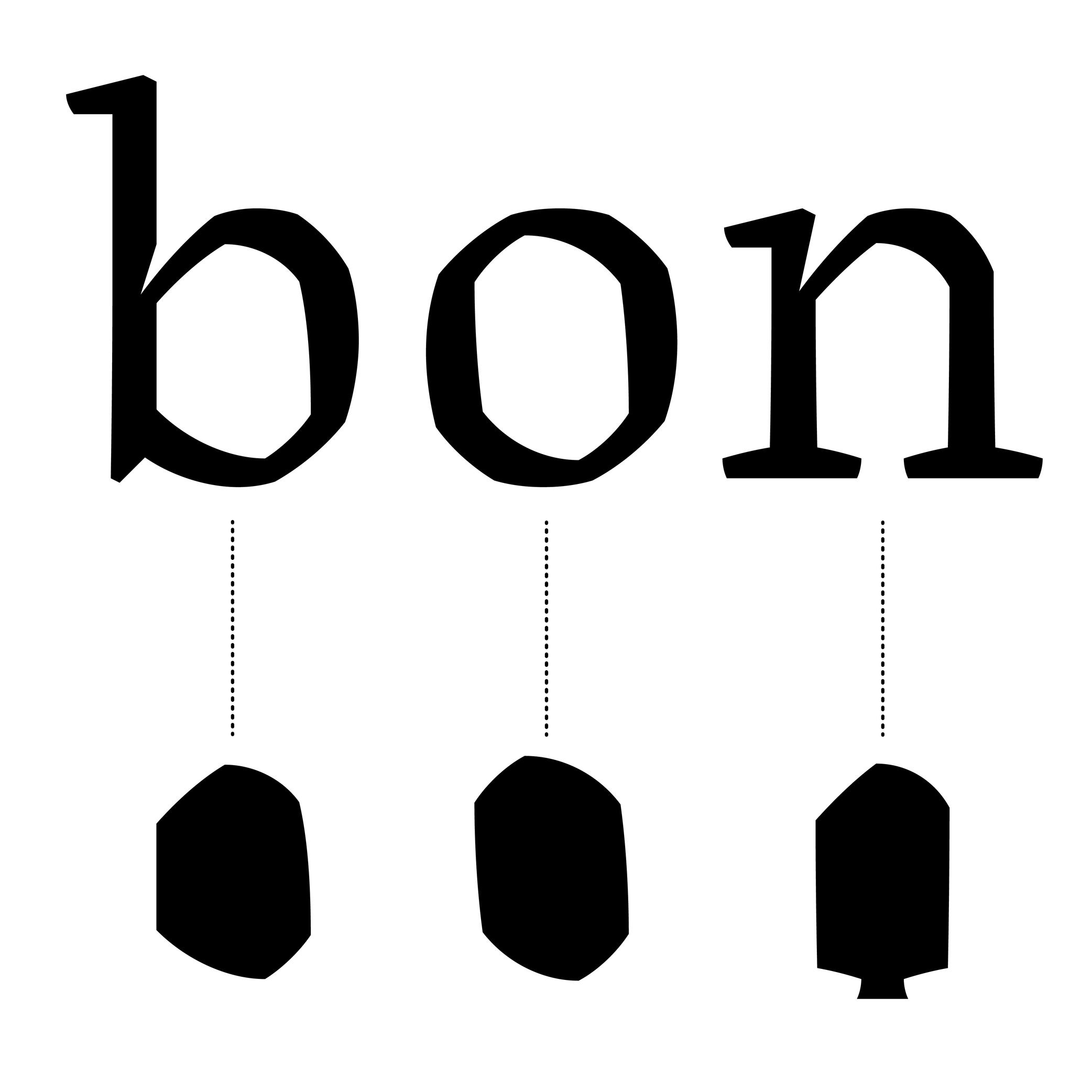
Height
Illustration: Jonny Wan .
(Read More)In type design, height refers to vertical measurements used as guidelines for different categories of glyphs (such as uppercases, lowercases, small caps, etc.). These are measured from the baseline and help ensure visual consistency across the typeface.
LCG (LATIN, CYRILLIC, GREEK)
LCG scripts typically use the following height guidelines for their lowercases, uppercases, and small caps:
• x-height: height of short lowercases;
• ascender height: height of the extension of lowercase letters that rise above the x-height;
• descender height: height of the extension of lowercase letters that fall below the baseline;
• cap height: height of uppercase letters;
• small case height: heigh of the small cases;
• sometimes also specific figure heights too (for old style or proportional figures, and more).CJK (CHINESE, JAPANESE, KOREAN)
Characters of CJK scripts are commonly designed to fit within a common em-square (same width and/or height) for all characters within the same typeface. Designers often define:
• ideographic em height: total vertical space for a character;
• baseline offset: vertical alignment for mixed-script texts.ARABIC SCRIPTS
Arabic scripts have various types of heights measurements depending on the style involved, including some that don’t follow the same rule as Latin script, where the “horizontal” baseline may not be exactly the same word to word when the letters are typed into texts. But in general, we can list down the following:
• baseline: anchors the “horizontal” alignment;
• median line: main body height;
• ascender and descender lines: based on the tallest and lowest glyph strokes;
• mark height: guides the placement of diacritics.INDIC SCRIPTS
The following are the most common height measurements for Indic scripts (which encompasses a large number of different scripts!):
• shirorekha (headline): the horizontal bar on top of many letters;
• base height: where the main glyph body sits;
• matra height: position for vowel signs and marks above or below the base glyph.Note: These design heights relate to glyphs’ outlines, and are not to be confused with vertical metrics, which define the overall line spacing in a font.
FONT ENGINEERING ADVICE
The x-height and the cap-height are important values that can be found in the OS/2 table of the font file.
Hook
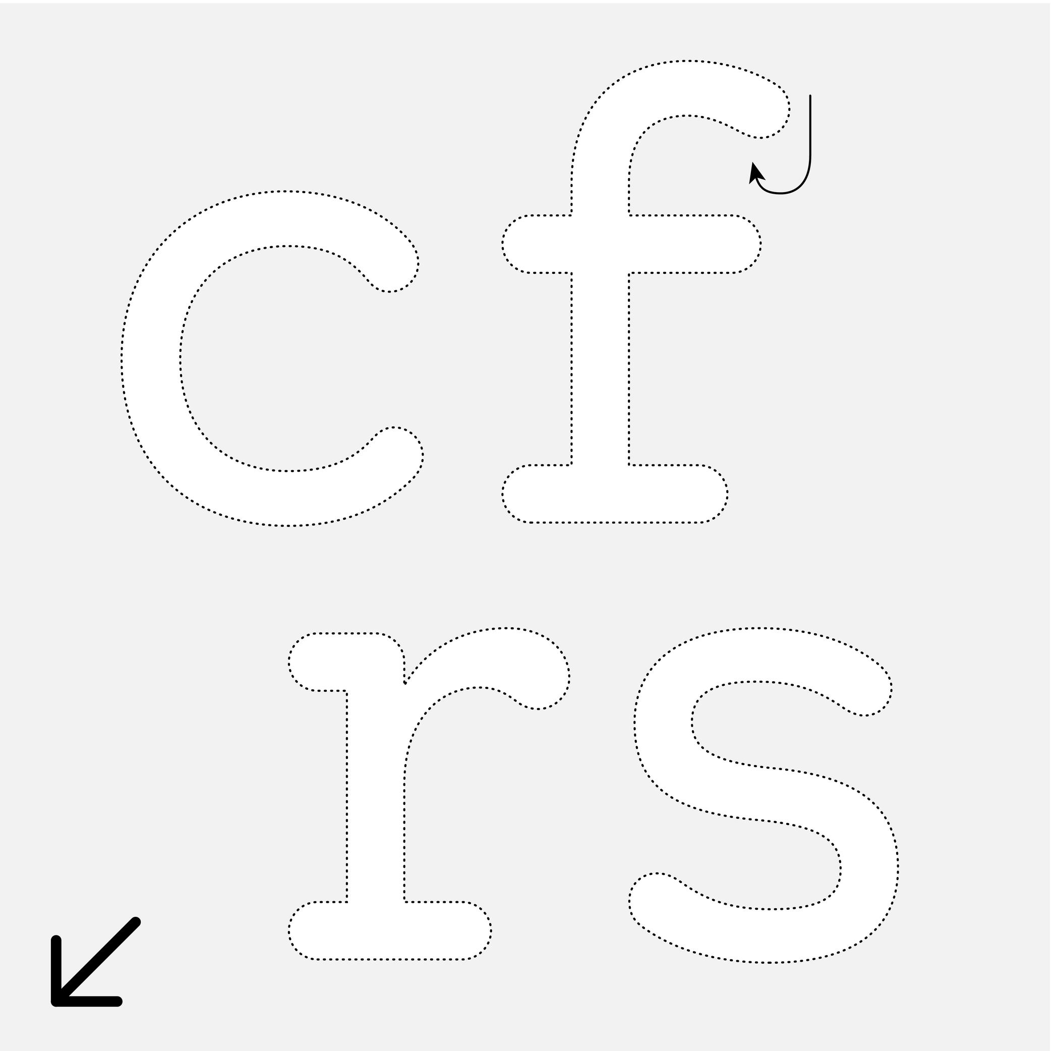
Sponsor Word of Type and feature your typeface in this card with a linked caption. Contact us for more information.
(Read More)Many terms are borrowed from architecture or human and animal anatomy to designate and describe parts of letters and other characters. We even speak of type design anatomy.
In the Latin script, the hook refers to the part curling downward in letters such as c, f, r, s, etc.
Depending on the style or the shape of this part, it can also be called an ear, an arch or a (upper) terminal.
Ink Trap
Sponsored by Blaze Type . Typeface in use: Area Normal Inktrap , designed by Matthieu Salvaggio, 2021.
(Read More)When printing technology was primarily based on printing inked metal types on paper, ink could easily spread into the small corners of the characters. In printing, this effect is called a “bleed.” Especially at small sizes, too much ink spread can weaken legibility.
One of the best examples of a typeface solving the ink-spread problem is Bell Centennial, designed by Matthew Carter in 1975 for the US telephone company AT&T. It needed a typeface for its phone books, which would be printed on thin and porous paper. The resulting typeface featured inner corners that dug into the letterforms’ usual contours. Those are called ink traps.
In digital typeface design, designers still use ink traps, especially for typefaces intended for small sizes (on printed and/or digital media), but also as design features (which can be pretty wild!).
Italic
Univers, extract from Manuel Typographique, by Fournier le Jeune, 1766, as displayed in De Plomb, d’Encre et de Lumière, Essai sur la typographie & la communication écrite, C. Peignot and G. Bonnin, French National Printing Office (Imprimerie Nationale), 1982
(Read More)DESCRIPTION
Two construction styles are possible for the same weight in a Latin script typeface: Roman (or upright) and Italic. Italics usually have slanted letterforms, with more or less obvious influence from handwritten letter structure (connected letters) and shapes (softer starts and endings). In general, italic letters also have a slightly narrower width than their upright companion.
For italic styles to be visually linked to an upright version, they have to be related to each other (similar weight, height, etc.). However, they also need to be different enough so that the reader can easily differentiate one from the other. Managing a good balance between differentiation and similarity is part of the typeface designer’s expertise to design a “nice couple.”
HISTORY
During the Renaissance in Europe, when the Humanist movement emerged, they developed a new style of handwriting that combined the old Carolingian Minuscule (all lowercase letters) with forms inspired by Ancient Roman inscriptional lettering (Capitalis Monumentalis). Both have a close relationship to the ‘natural’ movements of the human hand.
While Humanistic handwriting could use either roman (upright, interrupted) or italic (slanted, connected) letterforms, each direction would eventually become an independent style used for different purposes, as is familiar today. The names we use now also come from that era, with ’roman’ referring to the alphabet of the Ancient Romans and ‘Italic’ being a moniker English writers used to refer to the style of connected letters that had originated more recently in Italy.
In typography, the first italic typefaces used date to around 1500. However, it was not until the mid-16th century that French printers began using roman and italic styles as we do today. They employed both styles in various applications to convey different impressions (emphasis, comments, etc.).
USE IN TYPOGRAPHY TODAY
In text, Italic styles are mainly used as a functional companion for a typeface family’s roman styles.
They are used when a part of a sentence or word needs to be emphasized, or differentiated from the rest. Italics are often used to emphasize titles of various works (albums, books, films, magazines, newspapers, etc.), words in a different language, or words that need to be highlighted.NOTE
Not every writing system uses or even has Italic styles like in the Latin script. Instead, other scripts use different ways to achieve the same purpose of emphasis (i.e., by using a different weight or specific kind of punctuation).
Leg
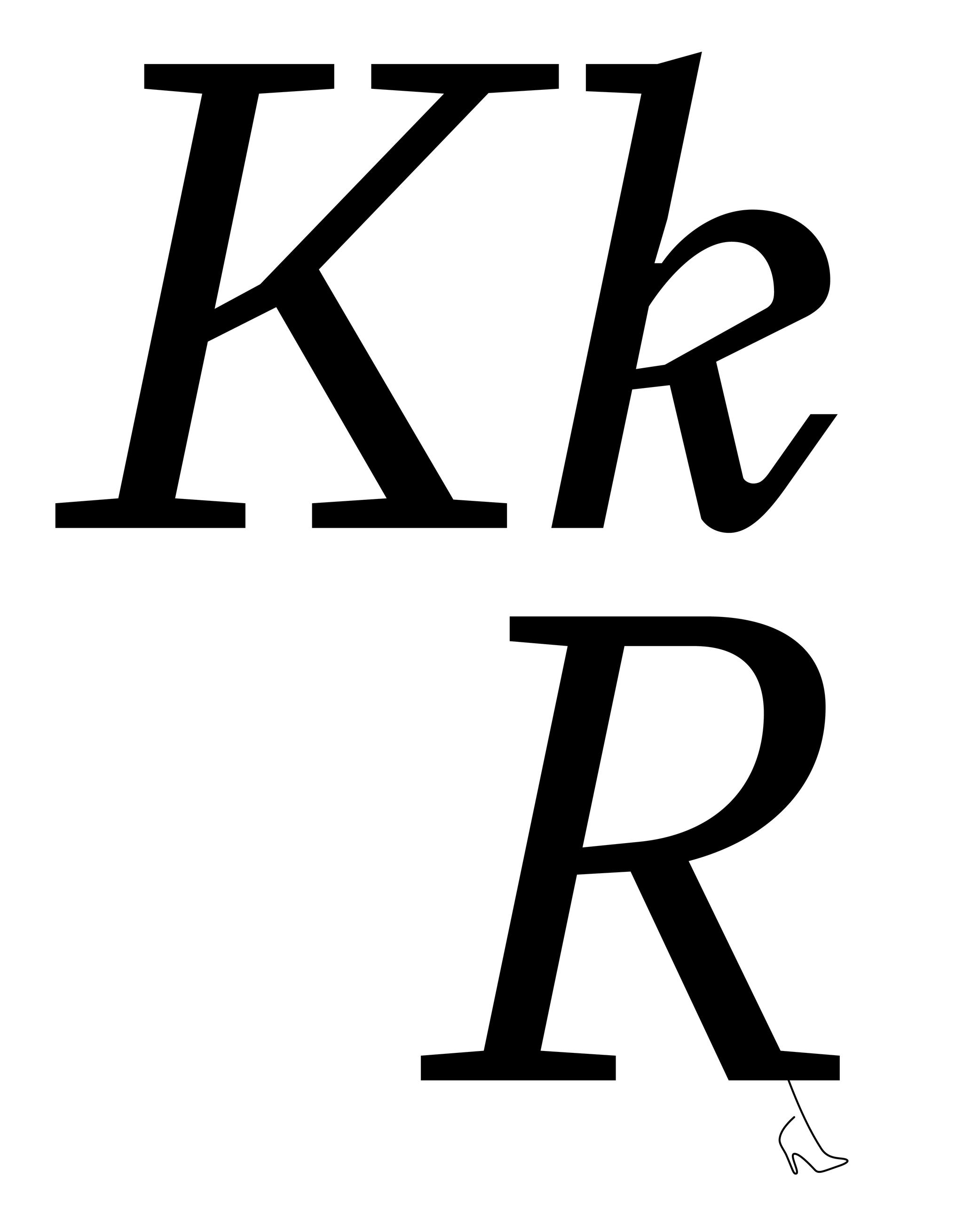
Sponsored by Type Together . Typeface in use: Aeroplan , designed by Nina Faulhaber, 2023.
(Read More)Many terms are borrowed from architecture or human and animal anatomy to designate and describe parts of letters and other characters. We even speak of type design anatomy.
In Latin script, the leg is the lower diagonal stroke of letters like R, k or K.
Lettering
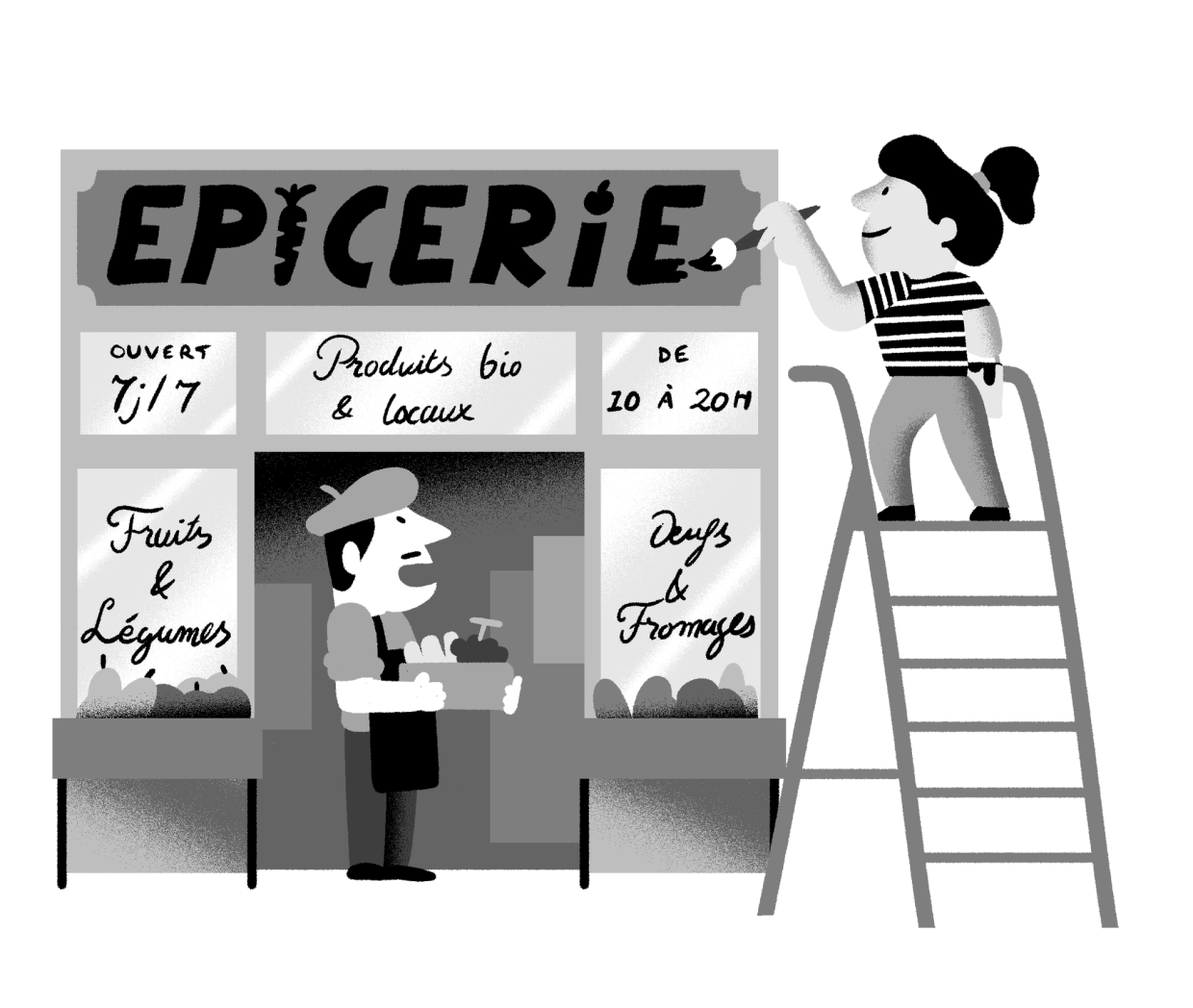
Illustration: Yann Bastard .
(Read More)A lettering is a drawing of a group of characters made for a specific situation (such as on a shop sign) or for a piece of work (a brand’s logo, a title for a magazine insert, etc.), unlike a typeface where each and every glyph is individually designed in a way to work in all kinds of combinations.
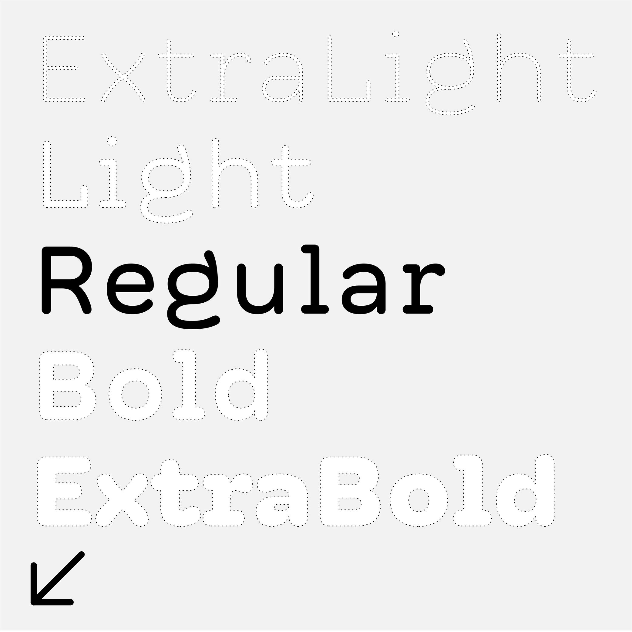
Light (weight)
Sponsored by R-Typography . Typeface in use: Rizoma , designed by Rui Abreu, 2018.
(Read More)A typeface style with a lighter (thinner) weight than the Regular can be called “Light.”
It is one of the most common weights in Latin typefaces (along with Regular and Bold). However, many other terms exist for weight styles on the Design Space spectrum, such as Thin, Book, ExtraLight or Hairline.
Oldstyle Figures
Sponsored by Dinamo . Typeface in use: Daily Scotch , designed by Fabian Harb and Michelangelo Nigra, 2024.
(Read More)DESCRIPTION
Oldstyle figures are designed to fit with the design of lowercase characters. They are more often used in texts as they visually blend in better than the other figure variants.
HISTORY
The proportions of oldstyle figures are closely related to how they were written in calligraphy using similar strokes and movements as those of the (lowercase) letters.
“Oldstyle” used to have a typographic meaning of its own. It was a 19th century/early 20th century term for revivals of Renaissance serif faces after British printers got bored of Bodoni/Didot/Scotch/etc., and particularly referred to revivals of types those from Venice, Paris, and Caslon’s much later roman. Some typefaces had “Old Style” in their name to signify this.
EVOLUTION
Oldstyle figures are also called “traditional” figures in some languages, as more modern styles came later on (hence the name identification) as better adapted forms to specific situations: tabular, lining or proportional figures. In digital typefaces, several style sets of figures are available and can be accessed via the alternate sets.
Optical Corrections
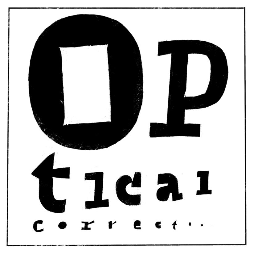
Illustration: Erik van Blokland .
(Read More)The shapes used to form the words and texts we read are seen by our eyes. And our eyes and brain are organs that don’t rely on geometry, rulers, and compasses to “read” the world.
Even if they are geometrically aligned, some shapes may appear uneven and require optical adjustments to appear consistent. In type design, we talk about optical corrections.
Optical Size
Sponsored by Blaze Type . Typeface in use: Joly , designed by Léon Hugues, 2021.
(Read More)When a typeface is intended to be used at some specific sizes only (large on billboards or small in printed books), some details can be optimized for each situation, resulting in optical size styles such as Text, Caption, Titling, or Display.
For text styles, aspects such as lower contrast and simpler details have been proven more efficient for reading small texts (especially if they are printed on rough surfaces), while display styles can carry elaborate details as they are seen in larger sizes.
Orphan
Illustration: Words of Type. Typeface in use: Knowledge, designed by Lisa Huang, 2024.
(Read More)Odd situations can happen when typesetting a text making its overall appearance look sloppy.
When the first line of a paragraph appears alone at the end of a column or a page, it is called an orphan.
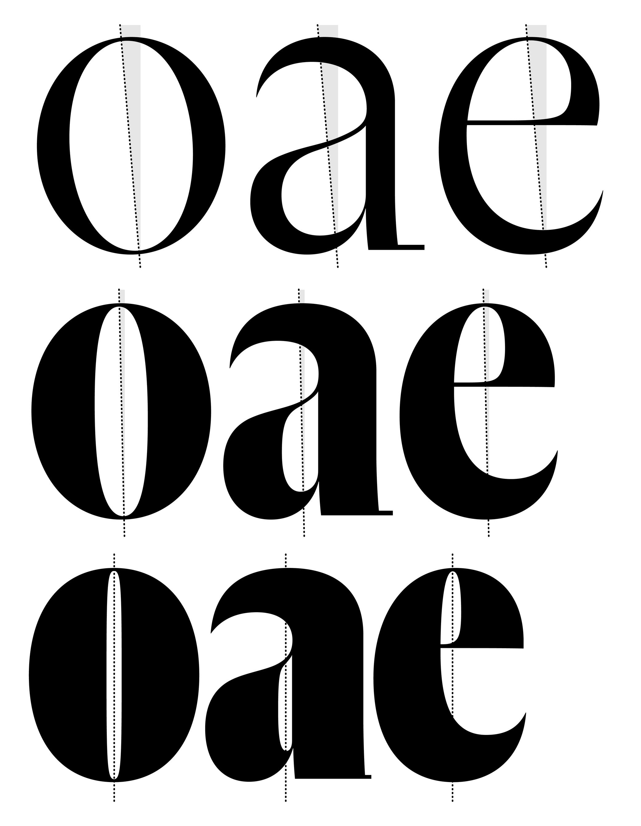
Overshoot
Illustration: Words of Type.
(Read More)Overshoot refers to the slight extension of curved or pointed glyph parts beyond a given height or alignment guideline (such as the baseline, x-height, or cap height).
For example:
• the round part of O often extends slightly above the cap height and below the baseline.
• the pointed part of A might go a tiny bit above the cap height.This is done optically, so that curves and points can appear visually aligned with the flat shapes (such as H or E) even if—mathematically speaking—they go beyond past the guidelines. Without overshoot, rounded or pointed shapes would appear smaller or misaligned to the eye.
FONT ENGINEERING HINT
Overshoot values are used in hinting and can also be reflected in font metrics (such as vertical alignment zones) to ensure consistent rendering across sizes and platforms. On a small pixel grid, overshoot can make curved and flat segments appear uneven. Hinting instructs rasterizers up to which size the overshoot should be suppressed, so curves and flat parts appear visually even at any sizes, and allows it to be restored at larger sizes where the difference is no longer visually noticeable.
In the .otf font format files, the overshoots are stored as BlueValues and OtherBlues in the CFF (Compact Font Format) table. This is because these guidelines are often represented as areas colored in blue in font editors. In .ttf files, the overshoots values are stored in the cvt (Control Value Table) table.
Proof
Illustration: Pauline Fourest (Spaghetype ).
(Read More)To test the quality of a typeface, designers use proofs. They are documents that use the typeface’s font files in various situations, such as different sizes, with numerous glyph combinations, in multiple languages, and varied paragraph lengths, among other things. Specimen documents often resemble those from the printing industry. Type designers use them to check out how their fonts are progressing and/or to help make more targeted corrections.
Regular (weight)
Sponsor Word of Type and feature your typeface in this card with a linked caption. Contact us for more information.
(Read More)Regular weight is the most frequently used style in a typeface family.
With its proportions and features designed to be easily read, it is the best style to be used in running texts.Reversed Contrast
 (Read More)
The contrast is the relationship between a glyph’s thick and thin parts.
The variation in a stroke’s thickness comes originally from handwriting and results from the writing tool’s reaction to the medium, in combination with how the toll is held and the movements the writer makes. Nowadays, in type design for the Latin script, we refer to a vertical contrast when the vertical parts are thicker than the horizontal ones, which is its “natural” contrast. And the opposite is known as a reversed or inverted contrast.
But these concepts only apply to scripts that evolved using tools and a medium that creates such contrast “naturally,” which is not universal for all. For example, the Hebrew script’s contrast would naturally be distributed the other way around.
Revival
(Read More)A revival refers to a new typeface whose letterforms are based on historic models. Today, when we speak of revivals, we usually refer to digital typefaces that take their designs from existing ones. Most often, they base their forms on exisiting typefaces cast in metal, engraved into word, or produced for photo-composition.
The oldest revivals were made by 19th century type foundries when they adapted early 18th century typefaces for industrial printing conditions. In the 20th century, more revivals from mechanical and photo-typesetting device manufacturers followed.Inevitably, the design of a revival contains unique details of the designer, from interpretations of the initial design while analyzing printed results on paper to those on screen at various resolutions. Today, we can see multiple typefaces designed as revivals from one and the same typeface, but each have (sometimes very subtle) differences. For example, we can think of the many versions of the Garamond.
A revival from a running text typeface is considered as a good assignment for students starting to learn typeface design, as this allows to get more familiar with styles considered as “conventional” before experimenting further with more creativity.
Sans Serif
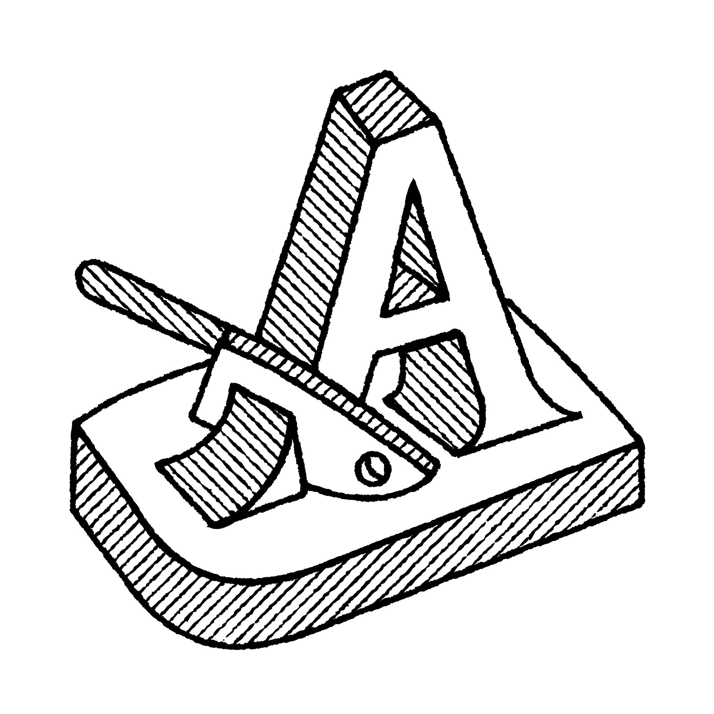
Illustration: Pauline Fourest (Spaghetype ).
(Read More)DESCRIPTION
Sans serif, or Sans (literally meaning without in French), describes a typeface style without serifs.
HISTORY
As far as we know, the first published sans serif typeface, Two-Lines English Egyptian by William Caslon IV, was published in 1816 in London, England.
Many terms have been used to speak of a sans style as we understand it today, with multiple categories names in different typographic classification systems of Europe: ‘grotesque’ (France and United Kingdom), ‘Grotesk’ (Germany), ‘gothic’ (USA), ‘linéale’, ‘bâton’ or ‘antique’ (France).EVOLUTION
In Europe and North America, Sans-serif styles became popular in the early 20th century as part of a modern trend. Typeface designers experimented a lot around the this style, with some becoming references, and later style sub-categories of Sans-serif: humanistic sans, geometric sans, grotesque or gothic, etc.
But these don’t apply to other scripts that evolved on an independent path from the ‘Latin’ world. Chinese Hanzi have a category of style similar to Sans, called Heiti (or Hei), that doesn’t have as many sub-categories.
Script (style)
(Read More)DESCRIPTION
Script is a category of typefaces that imitates handwritten forms.
HISTORY
Various categories of typeface styles started to be identified from the various metal typefaces being produced for movable type printing. Metal type technology worked so that each piece of metal representing one character could be assembled and reassembled in every possible combination, meaning that each character was designed as a disconnected form.
As new typeface designs kept being produced (mainly in Europe), more flourished styles for more diverse choices started to appear, especially during the early 20th century. Not only did they give more possibilities for typesetters (for advertisements or novelty), but new typefaces were also a way for type foundries to display their capabilities in technical and design innovation. Beyond italic styles, typefaces that could imitate handwritten forms (with connected and/or irregular forms) were one of the most challenging styles at that time, technologically speaking. As one (early but not the earliest) example of such a challenge, we have the typeface Mistral, designed by French typeface and advertiser designer Roger Excoffon in 1953 for Fonderie Olive.
EVOLUTION
Thanks to the possibilities offered by digital fonts, which have far fewer physical constraints than metal types, the same glyph can have multiple variations and replace one glyph to a more fitting one (see Opentype features or Alternates), to create the impression of handwritten words. Today, there is a wide choice of Script style typefaces, with a high variety of styles (and qualities).
IMPRESSION
Script typefaces are mainly used as display styles, in titles, short texts, or even in brand logos.
They can convey all kinds of impressions from the many possibilities of ‘sub-styles’. Note: script typefaces are not to be confused with lettering!Serif
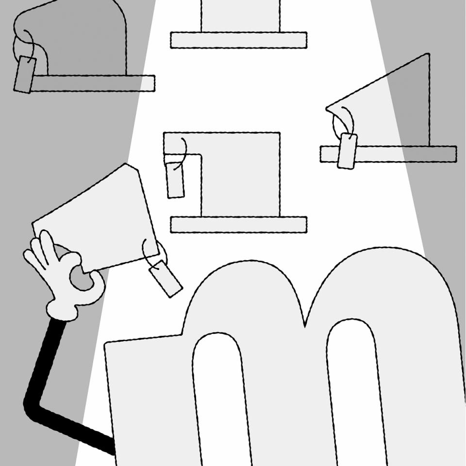
Illustration: Raven Mo .
(Read More)DESCRIPTION
Serifs are elements at the tips of strokes in serif style typefaces.
HISTORY
The origin and evolution of serifs differ in different scripts and don’t even exist in others.
For the Latin script, serifs come from the combination of the movements of the brush when writing Roman capital letters (the origins of the Latin alphabet) and stone carving techniques.EVOLUTION
Calligraphy, metal and wood type printing, photo composition, typewriters, digital typefaces, all of these tools and techniques contributed various shapes and presence (or absence) or serifs among the various typeface styles that we see today.
The positioning of serifs in each letter has been defined by the writing ductus combined with the tools use. For example, the general rule is that serifs should be on both sides at the top and bottom of vertical stems for upright letters, and none on the bottom of italic stems.
There are multiple possibilities for the shapes of serifs: thin, thick, long, short, wedged, squared, triangular, etc. Many typeface styles have a particular serif shape as part of their characteristics.
IMPRESSION
In Latin script, different impressions and feelings are associated with specific typeface styles (traditional, luxurious, casual, elegant, etc.), which are mainly due to the circumstances of their creation, usage preferences, and habits.
For example, humanist or transitional serifs are the go-to styles for long reading uses.DESIGN
For styles where serifs are on both sides of the stems, some asymmetrical letters (such as f, r, F or P) have a large opened counter on one side. To compensate for the imbalance created by the “empty space”, the designer can adjust the serif on that side by making it longer.
Stroke
Sponsored by R-Typography . Typeface in use: Flecha , designed by Rui Abreu, 2019.
(Read More)Letters, characters, and other glyphs are written with strokes. Their shapes and writing direction come from how they were traced by hand with the many tools humanity used for writing.
Structure
Sponsored by Blaze Type . Typeface in use: Fusion Neue , designed by Matthieu Salvaggio, Tim Vanhille, and Ferdinan Del Fabro, 2024.
(Read More)Every glyph of every writing system follows a specific structure for its parts (positioning of the strokes in relation to each other). People reading words and texts in a given script would recognize the glyphs (letters, characters, symbols, etc.) if their structure follows a convention that is familiar to all of users.
Due to the evolution of each script, the structure can change over time (e.g., Fraktur styles), or have multiple variants (e.g., single and double storey a).
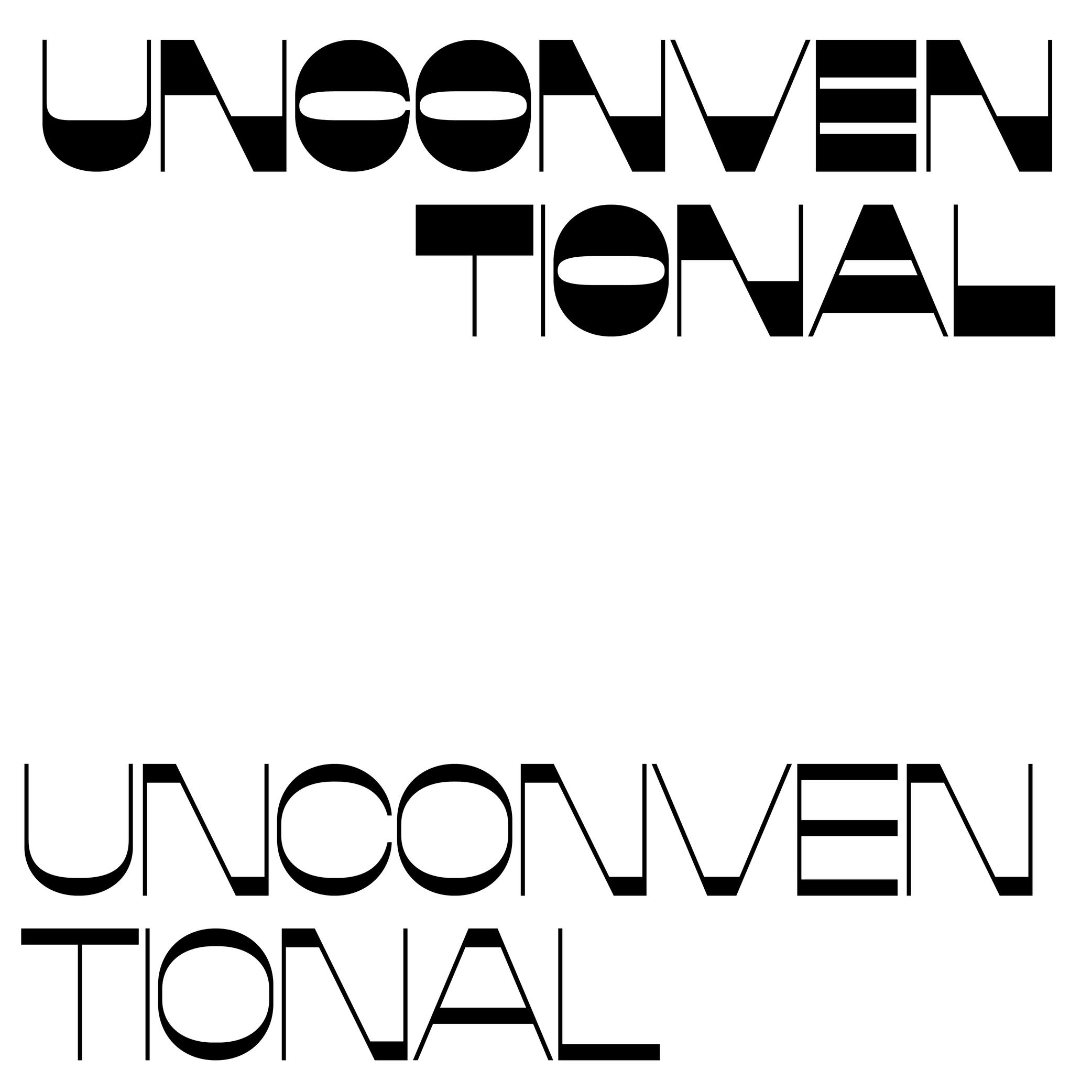
Style
Illustration: Pauline Fourest (Spaghetype ).
(Read More)In any writing system, typefaces exist in an infinite number and variety of styles. They are influenced by many factors, such as technology, tools, necessity, and trends. But some of them are (or can be) grouped into categories for their similarities, into classification systems (sans serif, serif, humanist or geometric, etc.).
In the Latin script, we also identify Roman (or upright) and Italic as two ‘companion’ styles of the same typeface style.
Swash
Sponsored by Blaze Type . Typeface in use: Sigurd , designed by Matthieu Salvaggio and Léon Hugues, 2021.
(Read More)Swashes are the elongated extensions of letters, designed with longer strokes than their “usual” construction, most generally as a decorative feature and/or in display style typefaces.
HISTORY
They appeared during the metal type era in the Latin world, when swashed letters served as decorative features to the text. They were also a way to showcase the punch-cutters’ skills, sometimes with incredibly long and elaborate swashes.
Swashes still have the same purpose today in digital typefaces, where “normal” letters are the default ones and swashes can be activated as alternates from the typefaces’ features (if available).Thick
 (Read More)
The thickest part(s) of a glyph is called the thick. The opposite is the thin, and the relation between thick and thin is called the contrast.
Thin
 (Read More)
The thinnest part(s) of a glyph is called the thin. The opposite is the thick, and the relation between thick and thin is called the contrast.
Typeface
Illustration: Erik van Blokland .
(Read More)A typeface is a set of glyphs designed with a particular intention (and/or style).
A typeface family can gather multiple styles with their individual particularity (weight, width, contrast, etc.) but keep common traits specific to the same group.
Not to confuse with font or typography.
Typeface Design
Illustration: Jay Cover .
(Read More)Typeface Design (or type design for short) is the practice of designing typefaces.
It is about designing every part and aspect of a typeface, from drawing the shapes of the glyphs (letters, characters, figures, symbols, and so on) to setting the specifications such as spacing, kerning, and hinting. The person doing type design is called a type designer.
Not to be confused with typography.
Typography
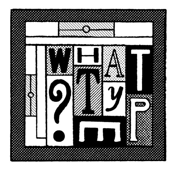
Illustration: Jay Cover .
(Read More)Typography (or typesetting) is the practice of assembling text elements in a design composition by defining multiple aspects such as the ratio between text columns and white spaces, choosing and using typefaces, setting their styles and sizes for all categories of texts, leading, justification style, and hyphenation, etc.
The person practicing typography is called a typographer.
Not to be confused with Typeface Design.
Variation Axis
 (Read More)
A variation axis allows a continuous interpolation of outlines between at least two compatible sources (also called masters).
It is a trajectory between different states of a given shape. For example, the weight axis would shift points to adjust the stem thickness, allowing a transition from Thin to Bold styles.FONT ENGINEERING HINT
The OpenType Specification defines 5 standard axes: weight, width, optical size, italic, and slant.
Note that italic acts as a stylistic link between two styles rather than a true interpolation axis.
These guidelines serve as a reference for how axes should be implemented into a font.Variation axes are stored and referenced across several font tables:
• avar (Axis Variations): normalizes axis coordinates
• fvar (Font Variations): provides location coordinates for the instances
• STAT (Style Attributes): provides human-readable names for axes and their defined instancesWeight
Sponsored by Production Type . Typeface in use: Enduro , designed by Emmanuel Besse, 2020.
(Read More)The weight of a typeface refers to the thickness of its strokes.
Within a typeface family, different weights are designed to be visually consistent across all glyphs of a given style.
NAMING CONVENTIONS
While much of the historical naming conventions (e.g., Light, Bold, Black) originate from the Latin typographic tradition, the concept of weight applies to all writing systems that use stroke thickness variations. These labels are not universal standards as style description conventions differs from a culture to another.
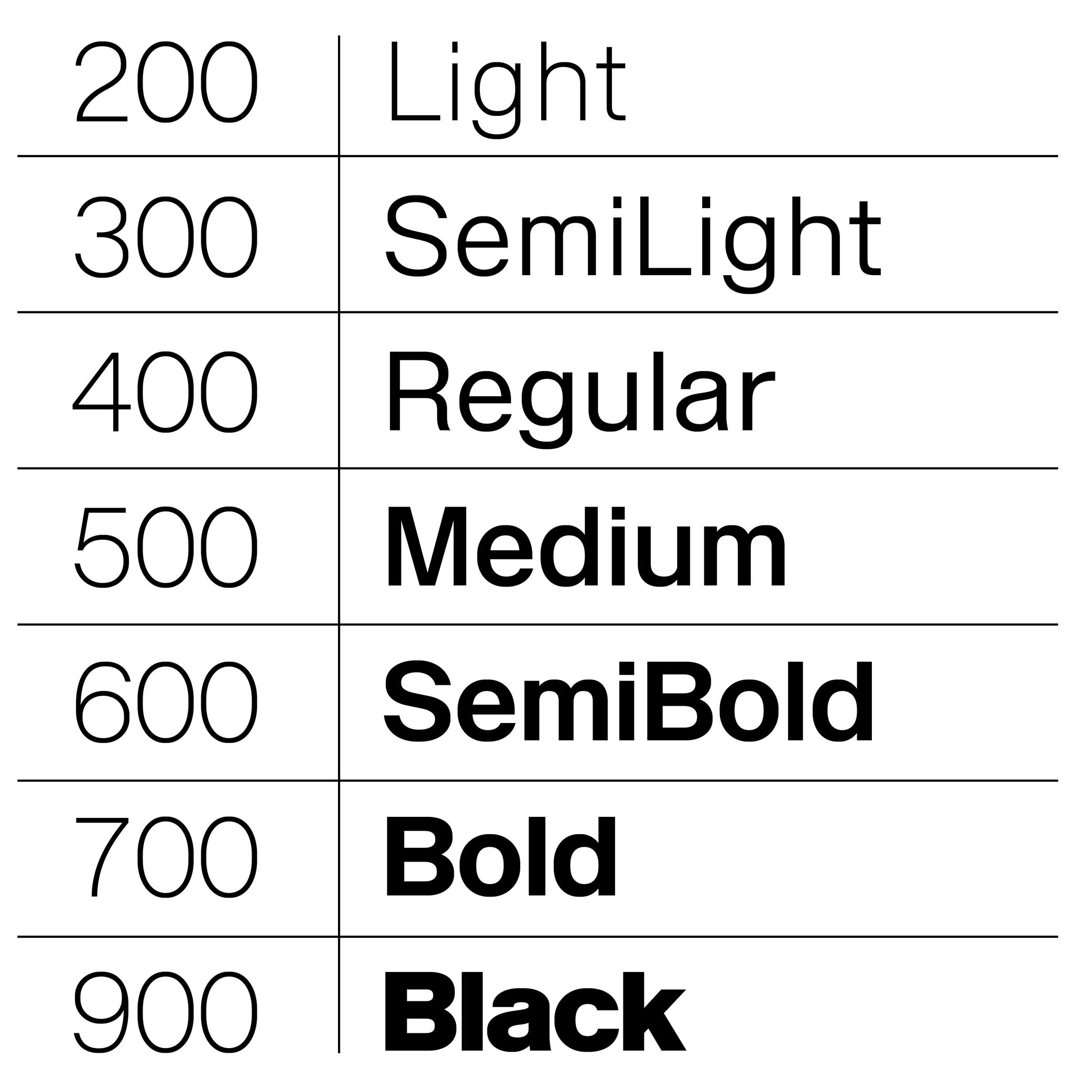
WEIGHT NAMES & CSS VALUES
In digital typography, weights are also expressed numerically, using the “font-weight attribute”:
• Thin: 100
• ExtraLight: 200
• Light: 300
• Regular: 400
• Medium: 500
• SemiBold: 600
• Bold: 700
• ExtraBold: 800
• Black: 900FONT ENGINEERING HINT
In OpenType font formats, weight is stored in the OS/2 table under the “usWeightClass” field, which maps to CSS “font-weight” values (ranging from 100 to 900):
• while CSS defines nine steps, “usWeightClass” allows values from 1 to 1000, giving finer granularity for internal font definitions;
• CSS weight values are expected to correspond to the font’s weight class. Following this standard is important because many environments rely on these mappings for text rendering and style linking. If, for example, Regular = 350, browsers or apps may mislabel it or fail to recognize it as Regular, causing user confusion or incorrect transformation to Bold.For variable fonts, the weight axis is defined by the registered axis tag “wght.” Unlike static fonts, it supports continuous interpolation between a minimum and maximum, allowing CSS “font-weight” to take any integer (e.g., 347) within the supported range for smoother transitions and precise control.
Localized weight names (e.g., ‘Gras’ for Bold in French, ‘Fett’ in German) are often generated from the OS’s internal dictionaries. This ensures style names appear in the user’s language even if the font lacks explicit translations. If the default naming does not strictly follow OpenType Specifications, localized names may not be translated correctly.
White Space
Sponsor Word of Type and feature your typeface in this card with a linked caption. Contact us for more information.
(Read More)A white space is any part of a glyph that is not of the glyph itself. They can be counters (inside), spaces, or negative space (outside).
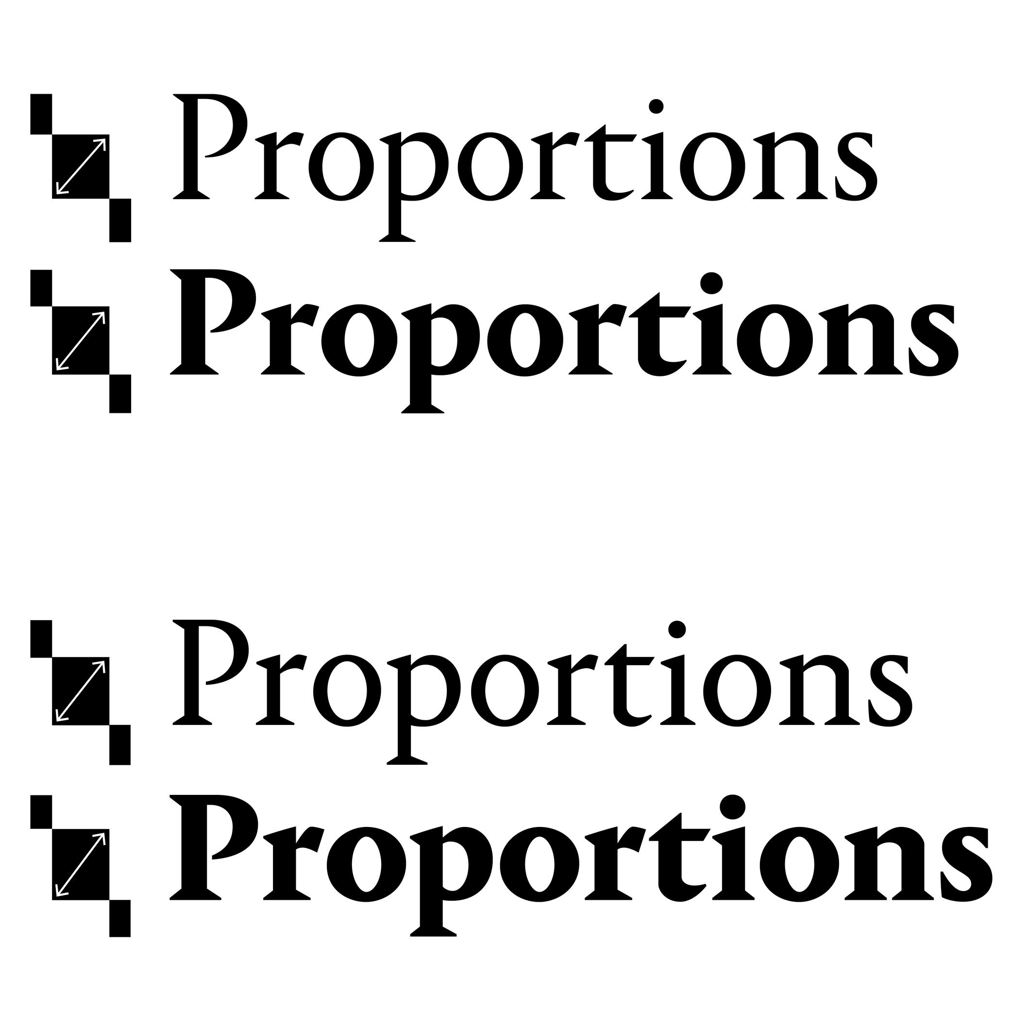
Width
Sponsored by Blaze Type . Typeface in use: Surt , designed by Matthieu Salvaggio, 2020.
(Read More)Other than the width of individual glyphs and characters (the letter M is usually wider than I), there are also various widths for typeface styles that participate in its personality or help make a content set in a specific width to fit specific conditions.
Some common width styles are: Narrow, Condensed, Regular, Extended and Wide. They serve more as a way to identify each style within a typeface family, rather than standards to follow for all scripts, as they can be different from one script to another.
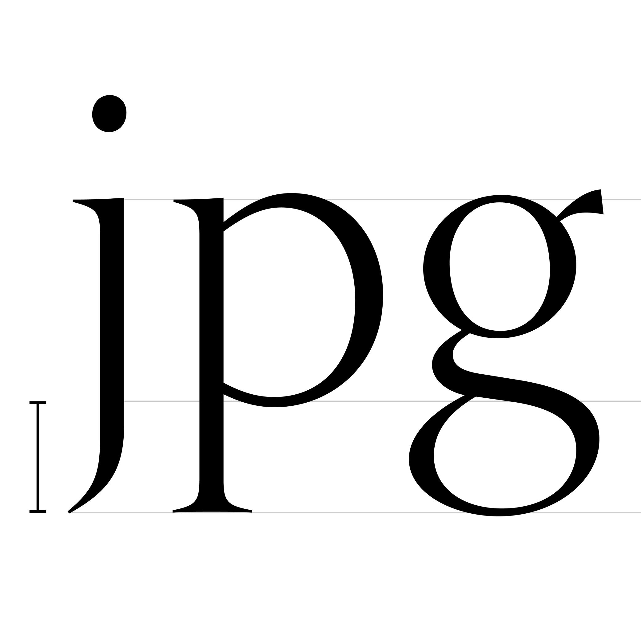
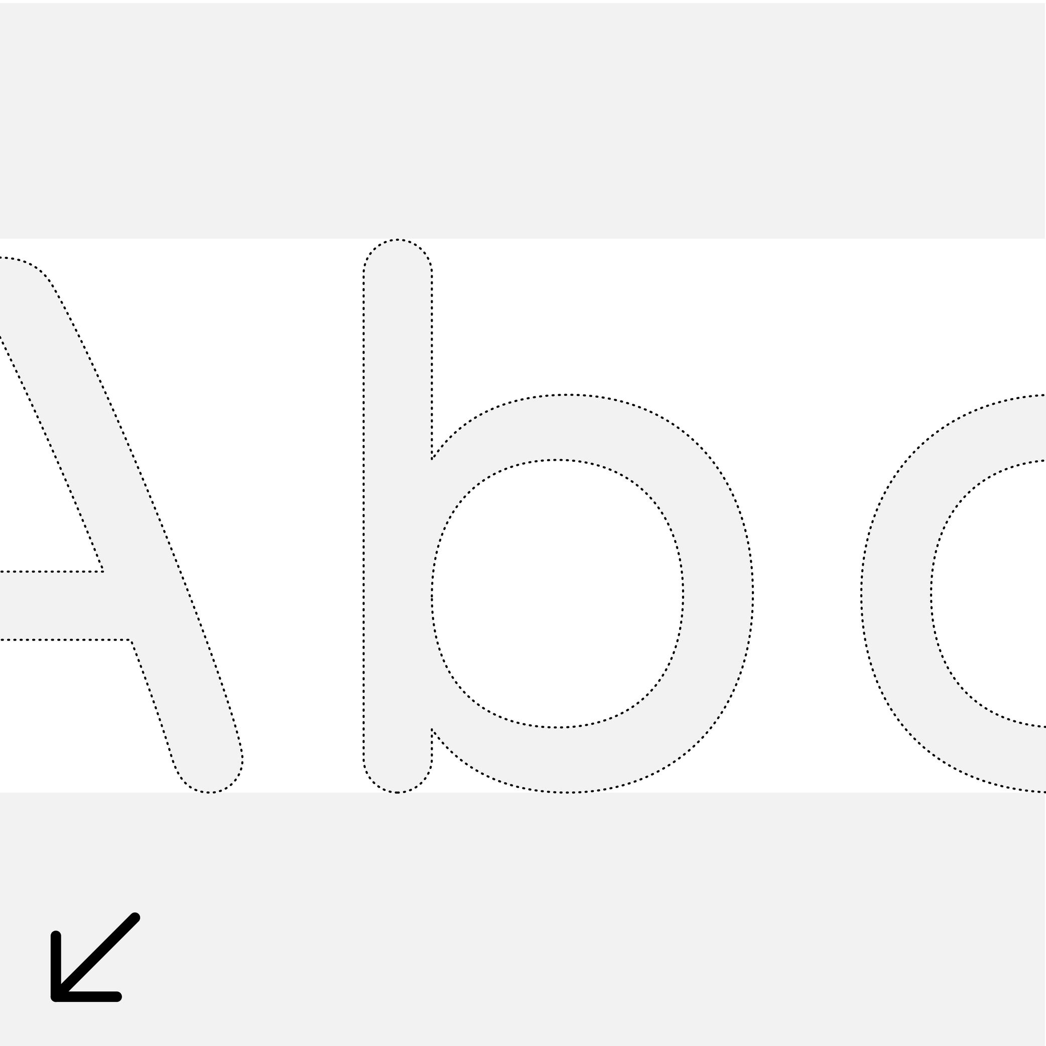
x-Height
Sponsored by TypeMates . Typeface in use: Halvar Stencil Breitschrift , designed by Paul Eslage, Jakob Runge, Lisa Fischbach and Nils Thomsen-Haberman, 2019.
(Read More)The x-height is the guideline placed at the top of the Latin letter x.
It helps to align the other lowercase letters and to set the proportions with uppercase letters and the ascenders.
Because the letter x is the only lowercase letter without ascenders and horizontal tips at its top and bottom (it has no overshoots), it is the reference letter for lowercase height.