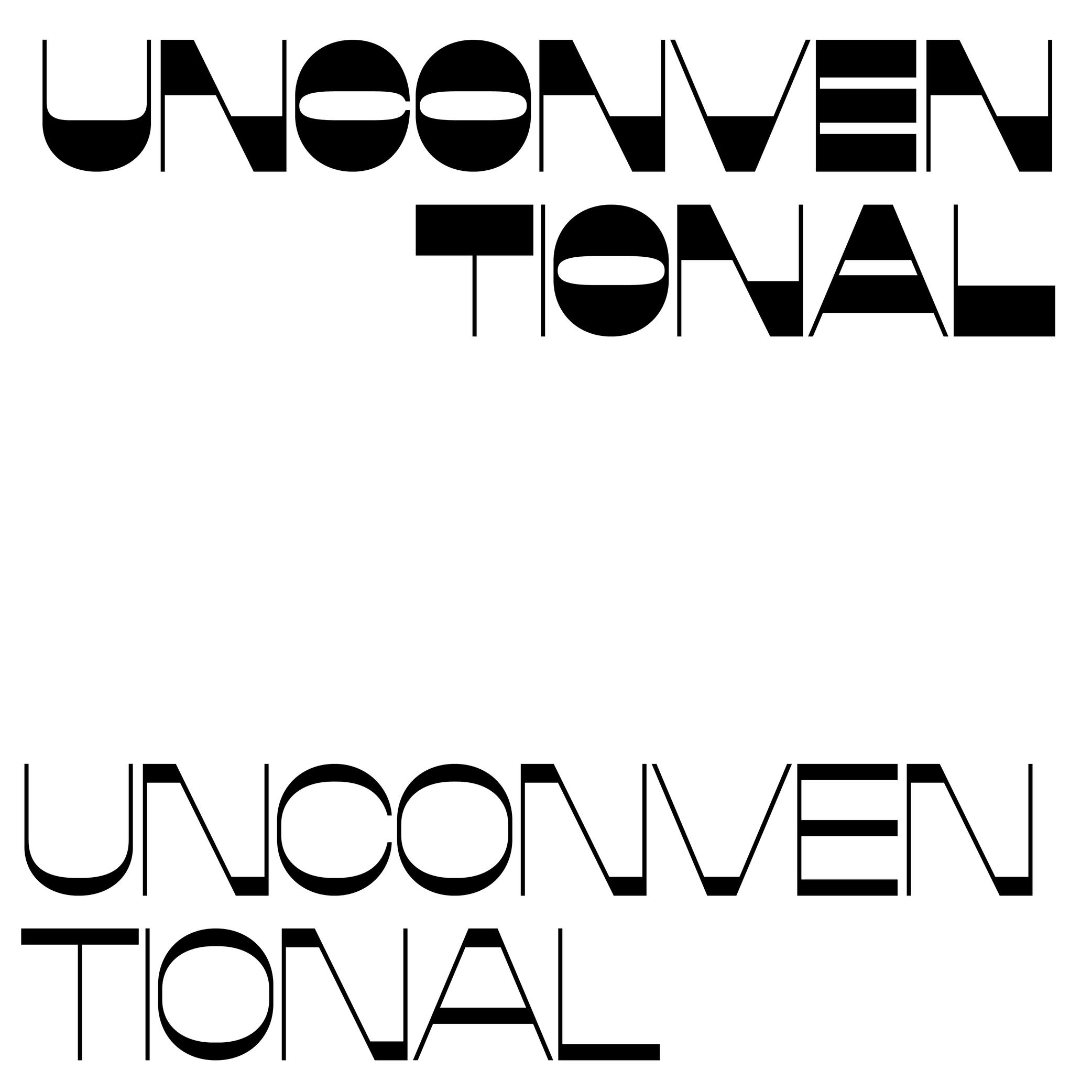
Anchor
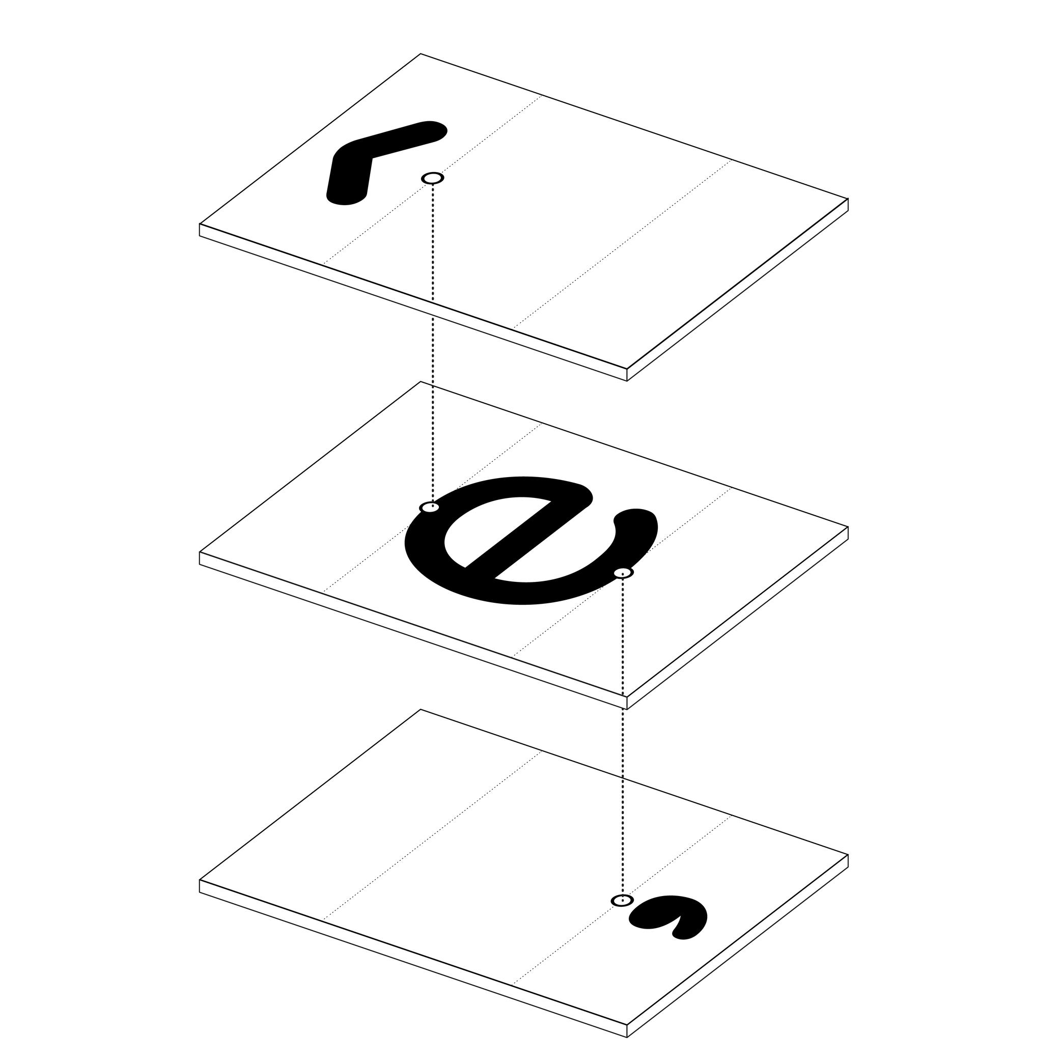
Illustration: Words of Type.
(Read More)In many languages and scripts, some glyphs are a combination of others, such as accented letters: é is the pairing of e with the diacritic “acute” on top.
When designing fonts, instead of copy-pasting the contours of both e and the acute accent into é, the designer adds an anchor on the top of e and below the acute accent, where both should be connected or anchored to each other. Thus, both elements are “called” to form the character é, which becomes its components.
Angle
Sponsored by TypeMates . Typefaces in use: Edie & Eddie Modern , designed by Lisa Fischbach, 2022.
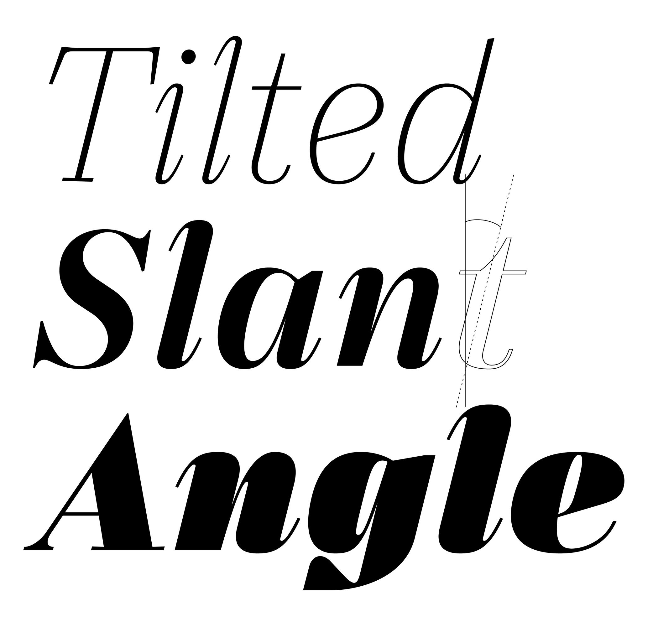
(Read More)Also called slant.
The angle is what we can observe on italic-style letterforms. We say the vertical stems are stretched and leaning to the right at a certain angle.
In the same typeface family, the degree of the italic angle may vary from one weight to another, different sizes of use (display to caption styles), different scripts, or even from one glyph to another in the same style to optically improve the typeface’s balance.
Axis (in Type Design)
Sponsored by R-Typography . Typeface in use: Gliko Modern L , designed by Rui Abreu, 2018.
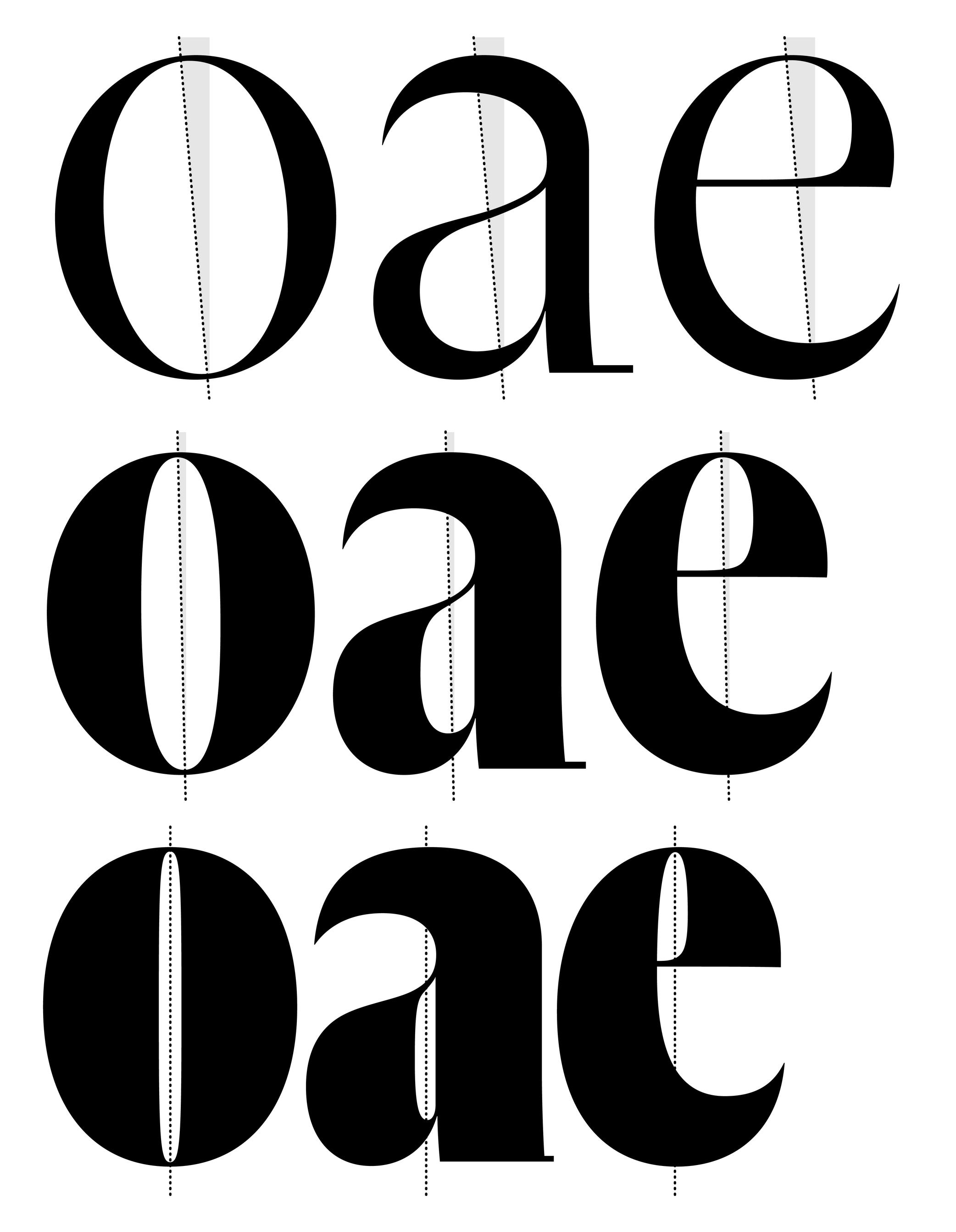
(Read More)In Latin script, we speak of a “diagonal,” “tilted” or “oblique” axis when we refer to the shapes of letters in a typeface that have some contrast.
In calligraphy (when using a broad nib pen), the axis of the stroke is defined by the angle at which the pen is held, from which a contrast between thin and thick parts is formed. The axis should be kept the same (or very similar) for a consistent construction on all glyphs.
Balance
Illustration: Catherine Potvin .
(Read More)The concept of balance is fundamental in typeface design. With many different shapes (letters, figures, symbols, etc.) that have to be combined to create a more complex group (words, sentences), a certain level of training and expertise is required to achieve a harmonious balance of the whole set.
A good balance allows a comfortable reading experience.
Bézier Curve
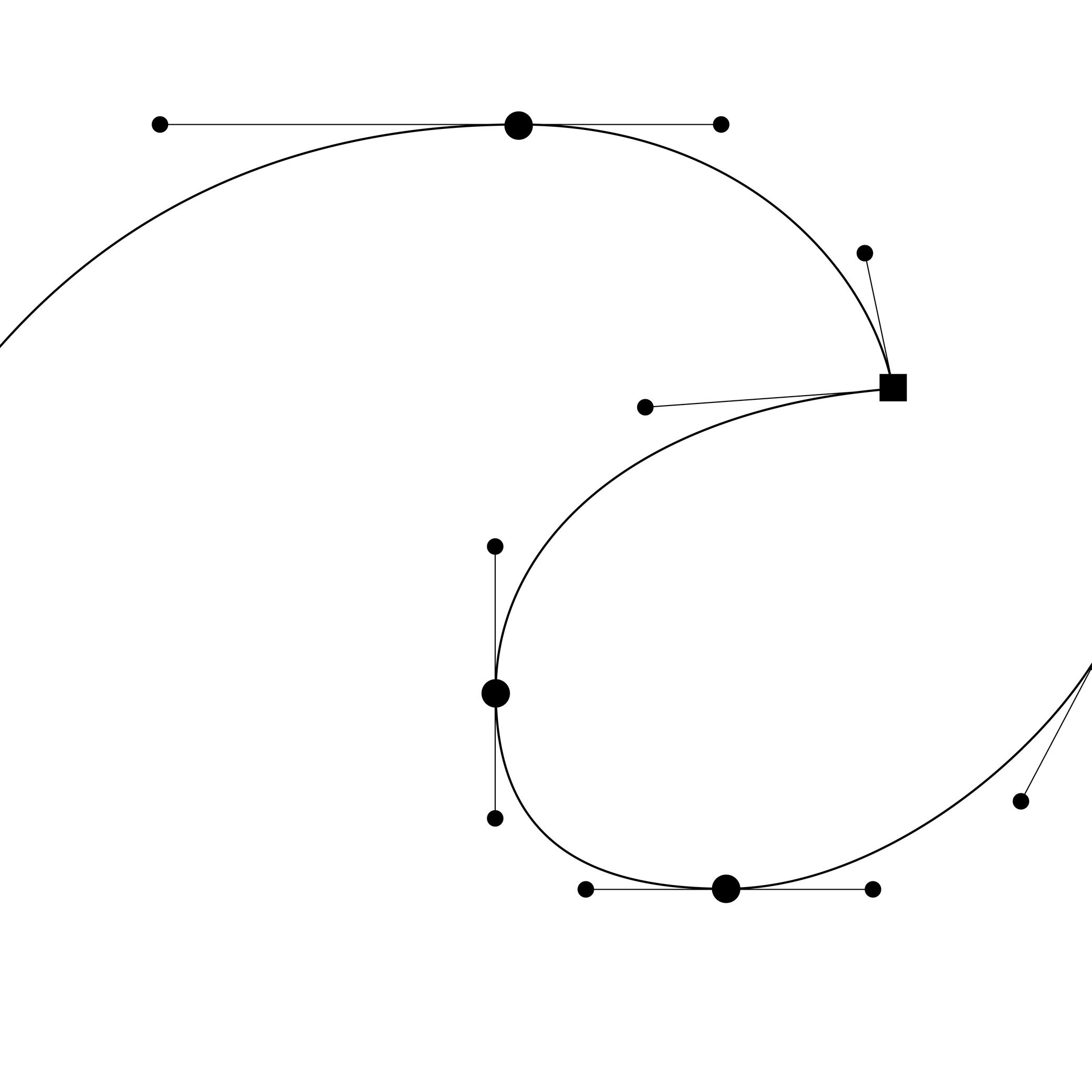
Illustration: Words of Type.
(Read More)In digital type design, Bézier curves are used to draw contours on applications with vectors drawn by placing points and handles. This technology allows the users to rasterize digital shapes while keeping their quality.
The most common font file format—OpenType—allows the use of two types of Bézier curves: cubic and quadratic.
Center Space
Sponsored by Mallikātype . Typeface in use: Nan Sans, designed by Tianmeng Xue. Coming soon.
(Read More)In the Chinese Hanzi script, the center space (or optical core, 中宫 in Chinese) corresponds to the central area of a character, similar in Latin to the area between the x-height and the baseline. This area can differ from style to style, but it has to be visually constant for all characters in a typeface.
A text typeface with a bigger center space has its legibility improved for small sizes.
Coherence
Illustration: Chloe Kendall .
(Read More)It is important to manage the coherence (or consistency) of the shapes of all glyphs in a typeface to create a unified set. This includes the shape of the serifs, thickness of the strokes, proportions with one another, spacing, etc.
Compatibility
Sponsored by NM type . Typeface in use: Movement Direct , designed by Noel Pretorius & María Ramos, 2019.
(Read More)Variable fonts technology allows users to navigate between two or more specific styles (called “masters” or “sources”) with high precision and much smaller font file sizes than several static fonts.
Outline compatibility allows the interpolation of vector shapes, enabling the generation of intermediate instances between two source files. This is essential for variable fonts, but even in static font design, maintaining compatibility is beneficial: it spares the designer from manually draw in-between weights or styles as separate masters, when they can be automatically created during the export.
For each glyph, compatibility means:
• same number of points, in the same order;
• same number of contours, in the same order and direction;
• same number of components, in the same order.Component
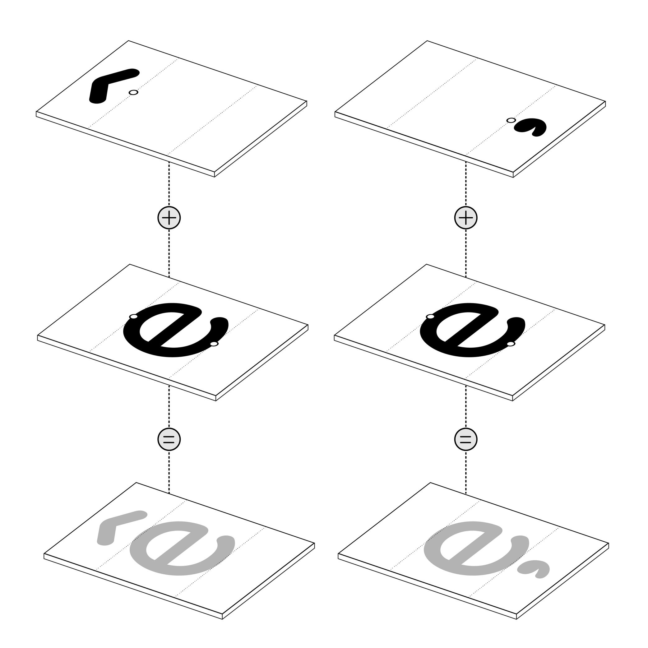
Illustration: Words of Type. Typeface in use: Knowledge Rounded, designed by Lisa Huang for Words of Type, 2024.
(Read More)Many shapes in a digital font are repeated identically across glyphs. These repeated elements can be turned into components. Components are reusable parts stored as separate glyphs which can be borrowed to form another glyph. For example, the letter é is made of the combination of two components; the base letter e and the acute accent.
Using components instead of copying contours keeps shapes consistent and helps reduce the font file size.
• A glyph made only of components is called a “composite.”
• A glyph that combines both contours and components is called a “mixed composite.” Mixed composites are not permitted in the final binary font (exported font) files. As a result, they are usually decomposed during export.
• When a component references another component, it is said to be “nested.”
• A component is considered as aligned when it is reused in a glyph without transformation.For design purposes, components can be transformed — shifted (translated), scaled, rotated, skewed, flipped, or mirrored. Transformed components may need to be decomposed, especially if the transformation alters the contour direction (such as mirroring), which can affect its appearance on the pixel grid.
FONT ENGINEERING ADVICE
The component system is a compression strategy used in TrueType fonts to reduce file size by referencing repeated shapes across glyphs. In contrast, PostScript-based fonts (OpenType-CFF flavor, with the .otf extension) use a different space-saving method called subroutines—small sections of path instructions that can be reused. Because subroutines operate at the path level rather than referencing entire glyphs, components are typically decomposed during export so their outlines can be stored and reused within these subroutines.
Construction
Illustration: Yann Bastard .
(Read More)Letters, characters and other glyphs of every script are written with a specific number of strokes of a particular shape. This is the glyph construction.
This construction went through multiple evolutions over time and at different pace for each script, being influenced by various circumstances (tools in use, style preferences, needs, etc.).
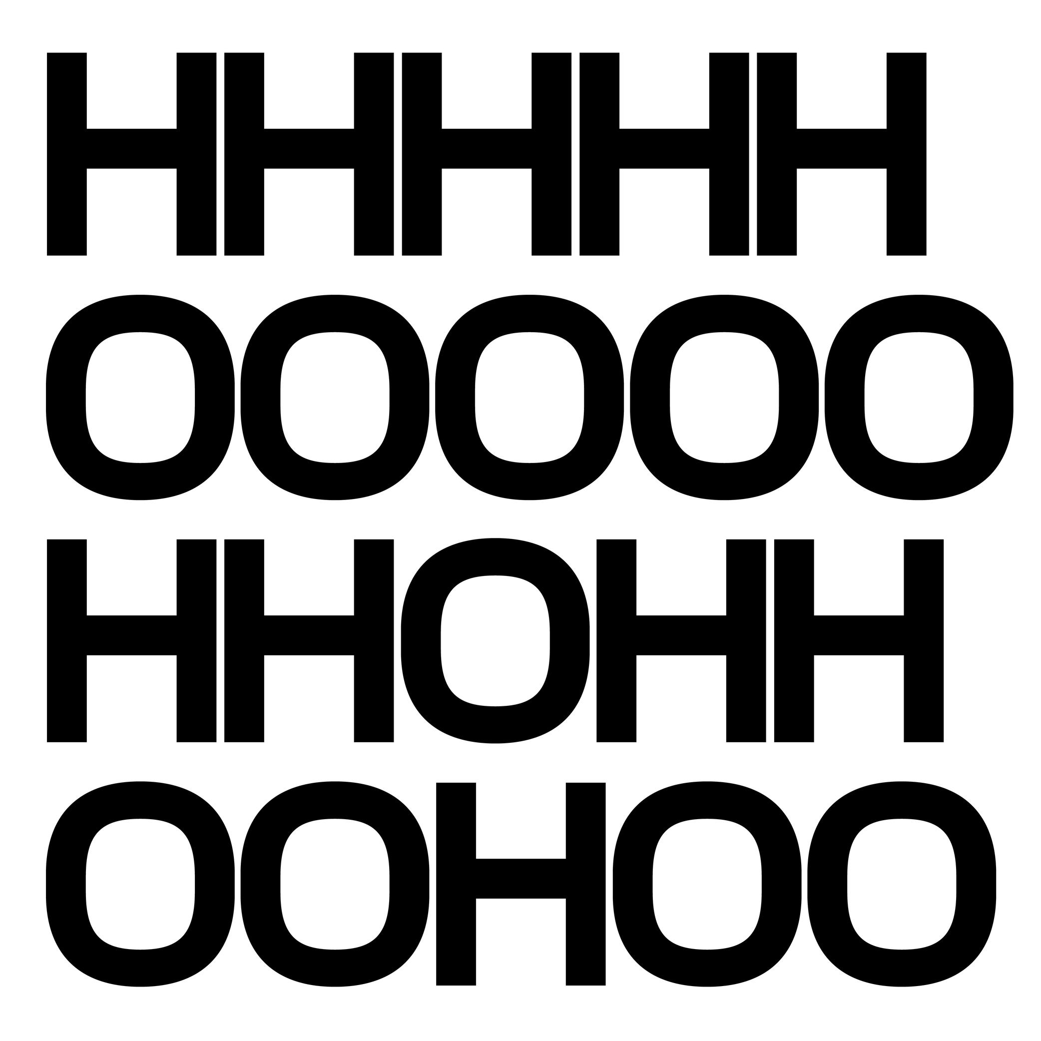
Contour
Illustration: Words of Type. Typeface in use: Knowledge Rounded, designed by Lisa Huang, 2024.
(Read More)Also called Outline.
The shape of a glyph is defined by one or more contours. In digital typeface design, the contour is what the designer draws. What the user sees on screen or in print is the filled shape in between these contours.
Contours and outlines are related but not exactly the same. An outline is the full outer shape of a glyph: it defines what the glyph looks like overall. While a contour is one continuous closed path within that outline. For example, the outline of the letter O typically has two contours; one for the outer circle and one for the inner counter (the transparent “hole”).
Custom
Illustration: James Graham .
(Read More)Companies, brands, institutions and so on can find great benefits in using and/or owning a custom-made typeface with a design that fits their voice. Unlike retail typefaces, they can be used as an important and exclusive element of the visual identity and be fully suited to their needs.
A custom typeface costs more at first than a license of an existing retail one (the client can have a design for their exclusive use instead of a retail design that may be used by many others). Still, it can be financially and strategically more interesting, and profitable than licensing retail typefaces in the long run. The pros and cons between these choices are worth the effort of comparison and evaluation.
Extrapolation
(Read More)Variable fonts technology allows users to navigate between two or more specific styles (called “masters” or “sources”) with high precision and much smaller font file sizes than several static fonts.
When we navigate between masters—in the design space—we are looking at “interpolations,” and “extrapolations” go in the opposite directions.
For example, if we design a Regular and a Bold weight, a Medium can be interpolated between them. Using the same data, it could also be possible to extrapolate a Light weight, extending beyond the original scope of that weight axis.
It is not commonly used but some type design applications (or plug-ins) can generate previews of extrapolated instances.
GOING FURTHER
In a font editor software, extrapolation can be used to create new masters, helping extend the boundaries of the existing design space.
In a variable font, extrapolation can theoretically be used to preview areas of the design space (usually called “corners”) that haven't been defined by masters. Traditionally, you need at least 4 masters to define a design space of 2 axes. For example, a Regular and Bold on the weight axis, and a Condensed and Condensed Bold on the width axis. Mathematically, it should be possible to omit the Condensed Bold corner in the source, and still be able to generate a full functional VF out of the 3 other masters—Condensed Bold being extrapolated and not defined as a master. This makes it possible to manage complex design spaces while keeping the font file size reasonable.
Extrapolated results can be unreliable and visually disappointing, so they should be used with caution.
FONT ENGINEERING ADVICE
Functional variable font extrapolations as described above were not really possible until the addition of the avar2 font table in 2024 in the OpenType Specifications. The table is still not widely supported yet and thus still at the experimental stage (as of the current version of Words of Type).
Extrema Point
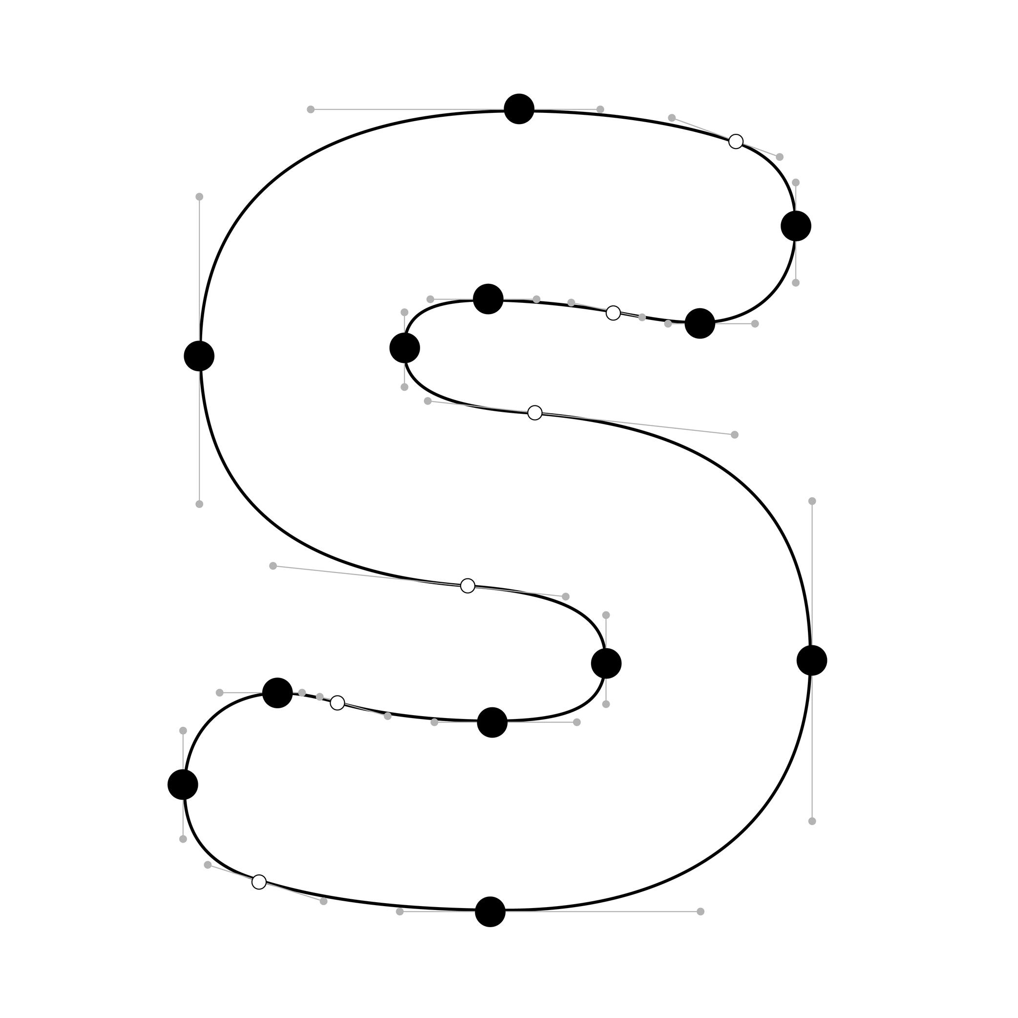
Illustration: Words of Type. Typeface in use: Knowledge Rounded, designed by Lisa Huang, 2024.
(Read More)In digital fonts, curves are defined by at least two end points (also called “on-curve points” or “nodes”) and one or more “off-curve points” (also called “handles”), which control the shape and tension of the curve.
Extrema points are the highest, lowest, leftmost, or rightmost points on a curve. These can be recognised by their associated handles, which align strictly horizontally or vertically.
FONT ENGINEERING HINT
Hints can only attach to extrema points. For proper rasterization (conversion of vector shapes into pixels), it is therefore essential to ensure these points are present and correctly placed.
NOTE
Since PostScript hinting doesn’t apply to diagonal stems, it is debated whether vertical extrema are necessary in italic shapes.
Handle
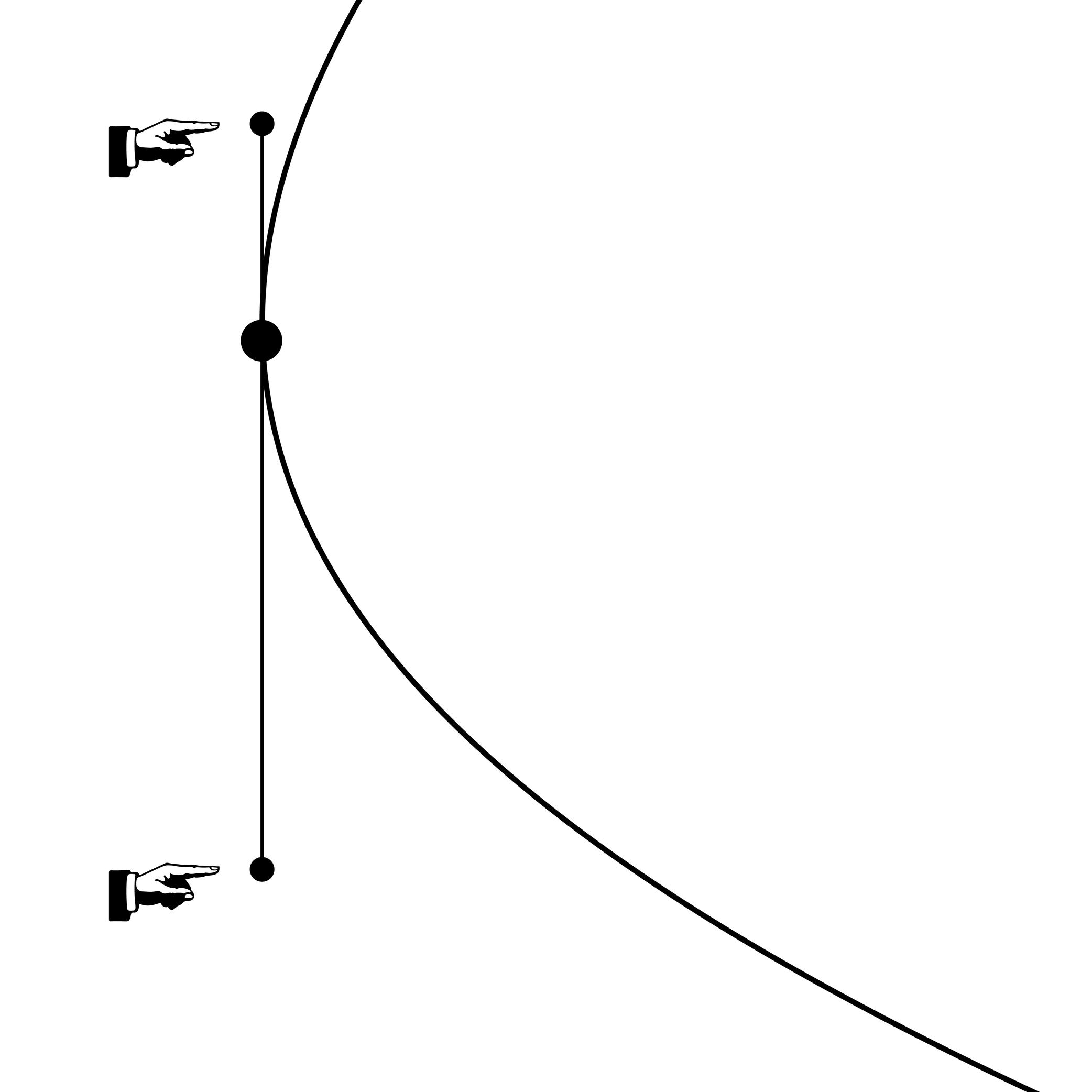
Illustration: Words of Type.
(Read More)Also called Bézier Control Point (BCP) or off-curve point.
Handles are control toggles placed by the designer to define the curvature of a segment. Their length and relative position must follow certain rules to ensure the contour remains functional and compatible, especially when exported to formats like TrueType that use quadratic curves.
GOING FURTHER
Cubic and quadratic Bézier curves differ in structure: cubic curves allow more control with fewer points, while quadratic curves often require additional points to approximate the same shape. During export to TrueType, extra points may be added to preserve the original curvature from a PostScript-based source.
When working with cubic curves in an editable source file, keep in mind:
• both handles should stay on the same side of the curve to maintain a strictly concave or convex shape. If the curvature direction changes, converting to quadratic may lead to poor approximations or unnecessary extra points;
• handles should be balanced (roughly equal in length) to avoid irregularities and bumpy curves;
• avoid intersecting handles on the same segment, as this can also cause distorsions.Ink Trap
Sponsored by Blaze Type . Typeface in use: Area Normal Inktrap , designed by Matthieu Salvaggio, 2021.
(Read More)When printing technology was primarily based on printing inked metal types on paper, ink could easily spread into the small corners of the characters. In printing, this effect is called a “bleed.” Especially at small sizes, too much ink spread can weaken legibility.
One of the best examples of a typeface solving the ink-spread problem is Bell Centennial, designed by Matthew Carter in 1975 for the US telephone company AT&T. It needed a typeface for its phone books, which would be printed on thin and porous paper. The resulting typeface featured inner corners that dug into the letterforms’ usual contours. Those are called ink traps.
In digital typeface design, designers still use ink traps, especially for typefaces intended for small sizes (on printed and/or digital media), but also as design features (which can be pretty wild!).
Kerning
Sponsored by Kerns & Cairns . Typeface in use: Glissade , designed by Dyana Weissman, coming soon.
(Read More)Each glyph of a typeface has a specific spacing value on each sides, which can be positive, negative, or zero. Setting these values for characters in a font globally is called setting its “spacing.”
And “kerning” is the positioning adjustment applied to specific pairs of glyphs to refine their spacing where the global values alone give a result that is too loose, too tight, or it parts of the glyphs overlap with one another. A good kerning (combined with a good spacing) on a font ensures a smoother texture of the text.
Once a kerning value is set for one pair, it can often be applied to other pairs with similar shapes (e.g., V + A, W + A) using kerning groups.
Some DTP (Desktop Publishing) applications offer kerning adjustment algorithms that can override the font’s built-in kerning. This is useful when working with non-professional fonts.
FONT ENGINEERING HINT
• In older fonts, the kern table contains pairwise adjustments.
• In modern OpenType fonts, kerning is stored in the gpos (Glyph Positioning) table, which supports pair-based, class-based, and contextual adjustments for greater efficiency and flexibility.Layout
Illustration: Yann Bastard .
(Read More)Layout can either be a noun or a verb. It refers to both the activity of arranging graphic elements on a surface (page, screen, wall, space, etc.) and the result of that arrangement. The different graphic elements within a layout might include blocks of text, titles, pagination, images, etc. The white space between and around elements is just as important as the elements themselves.
Ideally, a layout has a clear and consistent aesthetic, and that aesthetic is appropriate to the desired function of the layout’s contents.
Line Length
Sponsor Word of Type and feature your typeface in this card with a linked caption. Contact us for more information.
(Read More)A line of text that is too long or too short affects its readability.
Depending on the script and/or the document, there is an average number of words or characters for a comfortable reading.In English, a “good” line length average is between 10 to 15 words.
Master
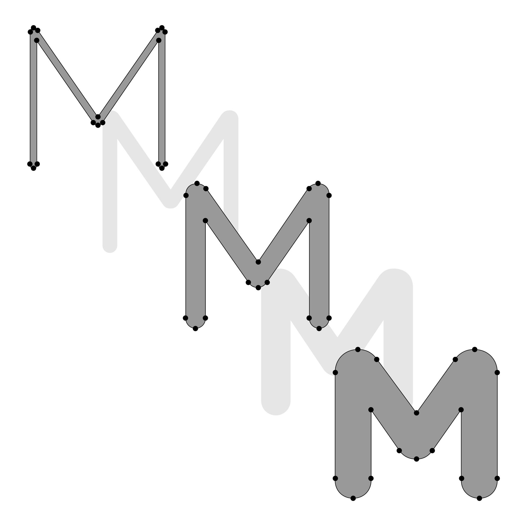
Illustration: Lisa Huang. Typeface in use: Knowledge Rounded, designed by Lisa Huang, 2024.
(Read More)In digital type design, a master is a fully drawn style of a typeface (e.g., Regular, Bold, Regular Condensed) that defines a reference point in its design space (the area in which a typeface can change in terms of weight, width, and so on, such as going from Regular to Bold).
Masters are used to generate intermediate instances through interpolations. For an interpolation to work, masters must be compatible with each other (same contour structure, point order, components, etc.).
In general, a master means it is a style—in or of a typeface—with editable outlines in a typeface file, as opposed to interpolated instances which are generated intermediaries, and therefore are not directly editable.
NOTE
The terms “source” and “master” are terms that are often mixed up.
A source file (with.glyphs, .ufo, .vfj format extensions) is a working file containing editable outlines and can contain one or more masters. It usually requires a font editor app to be opened and modified (e.g., GlyphsApp, Robofont, Fontlab).
The font format .ufo (for Unified Font Object) is compatible with most font editors. In that format, one master corresponds to one source.
FONT ENGINEERING HINT
In Variable Fonts, only one full master (the origin) is stored explicitly. Additional masters are stored as variation instructions data in the gvar (Glyph Variation) table. Intermediate masters (not the extremes of an axis) can also be defined, and generated. Intermediates are needed when simple linear interpolations between two extremes would result in undesired designs at some point. They add extra data to describe corrections along the axis, ensuring smoother or more controlled transitions. While they don’t store full outlines, including them still increases file size.
Node
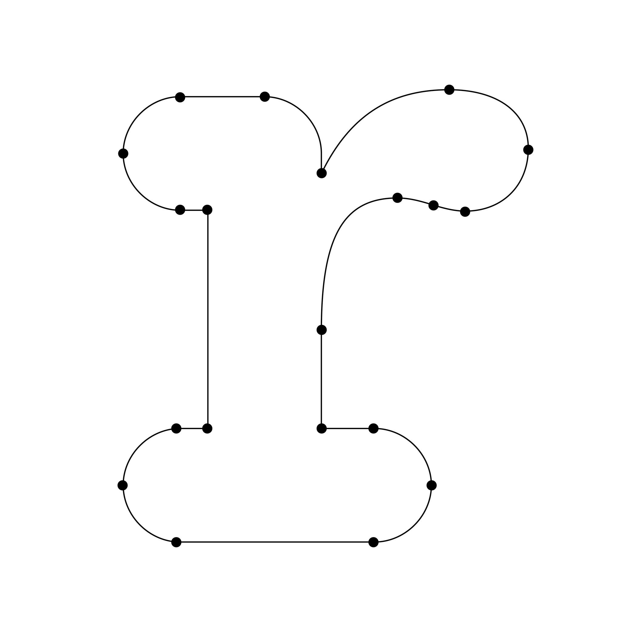
Illustration: Words of Type. Typeface in use: Knowledge Rounded, designed by Lisa Huang, 2024.
(Read More)A vector is a segment-line defined by two nodes (points or on-curve points).
That vector can be a straight line if it is without handles (or off-curve points), or curved if it is with handles.In digital type design, glyph outlines are composed of closed paths (also called contours), where each point connects two segments—as if they were “tying” the vectors together. Because of this connective role, points are commonly referred to as nodes.
There are two main kinds of points:
• nodes (on-curve points): points that sit directly on the contour and define the actual path of the outline;
• handles (off-curve points): points that control the curvature of the segment without being part of the contour itself. They are also called Bézier control-points (BCP for short).Together, nodes and handles determine the final shape of the glyph.
Optical Corrections
Illustration: Erik van Blokland .
(Read More)The shapes used to form the words and texts we read are seen by our eyes. And our eyes and brain are organs that don’t rely on geometry, rulers, and compasses to “read” the world.
Even if they are geometrically aligned, some shapes may appear uneven and require optical adjustments to appear consistent. In type design, we talk about optical corrections.
Optical Size
Sponsored by Blaze Type . Typeface in use: Joly , designed by Léon Hugues, 2021.
(Read More)When a typeface is intended to be used at some specific sizes only (large on billboards or small in printed books), some details can be optimized for each situation, resulting in optical size styles such as Text, Caption, Titling, or Display.
For text styles, aspects such as lower contrast and simpler details have been proven more efficient for reading small texts (especially if they are printed on rough surfaces), while display styles can carry elaborate details as they are seen in larger sizes.
Overlap
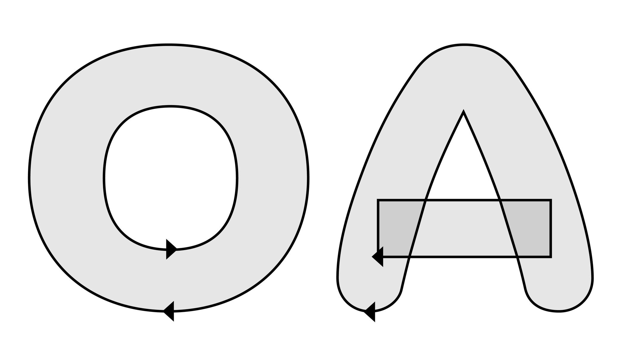
Illustration: Words of Type. Typeface in use: Knowledge Rounded, designed by Lisa Huang, 2024.
(Read More)In type design (digital or analog), an overlap refers to the situation where two or more contours of a glyph intersect or sit on top of each other.
For example:
• a complex shape like the letter E can be drawn as several overlapping contours;
• a counter form like in the letter O, which requires two contours: a larger outer contour (filled) and a smaller inner contour (the hole).When drawing a glyph in a digital file, the direction of each contour determines whether it is filled or cut out: the counter forms are drawn in the opposite direction than the larger contour.
Have you ever noticed a weird blank area in a letter out there? Well, that is the result of overlaps mistakenly drawn or managed at the export!
FONT ENGINEERING HINT
In an exported font file, managing overlaps depends on the outline technology:
• with PostScript outlines (.otf), contours are usually merged during export to avoid unwanted results. The rasterizer applies the “non-zero winding rule,” so overlaps are interpreted as counters regardless of their direction. Still, maintaining consistent contours directions is important, as it ensures that the export algorithms will merge contours correctly and their conversion to TrueType works properly.
• with TrueType outlines (.ttf), the “fill rule” depends on contour direction: clockwise paths are filled, counter-clockwise paths are cut out. Overlaps can remain unmerged as long as directions are consistent. Font editors usually provide a “Remove Overlap” option when generating fonts. This is often recommended for static TrueType fonts because some rendering environments and PostScript printers may still misinterpret overlapping paths.Overshoot
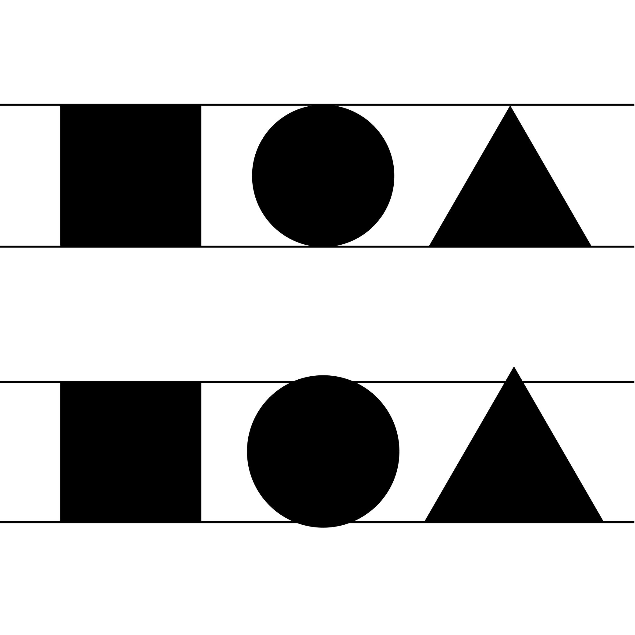
Illustration: Words of Type.
(Read More)Overshoot refers to the slight extension of curved or pointed glyph parts beyond a given height or alignment guideline (such as the baseline, x-height, or cap height).
For example:
• the round part of O often extends slightly above the cap height and below the baseline.
• the pointed part of A might go a tiny bit above the cap height.This is done optically, so that curves and points can appear visually aligned with the flat shapes (such as H or E) even if—mathematically speaking—they go beyond past the guidelines. Without overshoot, rounded or pointed shapes would appear smaller or misaligned to the eye.
FONT ENGINEERING HINT
Overshoot values are used in hinting and can also be reflected in font metrics (such as vertical alignment zones) to ensure consistent rendering across sizes and platforms. On a small pixel grid, overshoot can make curved and flat segments appear uneven. Hinting instructs rasterizers up to which size the overshoot should be suppressed, so curves and flat parts appear visually even at any sizes, and allows it to be restored at larger sizes where the difference is no longer visually noticeable.
In the .otf font format files, the overshoots are stored as BlueValues and OtherBlues in the CFF (Compact Font Format) table. This is because these guidelines are often represented as areas colored in blue in font editors. In .ttf files, the overshoots values are stored in the cvt (Control Value Table) table.
Reversed Contrast
 (Read More)
The contrast is the relationship between a glyph’s thick and thin parts.
The variation in a stroke’s thickness comes originally from handwriting and results from the writing tool’s reaction to the medium, in combination with how the toll is held and the movements the writer makes. Nowadays, in type design for the Latin script, we refer to a vertical contrast when the vertical parts are thicker than the horizontal ones, which is its “natural” contrast. And the opposite is known as a reversed or inverted contrast.
But these concepts only apply to scripts that evolved using tools and a medium that creates such contrast “naturally,” which is not universal for all. For example, the Hebrew script’s contrast would naturally be distributed the other way around.
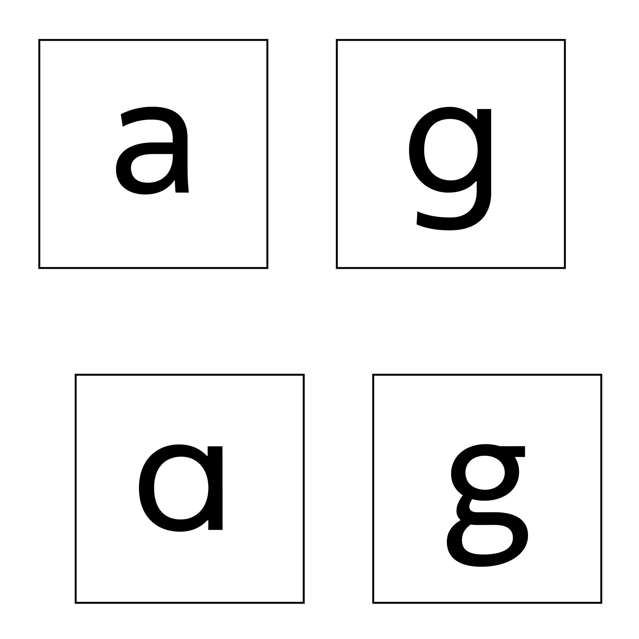
Single or Double Storey
Sponsored by Typotheque . Typeface in use: Zed Text , designed by Peter Biľak, 2024.
(Read More)Latin letters a and g can be represented with two different constructions:
- single storey, for modern and/or geometric styles;
- double storey, for traditional and/or classical styles.
In some typefaces, both constructions are available, as designers feel that some users prefer one over the other.
The letter g can also be designed with a half storey construction, often seen in Scandinavian designs as a legacy from Danish street signs.
Spacing
Sponsored by Production Type . Typeface in use: Media Sans , designed by Jean-Baptiste Levée, 2018.
(Read More)Spacing is the space around a glyph, defined by its side bearings (on the left and right side for a script written horizontally). Managing side bearings values is also referred as “managing the spacing.”
It controls the distance between glyphs and helps yo maintain a consistent rhythm and legibility once set in texts, making it an important aspect of a typeface’s quality.Spacing can be adjusted manually, or with the help of coding scripts. Glyphs with similar shapes are often grouped into groups so their side bearings can be adjusted collectively: for example, o, d, c, e, q can often share the same left side bearing group. This ensures consistency and speeds up the spacing process across a typeface.
FONT ENGINEERING HINT
Side bearing values are stored in the hmtx (Horizontal Metrics) table for scripts written horizontally, and in vmtx (Vertical Metrics) for scripts written vertically.
Specimen
Illustration: Jay Cover .
(Read More)A specimen is a visual sample document published by type foundries that showcases a typeface, its glyph set, text settings in different sizes, Opentype features, etc.
A collection of specimens of different typefaces bound together is called a typeface catalog.Style
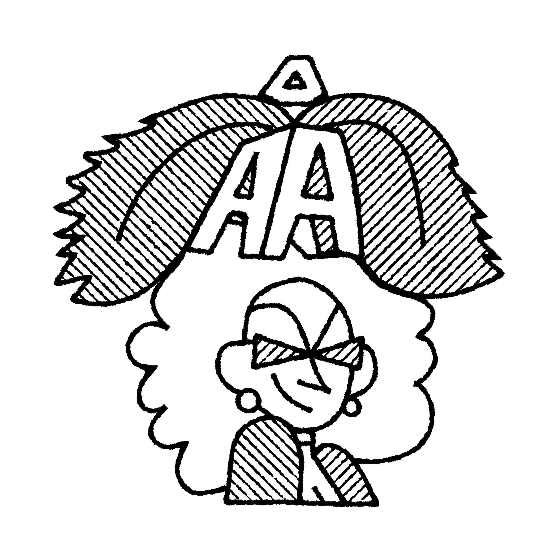
Illustration: Pauline Fourest (Spaghetype ).
(Read More)In any writing system, typefaces exist in an infinite number and variety of styles. They are influenced by many factors, such as technology, tools, necessity, and trends. But some of them are (or can be) grouped into categories for their similarities, into classification systems (sans serif, serif, humanist or geometric, etc.).
In the Latin script, we also identify Roman (or upright) and Italic as two ‘companion’ styles of the same typeface style.
Template
Illustration: Raven Mo .
(Read More)A template serves as a model for typography and typesetting. Like a reference guideline, it helps with the composition of the elements in a page (images, texts, spaces, grids, etc.), printed or on screen, to create a coherent and consistent document with specific design characteristics.
Variable Font

Sponsored by Letterror . Typeface in use: (“Style”) Very Bauble , (“Weight”) Limited Grotesque , (“Width”) Principia . Designed by Erik van Blokland.
(Read More)A variable font file contains data for an entire typeface family and allows an unlimited number of style variations along one or more design axes.
It uses interpolation, so designers only need to draw key masters to automatically visualize and/or generate intermediate instances.
HISTORY
The concept began with Apple’s TrueType GX technology for QuickDraw GX. Adobe, Google, and Microsoft later developed it into the OpenType Variable Font format, officially announced in 2016. Today, variable fonts are widely used in digital media, especially for responsive and animated text.
BENEFITS
Unlike static fonts, where each file contains a single style, a variable font can generate any style between its masters using interpolation. This reduces the number of separate files needed, decreases overall file size, and allows precise control over weight, width, slant, or other axes. Users can install one variable font file and dynamically adjust styles in applications or responsive environments without switching files.
FONT ENGINEERING HINT
Variable fonts store one full master (the origin) and delta data describing other masters. The gvar (Glyph Variation) table is the heart of outline interpolation. Tables like cvar, MVAR, HVAR, and VVAR handle metrics, spacing, and alignment changes across the axes. FVAR, AVAR, and STAT define, normalize, and provide human-readable names for the variation axes and their instances.
Variation Axis
 (Read More)
A variation axis allows a continuous interpolation of outlines between at least two compatible sources (also called masters).
It is a trajectory between different states of a given shape. For example, the weight axis would shift points to adjust the stem thickness, allowing a transition from Thin to Bold styles.FONT ENGINEERING HINT
The OpenType Specification defines 5 standard axes: weight, width, optical size, italic, and slant.
Note that italic acts as a stylistic link between two styles rather than a true interpolation axis.
These guidelines serve as a reference for how axes should be implemented into a font.Variation axes are stored and referenced across several font tables:
• avar (Axis Variations): normalizes axis coordinates
• fvar (Font Variations): provides location coordinates for the instances
• STAT (Style Attributes): provides human-readable names for axes and their defined instancesVector
(Read More)A vector is a directional line defined by two points.
In digital graphics, vectors represent shapes mathematically rather than as pixels, making them fully scalable.
In digital type design, glyph outlines are built from vectors using Bézier curve technology. Each contour of a glyph is composed of connected vectors, allowing precise, editable, and scalable shapes. Type design applications rely on this vector-based system to create and manipulate glyphs.