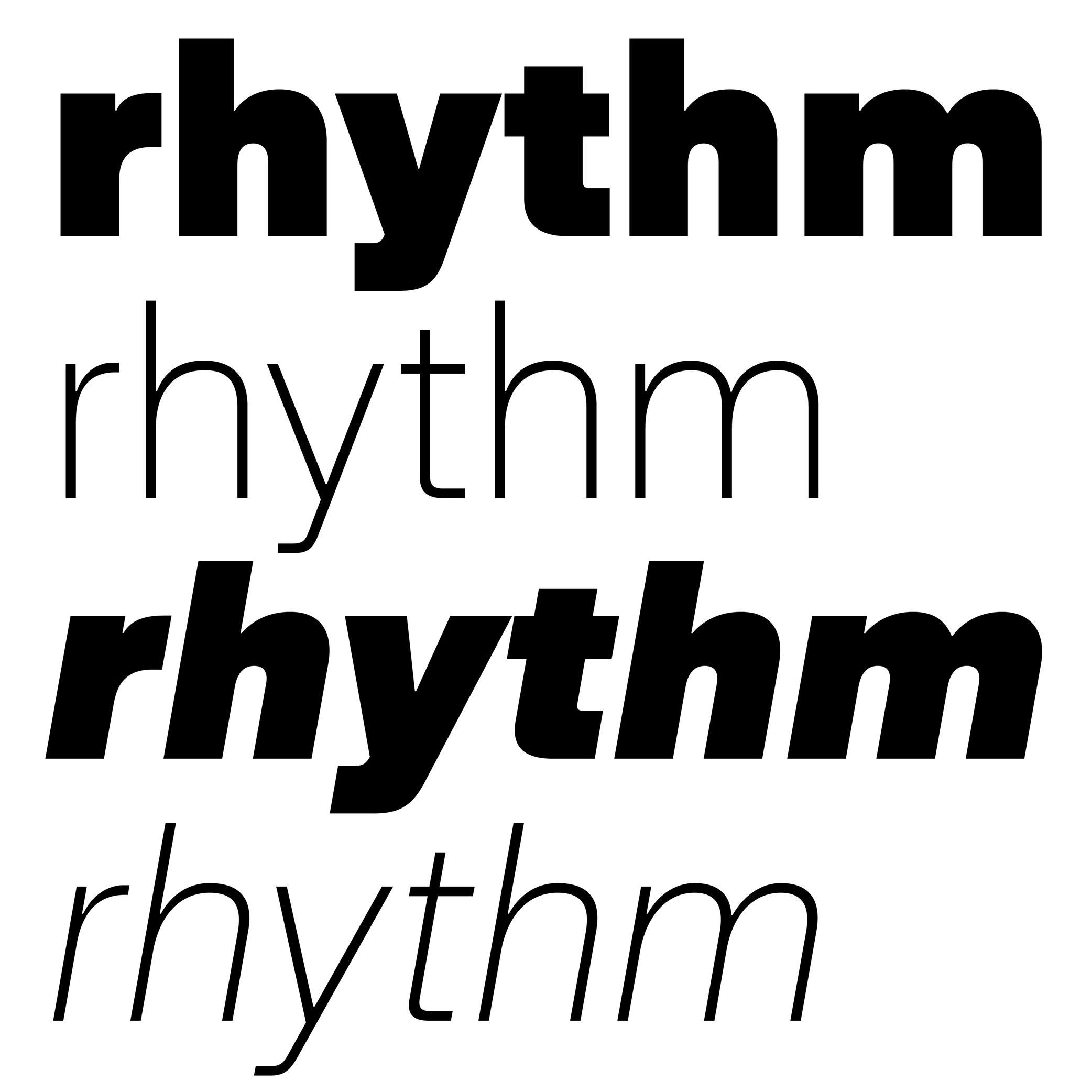
Anatomy
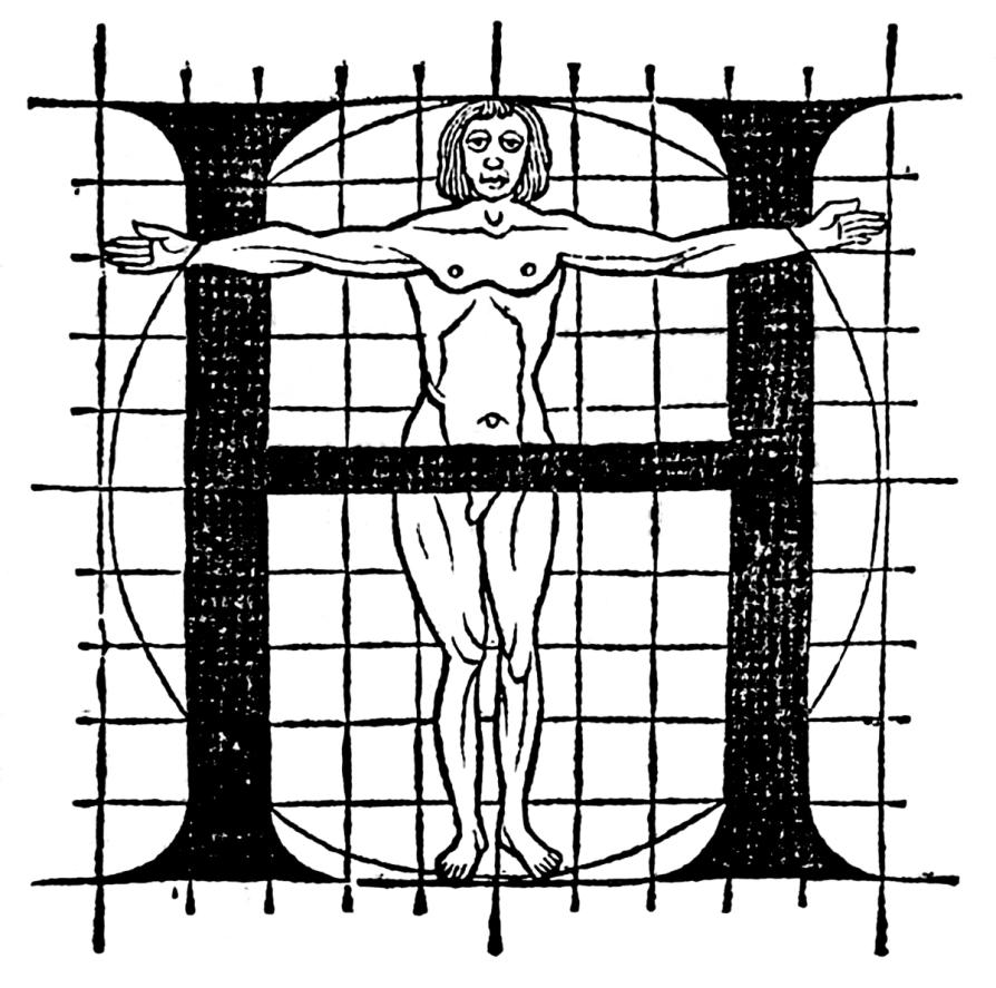
Illustration: Le Champ Fleury, Geoffroy Tory, 1529. Source: Bibliothèque nationale de France .
(Read More)To name and describe parts of letters and other characters, many terms are borrowed from architecture (e.g., arch of an n) or from human and animal anatomy (e.g. leg of an R), which is why we speak of “type design anatomy.”
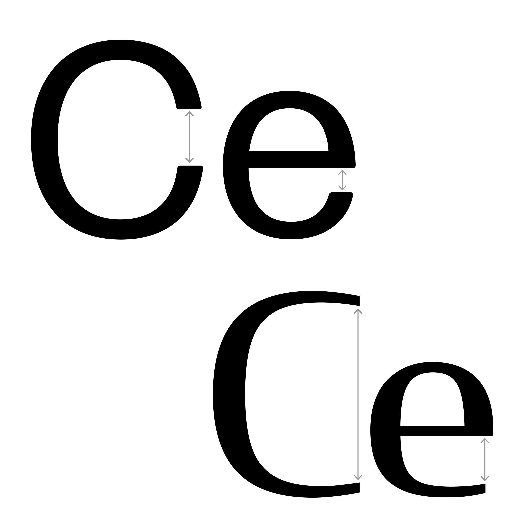
Aperture
Sponsored by DJR . Typefaces in use: (top) Forma DJR , (bottom) Condor , designed by David Jonathan Ross, 2017.
(Read More)The aperture is the frontier between the counter and the surrounding white space of opened letters (such as a, e or c).
Contemporary typefaces that are meant for long text reading are often designed with a wider aperture (sometimes even without a terminal at the top of a and c) as solutions to increase their legibility at smaller size.
Apex
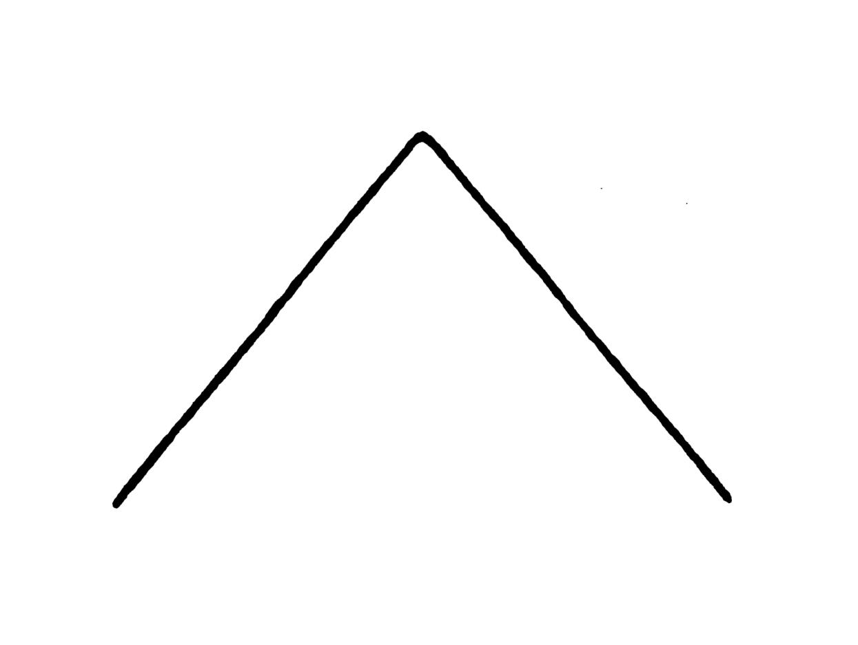
Illustration: Tezzo Suzuki .
(Read More)The apex is the point on the top of a letter where two stems meet, such as the top of the letter A or the middle of w.
We also find the term “vertex,” referring to the top of A as well, but also to other pointed parts such as the base of V or the intersection of K when/if its diagonals don’t meet the vertical stem.
Arch
Sponsored by R-Typography . Typeface in use: Canora Frente and Verso , designed by Rui Abreu, 2021.
(Read More)Many terms are borrowed from architecture or human and animal anatomy to designate and describe parts of letters and other characters. We even speak of type design anatomy.
In Latin script, the arch is the top-right part of letters such as n, m, h and a.
Arm
Sponsor Word of Type and feature your typeface in this card with a linked caption. Contact us for more information.
(Read More)Many terms are borrowed from architecture or human and animal anatomy to designate and describe parts of letters and other characters. We even speak of type design anatomy.
In Latin script, the arm is the horizontal bar at the top of the letter T, as well as the horizontal bars on the E and F.
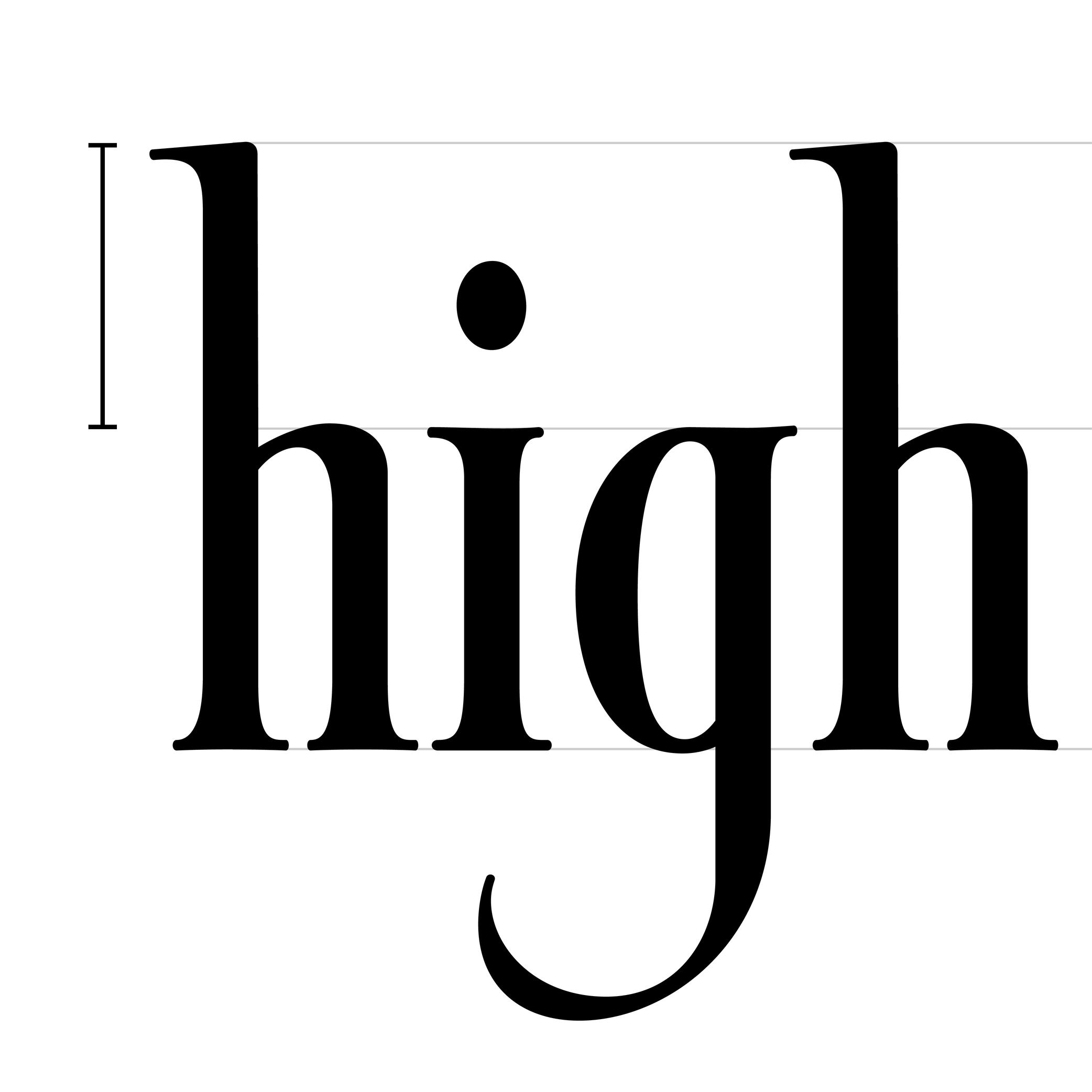
Ascender
 (Read More)
The parts of lowercase letters that go above the x-height level (such as b, d or h) are called “ascenders.”
On the opposite side of the x-height, the parts going below the baseline are descenders.
Both don’t necessarily need to have the same length. In general, descenders are shorter than ascenders.
Attention: do not confuse ascender height with the capital height (or cap height). Ascenders in Latin script are commonly taller than capital letters.
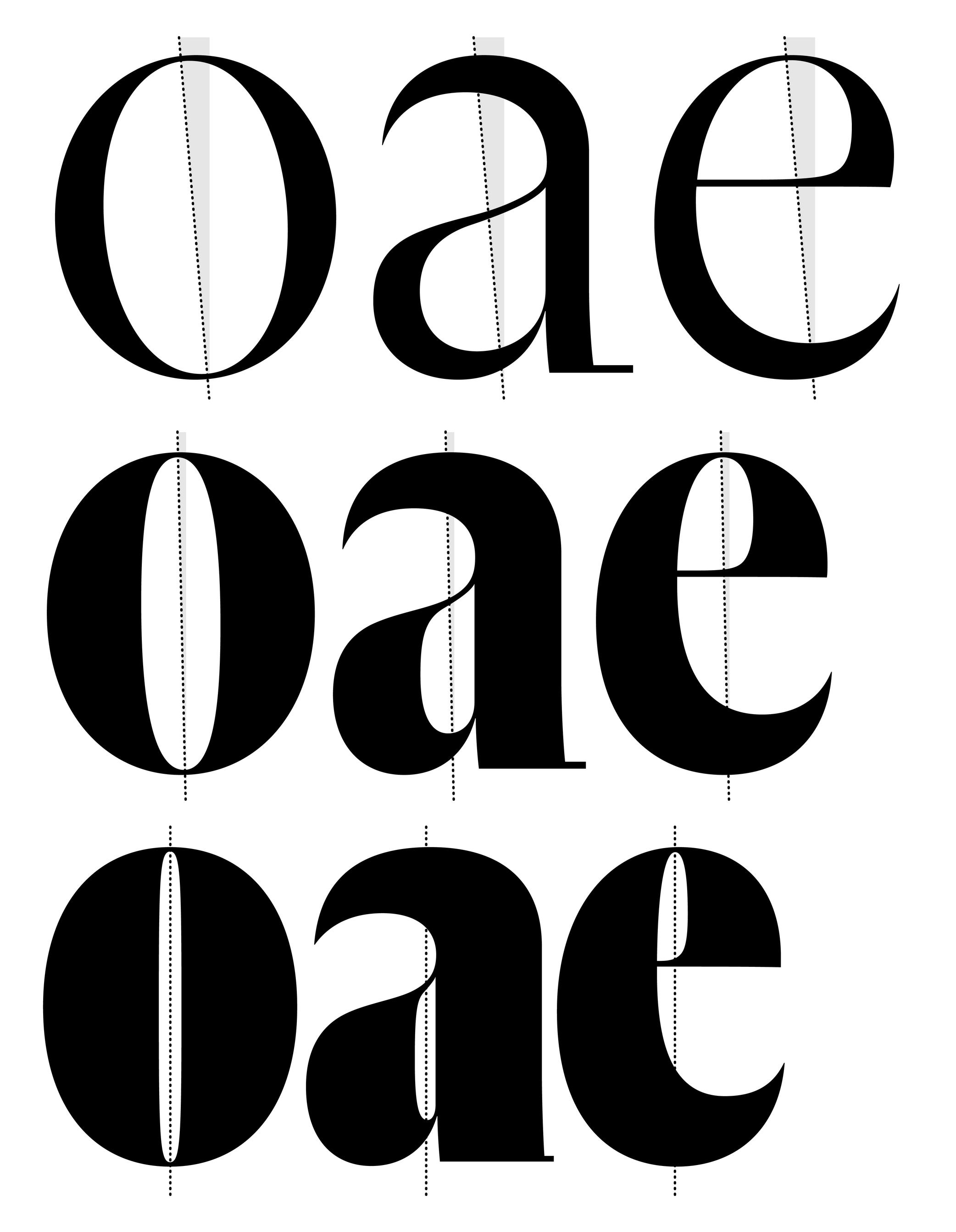
Axis (in Type Design)
Sponsored by R-Typography . Typeface in use: Gliko Modern L , designed by Rui Abreu, 2018.
(Read More)In Latin script, we speak of a “diagonal,” “tilted” or “oblique” axis when we refer to the shapes of letters in a typeface that have some contrast.
In calligraphy (when using a broad nib pen), the axis of the stroke is defined by the angle at which the pen is held, from which a contrast between thin and thick parts is formed. The axis should be kept the same (or very similar) for a consistent construction on all glyphs.
Baseline
Sponsor Word of Type and feature your typeface in this card with a linked caption. Contact us for more information.
(Read More)The baseline is where the bottom extremity of letters such as n and H are positioned, and it is used as a reference guide for the entire character set. We also say that letters are “sitting” on the baseline.
The baseline—with other guidelines like x-height, ascender, descender and capital height—helps to control the position of all letters and glyphs.
Bounding Box
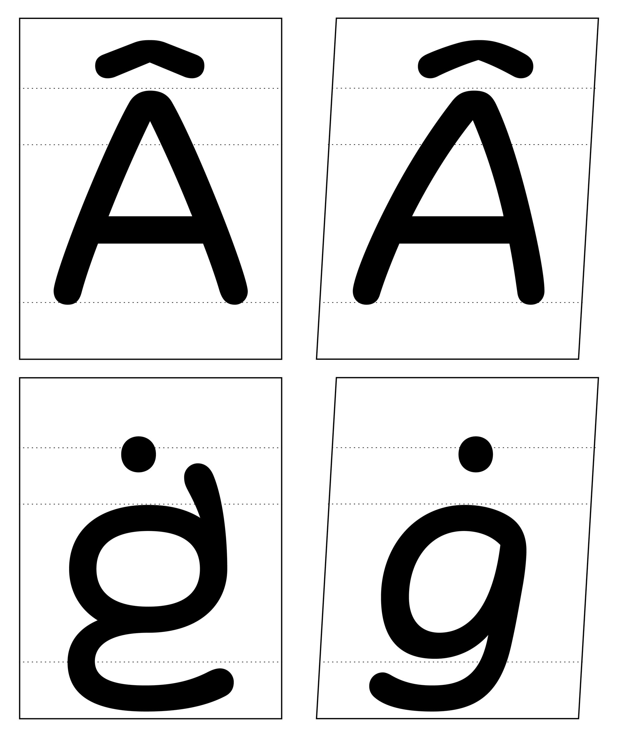
Illustration: Words of Type. Typeface in use: Knowledge Rounded, designed by Lisa Huang for Words of Type, 2024.
(Read More)The bounding box is a virtual rectangle enclosing a selected (vector) shape—such as a segment, an outline, or an entire glyph.
The font bounding box defines the outermost limits of a typeface, marked by the four extreme coordinates along the X and Y axes: highest (Y-max), lowest (Y-min), leftmost (X-min), and rightmost (X-max).
FONT ENGINEERING ADVICE
The font bounding box is stored in the head table.
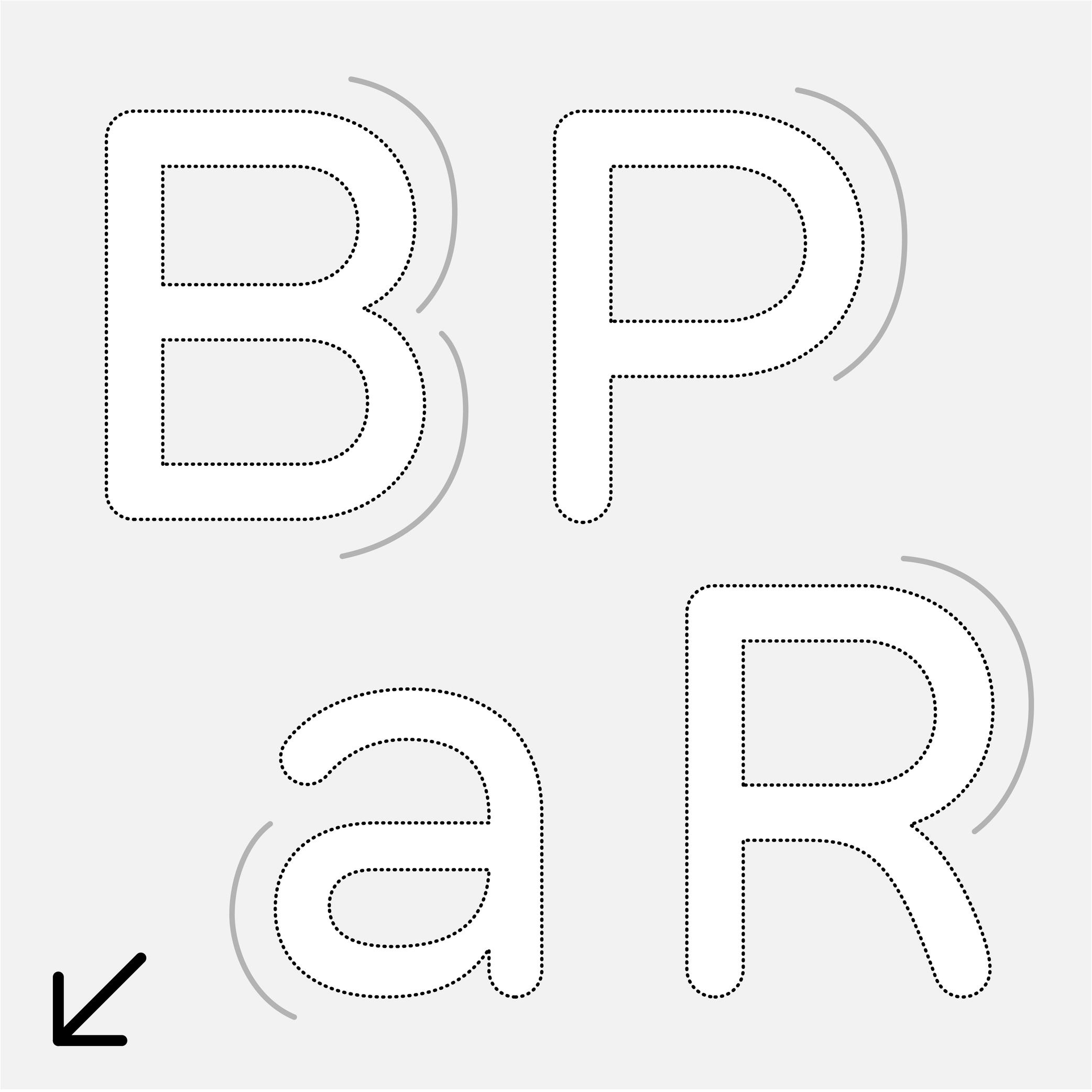
Bowl
Sponsor Word of Type and feature your typeface in this card with a linked caption. Contact us for more information.
(Read More)Many terms are borrowed from architecture or human and animal anatomy to designate and describe parts of letters and other characters. We even speak of type design anatomy.
In the Latin script, the bowl refers to the rounded parts of a letter, like those in a, B, P, R, etc.
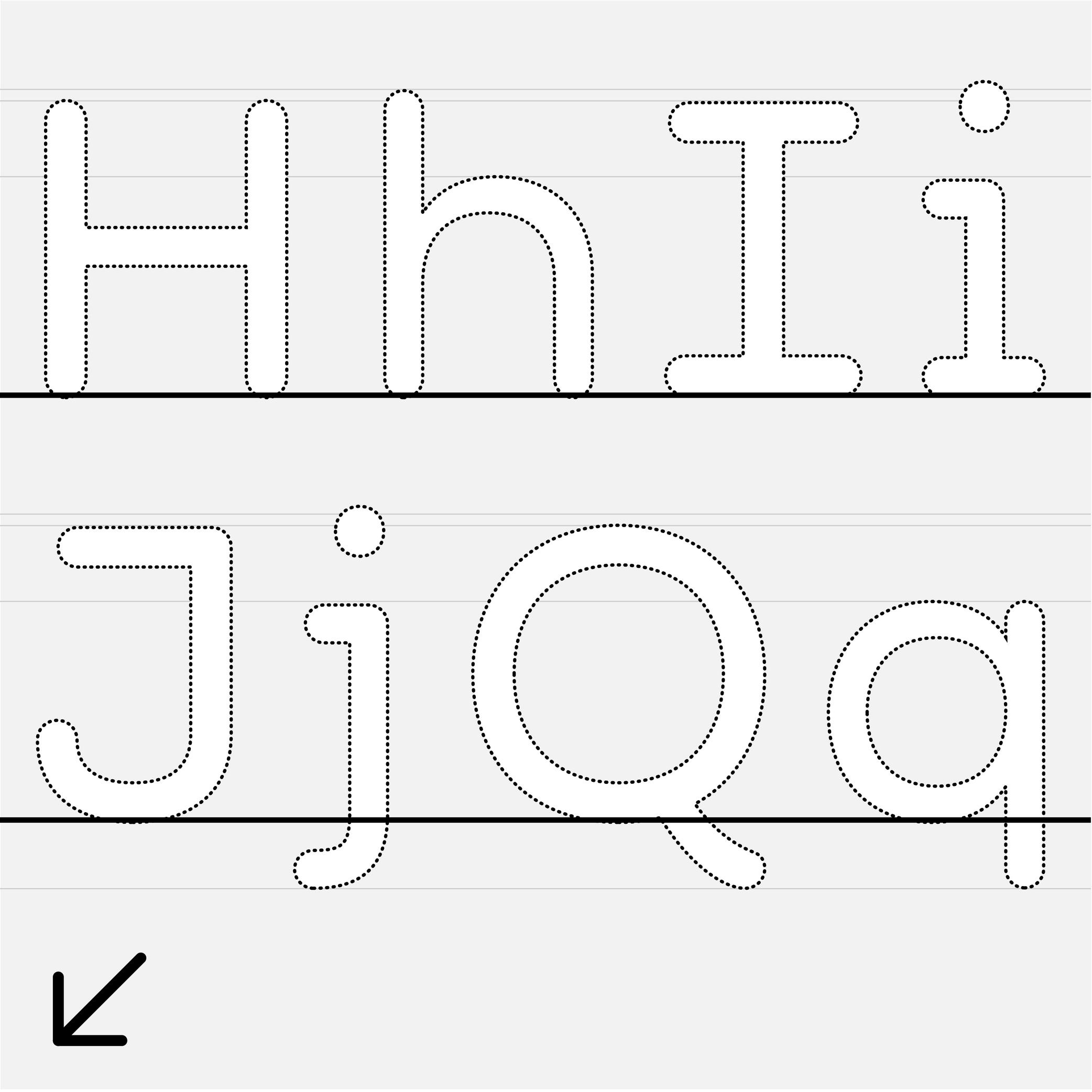
Cap Height
Sponsor Word of Type and feature your typeface in this card with a linked caption. Contact us for more information.
(Read More)The cap height (short for “capital height”) is at the top level of square capital letters, such as H.
The cap height is one of the main guidelines for Latin-script typefaces. It is usually lower than the ascender height in typefaces meant to be used at small size. This is also the case for sans serif styles to show a difference between l (lowercase L) and I (uppercase i). In many display styles, the ascenders are the same as the cap height to save some vertical space.
Center Space
Sponsored by Mallikātype . Typeface in use: Nan Sans, designed by Tianmeng Xue. Coming soon.
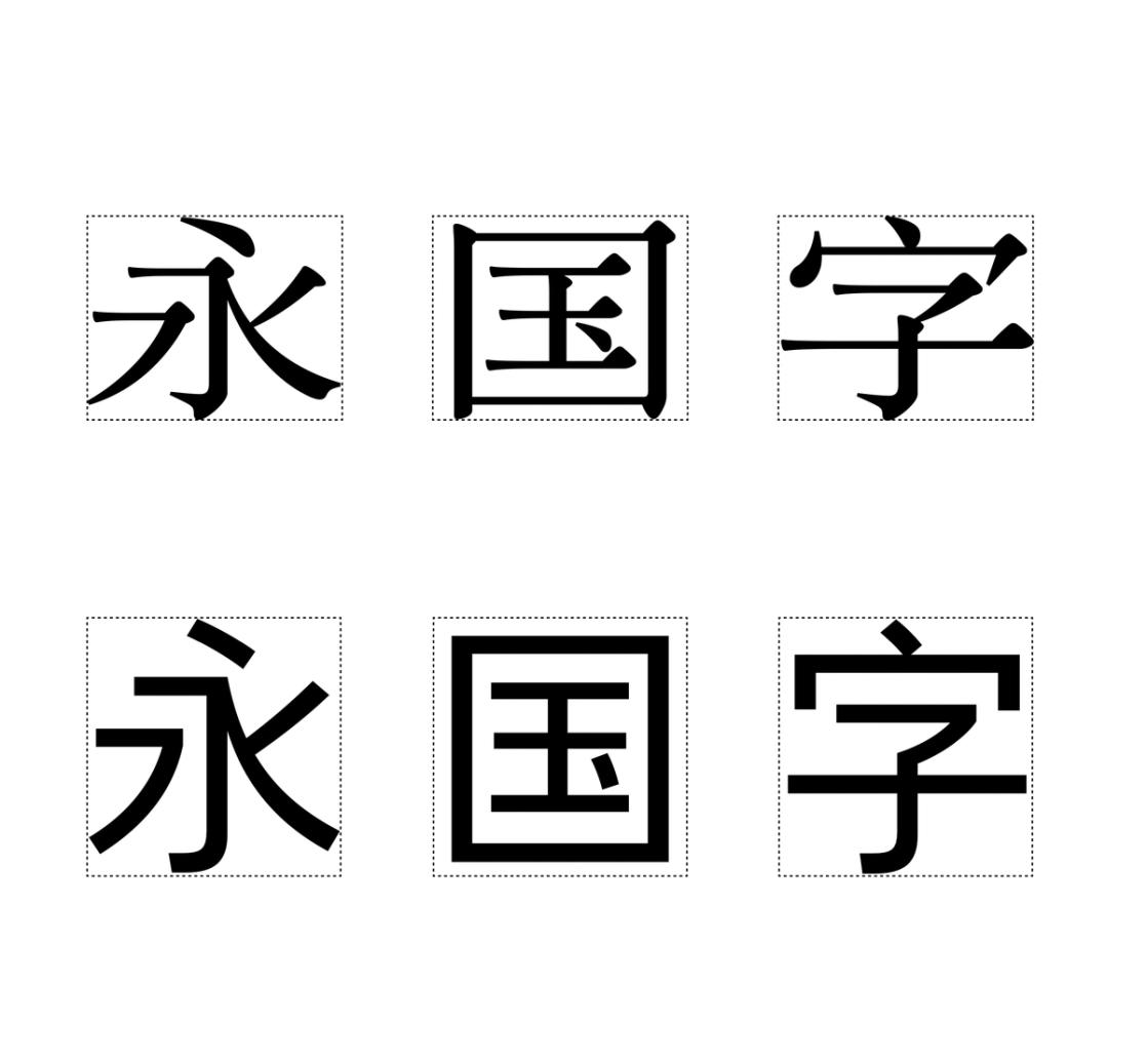
(Read More)In the Chinese Hanzi script, the center space (or optical core, 中宫 in Chinese) corresponds to the central area of a character, similar in Latin to the area between the x-height and the baseline. This area can differ from style to style, but it has to be visually constant for all characters in a typeface.
A text typeface with a bigger center space has its legibility improved for small sizes.
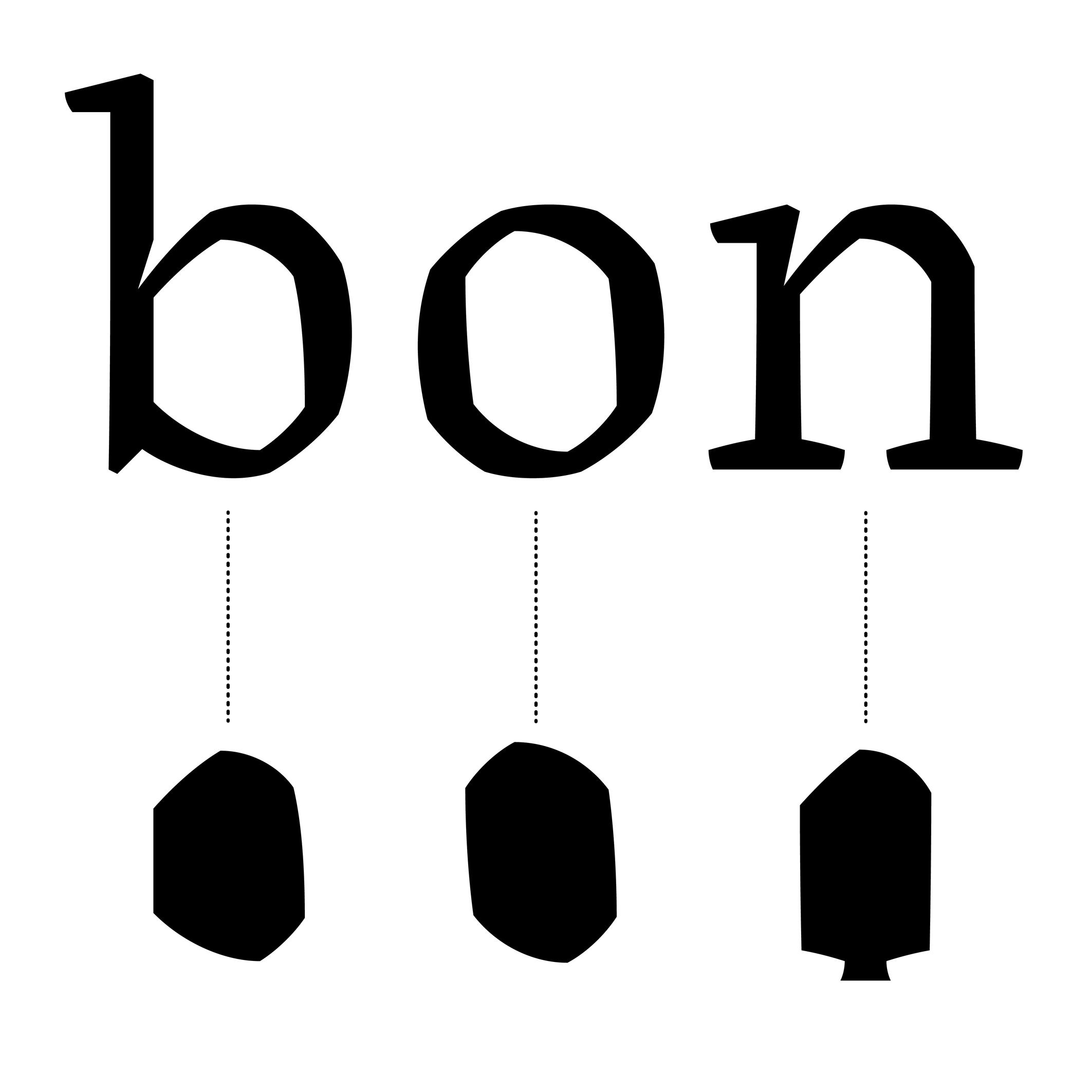
Counter
Sponsored by NM type . Typeface in use: Sastre, designed by María Ramos, 2024.
(Read More)Also called counterform.
A counter is the negative shape inside a glyph with an enclosed form, either entirely closed (such as b) or partially open (such as n).
This term comes from the “counterpunch.” Punchcutters used counterpunches to depress the white spaces inside letterforms while making the master punches for metal-type sorts.
Concretely, they would strike the counterpunch into a larger steel punch. Afterward, the punchcutter filed down the outside of the punch, creating the letterform’s exterior contour.
Punchcutters could reuse a counterpunch on any related letterforms in the typeface, keeping a consistent look throughout an entire font.TYPE DESIGN
In digital type design for Latin scripts, it is important to keep this consistency as well, with various techniques, such as putting the component of a reference letter in the background or copy-pasting the contours of the counter, or making sure that they visually look consistent by placing them next to each other while designing the shapes.
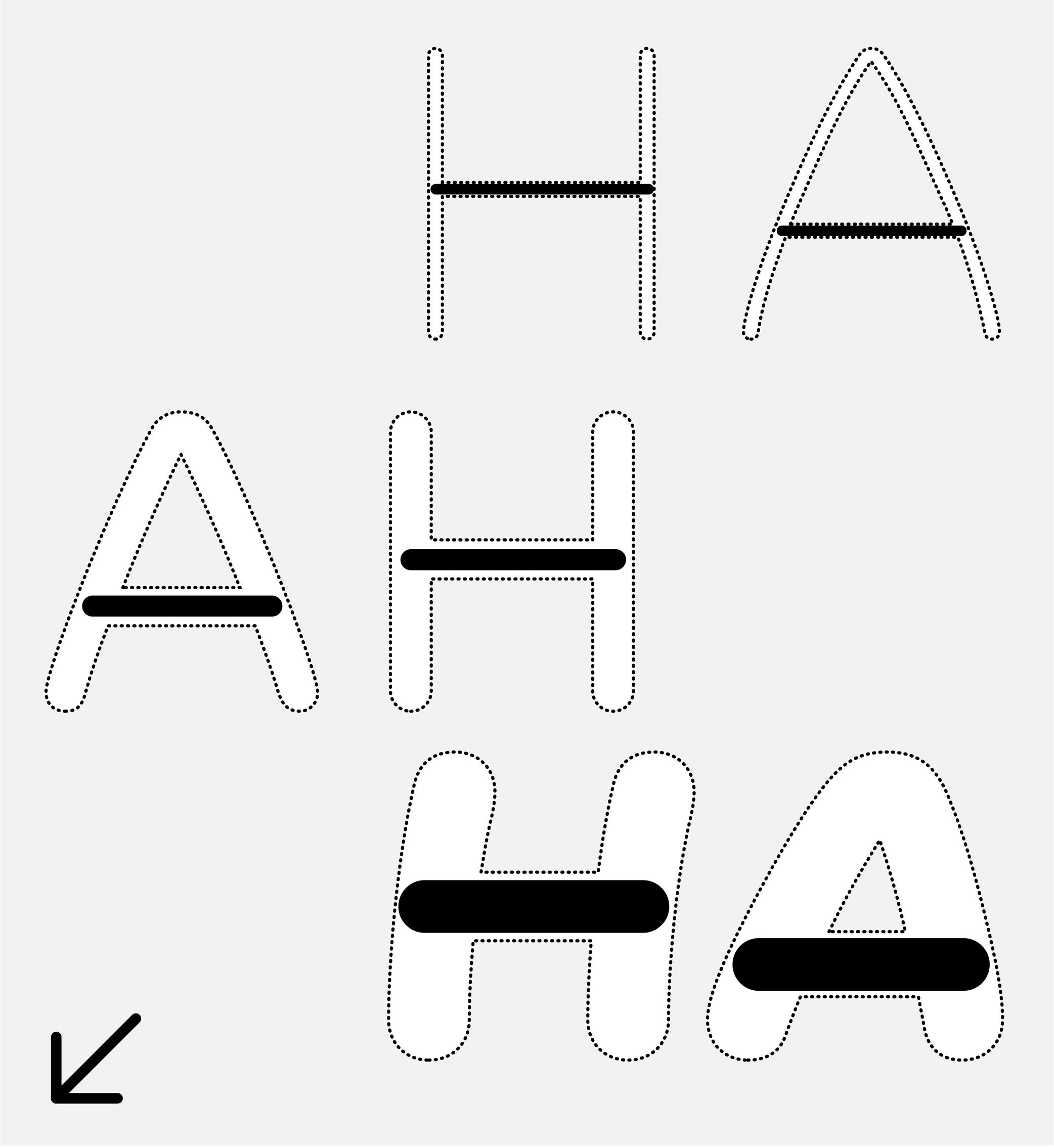
Crossbar
Sponsor Word of Type and feature your typeface in this card with a linked caption. Contact us for more information.
(Read More)Many terms are borrowed from architecture or human and animal anatomy to designate and describe parts of letters and other characters. We are even speaking of type design anatomy.
For Latin script, the crossbar is the horizontal bar on letters like A or H.
Descender
Sponsored by Frere-Jones Type . Typefaces in use: Empirica , designed by Tobias Frere-Jones, Nina Stössinger, 2018.
(Read More)The parts of lowercase letters (such as p, q or y), old style figures or some punctuation symbols going below the baseline are called descenders.
In the same typeface, all descenders need to have the same height for overall consistency.
On the opposite side, parts going above the x-height are ascenders, like in letters b, d or f.
Both ascenders and descenders don’t necessarily need to have the same length. In general, descenders are shorter than ascenders.
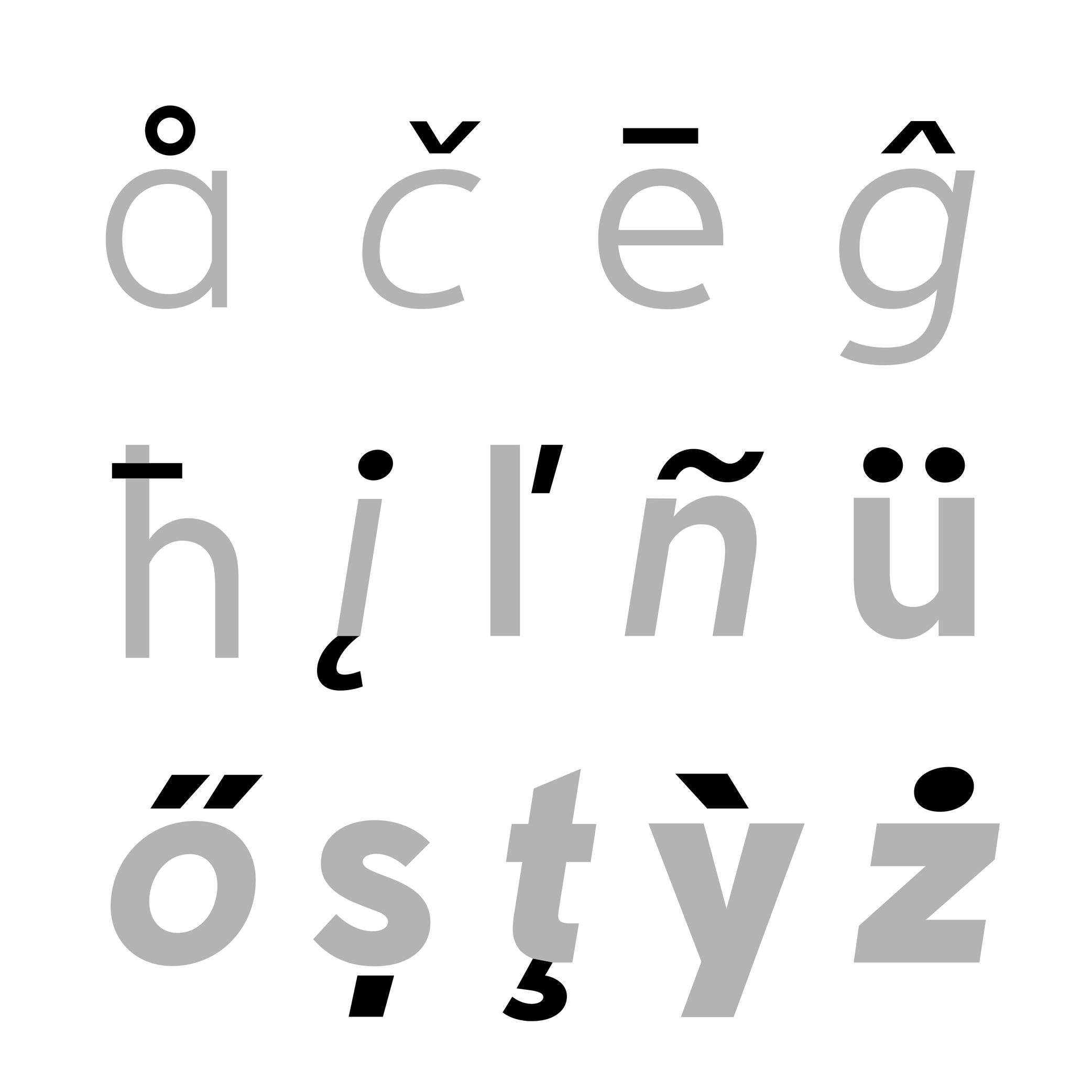
Diacritic
Sponsored by Nymark Type . Typeface in use: Tranemo , designed by Andreas Nymark, 2021.
(Read More)Diacritics are marks added to letters. They can be above, below, or attached to a letter. In most languages and scripts using diacritics, these bring to the letter a different sound than that of the letter by itself.
LATIN SCRIPT
The Latin script is used in a large number of languages. Most of them use diacritics to bring (sometimes very subtle) variations of sound to letters. The quality of the sound of a diacritic can be different from one language to another. An example with the cedilla ç, used in French, Portuguese, and Turkish. Other languages even use multiple diacritics combined together within the same letter (like in Vietnamese with ở).
ARABIC SCRIPT
In the Arabic script, letters have different pronunciations depending on which diacritic is attached to them (or not there), and the language in use.
CHINESE PINYIN
In Mainland China during the 1950s, a new phonetic transcription system was created to make Chinese learning easier: Pinyin, which borrows Latin alphabet letters combined with diacritics as tone markers.
DESIGN
When creating a typeface, diacritics are designed as individual glyphs and are then combined with letters as components in type design applications. They need to be:
- visually aligned to the same height with one another (for those placed in the same area);
- have consistent weight and color;
- placed in a position with the letter that feels “natural” for each language.
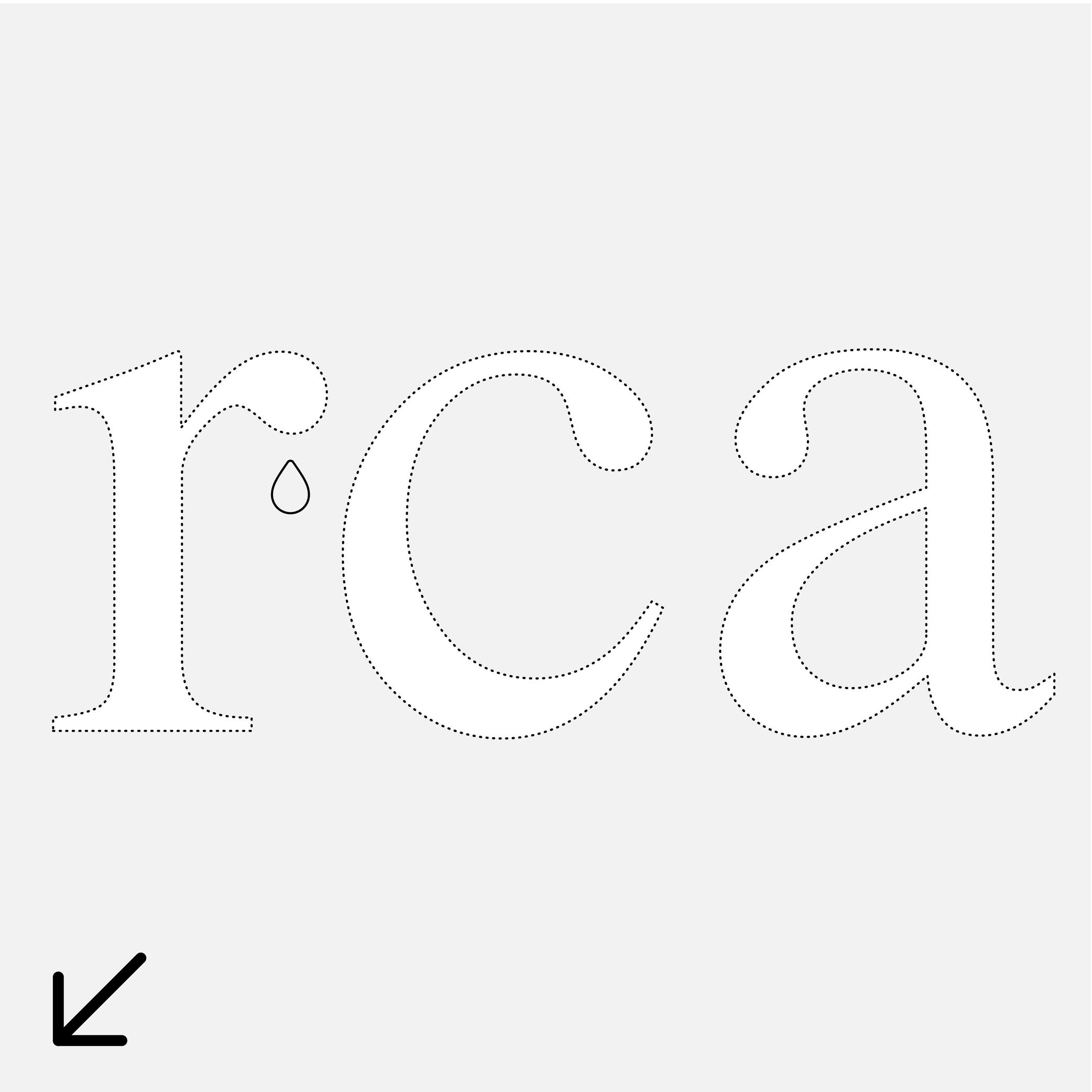
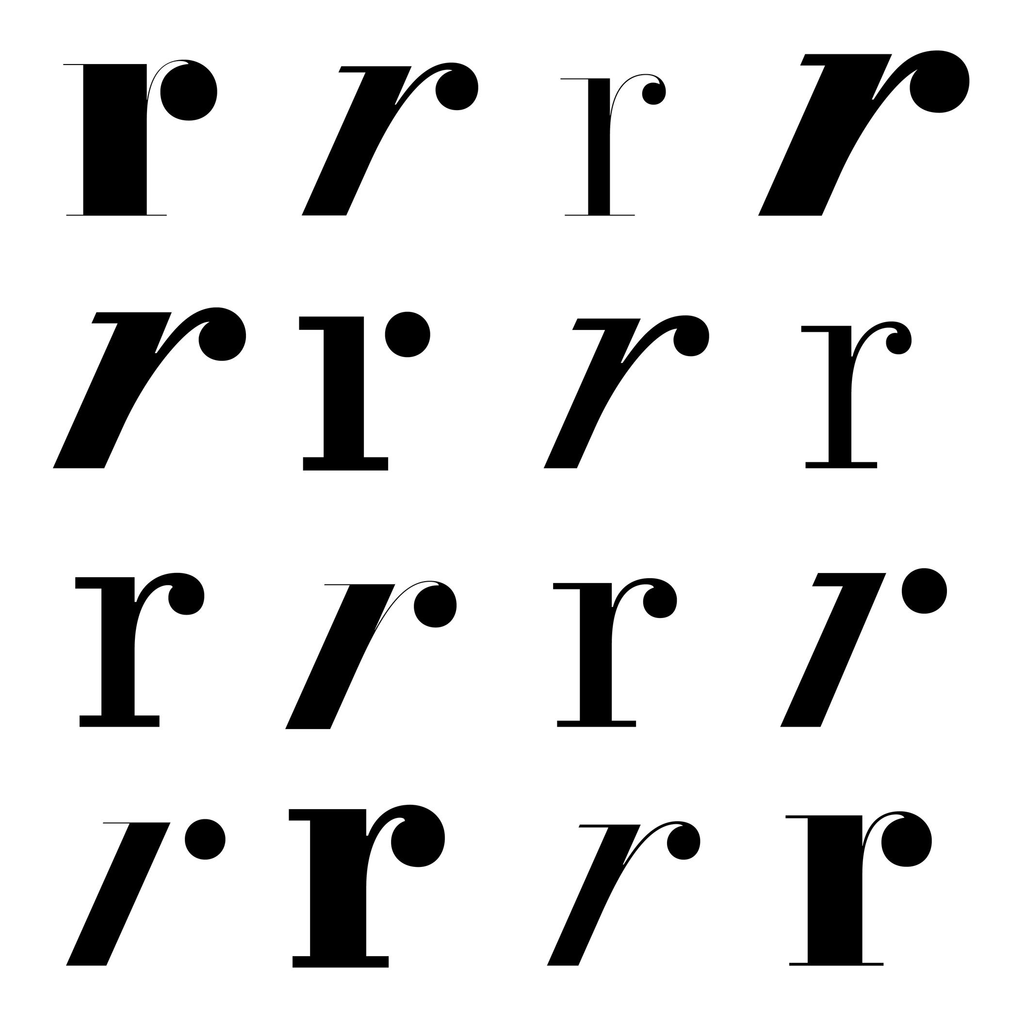
Drop
Sponsor Word of Type and feature your typeface in this card with a linked caption. Contact us for more information.
(Read More)Many terms are borrowed from architecture or human and animal anatomy to designate and describe parts of letters and other characters. We even speak of type design anatomy.
For Latin script, the drop refers to the top hanging part of r or a that looks like a drop falling downward, generally present in serif style fonts.
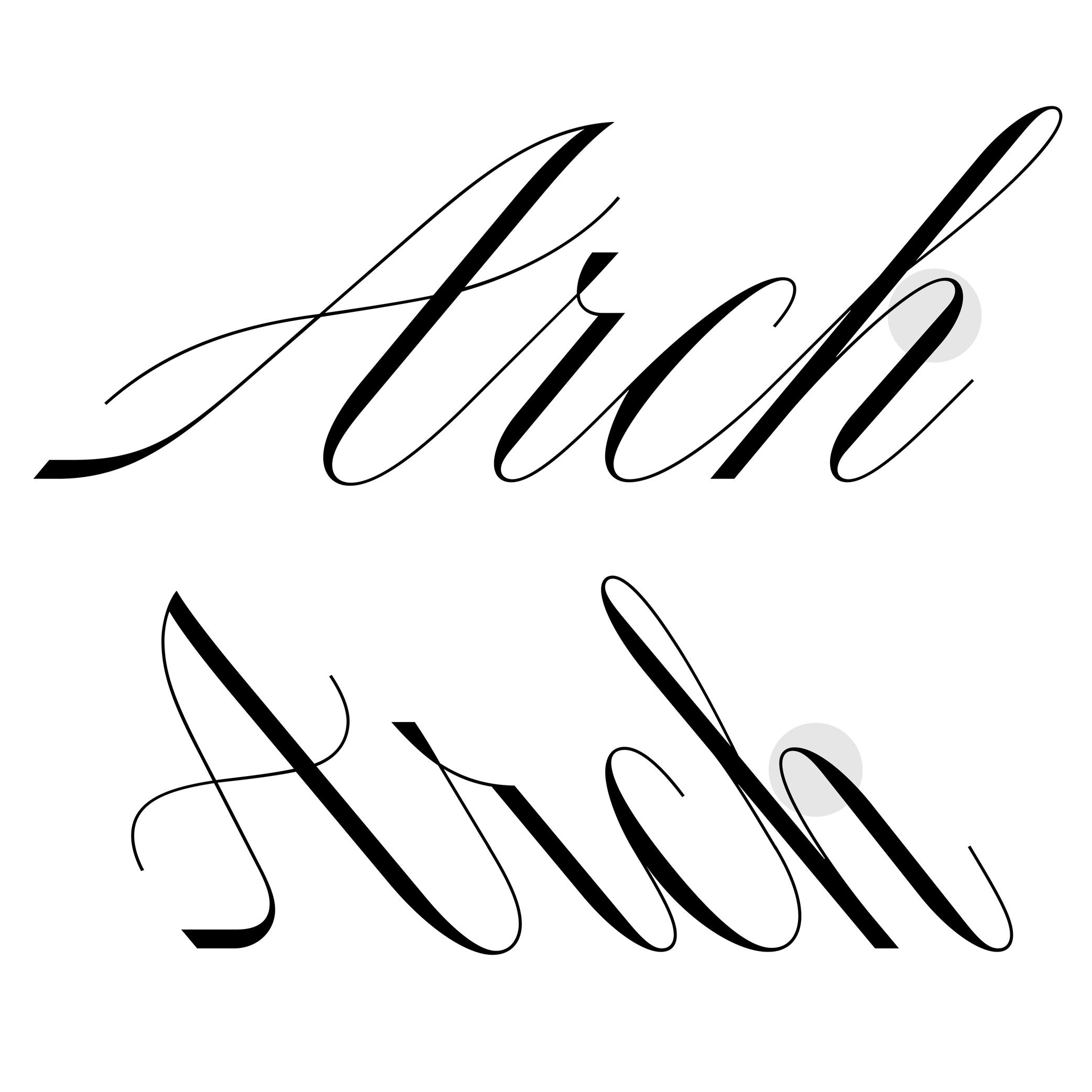
Ductus
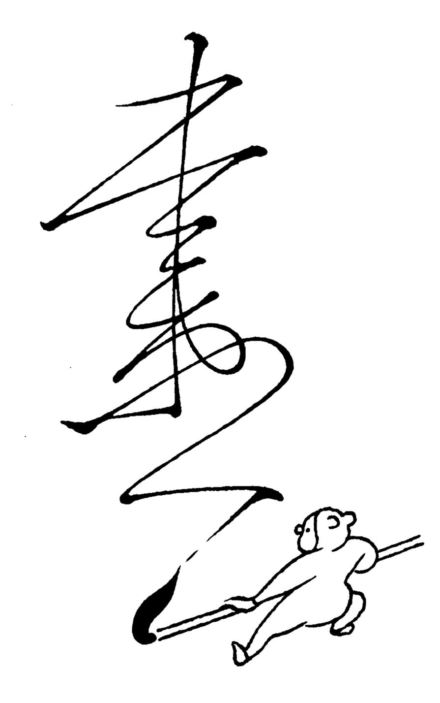
Illustration: Tezzo Suzuki .
(Read More)Glyphs from every script are written with a specific stroke order and drawn in a specific direction. This is called the ductus (from Latin ducere, meaning “to lead,” “to pull”). It took multiple evolution phases for characters to look as they do today. Most ductus changes were for characters to be written more easily (and/or faster) with the tools used.
Ear
Sponsored by Commercial Type . Typeface in use: Le Jeune , designed by Paul Barnes, Christian Schwarz, Greg Gazdowicz, 2016.
(Read More)Many terms are borrowed from architecture or human and animal anatomy to designate and describe parts of letters and other characters. We even speak of type design anatomy.
In the Latin script, the ear refers to the top-right hanging part of letters like the r, f or the double-storey g.
Eye
Sponsored by Commercial Type . Typeface in use: Portrait , designed by Berton Hasebe, 2013.
(Read More)Many terms are borrowed from architecture or human and animal anatomy to designate and describe parts of letters and other characters. We even speak of type design anatomy.
In Latin type design, the eye refers to the ratio between the x-height and the other guidelines (ascenders and descenders).
A typeface is suited for text usage if it has a ratio slightly bigger between its eye to its ascenders and descenders, as this enhances the legibility of the letters.
Glyph Surface
Sponsored by Mallikātype . Typefaces in use: (top) Jinhua Serif , 2023, and (bottom) Nan Sans, coming soon. Designed by Xue Tianmeng, Li Jian, and Kazuhiro Yamada.
(Read More)In East Asian typeface design (Chinese, Japanese, and Korean), characters (commonly called Hanzi) are settled in a squared frame, the same for all characters of one typeface.
The glyph surface (字面 in Chinese, literally ‘face of the character’) is the area occupied by the character in its square.
Gravity Center
Sponsored by Mallikātype . Typeface in use: Beiwei Longmen, coming soon. Designed by Tianmeng Xue.
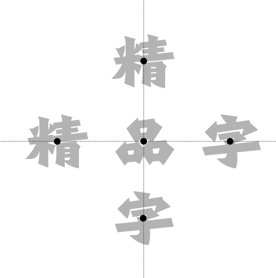
(Read More)In Chinese Hanzi script, the gravity center (also barycenter, 重心 in Chinese, literally ‘focus’) can be perceived as the optical center of a glyph, similar to the horizontal bar of the capital letter H.
It has to be visually aligned for all characters—especially for text typefaces—to allow a fluid and continuous reading.
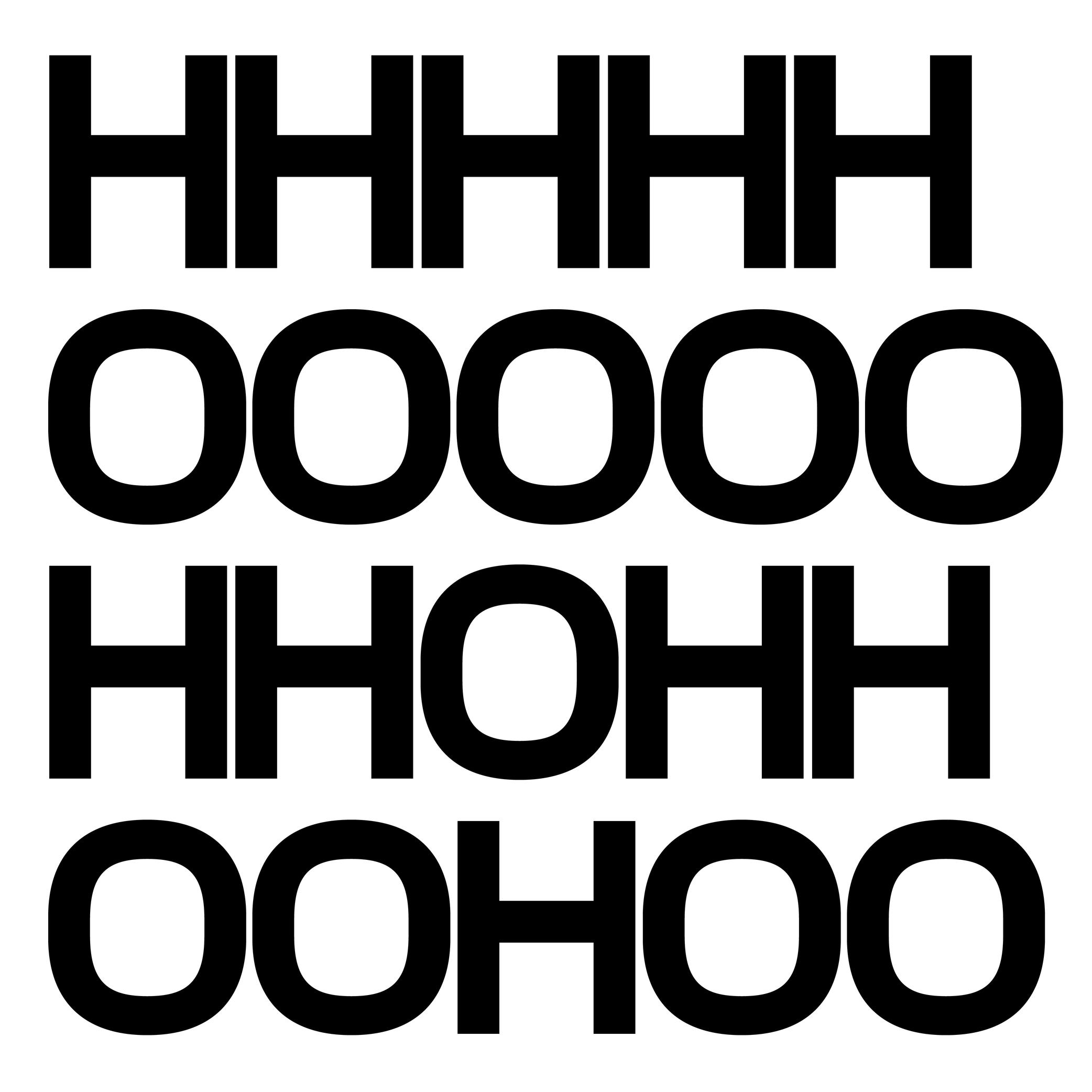
Height
Illustration: Jonny Wan .
(Read More)In type design, height refers to vertical measurements used as guidelines for different categories of glyphs (such as uppercases, lowercases, small caps, etc.). These are measured from the baseline and help ensure visual consistency across the typeface.
LCG (LATIN, CYRILLIC, GREEK)
LCG scripts typically use the following height guidelines for their lowercases, uppercases, and small caps:
• x-height: height of short lowercases;
• ascender height: height of the extension of lowercase letters that rise above the x-height;
• descender height: height of the extension of lowercase letters that fall below the baseline;
• cap height: height of uppercase letters;
• small case height: heigh of the small cases;
• sometimes also specific figure heights too (for old style or proportional figures, and more).CJK (CHINESE, JAPANESE, KOREAN)
Characters of CJK scripts are commonly designed to fit within a common em-square (same width and/or height) for all characters within the same typeface. Designers often define:
• ideographic em height: total vertical space for a character;
• baseline offset: vertical alignment for mixed-script texts.ARABIC SCRIPTS
Arabic scripts have various types of heights measurements depending on the style involved, including some that don’t follow the same rule as Latin script, where the “horizontal” baseline may not be exactly the same word to word when the letters are typed into texts. But in general, we can list down the following:
• baseline: anchors the “horizontal” alignment;
• median line: main body height;
• ascender and descender lines: based on the tallest and lowest glyph strokes;
• mark height: guides the placement of diacritics.INDIC SCRIPTS
The following are the most common height measurements for Indic scripts (which encompasses a large number of different scripts!):
• shirorekha (headline): the horizontal bar on top of many letters;
• base height: where the main glyph body sits;
• matra height: position for vowel signs and marks above or below the base glyph.Note: These design heights relate to glyphs’ outlines, and are not to be confused with vertical metrics, which define the overall line spacing in a font.
FONT ENGINEERING ADVICE
The x-height and the cap-height are important values that can be found in the OS/2 table of the font file.
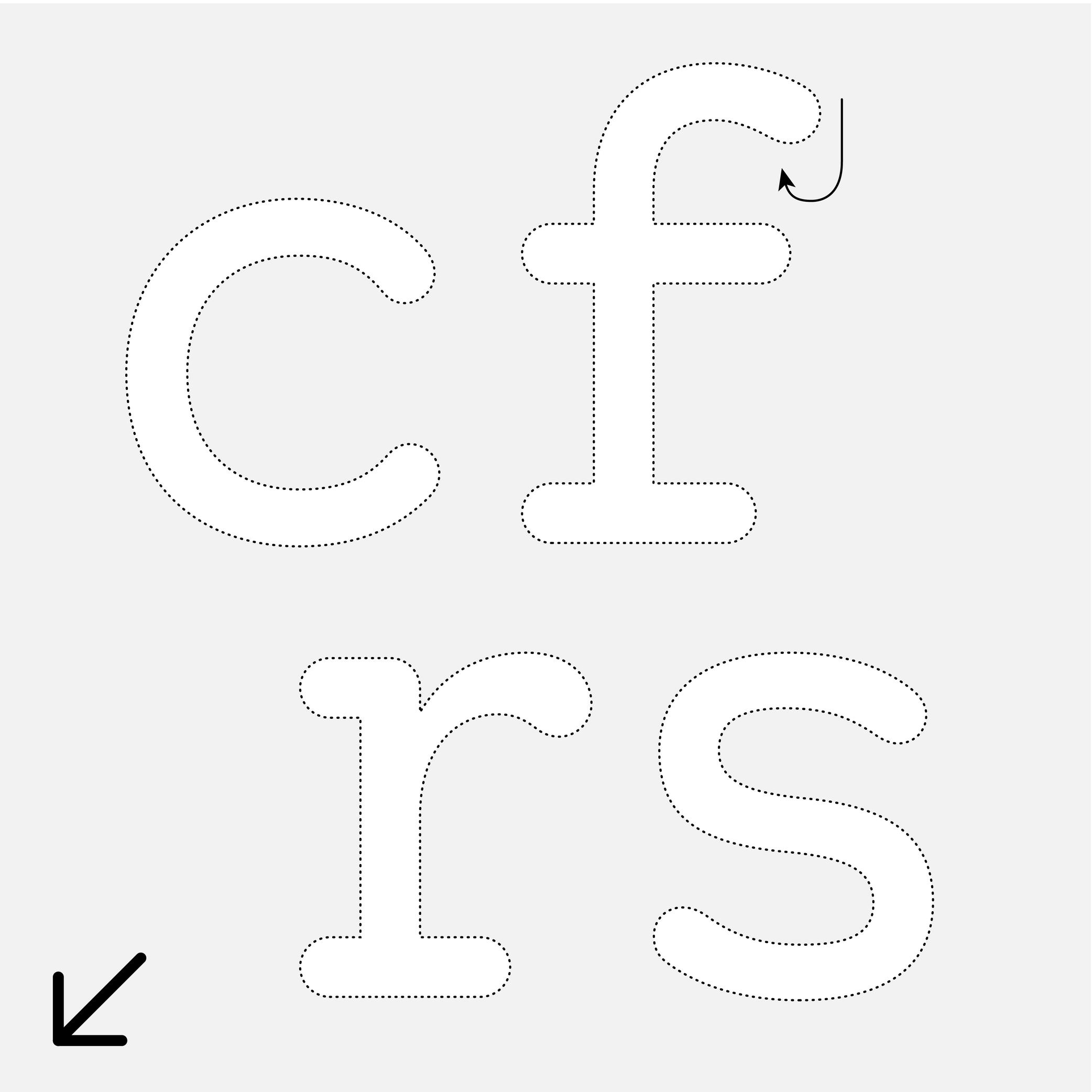
Hook
Sponsor Word of Type and feature your typeface in this card with a linked caption. Contact us for more information.
(Read More)Many terms are borrowed from architecture or human and animal anatomy to designate and describe parts of letters and other characters. We even speak of type design anatomy.
In the Latin script, the hook refers to the part curling downward in letters such as c, f, r, s, etc.
Depending on the style or the shape of this part, it can also be called an ear, an arch or a (upper) terminal.
Ink Trap
Sponsored by Blaze Type . Typeface in use: Area Normal Inktrap , designed by Matthieu Salvaggio, 2021.
(Read More)When printing technology was primarily based on printing inked metal types on paper, ink could easily spread into the small corners of the characters. In printing, this effect is called a “bleed.” Especially at small sizes, too much ink spread can weaken legibility.
One of the best examples of a typeface solving the ink-spread problem is Bell Centennial, designed by Matthew Carter in 1975 for the US telephone company AT&T. It needed a typeface for its phone books, which would be printed on thin and porous paper. The resulting typeface featured inner corners that dug into the letterforms’ usual contours. Those are called ink traps.
In digital typeface design, designers still use ink traps, especially for typefaces intended for small sizes (on printed and/or digital media), but also as design features (which can be pretty wild!).
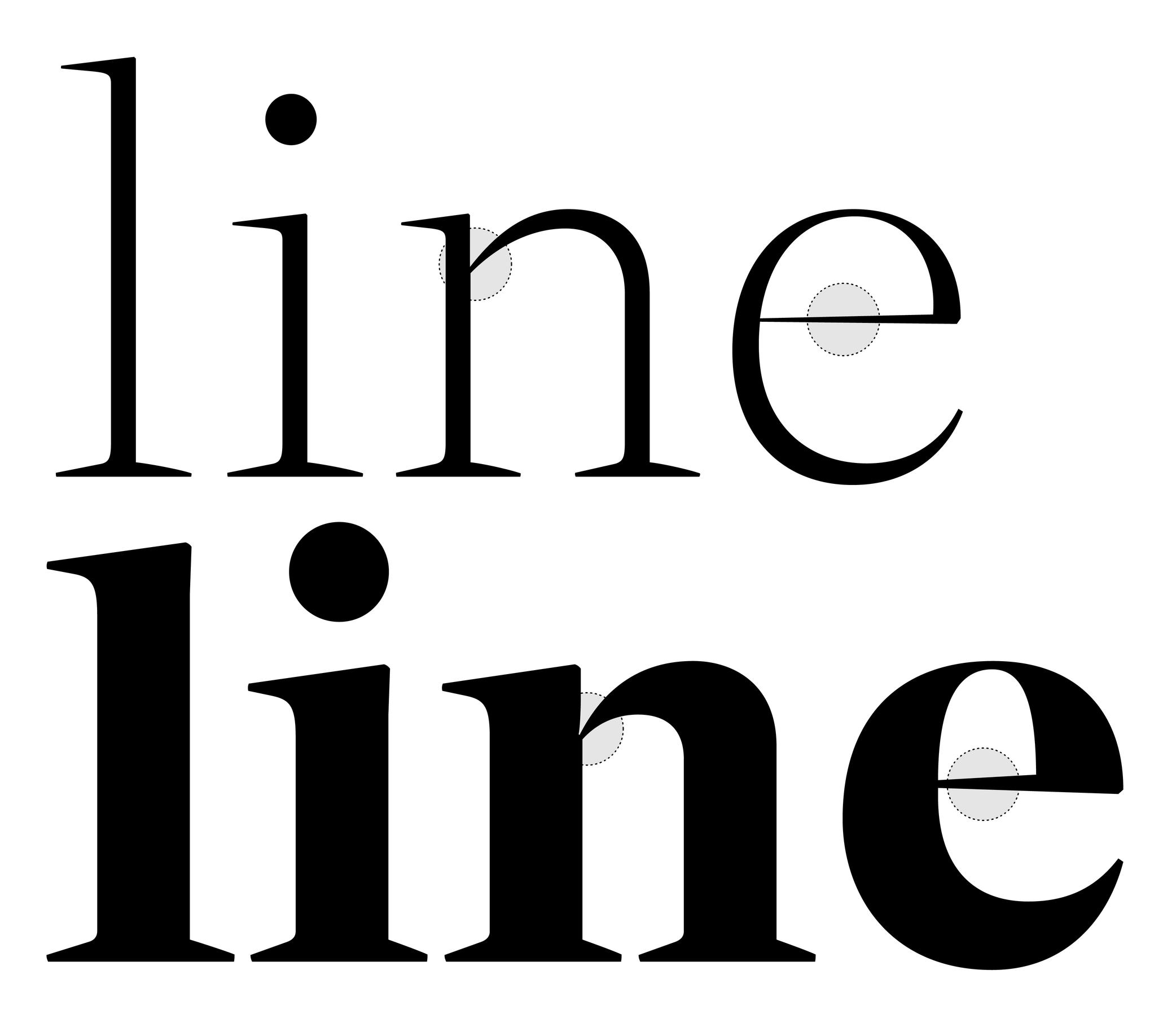
Junction
 (Read More)
Many terms are borrowed from architecture or human and animal anatomy to designate and describe parts of letters and other characters. We even speak of type design anatomy.
The junction is the meeting point of two strokes.
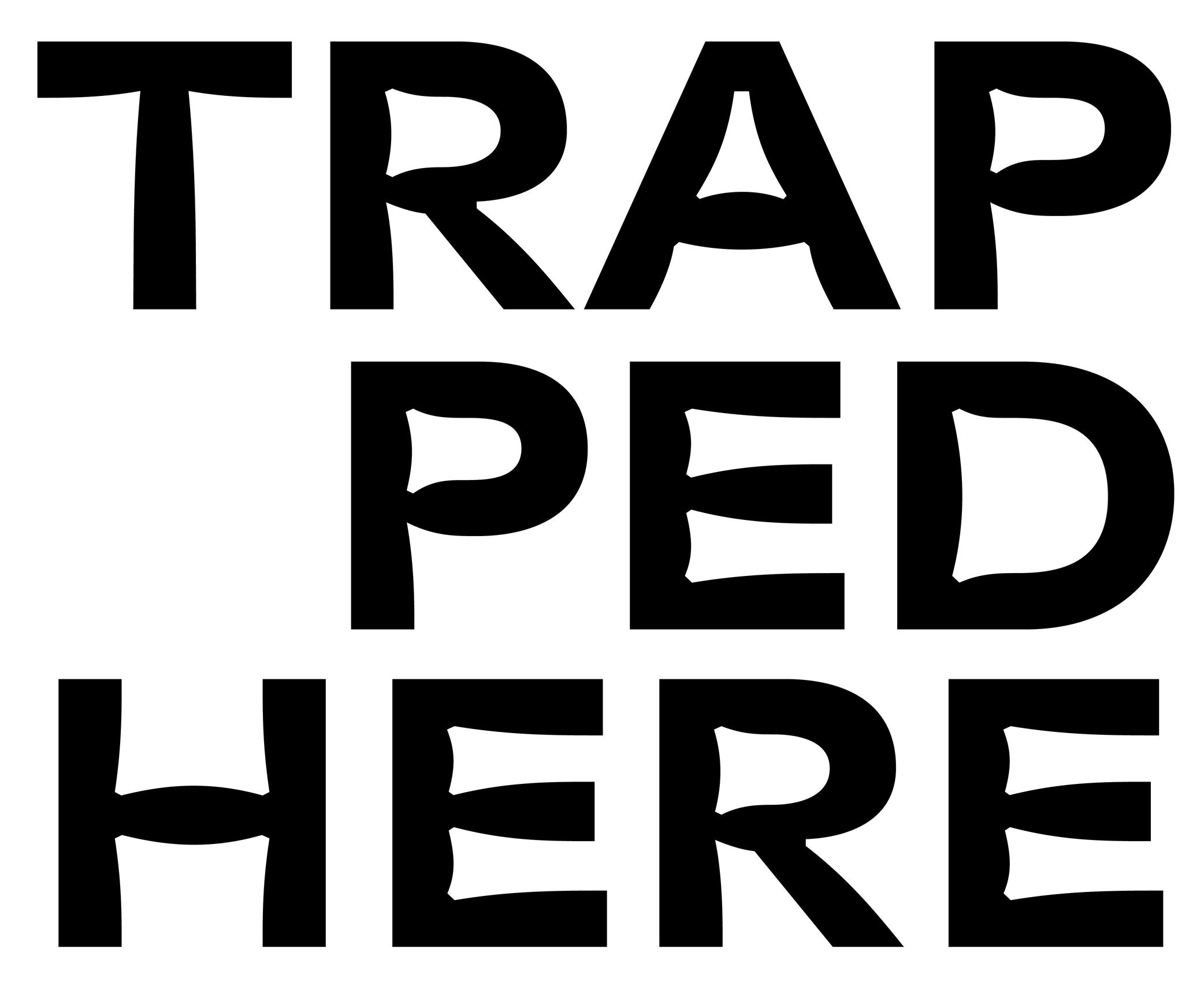
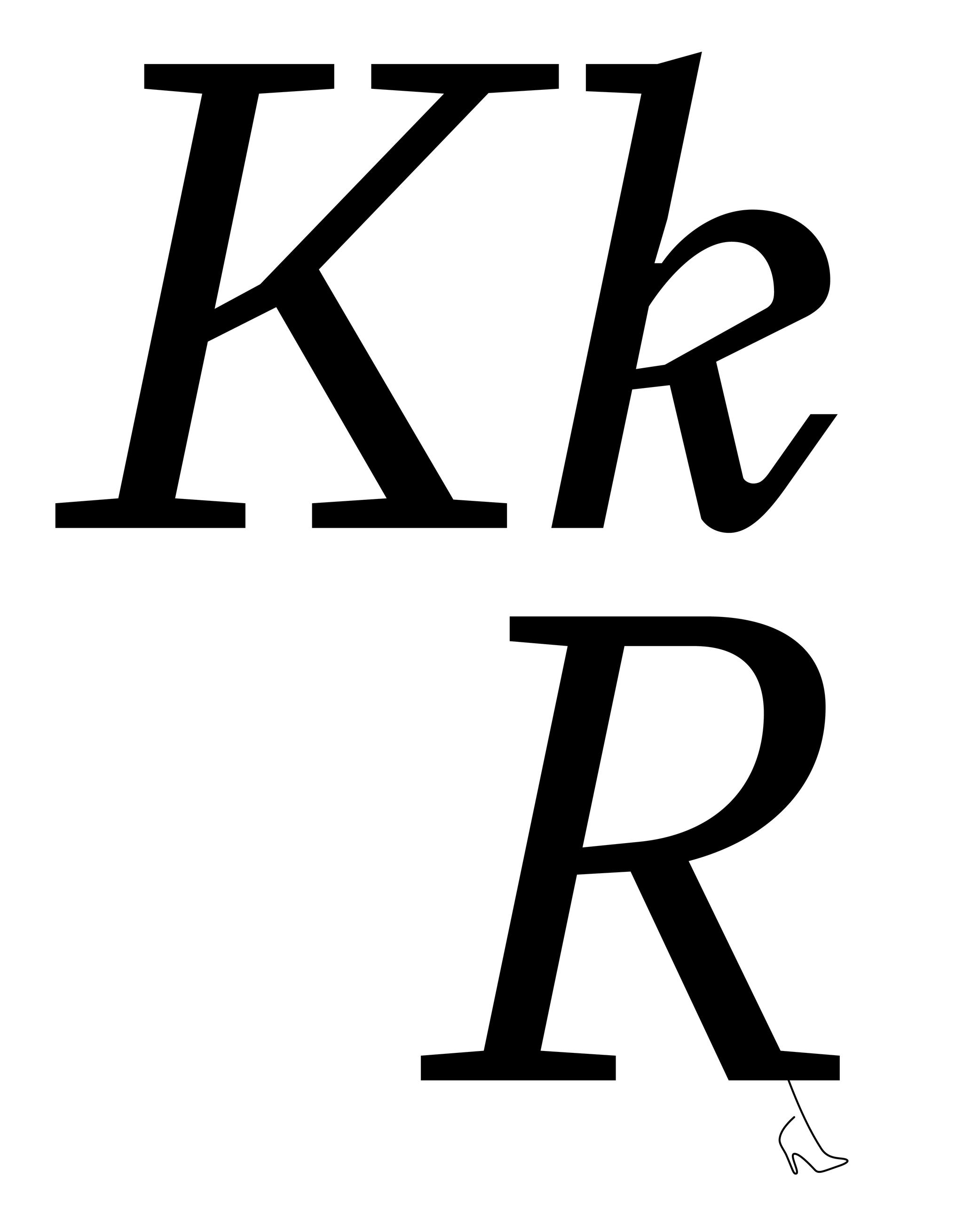
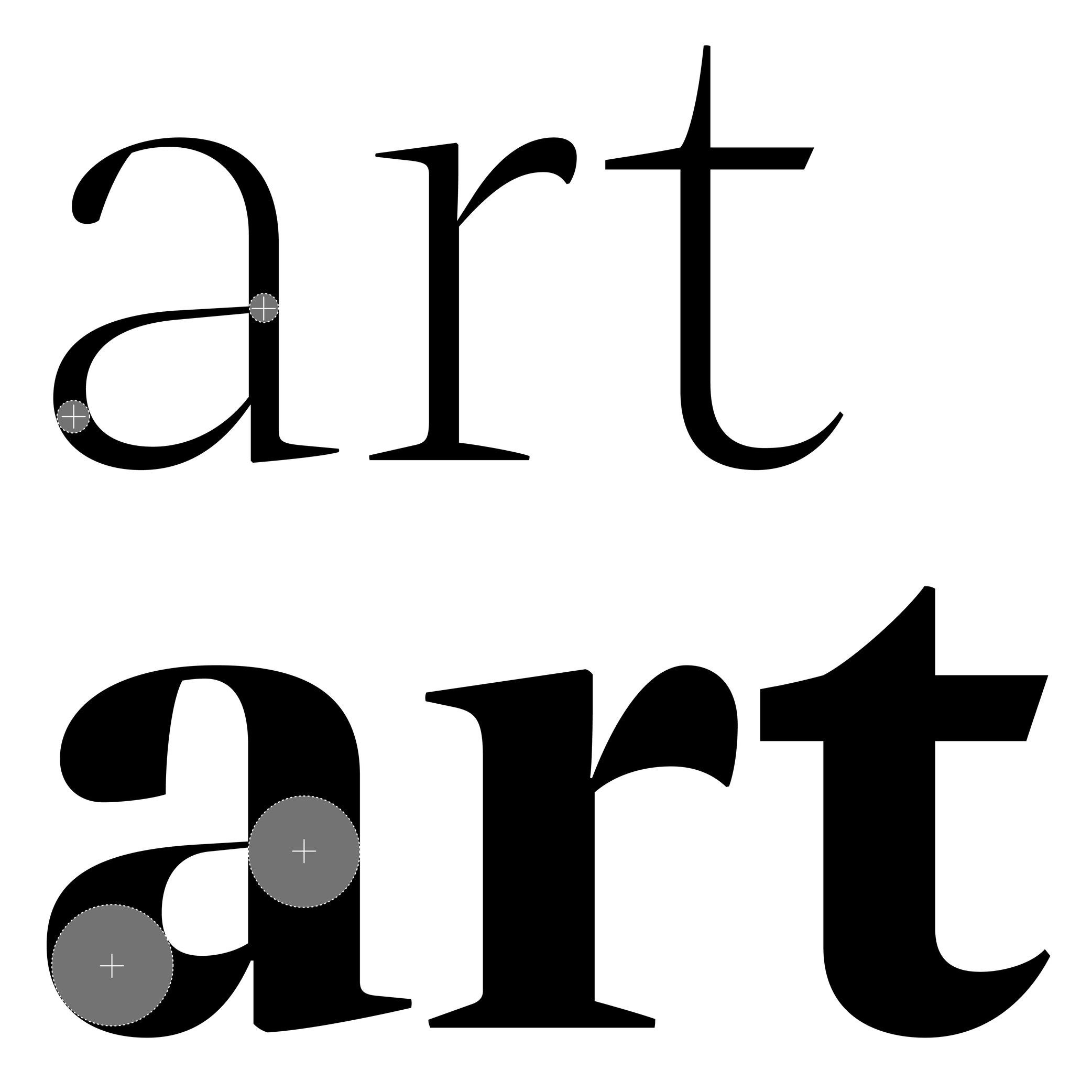
Leg
Sponsored by Type Together . Typeface in use: Aeroplan , designed by Nina Faulhaber, 2023.
(Read More)Many terms are borrowed from architecture or human and animal anatomy to designate and describe parts of letters and other characters. We even speak of type design anatomy.
In Latin script, the leg is the lower diagonal stroke of letters like R, k or K.
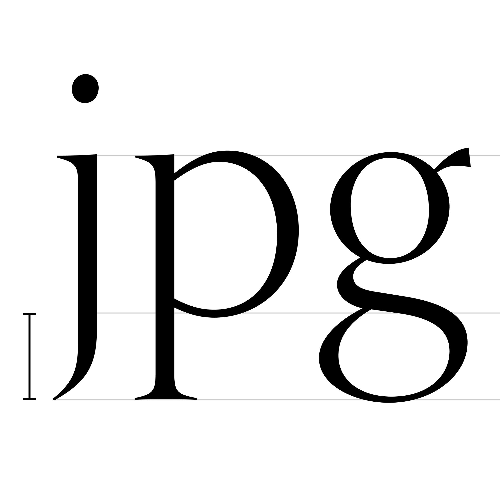
Ligature
Sponsored by LO-OL . Typeface in use: Kronik Antik Display, designed by Loris Olivier, 2023.
(Read More)In the era of metal-type printing, some character combinations in specific languages were used so often that they were combined to save time while composing texts. Punchcutters would ensure that one sort from the font would depict both letterforms together. We call these individual sorts with more than one letterform a “ligature.”
Other ligatures weren’t made because of the need to save time but because a series of letterforms would otherwise appear in a non-aesthetic manner on the page. One example of this is the f and i. Without a ligature, the white space between those two letters would be bigger than between other lowercase letters. Plus, the upper terminal of the f would be too close to the dot of the i.
The same principle has been kept in digital typefaces and ligatures exist as independent glyphs. OpenType features allow us to switch from two separated glyphs to their ligature variant thanks to the ligature alternate features (if they exist in the selected typeface).
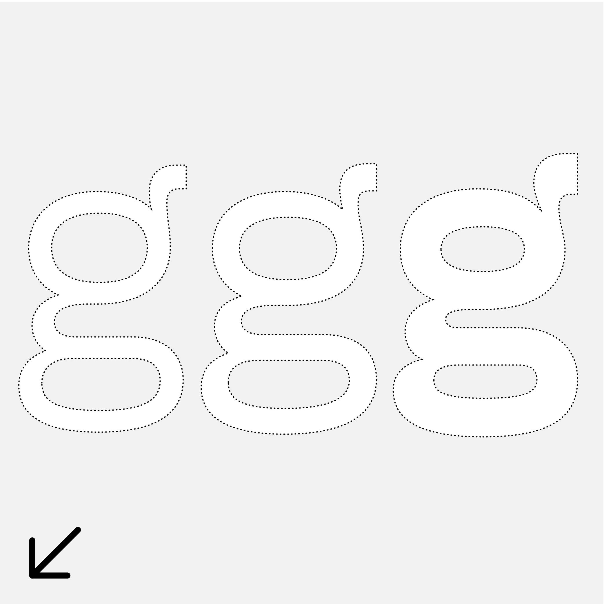
Loop
Sponsor Word of Type and feature your typeface in this card with a linked caption. Contact us for more information.
(Read More)Many terms are borrowed from architecture or human and animal anatomy to designate and describe parts of letters and other characters. We even speak of type design anatomy.
In the Latin script, a loop is the lower part of a double-story g, looking like a loop, open or closed.
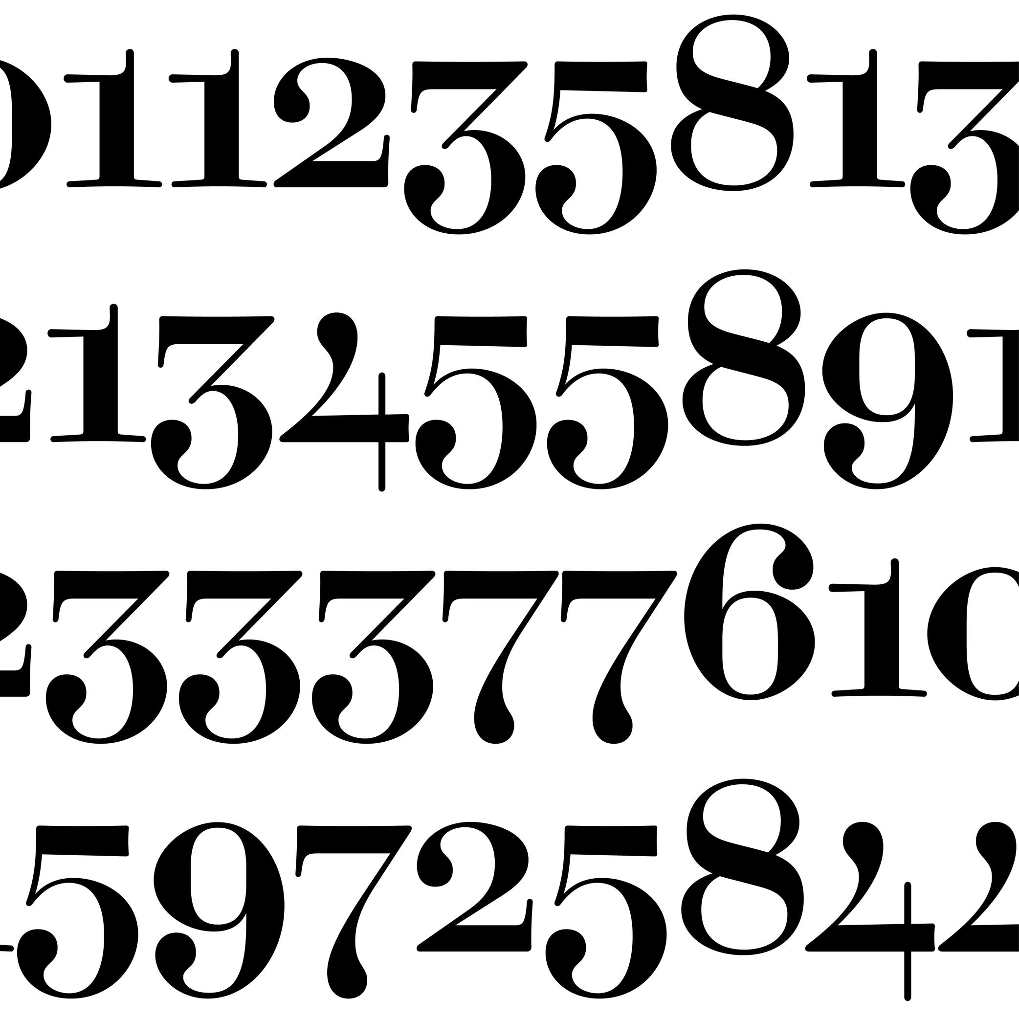
Oldstyle Figures
Sponsored by Dinamo . Typeface in use: Daily Scotch , designed by Fabian Harb and Michelangelo Nigra, 2024.
(Read More)DESCRIPTION
Oldstyle figures are designed to fit with the design of lowercase characters. They are more often used in texts as they visually blend in better than the other figure variants.
HISTORY
The proportions of oldstyle figures are closely related to how they were written in calligraphy using similar strokes and movements as those of the (lowercase) letters.
“Oldstyle” used to have a typographic meaning of its own. It was a 19th century/early 20th century term for revivals of Renaissance serif faces after British printers got bored of Bodoni/Didot/Scotch/etc., and particularly referred to revivals of types those from Venice, Paris, and Caslon’s much later roman. Some typefaces had “Old Style” in their name to signify this.
EVOLUTION
Oldstyle figures are also called “traditional” figures in some languages, as more modern styles came later on (hence the name identification) as better adapted forms to specific situations: tabular, lining or proportional figures. In digital typefaces, several style sets of figures are available and can be accessed via the alternate sets.
Overshoot
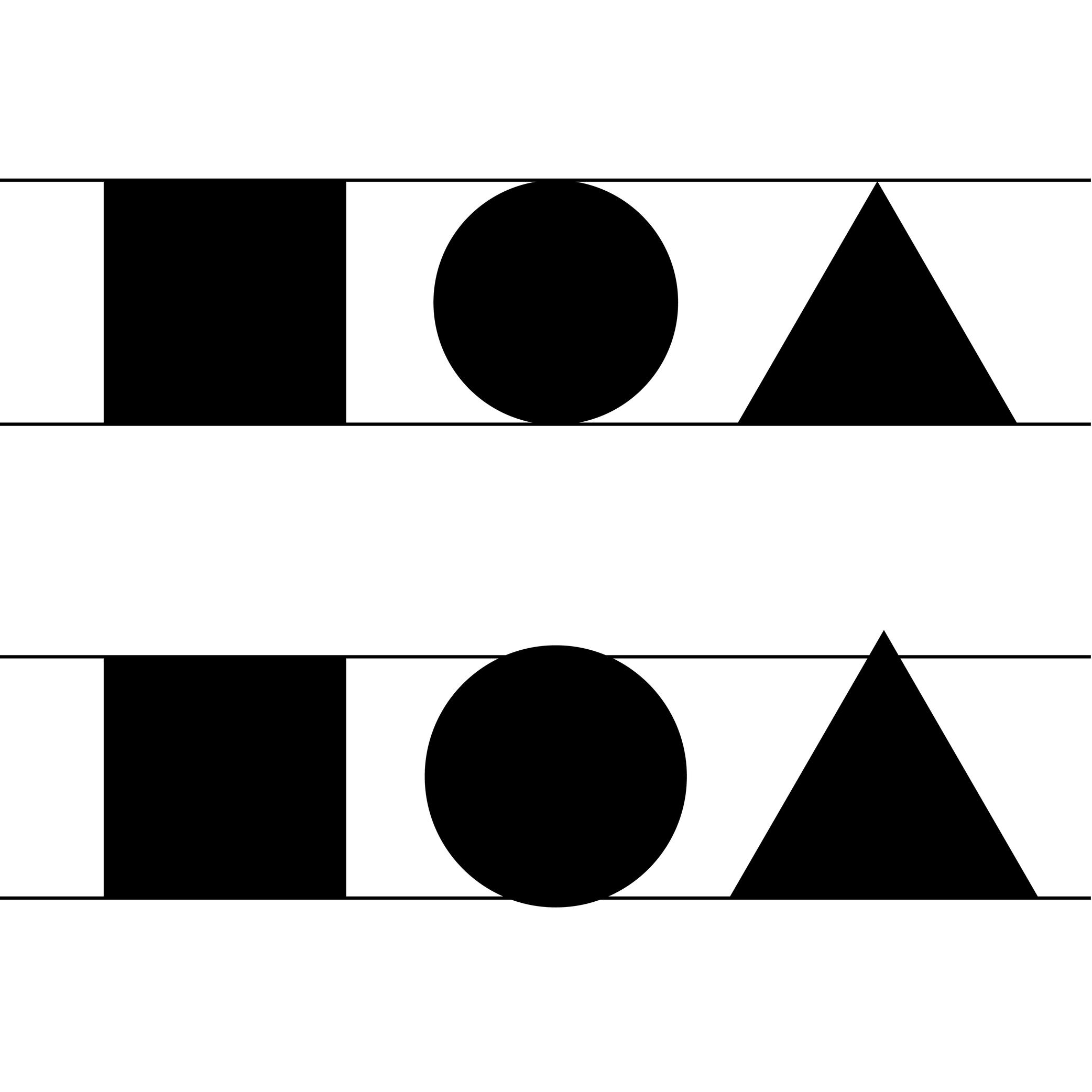
Illustration: Words of Type.
(Read More)Overshoot refers to the slight extension of curved or pointed glyph parts beyond a given height or alignment guideline (such as the baseline, x-height, or cap height).
For example:
• the round part of O often extends slightly above the cap height and below the baseline.
• the pointed part of A might go a tiny bit above the cap height.This is done optically, so that curves and points can appear visually aligned with the flat shapes (such as H or E) even if—mathematically speaking—they go beyond past the guidelines. Without overshoot, rounded or pointed shapes would appear smaller or misaligned to the eye.
FONT ENGINEERING HINT
Overshoot values are used in hinting and can also be reflected in font metrics (such as vertical alignment zones) to ensure consistent rendering across sizes and platforms. On a small pixel grid, overshoot can make curved and flat segments appear uneven. Hinting instructs rasterizers up to which size the overshoot should be suppressed, so curves and flat parts appear visually even at any sizes, and allows it to be restored at larger sizes where the difference is no longer visually noticeable.
In the .otf font format files, the overshoots are stored as BlueValues and OtherBlues in the CFF (Compact Font Format) table. This is because these guidelines are often represented as areas colored in blue in font editors. In .ttf files, the overshoots values are stored in the cvt (Control Value Table) table.
Serif
Illustration: Raven Mo .
(Read More)DESCRIPTION
Serifs are elements at the tips of strokes in serif style typefaces.
HISTORY
The origin and evolution of serifs differ in different scripts and don’t even exist in others.
For the Latin script, serifs come from the combination of the movements of the brush when writing Roman capital letters (the origins of the Latin alphabet) and stone carving techniques.EVOLUTION
Calligraphy, metal and wood type printing, photo composition, typewriters, digital typefaces, all of these tools and techniques contributed various shapes and presence (or absence) or serifs among the various typeface styles that we see today.
The positioning of serifs in each letter has been defined by the writing ductus combined with the tools use. For example, the general rule is that serifs should be on both sides at the top and bottom of vertical stems for upright letters, and none on the bottom of italic stems.
There are multiple possibilities for the shapes of serifs: thin, thick, long, short, wedged, squared, triangular, etc. Many typeface styles have a particular serif shape as part of their characteristics.
IMPRESSION
In Latin script, different impressions and feelings are associated with specific typeface styles (traditional, luxurious, casual, elegant, etc.), which are mainly due to the circumstances of their creation, usage preferences, and habits.
For example, humanist or transitional serifs are the go-to styles for long reading uses.DESIGN
For styles where serifs are on both sides of the stems, some asymmetrical letters (such as f, r, F or P) have a large opened counter on one side. To compensate for the imbalance created by the “empty space”, the designer can adjust the serif on that side by making it longer.
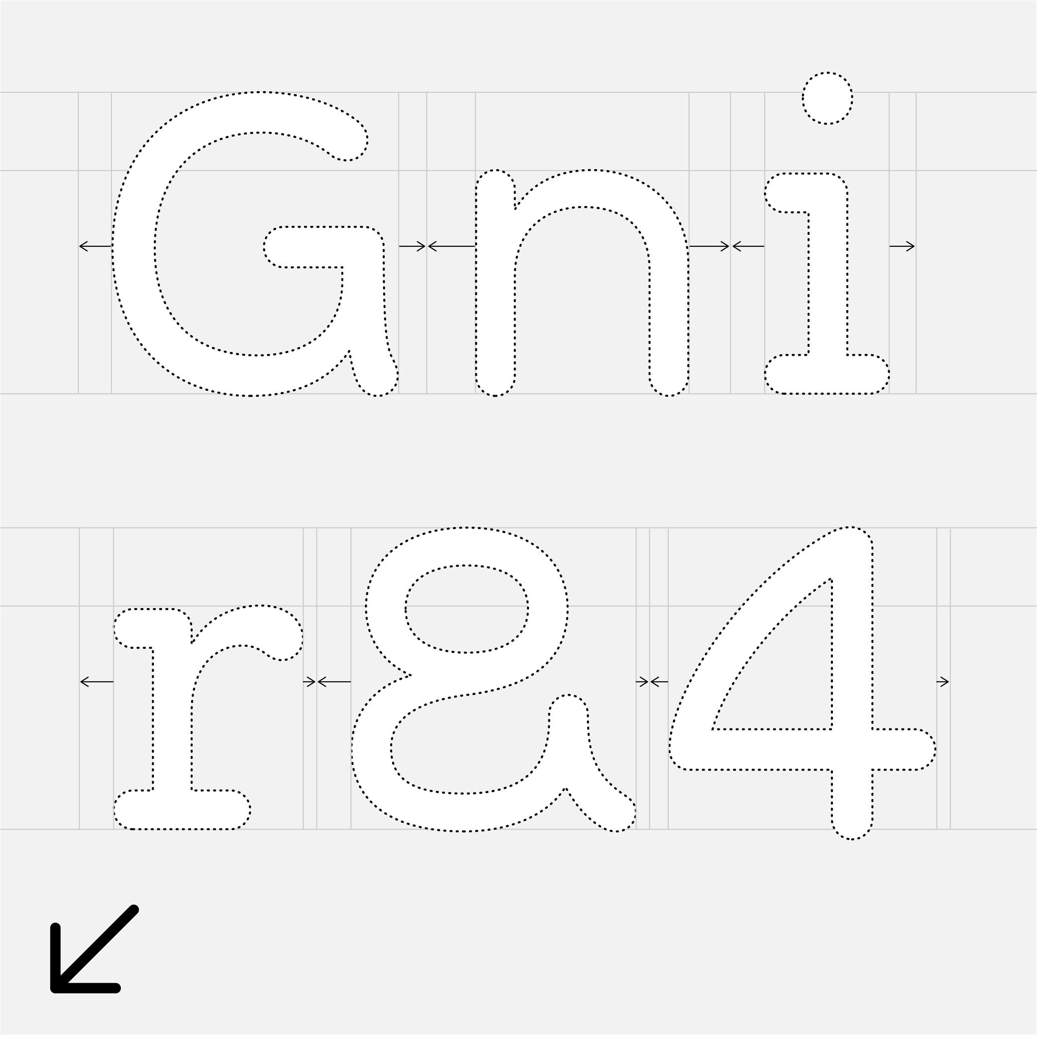
Side Bearings
Sponsor Word of Type and feature your typeface in this card with a linked caption. Contact us for more information.
(Read More)A side bearing is the space outside a glyph’s outline, measured from the outline’s extreme points to the side of its body frame, and it controls the spacing to adjacent glyphs. In horizontally written scripts, each glyph has a left side bearing (LSB) and a right side bearing (RSB). Adjusting side bearings is essential for managing the overall rhythm and spacing of a typeface.
FONT ENGINEERING HINT
• Side bearing values are stored in the hmtx table for horizontal metrics.
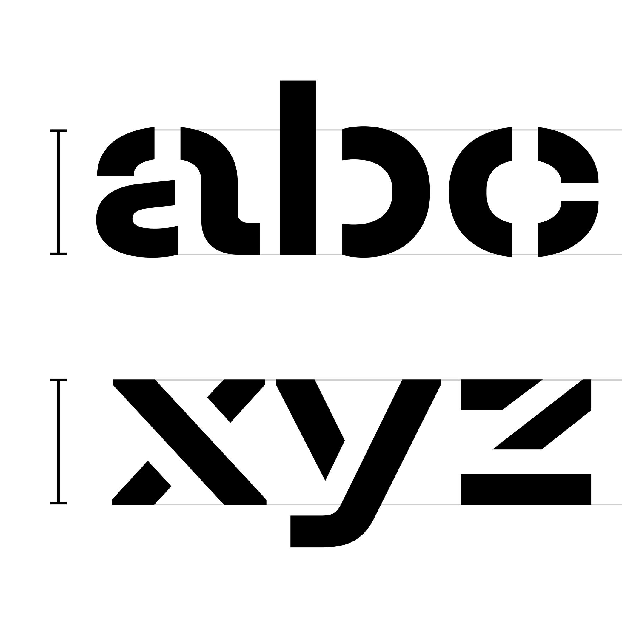
• The advance width of a glyph is calculated as the sum of its glyph bounding box width, plus its left and right side bearings.Single or Double Storey
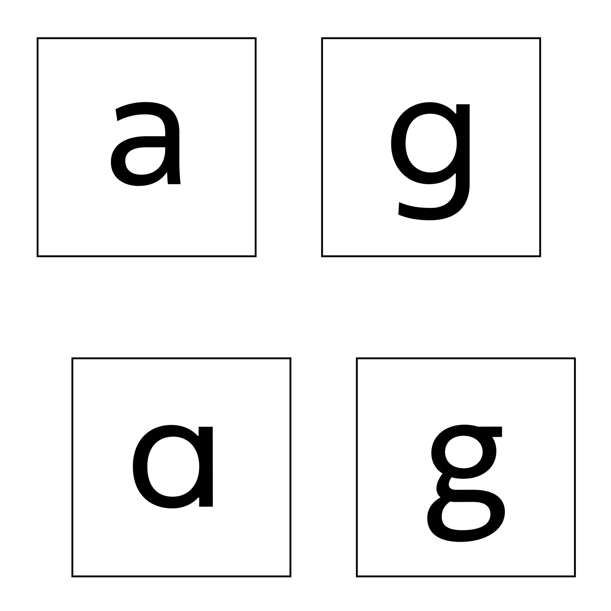
Sponsored by Typotheque . Typeface in use: Zed Text , designed by Peter Biľak, 2024.
(Read More)Latin letters a and g can be represented with two different constructions:
- single storey, for modern and/or geometric styles;
- double storey, for traditional and/or classical styles.
In some typefaces, both constructions are available, as designers feel that some users prefer one over the other.
The letter g can also be designed with a half storey construction, often seen in Scandinavian designs as a legacy from Danish street signs.
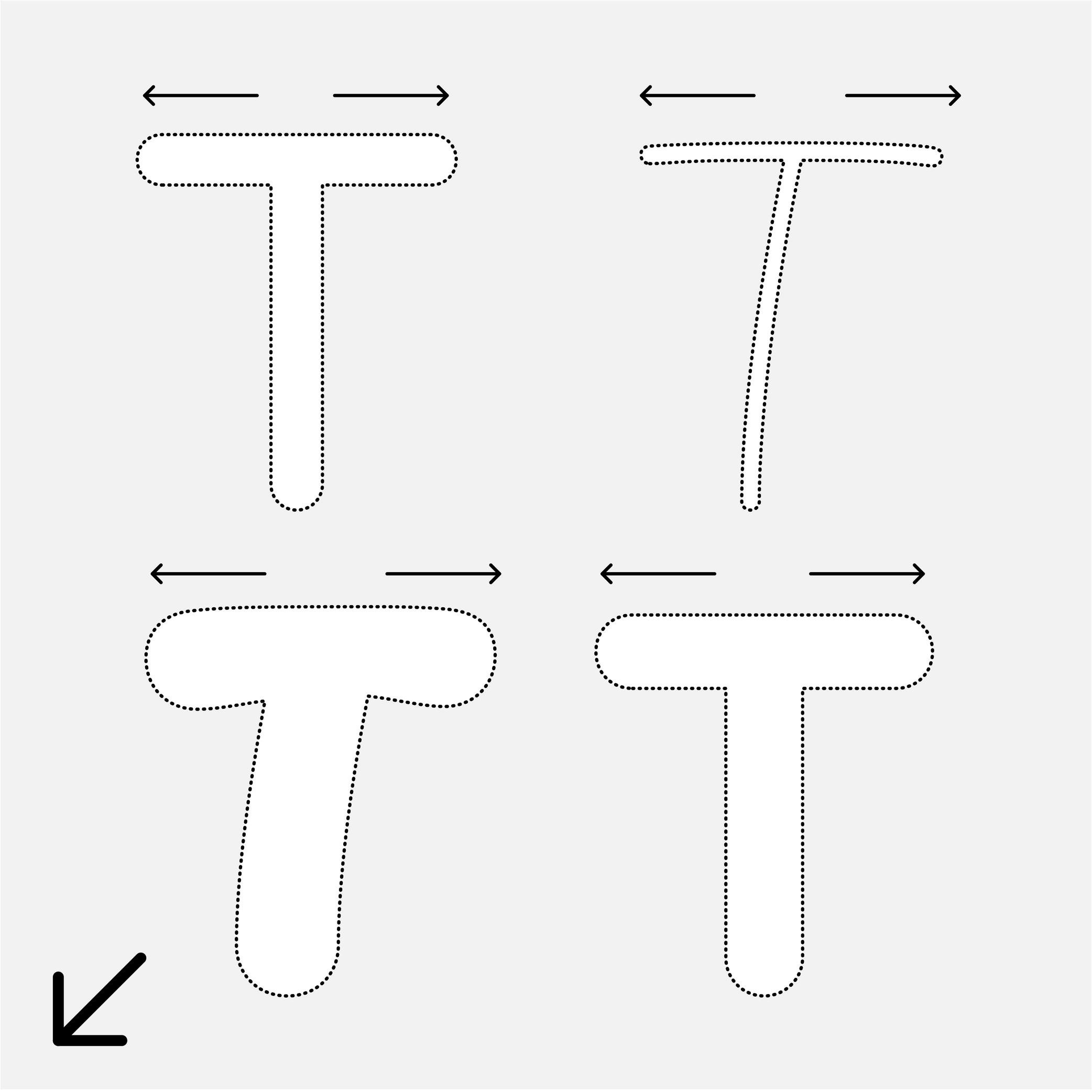
Skeleton
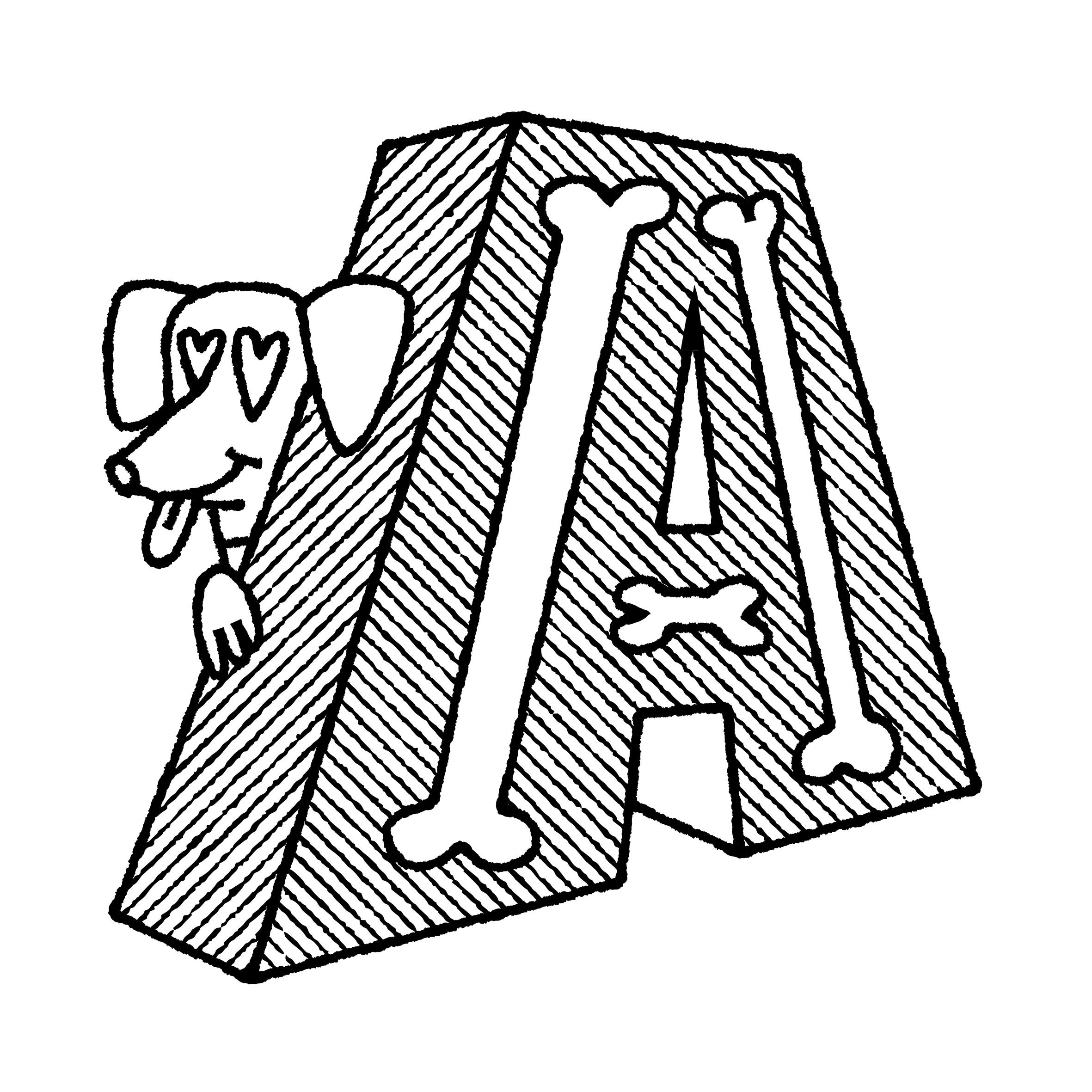
Illustration: Pauline Fourest (Spaghetype ).
(Read More)Many terms are borrowed from architecture or human and animal anatomy to designate and describe parts of letters and other characters. We even speak of type design anatomy.
The skeleton is the center line around which every part of a glyph is built (weight, contrast, curvature, terminals, etc.). Keeping the skeleton the same across multiple styles of one typeface family is, by definition, keeping the same structure, which is one of the principal ways to maintain design consistency.
Spacing
Sponsored by Production Type . Typeface in use: Media Sans , designed by Jean-Baptiste Levée, 2018.
(Read More)Spacing is the space around a glyph, defined by its side bearings (on the left and right side for a script written horizontally). Managing side bearings values is also referred as “managing the spacing.”
It controls the distance between glyphs and helps yo maintain a consistent rhythm and legibility once set in texts, making it an important aspect of a typeface’s quality.Spacing can be adjusted manually, or with the help of coding scripts. Glyphs with similar shapes are often grouped into groups so their side bearings can be adjusted collectively: for example, o, d, c, e, q can often share the same left side bearing group. This ensures consistency and speeds up the spacing process across a typeface.
FONT ENGINEERING HINT
Side bearing values are stored in the hmtx (Horizontal Metrics) table for scripts written horizontally, and in vmtx (Vertical Metrics) for scripts written vertically.
Spine (in type design)
Sponsor Word of Type and feature your typeface in this card with a linked caption. Contact us for more information.
(Read More)Many terms are borrowed from architecture or human and animal anatomy to designate and describe parts of letters and other characters. We even speak of type design anatomy.
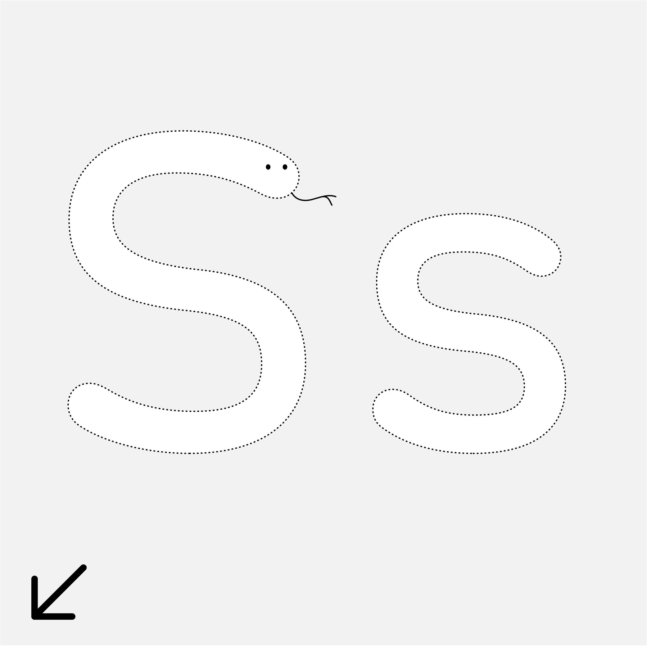
In the Latin script, the spine is the middle curve segment of characters like s or S.
Stem
Sponsored by Blaze Type . Typeface in use: Rules , designed by Matthieu Salvaggio, Léon Hugues, Tim Vanhille, and Guido Ferreyra, 2024.
(Read More)Many terms are borrowed from architecture or human and animal anatomy to designate and describe parts of letters and other characters. We even speak of type design anatomy.
In many writing systems, a glyph’s stem refers to its vertical bar(s) or stroke(s).
Stroke
Sponsored by R-Typography . Typeface in use: Flecha , designed by Rui Abreu, 2019.
(Read More)Letters, characters, and other glyphs are written with strokes. Their shapes and writing direction come from how they were traced by hand with the many tools humanity used for writing.
Structure
Sponsored by Blaze Type . Typeface in use: Fusion Neue , designed by Matthieu Salvaggio, Tim Vanhille, and Ferdinan Del Fabro, 2024.
(Read More)Every glyph of every writing system follows a specific structure for its parts (positioning of the strokes in relation to each other). People reading words and texts in a given script would recognize the glyphs (letters, characters, symbols, etc.) if their structure follows a convention that is familiar to all of users.
Due to the evolution of each script, the structure can change over time (e.g., Fraktur styles), or have multiple variants (e.g., single and double storey a).
Swash
Sponsored by Blaze Type . Typeface in use: Sigurd , designed by Matthieu Salvaggio and Léon Hugues, 2021.
(Read More)Swashes are the elongated extensions of letters, designed with longer strokes than their “usual” construction, most generally as a decorative feature and/or in display style typefaces.
HISTORY
They appeared during the metal type era in the Latin world, when swashed letters served as decorative features to the text. They were also a way to showcase the punch-cutters’ skills, sometimes with incredibly long and elaborate swashes.
Swashes still have the same purpose today in digital typefaces, where “normal” letters are the default ones and swashes can be activated as alternates from the typefaces’ features (if available).Tail
Sponsor Word of Type and feature your typeface in this card with a linked caption. Contact us for more information.
(Read More)Many terms are borrowed from architecture or human and animal anatomy to designate and describe parts of letters and other characters. We even speak of type design anatomy.
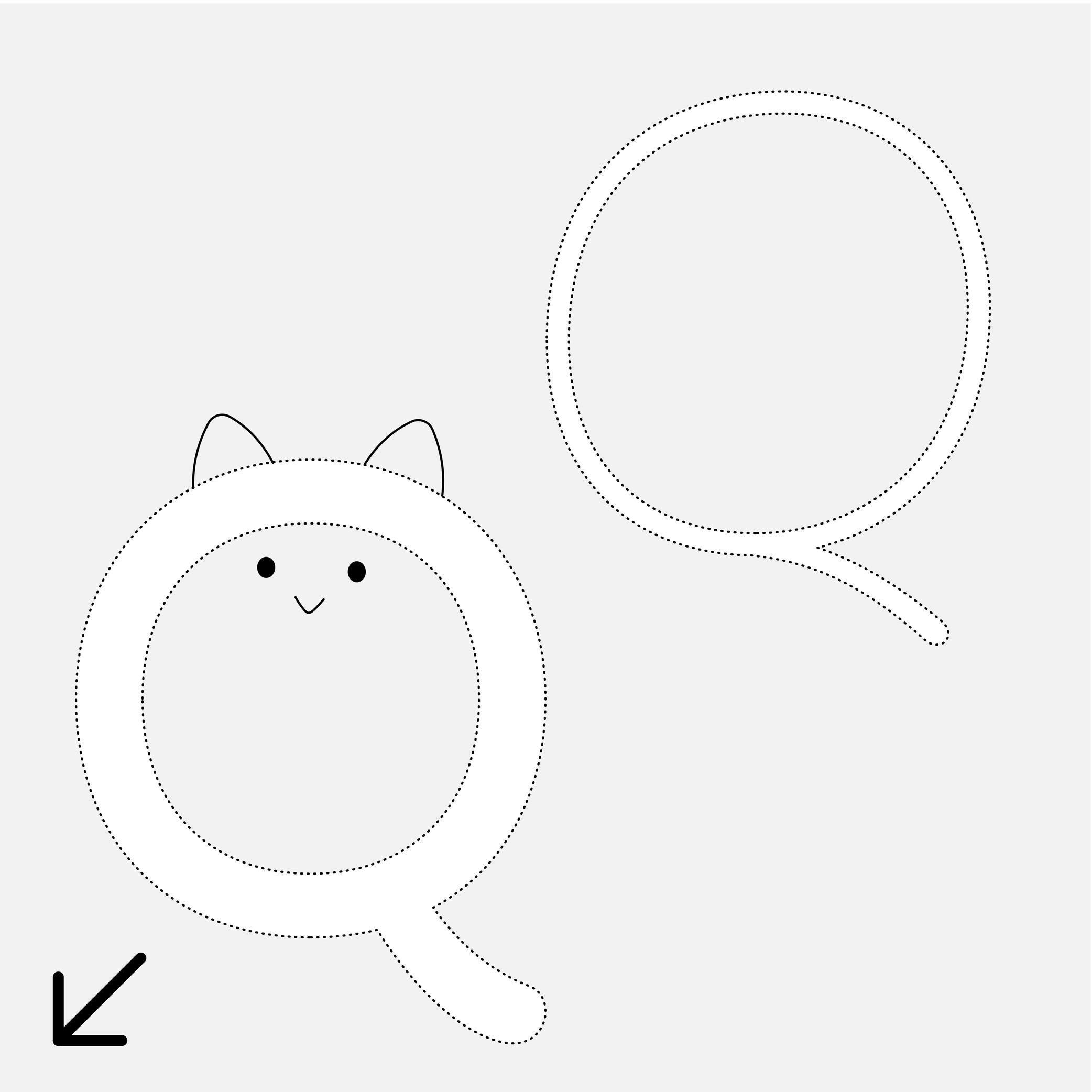
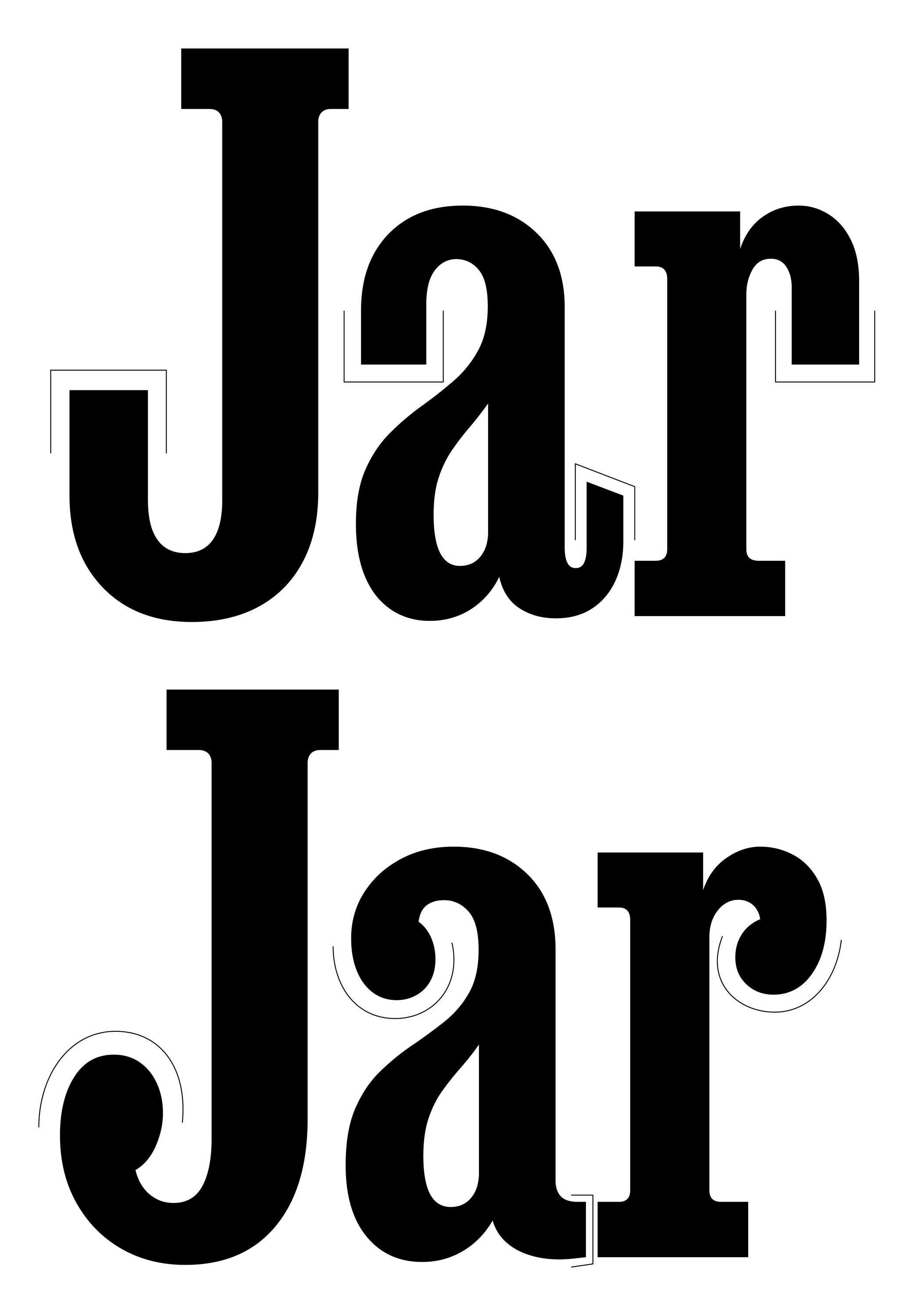
In the Latin script, the tail is a terminal part at the bottom of letters like t, y or Q.
Terminal
Sponsored by DJR . Typeface in use: Job Clarendon , designed by David Jonathan Ross, 2023.
(Read More)Many terms are borrowed from architecture or human and animal anatomy to designate and describe parts of letters and other characters. We even speak of type design anatomy.
The terminal of a character is its very last part, according to its ductus. The shape of the terminal can vary depending on the style of the typeface, with names that ‘feel’ most suited to its shape (drop, ear, serif, etc.).
Thick
 (Read More)
The thickest part(s) of a glyph is called the thick. The opposite is the thin, and the relation between thick and thin is called the contrast.
Thin
 (Read More)
The thinnest part(s) of a glyph is called the thin. The opposite is the thick, and the relation between thick and thin is called the contrast.
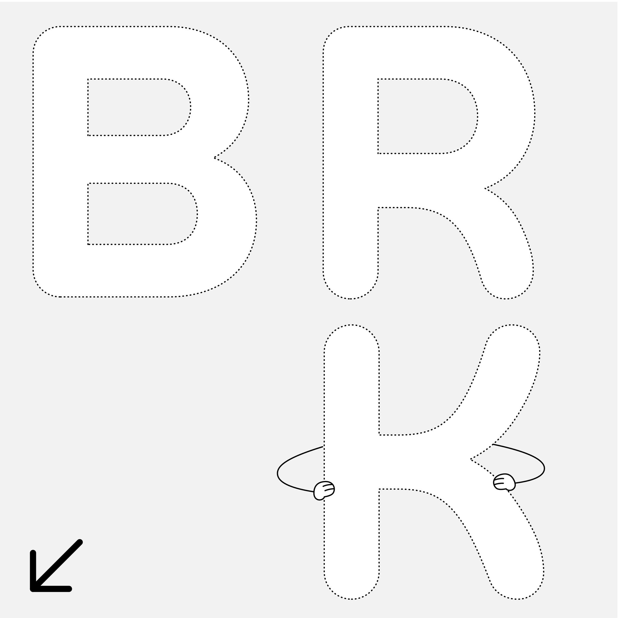
Waist
Sponsor Word of Type and feature your typeface in this card with a linked caption. Contact us for more information.
(Read More)Many terms are borrowed from architecture or human and animal anatomy to designate and describe parts of letters and other characters. We even speak of type design anatomy.
In the Latin script, the waist is the middle part of letters like B or R, where the stroke’s connection shapes a narrower part.
White Space
Sponsor Word of Type and feature your typeface in this card with a linked caption. Contact us for more information.
(Read More)A white space is any part of a glyph that is not of the glyph itself. They can be counters (inside), spaces, or negative space (outside).
x-Height
Sponsored by TypeMates . Typeface in use: Halvar Stencil Breitschrift , designed by Paul Eslage, Jakob Runge, Lisa Fischbach and Nils Thomsen-Haberman, 2019.
(Read More)The x-height is the guideline placed at the top of the Latin letter x.
It helps to align the other lowercase letters and to set the proportions with uppercase letters and the ascenders.
Because the letter x is the only lowercase letter without ascenders and horizontal tips at its top and bottom (it has no overshoots), it is the reference letter for lowercase height.