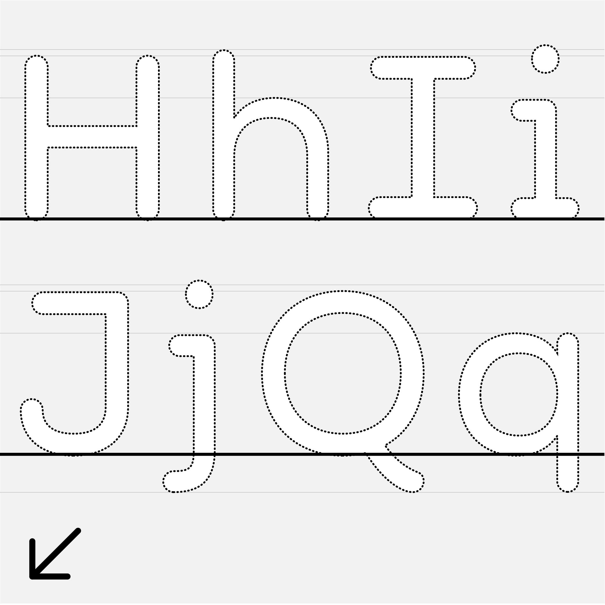
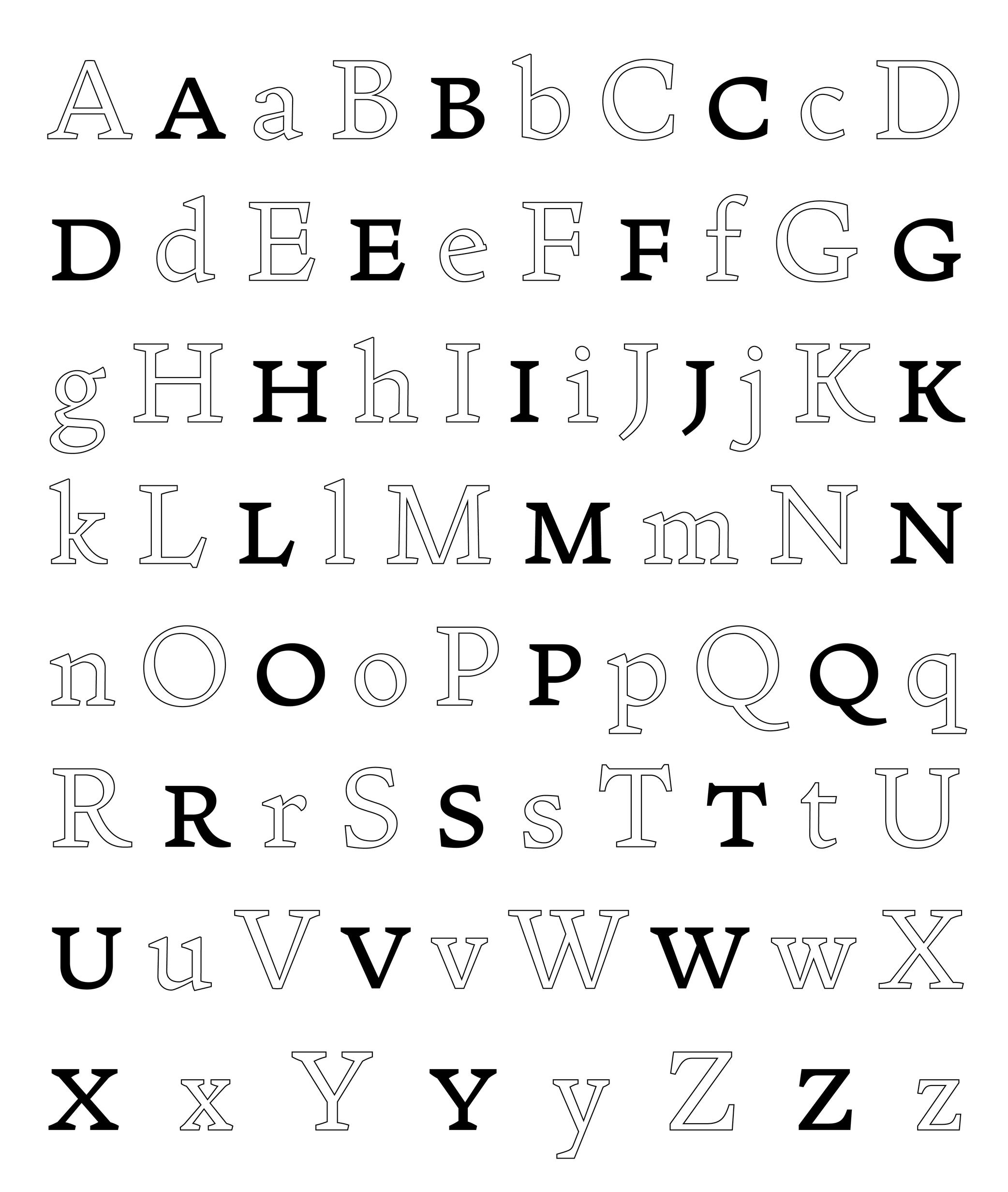
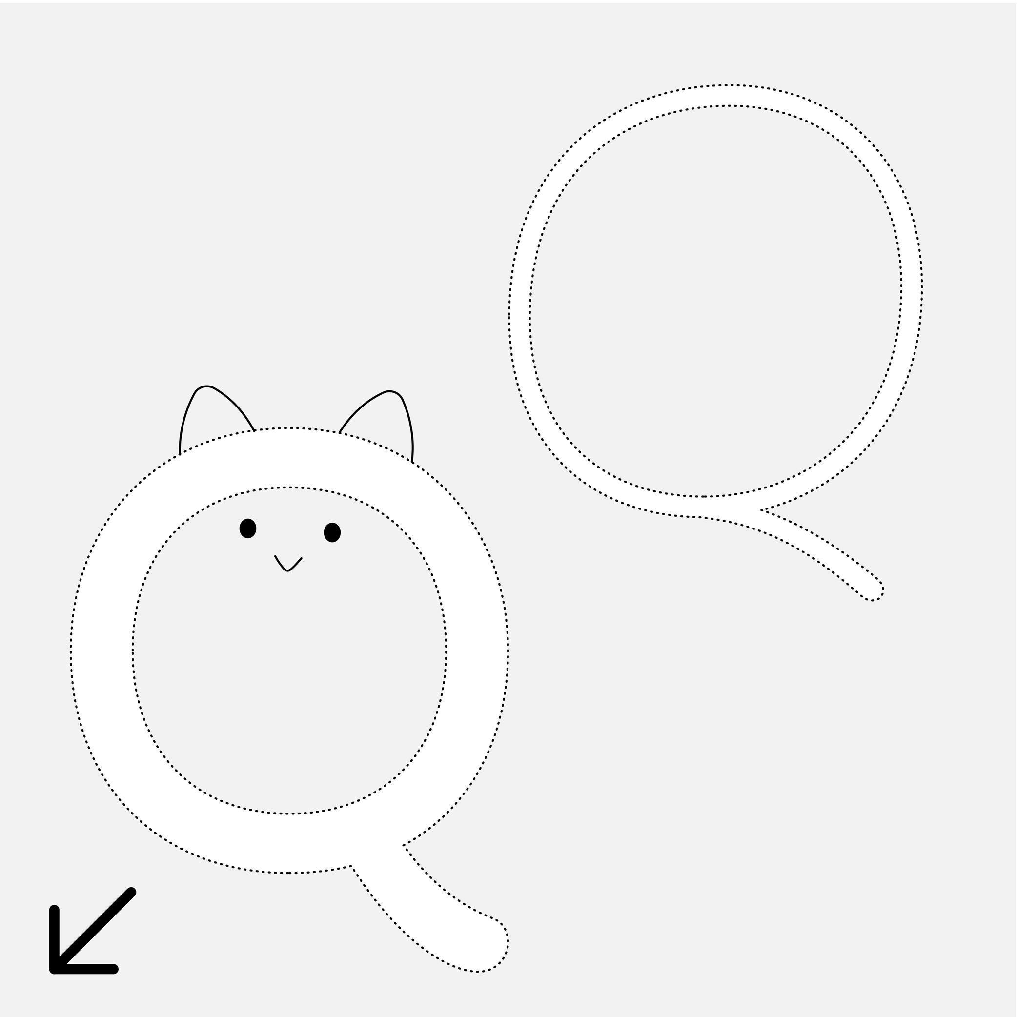
Alphabet
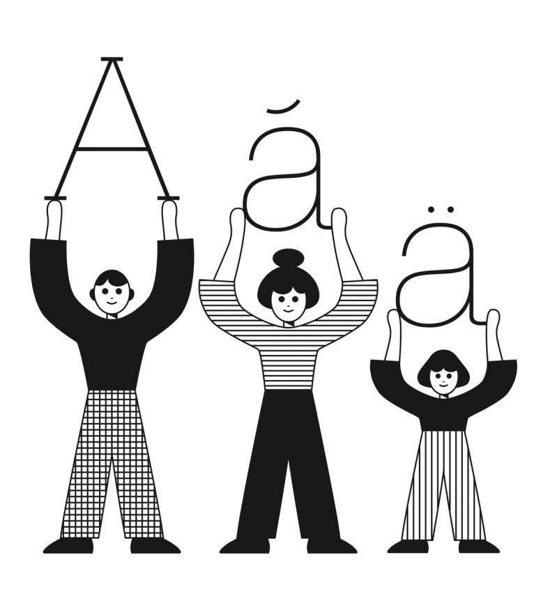
Illustration: James Graham .
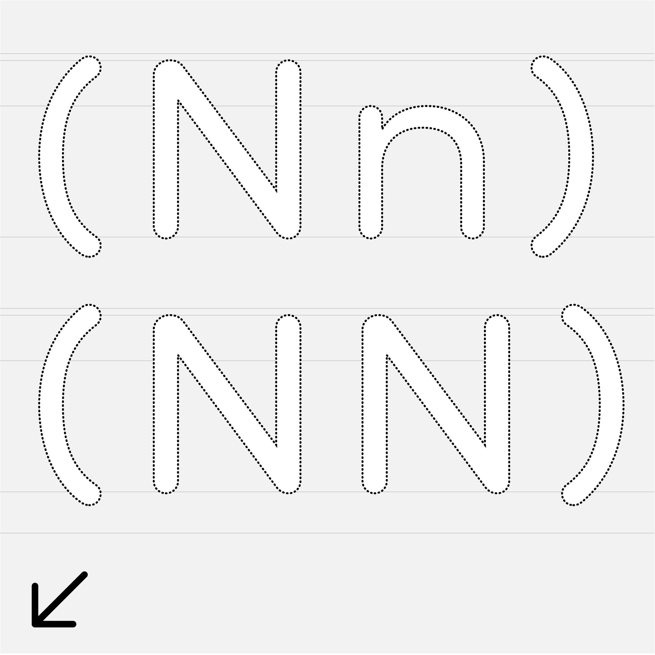
(Read More)An alphabet is a type of writing system that uses a set of letters to represent a language visually. Each letter represents a different sound, and when combined together following a certain order specific to each language, they form syllables, words, and sentences.
Across the world and throughout history, many languages have used alphabetical systems (Greek, Arabic, Hebrew, etc.). As of today, the Latin script is being used for the largest number of languages, with many different sets of alphabets, varying in number of letters depending on the needs of the language (i.e., both English and Spanish use the Latin script, but they have different alphabets).
Alternate (Glyph)
 (Read More)
An alternate is a variant shape of a character, which has to be considered as a glyph of its own.
Alternate glyphs are created for various reasons:
• contextual: such as case-sensitive punctuations, where punctuation symbols can be aligned in a nicer way with capital letters when set within them, or tabular figures if they are used in numeric tables;
• positional: in Arabic or other scripts that have connected characters, a character may need to have different shapes depending on its position in a word (initial, medial, final, isolated);
• stylistic: such as single-story or double-story letters a or g. These alternates can also reflect a specific aesthetic choice (e.g., with or without swashes).
• localization: some languages using a same script as others require a different form of the same character as localized preference variant.In digital fonts, these variants are accessed through OpenType features. Each one is tagged with a specific code (added as an extension to a glyph’s name) that enables a software to apply them whenever needed. Some most used ones being listed below:
• calt : contextual alternates
• case : case-sensitive forms
• ss01, ss02, etc. : stylistic sets
• locl : localized forms
• onum : oldstyle figures
• tnum : tabular figuresAmpersand
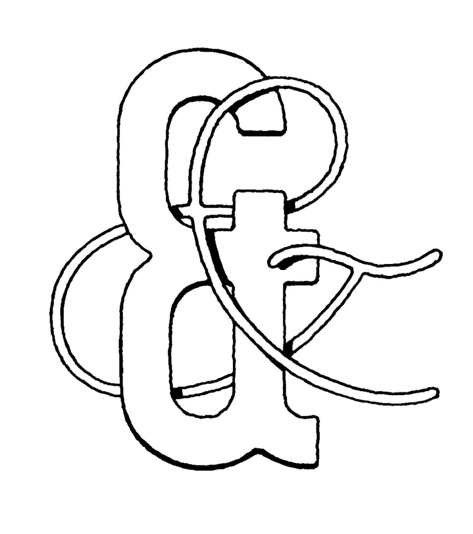
Illustration: Tezzo Suzuki .
(Read More)FUNCTION
The ampersand (&) is a character used in titles, company, or brand names with combined words to replace “and.”
HISTORY
During the Middle Ages in Europe, books were mainly produced to distribute religious texts. For that reason, most texts were written in Latin, even after Gutenberg’s invention of metal-type printing in 1450. The letters e and t (for et meaning “and” in Latin) were used so often that punch-cutters combined the letters to create a single character et, first as a ligature and later as a character on its own.
DESIGN
The ampersand has many design possibilities. The & as we know today is only one out of many designs that have been created, experimented, and used since the introduction of the combination of the letters e and t of metal-type printing. Its top is often aligned with the uppercase and/or figures to give it enough space to be legible.
TYPOGRAPHIC RULES
The ampersand is mostly used as a decorative addition in titles or brands to represent the word “and” (or equivalent in other languages). It is better to use the word “and” in body-size texts.
Aperture
Sponsored by DJR . Typefaces in use: (top) Forma DJR , (bottom) Condor , designed by David Jonathan Ross, 2017.
(Read More)The aperture is the frontier between the counter and the surrounding white space of opened letters (such as a, e or c).
Contemporary typefaces that are meant for long text reading are often designed with a wider aperture (sometimes even without a terminal at the top of a and c) as solutions to increase their legibility at smaller size.
Apex
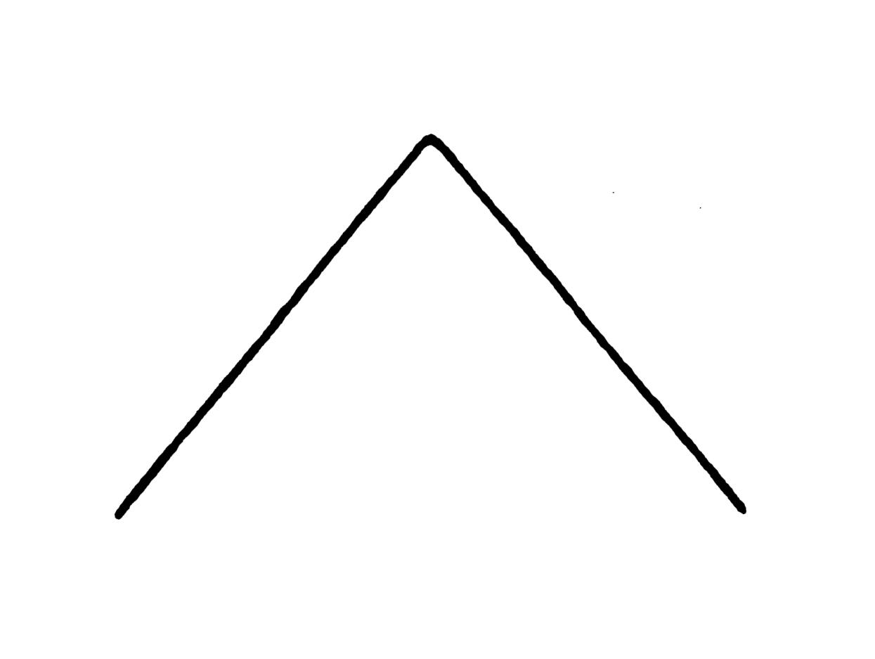
Illustration: Tezzo Suzuki .
(Read More)The apex is the point on the top of a letter where two stems meet, such as the top of the letter A or the middle of w.
We also find the term “vertex,” referring to the top of A as well, but also to other pointed parts such as the base of V or the intersection of K when/if its diagonals don’t meet the vertical stem.
Arch
Sponsored by R-Typography . Typeface in use: Canora Frente and Verso , designed by Rui Abreu, 2021.
(Read More)Many terms are borrowed from architecture or human and animal anatomy to designate and describe parts of letters and other characters. We even speak of type design anatomy.
In Latin script, the arch is the top-right part of letters such as n, m, h and a.
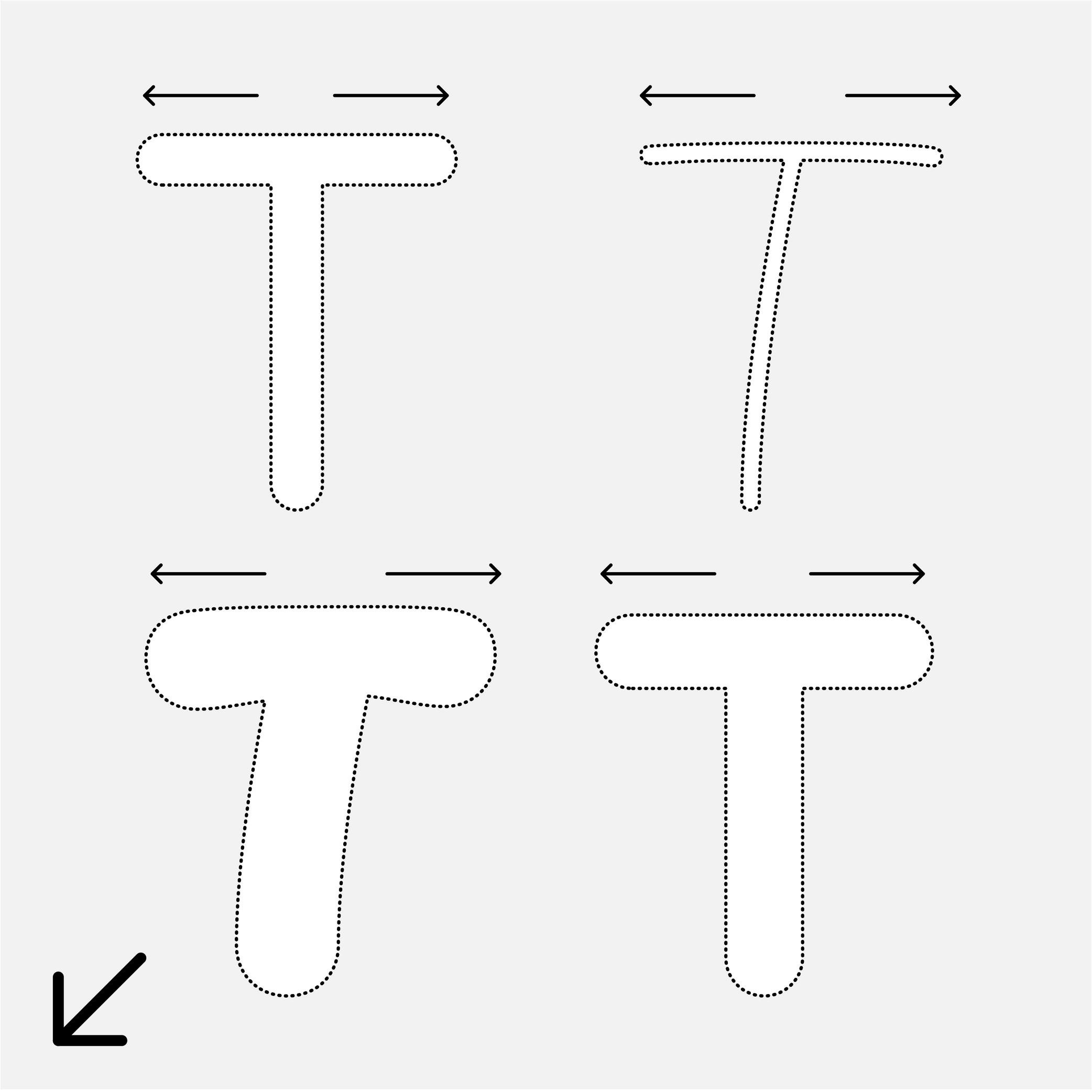
Arm
Sponsor Word of Type and feature your typeface in this card with a linked caption. Contact us for more information.
(Read More)Many terms are borrowed from architecture or human and animal anatomy to designate and describe parts of letters and other characters. We even speak of type design anatomy.
In Latin script, the arm is the horizontal bar at the top of the letter T, as well as the horizontal bars on the E and F.
Ascender
 (Read More)
The parts of lowercase letters that go above the x-height level (such as b, d or h) are called “ascenders.”
On the opposite side of the x-height, the parts going below the baseline are descenders.
Both don’t necessarily need to have the same length. In general, descenders are shorter than ascenders.
Attention: do not confuse ascender height with the capital height (or cap height). Ascenders in Latin script are commonly taller than capital letters.
Baseline
Sponsor Word of Type and feature your typeface in this card with a linked caption. Contact us for more information.
(Read More)The baseline is where the bottom extremity of letters such as n and H are positioned, and it is used as a reference guide for the entire character set. We also say that letters are “sitting” on the baseline.
The baseline—with other guidelines like x-height, ascender, descender and capital height—helps to control the position of all letters and glyphs.
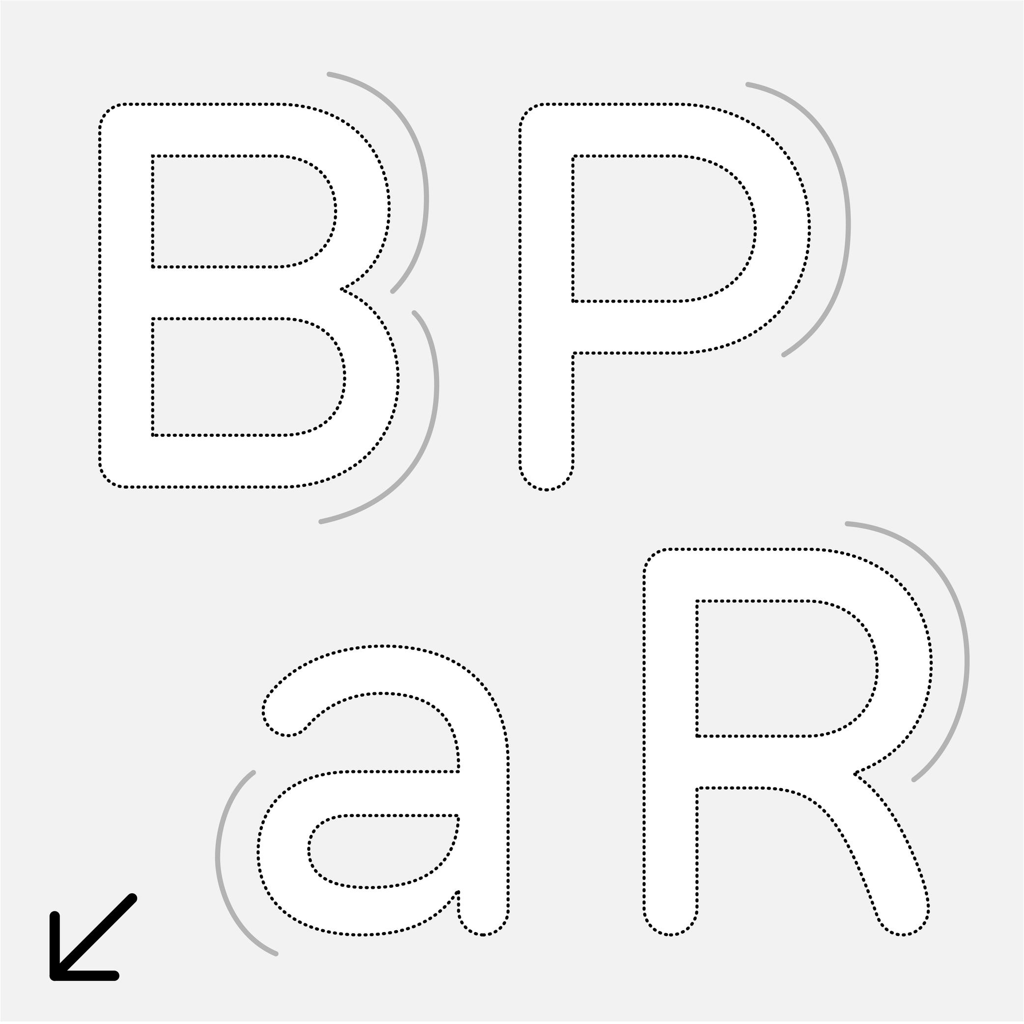
Bowl
Sponsor Word of Type and feature your typeface in this card with a linked caption. Contact us for more information.
(Read More)Many terms are borrowed from architecture or human and animal anatomy to designate and describe parts of letters and other characters. We even speak of type design anatomy.
In the Latin script, the bowl refers to the rounded parts of a letter, like those in a, B, P, R, etc.
Cap Height
Sponsor Word of Type and feature your typeface in this card with a linked caption. Contact us for more information.
(Read More)The cap height (short for “capital height”) is at the top level of square capital letters, such as H.
The cap height is one of the main guidelines for Latin-script typefaces. It is usually lower than the ascender height in typefaces meant to be used at small size. This is also the case for sans serif styles to show a difference between l (lowercase L) and I (uppercase i). In many display styles, the ascenders are the same as the cap height to save some vertical space.
Capitalize
Sponsored by Type Together . Typeface in use: Rezak , designed by Anya Danilova, 2022.
(Read More)Also called to set in All-Caps.
In applications and tools that can process texts, to capitalize is to transform every selected lowercase letter into its capital variant.
FONT ENGINEERING ADVICE
The capitalization button in text editors usually calls several OpenType features: the case sensitive (.case), the capital spacing (.cpsp) and the proportional numbers features (.pnum).
Case Sensitive
Sponsor Word of Type and feature your typeface in this card with a linked caption. Contact us for more information.
(Read More)By default, most punctuation signs and some characters are designed to be combined with lowercase letters because this is the most frequent situation.
When combined with capital letters, some of them need to be adjusted to be optically aligned with the capitals. These variants are required in a good typeface so the user can access enough tools for quality micro-typography. They are called case-sensitive alternates, usually attached with the extension “.case” and accessible or activated on applications supporting OpenType features.
Descender
Sponsored by Frere-Jones Type . Typefaces in use: Empirica , designed by Tobias Frere-Jones, Nina Stössinger, 2018.
(Read More)The parts of lowercase letters (such as p, q or y), old style figures or some punctuation symbols going below the baseline are called descenders.
In the same typeface, all descenders need to have the same height for overall consistency.
On the opposite side, parts going above the x-height are ascenders, like in letters b, d or f.
Both ascenders and descenders don’t necessarily need to have the same length. In general, descenders are shorter than ascenders.
Diacritic
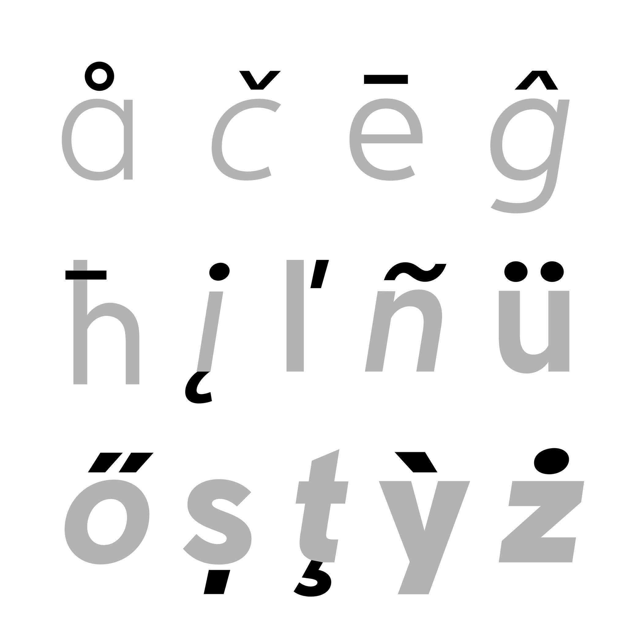
Sponsored by Nymark Type . Typeface in use: Tranemo , designed by Andreas Nymark, 2021.
(Read More)Diacritics are marks added to letters. They can be above, below, or attached to a letter. In most languages and scripts using diacritics, these bring to the letter a different sound than that of the letter by itself.
LATIN SCRIPT
The Latin script is used in a large number of languages. Most of them use diacritics to bring (sometimes very subtle) variations of sound to letters. The quality of the sound of a diacritic can be different from one language to another. An example with the cedilla ç, used in French, Portuguese, and Turkish. Other languages even use multiple diacritics combined together within the same letter (like in Vietnamese with ở).
ARABIC SCRIPT
In the Arabic script, letters have different pronunciations depending on which diacritic is attached to them (or not there), and the language in use.
CHINESE PINYIN
In Mainland China during the 1950s, a new phonetic transcription system was created to make Chinese learning easier: Pinyin, which borrows Latin alphabet letters combined with diacritics as tone markers.
DESIGN
When creating a typeface, diacritics are designed as individual glyphs and are then combined with letters as components in type design applications. They need to be:
- visually aligned to the same height with one another (for those placed in the same area);
- have consistent weight and color;
- placed in a position with the letter that feels “natural” for each language.
Drop
Sponsor Word of Type and feature your typeface in this card with a linked caption. Contact us for more information.
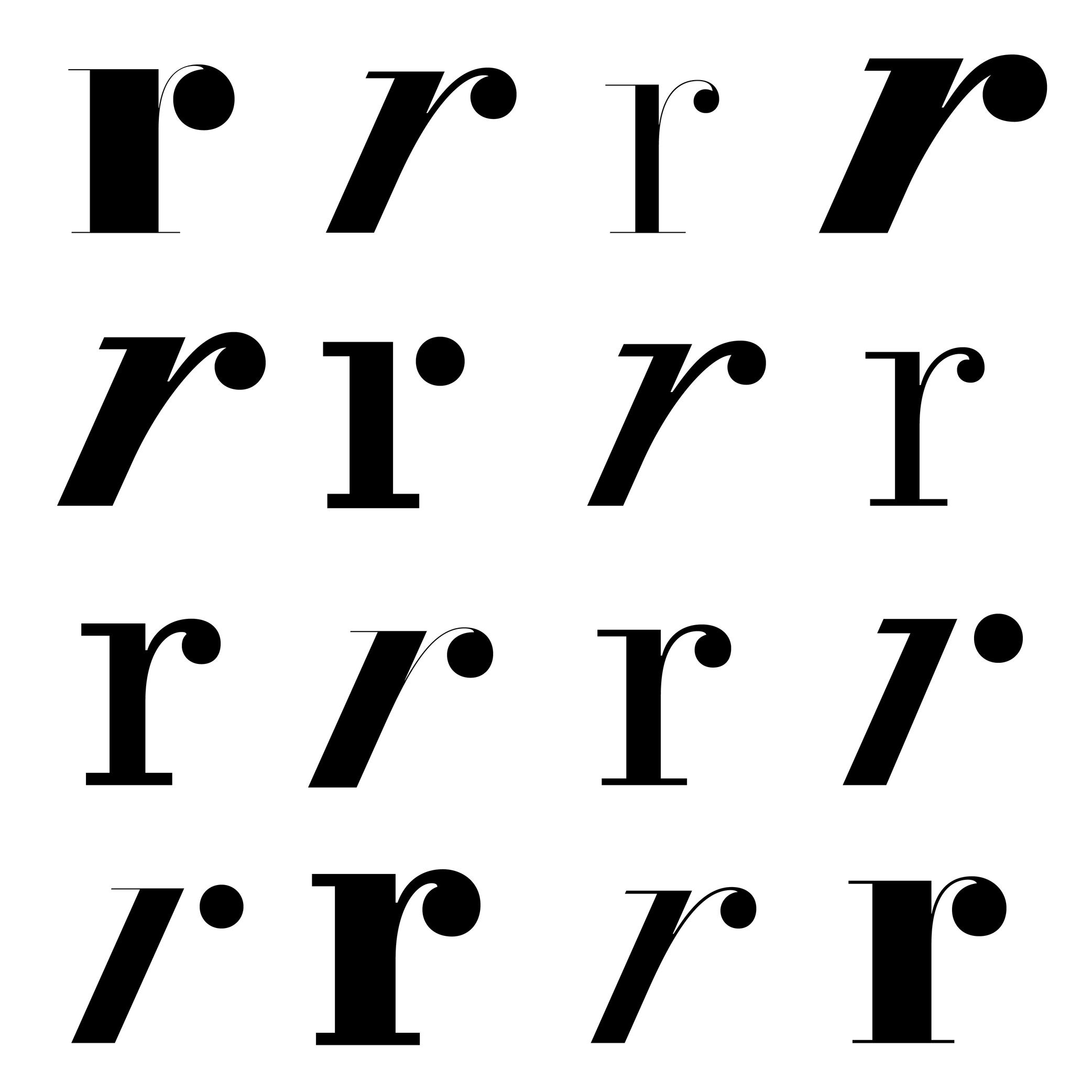
(Read More)Many terms are borrowed from architecture or human and animal anatomy to designate and describe parts of letters and other characters. We even speak of type design anatomy.
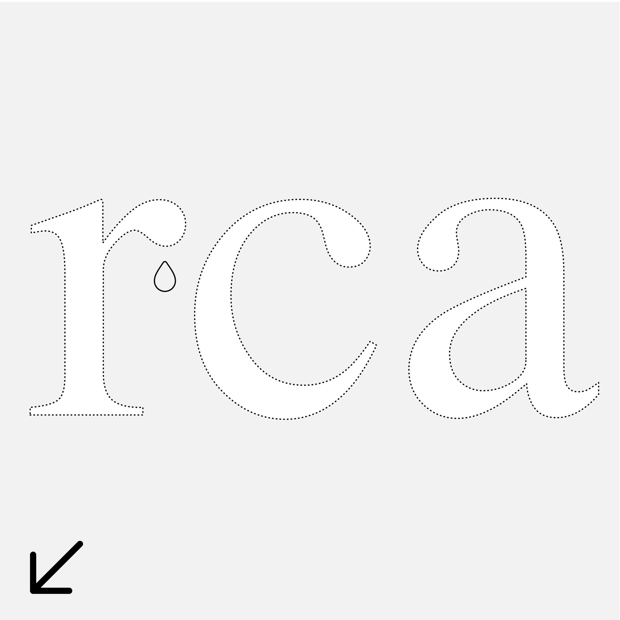
For Latin script, the drop refers to the top hanging part of r or a that looks like a drop falling downward, generally present in serif style fonts.
Ear
Sponsored by Commercial Type . Typeface in use: Le Jeune , designed by Paul Barnes, Christian Schwarz, Greg Gazdowicz, 2016.
(Read More)Many terms are borrowed from architecture or human and animal anatomy to designate and describe parts of letters and other characters. We even speak of type design anatomy.
In the Latin script, the ear refers to the top-right hanging part of letters like the r, f or the double-storey g.
Expansion
(Read More)Expansion is one of the multiple contrast types in Latin-script type design (along with translation and rotation).
The specificities of the expansion contrast come from the pressure applied while writing a stroke with a fountain pen or quill (the two flexible tips split with added pressure) while keeping the pen tip at a vertical axis.
Bodoni and Didone (or Didot) styles are typical examples of expansion contrast typefaces.
Eye
Sponsored by Commercial Type . Typeface in use: Portrait , designed by Berton Hasebe, 2013.
(Read More)Many terms are borrowed from architecture or human and animal anatomy to designate and describe parts of letters and other characters. We even speak of type design anatomy.
In Latin type design, the eye refers to the ratio between the x-height and the other guidelines (ascenders and descenders).
A typeface is suited for text usage if it has a ratio slightly bigger between its eye to its ascenders and descenders, as this enhances the legibility of the letters.
Geometric
 (Read More)
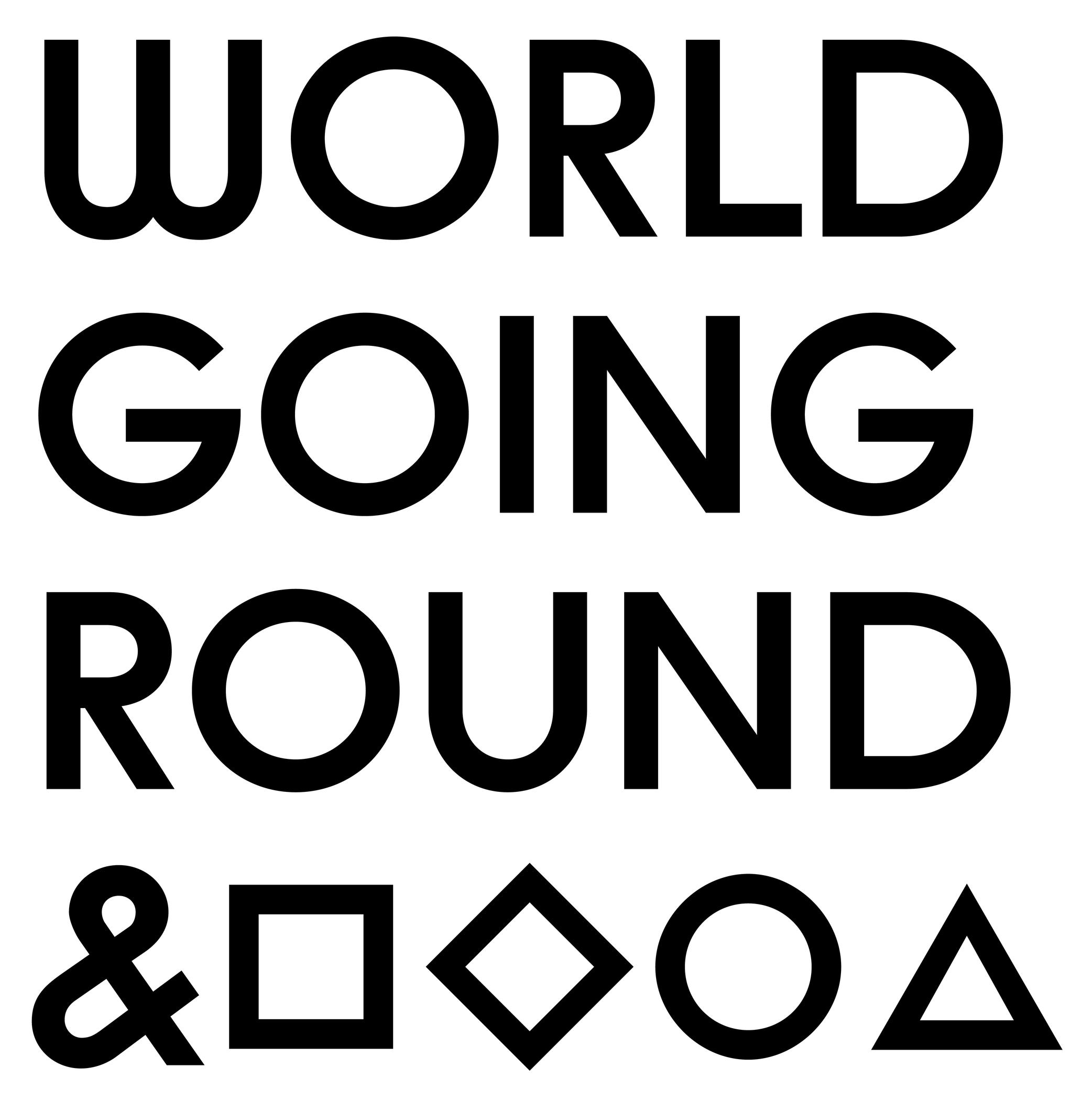
A typeface with a geometric style has shapes designed in a way that follows the logic of geometry (straight, round, square, etc.).
But our human eyes are organic (as opposed to artificial), we need to use optical tweaks and adjustments in addition to the shapes drawn out of geometric tools to make the letterforms look geometric.Italic
Univers, extract from Manuel Typographique, by Fournier le Jeune, 1766, as displayed in De Plomb, d’Encre et de Lumière, Essai sur la typographie & la communication écrite, C. Peignot and G. Bonnin, French National Printing Office (Imprimerie Nationale), 1982
(Read More)DESCRIPTION
Two construction styles are possible for the same weight in a Latin script typeface: Roman (or upright) and Italic. Italics usually have slanted letterforms, with more or less obvious influence from handwritten letter structure (connected letters) and shapes (softer starts and endings). In general, italic letters also have a slightly narrower width than their upright companion.
For italic styles to be visually linked to an upright version, they have to be related to each other (similar weight, height, etc.). However, they also need to be different enough so that the reader can easily differentiate one from the other. Managing a good balance between differentiation and similarity is part of the typeface designer’s expertise to design a “nice couple.”
HISTORY
During the Renaissance in Europe, when the Humanist movement emerged, they developed a new style of handwriting that combined the old Carolingian Minuscule (all lowercase letters) with forms inspired by Ancient Roman inscriptional lettering (Capitalis Monumentalis). Both have a close relationship to the ‘natural’ movements of the human hand.
While Humanistic handwriting could use either roman (upright, interrupted) or italic (slanted, connected) letterforms, each direction would eventually become an independent style used for different purposes, as is familiar today. The names we use now also come from that era, with ’roman’ referring to the alphabet of the Ancient Romans and ‘Italic’ being a moniker English writers used to refer to the style of connected letters that had originated more recently in Italy.
In typography, the first italic typefaces used date to around 1500. However, it was not until the mid-16th century that French printers began using roman and italic styles as we do today. They employed both styles in various applications to convey different impressions (emphasis, comments, etc.).
USE IN TYPOGRAPHY TODAY
In text, Italic styles are mainly used as a functional companion for a typeface family’s roman styles.
They are used when a part of a sentence or word needs to be emphasized, or differentiated from the rest. Italics are often used to emphasize titles of various works (albums, books, films, magazines, newspapers, etc.), words in a different language, or words that need to be highlighted.NOTE
Not every writing system uses or even has Italic styles like in the Latin script. Instead, other scripts use different ways to achieve the same purpose of emphasis (i.e., by using a different weight or specific kind of punctuation).
Latin Script
(Read More)Historians and linguists consider that the origins of the Latin script date back to the Phoenician civilization around the 13th century BC in Greece and the Mediterranean Sea. They created a consonantal alphabet called abjad, which was borrowed by other languages in the region for the innovative nature of its phonetic system, and due to the large influence of the Phoenician people as principal traders and navigators. This alphabet later led to multiple derivatives, including Greek and Latin alphabets.
The Latin script evolved from the Greek, with a Proto-Latin appearing around the 2nd century BC. It started by taking some of the Greek letters and modifying them, adding or removing others to fit better with the Latin language, spoken by Roman civilization (which is why it is also called the Roman alphabet).
The modern Latin script contains 26 distinct letters from its most basic set, with uppercase and lowercase forms for each. Many languages using the Latin alphabet have additional letters, ligatures or digraphs (e.g., æ, œ) to better adapt to the sounds of each.
With Eurocentrism ideology (main focus on European culture), the type design industry has also been largely focused on scripts used by the Western world: Latin in particular, with hundreds of years of practice, experience, theories, teaching and conventions, exhibitions and festivals mainly about this script. But, thanks to the increasing international exchanges and efforts to create a perspective beyond those boundaries, the type design industry is currently evolving into a much richer and diverse typographic culture.
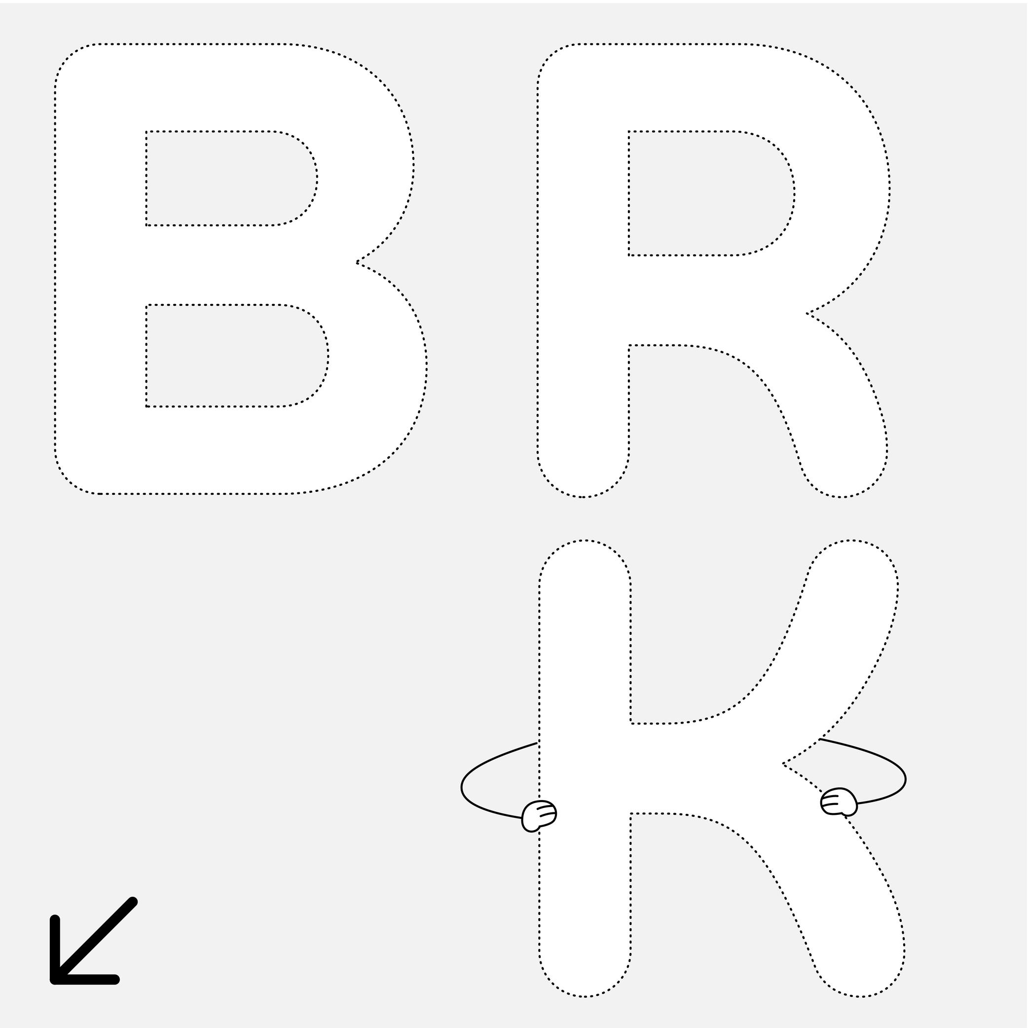
Leg
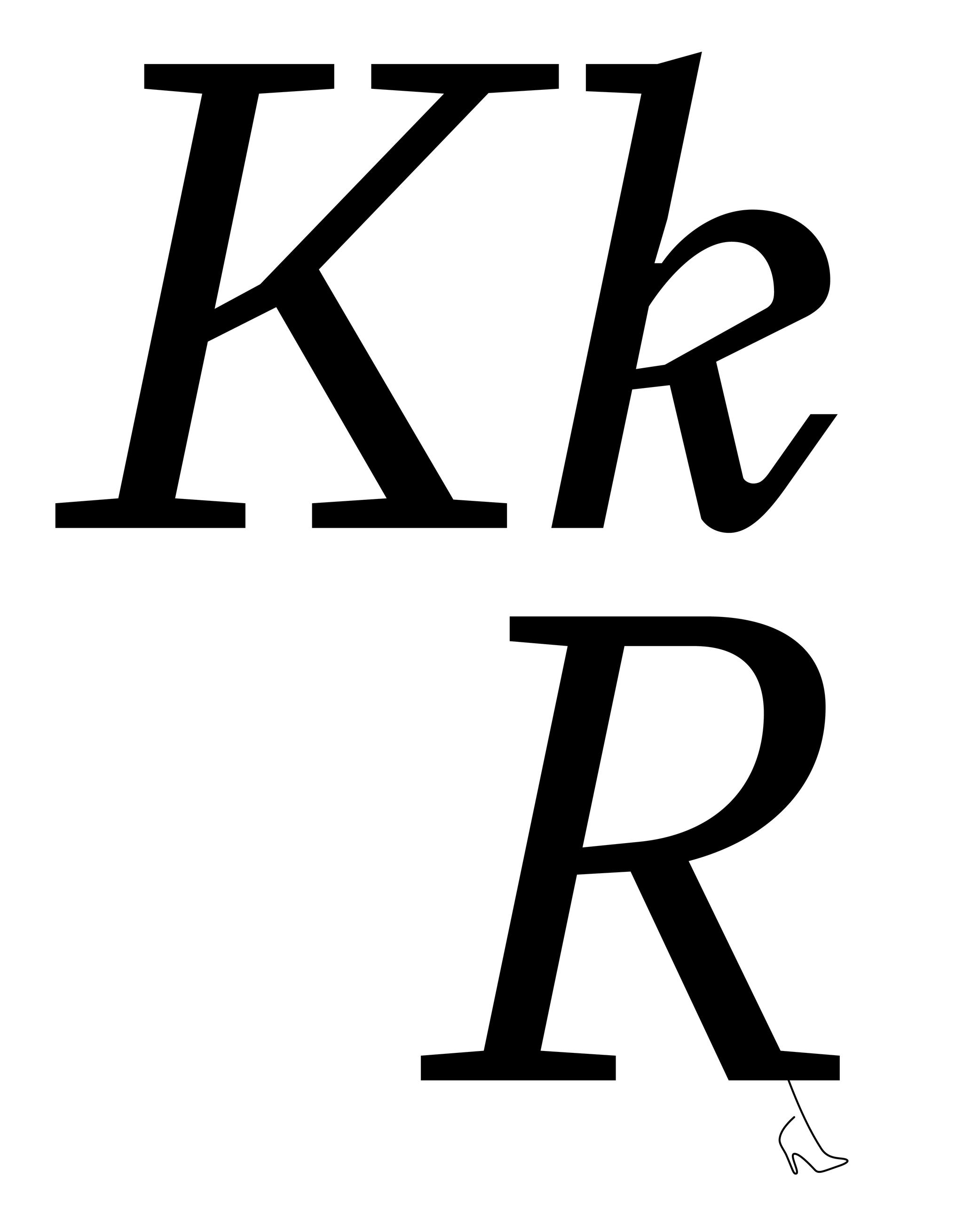
Sponsored by Type Together . Typeface in use: Aeroplan , designed by Nina Faulhaber, 2023.
(Read More)Many terms are borrowed from architecture or human and animal anatomy to designate and describe parts of letters and other characters. We even speak of type design anatomy.
In Latin script, the leg is the lower diagonal stroke of letters like R, k or K.
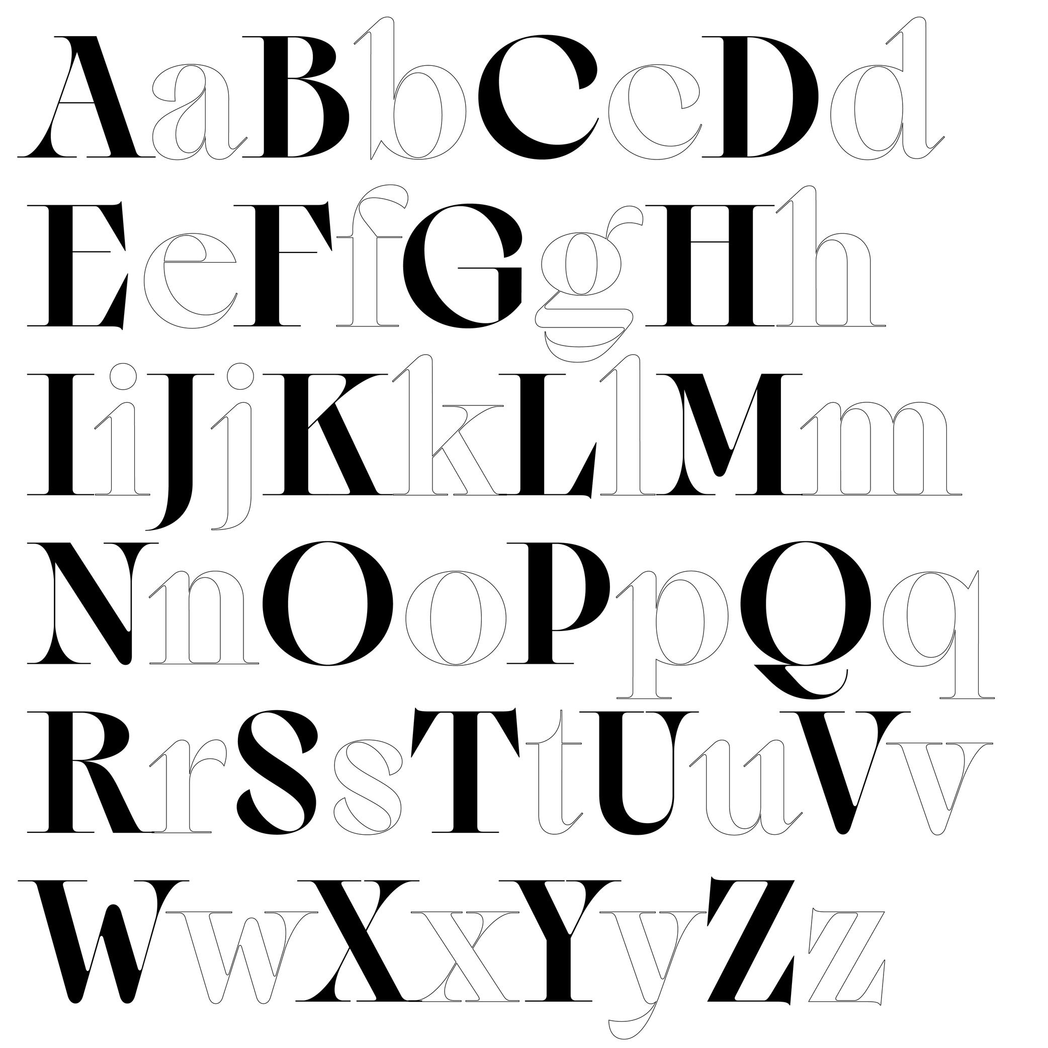
Letter
Illustration: Raven Mo .
(Read More)Letters are a type of characters used in an alphabet to represent the sounds of a spoken language.
The same letter can have multiple sounds due to different pronunciation in different languages, and one sound can be transcribed with various letters or characters. Some letters can also bear diacritics to have more or less subtle variations of pronunciation in some languages.
Linguistically, a letter is an abstract symbol, but it can appear in different glyph forms, such as cases (uppercase or lowercase), stylistic variants, or contextual forms.
FONT ENGINEERING HINT
In a font file, a letter is encoded as a character (with a unique Unicode code point) but it may correspond to multiple glyphs. For example, an a can have a single or double storey form.
Some letters can also be combined into a single glyph to form a ligature (such as fi or æ).These substitutions are handled in the gsub (Glyph Substitution) table, while the character-to-glyph mapping is defined in the cmap (Character To Glyph Index Mapping) table.
Loop
Sponsor Word of Type and feature your typeface in this card with a linked caption. Contact us for more information.
(Read More)Many terms are borrowed from architecture or human and animal anatomy to designate and describe parts of letters and other characters. We even speak of type design anatomy.
In the Latin script, a loop is the lower part of a double-story g, looking like a loop, open or closed.
Lowercase
Sponsored by Formagari . Typeface in use: Cedrat, designed by Emmanuel Besse, 2024.
(Read More)Also called minuscule.
Lowercase letters are the smaller forms of alphabetic letters, at least in scripts like Latin that have two cases. Lowercase letters are the opposite of uppercase letters (or majuscules/capitals).
HISTORY
The words ending with -case are a legacy from the era of printing with movable metal type. For the English-language, letters (metal pieces of type) from one font size were traditionally sorted into two wooden drawers or cases, one for each kind of characters. Capitals were in the kept in the upper case, and lowercase letters were on the bottom one. Later, single drawers would be used for an entire font. There, capitals were kept the upper section of the drawer, above the lowercase.
Even though they appeared later than their uppercase “parents,” lowercase letters went through many more iterations. Some of these evolutions were influenced by history (invention of new tools), cultures (preference for certain styles) and geography (influence of nearby cultures).
Majuscule
(Read More)A majuscule is a capital letter placed at the beginning of a sentence or the first letter of a name.
Note that all capital letters are not necessarily majuscules, such as CAPITALIZED words, which are made of capital letters.
Serif
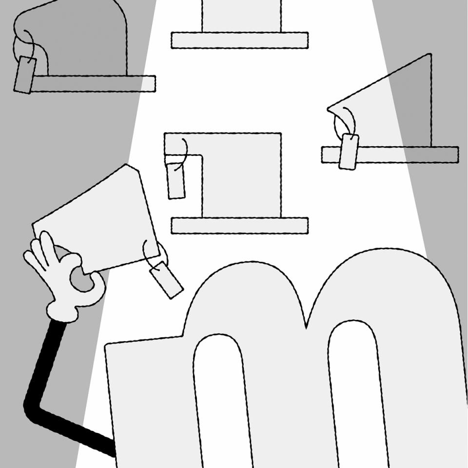
Illustration: Raven Mo .
(Read More)DESCRIPTION
Serifs are elements at the tips of strokes in serif style typefaces.
HISTORY
The origin and evolution of serifs differ in different scripts and don’t even exist in others.
For the Latin script, serifs come from the combination of the movements of the brush when writing Roman capital letters (the origins of the Latin alphabet) and stone carving techniques.EVOLUTION
Calligraphy, metal and wood type printing, photo composition, typewriters, digital typefaces, all of these tools and techniques contributed various shapes and presence (or absence) or serifs among the various typeface styles that we see today.
The positioning of serifs in each letter has been defined by the writing ductus combined with the tools use. For example, the general rule is that serifs should be on both sides at the top and bottom of vertical stems for upright letters, and none on the bottom of italic stems.
There are multiple possibilities for the shapes of serifs: thin, thick, long, short, wedged, squared, triangular, etc. Many typeface styles have a particular serif shape as part of their characteristics.
IMPRESSION
In Latin script, different impressions and feelings are associated with specific typeface styles (traditional, luxurious, casual, elegant, etc.), which are mainly due to the circumstances of their creation, usage preferences, and habits.
For example, humanist or transitional serifs are the go-to styles for long reading uses.DESIGN
For styles where serifs are on both sides of the stems, some asymmetrical letters (such as f, r, F or P) have a large opened counter on one side. To compensate for the imbalance created by the “empty space”, the designer can adjust the serif on that side by making it longer.
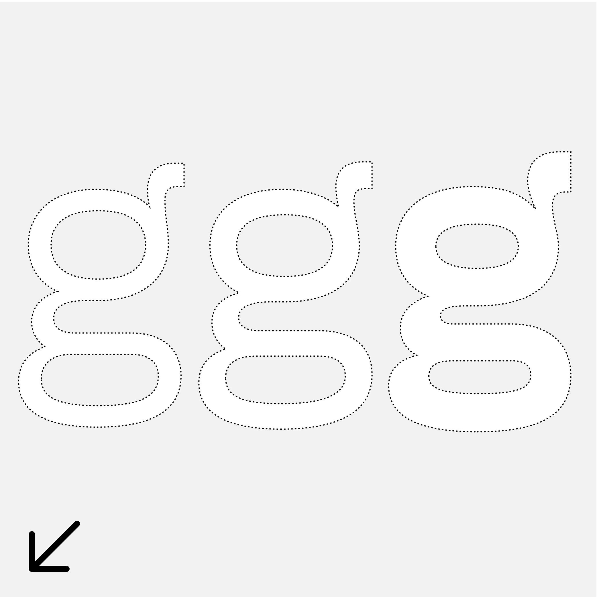
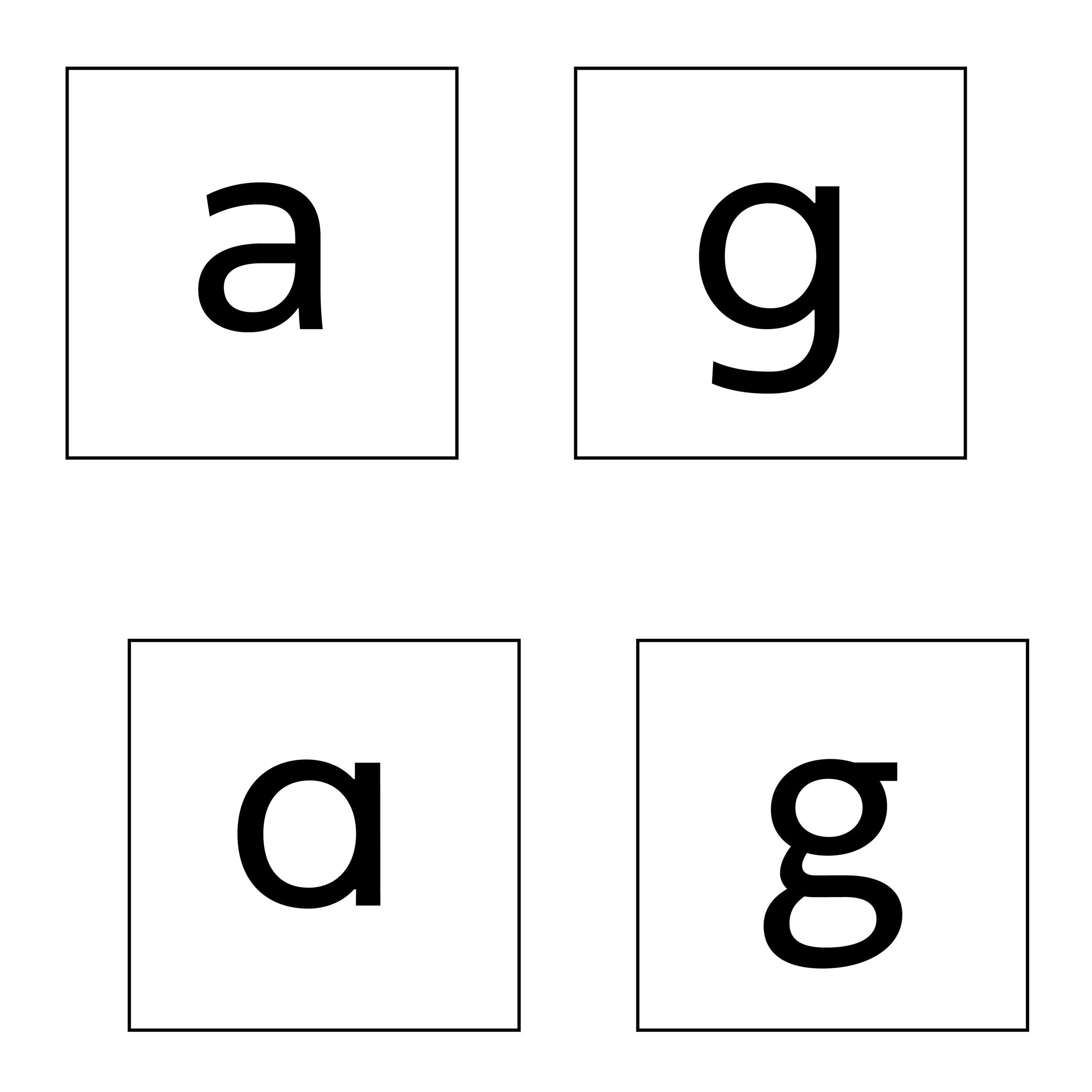
Single or Double Storey
Sponsored by Typotheque . Typeface in use: Zed Text , designed by Peter Biľak, 2024.
(Read More)Latin letters a and g can be represented with two different constructions:
- single storey, for modern and/or geometric styles;
- double storey, for traditional and/or classical styles.
In some typefaces, both constructions are available, as designers feel that some users prefer one over the other.
The letter g can also be designed with a half storey construction, often seen in Scandinavian designs as a legacy from Danish street signs.
Small Caps
 (Read More)
FUNCTION
Small Capitals, or commonly just Small Caps, are letters with a capital letter structure but smaller in size (hence the name).
USAGE
They are used in texts when there are many capital letters together (initials, abbreviations, acronyms, Roman figures or all caps words in texts). In traditional typesetting where a new chapter starts with an initial or drop cap, the other letters of the first word or the entire first line can also be set in small caps to ease out the change towards the following text in lowercase.
HISTORY
The use of small caps started to be popular during metal type printing, as they added an additional option to the typographic palette, while keeping the same typeface.
Today, small caps are not present in every digital Latin typeface (they have their own Unicode values and are not in every Latin character set), as using small caps was more common in the ‘Latin’ world and used in traditional typography.
Some text processing or design applications can automatically generate small caps by scaling down capitals letters (just like they can do the same for italic or bold styles), but this is not advised for high quality typography, as the weight relation is much lighter.
DESIGN
Small caps have no precise height proportions compared to the capitals or lowercase, but a good ratio sits between these two heights.
Their weight and contrast should match those of the lowercase, and their height/width proportions are usually slightly wider than simply scaled-down capitals.
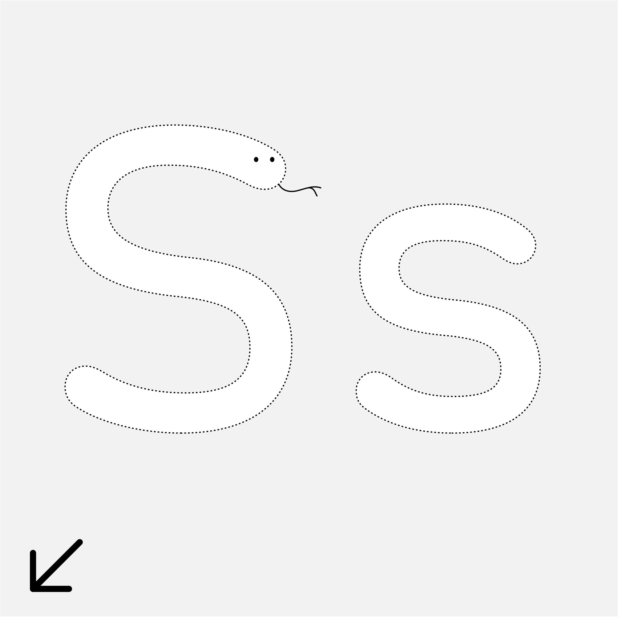
Spine (in type design)
Sponsor Word of Type and feature your typeface in this card with a linked caption. Contact us for more information.
(Read More)Many terms are borrowed from architecture or human and animal anatomy to designate and describe parts of letters and other characters. We even speak of type design anatomy.
In the Latin script, the spine is the middle curve segment of characters like s or S.
Tail
Sponsor Word of Type and feature your typeface in this card with a linked caption. Contact us for more information.
(Read More)Many terms are borrowed from architecture or human and animal anatomy to designate and describe parts of letters and other characters. We even speak of type design anatomy.
In the Latin script, the tail is a terminal part at the bottom of letters like t, y or Q.
Uppercase
Sponsored by Blaze Type . Typeface in use: Sagittaire , designed by Valerio Monopoli, 2023.
(Read More)Uppercase (or capital letters) are the taller and larger variants of alphabetical letters, as opposed to lowercase letters (or minuscule).
Linguistically speaking, a capital is not to be confused with a majuscule, which is a capital letter with the specific function of being used at the beginning of a sentence or a word.
HISTORY
Capital letterforms derive from Phoenician and Greek alphabets when the Roman Empire started its influence over Europe around the 1st century.
During the Roman Empire, they were painted and/or carved in stone at large sizes for inscriptions on monuments, buildings, and tombstones (called Capitalis Monumentalis).
Through time, with the need to write faster, some shapes evolved, resulting in minuscule (lowercase) letters. But that didn’t make capital letters disappear. On the contrary, they kept coexisting with minuscules. Each has its own specific functions and looks very different, so using both allows a more comfortable reading experience.
The word ending with -case is a legacy from metal type printing when letters (or types) were sorted by categories into cases (one per glyph), themselves into drawers (one per font). Capitals were placed in the cases of the upper section of the drawers, minuscules were on the lower part.
Not to be confused with a majuscule letter.
Waist
Sponsor Word of Type and feature your typeface in this card with a linked caption. Contact us for more information.
(Read More)Many terms are borrowed from architecture or human and animal anatomy to designate and describe parts of letters and other characters. We even speak of type design anatomy.
In the Latin script, the waist is the middle part of letters like B or R, where the stroke’s connection shapes a narrower part.
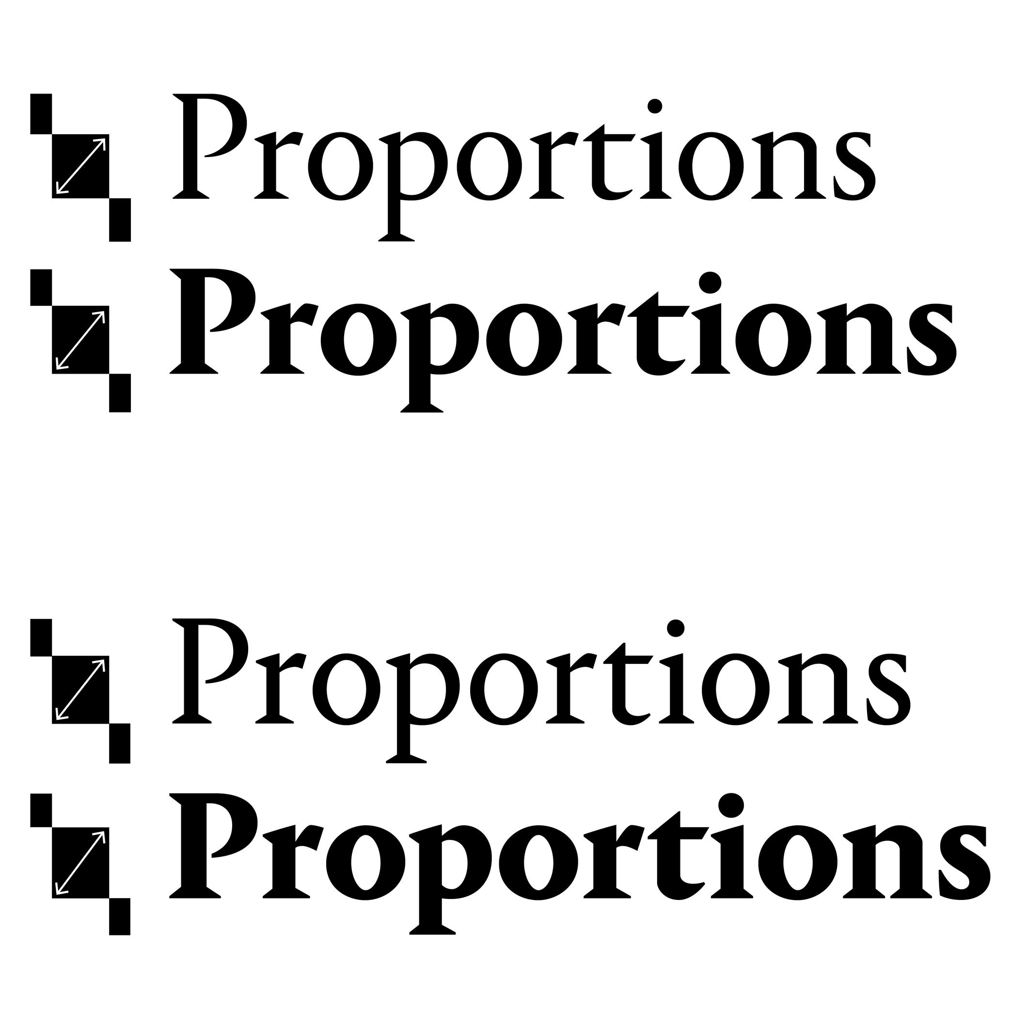
Weight
Sponsored by Production Type . Typeface in use: Enduro , designed by Emmanuel Besse, 2020.
(Read More)The weight of a typeface refers to the thickness of its strokes.
Within a typeface family, different weights are designed to be visually consistent across all glyphs of a given style.
NAMING CONVENTIONS
While much of the historical naming conventions (e.g., Light, Bold, Black) originate from the Latin typographic tradition, the concept of weight applies to all writing systems that use stroke thickness variations. These labels are not universal standards as style description conventions differs from a culture to another.
WEIGHT NAMES & CSS VALUES
In digital typography, weights are also expressed numerically, using the “font-weight attribute”:
• Thin: 100
• ExtraLight: 200
• Light: 300
• Regular: 400
• Medium: 500
• SemiBold: 600
• Bold: 700
• ExtraBold: 800
• Black: 900FONT ENGINEERING HINT
In OpenType font formats, weight is stored in the OS/2 table under the “usWeightClass” field, which maps to CSS “font-weight” values (ranging from 100 to 900):
• while CSS defines nine steps, “usWeightClass” allows values from 1 to 1000, giving finer granularity for internal font definitions;
• CSS weight values are expected to correspond to the font’s weight class. Following this standard is important because many environments rely on these mappings for text rendering and style linking. If, for example, Regular = 350, browsers or apps may mislabel it or fail to recognize it as Regular, causing user confusion or incorrect transformation to Bold.For variable fonts, the weight axis is defined by the registered axis tag “wght.” Unlike static fonts, it supports continuous interpolation between a minimum and maximum, allowing CSS “font-weight” to take any integer (e.g., 347) within the supported range for smoother transitions and precise control.
Localized weight names (e.g., ‘Gras’ for Bold in French, ‘Fett’ in German) are often generated from the OS’s internal dictionaries. This ensures style names appear in the user’s language even if the font lacks explicit translations. If the default naming does not strictly follow OpenType Specifications, localized names may not be translated correctly.
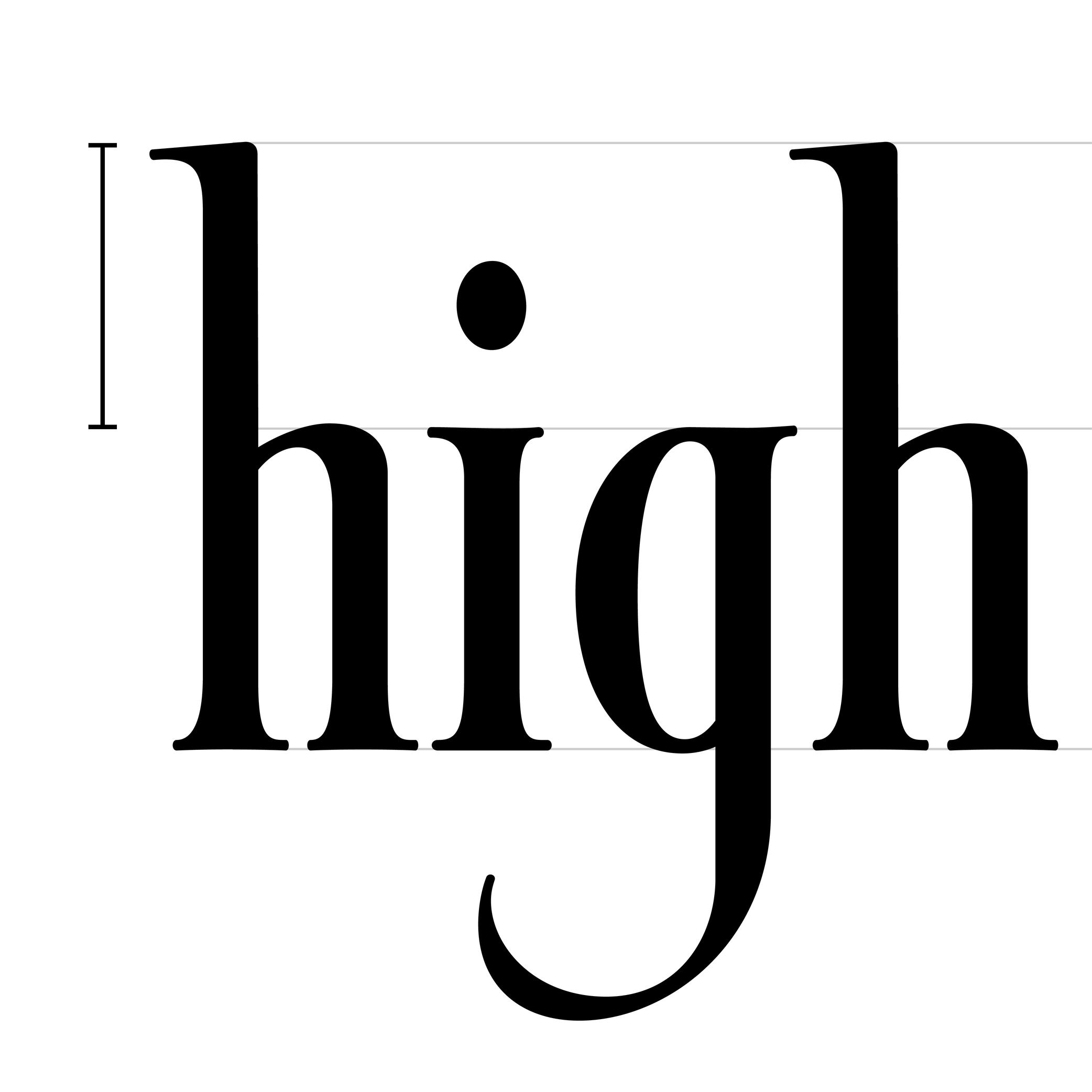
x-Height
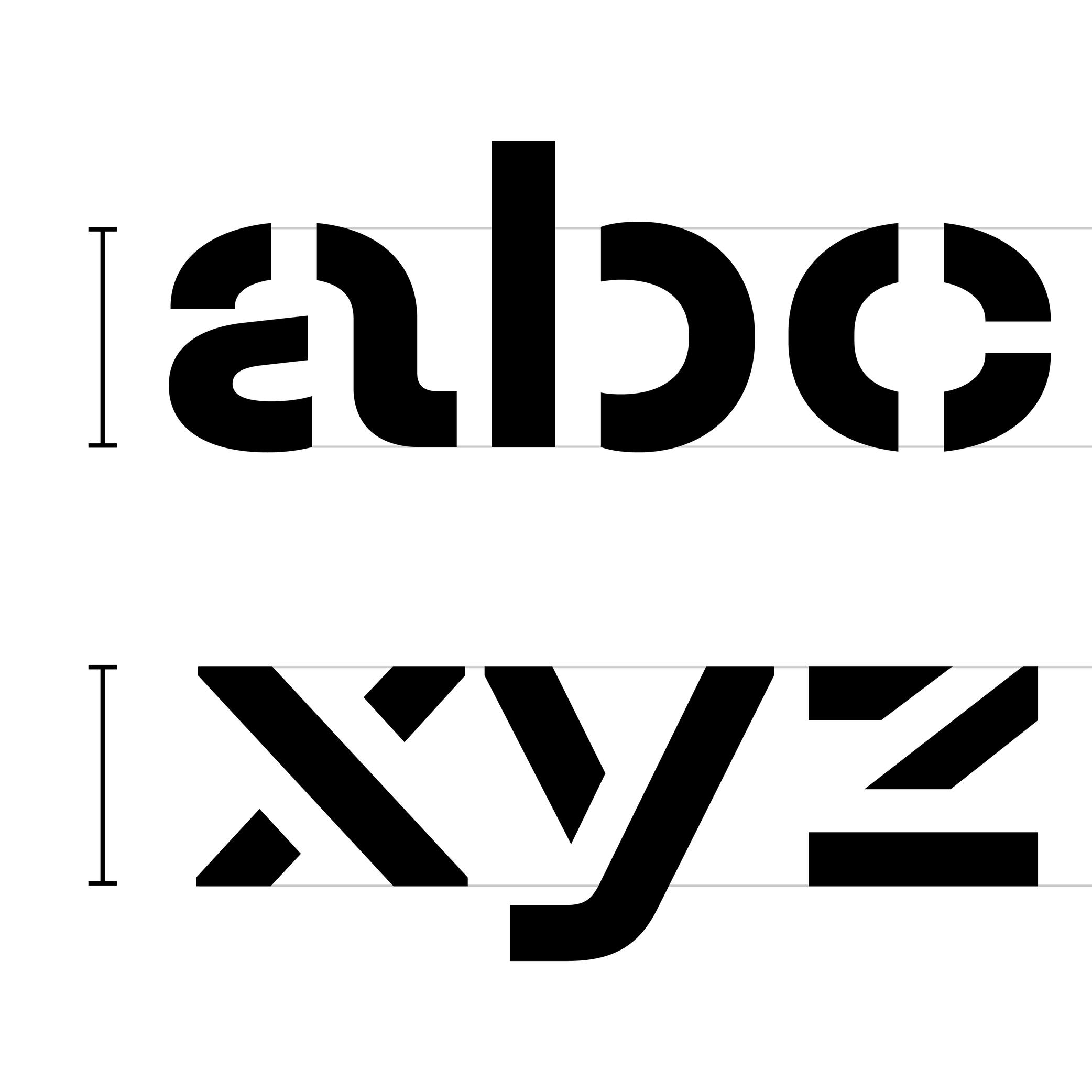
Sponsored by TypeMates . Typeface in use: Halvar Stencil Breitschrift , designed by Paul Eslage, Jakob Runge, Lisa Fischbach and Nils Thomsen-Haberman, 2019.
(Read More)The x-height is the guideline placed at the top of the Latin letter x.
It helps to align the other lowercase letters and to set the proportions with uppercase letters and the ascenders.
Because the letter x is the only lowercase letter without ascenders and horizontal tips at its top and bottom (it has no overshoots), it is the reference letter for lowercase height.