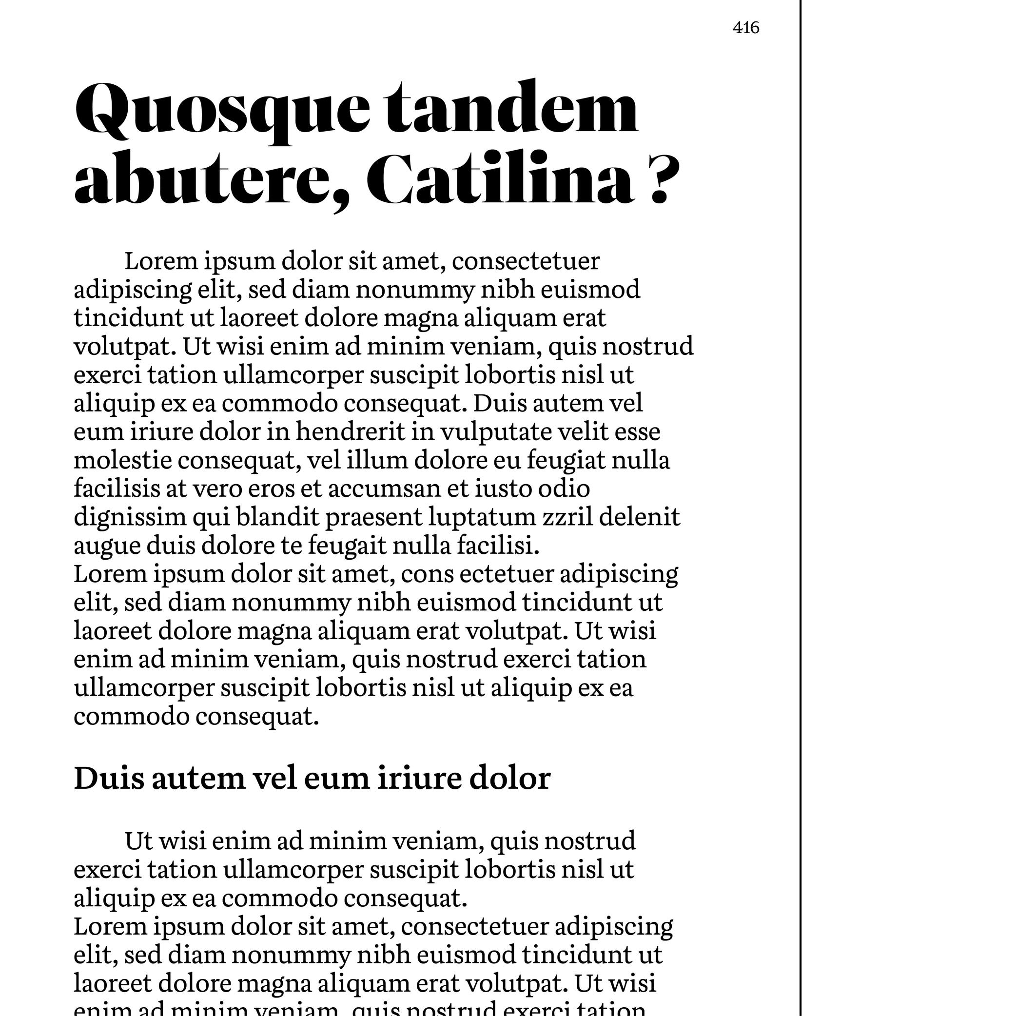
Body Text
Sponsored by TypeTogether . Typeface in use: Aneto , lead designers: Veronika Burian, José Scaglione, 2022.
(Read More)Also called body copy or running text, body text is usually the main written part of a document. Titles, subtitles, captions and others should be visually different from the body text so each type of information is clearly distinct and recognizable.
It is advised to set the body text at a size that is most comfortable for long reading: from 9 to 12 points for printed media and 16 to 18 points for digital screens.
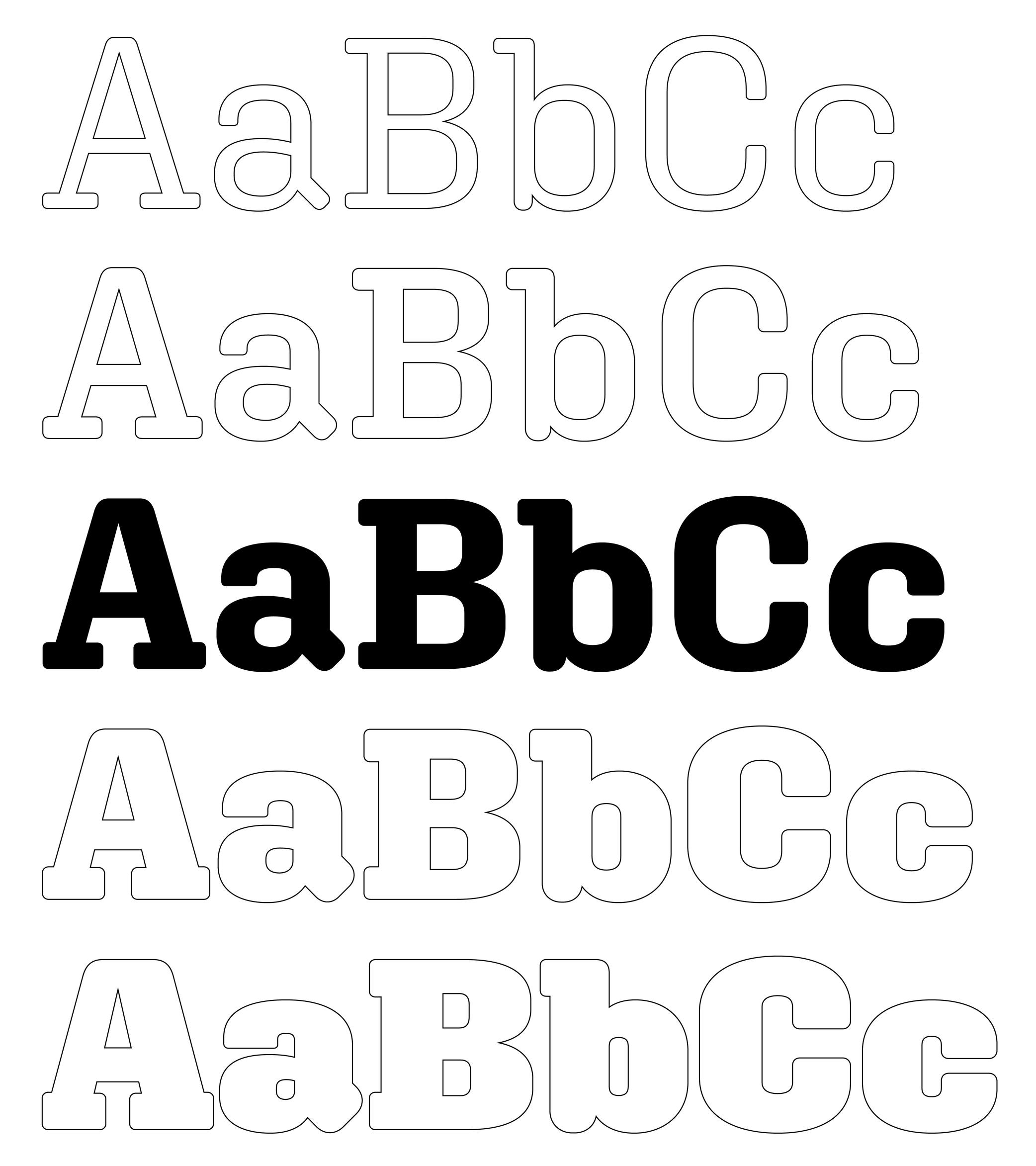
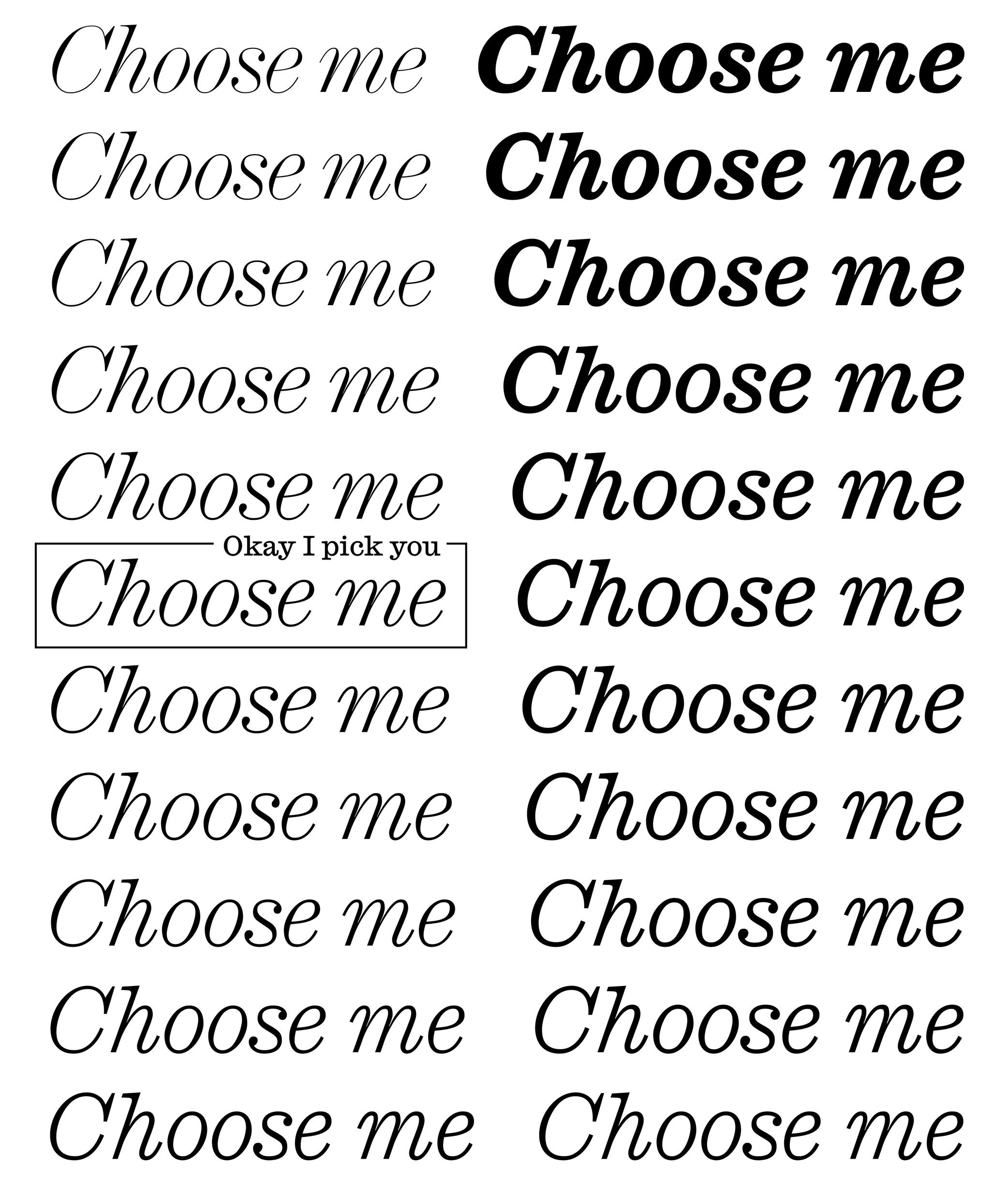
Bold (weight)
 (Read More)
While Regular is the most common weight for body text, Bold is a style often chosen to highlight a word or a sentence with a stronger emphasis than Italic.
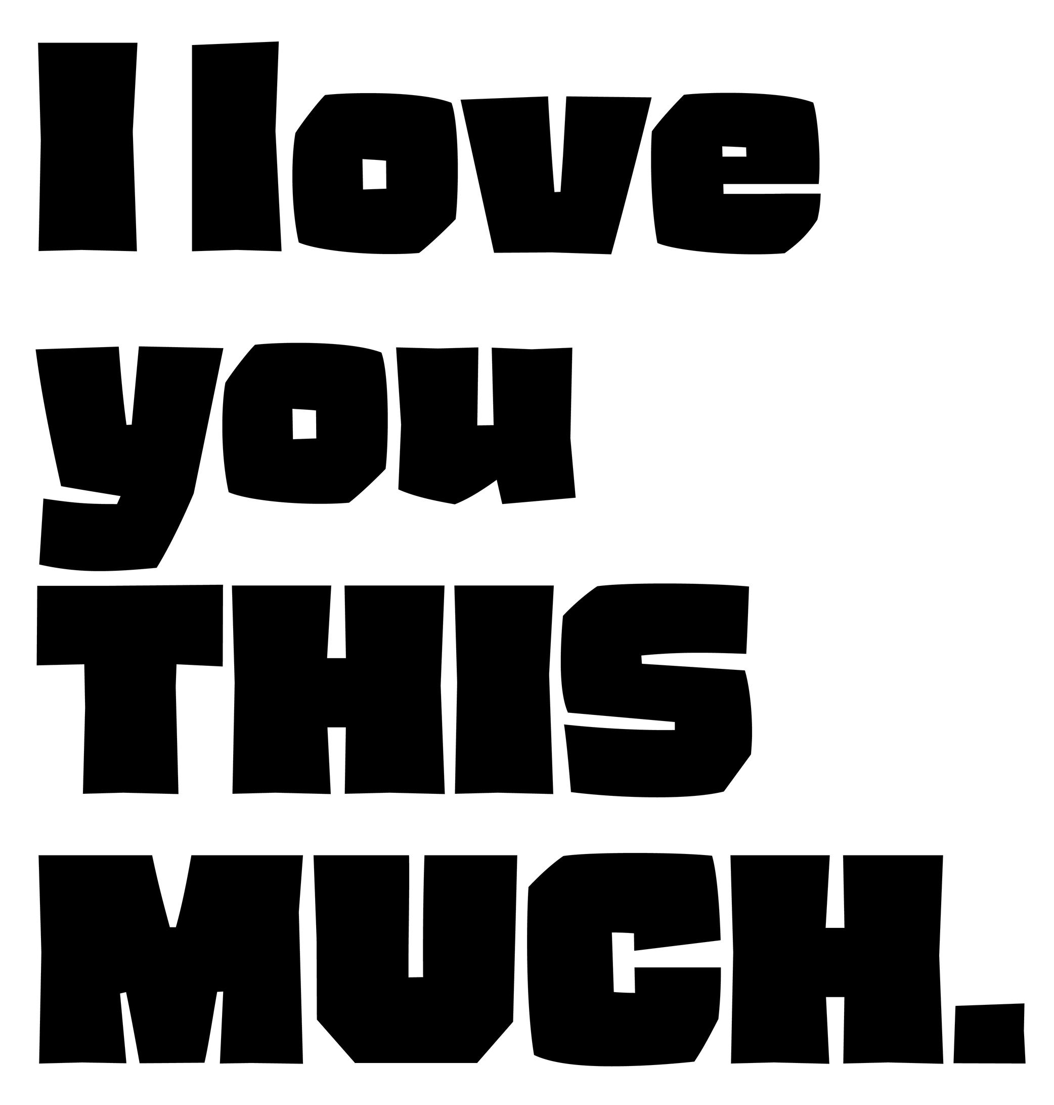
Capitalize
Sponsored by Type Together . Typeface in use: Rezak , designed by Anya Danilova, 2022.
(Read More)Also called to set in All-Caps.
In applications and tools that can process texts, to capitalize is to transform every selected lowercase letter into its capital variant.
FONT ENGINEERING ADVICE
The capitalization button in text editors usually calls several OpenType features: the case sensitive (.case), the capital spacing (.cpsp) and the proportional numbers features (.pnum).
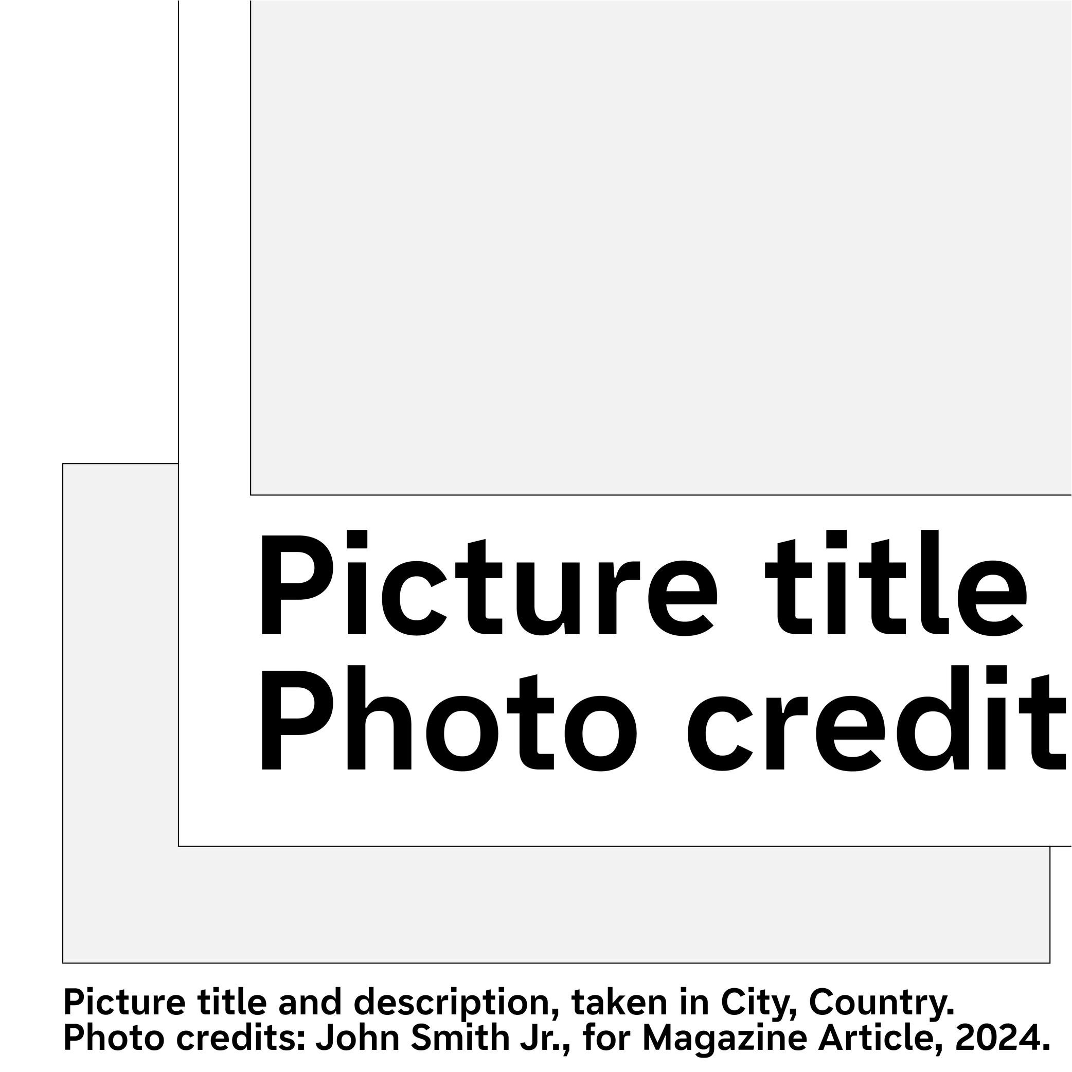
Caption
 (Read More)
To inform a reader that a passage of text is a caption, it is usually placed near the image it is linked to, but it is usually also set in a smaller size and/or in a different style.
Some typefaces contain a specific caption style in the family with optimized details for specific use in small sizes, such as lower contrast and higher x-height.
Case Sensitive
Sponsor Word of Type and feature your typeface in this card with a linked caption. Contact us for more information.
(Read More)By default, most punctuation signs and some characters are designed to be combined with lowercase letters because this is the most frequent situation.
When combined with capital letters, some of them need to be adjusted to be optically aligned with the capitals. These variants are required in a good typeface so the user can access enough tools for quality micro-typography. They are called case-sensitive alternates, usually attached with the extension “.case” and accessible or activated on applications supporting OpenType features.
Colophon
Illustration: Words of Type. Typeface in use: Archipel, designed by Lisa Huang, 2024.
(Read More)Also called imprint.
A colophon is a suggestive list of information about the production of a work or project. It can range from names and roles of people involved, typefaces or brand and kind of paper used, manufacturer and location of production, to hosting domain for websites, and more.
Emphasis
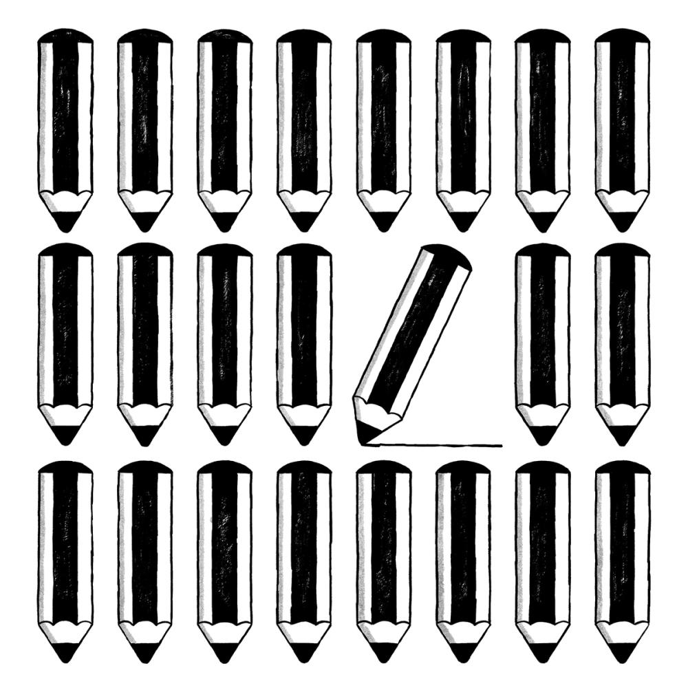
Illustration: Malota .
(Read More)In typography, we speak of “emphasis” when a section of a text needs to be visually brought forward or separated from the rest while keeping the paragraph’s setting, such as for a work’s title, comments, or a quote.
The most common way to create an emphasis in Latin based languages is to set the text in italic. Other scripts such as Chinese Hanzi and Japanese don’t have italics, and use different ways to emphasize text: bolder weight, underline, or dots.
Grid
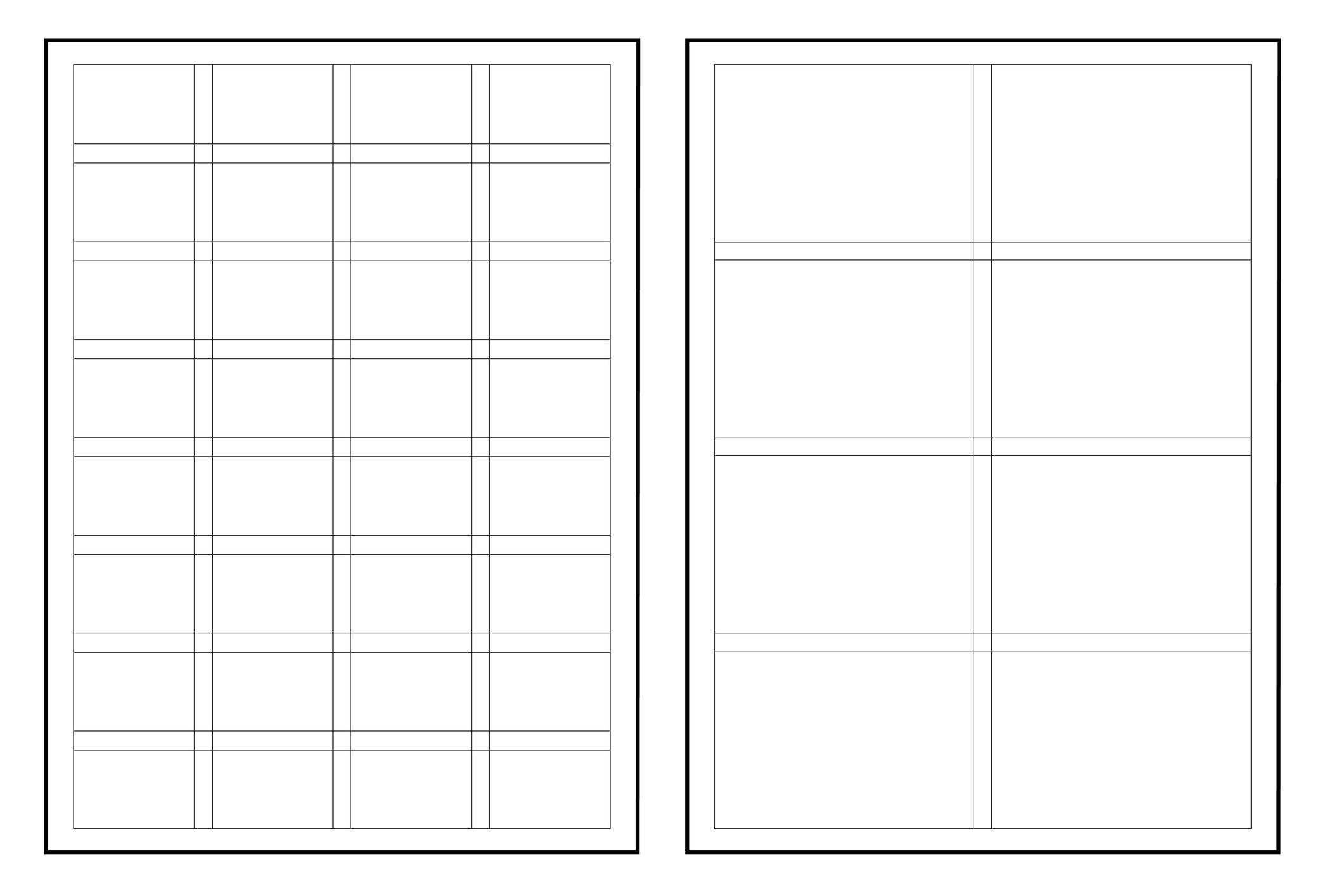
Illustration: Words of Type.
(Read More)In typography (or typesetting), a structure—called a grid—is designed on a page to place the elements, helping with the content’s organization and legibility.
Hypertext
(Read More)A hypertext link is a part of digital text linked to another page or website.
It is often displayed underlined or highlighted in a different color or style.
Hyphenation
(Read More)Hyphenation is the management of word breaks (with a hyphen) wherever a word at the end of a line doesn’t fit. The position of a word-break within a word depends on the language and the script.
There are some options about the usage of hyphenation, such as:
• whether or not to avoid it in capitalized words;
• whether or not to avoid it in the last word of a paragraph or a column;
• generally to avoid having more than three hyphenated lines of text in a row.Indent
(Read More)When typesetting a text, an indent indicates a new paragraph with a new line. It doesn’t have a “visible” sign so to speak, but it is equally considered a punctuation symbol.
In most word-processing applications, the indent symbol can be seen while selecting some text or activating the display of hidden characters.
Instance
Sponsored by Blaze Type . Typeface in use: Mega , designed by Matthieu Salvaggio and Malo Haffreingue, 2023.
(Read More)Variable Font technology allows users to navigate within or use multiple variations between two or more specific styles (called masters) with high precision and much smaller font files. When we navigate between masters, we are looking at interpolations, which can be exported and used as individual font files, called instances.
GOING FURTHER
Whether a font is variable or not, the concept of a design space can help makers and users visualize how the styles within a typeface family relate to one another. An instance is a style positioned at a defined location in this space. In addition to having a name (like Regular, Bold, or Condensed Bold), an instance also has coordinate values along one or more design axes (such as weight or width). That becomes especially important in the context of variable fonts, where styles are not static but generated through interpolation within the design space.
The names and values associated with common axes such as weight, width, italic, and slant are standardised and documented in the OpenType Specifications .
FONT ENGINEERING ADVICE
There is a distinction between the design space (defined by the outlines and master values) and the user space (what applications read and expose to the user). OpenType specifications document the user space.
Although it is possible to assign any coordinate values to masters and instances for design purposes, these must be mapped to standardized user space values when it come to the common axes mentioned above. For instance, a Regular style must always map to 400 on the weight axis, and a Bold to 700. Some apps only read these values to display an instance, the are therefore necessary for a proper user experience.
Interpolation
Sponsored by Commercial Type . Typeface in use: Ionic Modern , designed by Paul Barnes with Greg Gazdowicz, 2024.
(Read More)Variable Fonts technology allows users to navigate between two or more specific styles (called masters or sources) with high precision and much smaller font file sizes than several static fonts.
For example, the interpolation between Regular and Bold allows the generation of a Medium style (also called instance) as well as any other intermediate state.
This process relies on the compatibility of the outlines across masters, meaning they must share the same structure and number of points to interpolate correctly.
Interpolation allows variable fonts to have a reduced file size because they store only two masters (or more) and their variations data, rather than separate outlines for every possible style.
FONT ENGINEERING ADVICE
A variable font technically contains only one full master: the origin. This is the default style shown when variable font technology is not supported.
The other masters are stored as delta data—mathematical differences from the origin—used to interpolate and generate other instances dynamically. This delta data is stored in the gvar table.Italic
Univers, extract from Manuel Typographique, by Fournier le Jeune, 1766, as displayed in De Plomb, d’Encre et de Lumière, Essai sur la typographie & la communication écrite, C. Peignot and G. Bonnin, French National Printing Office (Imprimerie Nationale), 1982
(Read More)DESCRIPTION
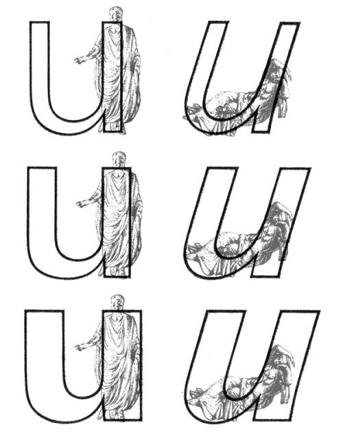
Two construction styles are possible for the same weight in a Latin script typeface: Roman (or upright) and Italic. Italics usually have slanted letterforms, with more or less obvious influence from handwritten letter structure (connected letters) and shapes (softer starts and endings). In general, italic letters also have a slightly narrower width than their upright companion.
For italic styles to be visually linked to an upright version, they have to be related to each other (similar weight, height, etc.). However, they also need to be different enough so that the reader can easily differentiate one from the other. Managing a good balance between differentiation and similarity is part of the typeface designer’s expertise to design a “nice couple.”
HISTORY
During the Renaissance in Europe, when the Humanist movement emerged, they developed a new style of handwriting that combined the old Carolingian Minuscule (all lowercase letters) with forms inspired by Ancient Roman inscriptional lettering (Capitalis Monumentalis). Both have a close relationship to the ‘natural’ movements of the human hand.
While Humanistic handwriting could use either roman (upright, interrupted) or italic (slanted, connected) letterforms, each direction would eventually become an independent style used for different purposes, as is familiar today. The names we use now also come from that era, with ’roman’ referring to the alphabet of the Ancient Romans and ‘Italic’ being a moniker English writers used to refer to the style of connected letters that had originated more recently in Italy.
In typography, the first italic typefaces used date to around 1500. However, it was not until the mid-16th century that French printers began using roman and italic styles as we do today. They employed both styles in various applications to convey different impressions (emphasis, comments, etc.).
USE IN TYPOGRAPHY TODAY
In text, Italic styles are mainly used as a functional companion for a typeface family’s roman styles.
They are used when a part of a sentence or word needs to be emphasized, or differentiated from the rest. Italics are often used to emphasize titles of various works (albums, books, films, magazines, newspapers, etc.), words in a different language, or words that need to be highlighted.Not every writing system uses or even has Italic styles like in the Latin script. Instead, other scripts use different ways to achieve the same purpose of emphasis (i.e., by using a different weight or specific kind of punctuation).
Justification
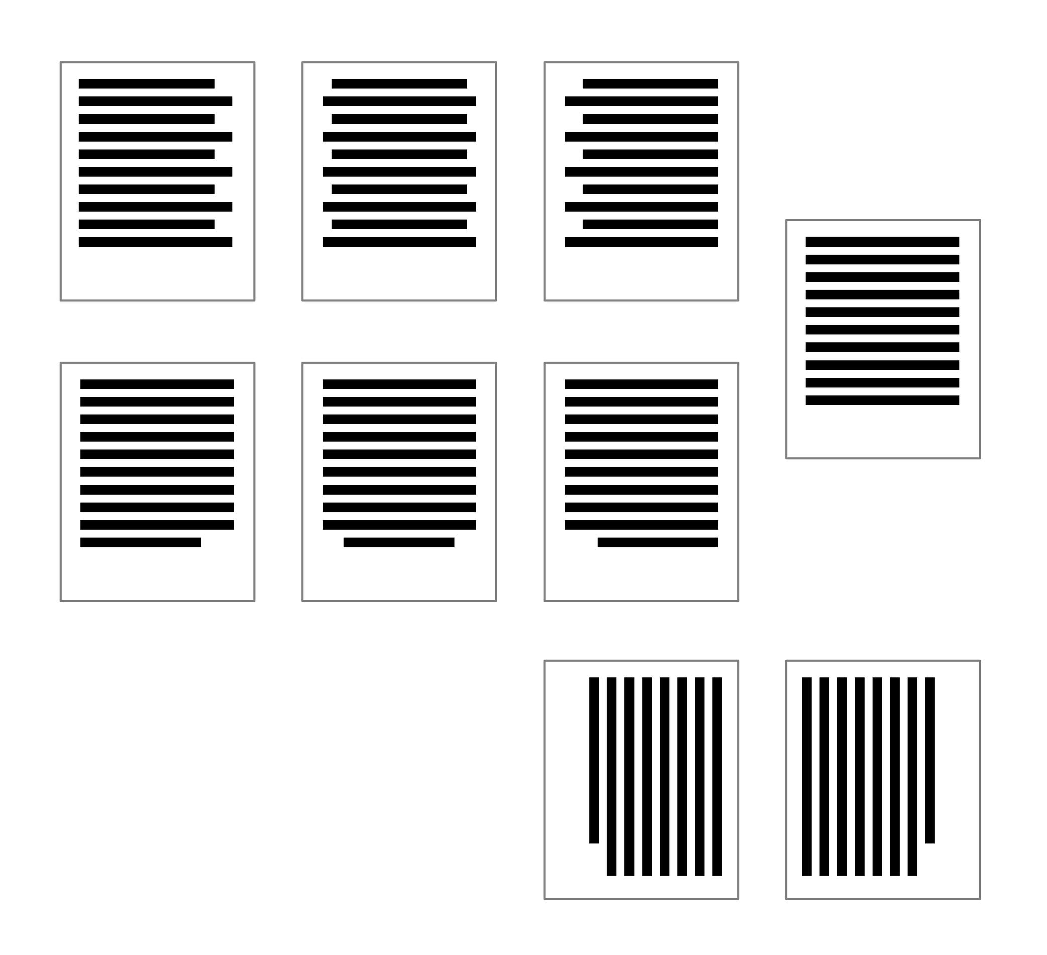
Illustration: Words of Type.
(Read More)Justification refers to text blocks where all lines are the same length, except, perhaps, for the last lines of individual paragraphs.
HISTORY
In the Middle Ages, many scribes would try to keep the appearance of their manuscripts as neat as possible. Guidelines for the left and the right margins, as well as the spaces between columns, would be scored onto the pages before they began to write lines of text. However, it was virtually impossible to keep the lengths of all lines of handwritten text equal, even with hyphenation (splitting a word across two lines).
When he pioneered Western printing technology, Johannes Gutenberg solved that problem through three methods: First, like scribes before him, he would hyphenate words that did not fit entirely on the end of a line. Second, he manipulated the space between words so that some lines had narrower word spaces and others wider ones. Finally, his compositors had narrower versions of some letterforms to fit more words onto one line.USE IN TYPOGRAPHY TODAY
In digital typesetting, algorithms for hyphenation and justification still split words across two lines and employ flexible word-space widths. However, Gutenberg’s use of multiple widths for individual letters did not catch on.
Inexperienced typographers occasionally use software features that can make some or all characters on a line artificially narrower or employ negative tracking between all characters on a line. These possibilities are both typographic abominations that should never be used.
Instead, users should adjust the hyphenation and justification options in their page-layout software to achieve a better result and add soft hyphens and/or soft line breaks to improve the appearance of their justified texts.Some other typesetting options (common for scripts written horizontally and from left to right) are centered, flush left/ragged right, and flush right/ragged left.
Layout
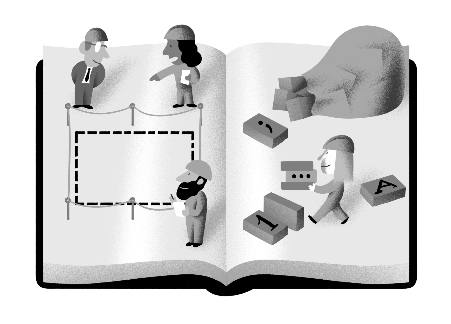
Illustration: Yann Bastard .
(Read More)Layout can either be a noun or a verb. It refers to both the activity of arranging graphic elements on a surface (page, screen, wall, space, etc.) and the result of that arrangement. The different graphic elements within a layout might include blocks of text, titles, pagination, images, etc. The white space between and around elements is just as important as the elements themselves.
Ideally, a layout has a clear and consistent aesthetic, and that aesthetic is appropriate to the desired function of the layout’s contents.
Leading
Illustration: Jay Cover .
(Read More)The leading is the amount of space added to increase line spacing (the height of the space between two baselines).
HISTORY
The word refers to the strips of lead used to separate lines of type with in the era of metal-type printing. The line spacing between two lines of 12 pt text set solid was exactly 12 pt. When 2 pt piece of lead was added between those lines, the line spacing value was increased to 14 pt. But the leading value was not 14 pt, instead it was 2 pt.
TODAY
Increasing line-spacing values in InDesign or in CSS isn’t per se “leading,” it is a “line-spacing increase.” Although, it is quite common to say “increase the leading” while you are technically increasing the line spacing.
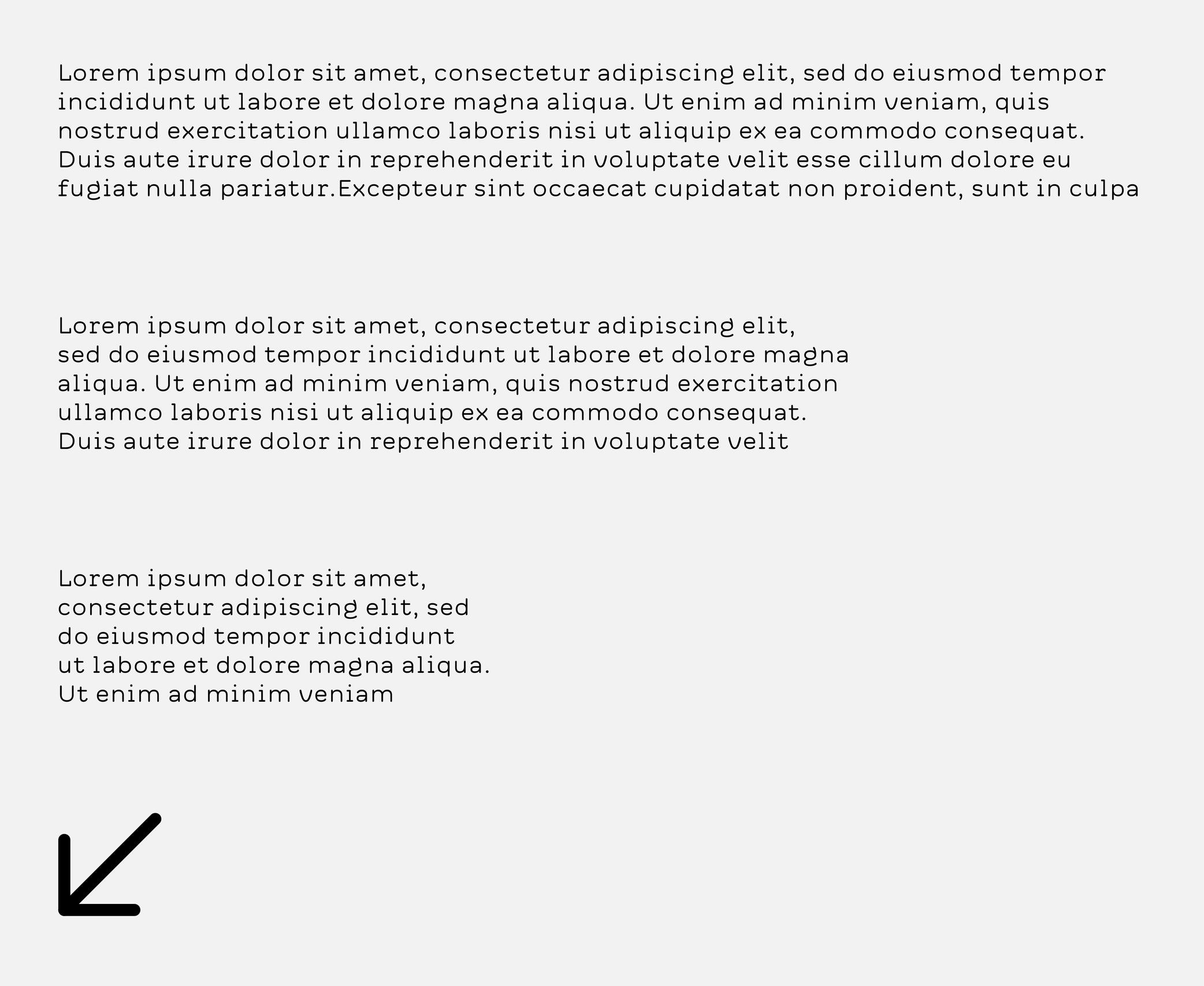
Line Length
Sponsor Word of Type and feature your typeface in this card with a linked caption. Contact us for more information.
(Read More)A line of text that is too long or too short affects its readability.
Depending on the script and/or the document, there is an average number of words or characters for a comfortable reading.In English, a “good” line length average is between 10 to 15 words.
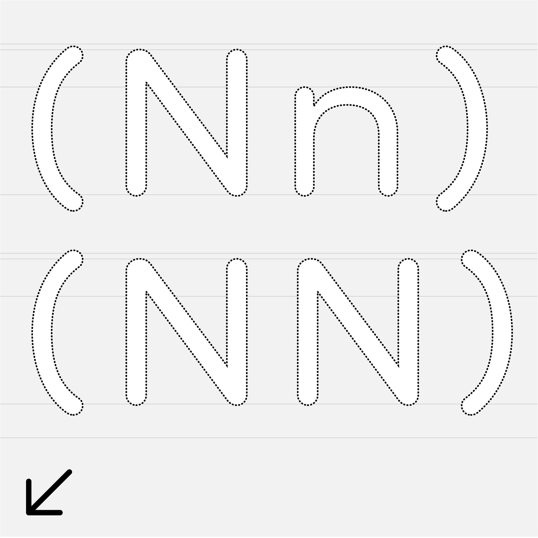
Majuscule
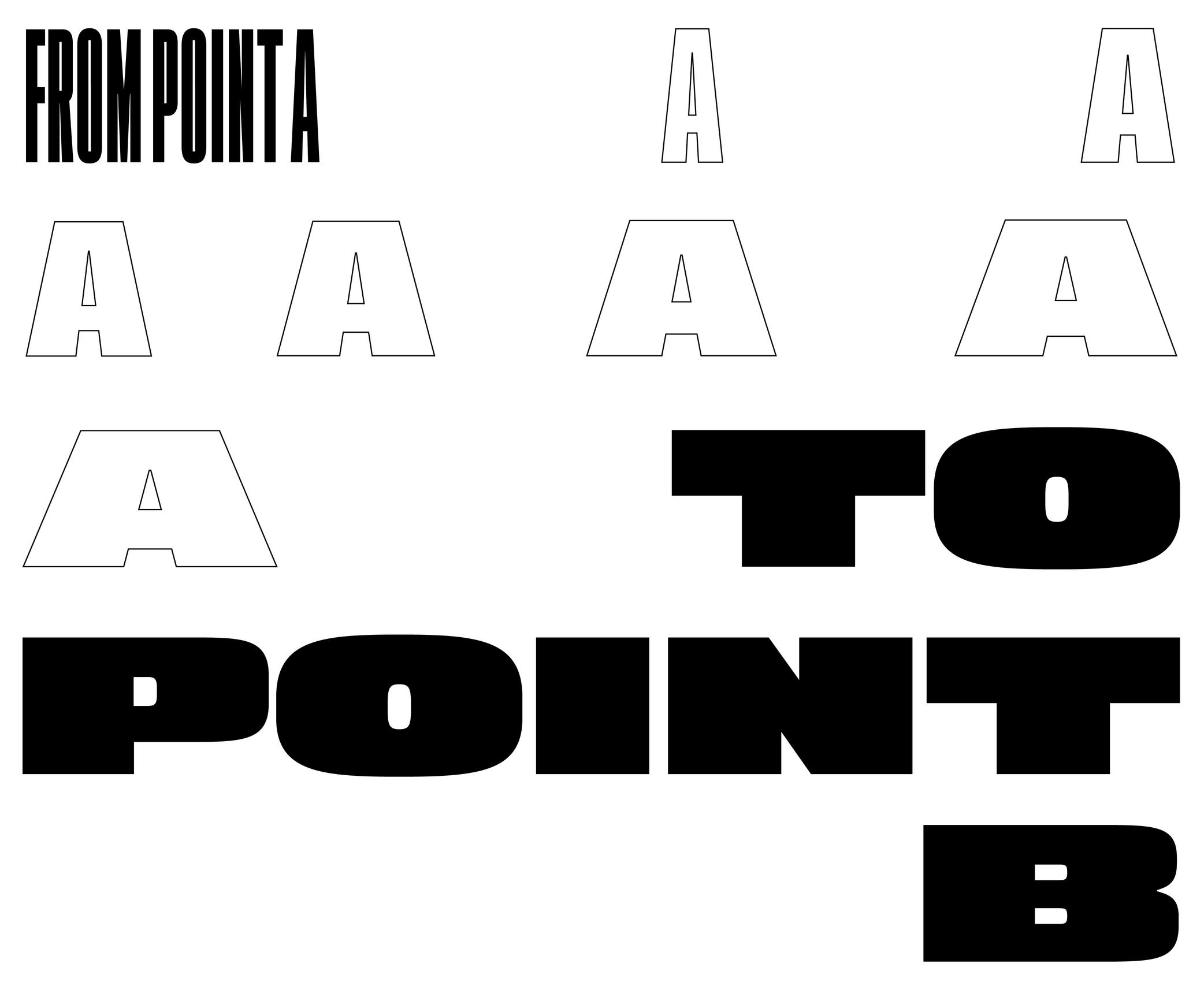
(Read More)A majuscule is a capital letter placed at the beginning of a sentence or the first letter of a name.
Note that all capital letters are not necessarily majuscules, such as CAPITALIZED words, which are made of capital letters.
Margins
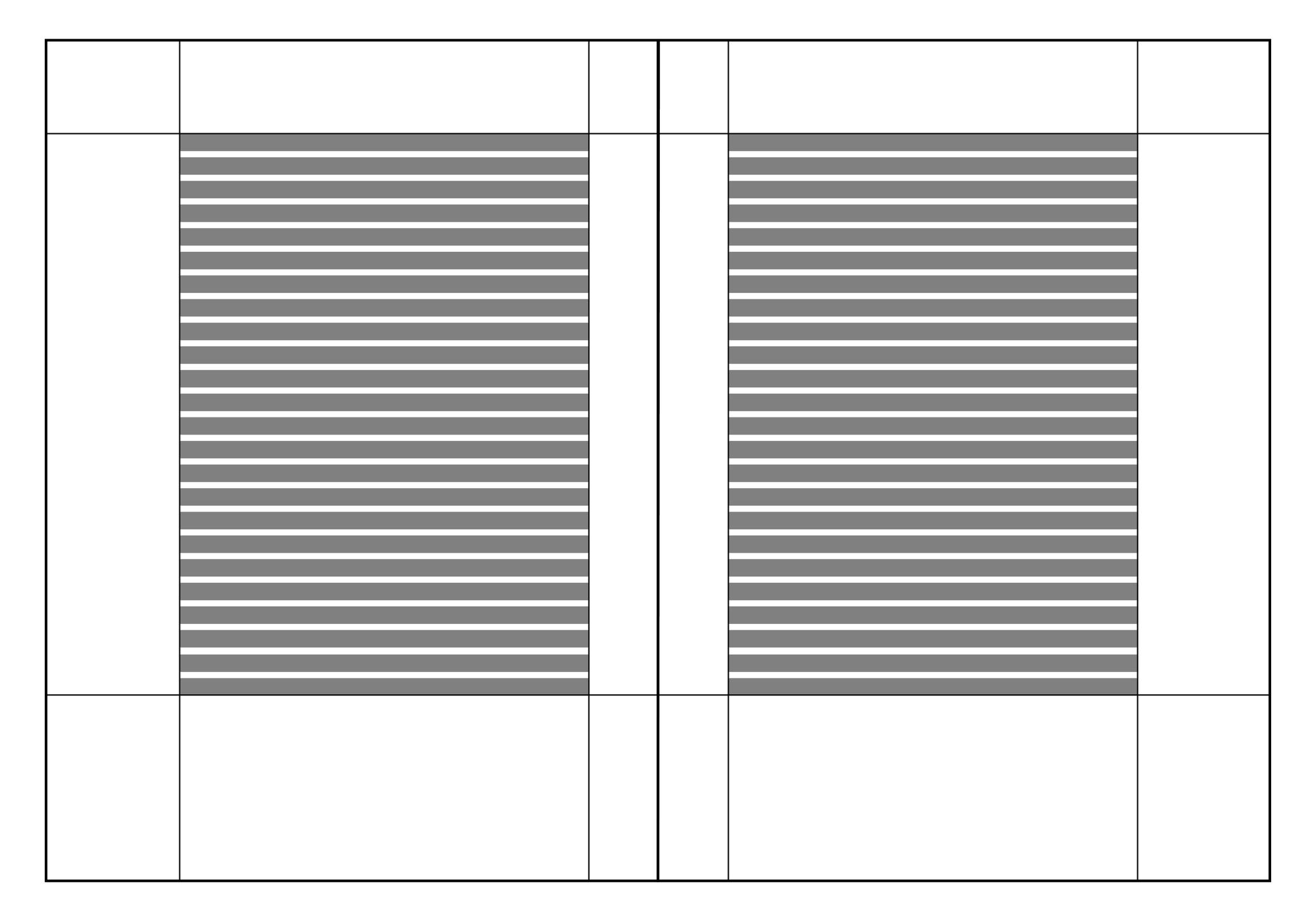
Illustration: Words of Type.
(Read More)Margins are the spaces around a composition block (left, right, top and bottom margins).
Metric System
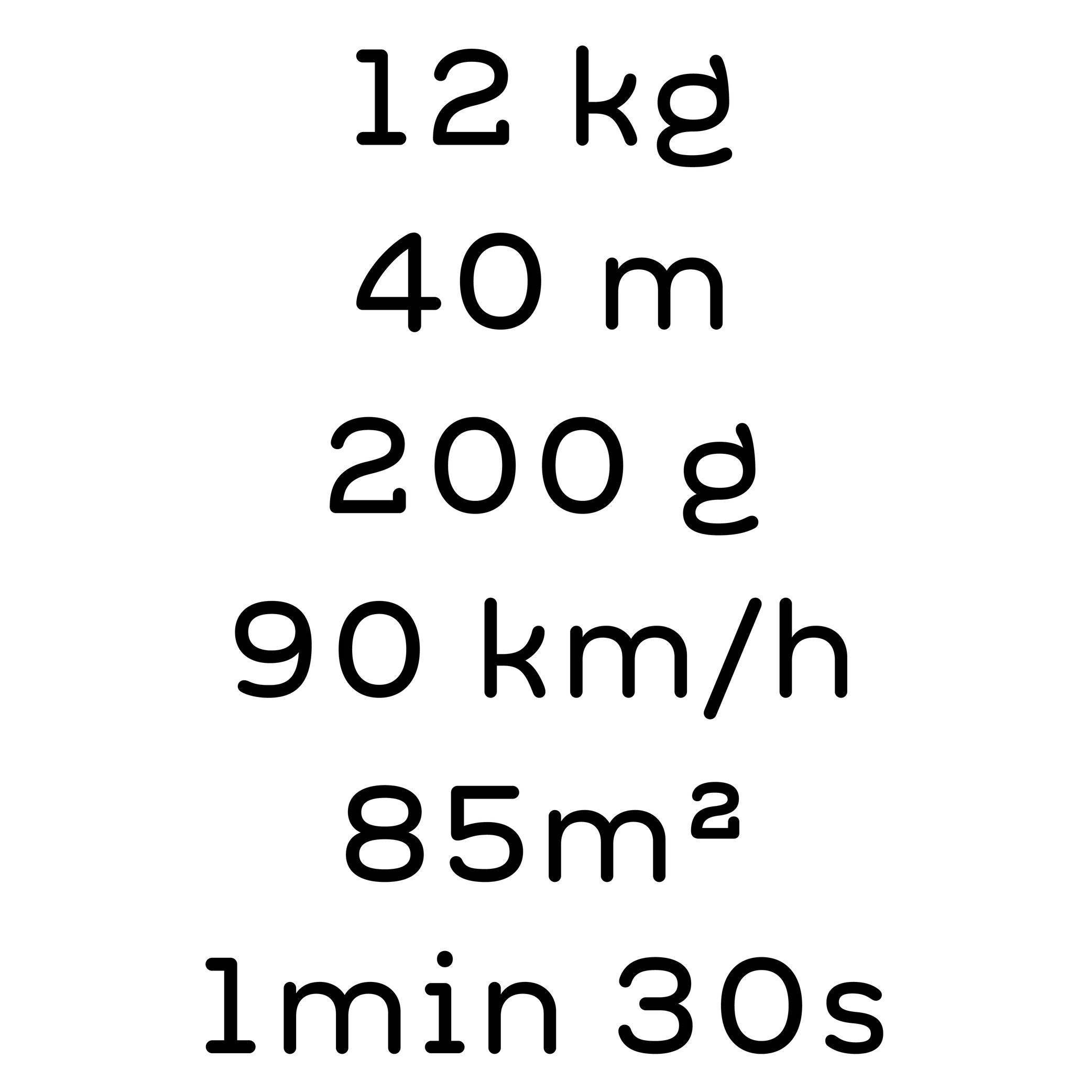
Illustration: Words of Type. Typeface in use: Knowledge Rounded, designed by Lisa Huang, 2024.
(Read More)The metric system is a measuring system used nowadays in most countries around the world, where the units are the meter, gram, Celsius degree, etc.
The United States of America and countries that were part of the British Empire use the imperial system with feet, pounds and Fahrenheit degrees.
OpenType Features
Sponsored by Typotheque . Typeface in use: Irma Display Black , designed by Peter Biľak, 2009-2011.
(Read More)Opentype features are found in digital fonts with an OpenType format.
For the same glyph, there can be multiple variations (or alternates) along with their default form, as options for stylistic alternative or functional improvement. OpenType features can be activated in apps supporting them or with code lines calling them on a website, if they exist in the selected typeface.
Some principal features are: case sensitive, swashes, various figure styles (old style, tabular, proportional, etc.), and small capitals (or Small Caps).
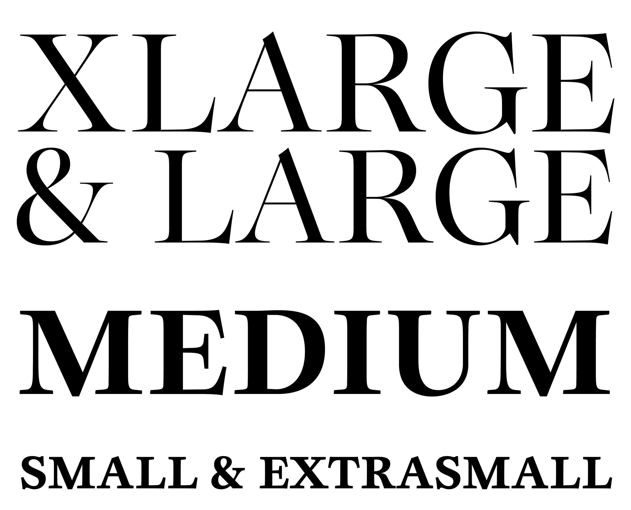
Optical Size
Sponsored by Blaze Type . Typeface in use: Joly , designed by Léon Hugues, 2021.
(Read More)When a typeface is intended to be used at some specific sizes only (large on billboards or small in printed books), some details can be optimized for each situation, resulting in optical size styles such as Text, Caption, Titling, or Display.
For text styles, aspects such as lower contrast and simpler details have been proven more efficient for reading small texts (especially if they are printed on rough surfaces), while display styles can carry elaborate details as they are seen in larger sizes.
Orphan
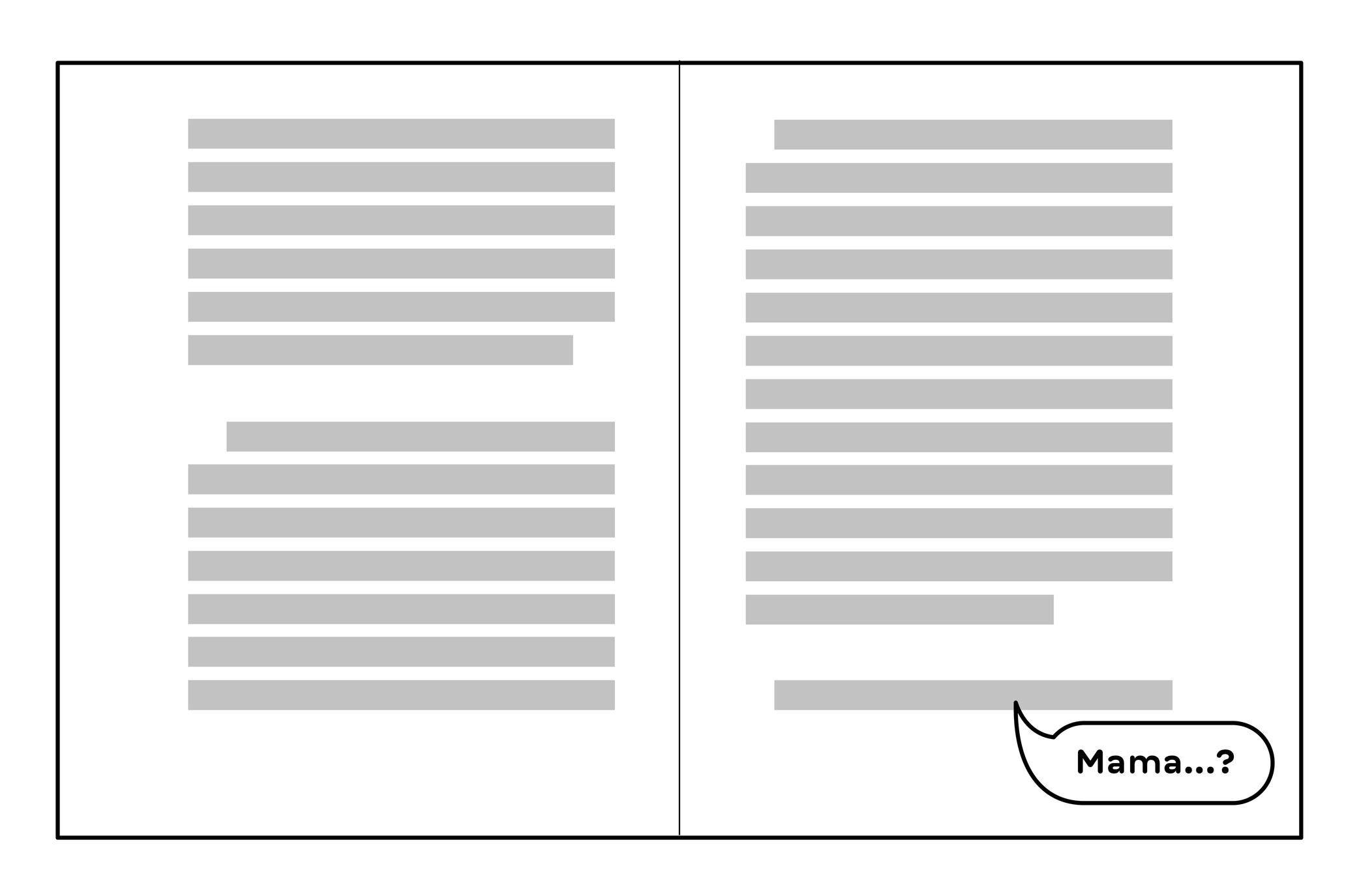
Illustration: Words of Type. Typeface in use: Knowledge, designed by Lisa Huang, 2024.
(Read More)Odd situations can happen when typesetting a text making its overall appearance look sloppy.
When the first line of a paragraph appears alone at the end of a column or a page, it is called an orphan.
Padding
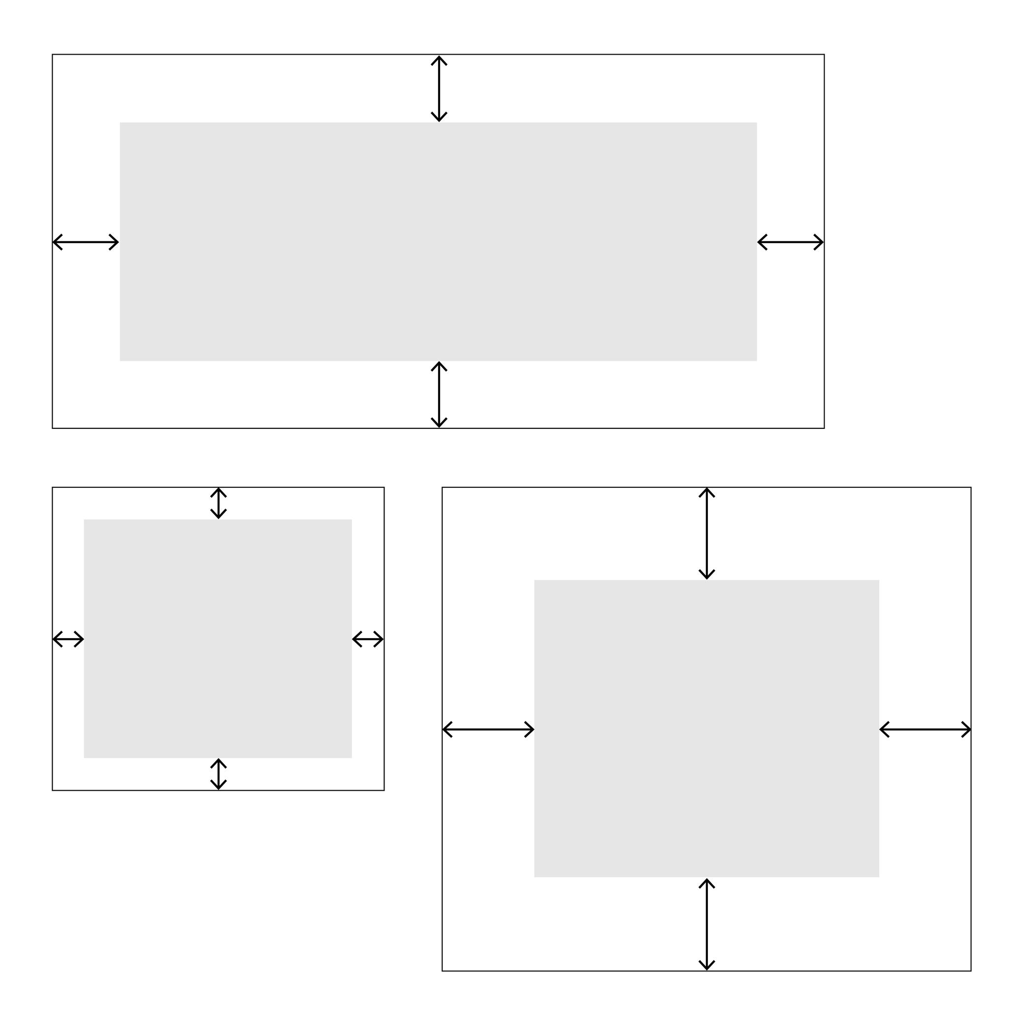
Illustration: Words of Type.
(Read More)In web typography, padding is about setting a specific distance between the sides of an element and its borders, like margins inside it.
Pagination
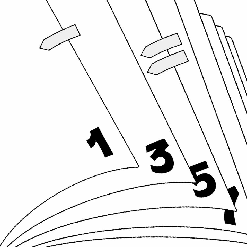
Illustration: Raven Mo .
(Read More)Pagination refers to the page numbering system of a printed document.
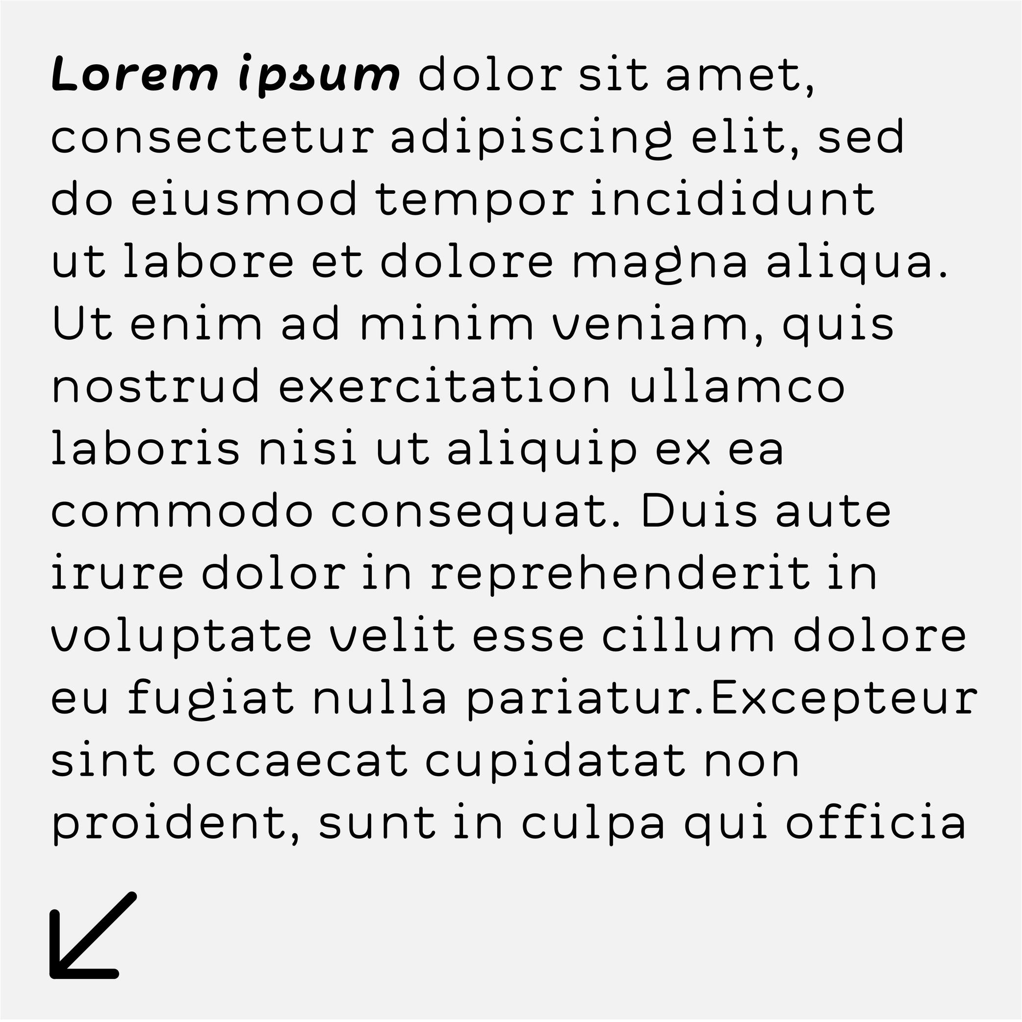
Placeholder Text
Sponsor Word of Type and feature your typeface in this card with a linked caption. Contact us for more information.
(Read More)Placeholder text (or Lorem Ipsum) is a fake text used to test the aspect of a typeface or a typographic composition.
Point
(Read More)In typography, points are measurement units to describe the size of a typeface (for printed or digital media).
Several point-based series of typographic measurements have been created and used over the centuries and across the globe. In France and Germany, 12 Didot points make one Cicéro, while in Britain and the US, it was a Pica that would be divided into 12 slightly smaller points.
Today, the international typographic unit in software applications is the (DTP) point, which is exactly 1/72 parts of an inch—a cleaner standard than the Pica point previously used in the United States. Digital font sizes are referred to in point sizes and indicated as pts.
Small Caps
 (Read More)
FUNCTION
Small Capitals, or commonly just Small Caps, are letters with a capital letter structure but smaller in size (hence the name).
USAGE
They are used in texts when there are many capital letters together (initials, abbreviations, acronyms, Roman figures or all caps words in texts). In traditional typesetting where a new chapter starts with an initial or drop cap, the other letters of the first word or the entire first line can also be set in small caps to ease out the change towards the following text in lowercase.
HISTORY
The use of small caps started to be popular during metal type printing, as they added an additional option to the typographic palette, while keeping the same typeface.
Today, small caps are not present in every digital Latin typeface (they have their own Unicode values and are not in every Latin character set), as using small caps was more common in the ‘Latin’ world and used in traditional typography.
Some text processing or design applications can automatically generate small caps by scaling down capitals letters (just like they can do the same for italic or bold styles), but this is not advised for high quality typography, as the weight relation is much lighter.
DESIGN
Small caps have no precise height proportions compared to the capitals or lowercase, but a good ratio sits between these two heights.
Their weight and contrast should match those of the lowercase, and their height/width proportions are usually slightly wider than simply scaled-down capitals.
Space
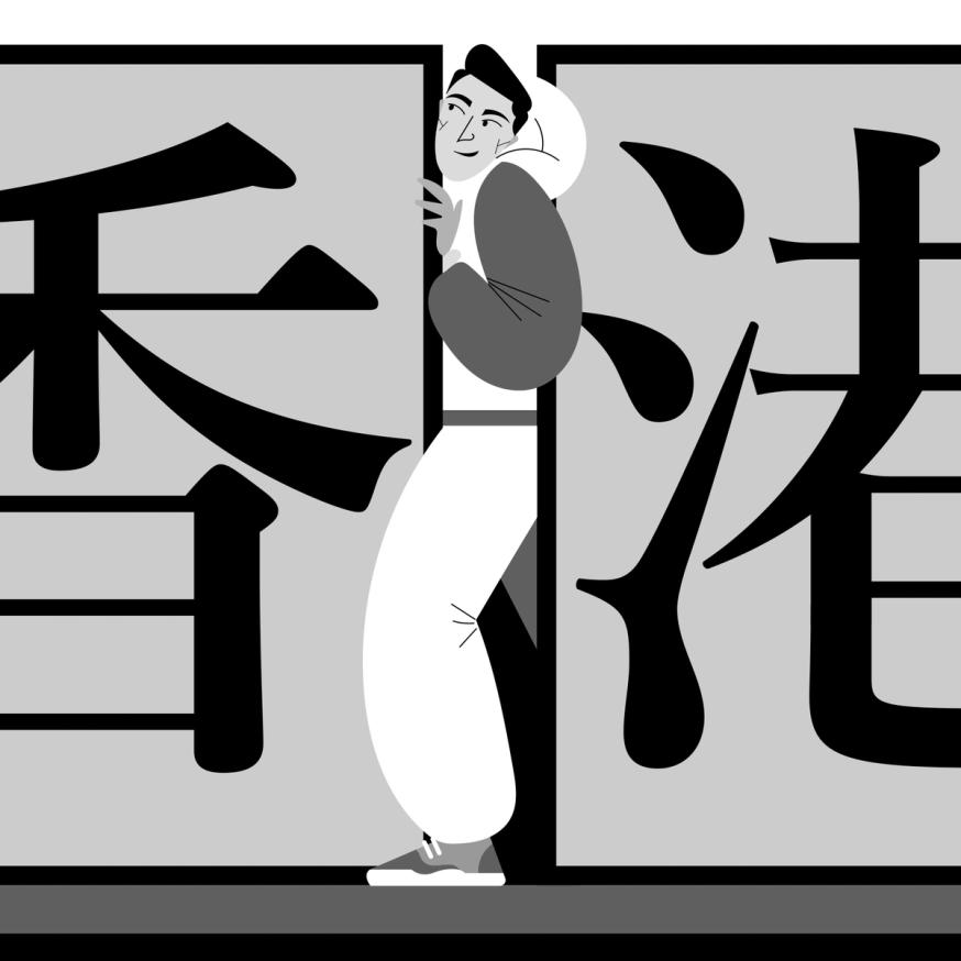
Illustration: Jonny Wan .
(Read More)FUNCTION
For many writing systems (but not all), spaces separate words. Like punctuation symbols, they bring rhythm and clarity to a text and help with the reading experience. In the Latin script, several spaces with different widths are used for various situations (see Typographic Rules below).
HISTORY
In Ancient Latin, Roman capitals had no spaces between words. In some monuments, dots could be placed at middle height to help identify the words. In Europe, with the adoption of the Latin script, they started to appear in calligraphed manuscripts to help the readers identify the different words.
During the metal type printing era, blank pieces of lead were used as spaces between words. There were multiple widths for word spaces to help arrange text lines with precise length (em space, thin space, etc.). They lead to various rules in various languages and typographic traditions.
Nowadays, texts in the digital realm still make use of a variety of spaces for different situations in different languages, and also to offer different typographic options.
DESIGN
Spaces shouldn’t be too wide or too narrow. In Latin script based languages, a common convention is to set the width of the generic space glyph (U+0020) similar to that of the letter I or i.
TYPOGRAPHIC RULES
Many languages—including those commonly using the Latin script—have specific typographic rules.
One example: in French, before a question mark, exclamation mark, semi-colon or colon, there is a non-breaking space, whereas there isn’t any in English or other languages.
In digital typesetting, there are variable word spaces, breaking and non-breaking spaces, which give the text processing application the information on whether the width of the space can be adjusted or if the text line can or can not be broken at a specific place.
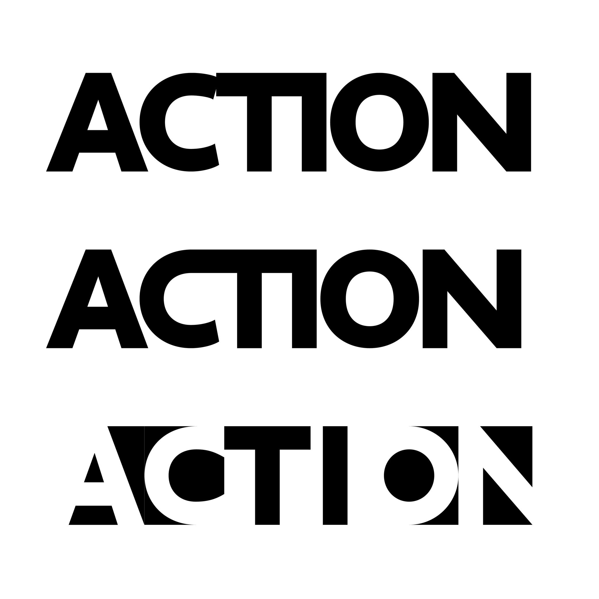
Substitution
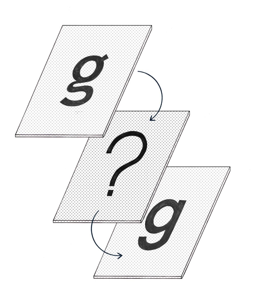
Illustration: Chloe Kendall .
(Read More)Whenever a file contains text using a font that isn’t installed on the user’s device, the system will replace it with another one as a fallback solution. It is a font substitution.
Synthetic Font
(Read More)In most text processing tools, it is possible to apply a different style (Bold, Italic, Underlined, or Strike-through).
When those styles don’t exist already in the selected typeface, the system can “automatically” generate a similar effect even if it hasn’t been designed (this is not recommended, but can be handy if needed).
What is created in such a situation is called a synthetic font.
Template
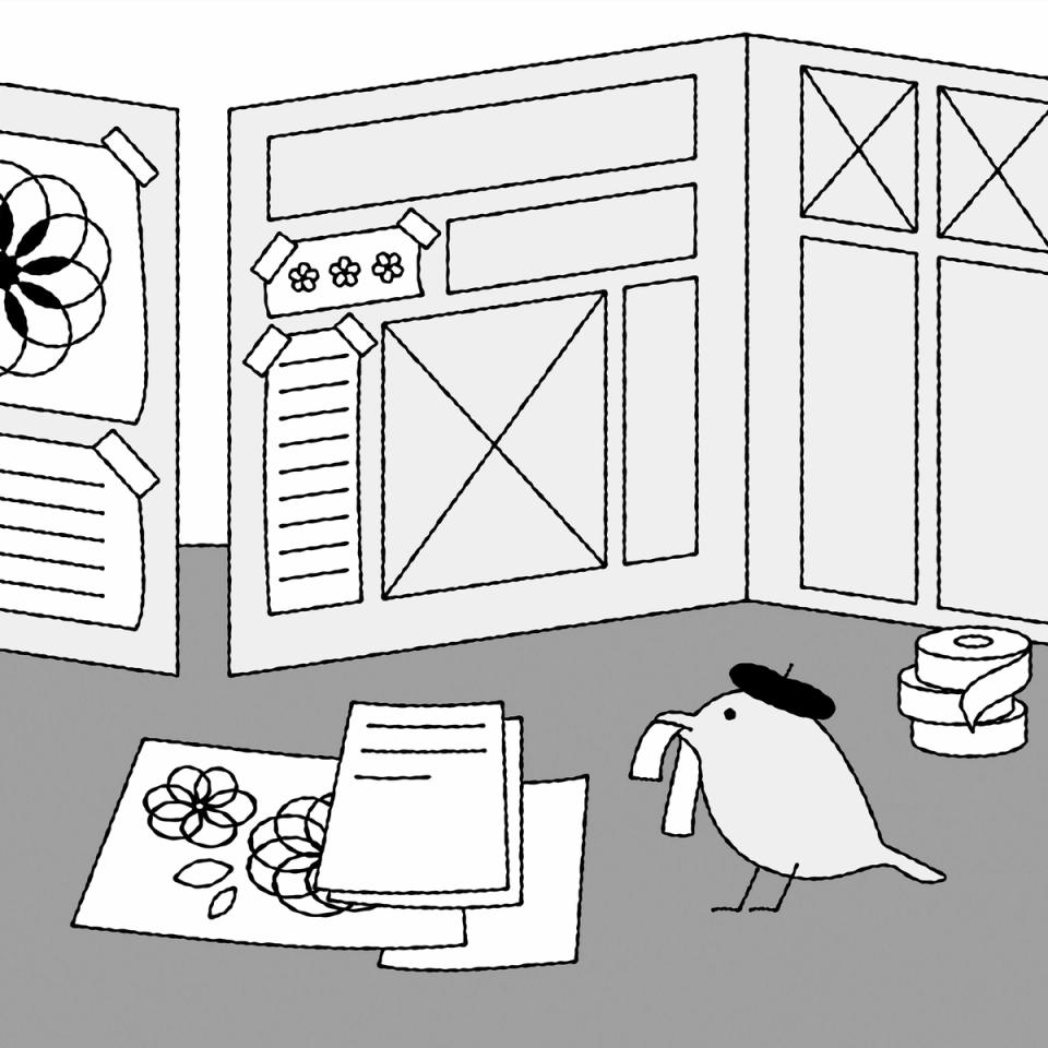
Illustration: Raven Mo .
(Read More)A template serves as a model for typography and typesetting. Like a reference guideline, it helps with the composition of the elements in a page (images, texts, spaces, grids, etc.), printed or on screen, to create a coherent and consistent document with specific design characteristics.
Tracking
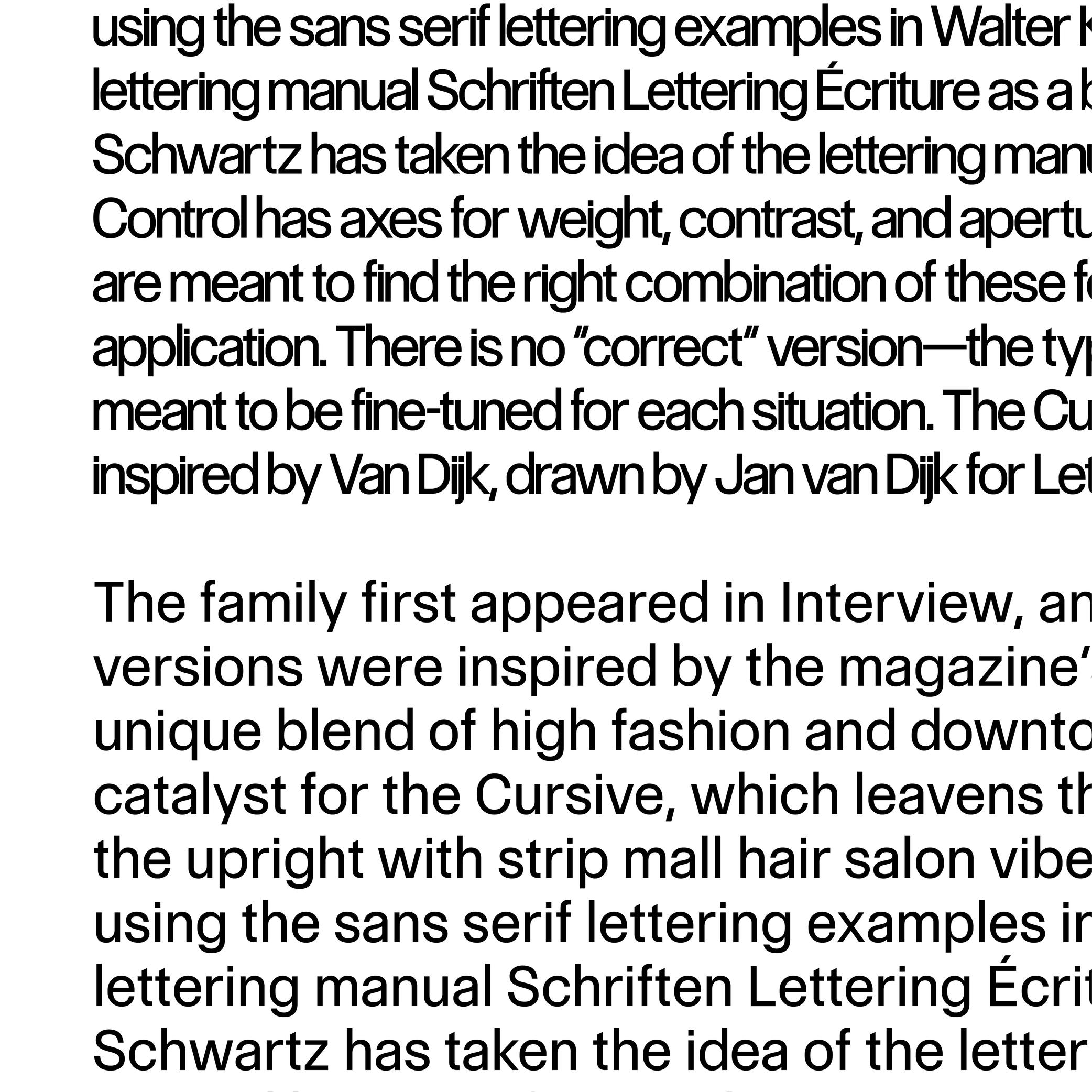
Sponsored by Commercial Type . Typeface in use: Control , designed by Christian Schwartz and Miguel Reyes, with contributions by Hrvoje Živčić, after Walter Käch and Jan Van Dijk, 2024.
(Read More)Fonts have spacing values for all glyphs that are defined by its designer.
If glyphs are too loose or too close to the needs (or taste) of the user, the spacing can be modified in most application tools for texts. It is called “to adjust the tracking.”Typography
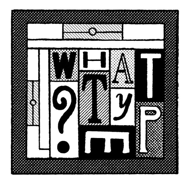
Illustration: Jay Cover .
(Read More)Typography (or typesetting) is the practice of assembling text elements in a design composition by defining multiple aspects such as the ratio between text columns and white spaces, choosing and using typefaces, setting their styles and sizes for all categories of texts, leading, justification style, and hyphenation, etc.
The person practicing typography is called a typographer.
Not to be confused with Typeface Design.
Unit
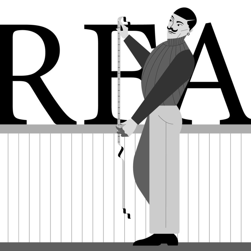
Illustration: Jonny Wan .
(Read More)Measuring the sizes of fonts is made with a specific type of unit called points or pts.
Multiple types of units with various sizes and names have been used over the years and across the globe, from the Didot point to Pica points to inches and DTP points (and these are for Latin script only).
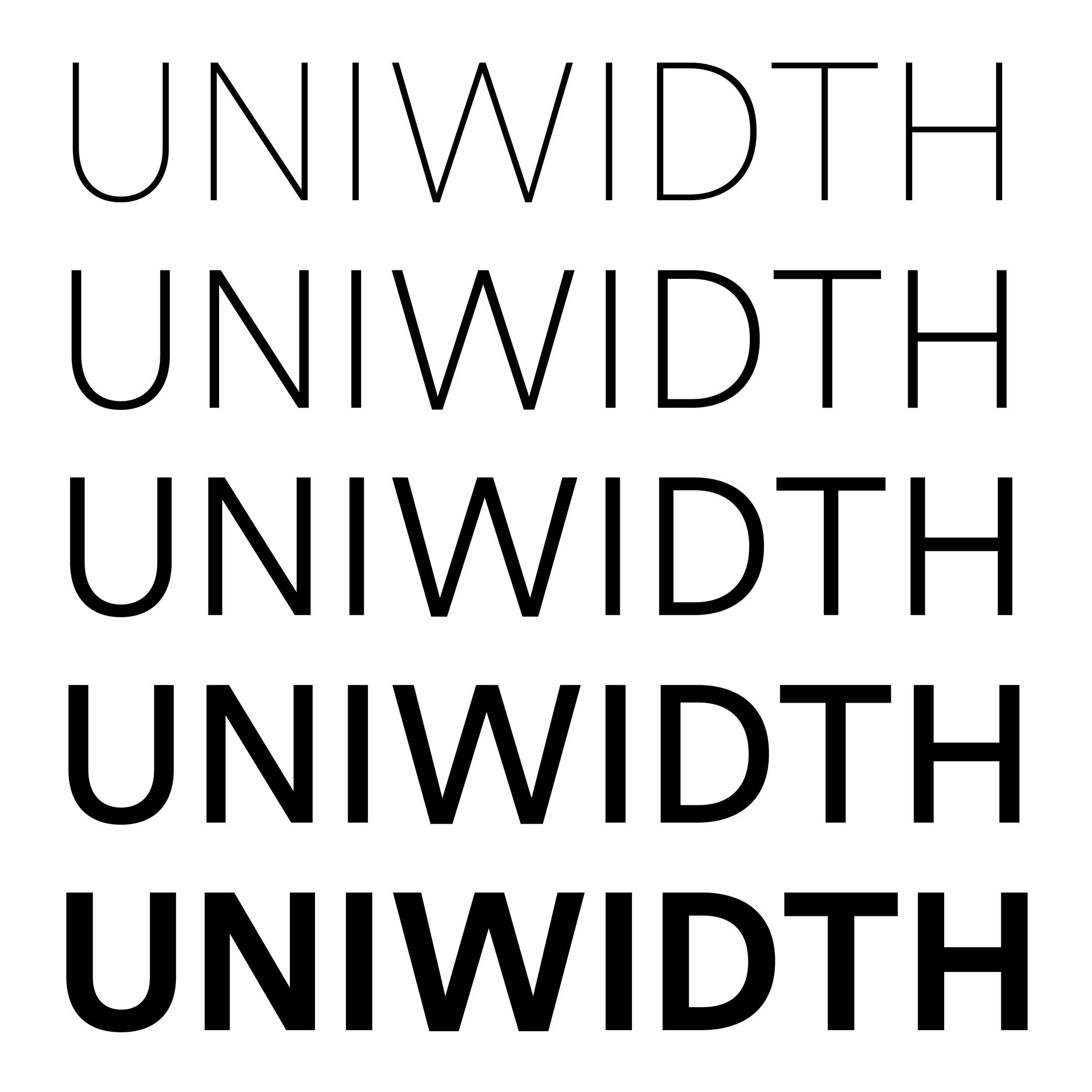
Uniwidth
Sponsored by Frere-Jones Type . Typefaces in use: Retina , designed by Tobias Frere-Jones, 2016.
(Read More)Also called Multiplexed or Duplexed.
The term of Uniwidth has been brought up by Armenian type designer and teacher Hrant Papazian.
In type design, the width and/or spacing values of a glyph change depending on the weight of the style to ensure a visual balance. However, some typefaces are designed as uniwidth, which means that the same glyph keeps the same width across all weights and styles of the family.
This feature facilitates digital typesetting, especially when there is an interaction between the user/viewer and the text on a digital screen. For example, words or parts of text can switch to a different style without modifying the typesetting of the block while hovering or clicking.
Widow
Illustration: Words of Type. Typeface in use: Knowledge Round, designed by Lisa Huang, 2024.
(Read More)Odd situations can happen when typesetting a text, making its overall appearance look sloppy.
When the last word or the last line of a paragraph appears alone at the beginning of a column or a page, it is called a widow.