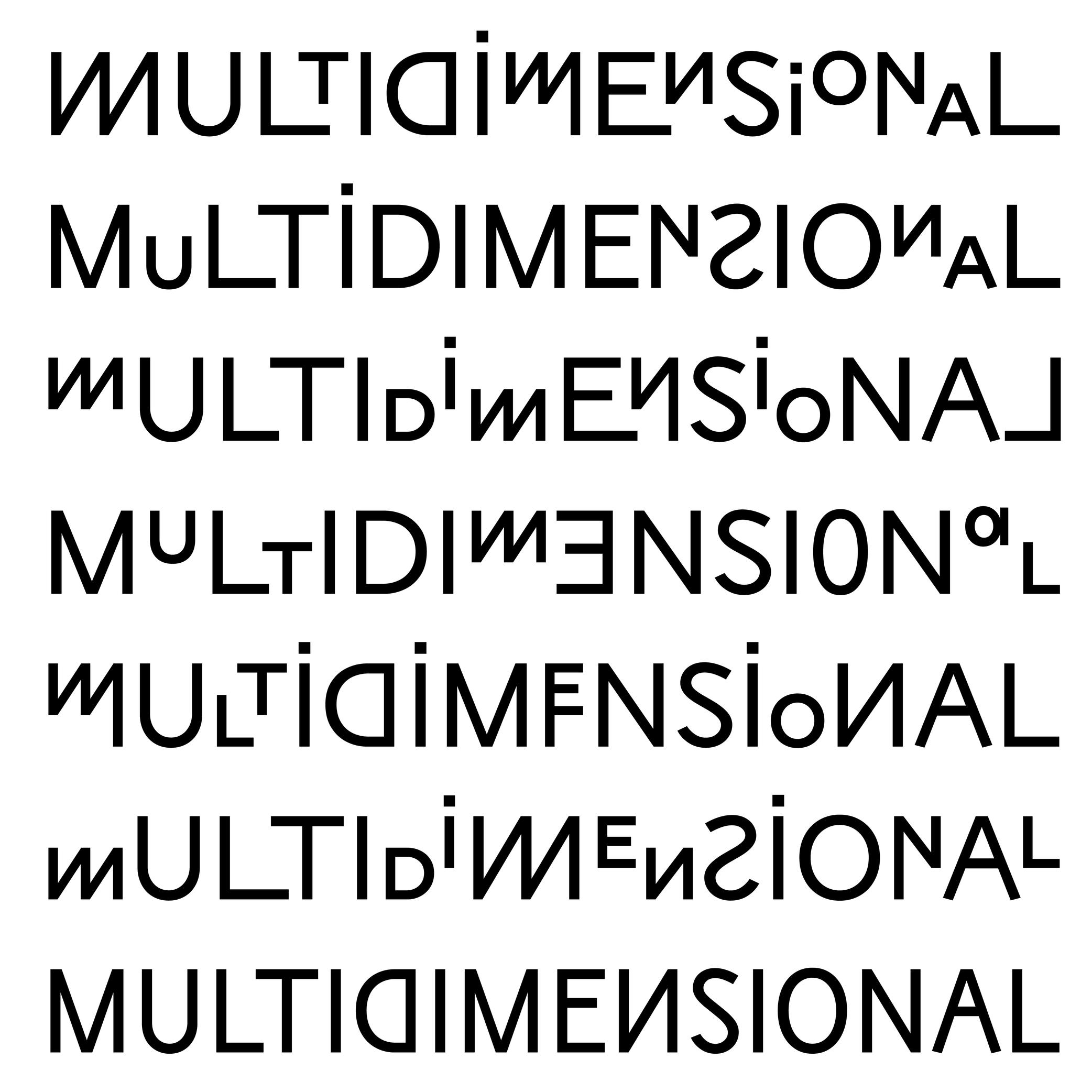
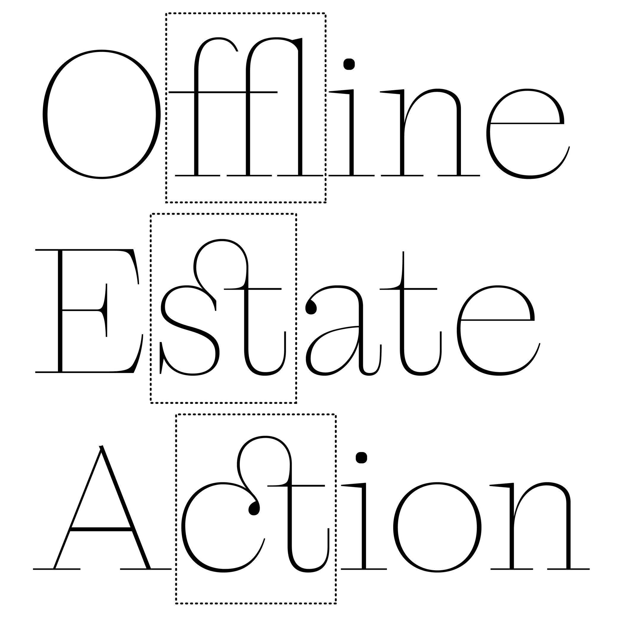
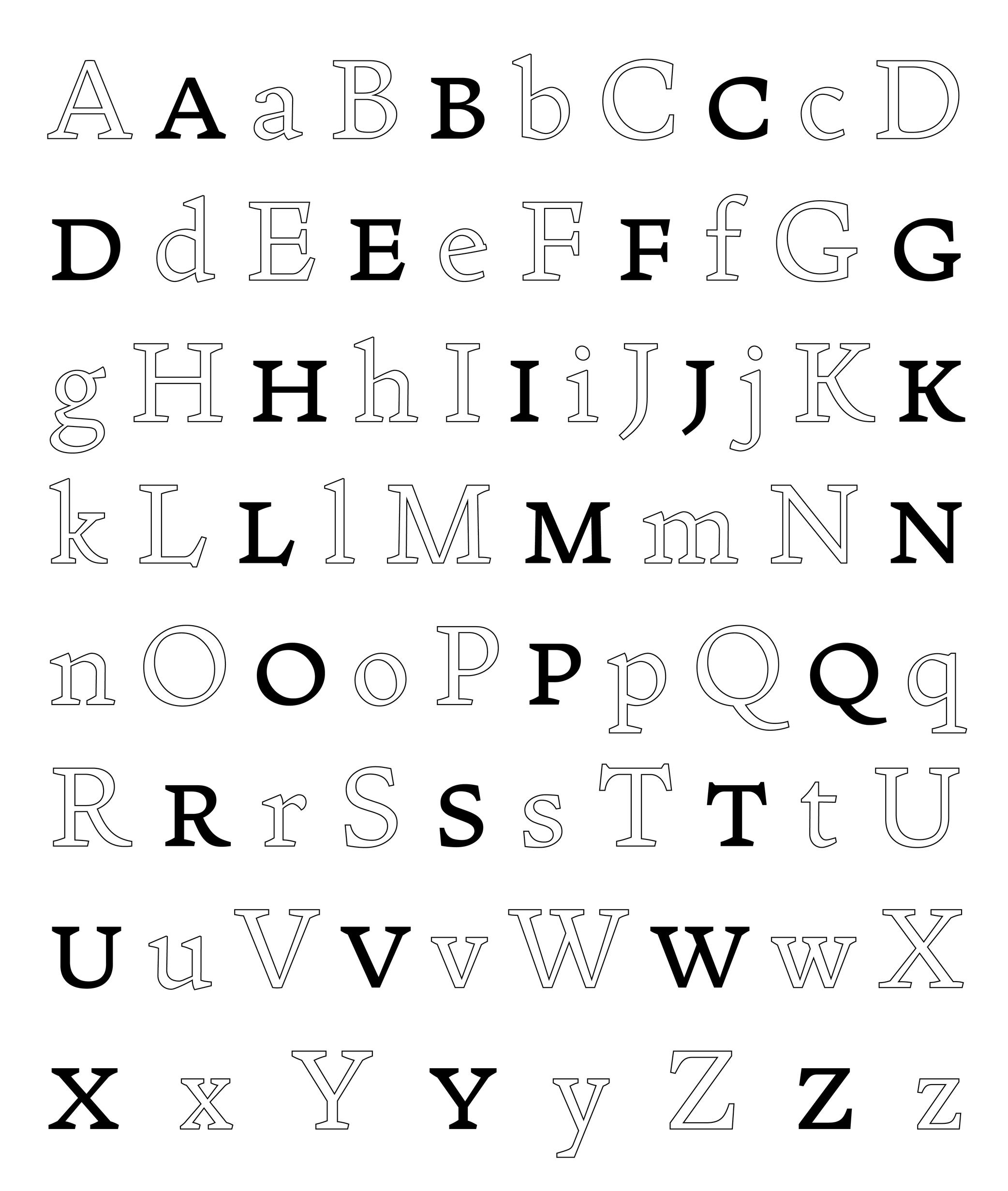
Alternate (Glyph)
 (Read More)
An alternate is a variant shape of a character, which has to be considered as a glyph of its own.
Alternate glyphs are created for various reasons:
• contextual: such as case-sensitive punctuations, where punctuation symbols can be aligned in a nicer way with capital letters when set within them, or tabular figures if they are used in numeric tables;
• positional: in Arabic or other scripts that have connected characters, a character may need to have different shapes depending on its position in a word (initial, medial, final, isolated);
• stylistic: such as single-story or double-story letters a or g. These alternates can also reflect a specific aesthetic choice (e.g., with or without swashes).
• localization: some languages using a same script as others require a different form of the same character as localized preference variant.In digital fonts, these variants are accessed through OpenType features. Each one is tagged with a specific code (added as an extension to a glyph’s name) that enables a software to apply them whenever needed. Some most used ones being listed below:
• calt : contextual alternates
• case : case-sensitive forms
• ss01, ss02, etc. : stylistic sets
• locl : localized forms
• onum : oldstyle figures
• tnum : tabular figuresAmpersand
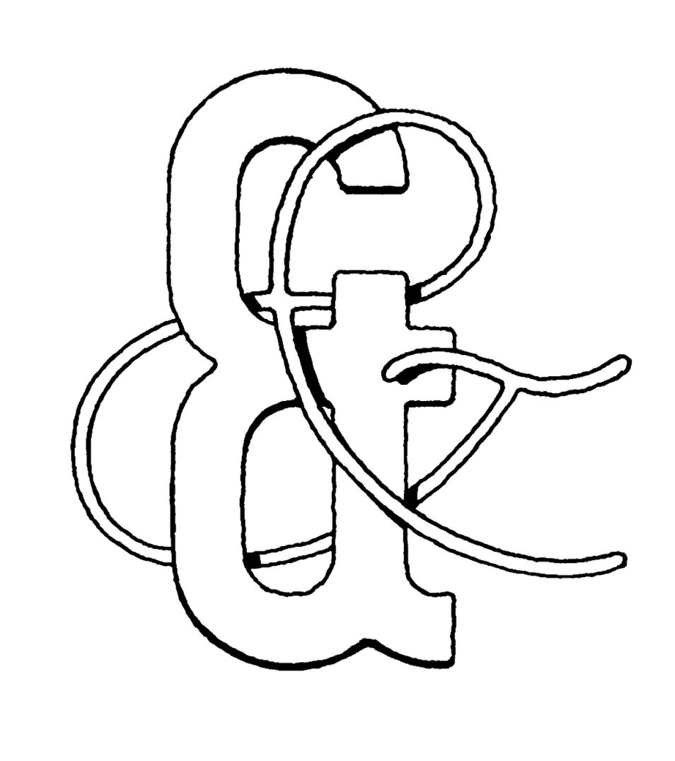
Illustration: Tezzo Suzuki .
(Read More)FUNCTION
The ampersand (&) is a character used in titles, company, or brand names with combined words to replace “and.”
HISTORY
During the Middle Ages in Europe, books were mainly produced to distribute religious texts. For that reason, most texts were written in Latin, even after Gutenberg’s invention of metal-type printing in 1450. The letters e and t (for et meaning “and” in Latin) were used so often that punch-cutters combined the letters to create a single character et, first as a ligature and later as a character on its own.
DESIGN
The ampersand has many design possibilities. The & as we know today is only one out of many designs that have been created, experimented, and used since the introduction of the combination of the letters e and t of metal-type printing. Its top is often aligned with the uppercase and/or figures to give it enough space to be legible.
TYPOGRAPHIC RULES
The ampersand is mostly used as a decorative addition in titles or brands to represent the word “and” (or equivalent in other languages). It is better to use the word “and” in body-size texts.
Apostrophe
Sponsored by DJR . Typeface in use: Roslindale , designed by David Jonathan Ross, 2017.
(Read More)FUNCTION
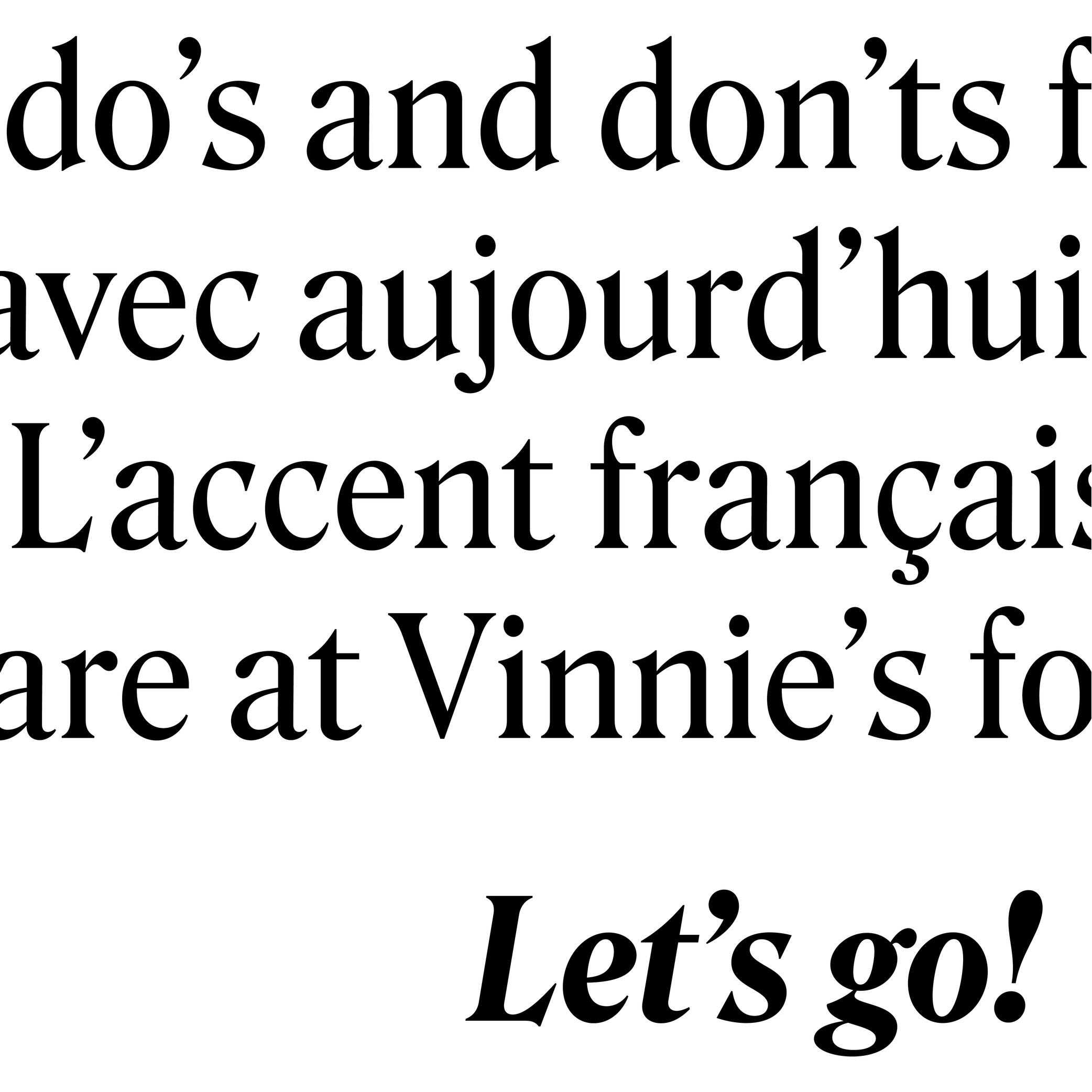
The apostrophe (or “single quote” for English speakers) is a very common punctuation mark in languages using the Latin alphabet. It has different functions from one language to another. In English, for example, it is used as a possession (“part of a letter” to “a letter’s part”) or an elision marker (“it is” to “it’s”).
HISTORY
A symbol looking like an apostrophe dates back to the 16th century in France when the engraver Geoffroy Tory (1480–1533) introduced this sign to replace a letter or a short word.
With the invention of typewriters, other look-alike glyphs (single quote, prime, acute accent, etc.) were assembled into the same key with the apostrophe to save as many keys as possible for the limited space of the keyboard. But this led to confusion that is still observed nowadays, with the prime glyph being often used as an apostrophe.DESIGN
Well-designed typefaces either have slanted or curly-shaped apostrophes (related to the comma of the typeface). This shape avoids confusion with the prime.
Asterisk
Illustration: Words of Type. Typeface in use: Knowledge Rounded, designed by Lisa Huang, 2024.
(Read More)FUNCTION
The asterisk (*) is commonly used as a punctuation symbol placed after a word to indicate that it refers to a note.
HISTORY
Star-shaped symbols are seen in documents from many regions of the world throughout history. It was only in the Middle Ages in Europe that the asterisk began to be used as a mark to link a part of a text to additional comments added elsewhere.
DESIGN
The asterisk can have many different designs in order to match the style of a typeface, from a very abstract five-branched star to more flourished ones, with more or less contrast between the center and the tips. The asterisk is aligned at the top of the glyphs to be legible in a text.
At (sign )
 (Read More)
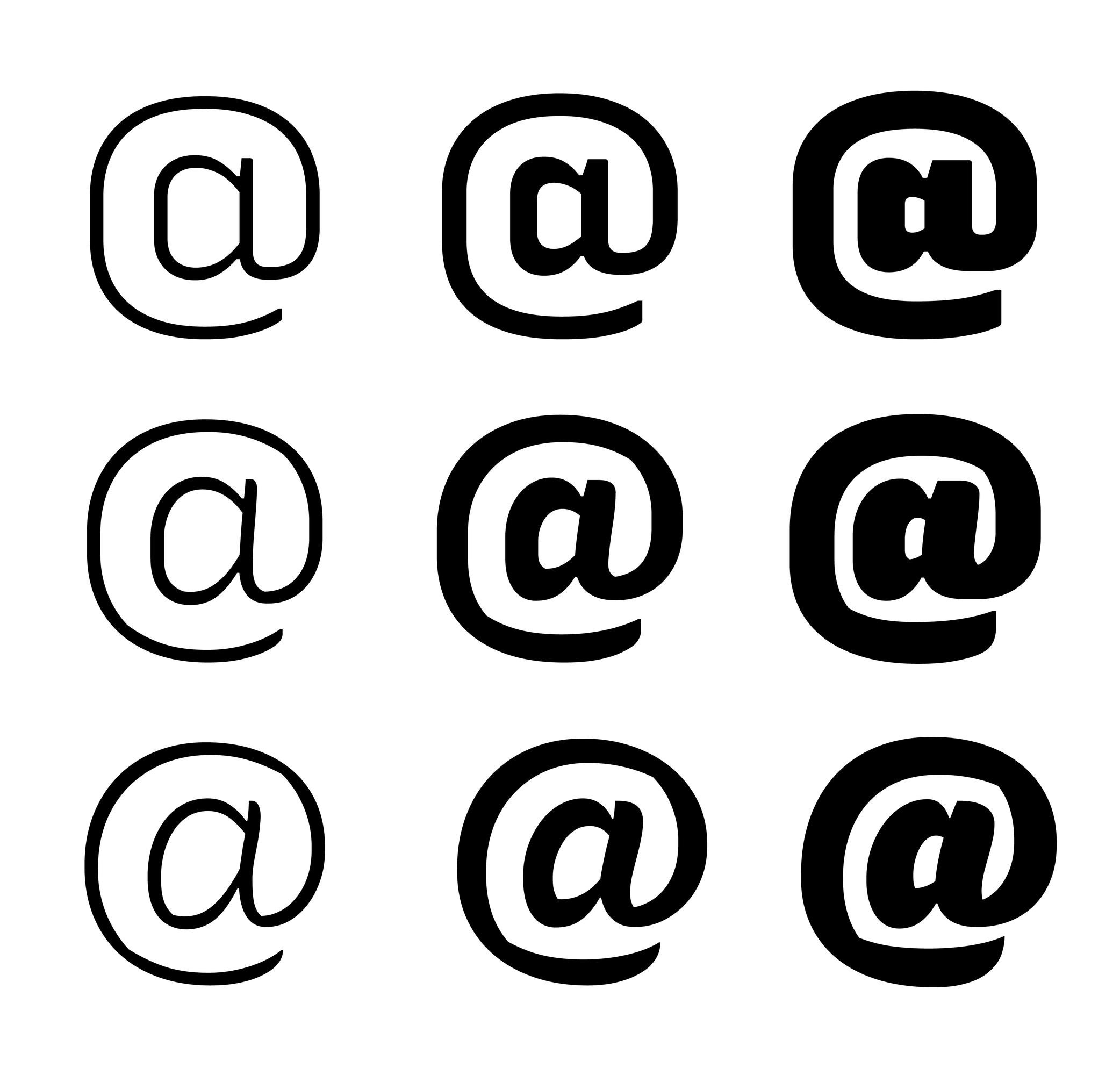
FUNCTION
The at sign (@) is used in email addresses to indicate a domain name or a social media account tag.
HISTORY
The origins of how and why the at sign was created and why it looks the way it does remain unclear. Allegedly, it has been created as a symbol to measure weight or quantity (to signify “at the rate of”) in some parts of Europe since the 14th century. That symbol looked more or less the same as the modern at sign: with a letter a circled by an elongated tail.
Since the use of email addresses, it is used to indicate at which domain name it is hosted.
DESIGN
The at sign is commonly designed as a lowercase a with a tail surrounding the letter. Due to the sign’s visual complexity, there are many solutions to simplify it by making the tail shorter (not entirely enclosing the a) or by starting the tail directly from the top instead of the bottom of the stem.
Colon
Sponsor Word of Type and feature your typeface in this card with a linked caption. Contact us for more information.
(Read More)FUNCTION
A colon indicates the beginning of a quote, a list, a ratio within numbers, or it can be used to indicate time in between two numbers.
HISTORY
The colon has been used in various languages for various types of uses. Scribes during Europe’s Middle Ages began using it as we do nowadays.
DESIGN
The colon is built with two periods on top of each other. The top one is placed just below the x-height and the bottom one sits on the baseline.
TYPOGRAPHIC RULES
There is no space before the colon in a sentence, and is followed by a space (U+00A0). But this rule doesn’t apply to every Latin language!
Comma
Sponsor Word of Type and feature your typeface in this card with a linked caption. Contact us for more information.
(Read More)FUNCTION
A comma separates parts of a sentence to mark a short pause or following ideas. If not overused, it helps improve the reading experience. It is also used in numbers to visually separate figures of larger categories. In the United States and most other English-speaking countries, in numerals of one thousand or more, a comma is used in between groups of three digits counting from the right (where a period is used for the same purpose in other European languages).
HISTORY
In Europe, the origins of many punctuation symbols, including the comma, come from the inventions of Greek scholar Aristophanes of Byzantium (3rd century BC) who created a set of symbols to help with the reading of texts aloud.
DESIGN
The comma is basically a period with a tail. It has to be designed with enough differences to the period so that both can’t be confused with one another, even in smaller text sizes.
TYPOGRAPHIC RULES
A comma has no space before and is always followed by a space (U+0020) when used in a sentence. In numbers with decimals, it is used as such:
(European languages) 15.000,05
(English) 15,000.05
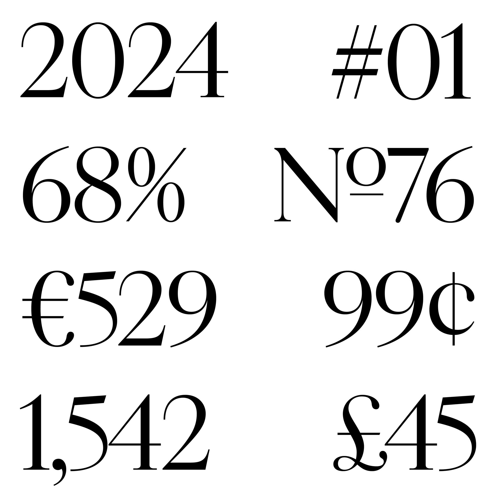
Currency
Sponsored by ArrowType . Typeface in use: Shantell Sans , designed by Shantell Martin and Stephen Nixon, available at Google Fonts, 2023.
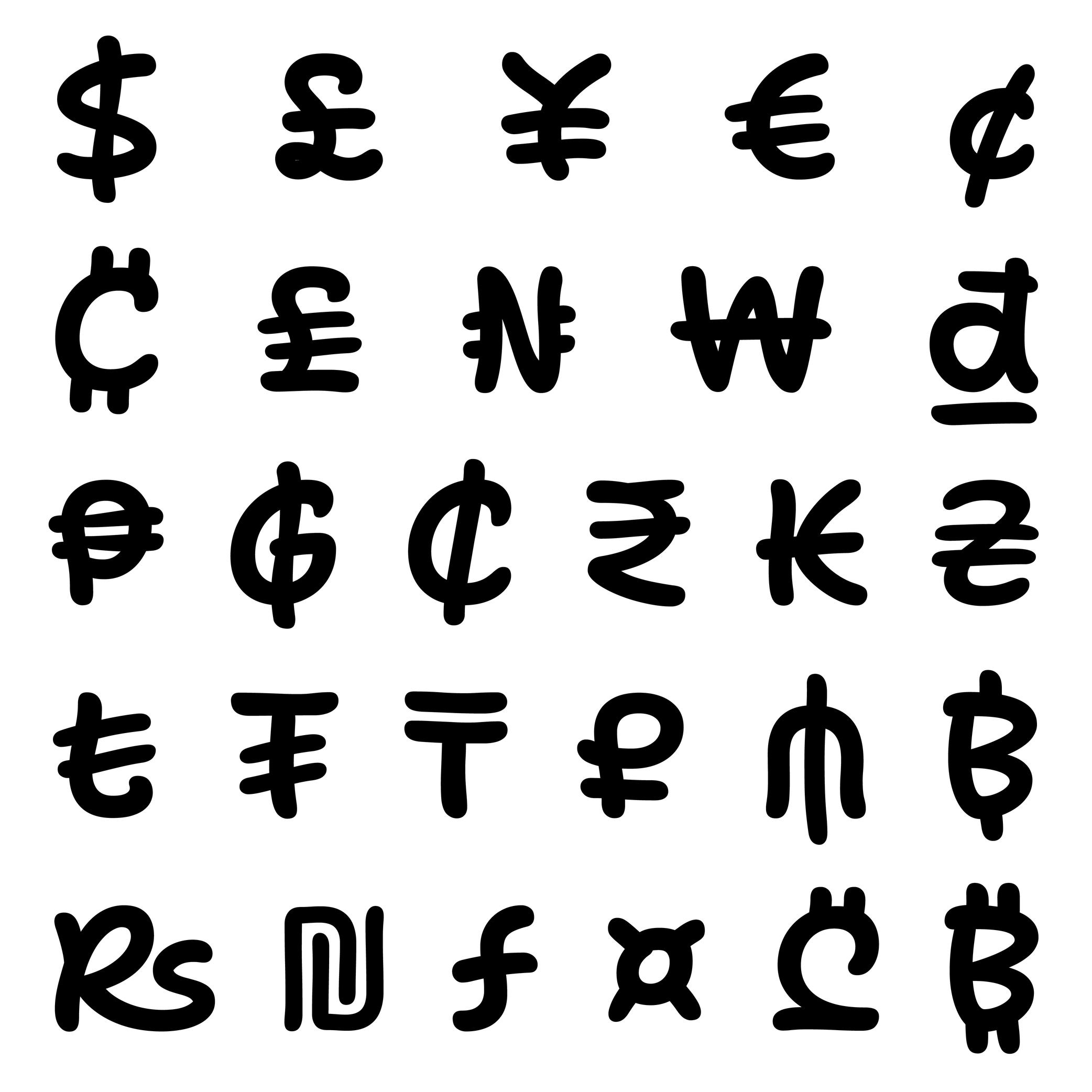
(Read More)Every currency symbol carries one function: to give a financial value to numbers. Each of them evolved through time. Some of them disappeared or have been modified to follow the needs of various civilisations.
For most of them, currency symbols are made of Latin letters with various levels of modifications (US dollar $, Euro €, Vietnamese dong ₫). Some of them can simply” be letters (Swiss CHF) or a character on their own (Chinese Yuan 元).
DESIGN
Currency symbols need to be designed in a good balance with figures, as they are combined with them.
In a typeface family with a wide range of weights, currency symbols of the lightest styles can easily carry every stroke and conventional details. But as the style gets bolder, these can be tricky to keep, especially when too many details darken the symbol to a point where it is hardly recognizable. The most common solution is to simplify the symbol by removing some “less” important parts while keeping the symbol’s legibility.
Dash
Sponsor Word of Type and feature your typeface in this card with a linked caption. Contact us for more information.
(Read More)USAGE
Among the multiple types of dashes (yes, there are many!), the most common ones are:
1. en dash, used for:
• to indicate a list;
• indicate a closed range (as a substitute of words “to” or “between”);
• (less common) to hide letters in a word;
• connecting words in compounds (in some languages)2. em dash, used for:
• indicate lines in a dialogue;
• (less common) to hide entire words or part of one.Both en and em dashes are also used to enclose a section of a sentence, just like a pair of parentheses, or to indicate a separation within a sentence like a colon or semicolon.
HISTORY
Before the adoption of any punctuation standard, markers of various forms were used by scribes to indicate pauses. Dashes of various lengths have been used for many kinds of roles through the centuries, and across countries. But for dash-like symbols, these evolutions left us with the en dash and em dash as principal successors.
DESIGN
Their length has been standardized during the metal type printing era (in Europe and North America), using the size of the font as a reference for their measurement as such:
• 1 em = the font size;
• length of em dash = 1 em (or sometimes the width of letter m of the font);
• length of en dash = 1/2 of 1 em (or sometimes the width of letter n of the font).
Both are placed at the optical middle height between the baseline and ascenders. In a typeface style with contrast, the thickness of the dashes has to be visually consistent with that of the thin parts.TYPOGRAPHIC RULES
Generally, in American English, it is preferred to use the en and em dash without any spaces before and after them; whereas in British English, it is often preferred to use a space before and after an en dash, and em dashes are rarely used.
NOT TO BE CONFUSED
The en dash is particularly often confused with the shorter character hyphen (U+2010), the mathematical sign minus − (U+2212), or the hyphen-minus - (U+002D).
In digital fonts, each of these glyphs has its own Unicode. They are designed and can be accessed individually. But on modern keyboards—inherited from typewriter keyboards which had to make compromises on the number of glyphs due to the limited space available—we are still often typing (mistakenly and without always knowing) the hyphen-minus instead of the hyphen or the en dash. Thankfully, most intelligent text processing apps automatically replace these with the correct glyph depending on the context.
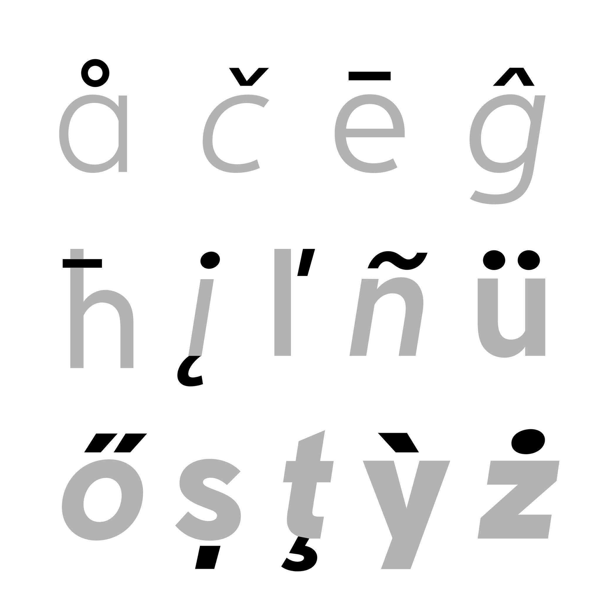
Diacritic
Sponsored by Nymark Type . Typeface in use: Tranemo , designed by Andreas Nymark, 2021.
(Read More)Diacritics are marks added to letters. They can be above, below, or attached to a letter. In most languages and scripts using diacritics, these bring to the letter a different sound than that of the letter by itself.
LATIN SCRIPT
The Latin script is used in a large number of languages. Most of them use diacritics to bring (sometimes very subtle) variations of sound to letters. The quality of the sound of a diacritic can be different from one language to another. An example with the cedilla ç, used in French, Portuguese, and Turkish. Other languages even use multiple diacritics combined together within the same letter (like in Vietnamese with ở).
ARABIC SCRIPT
In the Arabic script, letters have different pronunciations depending on which diacritic is attached to them (or not there), and the language in use.
CHINESE PINYIN
In Mainland China during the 1950s, a new phonetic transcription system was created to make Chinese learning easier: Pinyin, which borrows Latin alphabet letters combined with diacritics as tone markers.
DESIGN
When creating a typeface, diacritics are designed as individual glyphs and are then combined with letters as components in type design applications. They need to be:
- visually aligned to the same height with one another (for those placed in the same area);
- have consistent weight and color;
- placed in a position with the letter that feels “natural” for each language.
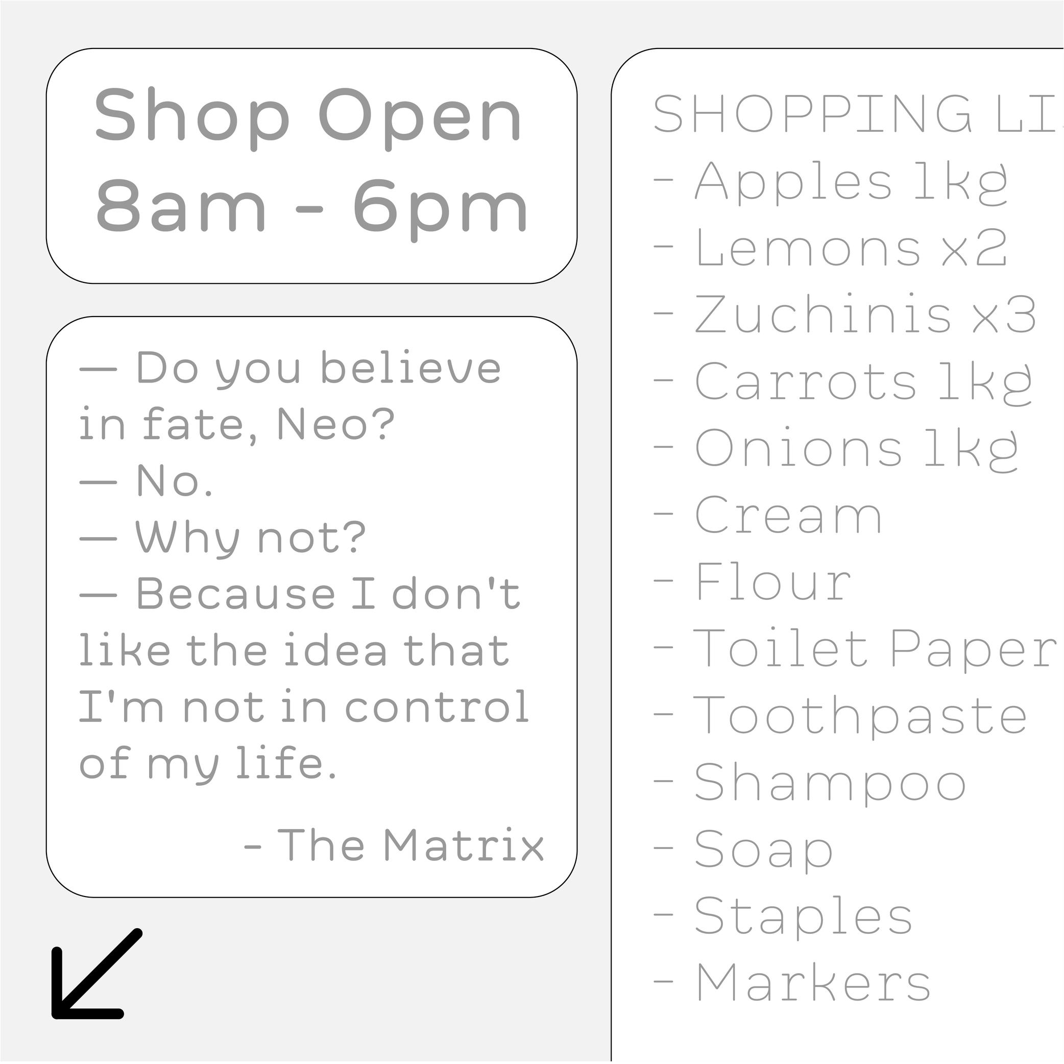
Ellipsis
Sponsor Word of Type and feature your typeface in this card with a linked caption. Contact us for more information.
(Read More)FUNCTION
The ellipsis (or dot dot dot) is a punctuation symbol used to indicate a missing part of a text (incomplete or untold) or a rhetorical pause…
DESIGN
An ellipsis is composed of three periods aligned next to each other. It is advised to place the periods closer together than three actual periods to avoid an exaggerated gap in texts. In Chinese, the ellipsis has six dots instead of three and is traditionally center-aligned.
TYPOGRAPHIC RULES
In most languages, when an ellipsis indicates a string of missing text, it is surrounded by parentheses (…).
If it’s placed at the end of a sentence, the ellipsis is followed by a space after the period to introduce the next sentence.
Exclamation Mark
Sponsored by Kerns & Cairns . Typeface in use: Apotek , designed by Dyana Weissman, 2020.
(Read More)FUNCTION
The exclamation mark is placed at the end of a sentence to indicate an exclamation (obviously!).
HISTORY
There is a theory that early exclamation marks were used by early manuscript copyists in Europe, who wrote the Latin word ‘io’ (sort of ‘hurray’), which evolved into a vertical stroke (formerly i) on top of a dot (formerly o). Other languages use different marks for the same purpose (as in Armenian or Burmese).
DESIGN
The top of the exclamation mark is optically aligned to the cap height, with a period at its base. The shape of the vertical stem can be designed to match the typeface (contrast, rounded tip, etc.).
TYPOGRAPHIC RULES
In English and in many other languages, there is no space before the exclamation mark. But in French, there is a non-breaking space. And in Spanish, a reversed exclamation mark is placed at the beginning of the sentence, with the upright one at the end, with no space.
Figure
Sponsored by Commercial Type . Typeface in use: Chiswick, designed by Paul Barnes, 2017.
(Read More)The words ‘figure’ and ‘number’ are often confused. But, linguistically speaking, they are to be distinguished from one another: a figure (or numeral) is the graphic representation of a number, which is a mathematical concept. Several figures can be combined to form a number. For example, the number ‘22’ is represented by two figures ‘2’.
There are multiple styles of figures (oldstyle, proportional, lining, tabular, etc.) that suit specific situations.
HISTORY
In Europe, figures and numbers used to be represented by Roman capital letters (X, V, I, D, C, etc.). With the rise of trade with Arab countries around the 15th century, the Arabic figures (themselves influenced by Indian figures) were adopted and replaced the Roman capitals. These distinct origins explain the difference between the structure and stroke shapes of modern figures compared to Latin letters.
Guillemet
Sponsored by Formagari . Typeface in use: Modale Antique , designed by Emmanuel Besse, 2024.
(Read More)FUNCTION
Guillemets (or chevron quotes) are quotation marks used in multiple European languages, such as French, Portuguese and Italian.
HISTORY
It is difficult to track down the origins of guillemets, but one of the earliest books using those dates back from 1527 by Dutch/Belgian printer Josse Badius, in which quotes were introduced. They may have been invented by French printer and punchcutter Guillaume Le Bé (1525–1598), after whom they were named: ‘guillemet’ as short for ‘Guillaume.’
DESIGN
Guillemets are shaped like small arrowheads vertically centred with the characters. In the Latin script, guillemets are placed in between the baseline and x-height by default. They can be centered between the baseline and capital height as case sensitive alternates to be better aligned with capital letters.
TYPOGRAPHIC RULES
Depending on the language, they are either pointing inward or outward of a quote, double or single (single guillemets are used as secondary quotes), followed by a space or without. Some examples here:
- « French » or ‹ French ›
- «Italian»
- »Danish«
Note: comma-shaped quotation marks “like these” are standardized in English.
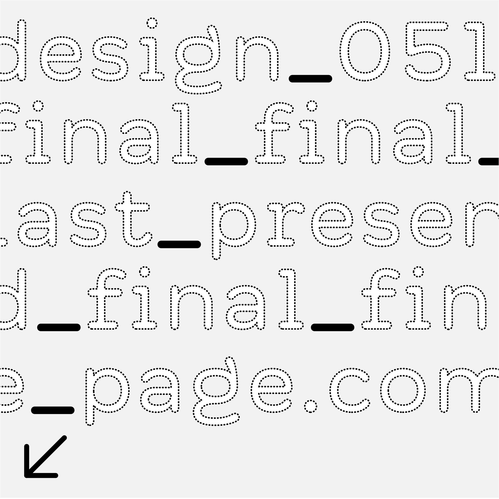
Hyphen
Sponsor Word of Type and feature your typeface in this card with a linked caption. Contact us for more information.
(Read More)FUNCTION
Hyphens are short dash-like glyphs used as word connectors in names or compound words, or to mark a word break (hyphenation in justified or unjustified texts), like in this word card’s illustration.
HISTORY
Before printing presses appeared, scribes used various markings in addition to the letters or characters as signs of punctuation. For the same function, they were often different from one country to the next, and could even be different from one scribe to another. In Ancient Greek manuscripts—when spaces were not used to separate words yet—there was a symbol in the shape of a curved underline used to connect two letters of a word. The name of the hyphen even comes from Ancient Greek: hypó hén, meaning “under one.” Since placing characters under letters with Johannes Gutenberg’s printing press was complicated, the hyphen moved upward to the middle height.
Later, with the limited space on typewriter keyboards, engineers had to make a compromise and put every similar glyph together under one key. This was the case for the en dash, hyphen, and minus signs (the latter two even became a hybrid hyphen-minus).
DESIGN
The hyphen is the shortest dash , and is placed at the same height as its siblings at middle height of letters.
In a typeface style with contrast, the hyphen’s thickness must be visually consistent with that of the thin parts.
TYPOGRAPHIC RULES
The hyphen has no spaces before or after it. See Hyphenation for information on how to use hyphens in a justified text.
NOT TO BE CONFUSED
It is often confused with the mathematical sign minus − (U+2212), which is usually longer than the hyphen, the hyphen-minus - (U+002D), or even with the en dash – (U+2013).
In digital fonts, each of those glyphs have their own Unicode. They are designed and can be accessed individually. But even on our modern keyboards, typewriter keyboards left us the hyphen-minus that we often use mistakenly, instead of the hyphen or the en dash. Thankfully, most intelligent text-processing apps automatically replace the hyphen-minus with the correct glyph depending on the context.
Icon
Illustration: Jonny Wan .
(Read More)In typography and type design, an icon can be a pictogram (a stylized drawing of an object) or an ideogram (a drawing with a meaning).
Indent
(Read More)When typesetting a text, an indent indicates a new paragraph with a new line. It doesn’t have a “visible” sign so to speak, but it is equally considered a punctuation symbol.
In most word-processing applications, the indent symbol can be seen while selecting some text or activating the display of hidden characters.
Ligature
Sponsored by LO-OL . Typeface in use: Kronik Antik Display, designed by Loris Olivier, 2023.
(Read More)In the era of metal-type printing, some character combinations in specific languages were used so often that they were combined to save time while composing texts. Punchcutters would ensure that one sort from the font would depict both letterforms together. We call these individual sorts with more than one letterform a “ligature.”
Other ligatures weren’t made because of the need to save time but because a series of letterforms would otherwise appear in a non-aesthetic manner on the page. One example of this is the f and i. Without a ligature, the white space between those two letters would be bigger than between other lowercase letters. Plus, the upper terminal of the f would be too close to the dot of the i.
The same principle has been kept in digital typefaces and ligatures exist as independent glyphs. OpenType features allow us to switch from two separated glyphs to their ligature variant thanks to the ligature alternate features (if they exist in the selected typeface).
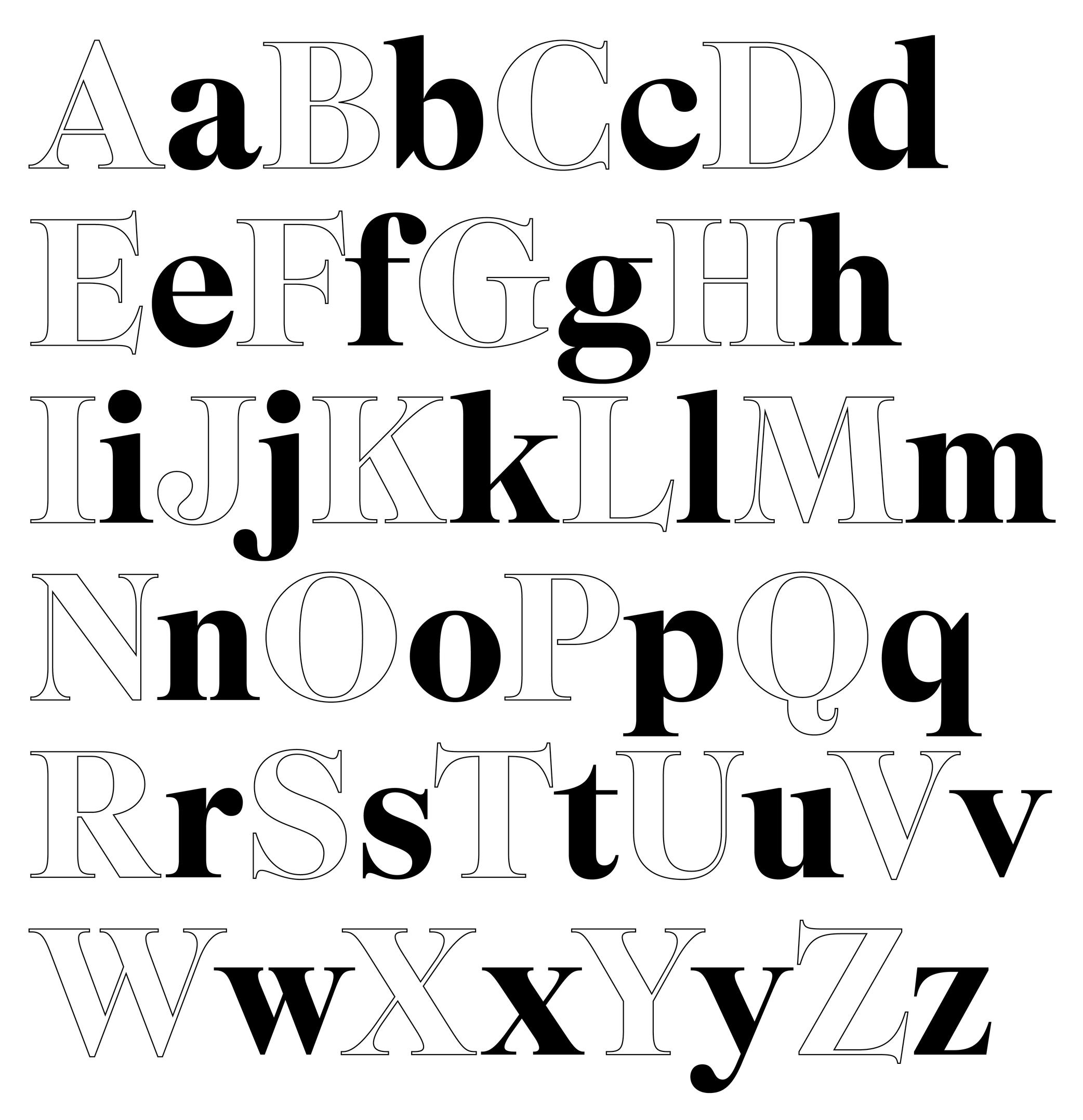
Lowercase
Sponsored by Formagari . Typeface in use: Cedrat, designed by Emmanuel Besse, 2024.
(Read More)Also called minuscule.
Lowercase letters are the smaller forms of alphabetic letters, at least in scripts like Latin that have two cases. Lowercase letters are the opposite of uppercase letters (or majuscules/capitals).
HISTORY
The words ending with -case are a legacy from the era of printing with movable metal type. For the English-language, letters (metal pieces of type) from one font size were traditionally sorted into two wooden drawers or cases, one for each kind of characters. Capitals were in the kept in the upper case, and lowercase letters were on the bottom one. Later, single drawers would be used for an entire font. There, capitals were kept the upper section of the drawer, above the lowercase.
Even though they appeared later than their uppercase “parents,” lowercase letters went through many more iterations. Some of these evolutions were influenced by history (invention of new tools), cultures (preference for certain styles) and geography (influence of nearby cultures).
Majuscule
(Read More)A majuscule is a capital letter placed at the beginning of a sentence or the first letter of a name.
Note that all capital letters are not necessarily majuscules, such as CAPITALIZED words, which are made of capital letters.
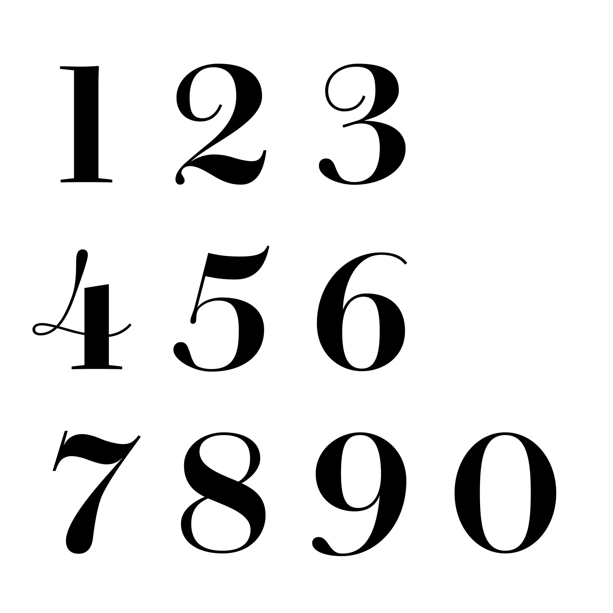
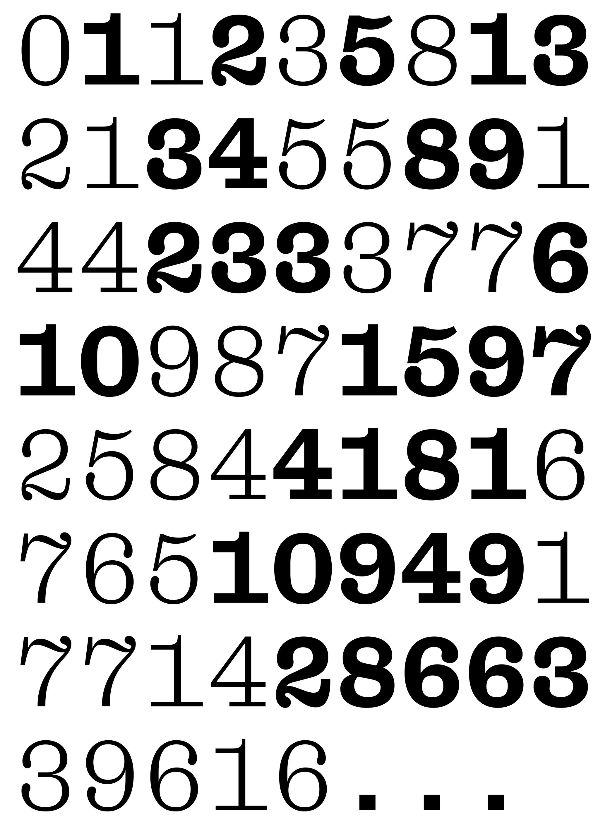
Number
Sponsored by Production Type . Typeface in use: Cardinal Photo , designed by Jean-Baptiste Levée, 2020.
(Read More)The confusion between the words “figure” and “number” is seen very often. But, linguistically speaking, they are to be distinguished from one another: a figure (or numeral) is the graphic representation of a number, which is a mathematical concept. Several figures can be combined to form a number. For example, the number 22 is represented by using the figures 2 twice.
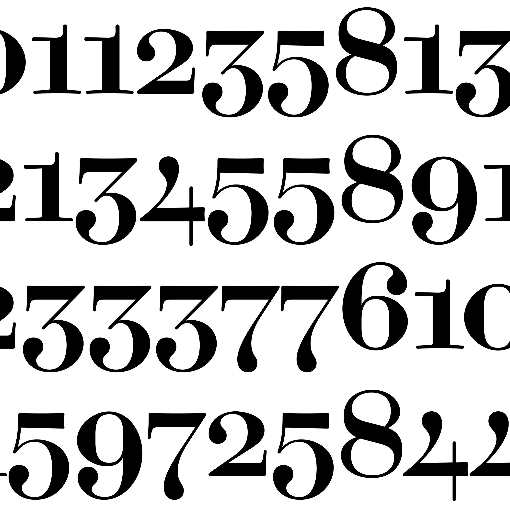
Oldstyle Figures
Sponsored by Dinamo . Typeface in use: Daily Scotch , designed by Fabian Harb and Michelangelo Nigra, 2024.
(Read More)DESCRIPTION
Oldstyle figures are designed to fit with the design of lowercase characters. They are more often used in texts as they visually blend in better than the other figure variants.
HISTORY
The proportions of oldstyle figures are closely related to how they were written in calligraphy using similar strokes and movements as those of the (lowercase) letters.
“Oldstyle” used to have a typographic meaning of its own. It was a 19th century/early 20th century term for revivals of Renaissance serif faces after British printers got bored of Bodoni/Didot/Scotch/etc., and particularly referred to revivals of types those from Venice, Paris, and Caslon’s much later roman. Some typefaces had “Old Style” in their name to signify this.
EVOLUTION
Oldstyle figures are also called “traditional” figures in some languages, as more modern styles came later on (hence the name identification) as better adapted forms to specific situations: tabular, lining or proportional figures. In digital typefaces, several style sets of figures are available and can be accessed via the alternate sets.
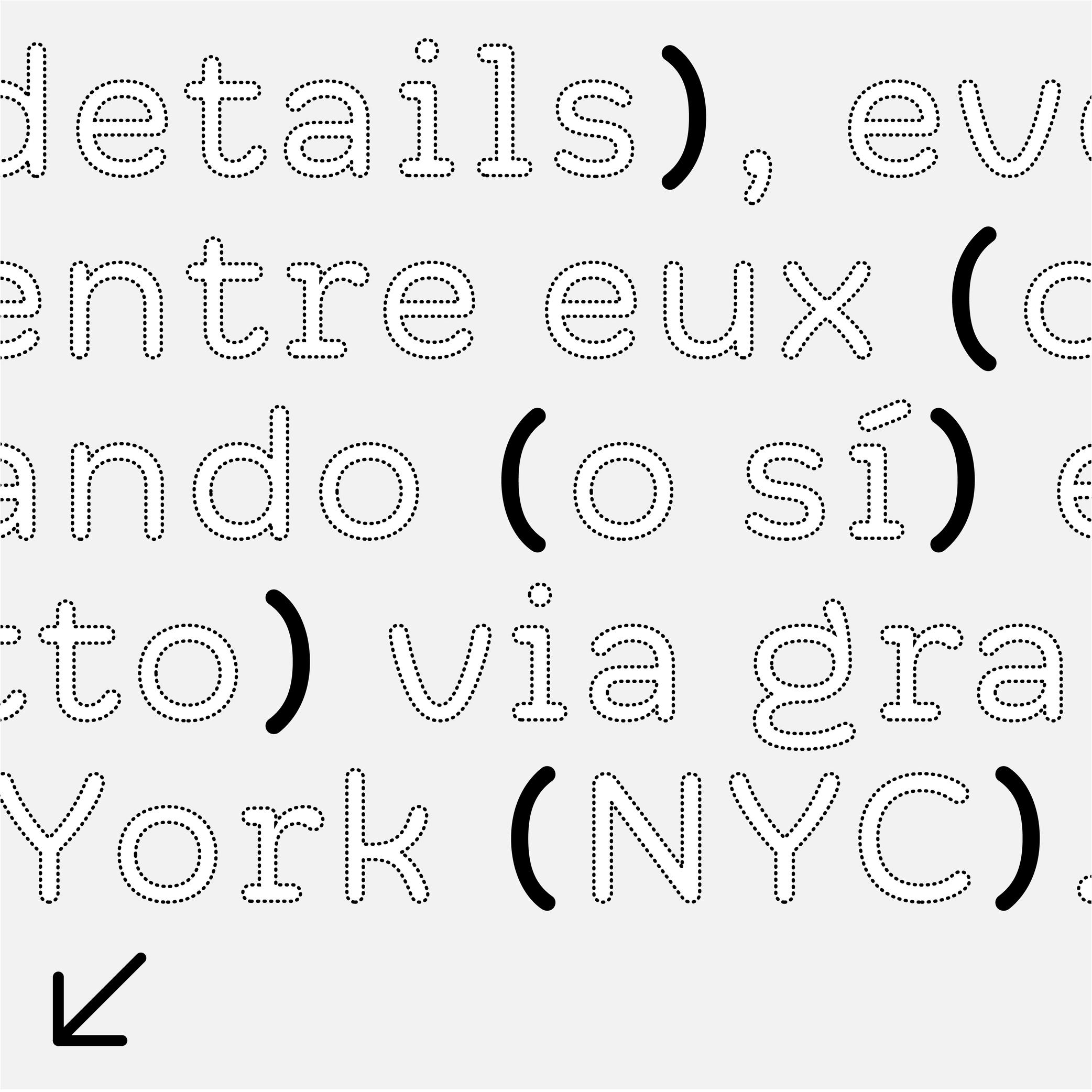
Parentheses
Sponsor Word of Type and feature your typeface in this card with a linked caption. Contact us for more information.
(Read More)FUNCTION
Parentheses indicate additional information in a sentence.
HISTORY
Early forms of parentheses added in text for the same purpose were shaped like chevron quotes (or guillemets). They later on evolved into the curved ones we know today.
These were introduced by French printer Nicholas Jenson in Venice, Italy, around the late 15th century.DESIGN
They have the same height as braces and brackets (or curly brackets and squared brackets).
For typefaces with contrast, parentheses have matching contrast (thick middle part, thin tips) and terminal tips (slanted, vertical or horizontal). S
everal parentheses alternates are necessary in a typeface to better fit with capitalized text, text set in titlecase and lowercase, and text set in small caps (when they exist in a typeface).The most common parentheses are curved (like these ones), but different shapes are used in other scripts.
TYPOGRAPHIC RULES
Parentheses are placed around a section of a sentence, with no space between them and the enclosed text.
Note:
one parenthesis
two parenthesesPeriod
Sponsor Word of Type and feature your typeface in this card with a linked caption. Contact us for more information.
(Read More)Also called full stop.
FUNCTION
The period is a punctuation symbol that marks the end of a sentence.
It is also used to replace sections of letters in abbreviations and, in numbers, to indicate either thousands or the decimal.
In European languages, the period is used to separate thousands while a comma separates decimals. In English, the period is used the other way around:
(European languages) 15.000,05
(English) 15,000.25In the digital world, the period is often used to separate information from individual categories (domain-name.com).
HISTORY
In Ancient Rome, the period (which looked like a dot placed at the middle height) was used to separate words. Scribes in medieval Europe started using it to separate sentences instead (words were being separated by a space). They also shifted it down to the baseline, which has been kept ever since.
DESIGN
In most scripts, the period is a dot placed on the baseline. In the Latin script, it is about the same size as the dot on the letter i. In many other languages and scripts, sentences end with different symbols. For example, in Chinese and Japanese, the period is a hollow circle, placed at the base or centered in relation to the characters.
TYPOGRAPHIC RULES
When used to end a sentence, it has no space before it, and it is followed by a space between it and the eventual next sentence. It has no space before the next letter in an abbreviation. In American English, when used in a quote, it is preferred to place the quotes after the period. While in British English the period goes after the quotes.
Proportional Figures

Sponsored by Dinamo . Typeface in use: Daily Scotch , designed by Fabian Harb and Michelangelo Nigra, 2024.
(Read More)Proportional figures in a typeface are designed with different widths, same for oldstyle figures, each one adapted to the forms of the figure in order to have balanced proportions.
For example, 1 would have a narrower width than 3.
Punctuation
Sponsor Word of Type and feature your typeface in this card with a linked caption. Contact us for more information.
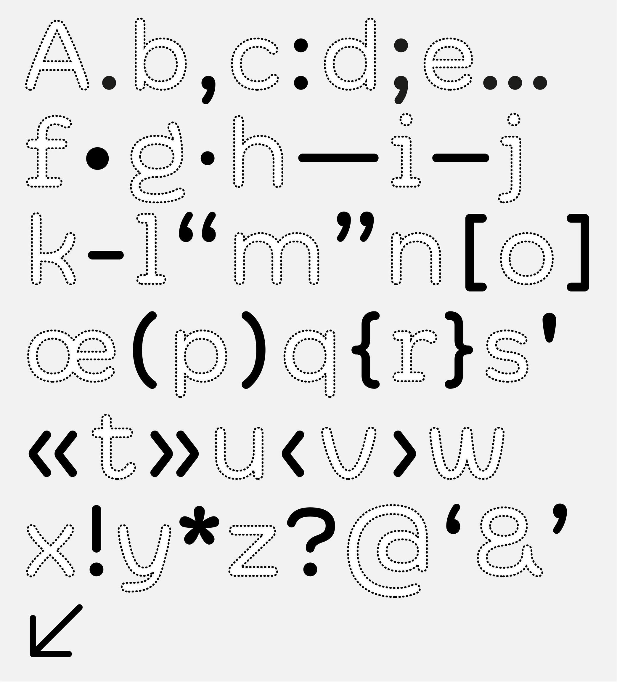
(Read More)Often forgotten when we think about the elements of a writing system, punctuation is just as important as letters, characters and figures. Punctuation symbols play a very important role in text.
When use correctly, punctuation marks a text’s rhythm and transmits the author’s desired voice. When well-designed in a typeface, punctuation helps with readability and facilitates typesetting and typography.
During the evolution of each writing system across the globe, multiple scripts developed different punctuation shapes for the same or similar purpose. Not every script or language uses the same shapes found in the Latin script.
Question Mark
Sponsored by Kerns & Cairns . Typeface in use: Apotek , designed by Dyana Weissman, 2020.
(Read More)FUNCTION
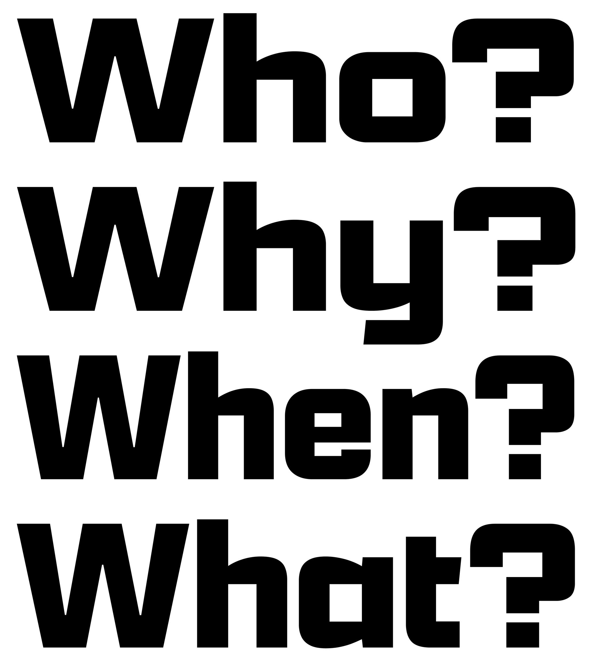
The question mark is placed at the end of a question.
HISTORY
In Latin texts dating back to the 16th century, questions were marked with a letter Q above an o (as an abbreviation of quaestio, ‘question’ in Latin). It has evolved over the centuries into the simplified form that we know today.
DESIGN
The question mark has to have enough presence in a text to be visible fairly quickly. In the Latin script, it has about the same height and width as a capital letter. Its design has to be related with other glyphs of the typeface, where the top terminal relates to the terminal of other glyphs in the typeface (such as 2, f or C) and the dot below is identical to the period.
TYPOGRAPHIC RULES
In English and all other languages based in the Latin script, there is no space before the question mark, French is the only exception where there is a thin non-breaking space before it.
In Spanish, a reversed question mark is placed at the beginning of the question and the upright one at the end, with no spaces in between the characters and the words.Quotation Mark
Sponsor Word of Type and feature your typeface in this card with a linked caption. Contact us for more information.
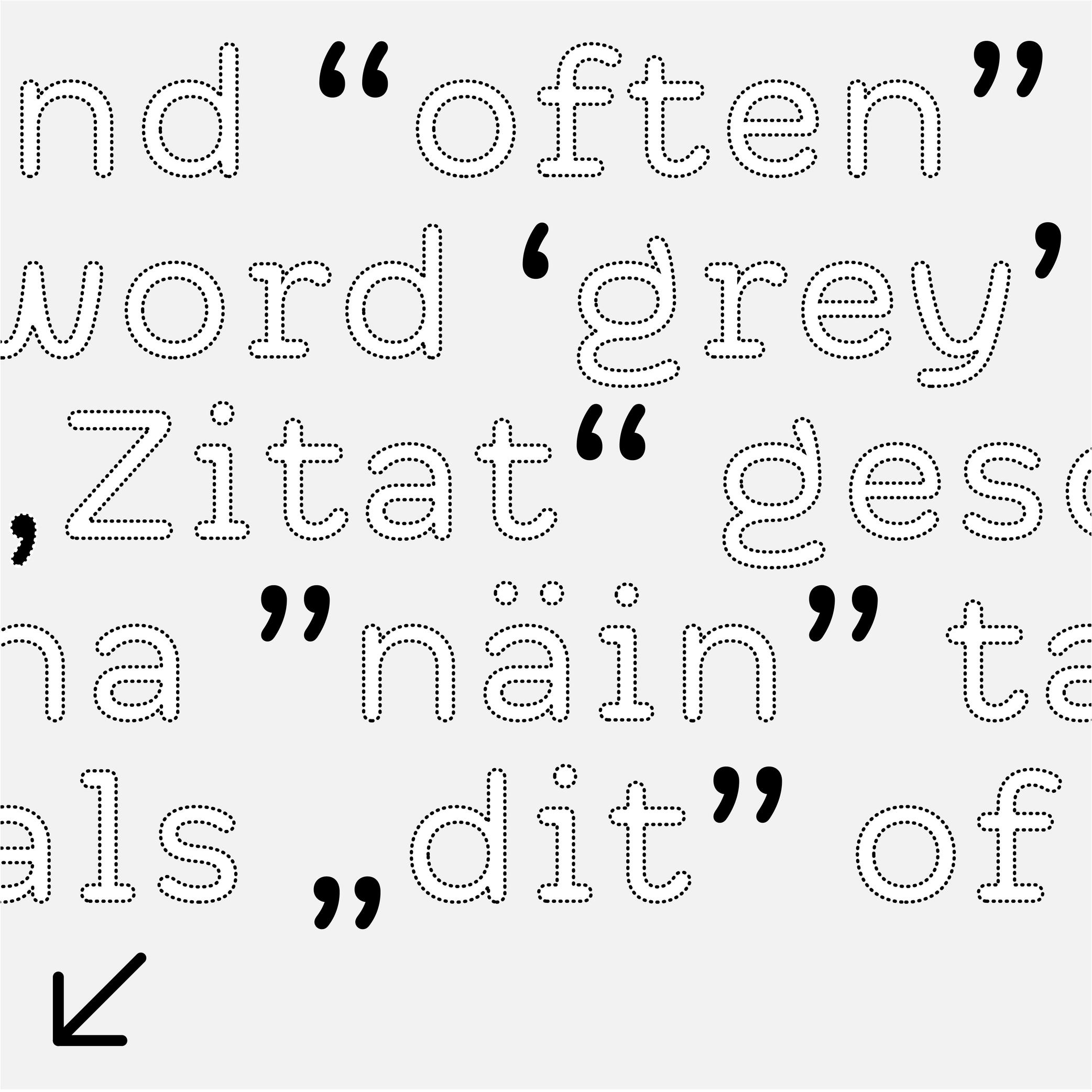
(Read More)FUNCTION
Quotation marks shaped like commas (or called “66” and “99” quotes), double or single, are used in most (but not all) languages to introduce a quote.
HISTORY
When texts were only written by hand, even if there were no standard marks used across Europe to indicate quotes, some slanted and double dashes were used for a similar purpose. During the printing press era, typographers used shifted upwards and/or rotated commas to work as quotation marks, and typewriters adopted the same forms.
DESIGN
Although quotation marks were historically identical to commas, in some typeface styles a slightly shorter and narrower form to create a better text color is more suitable. In sans serif typefaces, quotation marks have an even simpler shape to match with the overall style.
TYPOGRAPHIC RULES
The “66” quote is placed at the beginning of a quote, closed with the “99”, without any space between the quotes and the quoted text.
Some languages use these quotes differently, such as in „German“ or „Polish”, or use quotes of different shapes such as the guillemets in «French», or「Traditional Chinese」.
Single quotes are used as secondary quotes, if they are within double quotes. A common mistake is to use prime and double prime for quotes instead of symbols in mathematics (distance, time, etc.).Semicolon
Sponsor Word of Type and feature your typeface in this card with a linked caption. Contact us for more information.
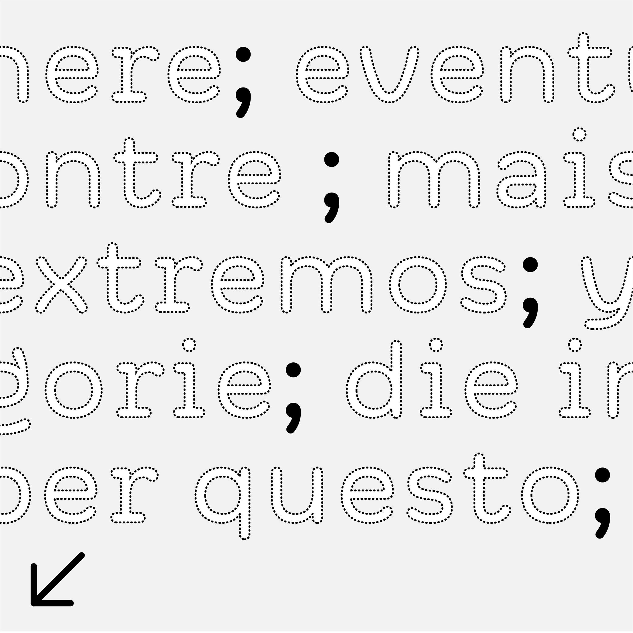
(Read More)FUNCTION
The semicolon is used as a separation symbol in a sentence between two independent sections. It is also used at the end of different points of a list, ended by a period.
DESIGN
The semicolon has a period at the top (aligned below the x-height) and a comma on the bottom (like the comma), the two elements are vertically aligned.
TYPOGRAPHY RULES
There is no space before the semicolon, except in French, where there is a non-breaking thin space.
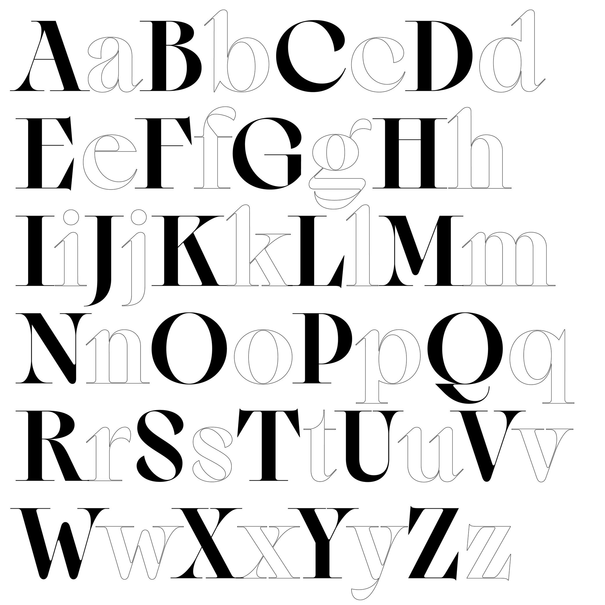
Single or Double Storey
Sponsored by Typotheque . Typeface in use: Zed Text , designed by Peter Biľak, 2024.
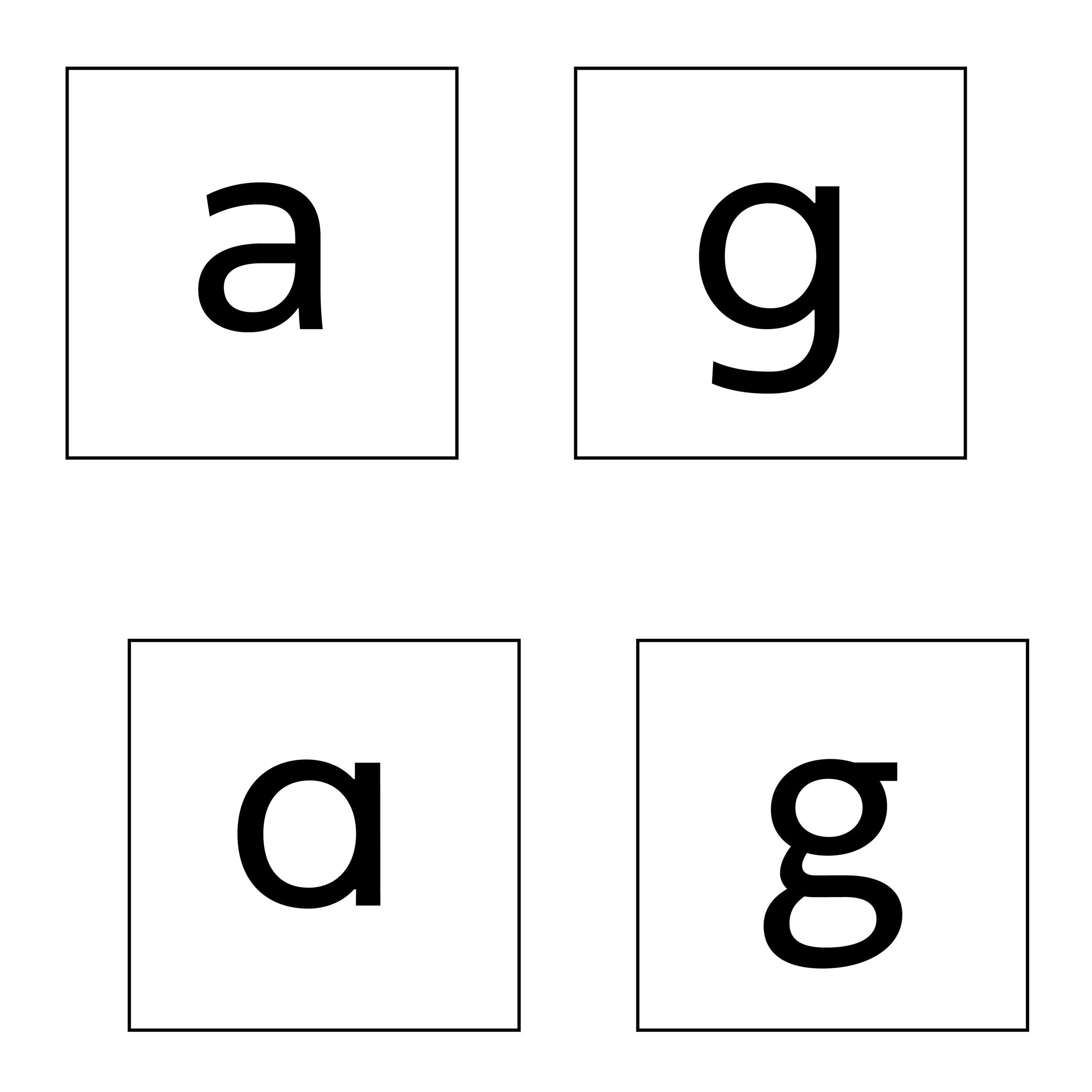
(Read More)Latin letters a and g can be represented with two different constructions:
- single storey, for modern and/or geometric styles;
- double storey, for traditional and/or classical styles.
In some typefaces, both constructions are available, as designers feel that some users prefer one over the other.
The letter g can also be designed with a half storey construction, often seen in Scandinavian designs as a legacy from Danish street signs.
Slash
Sponsor Word of Type and feature your typeface in this card with a linked caption. Contact us for more information.
(Read More)FUNCTION
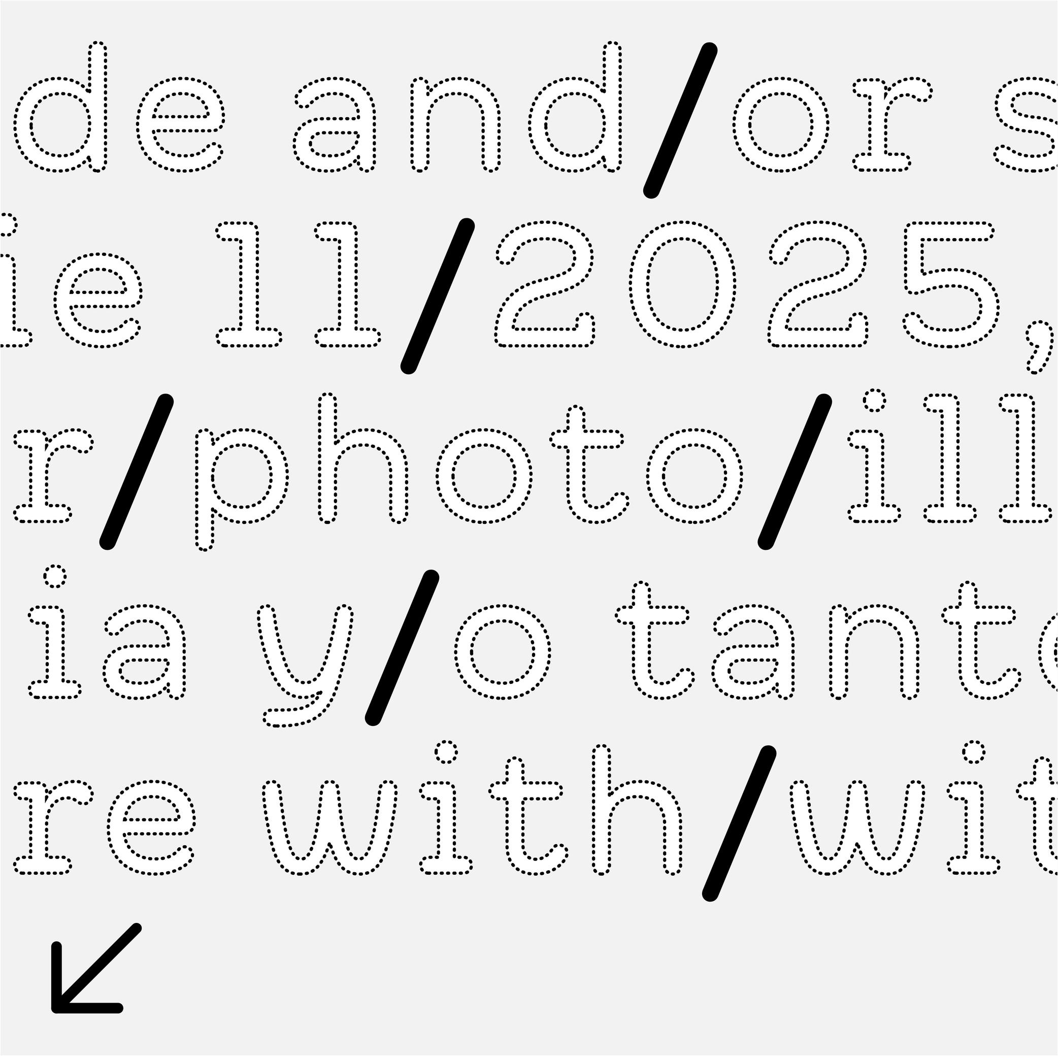
The slash (also called solidus) is used between two alternatives (in/or), as a date separator (2023/24) or, as a more recent use, to list someone’s job titles (designer/photographer/writer/…), generally in short or informative texts. In longer texts, it is better to avoid using a slash and write a complete sentence instead.
DESIGN
The slash is a line with a forward-leaning slope that goes from the capital height (in the Latin script) all the way to the baseline (or below for better visualization).
TYPOGRAPHY RULES
Most languages don’t usually use a space before or after the slash.
Small Caps
 (Read More)
FUNCTION
Small Capitals, or commonly just Small Caps, are letters with a capital letter structure but smaller in size (hence the name).
USAGE
They are used in texts when there are many capital letters together (initials, abbreviations, acronyms, Roman figures or all caps words in texts). In traditional typesetting where a new chapter starts with an initial or drop cap, the other letters of the first word or the entire first line can also be set in small caps to ease out the change towards the following text in lowercase.
HISTORY
The use of small caps started to be popular during metal type printing, as they added an additional option to the typographic palette, while keeping the same typeface.
Today, small caps are not present in every digital Latin typeface (they have their own Unicode values and are not in every Latin character set), as using small caps was more common in the ‘Latin’ world and used in traditional typography.
Some text processing or design applications can automatically generate small caps by scaling down capitals letters (just like they can do the same for italic or bold styles), but this is not advised for high quality typography, as the weight relation is much lighter.
DESIGN
Small caps have no precise height proportions compared to the capitals or lowercase, but a good ratio sits between these two heights.
Their weight and contrast should match those of the lowercase, and their height/width proportions are usually slightly wider than simply scaled-down capitals.
Space
Illustration: Jonny Wan .
(Read More)FUNCTION
For many writing systems (but not all), spaces separate words. Like punctuation symbols, they bring rhythm and clarity to a text and help with the reading experience. In the Latin script, several spaces with different widths are used for various situations (see Typographic Rules below).
HISTORY
In Ancient Latin, Roman capitals had no spaces between words. In some monuments, dots could be placed at middle height to help identify the words. In Europe, with the adoption of the Latin script, they started to appear in calligraphed manuscripts to help the readers identify the different words.
During the metal type printing era, blank pieces of lead were used as spaces between words. There were multiple widths for word spaces to help arrange text lines with precise length (em space, thin space, etc.). They lead to various rules in various languages and typographic traditions.
Nowadays, texts in the digital realm still make use of a variety of spaces for different situations in different languages, and also to offer different typographic options.
DESIGN
Spaces shouldn’t be too wide or too narrow. In Latin script based languages, a common convention is to set the width of the generic space glyph (U+0020) similar to that of the letter I or i.
TYPOGRAPHIC RULES
Many languages—including those commonly using the Latin script—have specific typographic rules.
One example: in French, before a question mark, exclamation mark, semi-colon or colon, there is a non-breaking space, whereas there isn’t any in English or other languages.
In digital typesetting, there are variable word spaces, breaking and non-breaking spaces, which give the text processing application the information on whether the width of the space can be adjusted or if the text line can or can not be broken at a specific place.
Swash
Sponsored by Blaze Type . Typeface in use: Sigurd , designed by Matthieu Salvaggio and Léon Hugues, 2021.
(Read More)Swashes are the elongated extensions of letters, designed with longer strokes than their “usual” construction, most generally as a decorative feature and/or in display style typefaces.
HISTORY
They appeared during the metal type era in the Latin world, when swashed letters served as decorative features to the text. They were also a way to showcase the punch-cutters’ skills, sometimes with incredibly long and elaborate swashes.
Swashes still have the same purpose today in digital typefaces, where “normal” letters are the default ones and swashes can be activated as alternates from the typefaces’ features (if available).Tabular Figures
Sponsored by Dinamo . Typeface in use: Daily Slab , designed by Fabian Harb and Michelangelo Nigra, 2024.
(Read More)Tabular figures are designed to fit in the same uniform width frame, making them suitable to be used in tables, and this helps identify the numbers more easily and clearly.
Tofu
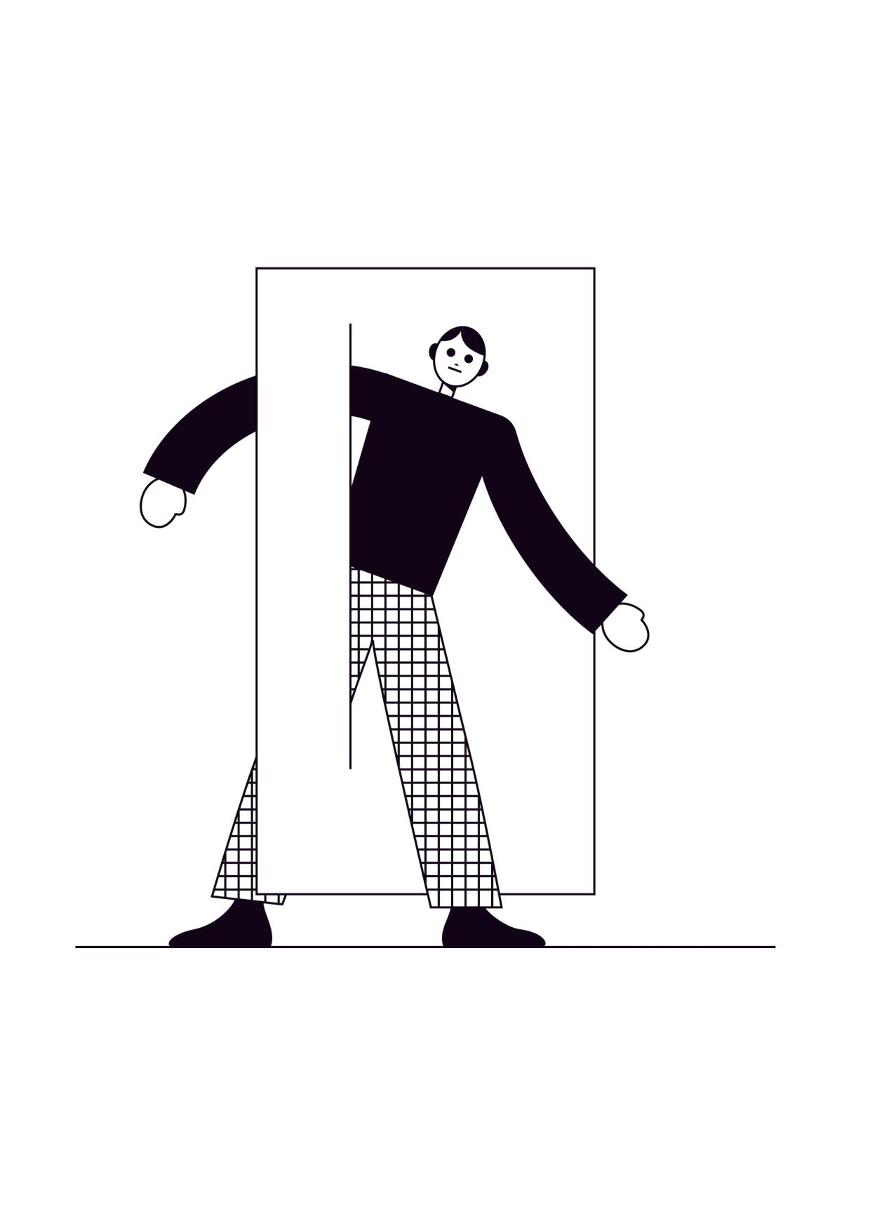
Illustration: James Graham .
(Read More)Tofu is the placeholder symbol that appears when a character cannot be displayed because the font in use doesn’t support it (not existing in the font). Instead of the intended glyph, the reader sees a small rectangle—often empty or filled with a cross, question mark, or other marker.
THE NAME
The word tofu comes from the visual resemblance of the small blank rectangles to blocks of tofu.
AVOIDING TOFUS
To avoid showing a tofu, operating systems implement font fallback mechanisms to replace the missing glyph. If no suitable glyph is found in any available font, then the tofu placeholder is displayed. Sometimes, an entire script can be missing, resulting in a display of long lines of tofus.
Several initiatives exist to reduce the display of tofus. Apple developed the Last Resort font (first available in Mac OS 8.5 in 1998), which displays symbols representing the script and Unicode blocks of missing characters. This helps users to identify which character are missing. Adobe and Google created the Noto (named from “no tofu” expression, first published in 2013) typeface family to provide a coverage for all existing Unicode characters.
FONT ENGINEERING HINT
This fallback system is layered and can sometimes be confusing:
• tofu is what the users see; .notdef is the name of the glyph in fonts. As per the OpenType specifications, every font must contain a .notdef glyph as the first glyph (index 0). Since this glyph isn’t a character, it is not assigned a Unicode code point and therefore doesn’t appear in the cmap (Character-to-Glyph Mapping) table. If a shaping or rendering engine can’t find a glyph for a requested code point in the cmap, it falls back to glyph index 0.
• some environments always substitute the .notdef glyph from the selected font. Others instead use a system-supplied .notdef from a dedicated fallback font (like the Last Resort font), so the tofu can always appear with a consistent design in that environment.
• certain applications (like Adobe InDesign) bypass system font fallback entirely and always display the .notdef glyph from the active font when a glyph is missing.Underscore
Sponsor Word of Type and feature your typeface in this card with a linked caption. Contact us for more information.
(Read More)FUNCTION
The underscore is essentially used today as a marker to separate words whenever spaces are not valid (URLs or email addresses, file names, etc.).
HISTORY
In European book publishing conventions, to underscore a word or sentence in a manuscript was meant to inform the typographer and/or printer to set it in italic (or in roman) style.
The symbol has been kept on typewriters and our contemporary keyboards for various uses in different languages, as an individual sign instead of being a mark combined with other glyphs.
DESIGN
The underscore is a dash-like glyph placed below the baseline and has (usually) the length of the en dash.
TYPOGRAPHIC RULES
There is no space on both sides of the underscore.
NOT TO BE CONFUSED
Commonly, we call this glyph the underscore. But, its ‘proper’ name should be the low line (as it is called in the Unicode naming with its correct code), because the underscore (U+0332) is a combining diacritic symbol used in multiple African and Native American languages.
Unicode
Illustration: Words of Type. Typeface in use: Knowledge Round, designed by Lisa Huang, 2024.
(Read More)Unicode is an international standard for encoding characters, signs, and symbols used in digital devices worldwide.
Developed by the Unicode Consortium—a non-profit organisation with international members—Unicode assigns a unique code (or code point) to each character of as many written languages as possible. More characters and/or more scripts are added almost every year, presented to the organisation members, who research and discuss thoroughly about the relevance of adding them to the Unicode standard. These codes are used by digital systems to ensure consistent and stable exchange of texts across platforms and devices.
FONT ENGINEERING HINT
In font files, Unicode code points are mapped to glyphs through the cmap table (Character to Glyph Mapping). This allows software to know which glyph to display for a given character code. Not all glyphs in a font must be assigned with a Unicode code point; some may exist only for stylistic or contextual substitution purposes.
Uppercase
Sponsored by Blaze Type . Typeface in use: Sagittaire , designed by Valerio Monopoli, 2023.
(Read More)Uppercase (or capital letters) are the taller and larger variants of alphabetical letters, as opposed to lowercase letters (or minuscule).
Linguistically speaking, a capital is not to be confused with a majuscule, which is a capital letter with the specific function of being used at the beginning of a sentence or a word.
HISTORY
Capital letterforms derive from Phoenician and Greek alphabets when the Roman Empire started its influence over Europe around the 1st century.
During the Roman Empire, they were painted and/or carved in stone at large sizes for inscriptions on monuments, buildings, and tombstones (called Capitalis Monumentalis).
Through time, with the need to write faster, some shapes evolved, resulting in minuscule (lowercase) letters. But that didn’t make capital letters disappear. On the contrary, they kept coexisting with minuscules. Each has its own specific functions and looks very different, so using both allows a more comfortable reading experience.
The word ending with -case is a legacy from metal type printing when letters (or types) were sorted by categories into cases (one per glyph), themselves into drawers (one per font). Capitals were placed in the cases of the upper section of the drawers, minuscules were on the lower part.
Not to be confused with a majuscule letter.