Balance
Illustration: Catherine Potvin .
(Read More)The concept of balance is fundamental in typeface design. With many different shapes (letters, figures, symbols, etc.) that have to be combined to create a more complex group (words, sentences), a certain level of training and expertise is required to achieve a harmonious balance of the whole set.
A good balance allows a comfortable reading experience.
Bilingual
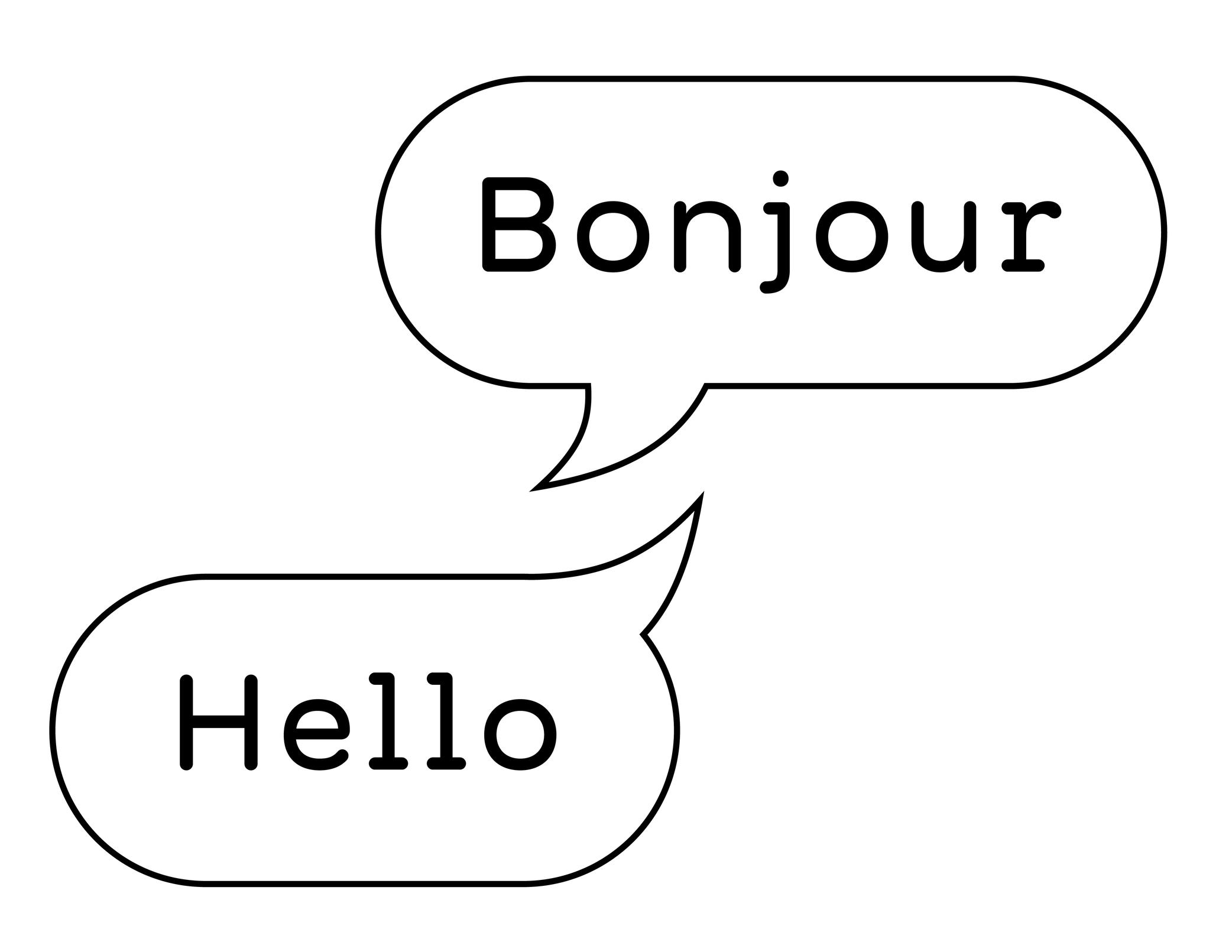
Illustration: Words of Type. Typeface in use: Knowledge Rounded, designed by Lisa Huang, 2024.
(Read More)A bilingual text is written in two languages (e.g., English and French).
Be careful to not mix up “bilingual” with “bi-scriptual.” The latter means “two scripts,” or “two writing systems.” For example, English and Chinese are two different languages, but they also use different scripts.
Capitalize
Sponsored by Type Together . Typeface in use: Rezak , designed by Anya Danilova, 2022.
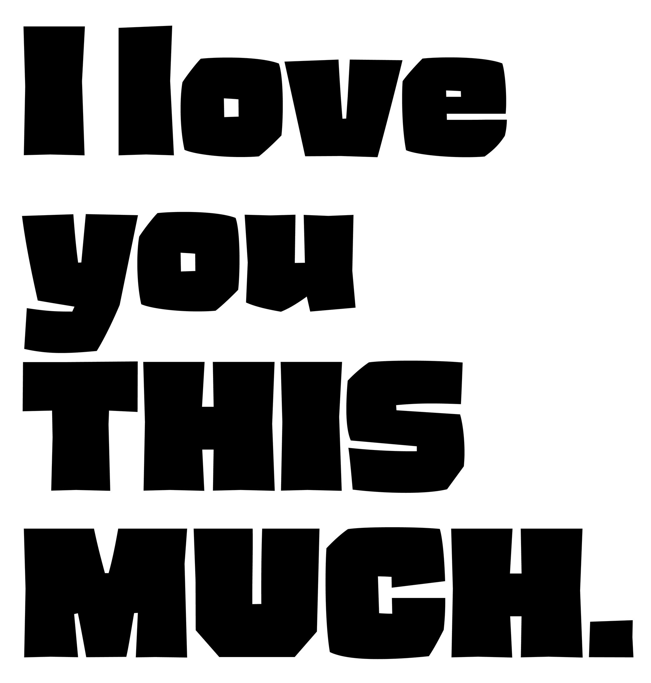
(Read More)Also called to set in All-Caps.
In applications and tools that can process texts, to capitalize is to transform every selected lowercase letter into its capital variant.
FONT ENGINEERING ADVICE
The capitalization button in text editors usually calls several OpenType features: the case sensitive (.case), the capital spacing (.cpsp) and the proportional numbers features (.pnum).
Classification
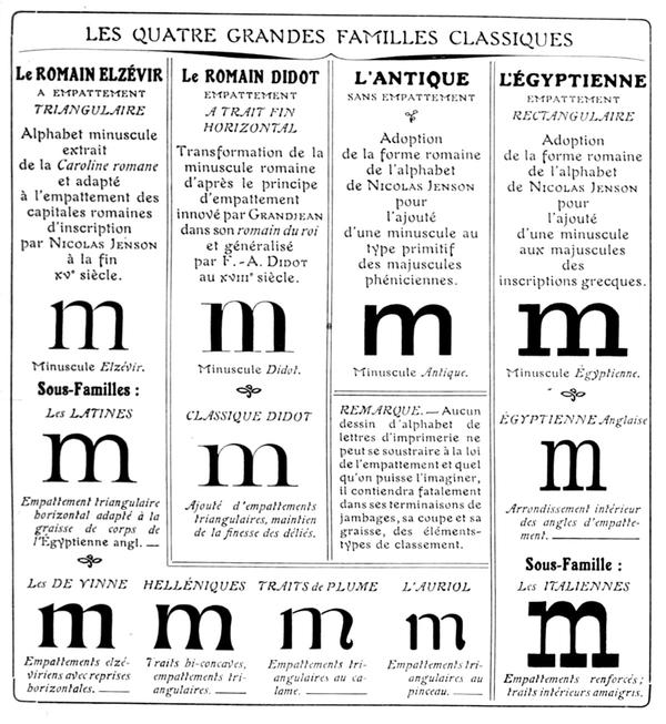
Francis Thibaudeau’s typographic classification, from Manuel français de typographie moderne, Francis Thibaudeau, 1924. Collection of Bibliothèque nationale de France (French National Library).
(Read More)With the many styles and designs of typefaces that exist, it can be difficult to describe, sort, or even find them in a catalog that isn’t familiar to the user.
Each writing system has its own typeface classification categories that best suit its nature and history. As aesthetic values differ from one culture to another, the same (or similar) style may not convey the same impression across different scripts, and one category considered a convention for one script is not always relevant to others.

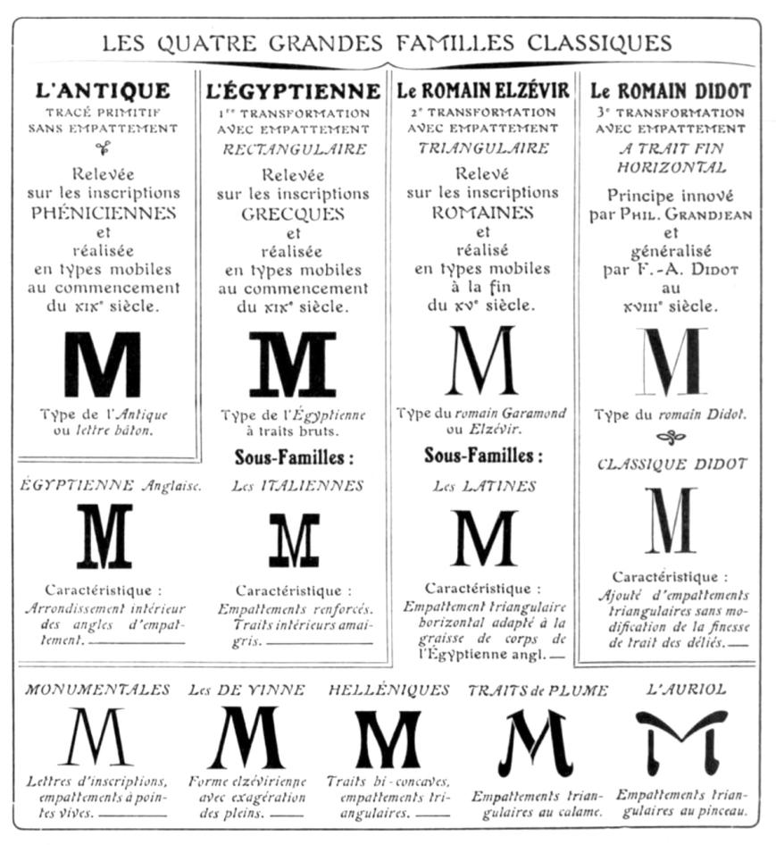
For example, Latin typefaces have been sorted into multiple classification systems since the beginning of metal typesetting. Here are some of them:
• Thibaudeau, by French typographer Francis Thibaudeau in 1921, with four categories: Elzévirs, Didots, Égyptiennes and Antiques;
• Vox (or Vox-Thibaudeau), by French historian Maximilien Vox in 1954, who started with the Thibaudeau classification as a basis and added more categories to include the additional typeface styles in the Deberny & Peignot type foundry’s library;
• Vox-ATypI, with additional categories and subcategories from the ATypI (Association Typographique Internationale), added between 1962 and 2021.Today, classification systems vary from one type foundry to another, using more or less “standardized” terms better suited to their own catalog or the scripts covered. These boxes also help users find what they are looking for in a wide variety of choices. They are not rules to be followed to the letter. Imagination and creativity shouldn’t be confined!
Coherence
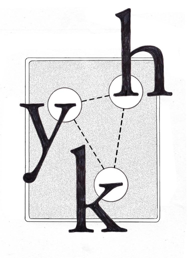
Illustration: Chloe Kendall .
(Read More)It is important to manage the coherence (or consistency) of the shapes of all glyphs in a typeface to create a unified set. This includes the shape of the serifs, thickness of the strokes, proportions with one another, spacing, etc.
Color
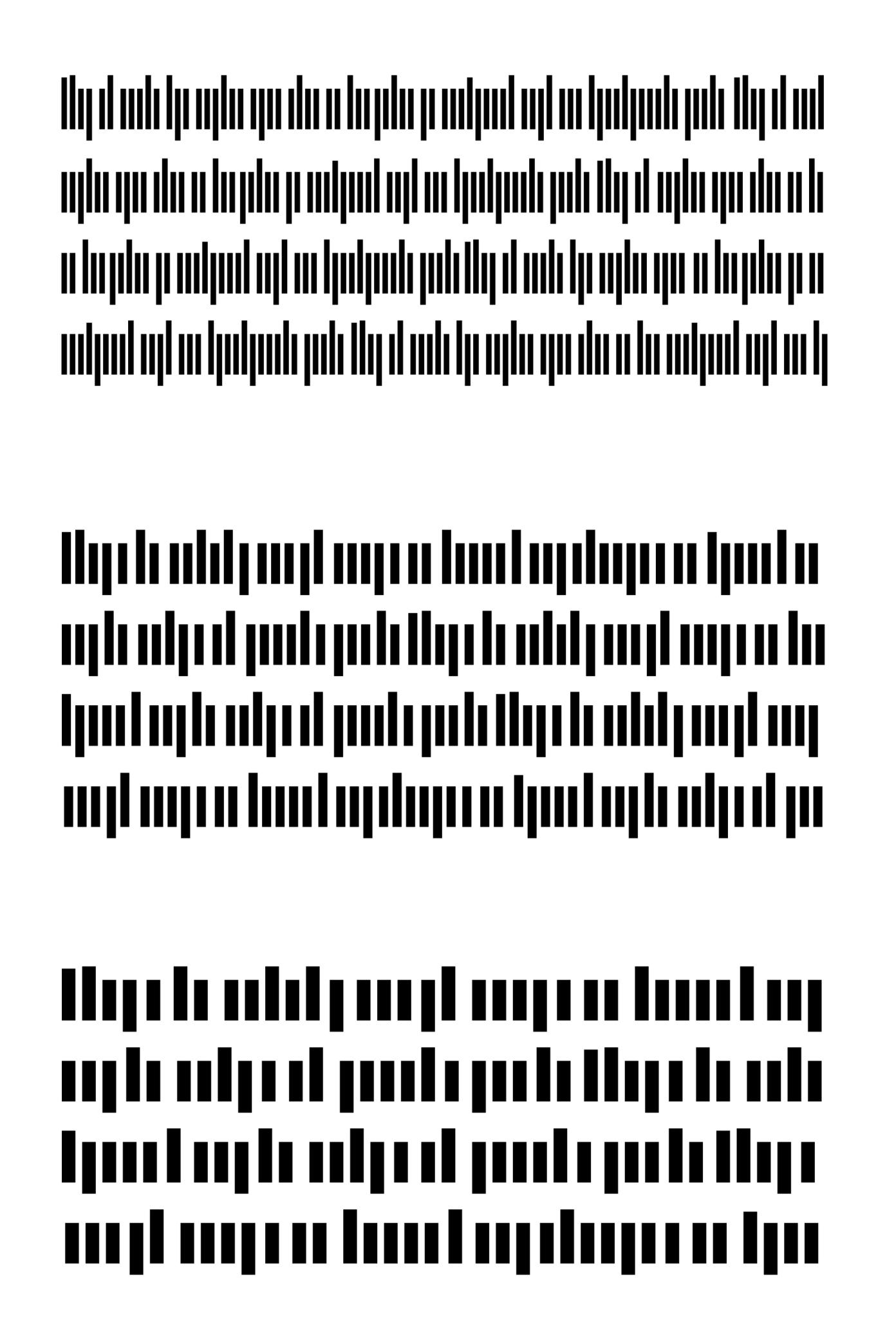
Illustration: Words of Type.
(Read More)The color of a text is the quality of its visual texture given by the design of the typeface in use.
Different settings such as spacing, leading, frequency of some letters or diacritics can also influence the typographic color.
Construction
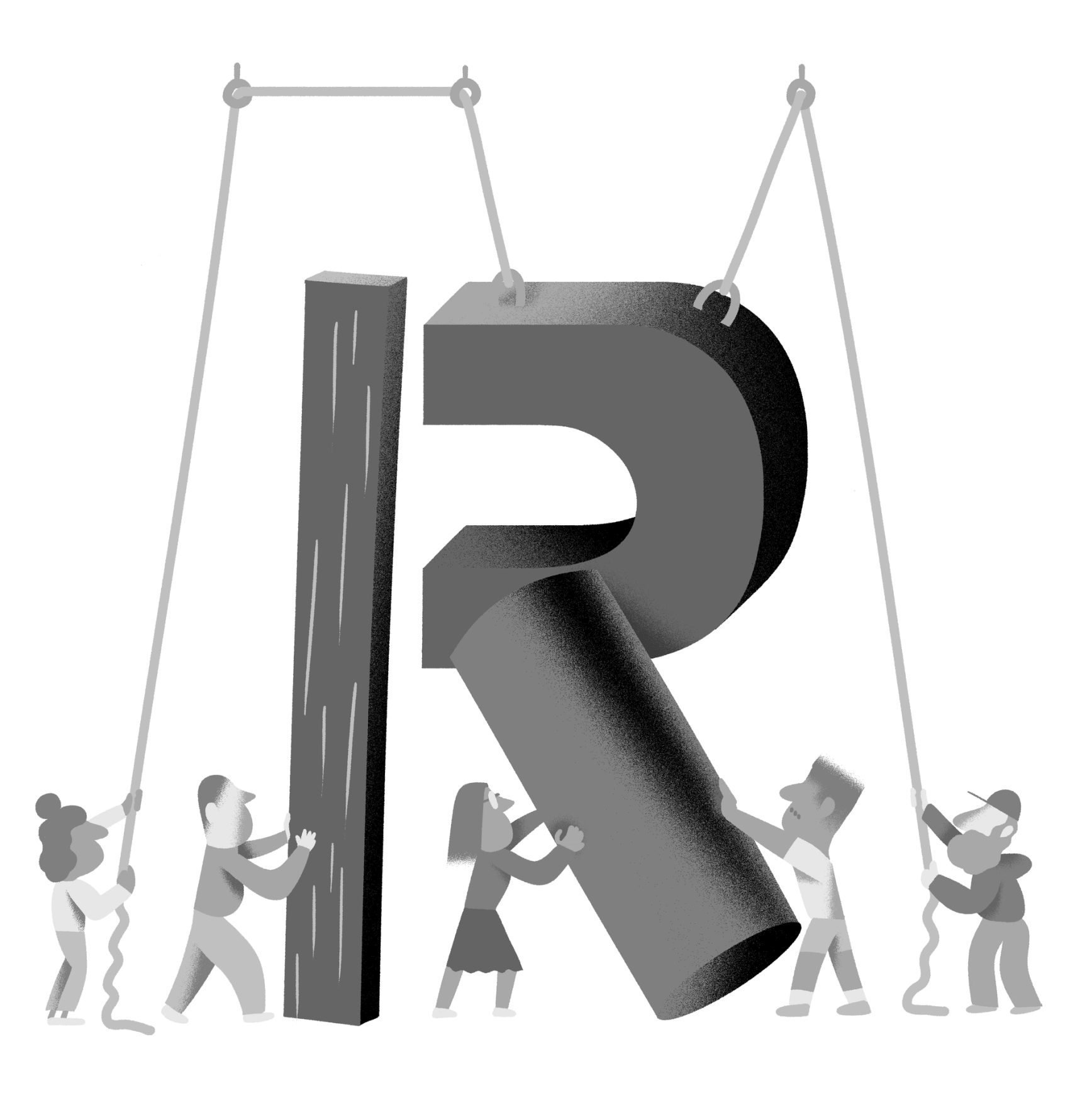
Illustration: Yann Bastard .
(Read More)Letters, characters and other glyphs of every script are written with a specific number of strokes of a particular shape. This is the glyph construction.
This construction went through multiple evolutions over time and at different pace for each script, being influenced by various circumstances (tools in use, style preferences, needs, etc.).
Contrast
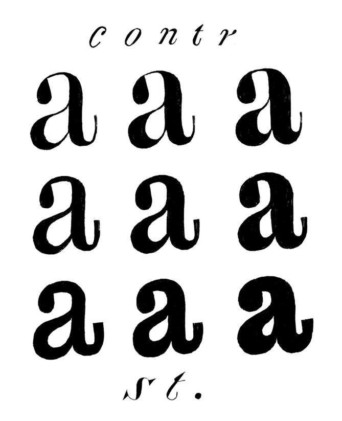
Illustration: Erik van Blokland .
(Read More)The contrast is the relationship between a glyph’s thick and thin parts.
The thickness variation in a stroke comes originally from handwriting, as a result of the tool’s reaction to the medium in combination with how it is held and the writer’s movements.
Nowadays, in type design for the Latin script, we speak of a vertical contrast when the vertical parts are thicker than the horizontal ones; this is its “natural” contrast. The opposite is known as a reversed or inverted contrast.But these concepts only apply to scripts that evolved using tools and a medium that creates such contrast “naturally”, which is not universal for all. For example, the Hebrew script’s contrast would naturally be distributed the other way around.
Custom
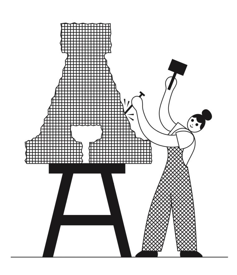
Illustration: James Graham .
(Read More)Companies, brands, institutions and so on can find great benefits in using and/or owning a custom-made typeface with a design that fits their voice. Unlike retail typefaces, they can be used as an important and exclusive element of the visual identity and be fully suited to their needs.
A custom typeface costs more at first than a license of an existing retail one (the client can have a design for their exclusive use instead of a retail design that may be used by many others). Still, it can be financially and strategically more interesting, and profitable than licensing retail typefaces in the long run. The pros and cons between these choices are worth the effort of comparison and evaluation.
Ductus
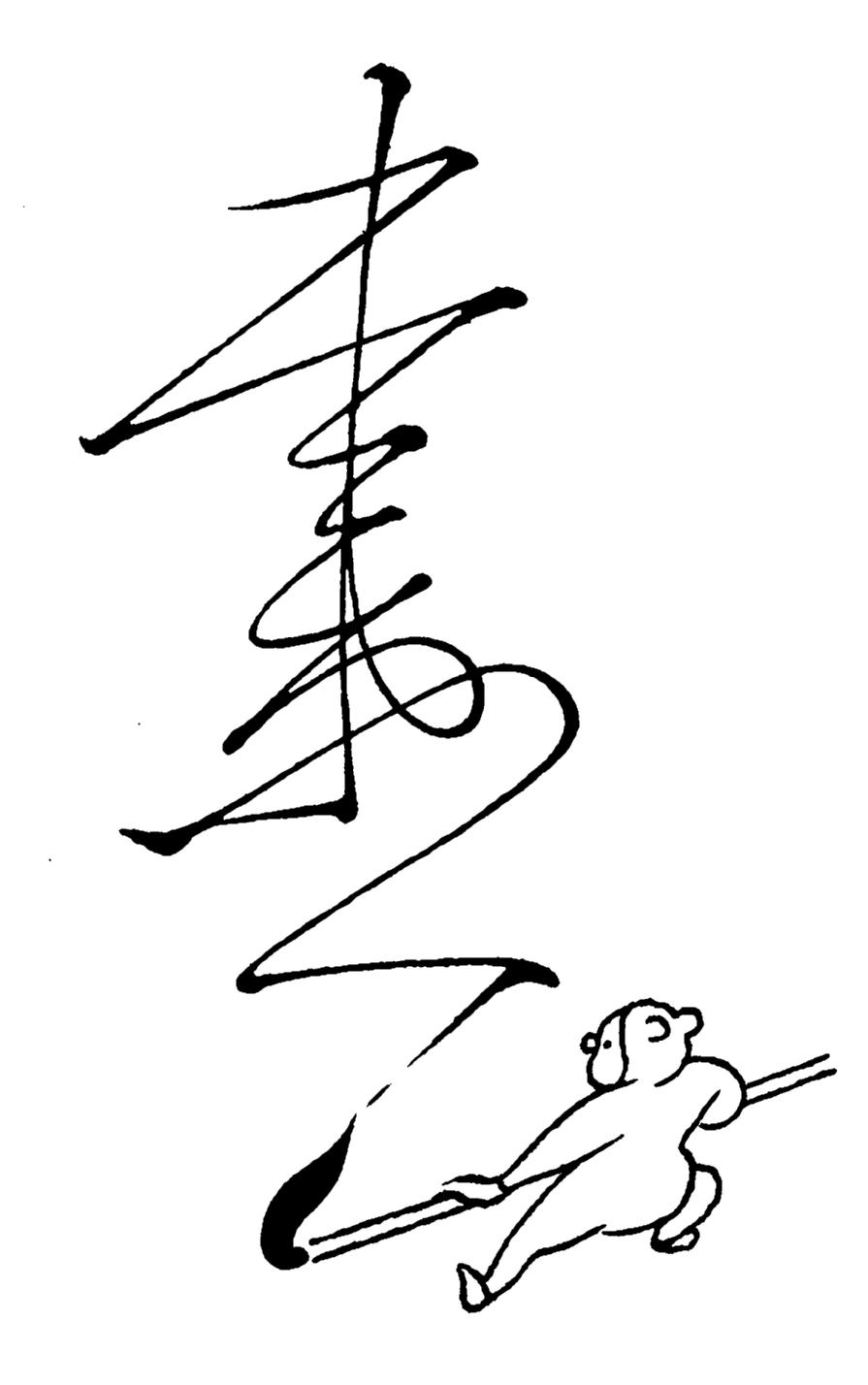
Illustration: Tezzo Suzuki .
(Read More)Glyphs from every script are written with a specific stroke order and drawn in a specific direction. This is called the ductus (from Latin ducere, meaning “to lead,” “to pull”). It took multiple evolution phases for characters to look as they do today. Most ductus changes were for characters to be written more easily (and/or faster) with the tools used.
Emphasis
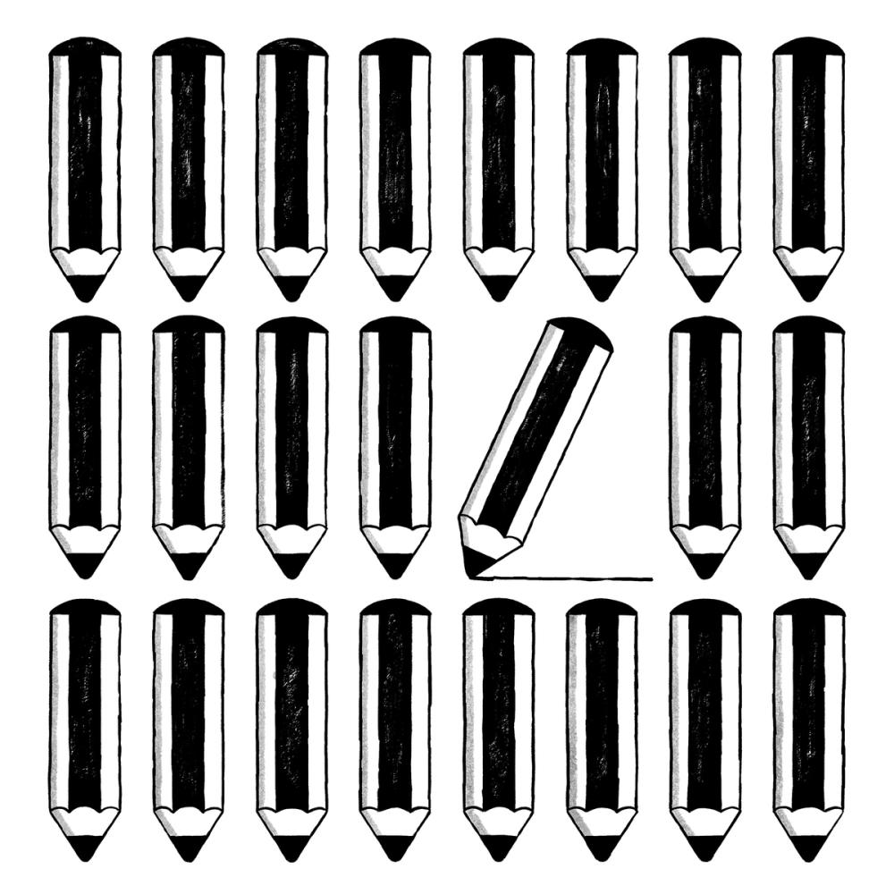
Illustration: Malota .
(Read More)In typography, we speak of “emphasis” when a section of a text needs to be visually brought forward or separated from the rest while keeping the paragraph’s setting, such as for a work’s title, comments, or a quote.
The most common way to create an emphasis in Latin based languages is to set the text in italic. Other scripts such as Chinese Hanzi and Japanese don’t have italics, and use different ways to emphasize text: bolder weight, underline, or dots.
Family
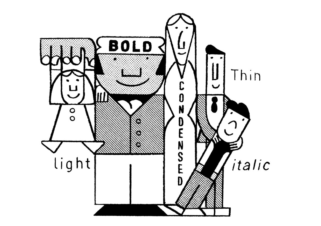
Illustration: Jay Cover .
(Read More)While a typeface refers to its design concept, a typeface (or font) family is the collection of styles derived from that design.
Each style has their own specificities (weight, width, contrast, slope, etc.), while retaining common characteristics—making them part of the same family.
A family usually contains a limited number of styles along the weight axis, including their matching italics.
When it spans a wide range of styles, across multiple axes, it is often referred to as a “superfamily.” These large families are often grouped into subfamilies to organize styles more clearly in the font menus of text editor softwares.Language
Illustration: Catherine Potvin .
(Read More)As opposed to the word script, a language is a means of communication and expression that does not necessarily rely on spoken words (e.g., sign language).
Legibility
Illustration: Catherine Potvin .
(Read More)Legibility is about how easily a text can be read thanks to the identification of each character.
In typeface design, some shapes allow a glyph to be recognized more easily than others, generally due to the readers’ familiarity.
It is a subjective concept that can vary with context, culture and history. The meaning of legibility and readability is often mixed up.Lettering
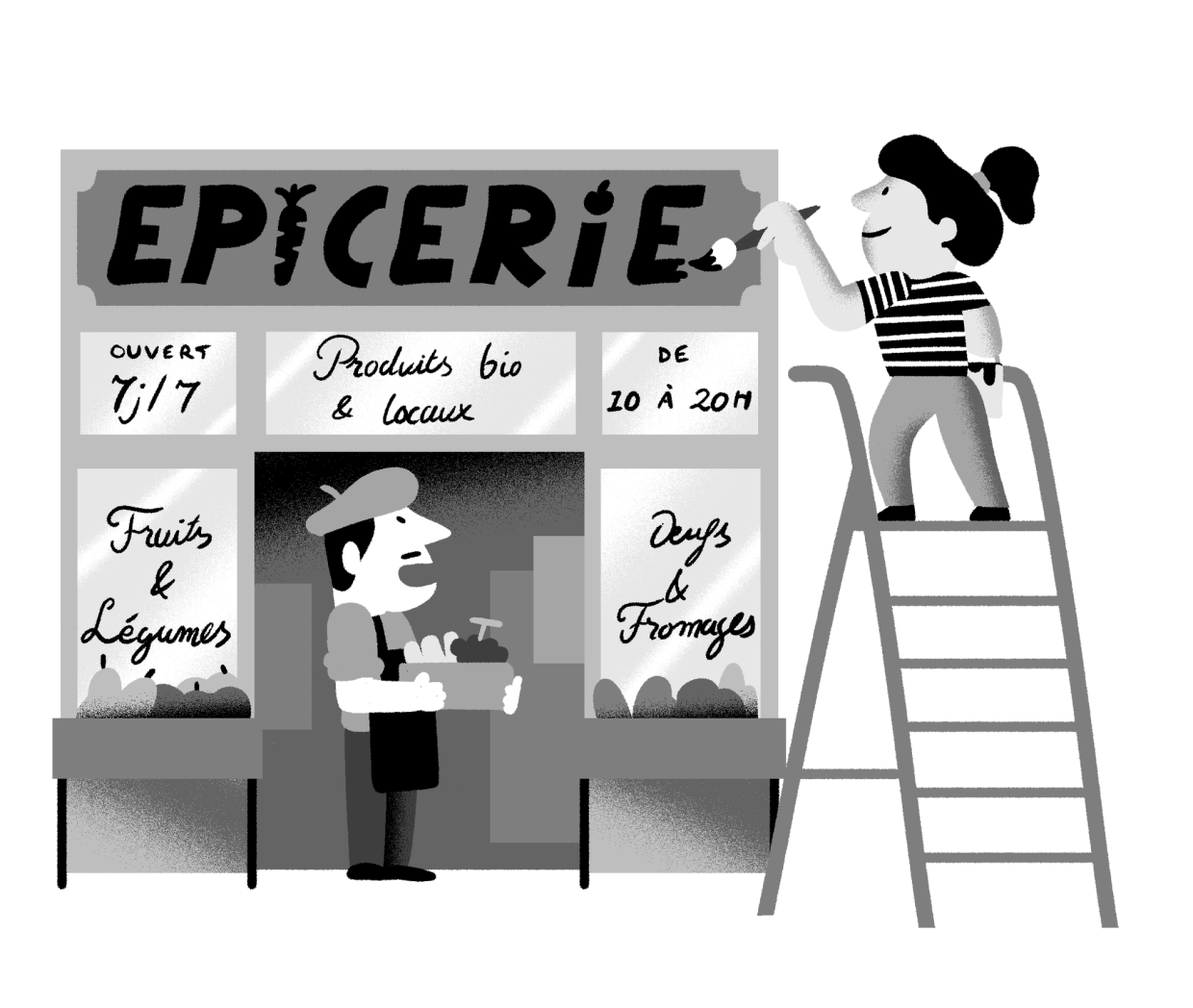
Illustration: Yann Bastard .
(Read More)A lettering is a drawing of a group of characters made for a specific situation (such as on a shop sign) or for a piece of work (a brand’s logo, a title for a magazine insert, etc.), unlike a typeface where each and every glyph is individually designed in a way to work in all kinds of combinations.
Multilingual
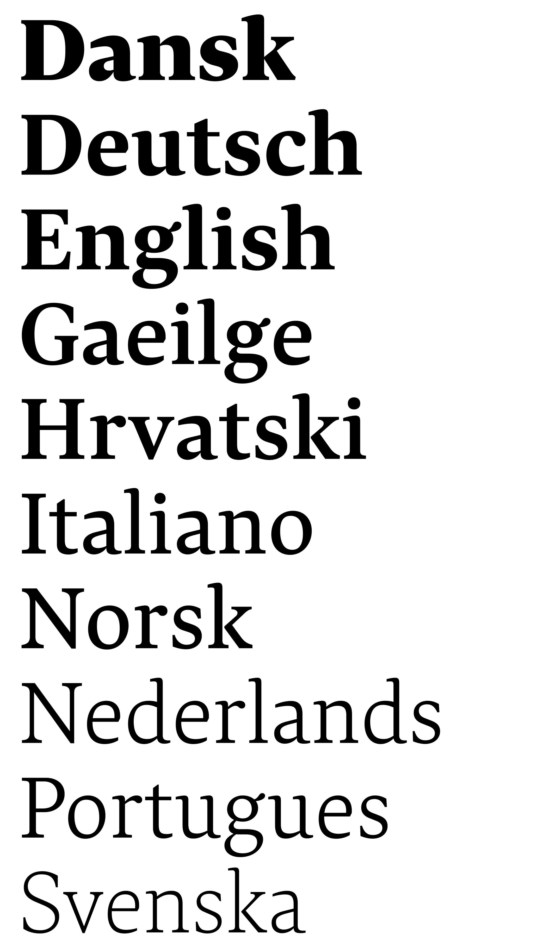
Sponsored by Typotheque . Typeface in use: Lava , designed by Peter Biľak, 2013.
(Read More)Multilingual means that a text makes use of multiple languages. The term should not be confused with “multiscript.”
For example, a book published in English and French languages is multilingual but uses the same script: the Latin script.
Multiscript
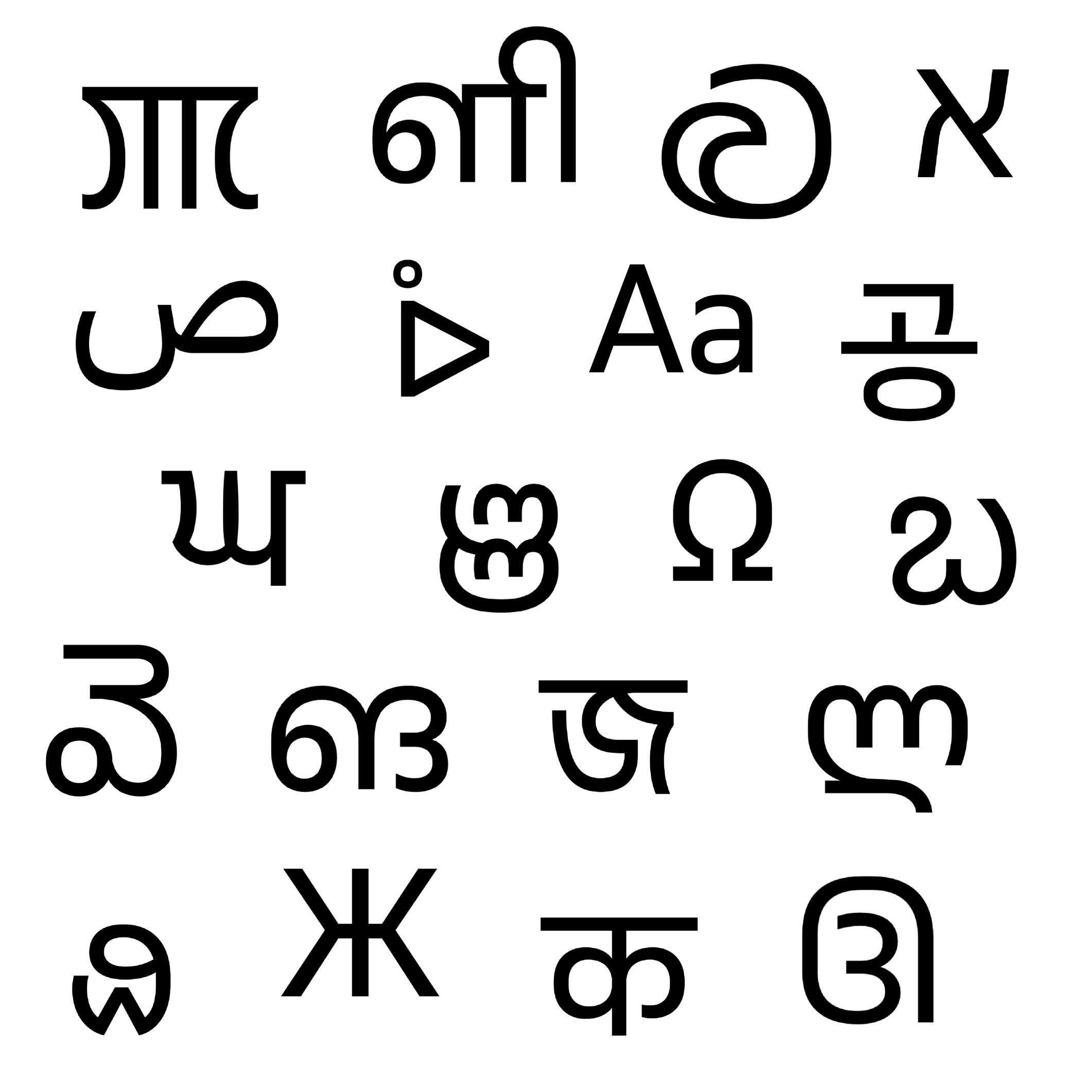
Sponsored by Typotheque . Typeface in use: November , multiple designers, 2016.
(Read More)Multiscript texts are written in multiple scripts or writing systems. For example, a book published in English and Arabic languages is multiscript because it uses two different scripts. But one in English and French is then multilingual: the same script for two languages.
Number
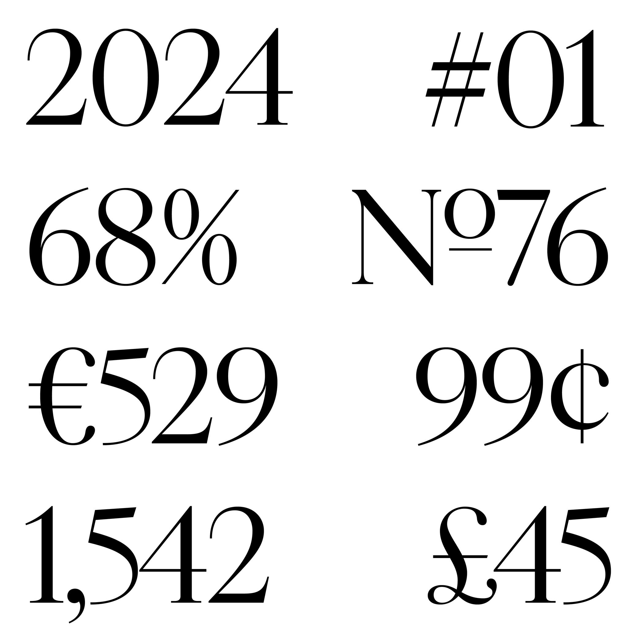
Sponsored by Production Type . Typeface in use: Cardinal Photo , designed by Jean-Baptiste Levée, 2020.
(Read More)The confusion between the words “figure” and “number” is seen very often. But, linguistically speaking, they are to be distinguished from one another: a figure (or numeral) is the graphic representation of a number, which is a mathematical concept. Several figures can be combined to form a number. For example, the number 22 is represented by using the figures 2 twice.
Readability
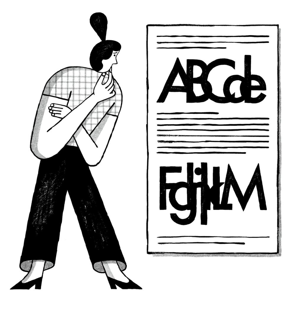
Illustration: Malota .
(Read More)In typography, readability refers to the ease with which a text may be read. The readability of a text is influenced by many aspects (listed in the quote below) other than the text itself. Readability is a concept often confused with legibility.
QUOTE
“The readability of a text is influenced not only by the choice of typeface, type size, correct or incorrect letter and wordspacing, and the length of line, but also by the linespacing or interlinear space, often termed ‘leading’.”
Jost Hochuli (translated by Charles Whitehouse) in Detail in typography.
Script
(Read More)A script, or writing system, is the visual system (letters, characters, symbols, etc.) used to transcribe one or several languages. Some scripts are used by multiple languages (e.g., the Roman alphabet for many Western European languages).
Style
Illustration: Pauline Fourest (Spaghetype ).
(Read More)In any writing system, typefaces exist in an infinite number and variety of styles. They are influenced by many factors, such as technology, tools, necessity, and trends. But some of them are (or can be) grouped into categories for their similarities, into classification systems (sans serif, serif, humanist or geometric, etc.).
In the Latin script, we also identify Roman (or upright) and Italic as two ‘companion’ styles of the same typeface style.
Typeface
Illustration: Erik van Blokland .
(Read More)A typeface is a set of glyphs designed with a particular intention (and/or style).
A typeface family can gather multiple styles with their individual particularity (weight, width, contrast, etc.) but keep common traits specific to the same group.
Not to confuse with font or typography.
Typeface Design
Illustration: Jay Cover .
(Read More)Typeface Design (or type design for short) is the practice of designing typefaces.
It is about designing every part and aspect of a typeface, from drawing the shapes of the glyphs (letters, characters, figures, symbols, and so on) to setting the specifications such as spacing, kerning, and hinting. The person doing type design is called a type designer.
Not to be confused with typography.
Typography
Illustration: Jay Cover .
(Read More)Typography (or typesetting) is the practice of assembling text elements in a design composition by defining multiple aspects such as the ratio between text columns and white spaces, choosing and using typefaces, setting their styles and sizes for all categories of texts, leading, justification style, and hyphenation, etc.
The person practicing typography is called a typographer.
Not to be confused with Typeface Design.