Apostrophe
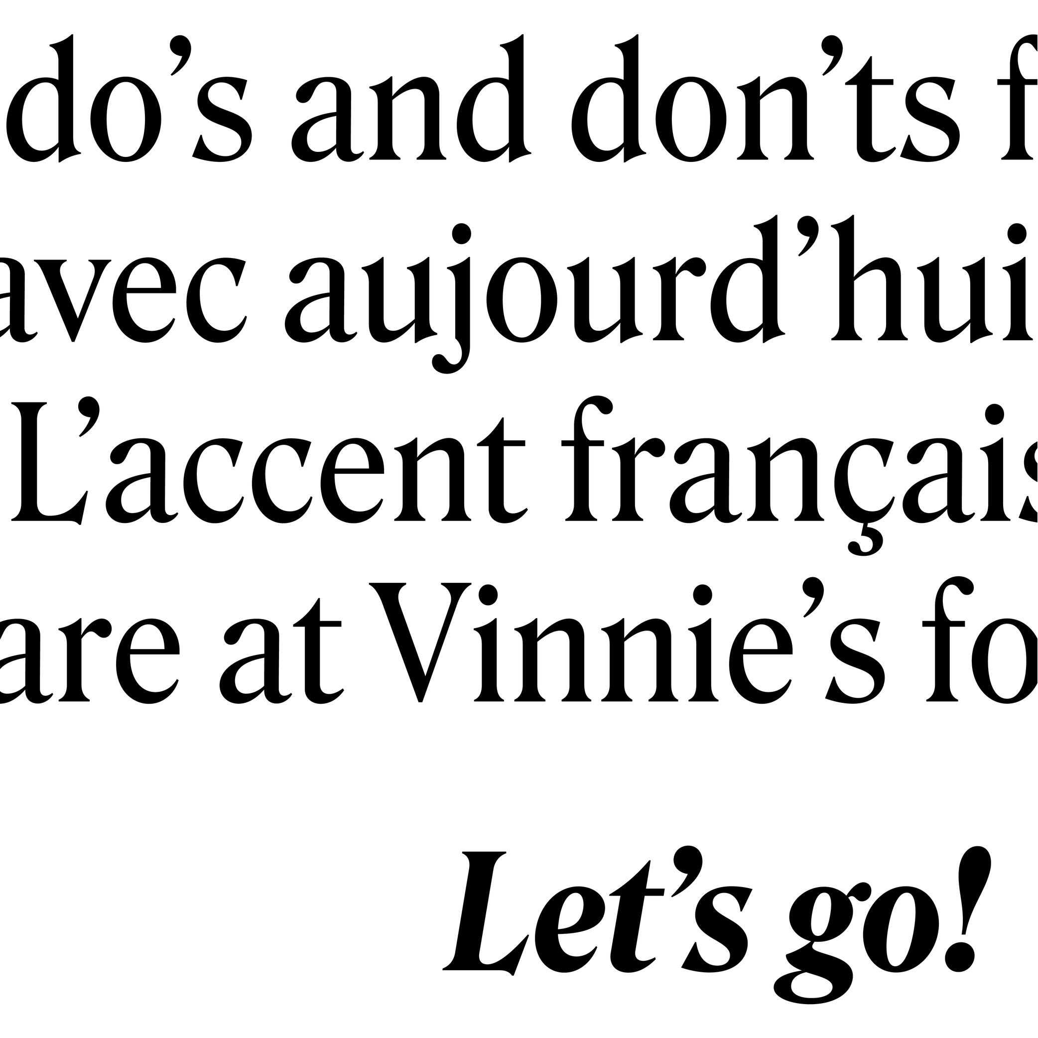
Sponsored by DJR . Typeface in use: Roslindale , designed by David Jonathan Ross, 2017.
(Read More)FUNCTION
The apostrophe (or “single quote” for English speakers) is a very common punctuation mark in languages using the Latin alphabet. It has different functions from one language to another. In English, for example, it is used as a possession (“part of a letter” to “a letter’s part”) or an elision marker (“it is” to “it’s”).
HISTORY
A symbol looking like an apostrophe dates back to the 16th century in France when the engraver Geoffroy Tory (1480–1533) introduced this sign to replace a letter or a short word.
With the invention of typewriters, other look-alike glyphs (single quote, prime, acute accent, etc.) were assembled into the same key with the apostrophe to save as many keys as possible for the limited space of the keyboard. But this led to confusion that is still observed nowadays, with the prime glyph being often used as an apostrophe.DESIGN
Well-designed typefaces either have slanted or curly-shaped apostrophes (related to the comma of the typeface). This shape avoids confusion with the prime.
Asterisk

Illustration: Words of Type. Typeface in use: Knowledge Rounded, designed by Lisa Huang, 2024.
(Read More)FUNCTION
The asterisk (*) is commonly used as a punctuation symbol placed after a word to indicate that it refers to a note.
HISTORY
Star-shaped symbols are seen in documents from many regions of the world throughout history. It was only in the Middle Ages in Europe that the asterisk began to be used as a mark to link a part of a text to additional comments added elsewhere.
DESIGN
The asterisk can have many different designs in order to match the style of a typeface, from a very abstract five-branched star to more flourished ones, with more or less contrast between the center and the tips. The asterisk is aligned at the top of the glyphs to be legible in a text.
At (sign )
 (Read More)
FUNCTION
The at sign (@) is used in email addresses to indicate a domain name or a social media account tag.
HISTORY
The origins of how and why the at sign was created and why it looks the way it does remain unclear. Allegedly, it has been created as a symbol to measure weight or quantity (to signify “at the rate of”) in some parts of Europe since the 14th century. That symbol looked more or less the same as the modern at sign: with a letter a circled by an elongated tail.
Since the use of email addresses, it is used to indicate at which domain name it is hosted.
DESIGN
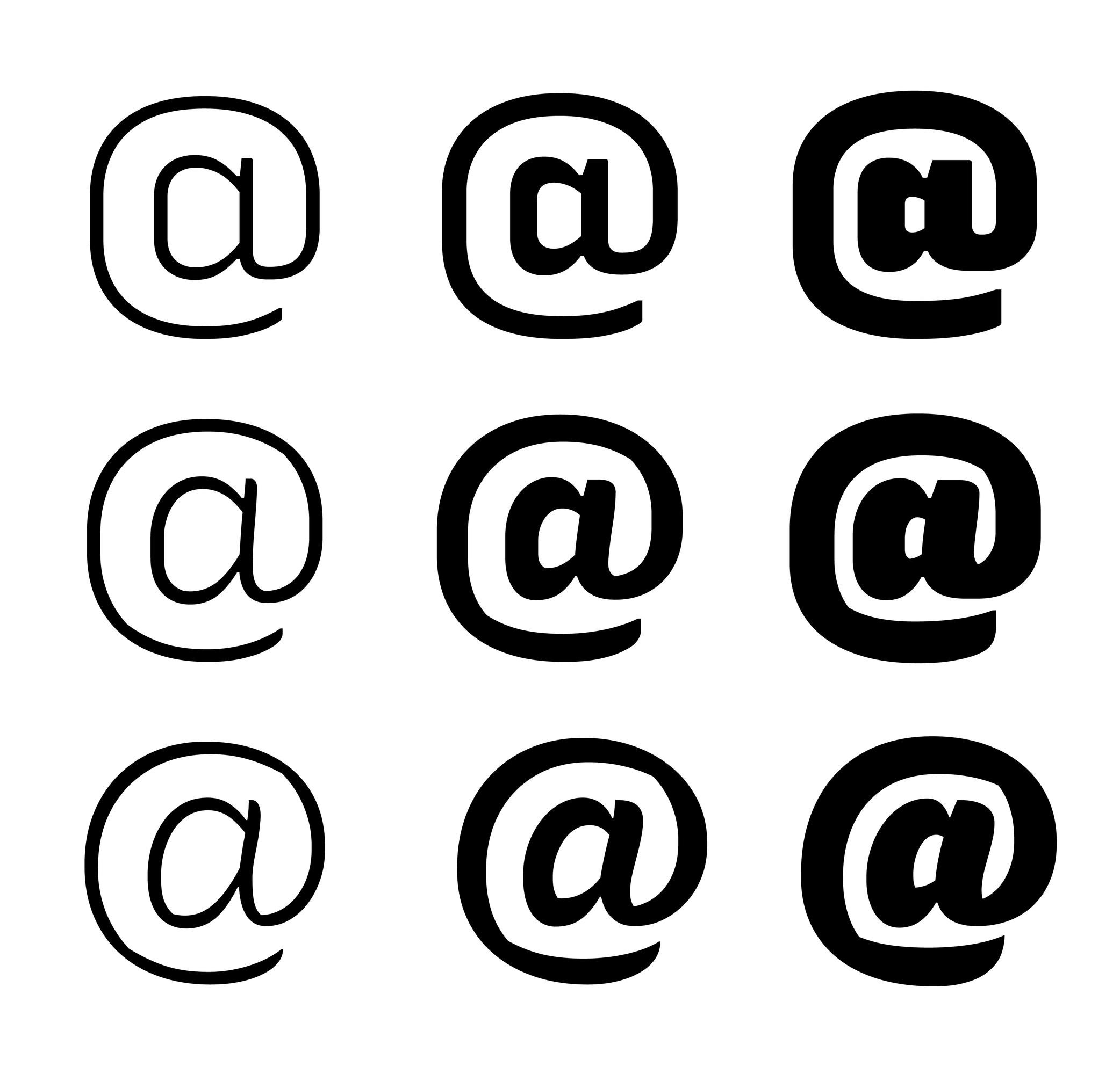
The at sign is commonly designed as a lowercase a with a tail surrounding the letter. Due to the sign’s visual complexity, there are many solutions to simplify it by making the tail shorter (not entirely enclosing the a) or by starting the tail directly from the top instead of the bottom of the stem.
Bézier Curve
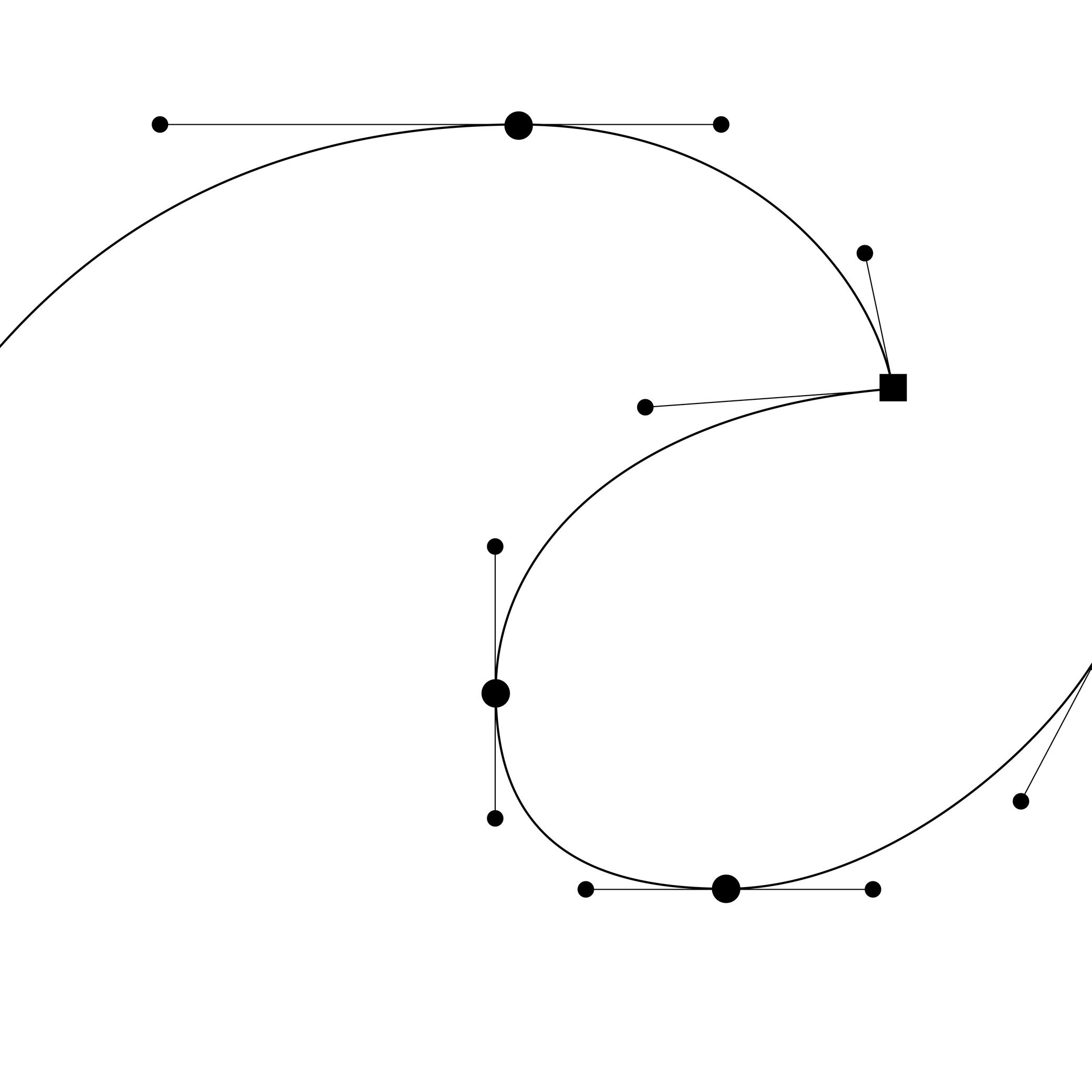
Illustration: Words of Type.
(Read More)In digital type design, Bézier curves are used to draw contours on applications with vectors drawn by placing points and handles. This technology allows the users to rasterize digital shapes while keeping their quality.
The most common font file format—OpenType—allows the use of two types of Bézier curves: cubic and quadratic.
Bounding Box
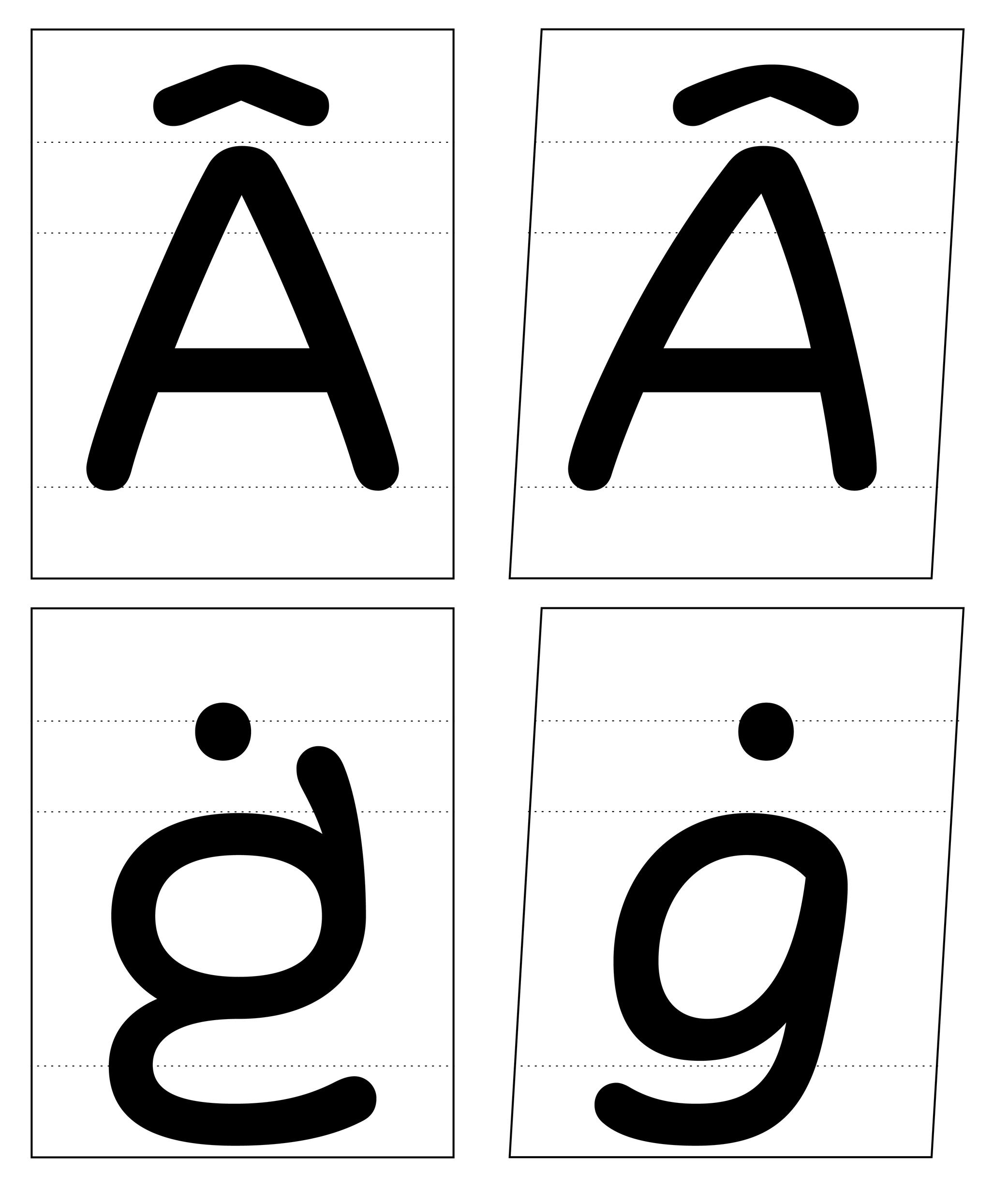
Illustration: Words of Type. Typeface in use: Knowledge Rounded, designed by Lisa Huang for Words of Type, 2024.
(Read More)The bounding box is a virtual rectangle enclosing a selected (vector) shape—such as a segment, an outline, or an entire glyph.
The font bounding box defines the outermost limits of a typeface, marked by the four extreme coordinates along the X and Y axes: highest (Y-max), lowest (Y-min), leftmost (X-min), and rightmost (X-max).
FONT ENGINEERING ADVICE
The font bounding box is stored in the head table.
Calligraphy
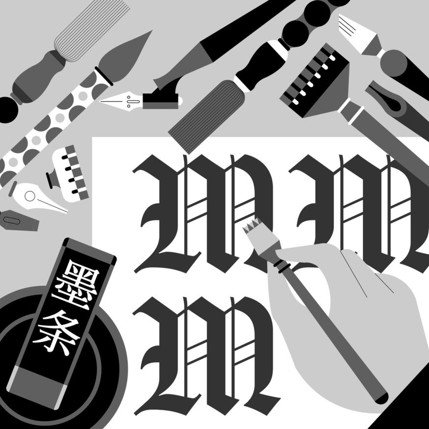
Illustration: Jonny Wan .
(Read More)The word calligraphy comes from the Greek kalos, meaning “beautiful,” and graphein, meaning “to write.” Together, it means “to write beautifully.”
Many civilizations around the world have practiced calligraphy (and continue to do so today) using a variety of tools: brush, pen, quill, broad nib pen or brush, etc. Most even consider it to be an art form.
Today, we describe typefaces whose letters and characters are inspired by those written with a calligraphy tool and following certain calligraphy styles as calligraphic. However, this is slightly different from “script” or “handwritten” styles, as those refer to handwritten shapes free from any particular calligraphic style.
Character
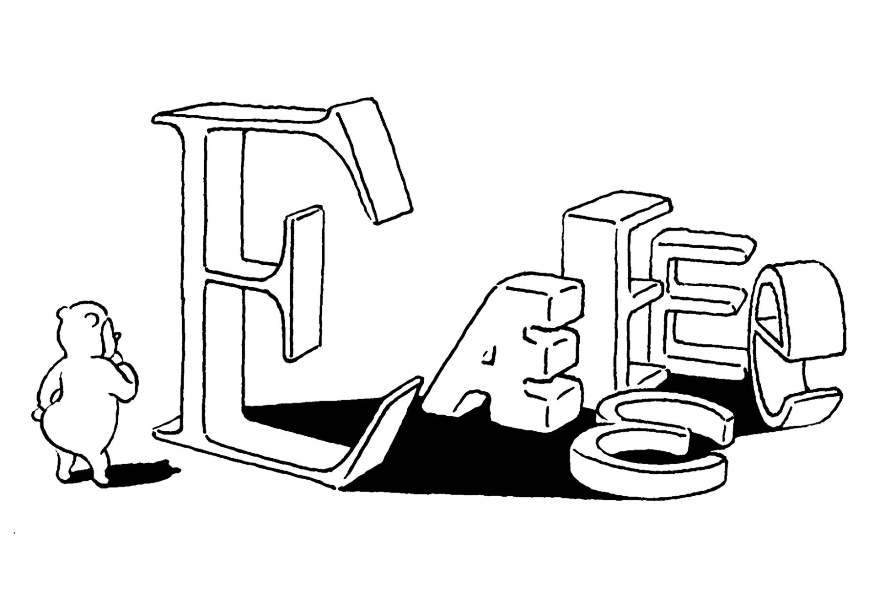
Illustration: Tezzo Suzuki .
(Read More)A character is an abstract symbol that represents a unit of a language in its written form. It is a broad term that covers letters, figures, punctuation, symbols, and more.
Not to confuse with a glyph, which is a visual representation of a character.
To be more precise:
• one character can be represented by multiple glyphs (such as alternates glyphs of the same character a: single story and double story a);
• one glyph can contain multiple characters (such as ligature fl containing two characters).In computing, characters are encoded in character encoding standards like Unicode or ASCII. These standards map a character to a numerical value (also called a “code point”) that can be processed by a computer. The character is what the user types, and the glyph is what is displayed in return.
NOTE
The distinction between uppercase and lowercase doesn’t affect the linguistic value of a character. A and a are therefore considered case variants of the same character in linguistic and phonological terms. In computing and digital typography, however, A and a are assigned different Unicode code points (A = U+0041 and a =U+0061), making them distinct encoded characters in that context.
FONT ENGINEERING ADVICE
In a font file, the cmap table (character to glyph index mapping) links character’s code points to the font’s glyphs.
Character Set
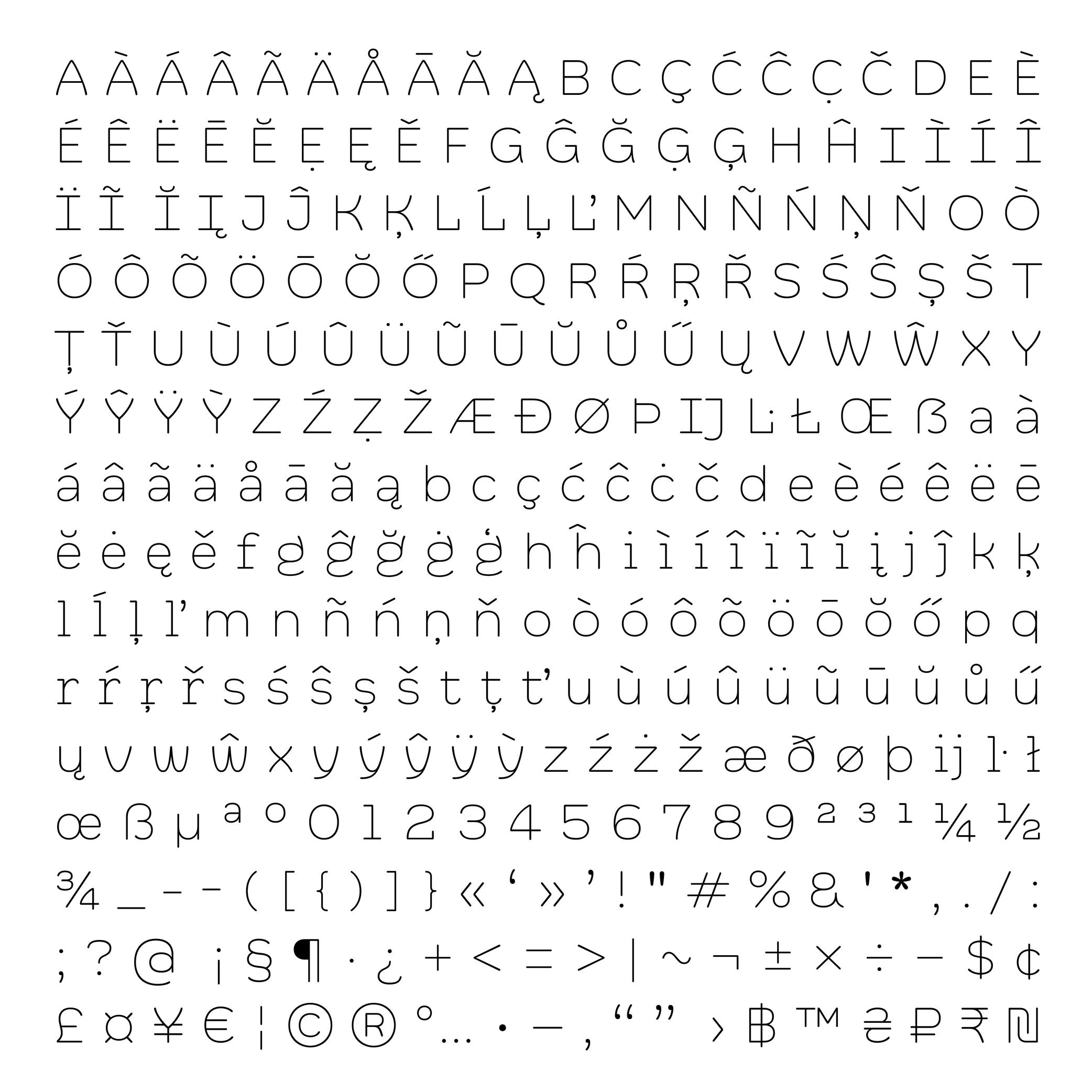
Illustration: Words of Type. Typeface in use: Knowledge Rounded, designed by Lisa Huang, 2024.
(Read More)A character set is a list of glyphs (letters, figures, symbols, ligatures, punctuations, etc.).
In digital fonts, character sets (also called “encoding lists”) contain the glyphs of a font with their individual names and Unicode references.
There are multiple character sets specific to various scripts or languages, as each contains the needed glyphs used by its respective language. Separated character sets per script or language allow a smaller and optimized file size.In the context of a type design, a character-set is a group of encoded glyphs, while a glyph-set encompasses all the glyphs of a typeface—whether encoded or not.
Classification
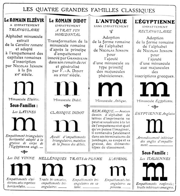
Francis Thibaudeau’s typographic classification, from Manuel français de typographie moderne, Francis Thibaudeau, 1924. Collection of Bibliothèque nationale de France (French National Library).
(Read More)With the many styles and designs of typefaces that exist, it can be difficult to describe, sort, or even find them in a catalog that isn’t familiar to the user.
Each writing system has its own typeface classification categories that best suit its nature and history. As aesthetic values differ from one culture to another, the same (or similar) style may not convey the same impression across different scripts, and one category considered a convention for one script is not always relevant to others.

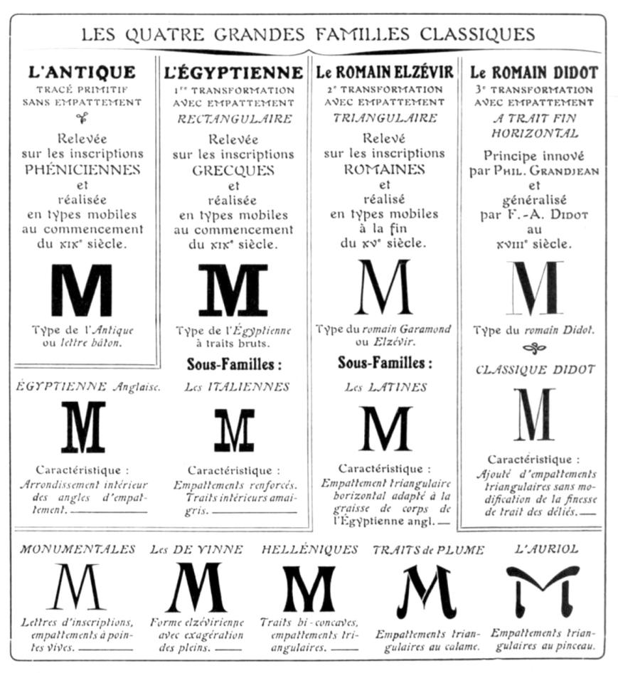
For example, Latin typefaces have been sorted into multiple classification systems since the beginning of metal typesetting. Here are some of them:
• Thibaudeau, by French typographer Francis Thibaudeau in 1921, with four categories: Elzévirs, Didots, Égyptiennes and Antiques;
• Vox (or Vox-Thibaudeau), by French historian Maximilien Vox in 1954, who started with the Thibaudeau classification as a basis and added more categories to include the additional typeface styles in the Deberny & Peignot type foundry’s library;
• Vox-ATypI, with additional categories and subcategories from the ATypI (Association Typographique Internationale), added between 1962 and 2021.Today, classification systems vary from one type foundry to another, using more or less “standardized” terms better suited to their own catalog or the scripts covered. These boxes also help users find what they are looking for in a wide variety of choices. They are not rules to be followed to the letter. Imagination and creativity shouldn’t be confined!
Colon
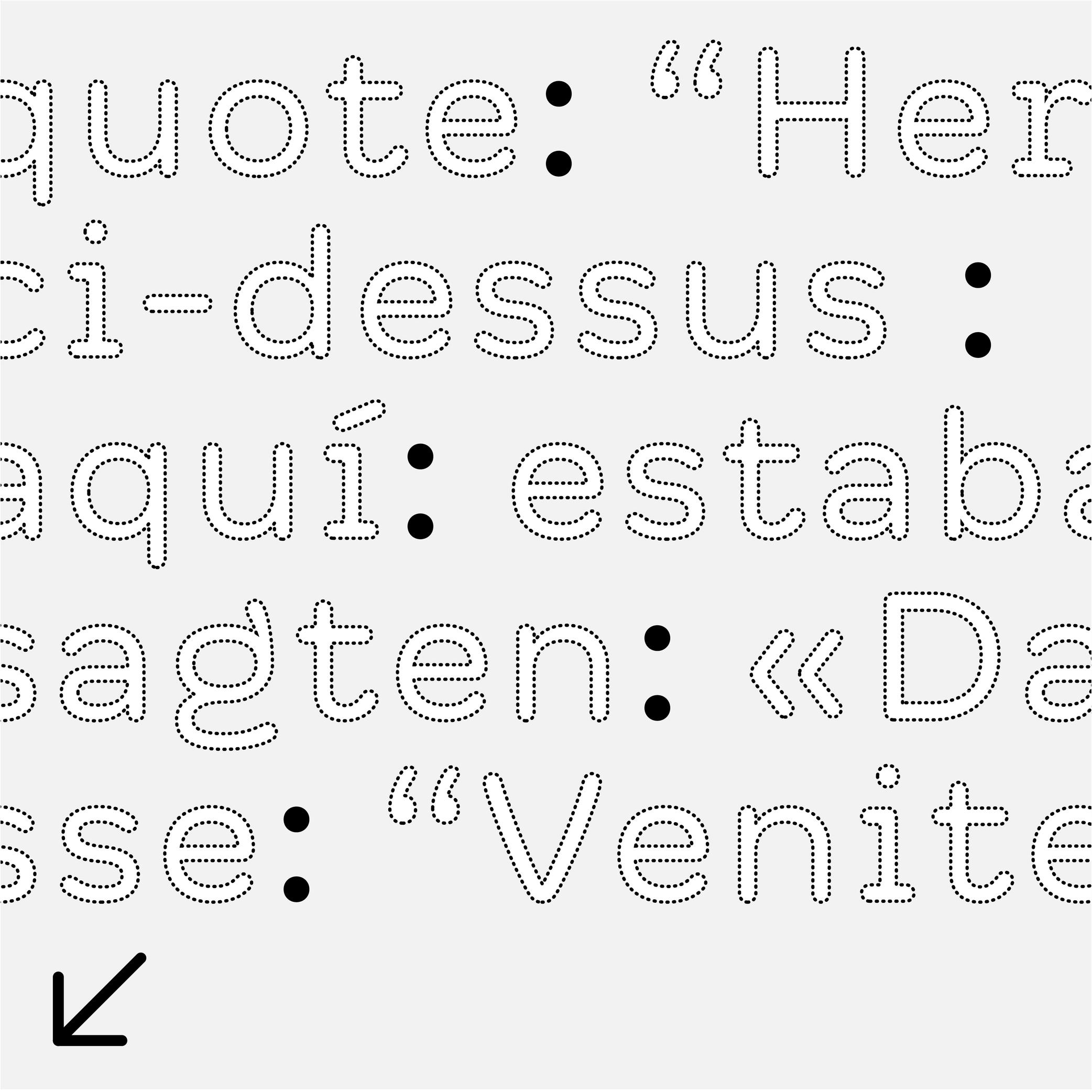
Sponsor Word of Type and feature your typeface in this card with a linked caption. Contact us for more information.
(Read More)FUNCTION
A colon indicates the beginning of a quote, a list, a ratio within numbers, or it can be used to indicate time in between two numbers.
HISTORY
The colon has been used in various languages for various types of uses. Scribes during Europe’s Middle Ages began using it as we do nowadays.
DESIGN
The colon is built with two periods on top of each other. The top one is placed just below the x-height and the bottom one sits on the baseline.
TYPOGRAPHIC RULES
There is no space before the colon in a sentence, and is followed by a space (U+00A0). But this rule doesn’t apply to every Latin language!
Comma
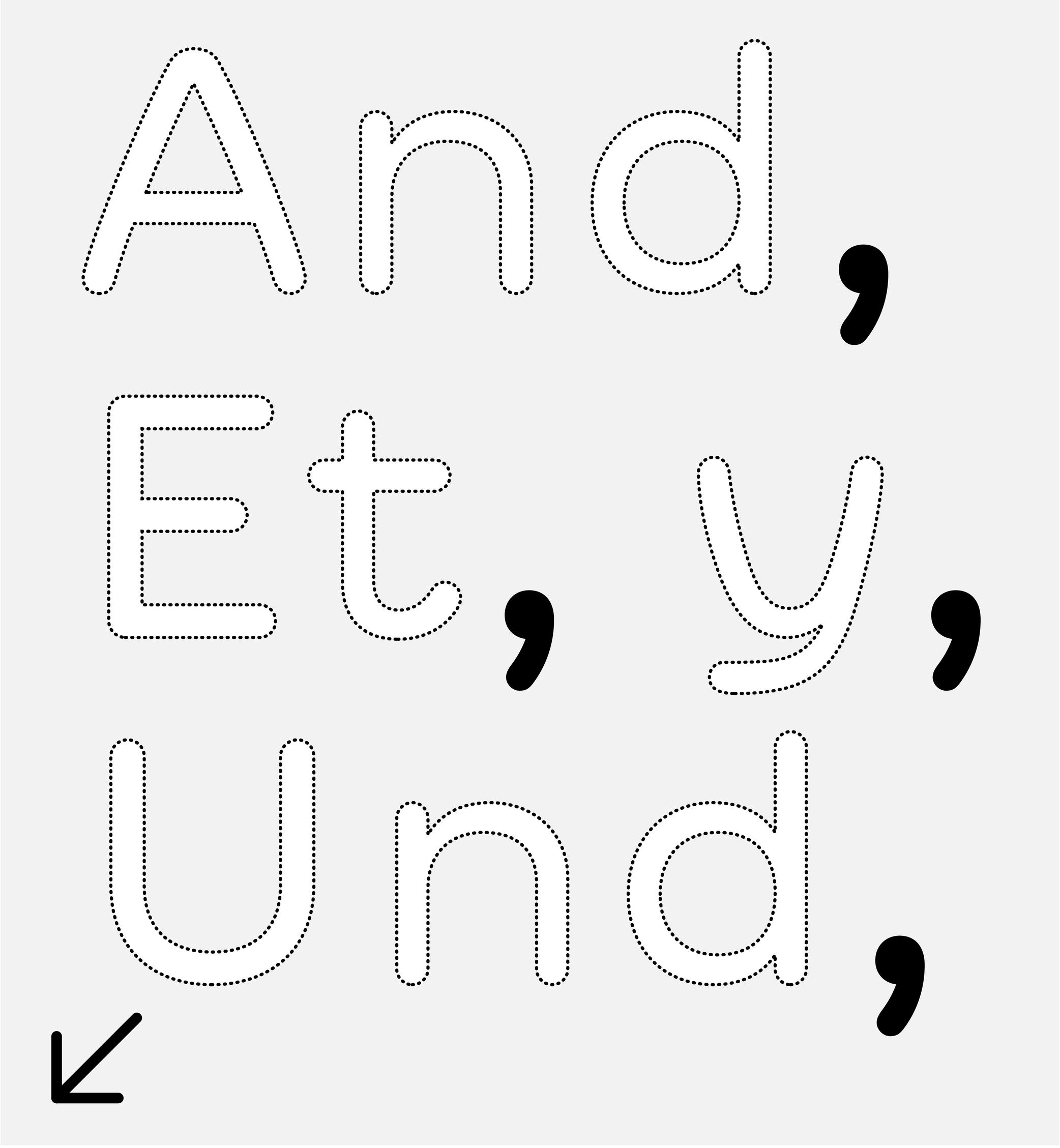
Sponsor Word of Type and feature your typeface in this card with a linked caption. Contact us for more information.
(Read More)FUNCTION
A comma separates parts of a sentence to mark a short pause or following ideas. If not overused, it helps improve the reading experience. It is also used in numbers to visually separate figures of larger categories. In the United States and most other English-speaking countries, in numerals of one thousand or more, a comma is used in between groups of three digits counting from the right (where a period is used for the same purpose in other European languages).
HISTORY
In Europe, the origins of many punctuation symbols, including the comma, come from the inventions of Greek scholar Aristophanes of Byzantium (3rd century BC) who created a set of symbols to help with the reading of texts aloud.
DESIGN
The comma is basically a period with a tail. It has to be designed with enough differences to the period so that both can’t be confused with one another, even in smaller text sizes.
TYPOGRAPHIC RULES
A comma has no space before and is always followed by a space (U+0020) when used in a sentence. In numbers with decimals, it is used as such:
(European languages) 15.000,05
(English) 15,000.05
Counter
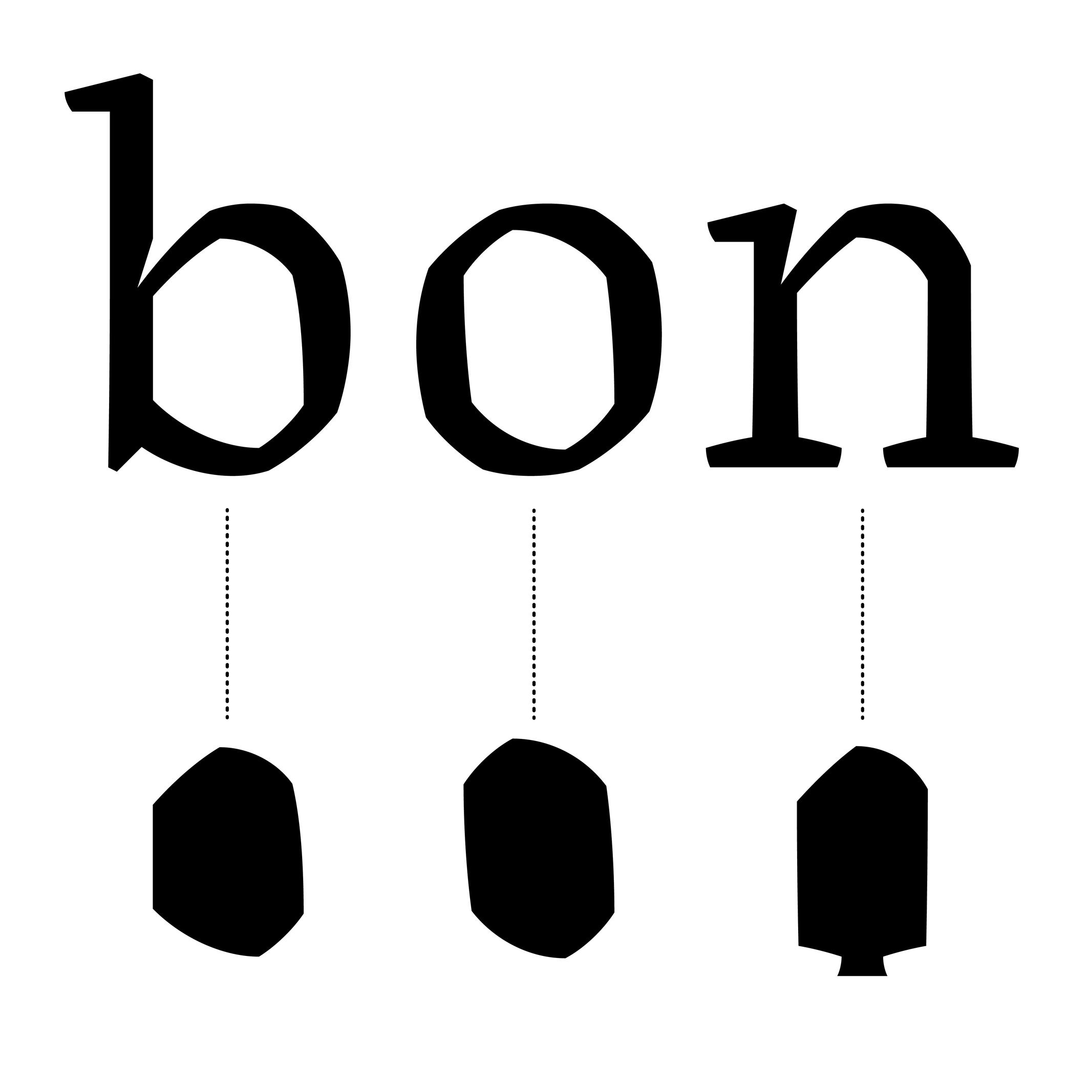
Sponsored by NM type . Typeface in use: Sastre, designed by María Ramos, 2024.
(Read More)Also called counterform.
A counter is the negative shape inside a glyph with an enclosed form, either entirely closed (such as b) or partially open (such as n).
This term comes from the “counterpunch.” Punchcutters used counterpunches to depress the white spaces inside letterforms while making the master punches for metal-type sorts.
Concretely, they would strike the counterpunch into a larger steel punch. Afterward, the punchcutter filed down the outside of the punch, creating the letterform’s exterior contour.
Punchcutters could reuse a counterpunch on any related letterforms in the typeface, keeping a consistent look throughout an entire font.TYPE DESIGN
In digital type design for Latin scripts, it is important to keep this consistency as well, with various techniques, such as putting the component of a reference letter in the background or copy-pasting the contours of the counter, or making sure that they visually look consistent by placing them next to each other while designing the shapes.
Currency
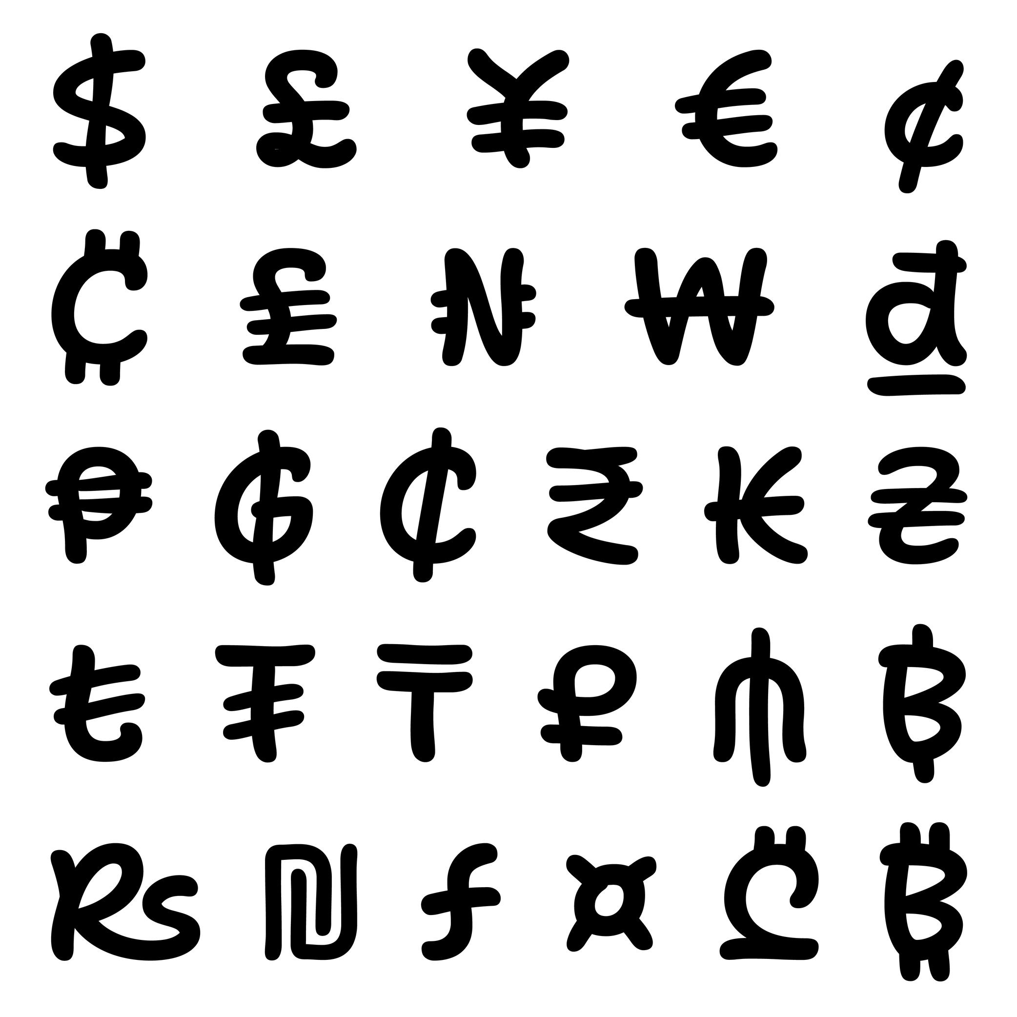
Sponsored by ArrowType . Typeface in use: Shantell Sans , designed by Shantell Martin and Stephen Nixon, available at Google Fonts, 2023.
(Read More)Every currency symbol carries one function: to give a financial value to numbers. Each of them evolved through time. Some of them disappeared or have been modified to follow the needs of various civilisations.
For most of them, currency symbols are made of Latin letters with various levels of modifications (US dollar $, Euro €, Vietnamese dong ₫). Some of them can simply” be letters (Swiss CHF) or a character on their own (Chinese Yuan 元).
DESIGN
Currency symbols need to be designed in a good balance with figures, as they are combined with them.
In a typeface family with a wide range of weights, currency symbols of the lightest styles can easily carry every stroke and conventional details. But as the style gets bolder, these can be tricky to keep, especially when too many details darken the symbol to a point where it is hardly recognizable. The most common solution is to simplify the symbol by removing some “less” important parts while keeping the symbol’s legibility.
Dash
Sponsor Word of Type and feature your typeface in this card with a linked caption. Contact us for more information.
(Read More)USAGE
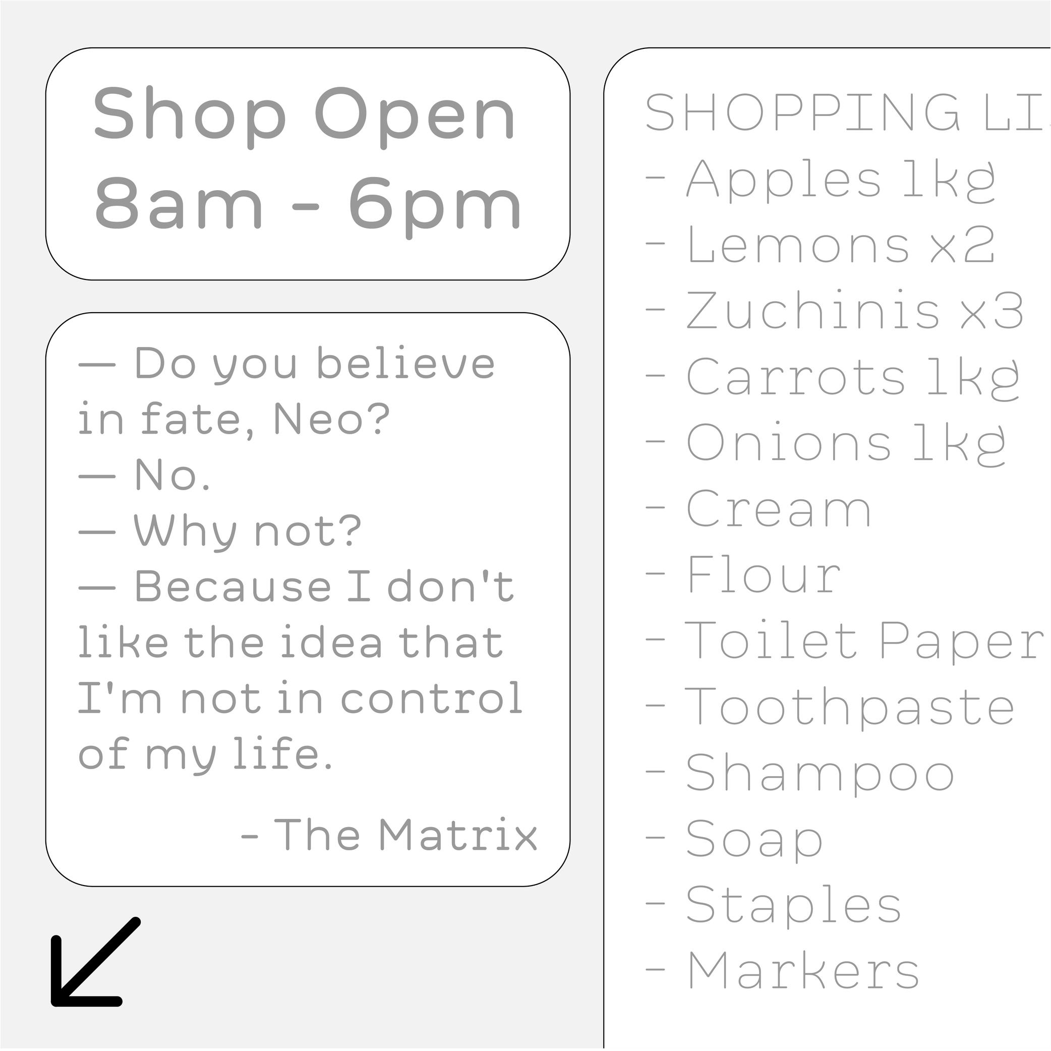
Among the multiple types of dashes (yes, there are many!), the most common ones are:
1. en dash, used for:
• to indicate a list;
• indicate a closed range (as a substitute of words “to” or “between”);
• (less common) to hide letters in a word;
• connecting words in compounds (in some languages)2. em dash, used for:
• indicate lines in a dialogue;
• (less common) to hide entire words or part of one.Both en and em dashes are also used to enclose a section of a sentence, just like a pair of parentheses, or to indicate a separation within a sentence like a colon or semicolon.
HISTORY
Before the adoption of any punctuation standard, markers of various forms were used by scribes to indicate pauses. Dashes of various lengths have been used for many kinds of roles through the centuries, and across countries. But for dash-like symbols, these evolutions left us with the en dash and em dash as principal successors.
DESIGN
Their length has been standardized during the metal type printing era (in Europe and North America), using the size of the font as a reference for their measurement as such:
• 1 em = the font size;
• length of em dash = 1 em (or sometimes the width of letter m of the font);
• length of en dash = 1/2 of 1 em (or sometimes the width of letter n of the font).
Both are placed at the optical middle height between the baseline and ascenders. In a typeface style with contrast, the thickness of the dashes has to be visually consistent with that of the thin parts.TYPOGRAPHIC RULES
Generally, in American English, it is preferred to use the en and em dash without any spaces before and after them; whereas in British English, it is often preferred to use a space before and after an en dash, and em dashes are rarely used.
NOT TO BE CONFUSED
The en dash is particularly often confused with the shorter character hyphen (U+2010), the mathematical sign minus − (U+2212), or the hyphen-minus - (U+002D).
In digital fonts, each of these glyphs has its own Unicode. They are designed and can be accessed individually. But on modern keyboards—inherited from typewriter keyboards which had to make compromises on the number of glyphs due to the limited space available—we are still often typing (mistakenly and without always knowing) the hyphen-minus instead of the hyphen or the en dash. Thankfully, most intelligent text processing apps automatically replace these with the correct glyph depending on the context.
Ellipsis
Sponsor Word of Type and feature your typeface in this card with a linked caption. Contact us for more information.
(Read More)FUNCTION
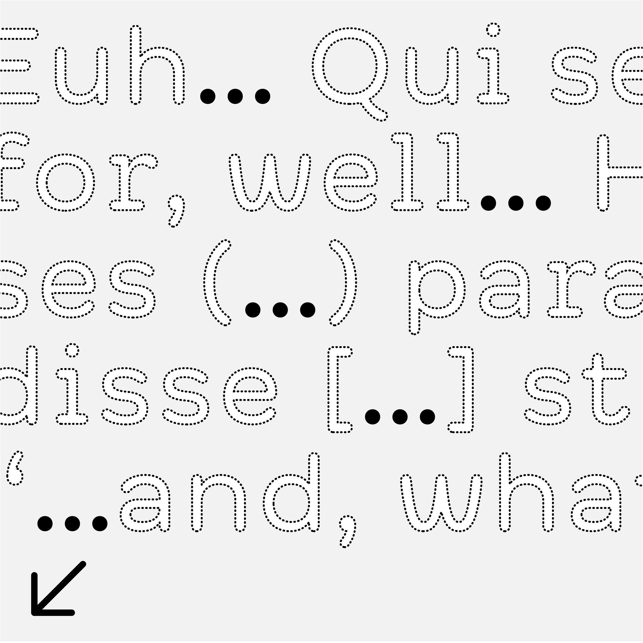
The ellipsis (or dot dot dot) is a punctuation symbol used to indicate a missing part of a text (incomplete or untold) or a rhetorical pause…
DESIGN
An ellipsis is composed of three periods aligned next to each other. It is advised to place the periods closer together than three actual periods to avoid an exaggerated gap in texts. In Chinese, the ellipsis has six dots instead of three and is traditionally center-aligned.
TYPOGRAPHIC RULES
In most languages, when an ellipsis indicates a string of missing text, it is surrounded by parentheses (…).
If it’s placed at the end of a sentence, the ellipsis is followed by a space after the period to introduce the next sentence.
Exclamation Mark
Sponsored by Kerns & Cairns . Typeface in use: Apotek , designed by Dyana Weissman, 2020.
(Read More)FUNCTION
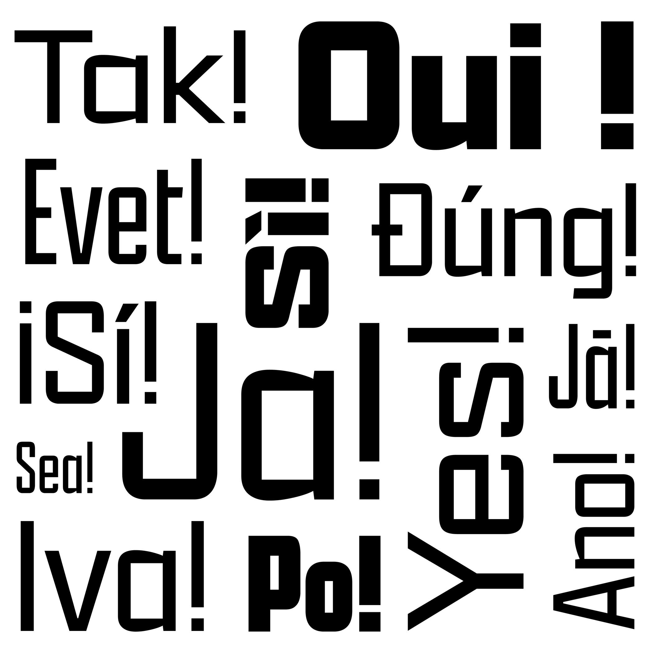
The exclamation mark is placed at the end of a sentence to indicate an exclamation (obviously!).
HISTORY
There is a theory that early exclamation marks were used by early manuscript copyists in Europe, who wrote the Latin word ‘io’ (sort of ‘hurray’), which evolved into a vertical stroke (formerly i) on top of a dot (formerly o). Other languages use different marks for the same purpose (as in Armenian or Burmese).
DESIGN
The top of the exclamation mark is optically aligned to the cap height, with a period at its base. The shape of the vertical stem can be designed to match the typeface (contrast, rounded tip, etc.).
TYPOGRAPHIC RULES
In English and in many other languages, there is no space before the exclamation mark. But in French, there is a non-breaking space. And in Spanish, a reversed exclamation mark is placed at the beginning of the sentence, with the upright one at the end, with no space.
Figure
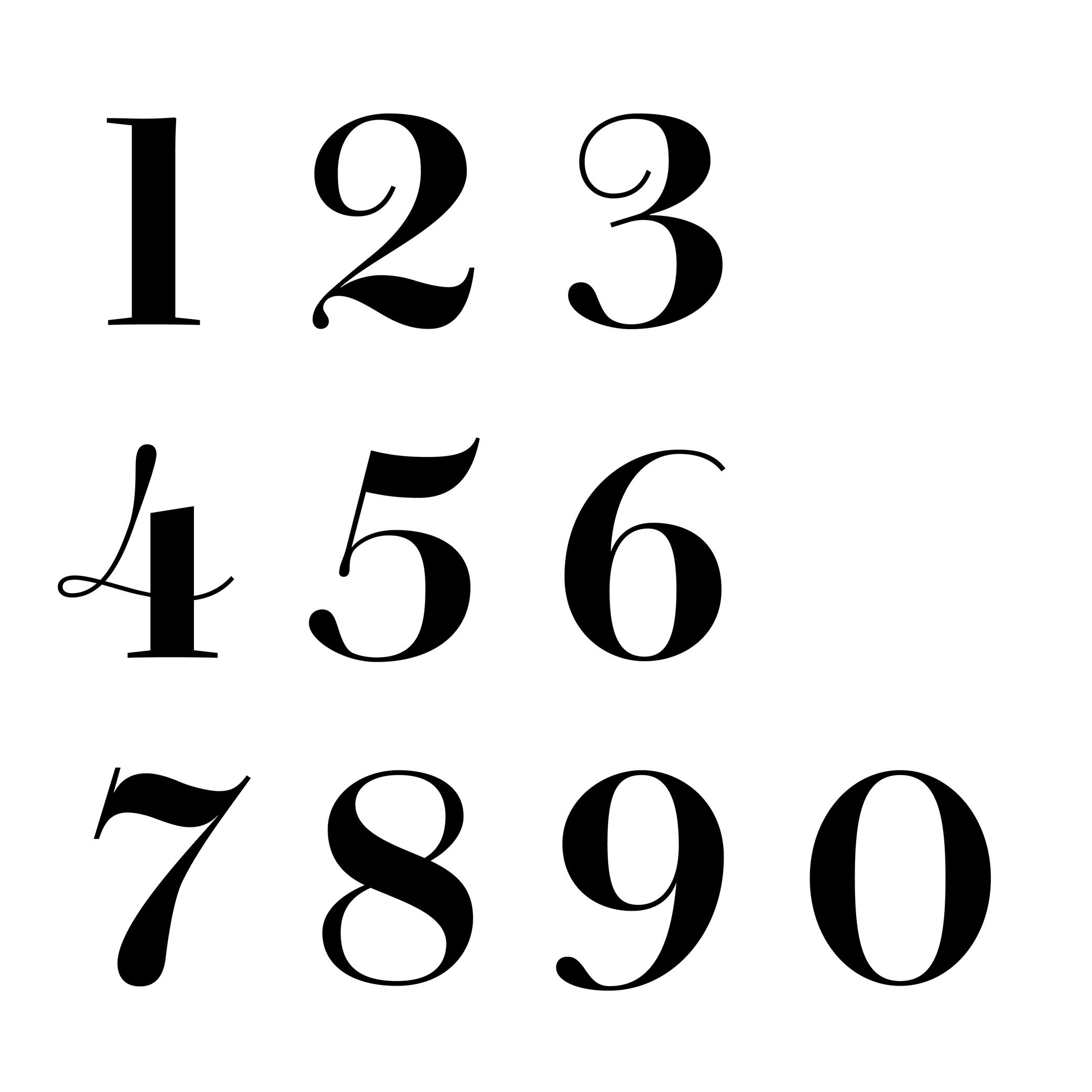
Sponsored by Commercial Type . Typeface in use: Chiswick, designed by Paul Barnes, 2017.
(Read More)The words ‘figure’ and ‘number’ are often confused. But, linguistically speaking, they are to be distinguished from one another: a figure (or numeral) is the graphic representation of a number, which is a mathematical concept. Several figures can be combined to form a number. For example, the number ‘22’ is represented by two figures ‘2’.
There are multiple styles of figures (oldstyle, proportional, lining, tabular, etc.) that suit specific situations.
HISTORY
In Europe, figures and numbers used to be represented by Roman capital letters (X, V, I, D, C, etc.). With the rise of trade with Arab countries around the 15th century, the Arabic figures (themselves influenced by Indian figures) were adopted and replaced the Roman capitals. These distinct origins explain the difference between the structure and stroke shapes of modern figures compared to Latin letters.
Height
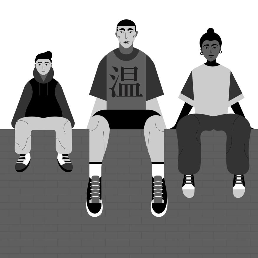
Illustration: Jonny Wan .
(Read More)In type design, height refers to vertical measurements used as guidelines for different categories of glyphs (such as uppercases, lowercases, small caps, etc.). These are measured from the baseline and help ensure visual consistency across the typeface.
LCG (LATIN, CYRILLIC, GREEK)
LCG scripts typically use the following height guidelines for their lowercases, uppercases, and small caps:
• x-height: height of short lowercases;
• ascender height: height of the extension of lowercase letters that rise above the x-height;
• descender height: height of the extension of lowercase letters that fall below the baseline;
• cap height: height of uppercase letters;
• small case height: heigh of the small cases;
• sometimes also specific figure heights too (for old style or proportional figures, and more).CJK (CHINESE, JAPANESE, KOREAN)
Characters of CJK scripts are commonly designed to fit within a common em-square (same width and/or height) for all characters within the same typeface. Designers often define:
• ideographic em height: total vertical space for a character;
• baseline offset: vertical alignment for mixed-script texts.ARABIC SCRIPTS
Arabic scripts have various types of heights measurements depending on the style involved, including some that don’t follow the same rule as Latin script, where the “horizontal” baseline may not be exactly the same word to word when the letters are typed into texts. But in general, we can list down the following:
• baseline: anchors the “horizontal” alignment;
• median line: main body height;
• ascender and descender lines: based on the tallest and lowest glyph strokes;
• mark height: guides the placement of diacritics.INDIC SCRIPTS
The following are the most common height measurements for Indic scripts (which encompasses a large number of different scripts!):
• shirorekha (headline): the horizontal bar on top of many letters;
• base height: where the main glyph body sits;
• matra height: position for vowel signs and marks above or below the base glyph.Note: These design heights relate to glyphs’ outlines, and are not to be confused with vertical metrics, which define the overall line spacing in a font.
FONT ENGINEERING ADVICE
The x-height and the cap-height are important values that can be found in the OS/2 table of the font file.
Punctuation
Sponsor Word of Type and feature your typeface in this card with a linked caption. Contact us for more information.
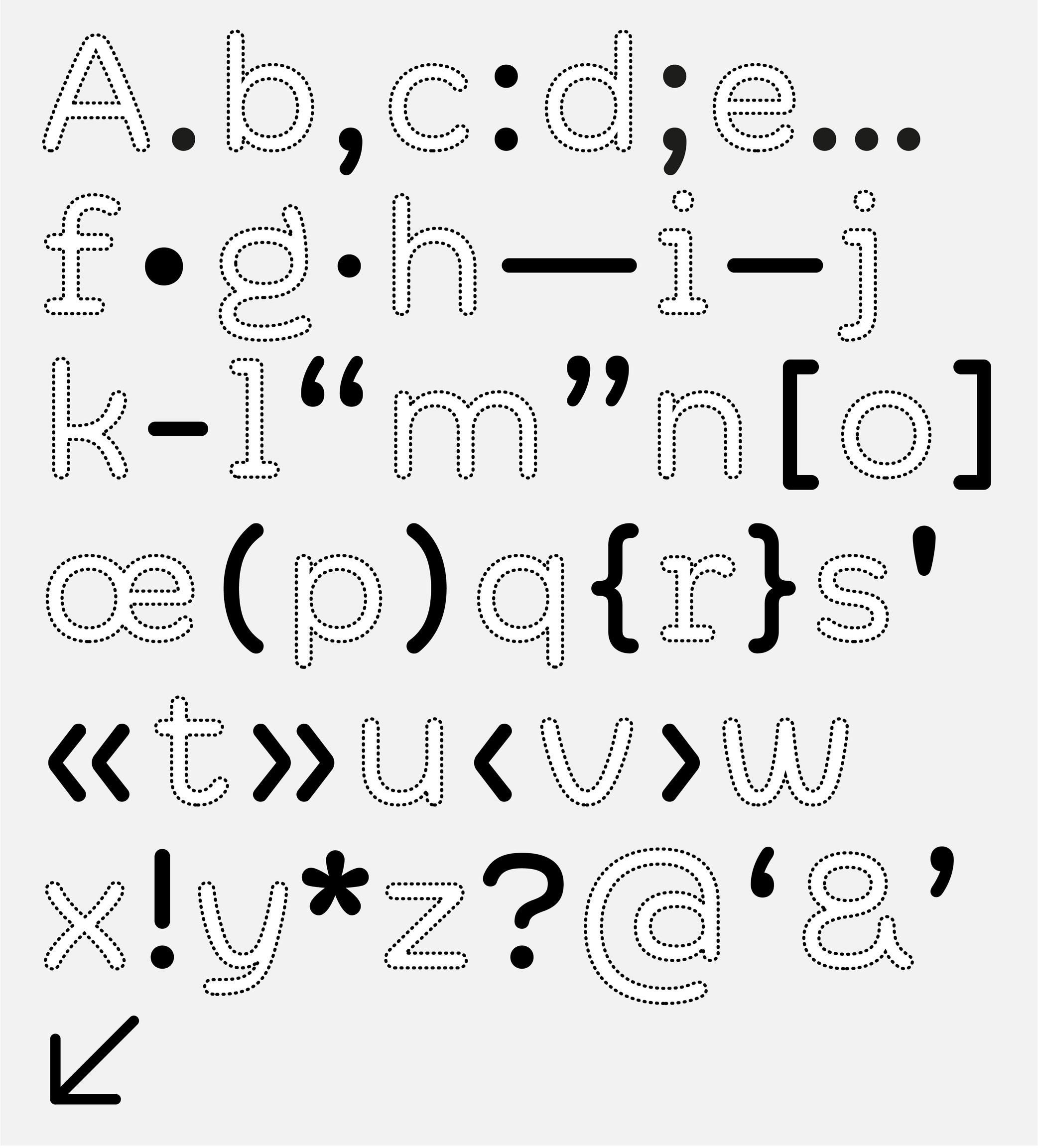
(Read More)Often forgotten when we think about the elements of a writing system, punctuation is just as important as letters, characters and figures. Punctuation symbols play a very important role in text.
When use correctly, punctuation marks a text’s rhythm and transmits the author’s desired voice. When well-designed in a typeface, punctuation helps with readability and facilitates typesetting and typography.
During the evolution of each writing system across the globe, multiple scripts developed different punctuation shapes for the same or similar purpose. Not every script or language uses the same shapes found in the Latin script.
Space
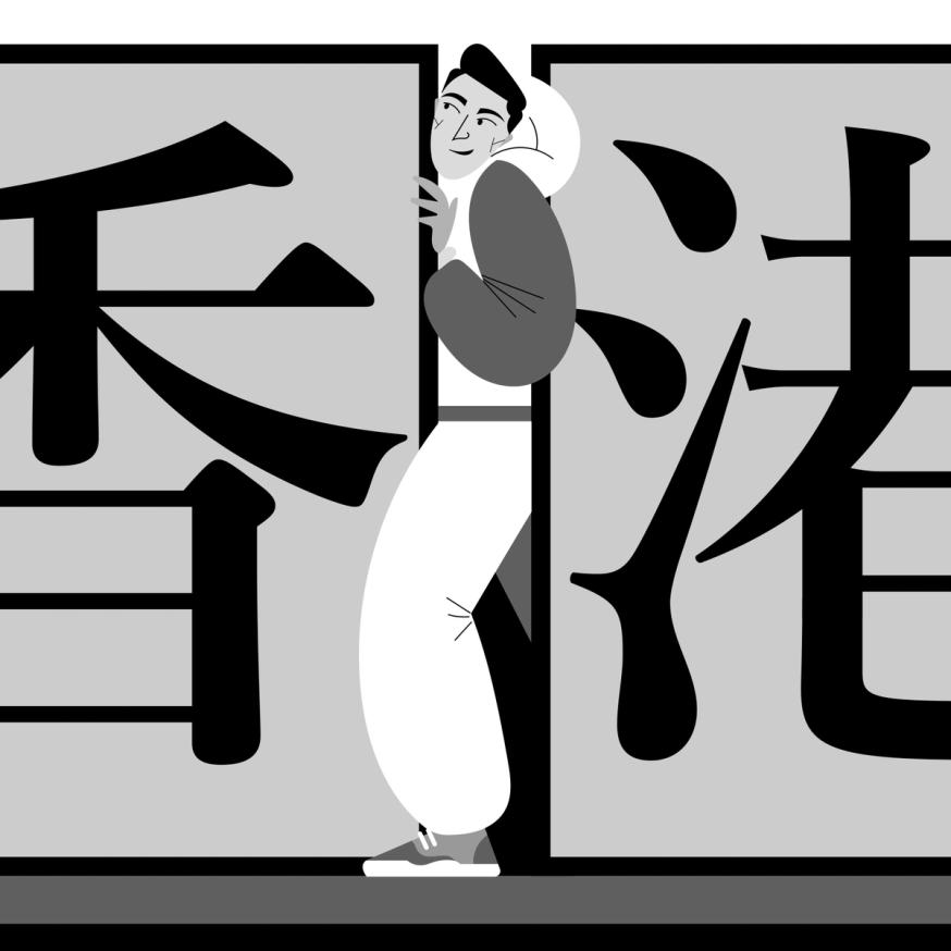
Illustration: Jonny Wan .
(Read More)FUNCTION
For many writing systems (but not all), spaces separate words. Like punctuation symbols, they bring rhythm and clarity to a text and help with the reading experience. In the Latin script, several spaces with different widths are used for various situations (see Typographic Rules below).
HISTORY
In Ancient Latin, Roman capitals had no spaces between words. In some monuments, dots could be placed at middle height to help identify the words. In Europe, with the adoption of the Latin script, they started to appear in calligraphed manuscripts to help the readers identify the different words.
During the metal type printing era, blank pieces of lead were used as spaces between words. There were multiple widths for word spaces to help arrange text lines with precise length (em space, thin space, etc.). They lead to various rules in various languages and typographic traditions.
Nowadays, texts in the digital realm still make use of a variety of spaces for different situations in different languages, and also to offer different typographic options.
DESIGN
Spaces shouldn’t be too wide or too narrow. In Latin script based languages, a common convention is to set the width of the generic space glyph (U+0020) similar to that of the letter I or i.
TYPOGRAPHIC RULES
Many languages—including those commonly using the Latin script—have specific typographic rules.
One example: in French, before a question mark, exclamation mark, semi-colon or colon, there is a non-breaking space, whereas there isn’t any in English or other languages.
In digital typesetting, there are variable word spaces, breaking and non-breaking spaces, which give the text processing application the information on whether the width of the space can be adjusted or if the text line can or can not be broken at a specific place.
Stem
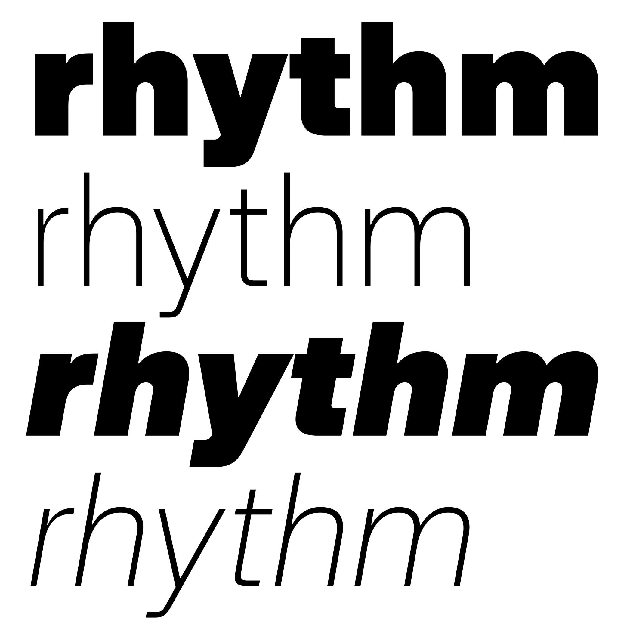
Sponsored by Blaze Type . Typeface in use: Rules , designed by Matthieu Salvaggio, Léon Hugues, Tim Vanhille, and Guido Ferreyra, 2024.
(Read More)Many terms are borrowed from architecture or human and animal anatomy to designate and describe parts of letters and other characters. We even speak of type design anatomy.
In many writing systems, a glyph’s stem refers to its vertical bar(s) or stroke(s).
Style
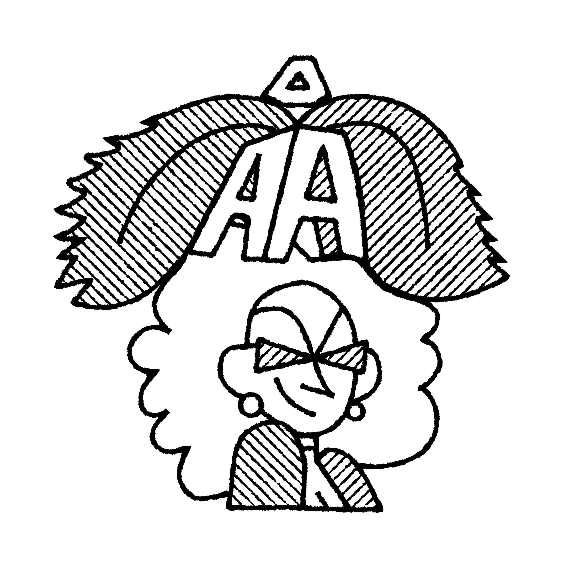
Illustration: Pauline Fourest (Spaghetype ).
(Read More)In any writing system, typefaces exist in an infinite number and variety of styles. They are influenced by many factors, such as technology, tools, necessity, and trends. But some of them are (or can be) grouped into categories for their similarities, into classification systems (sans serif, serif, humanist or geometric, etc.).
In the Latin script, we also identify Roman (or upright) and Italic as two ‘companion’ styles of the same typeface style.
Swash
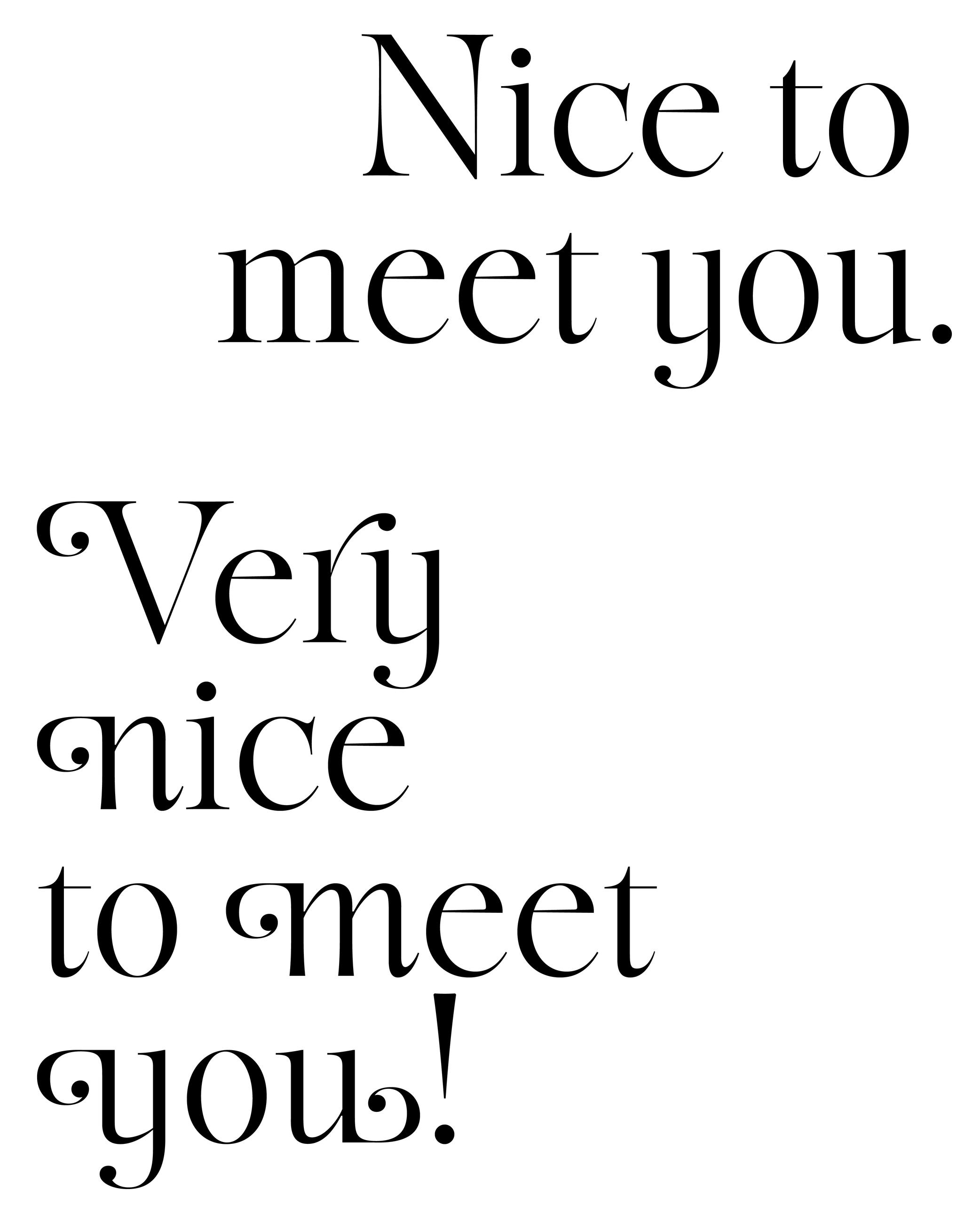
Sponsored by Blaze Type . Typeface in use: Sigurd , designed by Matthieu Salvaggio and Léon Hugues, 2021.
(Read More)Swashes are the elongated extensions of letters, designed with longer strokes than their “usual” construction, most generally as a decorative feature and/or in display style typefaces.
HISTORY
They appeared during the metal type era in the Latin world, when swashed letters served as decorative features to the text. They were also a way to showcase the punch-cutters’ skills, sometimes with incredibly long and elaborate swashes.
Swashes still have the same purpose today in digital typefaces, where “normal” letters are the default ones and swashes can be activated as alternates from the typefaces’ features (if available).Terminal
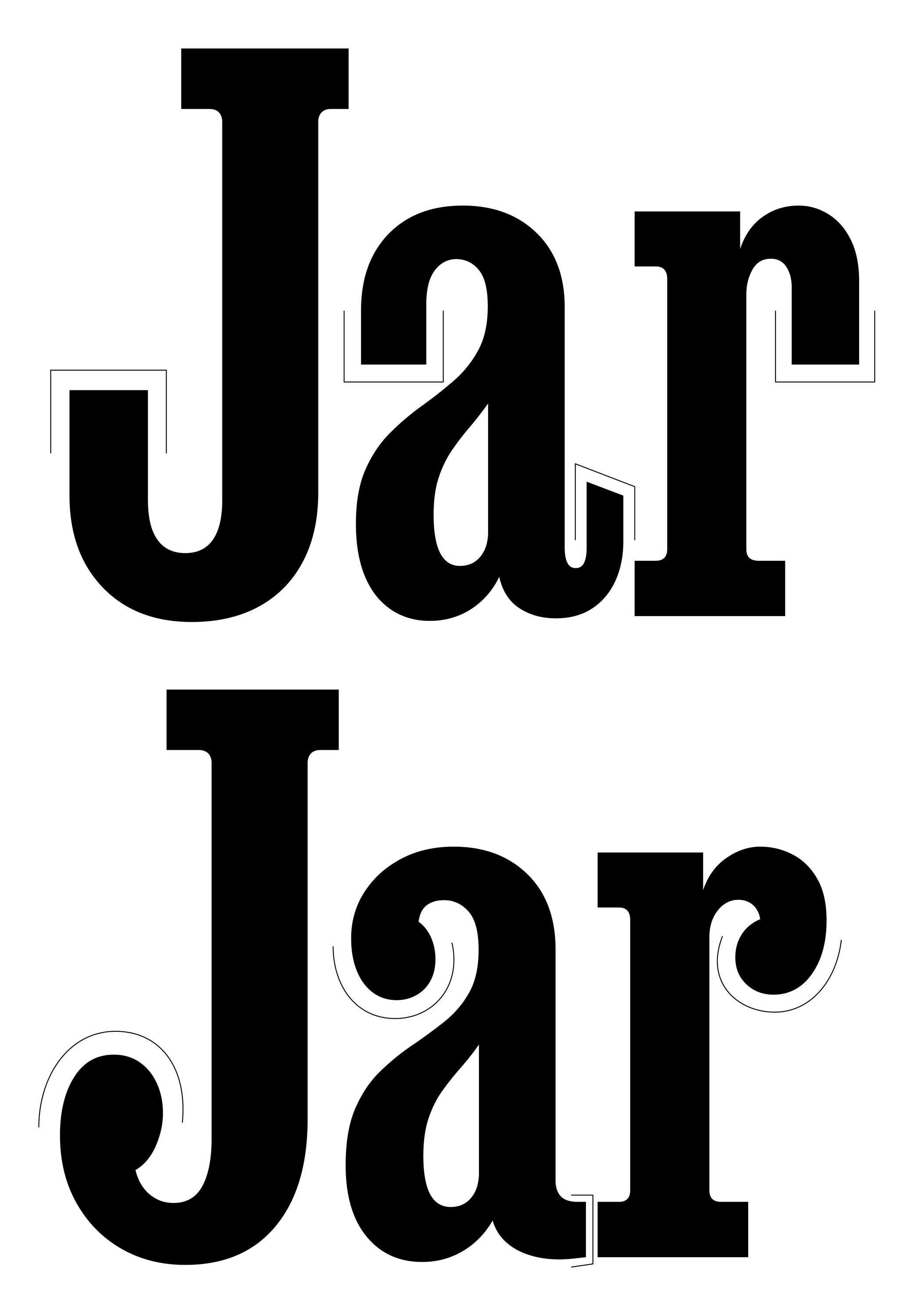
Sponsored by DJR . Typeface in use: Job Clarendon , designed by David Jonathan Ross, 2023.
(Read More)Many terms are borrowed from architecture or human and animal anatomy to designate and describe parts of letters and other characters. We even speak of type design anatomy.
The terminal of a character is its very last part, according to its ductus. The shape of the terminal can vary depending on the style of the typeface, with names that ‘feel’ most suited to its shape (drop, ear, serif, etc.).
Unicode
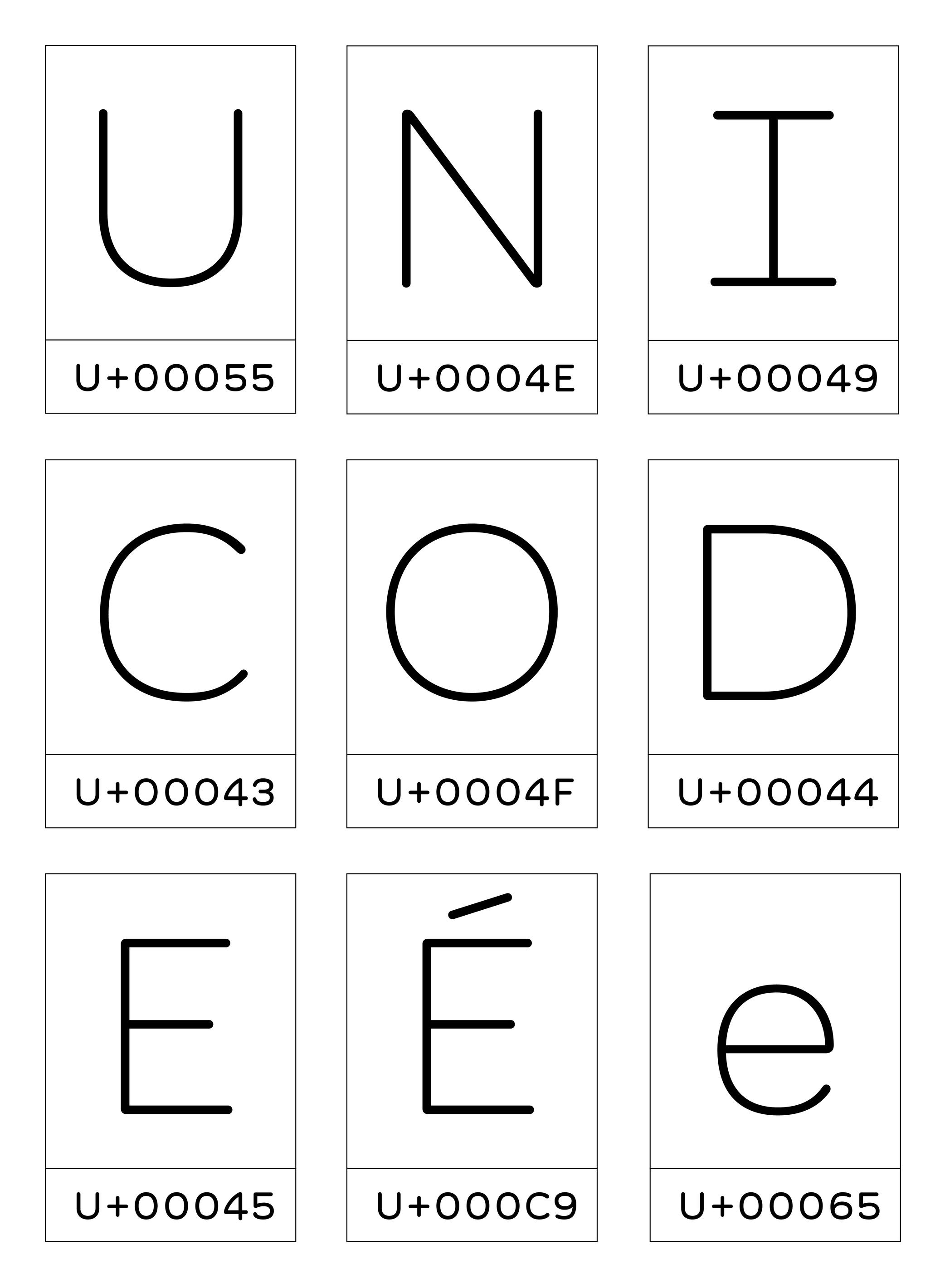
Illustration: Words of Type. Typeface in use: Knowledge Round, designed by Lisa Huang, 2024.
(Read More)Unicode is an international standard for encoding characters, signs, and symbols used in digital devices worldwide.
Developed by the Unicode Consortium—a non-profit organisation with international members—Unicode assigns a unique code (or code point) to each character of as many written languages as possible. More characters and/or more scripts are added almost every year, presented to the organisation members, who research and discuss thoroughly about the relevance of adding them to the Unicode standard. These codes are used by digital systems to ensure consistent and stable exchange of texts across platforms and devices.
FONT ENGINEERING HINT
In font files, Unicode code points are mapped to glyphs through the cmap table (Character to Glyph Mapping). This allows software to know which glyph to display for a given character code. Not all glyphs in a font must be assigned with a Unicode code point; some may exist only for stylistic or contextual substitution purposes.
White Space
Sponsor Word of Type and feature your typeface in this card with a linked caption. Contact us for more information.
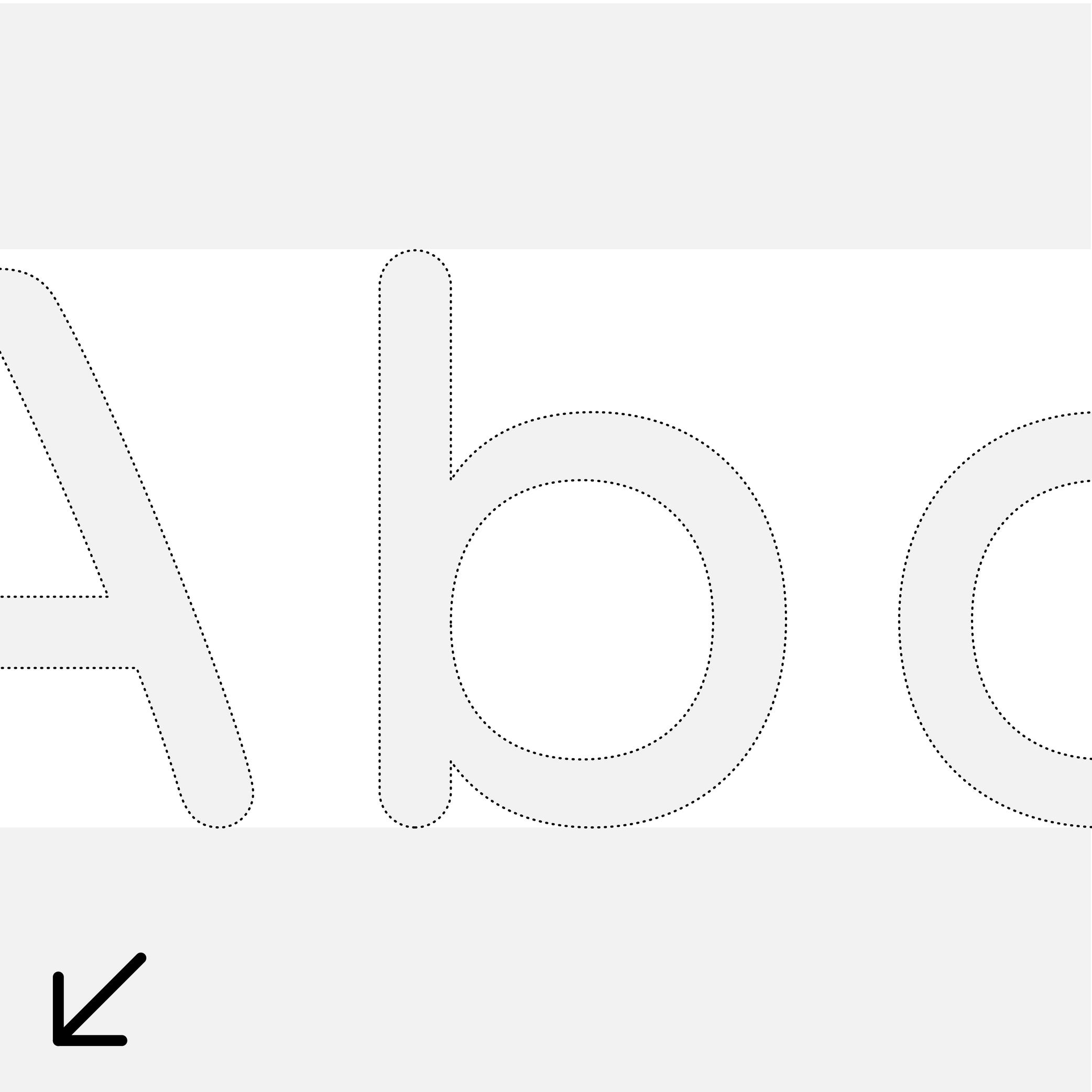
(Read More)A white space is any part of a glyph that is not of the glyph itself. They can be counters (inside), spaces, or negative space (outside).