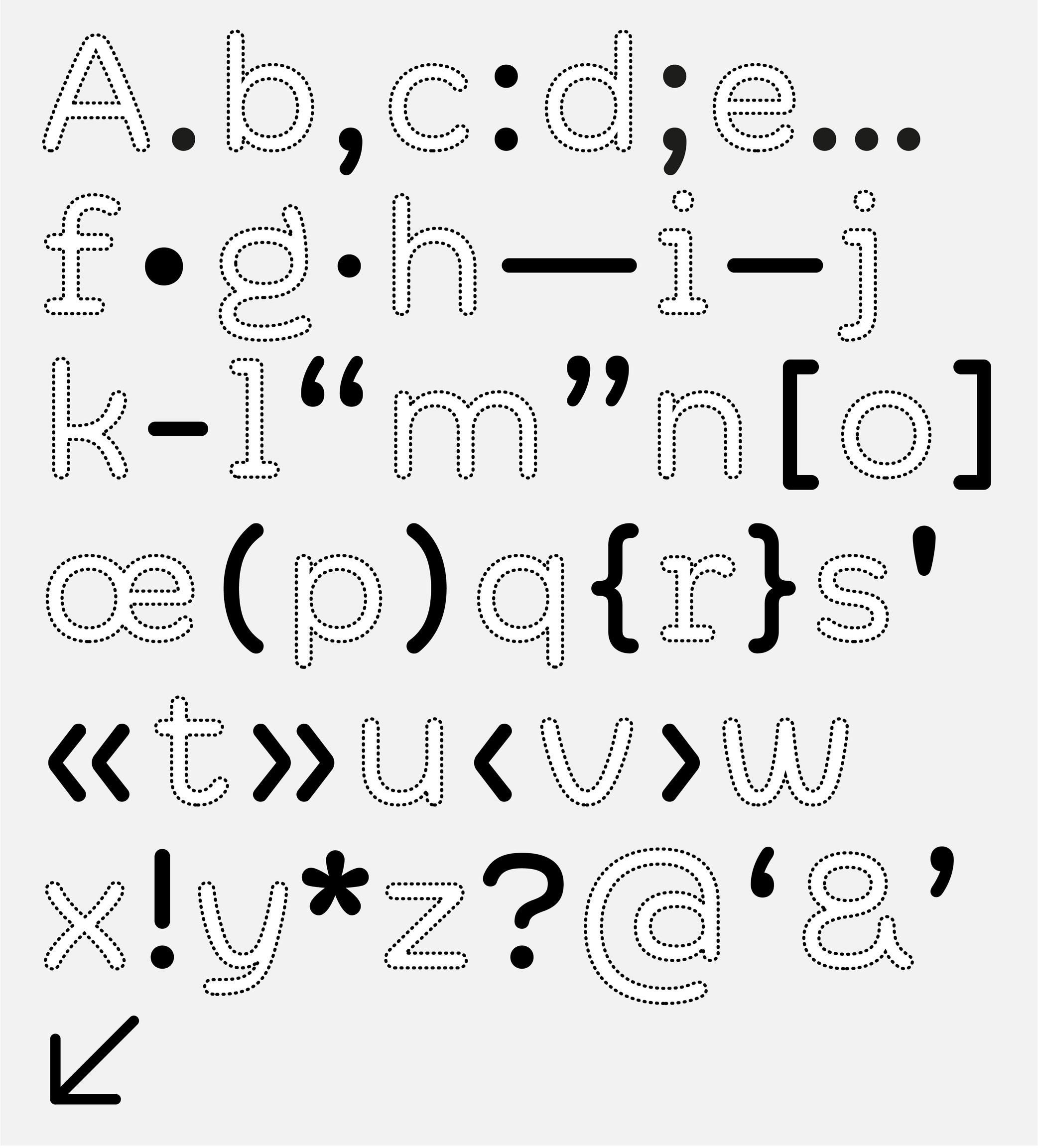
Alphabet
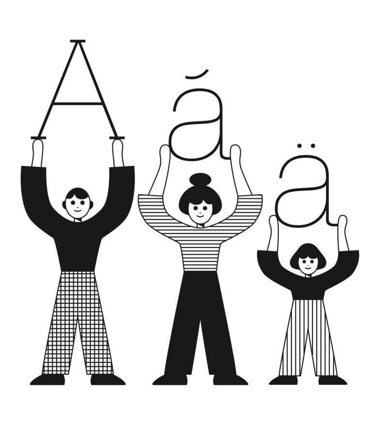
Illustration: James Graham .
(Read More)An alphabet is a type of writing system that uses a set of letters to represent a language visually. Each letter represents a different sound, and when combined together following a certain order specific to each language, they form syllables, words, and sentences.
Across the world and throughout history, many languages have used alphabetical systems (Greek, Arabic, Hebrew, etc.). As of today, the Latin script is being used for the largest number of languages, with many different sets of alphabets, varying in number of letters depending on the needs of the language (i.e., both English and Spanish use the Latin script, but they have different alphabets).
Anatomy
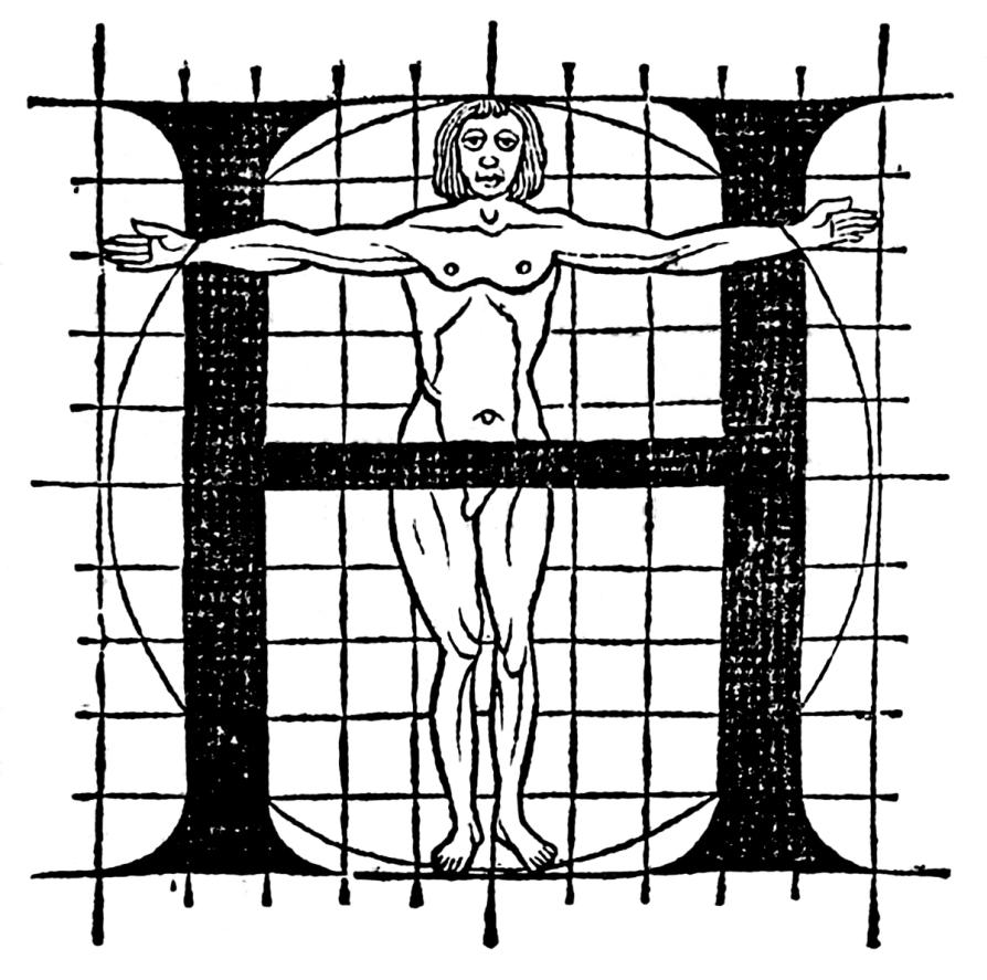
Illustration: Le Champ Fleury, Geoffroy Tory, 1529. Source: Bibliothèque nationale de France .
(Read More)To name and describe parts of letters and other characters, many terms are borrowed from architecture (e.g., arch of an n) or from human and animal anatomy (e.g. leg of an R), which is why we speak of “type design anatomy.”
Apostrophe
Sponsored by DJR . Typeface in use: Roslindale , designed by David Jonathan Ross, 2017.
(Read More)FUNCTION
The apostrophe (or “single quote” for English speakers) is a very common punctuation mark in languages using the Latin alphabet. It has different functions from one language to another. In English, for example, it is used as a possession (“part of a letter” to “a letter’s part”) or an elision marker (“it is” to “it’s”).
HISTORY
A symbol looking like an apostrophe dates back to the 16th century in France when the engraver Geoffroy Tory (1480–1533) introduced this sign to replace a letter or a short word.
With the invention of typewriters, other look-alike glyphs (single quote, prime, acute accent, etc.) were assembled into the same key with the apostrophe to save as many keys as possible for the limited space of the keyboard. But this led to confusion that is still observed nowadays, with the prime glyph being often used as an apostrophe.DESIGN
Well-designed typefaces either have slanted or curly-shaped apostrophes (related to the comma of the typeface). This shape avoids confusion with the prime.
Bilingual
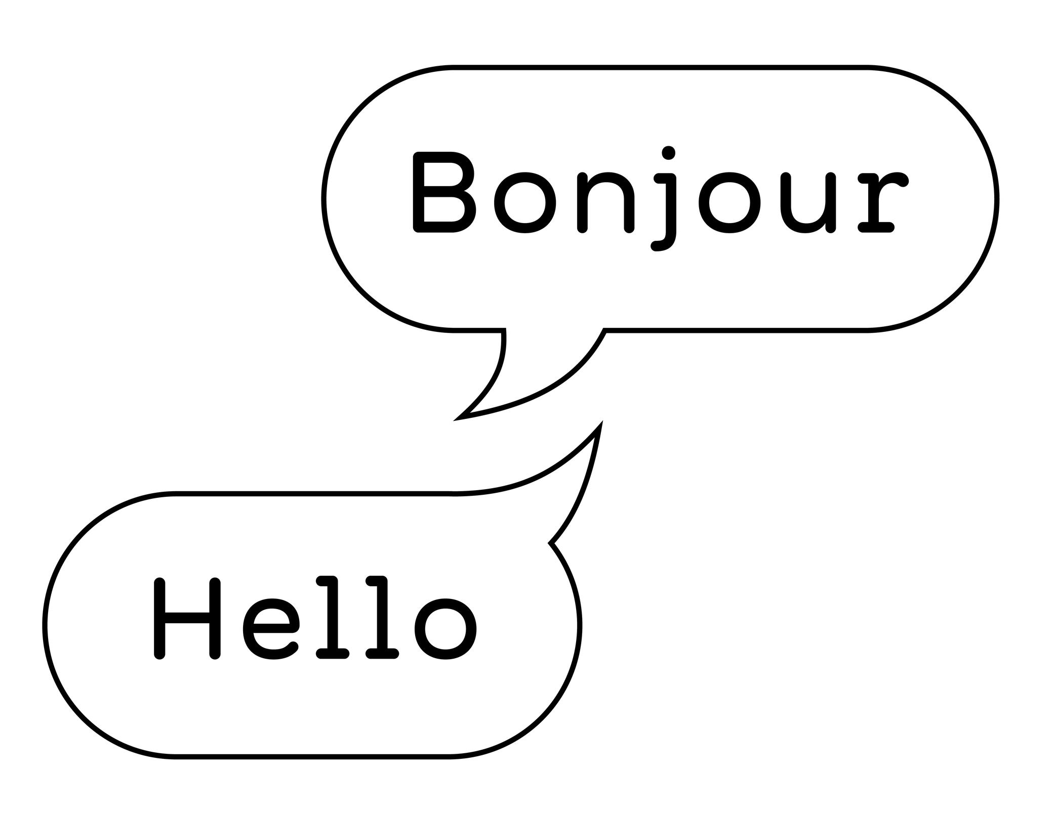
Illustration: Words of Type. Typeface in use: Knowledge Rounded, designed by Lisa Huang, 2024.
(Read More)A bilingual text is written in two languages (e.g., English and French).
Be careful to not mix up “bilingual” with “bi-scriptual.” The latter means “two scripts,” or “two writing systems.” For example, English and Chinese are two different languages, but they also use different scripts.
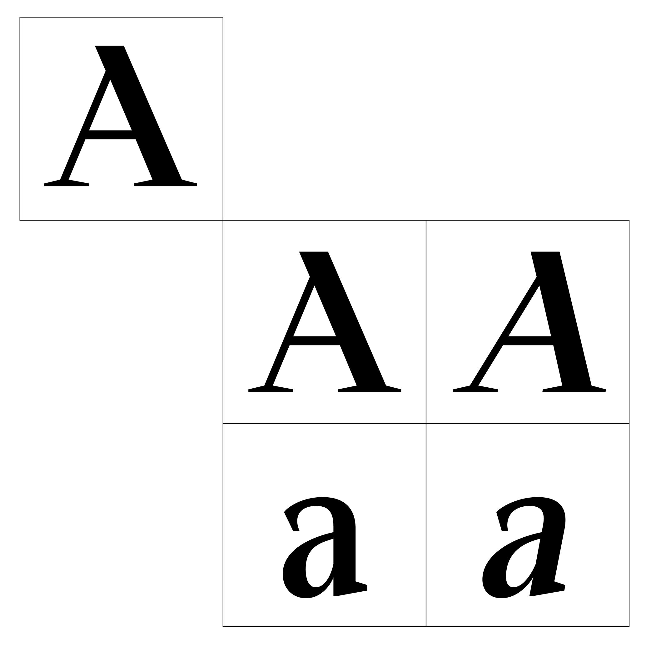
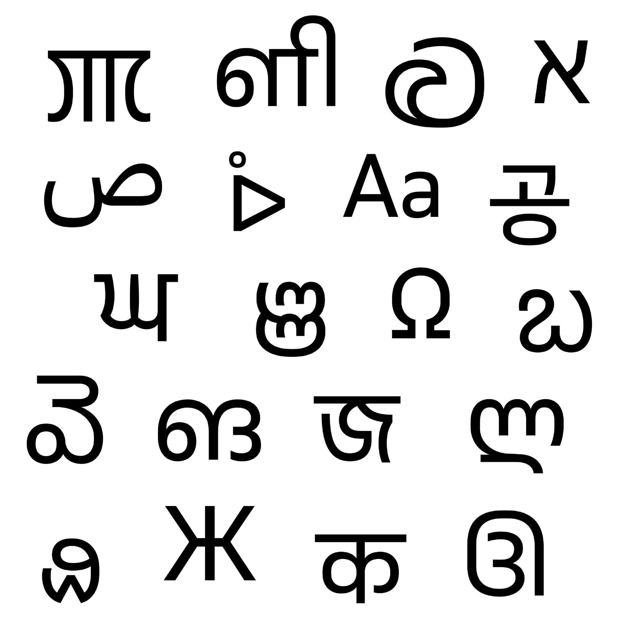
Character
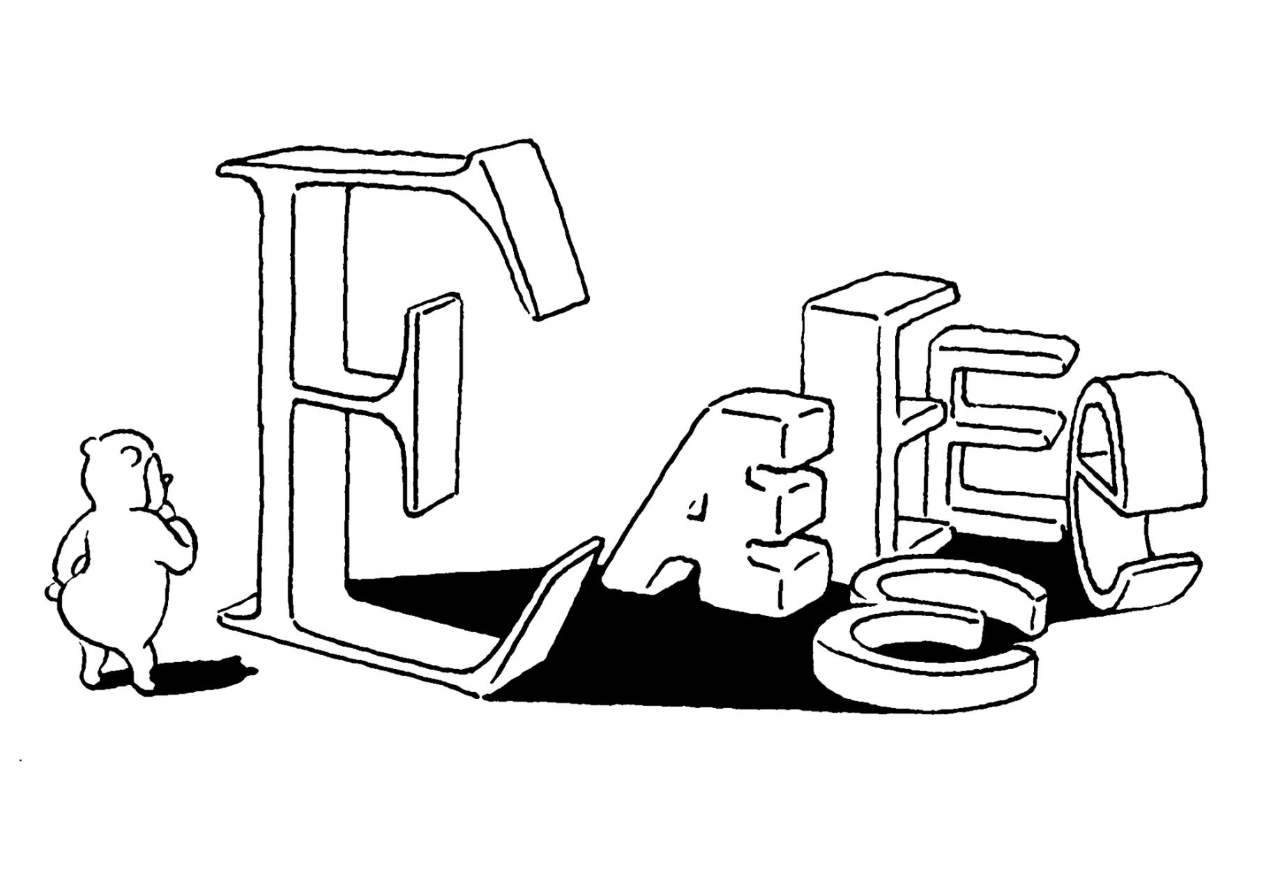
Illustration: Tezzo Suzuki .
(Read More)A character is an abstract symbol that represents a unit of a language in its written form. It is a broad term that covers letters, figures, punctuation, symbols, and more.
Not to confuse with a glyph, which is a visual representation of a character.
To be more precise:
• one character can be represented by multiple glyphs (such as alternates glyphs of the same character a: single story and double story a);
• one glyph can contain multiple characters (such as ligature fl containing two characters).In computing, characters are encoded in character encoding standards like Unicode or ASCII. These standards map a character to a numerical value (also called a “code point”) that can be processed by a computer. The character is what the user types, and the glyph is what is displayed in return.
NOTE
The distinction between uppercase and lowercase doesn’t affect the linguistic value of a character. A and a are therefore considered case variants of the same character in linguistic and phonological terms. In computing and digital typography, however, A and a are assigned different Unicode code points (A = U+0041 and a =U+0061), making them distinct encoded characters in that context.
FONT ENGINEERING ADVICE
In a font file, the cmap table (character to glyph index mapping) links character’s code points to the font’s glyphs.
Figure
Sponsored by Commercial Type . Typeface in use: Chiswick, designed by Paul Barnes, 2017.
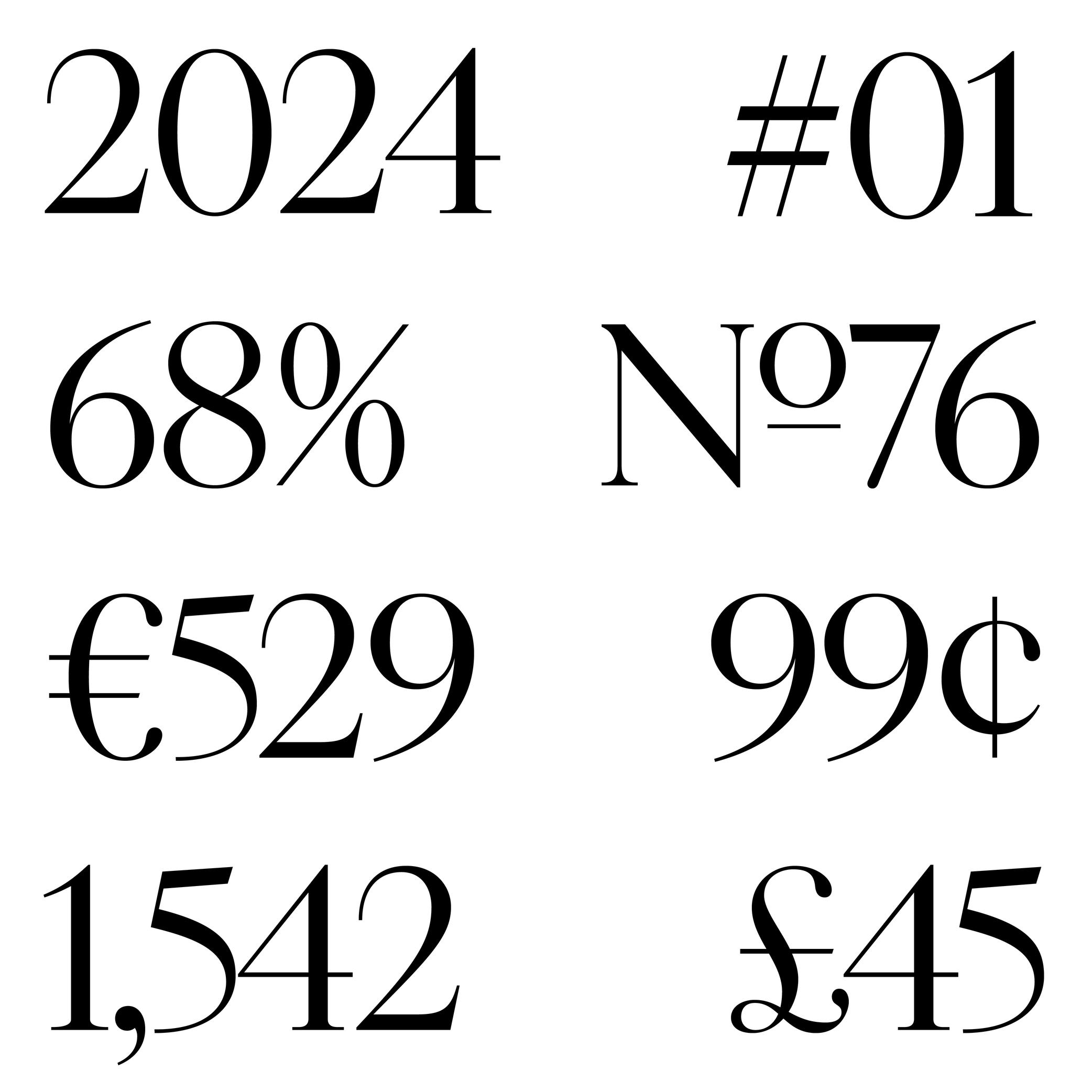
(Read More)The words ‘figure’ and ‘number’ are often confused. But, linguistically speaking, they are to be distinguished from one another: a figure (or numeral) is the graphic representation of a number, which is a mathematical concept. Several figures can be combined to form a number. For example, the number ‘22’ is represented by two figures ‘2’.
There are multiple styles of figures (oldstyle, proportional, lining, tabular, etc.) that suit specific situations.
HISTORY
In Europe, figures and numbers used to be represented by Roman capital letters (X, V, I, D, C, etc.). With the rise of trade with Arab countries around the 15th century, the Arabic figures (themselves influenced by Indian figures) were adopted and replaced the Roman capitals. These distinct origins explain the difference between the structure and stroke shapes of modern figures compared to Latin letters.
Glyph
Sponsored by Blaze Type . Typeface in use: Apoc , designed by Matthieu Salvaggio with Tomorrow Type, 2018.
(Read More)The terms “glyph” and “character” are often mixed up, but there is a linguistic difference between them: a glyph is a specific representation of a character. For example, the character A can be represented by either glyphs A and a.
In digital typography, a glyph may be encoded or not. If it represents a distinct character, it will be assigned a Unicode code point. If it is a localized, positional or stylistic variant, it won’t have its own code point and is instead accessed via OpenType feature substitutions.
FONT ENGINEERING ADVICE
In a font file, the cmap table maps characters (code points) to glyph indices. The GSUB table defines all available glyph substitutions, enabling access to stylistic alternates, ligatures, and localized forms.
Hanzi
Illustration: Tezzo Suzuki .
(Read More)Hanzi is the pinyin phonetic transcription of 汉字, literally meaning ‘character of the Han people’.
Hanzi characters are used in the Chinese language and they combine logograms and ideograms.
Note: Chinese is the language and Hanzi is the writing system (or script).
Today, there are two variations of Hanzi in the Chinese language: Traditional and Simplified Hanzi. Mainland China adopted Simplified Chinese Hanzi to increase literacy by making Hanzi simpler, while territories like Hong Kong and Taiwan kept the Traditional forms as a way to keep their cultural identity.
Multiple neighboring countries that have a strong historical connection with China also use Hanzi, or did so before adopting a different script:
- Japanese: Hanzi (Kanji in Japanese) used in combination with Hiragana and Katakana;
- Korean: now using Hangeul script, but some Hanzi (Hanja in Korean) are still used in specific situations;
- and Vietnamese: now using the Latin alphabet.
Each language and territory uses specific variations of the same Hanzi. However, since each has evolved independently, they developed more or less subtle differences from those of the Chinese.
Icon
Illustration: Jonny Wan .
(Read More)In typography and type design, an icon can be a pictogram (a stylized drawing of an object) or an ideogram (a drawing with a meaning).
Ideogram
(Read More)An ideogram is a drawing or symbol representing a specific meaning or a concept. It isn’t necessarily visually related to what it refers to, like pictograms or logograms.
Some scripts, such as Chinese Hanzi or Egyptian Hieroglyphs, use ideograms as part of their system.
Language
Illustration: Catherine Potvin .
(Read More)As opposed to the word script, a language is a means of communication and expression that does not necessarily rely on spoken words (e.g., sign language).
Latin Script
(Read More)Historians and linguists consider that the origins of the Latin script date back to the Phoenician civilization around the 13th century BC in Greece and the Mediterranean Sea. They created a consonantal alphabet called abjad, which was borrowed by other languages in the region for the innovative nature of its phonetic system, and due to the large influence of the Phoenician people as principal traders and navigators. This alphabet later led to multiple derivatives, including Greek and Latin alphabets.
The Latin script evolved from the Greek, with a Proto-Latin appearing around the 2nd century BC. It started by taking some of the Greek letters and modifying them, adding or removing others to fit better with the Latin language, spoken by Roman civilization (which is why it is also called the Roman alphabet).
The modern Latin script contains 26 distinct letters from its most basic set, with uppercase and lowercase forms for each. Many languages using the Latin alphabet have additional letters, ligatures or digraphs (e.g., æ, œ) to better adapt to the sounds of each.
With Eurocentrism ideology (main focus on European culture), the type design industry has also been largely focused on scripts used by the Western world: Latin in particular, with hundreds of years of practice, experience, theories, teaching and conventions, exhibitions and festivals mainly about this script. But, thanks to the increasing international exchanges and efforts to create a perspective beyond those boundaries, the type design industry is currently evolving into a much richer and diverse typographic culture.
Letter
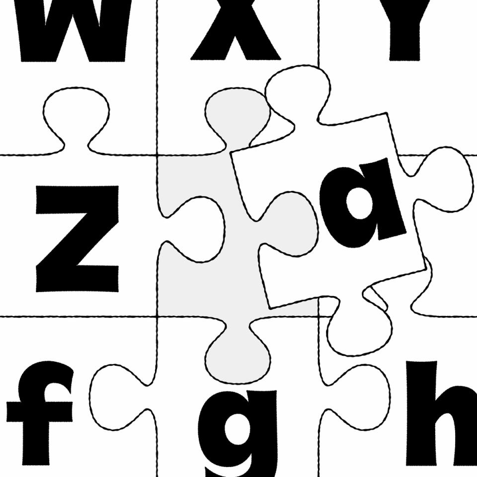
Illustration: Raven Mo .
(Read More)Letters are a type of characters used in an alphabet to represent the sounds of a spoken language.
The same letter can have multiple sounds due to different pronunciation in different languages, and one sound can be transcribed with various letters or characters. Some letters can also bear diacritics to have more or less subtle variations of pronunciation in some languages.
Linguistically, a letter is an abstract symbol, but it can appear in different glyph forms, such as cases (uppercase or lowercase), stylistic variants, or contextual forms.
FONT ENGINEERING HINT
In a font file, a letter is encoded as a character (with a unique Unicode code point) but it may correspond to multiple glyphs. For example, an a can have a single or double storey form.
Some letters can also be combined into a single glyph to form a ligature (such as fi or æ).These substitutions are handled in the gsub (Glyph Substitution) table, while the character-to-glyph mapping is defined in the cmap (Character To Glyph Index Mapping) table.
Majuscule
(Read More)A majuscule is a capital letter placed at the beginning of a sentence or the first letter of a name.
Note that all capital letters are not necessarily majuscules, such as CAPITALIZED words, which are made of capital letters.
Multilingual
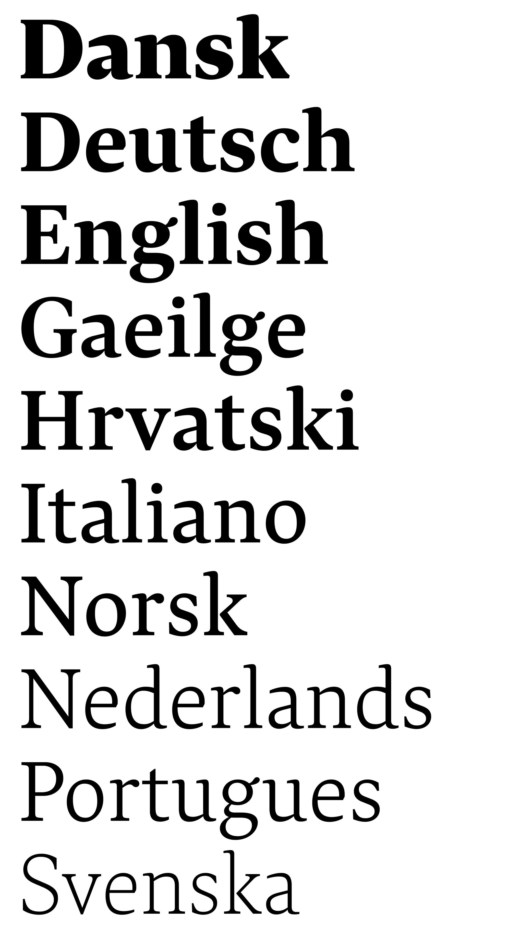
Sponsored by Typotheque . Typeface in use: Lava , designed by Peter Biľak, 2013.
(Read More)Multilingual means that a text makes use of multiple languages. The term should not be confused with “multiscript.”
For example, a book published in English and French languages is multilingual but uses the same script: the Latin script.
Multiscript
Sponsored by Typotheque . Typeface in use: November , multiple designers, 2016.
(Read More)Multiscript texts are written in multiple scripts or writing systems. For example, a book published in English and Arabic languages is multiscript because it uses two different scripts. But one in English and French is then multilingual: the same script for two languages.
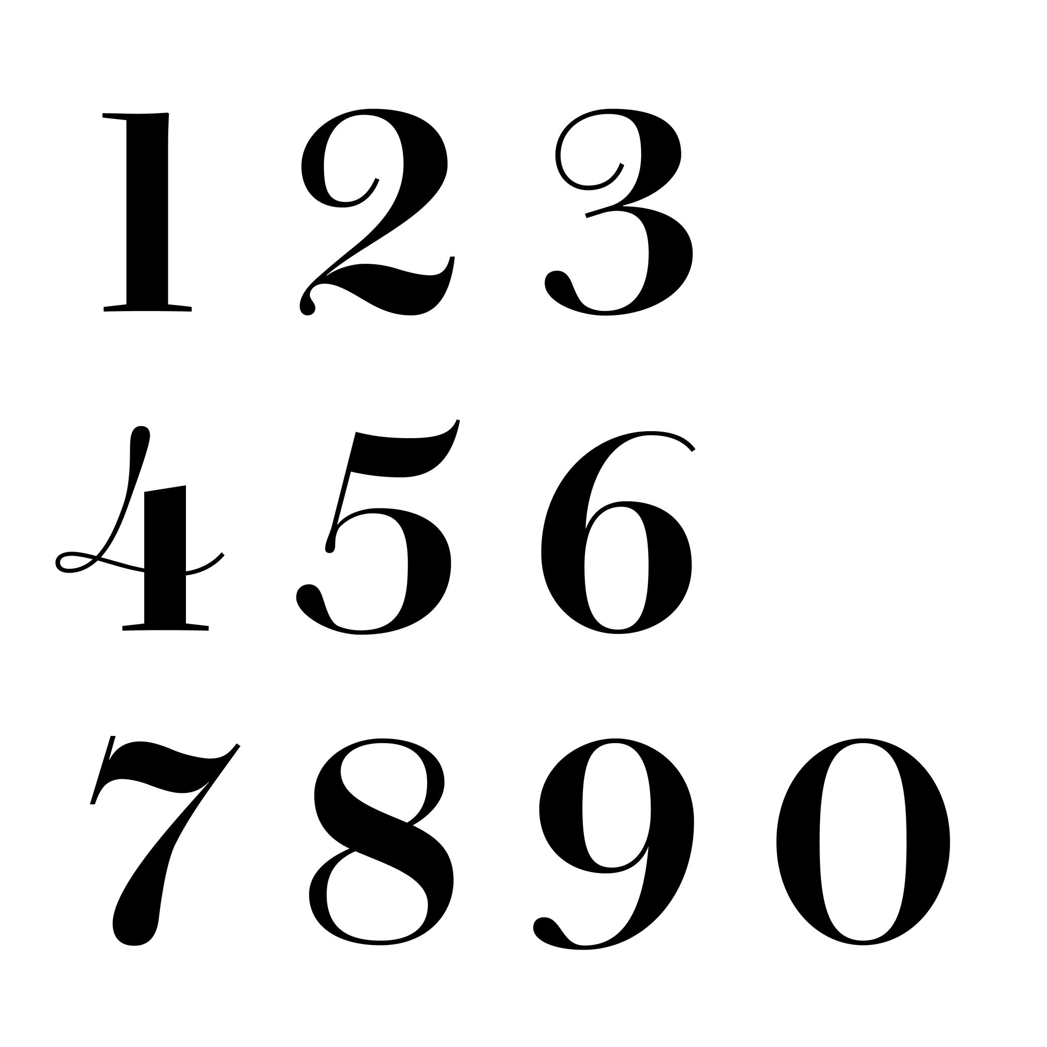
Number
Sponsored by Production Type . Typeface in use: Cardinal Photo , designed by Jean-Baptiste Levée, 2020.
(Read More)The confusion between the words “figure” and “number” is seen very often. But, linguistically speaking, they are to be distinguished from one another: a figure (or numeral) is the graphic representation of a number, which is a mathematical concept. Several figures can be combined to form a number. For example, the number 22 is represented by using the figures 2 twice.
Parentheses
Sponsor Word of Type and feature your typeface in this card with a linked caption. Contact us for more information.
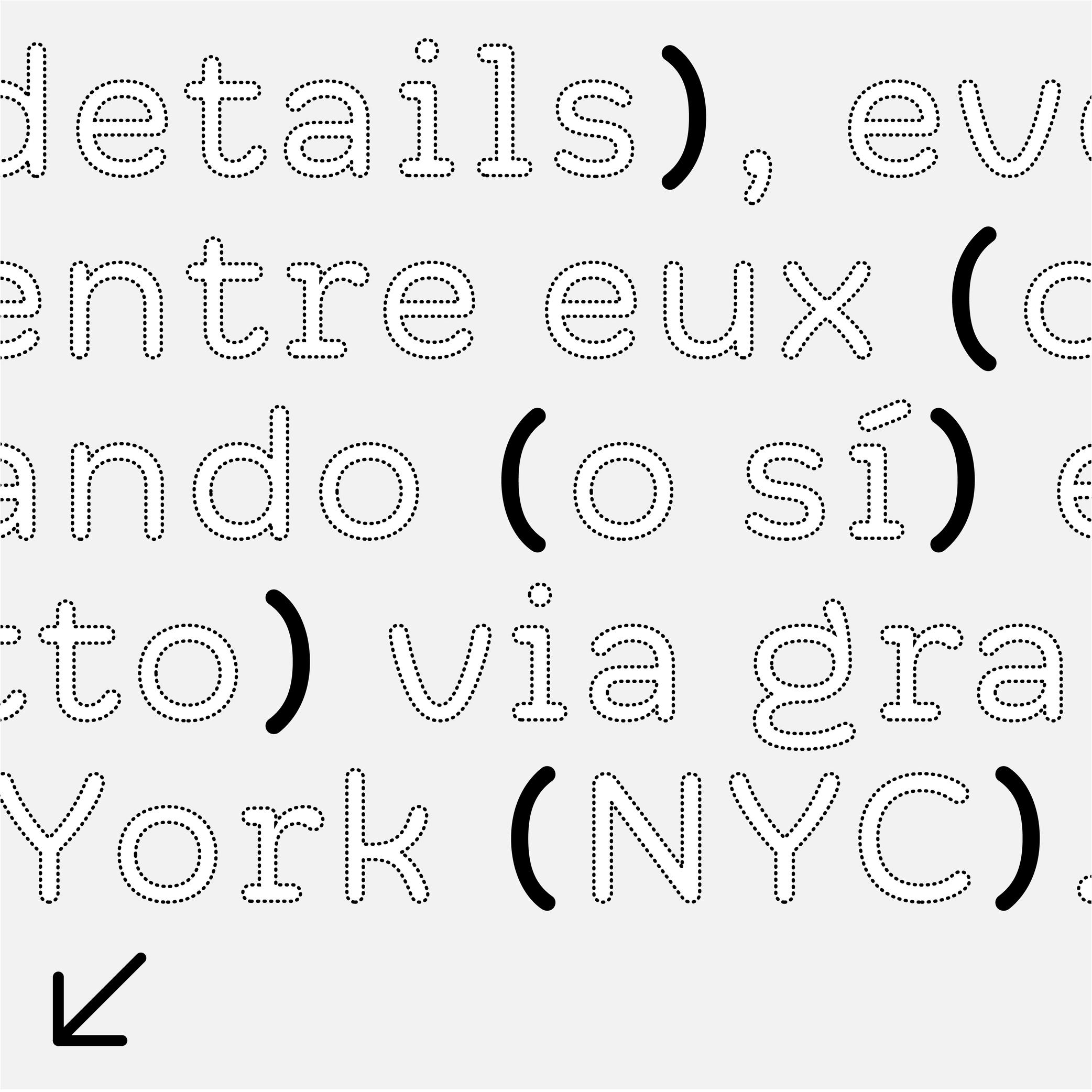
(Read More)FUNCTION
Parentheses indicate additional information in a sentence.
HISTORY
Early forms of parentheses added in text for the same purpose were shaped like chevron quotes (or guillemets). They later on evolved into the curved ones we know today.
These were introduced by French printer Nicholas Jenson in Venice, Italy, around the late 15th century.DESIGN
They have the same height as braces and brackets (or curly brackets and squared brackets).
For typefaces with contrast, parentheses have matching contrast (thick middle part, thin tips) and terminal tips (slanted, vertical or horizontal). S
everal parentheses alternates are necessary in a typeface to better fit with capitalized text, text set in titlecase and lowercase, and text set in small caps (when they exist in a typeface).The most common parentheses are curved (like these ones), but different shapes are used in other scripts.
TYPOGRAPHIC RULES
Parentheses are placed around a section of a sentence, with no space between them and the enclosed text.
Note:
one parenthesis
two parenthesesPeriod
Sponsor Word of Type and feature your typeface in this card with a linked caption. Contact us for more information.
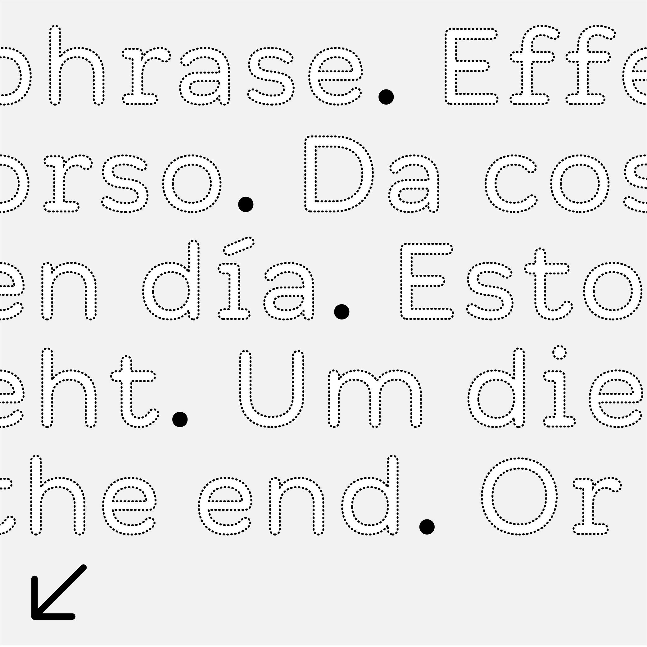
(Read More)Also called full stop.
FUNCTION
The period is a punctuation symbol that marks the end of a sentence.
It is also used to replace sections of letters in abbreviations and, in numbers, to indicate either thousands or the decimal.
In European languages, the period is used to separate thousands while a comma separates decimals. In English, the period is used the other way around:
(European languages) 15.000,05
(English) 15,000.25In the digital world, the period is often used to separate information from individual categories (domain-name.com).
HISTORY
In Ancient Rome, the period (which looked like a dot placed at the middle height) was used to separate words. Scribes in medieval Europe started using it to separate sentences instead (words were being separated by a space). They also shifted it down to the baseline, which has been kept ever since.
DESIGN
In most scripts, the period is a dot placed on the baseline. In the Latin script, it is about the same size as the dot on the letter i. In many other languages and scripts, sentences end with different symbols. For example, in Chinese and Japanese, the period is a hollow circle, placed at the base or centered in relation to the characters.
TYPOGRAPHIC RULES
When used to end a sentence, it has no space before it, and it is followed by a space between it and the eventual next sentence. It has no space before the next letter in an abbreviation. In American English, when used in a quote, it is preferred to place the quotes after the period. While in British English the period goes after the quotes.
Pictogram
(Read More)The word pictogram comes from the Latin pictum (‘painted’) and Greek gramma (‘character’).
It is an abstract drawing with a shape that relates to what it is referring to, unlike ideograms.Proportional Figures

Sponsored by Dinamo . Typeface in use: Daily Scotch , designed by Fabian Harb and Michelangelo Nigra, 2024.
(Read More)Proportional figures in a typeface are designed with different widths, same for oldstyle figures, each one adapted to the forms of the figure in order to have balanced proportions.
For example, 1 would have a narrower width than 3.
Punctuation
Sponsor Word of Type and feature your typeface in this card with a linked caption. Contact us for more information.
(Read More)Often forgotten when we think about the elements of a writing system, punctuation is just as important as letters, characters and figures. Punctuation symbols play a very important role in text.
When use correctly, punctuation marks a text’s rhythm and transmits the author’s desired voice. When well-designed in a typeface, punctuation helps with readability and facilitates typesetting and typography.
During the evolution of each writing system across the globe, multiple scripts developed different punctuation shapes for the same or similar purpose. Not every script or language uses the same shapes found in the Latin script.
Question Mark
Sponsored by Kerns & Cairns . Typeface in use: Apotek , designed by Dyana Weissman, 2020.
(Read More)FUNCTION
The question mark is placed at the end of a question.
HISTORY
In Latin texts dating back to the 16th century, questions were marked with a letter Q above an o (as an abbreviation of quaestio, ‘question’ in Latin). It has evolved over the centuries into the simplified form that we know today.
DESIGN
The question mark has to have enough presence in a text to be visible fairly quickly. In the Latin script, it has about the same height and width as a capital letter. Its design has to be related with other glyphs of the typeface, where the top terminal relates to the terminal of other glyphs in the typeface (such as 2, f or C) and the dot below is identical to the period.
TYPOGRAPHIC RULES
In English and all other languages based in the Latin script, there is no space before the question mark, French is the only exception where there is a thin non-breaking space before it.
In Spanish, a reversed question mark is placed at the beginning of the question and the upright one at the end, with no spaces in between the characters and the words.Quotation Mark
Sponsor Word of Type and feature your typeface in this card with a linked caption. Contact us for more information.
(Read More)FUNCTION
Quotation marks shaped like commas (or called “66” and “99” quotes), double or single, are used in most (but not all) languages to introduce a quote.
HISTORY
When texts were only written by hand, even if there were no standard marks used across Europe to indicate quotes, some slanted and double dashes were used for a similar purpose. During the printing press era, typographers used shifted upwards and/or rotated commas to work as quotation marks, and typewriters adopted the same forms.
DESIGN
Although quotation marks were historically identical to commas, in some typeface styles a slightly shorter and narrower form to create a better text color is more suitable. In sans serif typefaces, quotation marks have an even simpler shape to match with the overall style.
TYPOGRAPHIC RULES
The “66” quote is placed at the beginning of a quote, closed with the “99”, without any space between the quotes and the quoted text.
Some languages use these quotes differently, such as in „German“ or „Polish”, or use quotes of different shapes such as the guillemets in «French», or「Traditional Chinese」.
Single quotes are used as secondary quotes, if they are within double quotes. A common mistake is to use prime and double prime for quotes instead of symbols in mathematics (distance, time, etc.).Royalties
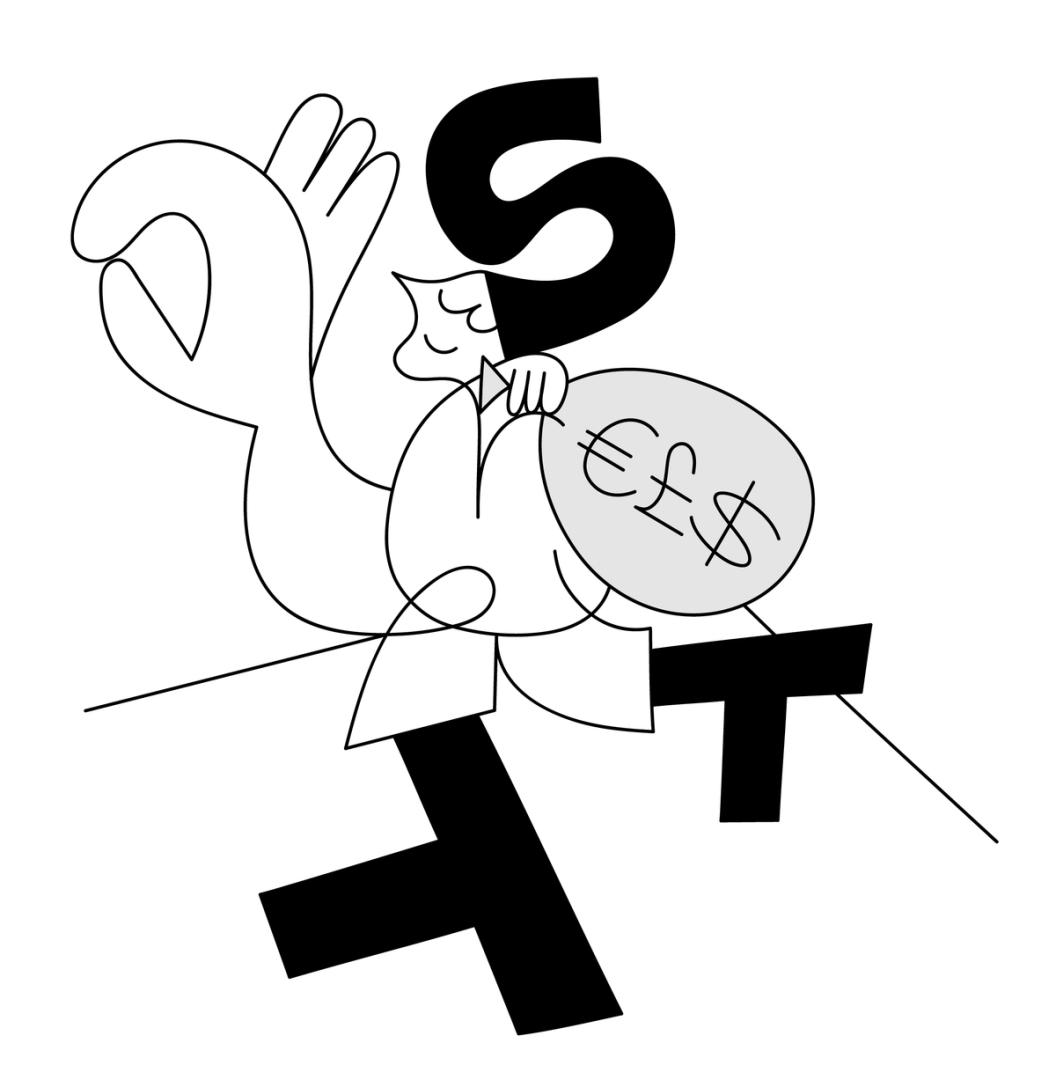
Illustration: Catherine Potvin .
(Read More)Typefaces are designs sold as fonts (copies of the original design) under their corresponding licenses. When such licenses are distributed and managed by an intermediary (publisher, distributor, or type foundry), a percentage of the sales goes to the designer. That part is the royalties, similar to what is applied in other artistic industries (music, illustration, etc.).
Script
(Read More)A script, or writing system, is the visual system (letters, characters, symbols, etc.) used to transcribe one or several languages. Some scripts are used by multiple languages (e.g., the Roman alphabet for many Western European languages).
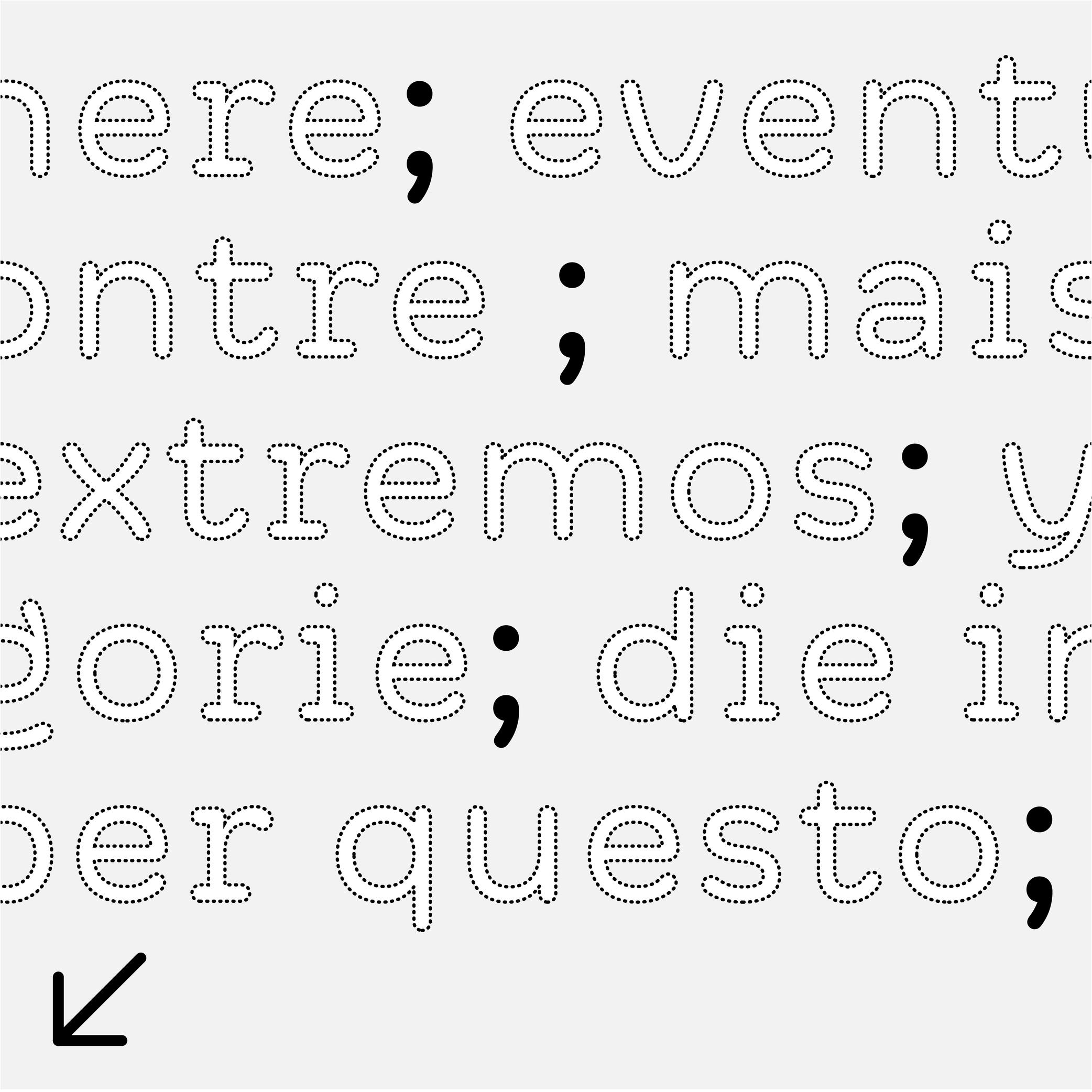
Semicolon
Sponsor Word of Type and feature your typeface in this card with a linked caption. Contact us for more information.
(Read More)FUNCTION
The semicolon is used as a separation symbol in a sentence between two independent sections. It is also used at the end of different points of a list, ended by a period.
DESIGN
The semicolon has a period at the top (aligned below the x-height) and a comma on the bottom (like the comma), the two elements are vertically aligned.
TYPOGRAPHY RULES
There is no space before the semicolon, except in French, where there is a non-breaking thin space.