Binding
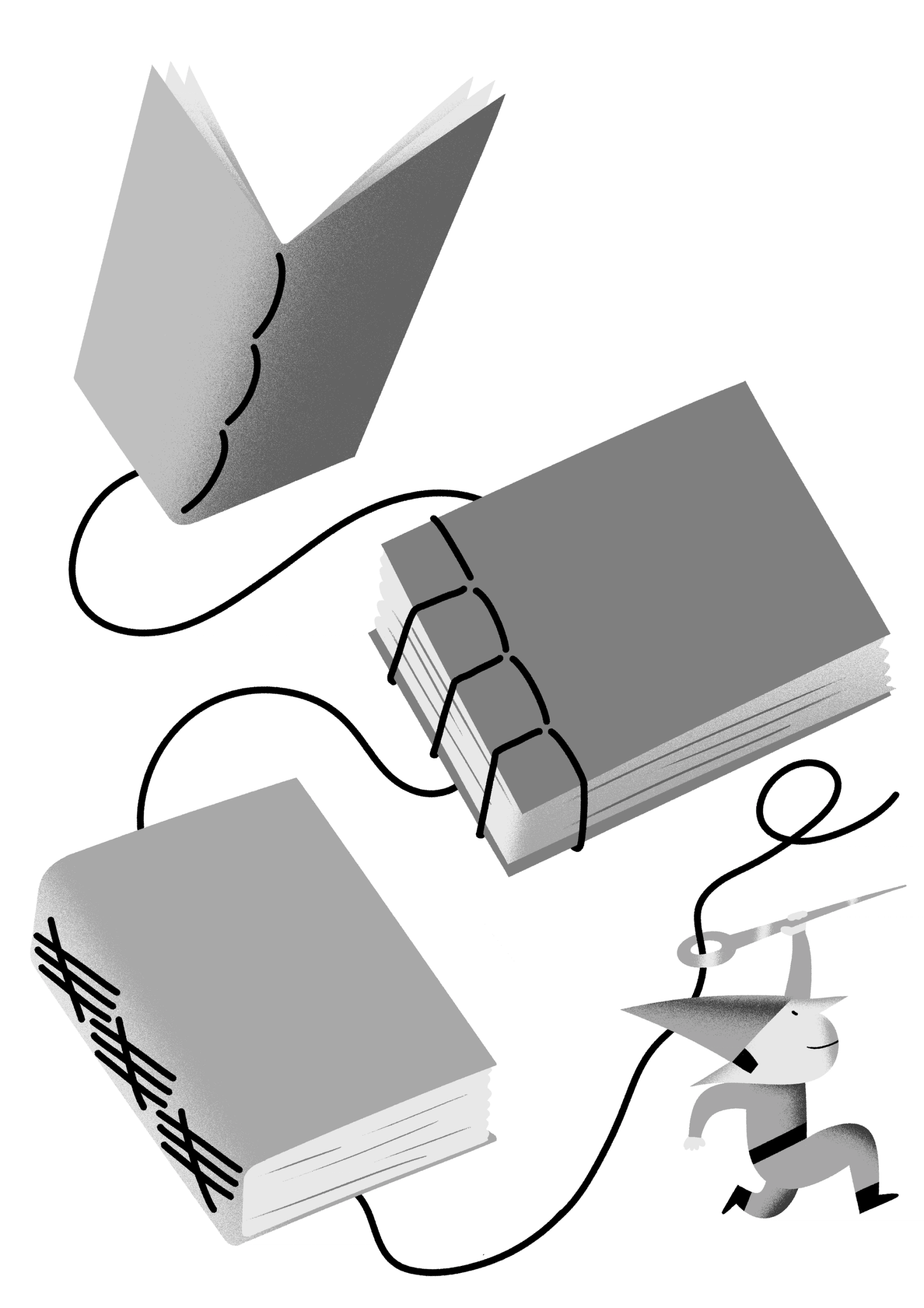
Illustration: Yann Bastard .
(Read More)Books are bound using a variety of binding techniques, from traditional to modern ones, and from various corners of the world: Japanese or Chinese bindings, Otabind, Smyth sewing, perfect binding, and others.
Calligraphy
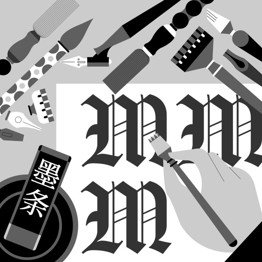
Illustration: Jonny Wan .
(Read More)The word calligraphy comes from the Greek kalos, meaning “beautiful,” and graphein, meaning “to write.” Together, it means “to write beautifully.”
Many civilizations around the world have practiced calligraphy (and continue to do so today) using a variety of tools: brush, pen, quill, broad nib pen or brush, etc. Most even consider it to be an art form.
Today, we describe typefaces whose letters and characters are inspired by those written with a calligraphy tool and following certain calligraphy styles as calligraphic. However, this is slightly different from “script” or “handwritten” styles, as those refer to handwritten shapes free from any particular calligraphic style.
Contour
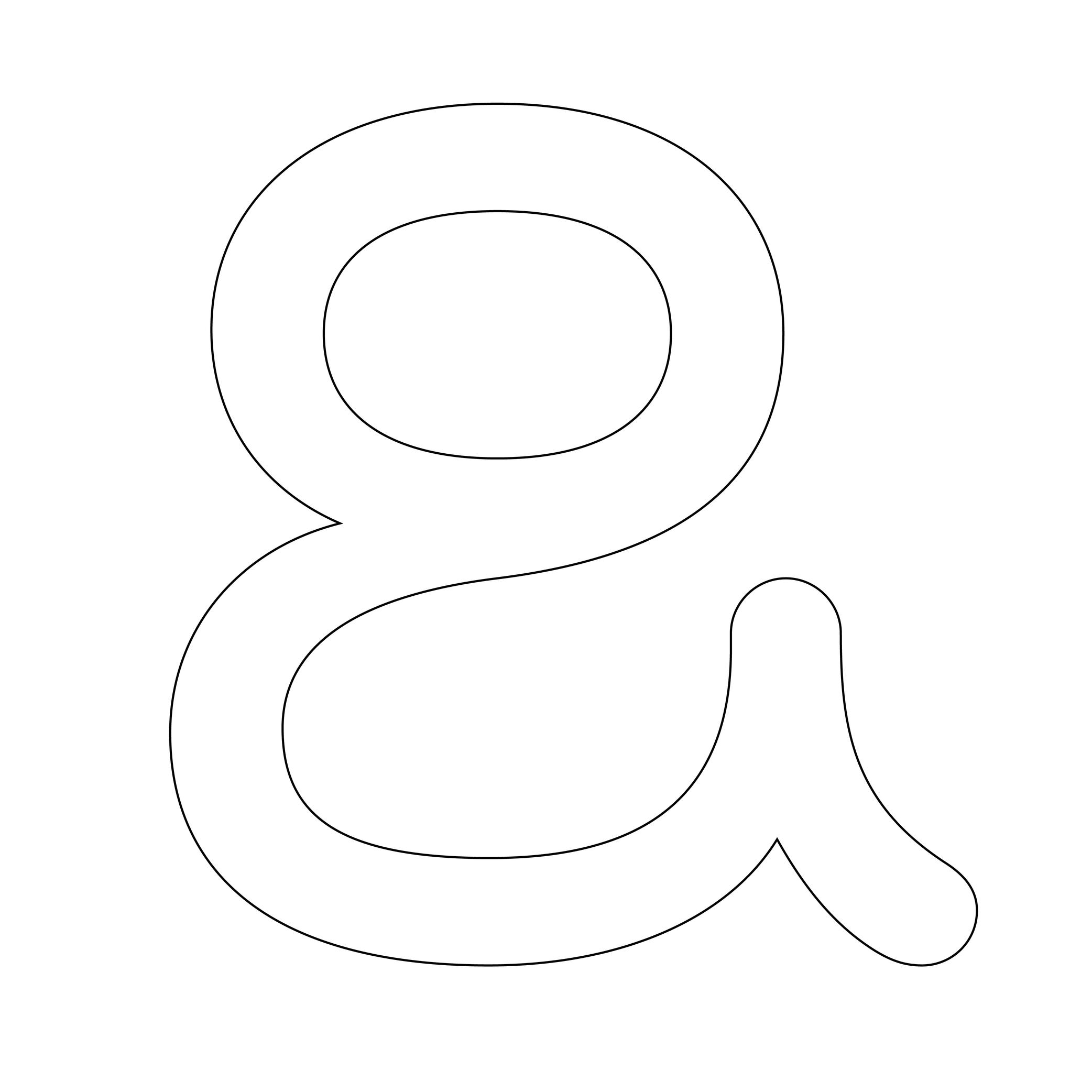
Illustration: Words of Type. Typeface in use: Knowledge Rounded, designed by Lisa Huang, 2024.
(Read More)Also called Outline.
The shape of a glyph is defined by one or more contours. In digital typeface design, the contour is what the designer draws. What the user sees on screen or in print is the filled shape in between these contours.
Contours and outlines are related but not exactly the same. An outline is the full outer shape of a glyph: it defines what the glyph looks like overall. While a contour is one continuous closed path within that outline. For example, the outline of the letter O typically has two contours; one for the outer circle and one for the inner counter (the transparent “hole”).
Ductus
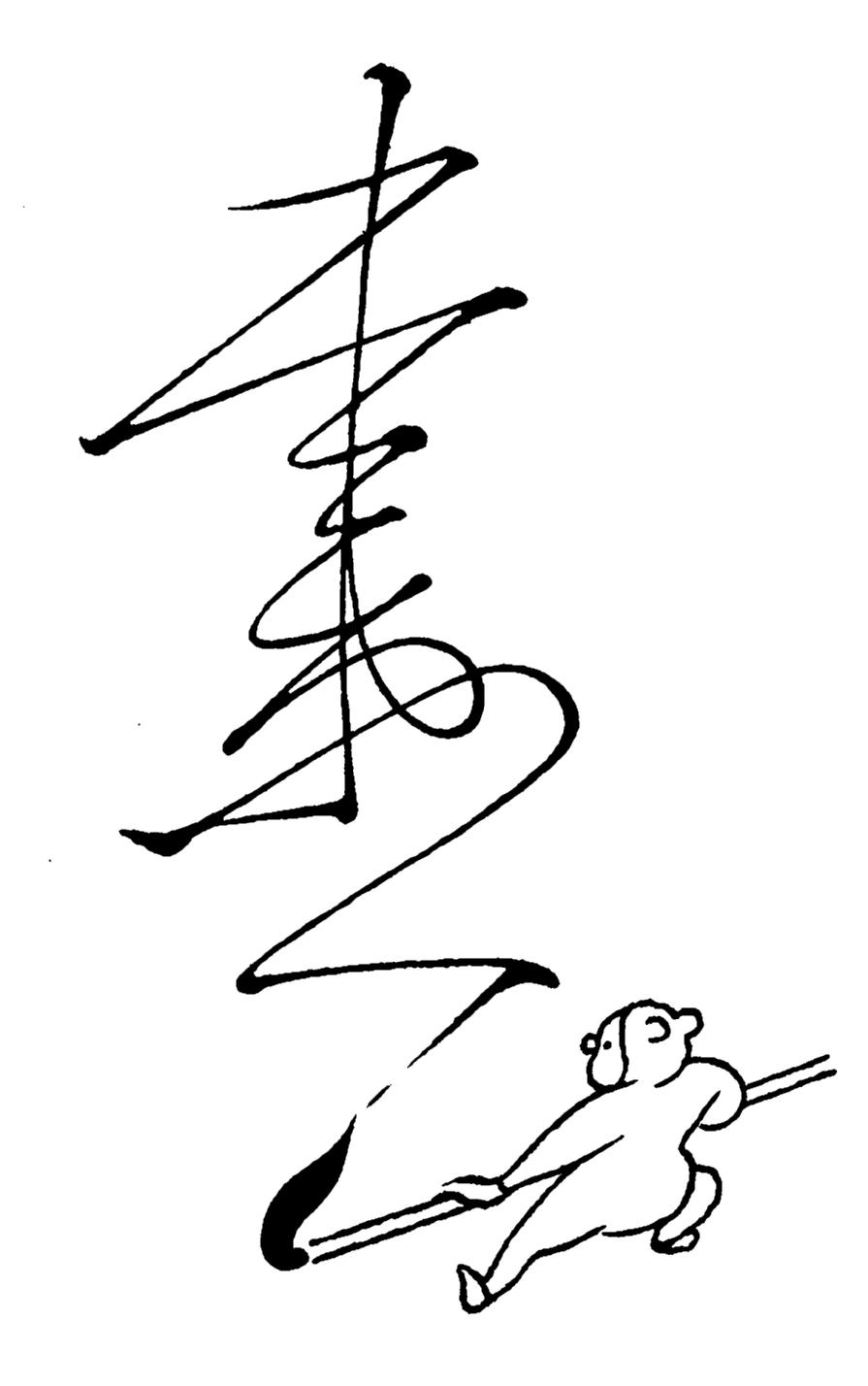
Illustration: Tezzo Suzuki .
(Read More)Glyphs from every script are written with a specific stroke order and drawn in a specific direction. This is called the ductus (from Latin ducere, meaning “to lead,” “to pull”). It took multiple evolution phases for characters to look as they do today. Most ductus changes were for characters to be written more easily (and/or faster) with the tools used.
Grid
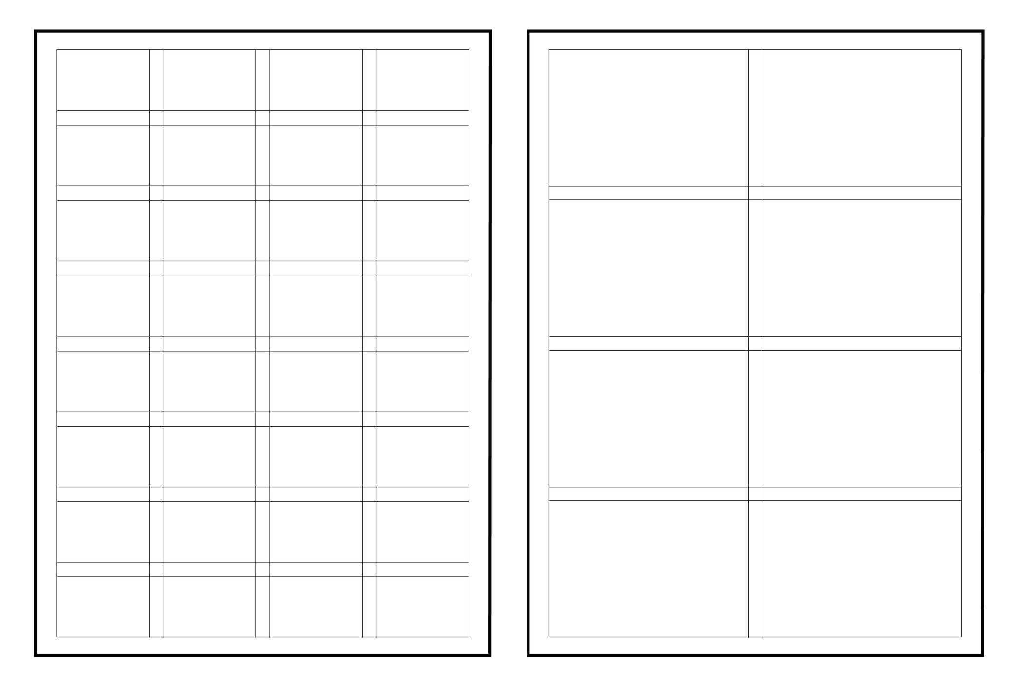
Illustration: Words of Type.
(Read More)In typography (or typesetting), a structure—called a grid—is designed on a page to place the elements, helping with the content’s organization and legibility.
Handwriting
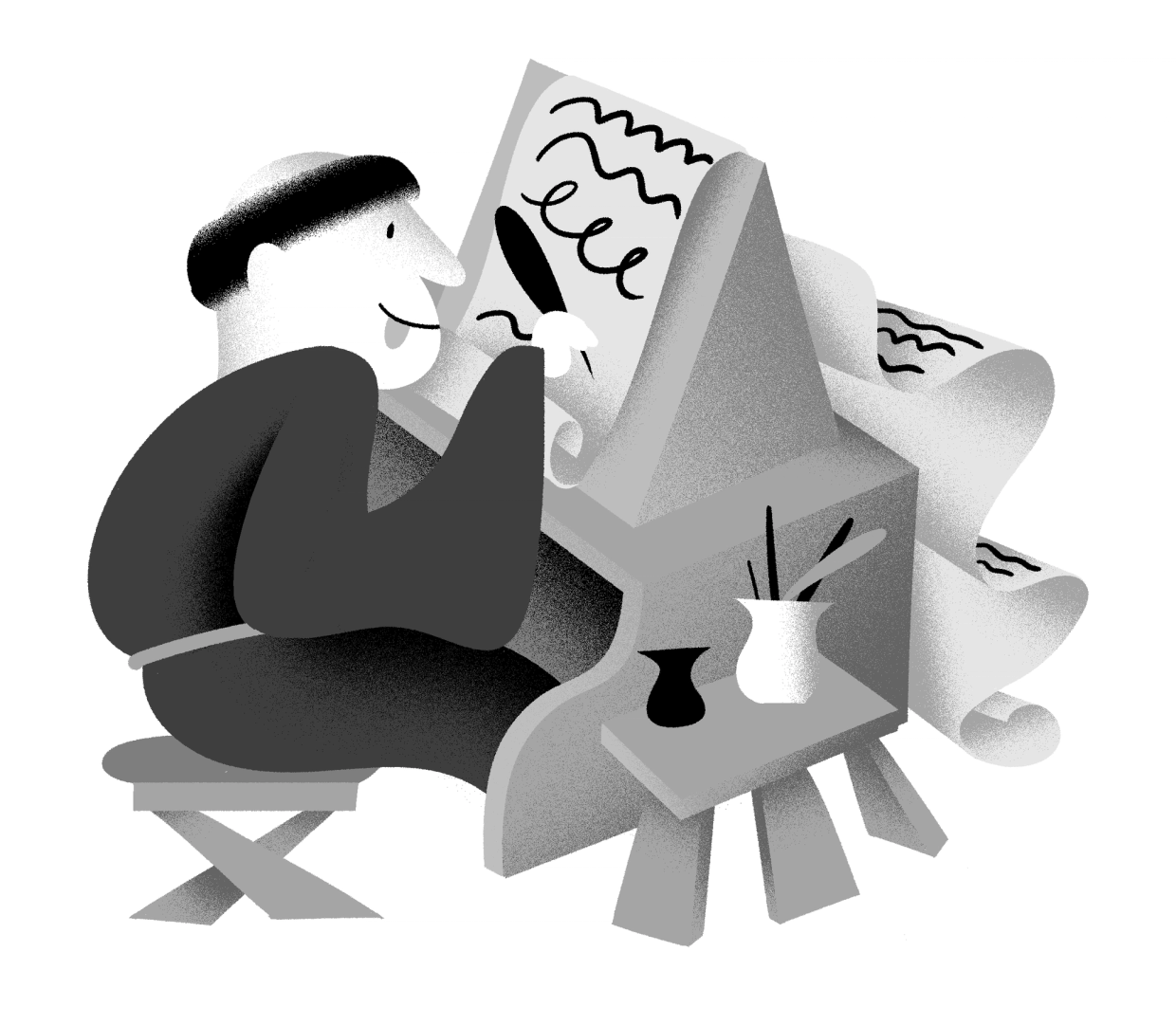
Illustration: Yann Bastard .
(Read More)The word ‘handwriting’ refers to texts written by hand.
Handwritten forms of any languages, combined together as handwritings, are considered to be one of the most important technologies ever invented, as it separated communications from live speech, made knowledge preservable, and began the development of numerous devices used for writing and materials to write on.
In many cultures, handwriting is so tightly related to the person writing a text that many consider someone’s handwriting style to reflect either the personality of the writer or his/her emotions at the moment of writing (and also his/her age).
Height
Illustration: Jonny Wan .
(Read More)In type design, height refers to vertical measurements used as guidelines for different categories of glyphs (such as uppercases, lowercases, small caps, etc.). These are measured from the baseline and help ensure visual consistency across the typeface.
LCG (LATIN, CYRILLIC, GREEK)
LCG scripts typically use the following height guidelines for their lowercases, uppercases, and small caps:
• x-height: height of short lowercases;
• ascender height: height of the extension of lowercase letters that rise above the x-height;
• descender height: height of the extension of lowercase letters that fall below the baseline;
• cap height: height of uppercase letters;
• small case height: heigh of the small cases;
• sometimes also specific figure heights too (for old style or proportional figures, and more).CJK (CHINESE, JAPANESE, KOREAN)
Characters of CJK scripts are commonly designed to fit within a common em-square (same width and/or height) for all characters within the same typeface. Designers often define:
• ideographic em height: total vertical space for a character;
• baseline offset: vertical alignment for mixed-script texts.ARABIC SCRIPTS
Arabic scripts have various types of heights measurements depending on the style involved, including some that don’t follow the same rule as Latin script, where the “horizontal” baseline may not be exactly the same word to word when the letters are typed into texts. But in general, we can list down the following:
• baseline: anchors the “horizontal” alignment;
• median line: main body height;
• ascender and descender lines: based on the tallest and lowest glyph strokes;
• mark height: guides the placement of diacritics.INDIC SCRIPTS
The following are the most common height measurements for Indic scripts (which encompasses a large number of different scripts!):
• shirorekha (headline): the horizontal bar on top of many letters;
• base height: where the main glyph body sits;
• matra height: position for vowel signs and marks above or below the base glyph.Note: These design heights relate to glyphs’ outlines, and are not to be confused with vertical metrics, which define the overall line spacing in a font.
FONT ENGINEERING ADVICE
The x-height and the cap-height are important values that can be found in the OS/2 table of the font file.
Lettering
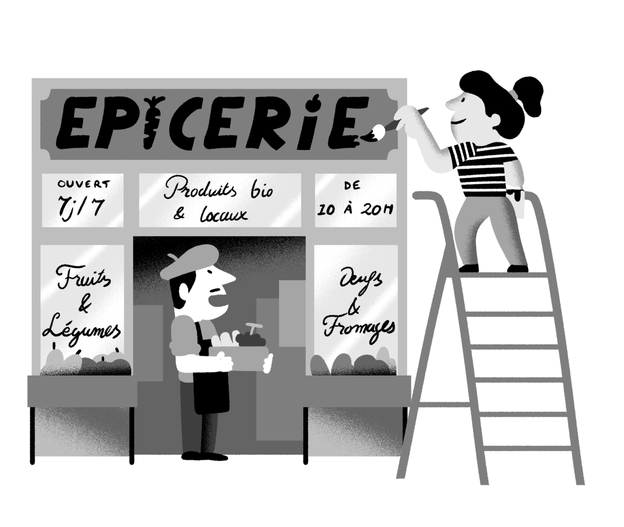
Illustration: Yann Bastard .
(Read More)A lettering is a drawing of a group of characters made for a specific situation (such as on a shop sign) or for a piece of work (a brand’s logo, a title for a magazine insert, etc.), unlike a typeface where each and every glyph is individually designed in a way to work in all kinds of combinations.
Lithography
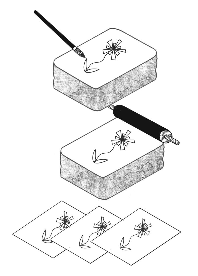
Illustration: Chloe Kendall .
(Read More)Lithography is a printing technique that enables the rapid production of elaborate prints using stone plates (lithos means ‘stone’ in Greek).
HISTORY
Lithography was invented in 1796 by Alois Senefelder (1771–1834), an actor in Bavaria. He developed lithography as a method of reproducing sheets of music.
After lithography proved successful at this, ever more complex and elaborate images were printed lithographically. Since lithography reproduced images drawn directly onto the stone, it allowed for closer results to original drawings than other techniques of that time. Lithography allowed for multiple layers and colors and was often used for advertising posters, sheet music covers, etc. Before offset lithography became the predominant printing method during the second half of the twentieth century, some books combined multiple techniques (lithography and/or engravings for images, letterpress printing for texts).
TECHNIQUE
The process of lithography printing uses the hydrophobic/hydrophilic chemical reaction between water and oil. Combined with the effect of acid or corrosive products, which creates an area for water to go in, the more greasy ink can be kept on the surface and transferred to the paper to be printed.
TODAY
Nowadays, traditional lithography is mostly used to print artistic works and other specific prints, as the process is much more costly than modern techniques, even if it renders a high-quality result. On the other hand, offset lithography is still the standard method by which most items are printed today.
Manuscript
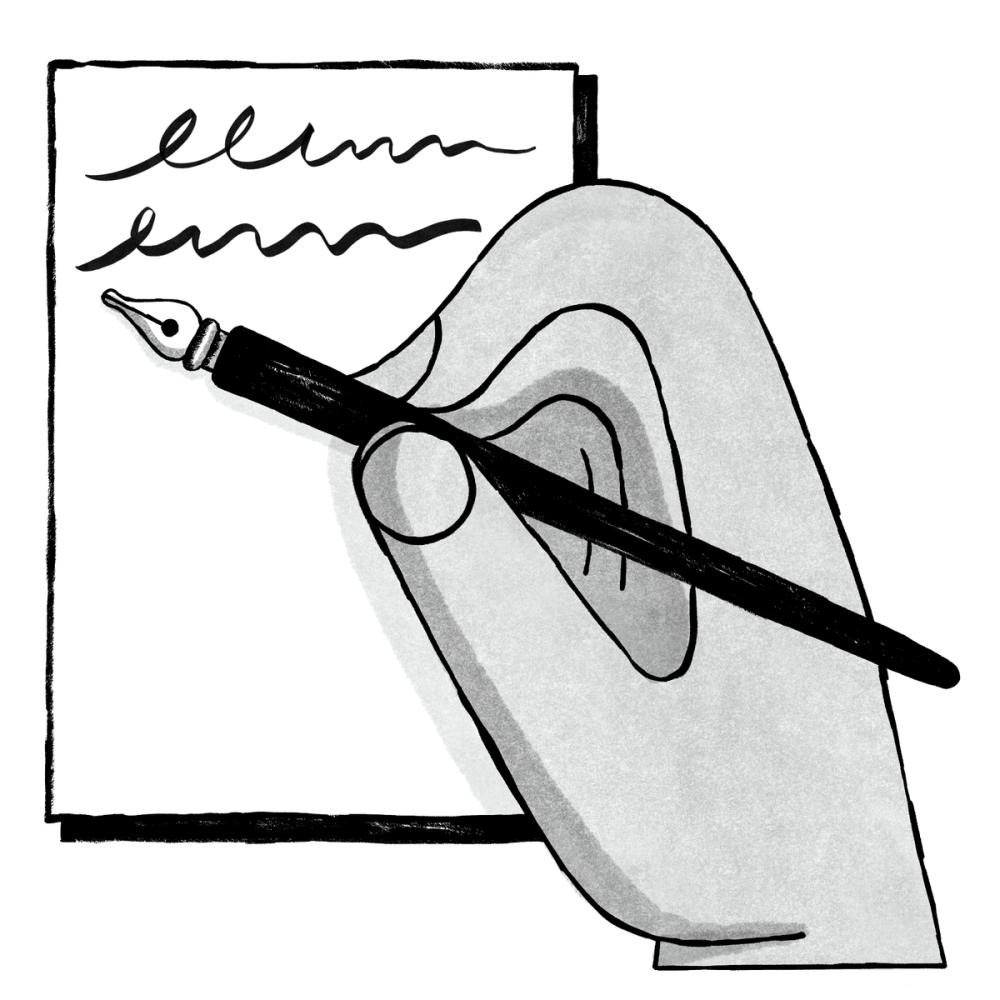
Illustration: Malota .
(Read More)A manuscript is a hand-written document.
Optical Corrections
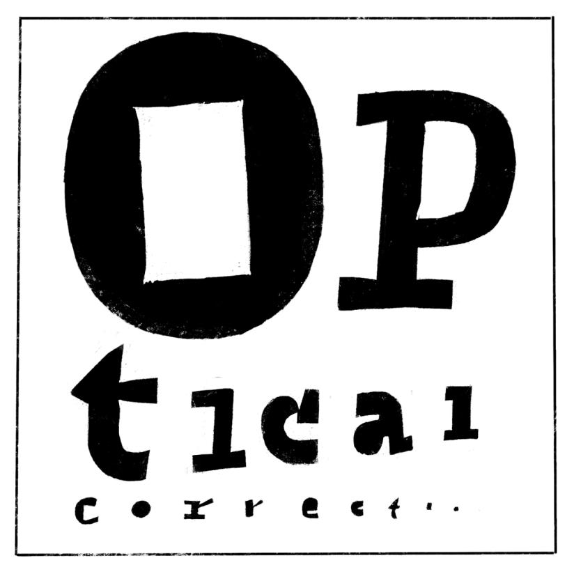
Illustration: Erik van Blokland .
(Read More)The shapes used to form the words and texts we read are seen by our eyes. And our eyes and brain are organs that don’t rely on geometry, rulers, and compasses to “read” the world.
Even if they are geometrically aligned, some shapes may appear uneven and require optical adjustments to appear consistent. In type design, we talk about optical corrections.
Pagination
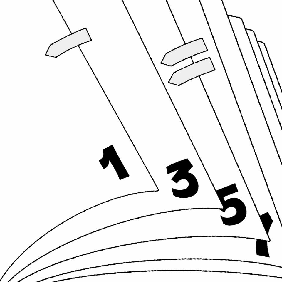
Illustration: Raven Mo .
(Read More)Pagination refers to the page numbering system of a printed document.
Revival
(Read More)A revival refers to a new typeface whose letterforms are based on historic models. Today, when we speak of revivals, we usually refer to digital typefaces that take their designs from existing ones. Most often, they base their forms on exisiting typefaces cast in metal, engraved into word, or produced for photo-composition.
The oldest revivals were made by 19th century type foundries when they adapted early 18th century typefaces for industrial printing conditions. In the 20th century, more revivals from mechanical and photo-typesetting device manufacturers followed.Inevitably, the design of a revival contains unique details of the designer, from interpretations of the initial design while analyzing printed results on paper to those on screen at various resolutions. Today, we can see multiple typefaces designed as revivals from one and the same typeface, but each have (sometimes very subtle) differences. For example, we can think of the many versions of the Garamond.
A revival from a running text typeface is considered as a good assignment for students starting to learn typeface design, as this allows to get more familiar with styles considered as “conventional” before experimenting further with more creativity.
Specimen
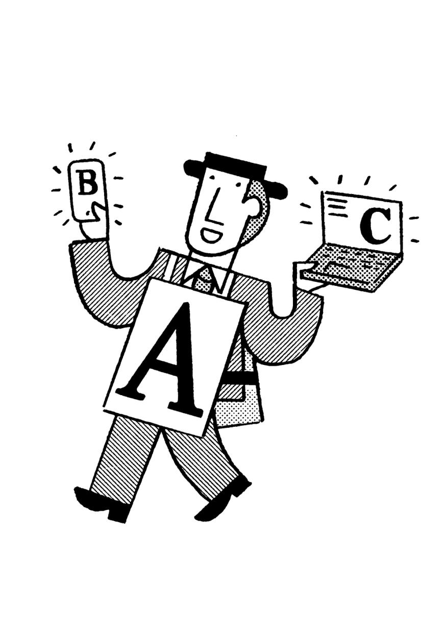
Illustration: Jay Cover .
(Read More)A specimen is a visual sample document published by type foundries that showcases a typeface, its glyph set, text settings in different sizes, Opentype features, etc.
A collection of specimens of different typefaces bound together is called a typeface catalog.Spine (in editorial design)
(Read More)The spine is the side of a printed object (book, brochure, etc.) which is bound.
Template
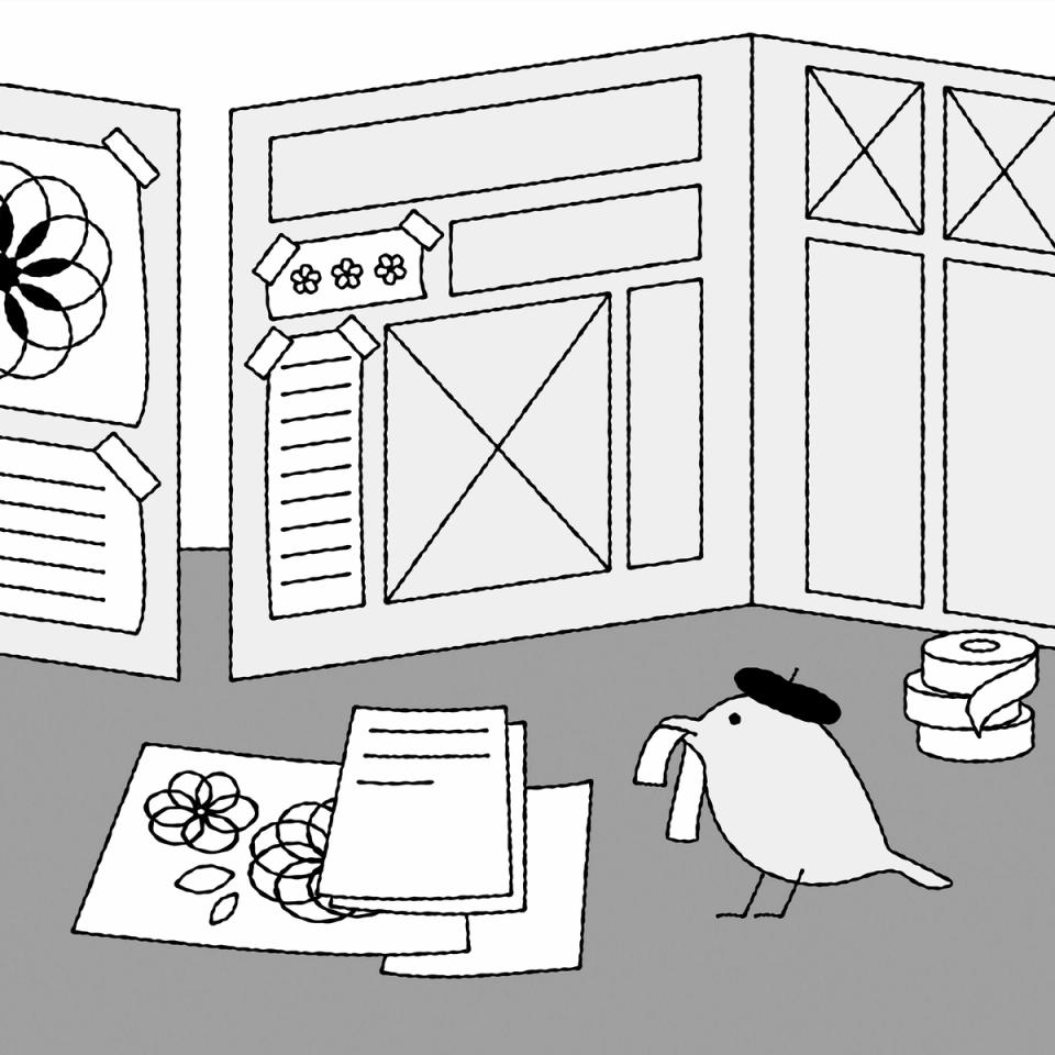
Illustration: Raven Mo .
(Read More)A template serves as a model for typography and typesetting. Like a reference guideline, it helps with the composition of the elements in a page (images, texts, spaces, grids, etc.), printed or on screen, to create a coherent and consistent document with specific design characteristics.
Typography
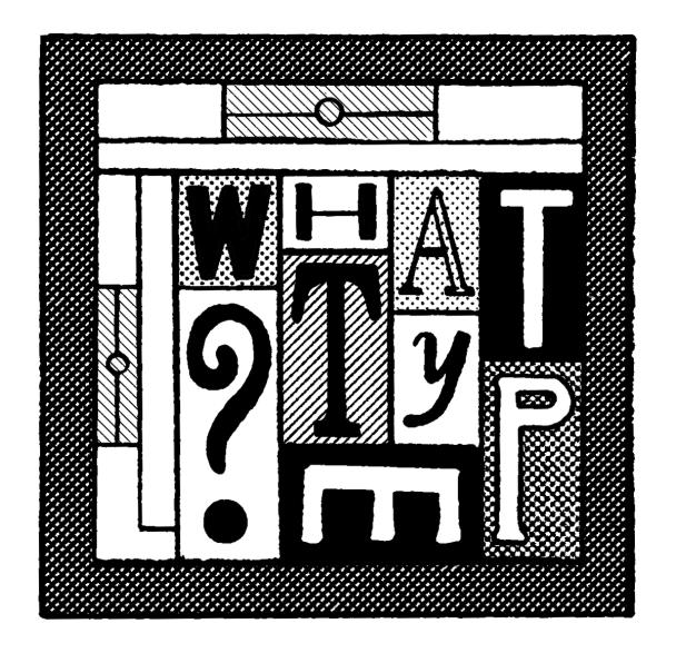
Illustration: Jay Cover .
(Read More)Typography (or typesetting) is the practice of assembling text elements in a design composition by defining multiple aspects such as the ratio between text columns and white spaces, choosing and using typefaces, setting their styles and sizes for all categories of texts, leading, justification style, and hyphenation, etc.
The person practicing typography is called a typographer.
Not to be confused with Typeface Design.
x-Height
Sponsored by TypeMates . Typeface in use: Halvar Stencil Breitschrift , designed by Paul Eslage, Jakob Runge, Lisa Fischbach and Nils Thomsen-Haberman, 2019.
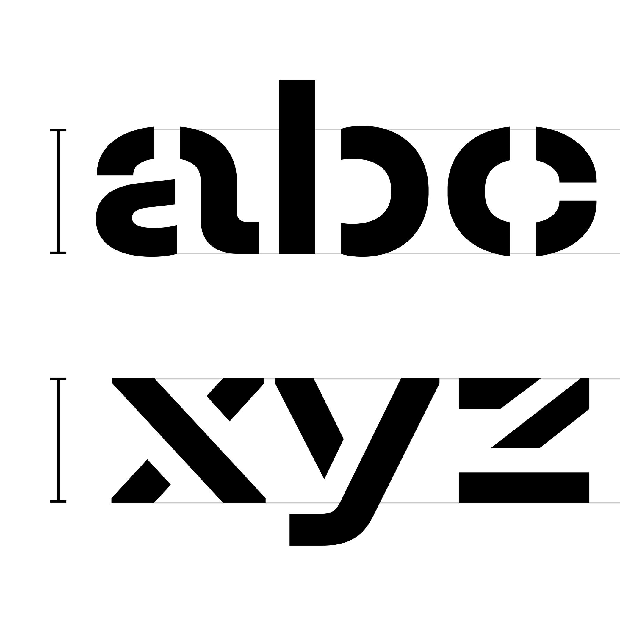
(Read More)The x-height is the guideline placed at the top of the Latin letter x.
It helps to align the other lowercase letters and to set the proportions with uppercase letters and the ascenders.
Because the letter x is the only lowercase letter without ascenders and horizontal tips at its top and bottom (it has no overshoots), it is the reference letter for lowercase height.